The views expressed in this publication are the views of the author(s) and do not necessarily reflect those of the Government of Ontario or the Ontario Online Learning Consortium
Title Page
1
Funded by the Government of Ontario
The views expressed in this publication are the views of the author(s) and do not necessarily reflect those of the Government of Ontario or the Ontario Online Learning Consortium
About This Book
2
Welcome to the exciting and transformative world of Engineering Statistics, where mathematical theory and innovation converge to shape the future of engineering, technology, the environment, and healthcare. This open-access textbook is specially tailored for undergraduate students as an introductory or survey course, providing you with the foundational knowledge and practical skills necessary to thrive in the dynamic field of engineering and the specializations of the discipline.
Why Statistics in Engineering?
Engineering is at the forefront of technological innovation and the lived experience of humanity.
Exploring Diverse Domains
Throughout this textbook, you will embark on a journey through various domains within engineering and the need for statistical methods within these domains. Practical examples, case studies, and problem-solving exercises are woven into the fabric of this textbook and its associated resources, providing real-world context and hands-on experience. From theory to real-world applications, this text navigates through descriptive and analytical statistical tools and methodology, emphasizing their application in real-world engineering problems. You will learn not only the theory of statistics but also how to apply these concepts to design experiments, analyze data, and control processes in engineering contexts.
Leveraging Open Access and Statistical Computing Resources for Exploration
We encourage you to make full use of the open access nature of this textbook, allowing you to comprehensively explore how statistics can be applied to engineering systems. Wherever your passion lies in engineering, this book will serve as an invaluable guide on your journey. Statistical computing support though tutorials residing at the associated GitHub repository offer practical examples and interaction with practical statistics and coding, as well as the ability to learn through simulation and exploration. The GitHub repository can be found here: GitHub: Introductory Statistical Methods for Engineering.
Changes include rewriting some of the passages and adding some minor original material. Formatting for Pressbooks and adaptation of the chapter numbering and nesting have been made. Python based Jupyter Notebooks have been adapted from the text examples and linked throughout.
This resource also has a reliance on a foundational statistics resources from “Process Improvement Using Data”. This is an invaluable legacy resource created and provided as an open educational resource by Kevin Dunn during his tenure at McMaster University between 2012 and 2016. Kevin’s resource was not just an invaluable for this text but for many educators globally, making engineering statistics and data science available, comprehensible, and applicable: PID. This resource is CC BY-SA 4.0.
However, these resources, as well as many others, have benefited here from a synthesis approach for engineering and statistical computing support, and for a specificity for specializations in engineering. The use of Jupyter Notebooks and the coding language of Python are supported here as a practical experience and active learning experience, combining this text with the FAIR principles of open access resources, being Findable, Accessible, Interoperable, and Reusable.
A Journey of Impact
As you embark on this educational adventure, remember that engineering is not just about engineering solutions; it’s about improving lives. Your work has the potential to significantly impact people and make a difference in the world. Together, we’ll embark on this transformative journey, where statistics and innovation go hand in hand.
Let’s explore the exciting intersection of engineering, statistics, and technology, shaping the future together!
Learning Outcomes
3
Learning Outcomes
Students will:
Master core principles of engineering statistics.
Implement data analytics tailored for engineering scenarios.
Develop hands-on Python skills through tutorials and simulations.
Apply statistical knowledge to real-world engineering challenges.
.
Importance to the Field
These learning outcomes are essential for engineers because they provide a strong foundation in statistical analysis, data analytics, and practical programming skills in Python. By achieving these outcomes, students will be well-prepared to address complex engineering problems that require data-driven decision-making and statistical analysis.
Parts, Modules, and Chapter
The following specific Parts and their associated learning outcomes, as taught in the Part modules and chapters, align with the broader goals outlined above.
Part 1: Explore Data
Recognize and differentiate between key terms.
Apply various types of sampling methods to data collection.
Understand the role of statistics in engineering.
Apply statistical computing skills to data exploration.
Clean data to prepare for statistcal analysis applications.
Part 2: Summarize, Visualize, and Communicate with Data
Learn to plot and communicate effectively with data
Display data graphically and interpret graphs.
Recognize, describe, and calculate measures of data location and spread.
Part 3: Probability and Discrete Random Variables
Understand and use probability terminology.
Calculate probabilities using Addition and Multiplication Rules.
Construct and interpret Contingency Tables, Venn Diagrams, and Tree Diagrams.
Recognize and understand discrete probability distribution functions.
Calculate and interpret expected values.
Apply various discrete probability distributions appropriately.
Part 4: Continuous Random Variables and The Normal Probability Distribution
Recognize and understand continuous probability density functions.
Apply continuous probability distributions appropriately.
Recognize and apply the normal probability distribution.
Part 5: Inferential Statistics and Hypothesis Testing with Samples
Apply and interpret the central limit theorem for means.
Describe hypothesis testing and differentiate between types of hypothesis testing errors.
Conduct and interpret hypothesis tests for population parameters.
Conduct and interpret hypothesis tests for two population parameters.
Understand and apply non-parametric methods for comparing distributions.
Calculate and interpret confidence intervals for population parameters.
Determine required sample sizes for confidence intervals.
Understand and communicate about the p-value and statistical test conclusions.
Confidently choose between statistical tests.
Part 6: Inference for Unstructured Multisample Studies and ANOVA
Interpret the F probability distribution.
Conduct and interpret one-way ANOVA and tests of variances.
Conduct individual and simultaneous confidence interval methods for one-way ANOVA.
Part 7: Least Squares and Simple Linear Regression Analysis
Discuss linear regression and correlation concepts.
Create and analyze scatter plots, calculate correlation coefficients, and identify outliers.
Make conclusions about simple linear regression models and confidently communicate conclusions.
Fit established models and create new models from data.
Part 8: Multiple Linear Regression Analysis
Apply multiple regression analysis.
Learn model fitting and building for multiple linear regression.
Introduction to Full Factorial Design of Experiments.
Part 9: Design of Experiments
Apply and implement a design of experiment.
Apply full and fractional designs.
Understand and utilize Surface Response Methods and Optimization Methods.
.
Overall, these modules and learning outcomes equip engineering students with the statistical knowledge and skills needed to excel in their field, enabling them to make data-driven decisions and tackle engineering challenges effectively.
Figurative Overview of Learning Modules
4
Attribution: This Figurative Overview of Learning Modules is from “Process Improvement Using Data”. by Kevin Dunn . This resourse is available at PID and any material is copyrighted to him and shared by CC BY-SA 4.0.
Python Installation and Review
5
To take full advantage of this resource, it is strongly recommended that you utilize a statistical package that can read the Python code. We recommend using Jupyter Lab or Jupyter Notebook with the Anaconda package. See the instructions below for installation for different operating systems.
Steps for Installation:
Navigate to the Anaconda Webpage and Download the appropriate setup file.
Statistical computing support though tutorials residing at the associated GitHub repository offer practical examples and interaction with practical statistics and coding, as well as the ability to learn through simulation and exploration. The GitHub repository can be found here: GitHub: Introductory Statistical Methods for Engineering.
The repository holds the Python based Jupyter Notebook files for this course. It is recommended that you download the specific files to your computer and run them locally. However, you can also work through interactive Jupyter Notebooks associated with the course modules without using anything else, find the BinderHub badge on the ReadMe section of the repository and click on it.
These interaction links are also incorporated throughout the text of this resource to be able to work through examples in the text at the same time as you review the concepts in each module, through Special GitHub Site repositories.
1.0.1 Introduction to Exploring Data
7
1912 photograph of Karl Pearson (By Unknown author – Google Books – Nock, Albert Jay (1912-03). “A New Science And Its Findings”. The American Magazine LXXIII: 579. The Phillips Publishing Co.., Public Domain, https://commons.wikimedia.org/w/index.php?curid=4578734, and Google Books: Karl Pearson, The Grammar of Science, Adam and Charles Black, 1911 London: https://www.google.com/books/edition/The_Grammar_of_Science/9mISAAAAIAAJ?hl=en&gbpv=1&dq=grammar+of+science&printsec=frontcover, Public Domain.
Karl Pearson, a pioneering and problematic English mathematician and biostatistician born in 1857, profoundly impacted the field of statistics. His book, “The Grammar of Science,” first published in 1892, is a pivotal work in scientific philosophy, and can be seen as a link between statistics and the engineering in that it focuses on the importance of statistical methods in comprehending and articulating natural phenomena. This perspective is particularly resonant in engineering, where observation, measurement, description, technical communication, and creative application— key aspects of the scientific method and heavily reliant on statistical reasoning— are fundamental.
Statistics and statistical methods are vital in engineering and biomedical engineering, playing a crucial role in the design, analysis, and interpretation of data. As these fields increasingly rely on technology and data, statistical literacy and being able to use “the grammar of science” becomes essential for biomedical engineers.
Key Takeaways
This course will be about harnessing data and describing and communicating about its uncertainty using statistical methods.
These methods are key in healthcare and necessary for creating, testing, and understanding the impact of new biomedical technologies, which produce vast data amounts. In real-world applications, unlike in pure mathematics, data always contain errors and variation. Statistics aid in making informed decisions amidst this inherent uncertainty, a critical skill in various fields including economics, health, business, and engineering.
Statistics involves two main areas- descriptive methods, which summarize sample data, and inferential methods, which draw conclusions about a larger population. Exploring and cleaning data and defining data type is crucial for choosing an appropriate statistical analysis. Understanding and communicating bout data’s central tendency and variation is vital, involving measures like mean, median, mode, standard deviation, and interquartile range.
This Part of the course will focus on the core concepts of statistics and introduce the use of statistical computing and some fundamental concepts of data science to be able to apply statistical methods to data. Data science is the interdisciplinary field of statistics, scientific computing, and science and engineering used to extract and use knowledge from data. For this course, we will be using Python based JupyterLab Notebooks as a statistical computing tool to explore and practice the application of statistical concepts.
Learning Objectives
Learning Outcomes for Part 1:
Differentiate between descriptive and inferential statistics and understand their applications in engineering contexts.
Understand basic statistical samples and sampling techniques.
Review and understand experimental design and designed experiments in engineering.
Identify, classify, and use different types of statistical data and data types (categorical, ranked, discrete, continuous).
Review the fundamentals of data cleaning and preparation for data exploration.
Learning Outcomes for Part 1- Jupyter Notebook Tutorials:
Open and use a JupyterLab Notebook tutorial and read in a simple dataset.
Use statistical computing to clean and prepare data.
This Course Part 1 lays a foundation for all that follows: It contains a road map for the study of engineering statistics. The subject is defined, its importance is described, some basic terminology is introduced, and the important issue of measurement is discussed. Finally, the role of mathematical models in achieving the objectives of engineering statistics is investigated.
Changes include rewriting some of the passages and adding some minor original material. Formatting for Pressbooks and adaptation of the chapter numbering and nesting have been made. Python based Jupyter Notebooks have been adapted from the text examples and linked throughout.
This resource also draws on Kevin Dunns “Process Improvement Using Data” at PID. Portions of this work are the copyright of Kevin Dunn, and shared through CC BY-SA 4.0. The chapter on Variability comes directly from this resource, and is the copyright of Kevin Dunn.
1.1.1 Statistical Methods in Engineering
9
In general terms, what a working engineer does is to design, build, operate, and/or improve physical systems and products. This work is guided by basic mathematical and physical theories learned in an undergraduate engineering curriculum. As the engineer’s experience grows, these quantitative and scientific principles work along-side sound engineering judgment. But as technology advances and new systems and products are encountered, the working engineer is inevitably faced with questions for which theory and experience provide little help. When this happens, what is to be done?
On occasion, consultants can be called in, but most often an engineer must independently find out “what makes things tick.” It is necessary to collect and interpret data that will help in understanding how the new system or product works. Without specific training in data collection and analysis, the engineer’s attempts can be haphazard and poorly conceived. Valuable time and resources are then wasted, and sometimes erroneous (or at least unnecessarily ambiguous) conclusions are reached. To avoid this, it is vital for a working engineer to have a toolkit that includes the best possible principles and methods for gathering and interpreting data. This toolkit is the statistical methods for engineering.
The goal of engineering statistics is to provide the concepts and methods needed by an engineer who faces a problem for which independent judgment is needed or new innovation is required. It supplies principles for how to efficiently acquire and process empirical information needed to understand and manipulate engineering systems.
DEFINITION 1.1.1.1. Engineering Statistics
Engineering statistics is the study of how best to
collect engineering data,
summarize or describe engineering data, and
draw formal inferences and practical conclusions on the basis of engineering data, all the while recognizing the reality of variation.
To better understand the definition, it is helpful to consider how the elements of engineering statistics enter into a real problem.
Example 1.1.1.1. Heat Treating Gears.
The article “Statistical Analysis: Mack Truck Gear Heat Treating Experiments” by P. Brezler (Heat Treating, November, 1986) describes a simple application of engineering statistics. A process engineer was faced with the question, “How should gears be loaded into a continuous carburizing furnace in order to minimize distortion during heat treating?” Various people had various semi-informed opinions about how it should be done—in particular, about whether the gears should be laid flat in stacks or hung on rods passing through the gear bores. But no one really knew the consequences of laying versus hanging.
Data Collection
In order to settle the question, the engineer decided to get the facts—to collect some data on “thrust face runout” (a measure of gear distortion) for gears laid and gears hung. Deciding exactly how this data collection should be done required careful thought. There were possible differences in gear raw material lots, machinists and machines that produced the gears, furnace conditions at different times and positions within the furnace, technicians and measurement devices that would produce the final runout measurements, etc. The engineer did not want these differences either to be mistaken for differences between the two loading techniques or to unnecessarily cloud the picture. Avoiding this required care.
In fact, the engineer conducted a well-thought-out and executed study. Table 1.1.1.1 shows the runout values obtained for 38 gears laid and 39 gears hung after heat treating. In raw form, the runout values are hardly understandable. They lack organization; it is not possible to simply look at Table 1.1 .1.1 and tell what is going on. The data needed to be summarized.
Data SummarizationOne thing that was done was to compute some numerical summaries of the data. For example, the process engineer found
Mean laid runout = 12.6
Mean hung runout = 17.9
Visualization
Further, a simple graphical summarization was made, as shown in Figure 1.1.1.1
Variation
From these summaries of the runouts, several points are obvious. One is that there is variation in the runout values, even within a particular loading method. Variability is an omnipresent fact of life, and all statistical methodology explicitly recognizes this. In the case of the gears, it appears from Figure 1.1.1.1 that there is somewhat more variation in the hung values than in the laid values. But in spite of the variability that complicates comparison between the load-
ing methods, Figure 1.1.1.1 and the two group means also carry the message that the laid runouts are on the whole smaller than the hung runouts. By how much? One answer is
Mean hung runout − Mean laid runout = 5.3
But how “precise” is this figure? Runout values are variable. So is there any assurance that the difference seen in the prese
nt means would reappear in further testing? Or is it possibly explainable as simply “stray background noise”? Laying gears is more expensive than hanging them. Can one know whether the extra expense is justified?
Drawing Inferences from Data
These questions point to the need for methods of formal statistical inference from data and translation of those inferences into practical conclusions. Methods presented in this text can, for example, be used to support the following statements about hanging and laying gears:
One can be roughly 90% sure that the difference in long-run mean runouts produced under conditions like those of the engineer’s study is in the range
3.2 to 7.4
One can be roughly 95% sure that 95% of runouts for gears laid under conditions like those of the engineer’s study would fall in the range
3.0 to 22.2
One can be roughly 95% sure that 95% of runouts for gears hung under conditions like those of the engineer’s study would fall in the range
.8 to 35.0
These are formal quantifications of what was learned from the study of laid and hung gears. To derive practical benefit from statements like these, the process engineer had to combine them with other information, such as the consequences of a given amount of runout and the costs for hanging and laying gears, and had to
apply sound engineering judgment. Ultimately, the runout improvement was great enough to justify some extra expense, and the laying method was implemented.
Table 1.1.1.1. Thrust Face Runouts (.0001 in.)
Figure 1.1.1.1. Dot diagrams of runouts
The example shows how the elements of statistics were helpful in solving an engineer’s problem. Throughout this text, the intention is to emphasize that the topics discussed are not ends in themselves, but rather methods that engineers can use to help them do their jobs effectively.
1.1.2 Variability
10
What is variability?
Life is pretty boring without variability, and this course, and almost all the field of statistics would be unnecessary if things did not naturally vary.
Fortunately, we have plenty of variability in the recorded data from our processes and systems:
Raw material and input properties are not constant.
Unknown sources, often called “error” or” noise“. These errors are all sources of variation which our imperfect knowledge of the process cannot account for.
Measurement and sampling variability: sensor drift, spikes, noise, recalibration shifts, errors in our sample analysis and laboratory equipment.
Production disturbances:
external conditions change, such as ambient temperature, or humidity, and
pieces of plant equipment break down, wear out and are replaced.
1.1.3 Types of Statistical Studies and Statistical Methods
11
When an engineer sets about to gather data, he or she must decide how active to be. Will the engineer turn knobs and manipulate process variables or simply let things happen and try to record the salient features?
DEFINITION 1.2.3.1. Observational Study
An observational study is one in which the investigator’s role is basically passive. A process or phenomenon is watched and data are recorded, but there is no intervention on the part of the person conducting the study.
DEFINITION 1.2.3.2. Experimental Study
An experimental study (or, more simply, an experiment) is one in which the investigator’s role is active. Process variables are manipulated, and the study environment is regulated.
Most real statistical studies have both observational and experimental features, and these two definitions should be thought of as representing idealized opposite ends of a continuum. On this continuum, the experimental end usually provides the most efficient and reliable ways to collect engineering data. It is typically much quicker to manipulate process variables and watch how a system responds
to the changes than to passively observe, hoping to notice something interesting or revealing.
Inferring causality
In addition, it is far easier and safer to infer causality from an experiment than from an observational study. Real systems are complex. One may observe several instances of good process performance and note that they were all surrounded by
circumstances X without being safe in assuming that circumstances X cause good process performance. There may be important variables in the background that are changing and are the true reason for instances of favorable system behavior. These so-called lurking variables may govern both process performance and circumstances X. Or it may simply be that many variables change haphazardly without appreciable impact on the system and that by chance, during a limited period of observation, some of these happen to produce X at the same time that good performance occurs. In either case, an engineer’s efforts to create X as a means of making things work well will be wasted effort.
On the other hand, in an experiment where the environment is largely regulated except for a few variables the engineer changes in a purposeful way, an inference of causality is much stronger. If circumstances created by the investigator are consistently accompanied by favorable results, one can be reasonably sure that they caused the favorable results.
Example 1.1.3.1. Pelletizing Hexamine Powder
Cyr, Ellson, and Rickard attacked the problem of reducing the fraction of non-conforming fuel pellets produced in the compression of a raw hexamine powder in a pelletizing machine. There were many factors potentially influencing the percentage of nonconforming pellets: among others, Machine Speed, Die Fill
Level, Percent Paraffin added to the hexamine, Room Temperature, Humidity at manufacture, Moisture Content, “new” versus “reground” Composition of the mixture being pelletized, and the Roughness of the chute entered by the freshly stamped pellets. Correlating these many factors to process performance through passive observation was hopeless.
The students were, however, able to make significant progress by conducting an experiment. They chose three of the factors that seemed most likely to be important and purposely changed their levels while holding the levels of other factors as close to constant as possible. The important changes they observed in the percentage of acceptable fuel pellets were appropriately attributed to the influence of the system variables they had manipulated.
Besides the distinction between observational and experimental statistical studies, it is helpful to distinguish between studies on the basis of the intended breadth of application of the results. Two relevant terms, popularized by the late W. E.Deming, are defined next:
DEFINITION 1.1.3.3. Enumerative study
An enumerative study is one in which there is a particular, well-defined, finite group of objects under study. Data are collected on some or all of these objects, and conclusions are intended to apply only to these objects.
DEFINITION 1.1.3.4. Analytical study
An analytical study is one in which a process or phenomenon is investigated at one point in space and time with the hope that the data collected will be representative of system behavior at other places and times under similar conditions. In this kind of study, there is rarely, if ever, a particular well-defined group of objects to which conclusions are thought to be limited.
Most engineering studies tend to be of the second type, although some important engineering applications do involve enumerative work. One such example is the reliability testing of critical components—e.g., for use in a space shuttle. The interest is in the components actually in hand and how well they can be expected to perform rather than on any broader problem like “the behavior of all components of this type.” Acceptance sampling (where incoming lots are checked before taking formal receipt) is another important kind of enumerative study. But as indicated, most engineering studies are analytical in nature.
Example 1.1.3.1. continued
The students working on the pelletizing machine were not interested in any particular batch of pellets, but rather in the question of how to make the machine work effectively. They hoped (or tacitly assumed) that what they learned about making fuel pellets would remain valid at later times, at least under shop conditions like those they were facing. Their experimental study was analytical in nature.
Particularly when discussing enumerative studies, the next two definitions are needed.
DEFINITION 1.1.3.5. Population
A population is the entire group of objects about which one wishes to gather information in a statistical study.
DEFINITION 1.1.3.6. Sample
A sample is the group of objects on which one actually gathers data. In the case of an enumerative investigation, the sample is a subset of the population (and can in some cases include the entire population).
Figure 1.1.3.1 shows the relationship between a population and a sample. If a crate of 100 machine parts is delivered to a loading dock and 5 are examined in order to verify the acceptability of the lot, the 100 parts constitute the population of interest, and the 5 parts make up a (single) sample of size 5 from the population. (Notice the word usage here: There is one sample, not five samples.)
Figure 1.1.3.1. Population and sample
There are several ways in which the meanings of the words population and sample are often extended. For one, it is common to use them to refer to not only objects under study but also data values associated with those objects. For example, if one thinks of Rockwell hardness values associated with 100 crated machine parts, the 100 hardness values might be called a population (of numbers). Five hardness values corresponding to the parts examined in acceptance sampling could be termed a sample from that population.
Example 1.1.3.1. continued
Cyr, Ellson, and Rickard identified eight different sets of experimental conditions under which to run the pelletizing machine. Several production runs of fuel pellets were made under each set of conditions, and each of these produced its own percentage of conforming pellets. These eight sets of percentages can be referred
to as eight different samples (of numbers).
Also, although strictly speaking there is no concrete population being investigated in an analytical study, it is common to talk in terms of a conceptual population in such cases. Phrases like “the population consisting of all widgets that could be produced under these conditions” are sometimes used. This can sometimes be confusing. But it is a common usage, and it is supported by the fact that typically the same mathematics is used when drawing inferences in enumerative and analytical contexts.
Types of Statistical methods
Two main statistical methods are used in data analysis: descriptive statistics and infernetial statistics. Descriptive statistics summarize data from a sample, such as by using the mean and standard deviation of a sample. and will be the main consideration for Part 2 of this course. Inferential statistics draw conclusions from data drawn from a sample that are subject to random variation. Inferential statistics uses a probability model to describe the process from which the data were obtained, which we will learn about in Part 3 and Part 4. Data are then used to draw conclusions about the process by estimating parameters in the model and making predictions based on the model. We will first learn about formal inferential tests of statistics in Part 5 of this course. Figure 1.1.2.2 shows how descriptive and inferential statistics are related.
Figure 1.1.2.2. How descriptive and inferential statistics are related.
1.1.4 Sampling
12
Sampling in Enumerative Studies
An enumerative study has an identifiable, concrete population of items. This chapter discusses selecting a sample of the items to include in a statistical investigation.
Using a sample to represent a (typically much larger) population has obvious advantages. Measuring some characteristics of a sample of 30 electrical components from an incoming lot of 10,000 can often be feasible in cases where it would not be feasible to perform a census (a study that attempts to include every member of the population). Sometimes testing is destructive, and studying an item renders
it unsuitable for subsequent use. Sometimes the timeliness and data quality of a sampling investigation far surpass anything that could be achieved in a census. Data collection technique can become lax or sloppy in a lengthy study. A moderate amount of data, collected under close supervision and put to immediate use, can be very valuable—often more valuable than data from a study that might appear more complete but in fact takes too long.
If a sample is to be used to stand for a population, how that sample is chosen becomes very important. The sample should somehow be representative of the population. The question addressed here is how to achieve this.
Systematic and judgment-based methods can in some circumstances yield samples that faithfully portray the important features of a population. If a lot of items is manufactured in a known order, it may be reasonable to select, say, every 20th one for inclusion in a statistical engineering study. Or it may be effective to force the sample to be balanced—in the sense that every operator, machine, and raw
material lot (for example) appears in the sample. Or an old hand may be able to look at a physical population and fairly accurately pick out a representative sample.
But there are potential problems with such methods of sample selection. Humans are subject to conscious and subconscious preconceptions and biases. Accordingly, judgment-based samples can produce distorted pictures of populations. Systematic methods can fail badly when unexpected cyclical patterns are present. (For example, suppose one examines every 20th item in a lot according to the order in which the items come off a production line. Suppose further that the items are at one point processed on a machine having five similar heads, each performing the same operation on every fifth item. Examining every 20th item only gives a picture of how one of the heads is behaving. The other four heads could be terribly misadjusted, and there would be no way to find this out.)
Even beyond these problems with judgment-based and systematic methods of sampling, there is the additional difficulty that it is not possible to quantify their properties in any useful way. There is no good way to take information from samples drawn via these methods and make reliable statements of likely margins of error. The method introduced next avoids the deficiencies of systematic and judgment-based sampling.
DEFINITION 1.1.4.1. Simple random sample
A simple random sample of size n from a population is a sample selected in such a manner that every collection of n items in the population is a priori equally likely to compose the sample.
Probably the easiest way to think of simple random sampling is that it is conceptually equivalent to drawing n slips of paper out of a hat containing one for each member of the population.
Example 1.1.4.1. Random Sampling Dorm Residents
C. Black did a partially enumerative and partially experimental study comparing student reaction times under two different lighting conditions. He decided to recruit subjects from his coed dorm floor, selecting a simple random sample of 20 of these students to recruit. In fact, the selection method he used involved a table of so-called random digits. He could today use a random number generator using a statistical computing package. But he could have just as well written the names of all those living on his floor on standard-sized slips of paper, put them in a bowl, mixed thoroughly, closed his eyes, and selected 20 different slips from the bowl.
Mechanical Methods, Random Digit Tables, and Simple Random Samples
Methods for actually carrying out the selection of a simple random sample include mechanical methods and methods using “random digits.” Mechanical methods rely for their effectiveness on symmetry and/or thorough mixing in a physical randomizing device. So to speak, the slips of paper in the hat need to be of the same size and well scrambled before sample selection begins.
The first Vietnam-era U.S. draft lottery was a famous case in which adequate care was not taken to ensure appropriate operation of a mechanical randomizing device. Birthdays were supposed to be assigned priority numbers 1 through 366 in a “random” way. However, it was clear after the fact that balls representing birth dates were placed into a bin by months, and the bin was poorly mixed. When the balls were drawn out, birth dates near the end of the year received a disproportionately
large share of the low draft numbers. In the present terminology, the first five dates out of the bin should not have been thought of as a simple random sample of size 5. Those who operate games of chance more routinely make it their business to know (via the collection of appropriate data) that their mechanical devices are operating in a more random manner.
Using random digits to do sampling implicitly relies for “randomness” on the appropriateness of the method used to generate those digits. Physical random processes like radioactive decay and pseudorandom number generators (complicated recursive numerical algorithms) are the most common sources of random digits. Until fairly recently, it was common to record such digits in printed tables.
Statistical Software and Random Samples
With the wide availability of personal computers, random digit tables have become largely obsolete. That is, random numbers can be generated “on the spot” using statistical or spreadsheet software.
Notes on Random Sampling
Regardless of how Definition 1.1.4.1 is implemented, several comments about the method are in order. First, it must be admitted that simple random sampling meets the original objective of providing representative samples only in some average or long-run sense. It is possible for the method to produce particular realizations that are horribly unrepresentative of the corresponding population. A simple random sample of 20 out of 80 axles could turn out to consist of those with the smallest diameters. But this doesn’t happen often. On the average, a simple random sample will faithfully portray the population. Definition 1.1.4.1 is a statement about a method, not a guarantee of success on a particular application of the method.
Second, it must also be admitted that there is no guarantee that it will be an easy task to make the physical selection of a simple random sample. Imagine the pain of retrieving 5 out of a production run of 1,000 microwave ovens stored in a warehouse. It would probably be a most unpleasant job to locate and gather 5 ovens corresponding to randomly chosen serial numbers to, for example, carry to a
testing lab.
But the virtues of simple random sampling usually outweigh its drawbacks. For one thing, it is an objective method of sample selection. An engineer using it is protected from conscious and subconscious human bias. In addition, the method interjects probability into the selection process in what turns out to be a manageable fashion. As a result, the quality of information from a simple random sample can be quantified. Methods of formal statistical inference, with their resulting conclusions (“I am 95% sure that …”), can be applied when simple random sampling is used.
1.1.5 Types of Data
13
Engineers encounter many types of data. One useful distinction concerns the degree to which engineering data are intrinsically numerical.
DEFINITION 1.1.5.1. Categorical Data
Qualitative or categorical data are the values of basically nonnumerical characteristics associated with items in a sample. There can be an order associated with qualitative data, but aggregation and counting are required to produce any meaningful numerical values from such data.
Consider again 5 machine parts constituting a sample from 100 crated parts. If each part can be classified into one of the (ordered) categories (1) conforming, (2) rework, and (3) scrap, and one knows the classifications of the 5 parts, one has 5 qualitative data points. If one aggregates across the 5 and finds 3 conforming, 1 reworkable, and 1 scrap, then numerical summaries have been derived from the original categorical data by counting.
In contrast to categorical data are numerical data.
DEFINITION 1.1.5.2. Numerical Data
Quantitative or numerical data are the values of numerical characteristics associated with items in a sample. These are typically either counts of the number of occurrences of a phenomenon of interest or measurements of some physical property of the items.
Returning to the crated machine parts, Rockwell hardness values for 5 selected parts would constitute a set of quantitative measurement data. Counts of visible blemishes on a machined surface for each of the 5 selected parts would make up a set of quantitative count data.
It is sometimes convenient to act as if infinitely precise measurement were possible. From that perspective, measured variables are continuous in the sense that their sets of possible values are whole (continuous) intervals of numbers. For example, a convenient idealization might be that the Rockwell hardness of a machine part can lie anywhere in the interval (0, ∞). But of course this is only an idealization. All real measurements are to the nearest unit (whatever that unit may be). This is becoming especially obvious as measurement instruments are increasingly equipped with digital displays. So in reality, when looked at under a strong enough magnifying glass, all numerical data (both measured and count alike) are discrete in the sense that they have isolated possible values rather than a continuum
of available outcomes. Although (0, ∞) may be mathematically convenient and completely adequate for practical purposes, the real set of possible values for the measured Rockwell hardness of a machine part may be more like {.1,.2,.3,…} than like (0, ∞).
Well-known conventional wisdom is that measurement data are preferable to categorical and count data. Statistical methods for measurements are simpler and more informative than methods for qualitative data and counts. Further, there is typically far more to be learned from appropriate measurements than from qualitative data taken on the same physical objects. However, this must sometimes be balanced against the fact that measurement can be more time-consuming (and thus expensive) than the gathering of qualitative data.
Example 1.1.5.1. Pellet Mass Measurements
As a preliminary to their experimental study on the pelletizing process (discussed in Example 1.1.3.1), Cyr, Ellson, and Rickard collected data on a number of aspects of machine behavior. Included was the mass of pellets produced under standard operating conditions. Because a nonconforming pellet is typically one from which some material has broken off during production, pellet mass is indicative of system performance. Informal requirements for (specifications on) pellet mass were from 6.2 to 7.0 grams.
Information on 200 pellets was collected. The students could have simply observed and recorded whether or not a given pellet had mass within the specifications, thereby producing qualitative data. Instead, they took the time necessary to actually measure pellet mass to the nearest .1 gram—thereby collecting measurement data. A graphical summary of their findings is shown in Figure 1.1.5.1
Figure 1.1.5.1 Pellet mass measurements
Notice that one can recover from the measurements the conformity/nonconformity information—about 28.5% (57 out of 200) of the pellets had masses that did not meet specifications. But there is much more in Figure 1.1.5.1 besides this. The shape of the display can give insights into how the machine is operating and
the likely consequences of simple modifications to the pelletizing process. For example, note the truncated or chopped-off appearance of the figure. Masses do not trail off on the high side as they do on the low side. The students reasoned that this feature of their data had its origin in the fact that after powder is dispensed into a die, it passes under a paddle that wipes off excess material before a cylinder compresses the powder in the die. The amount initially dispensed to a given die may have a fairly symmetric mound-shaped distribution, but the paddle probably introduces the truncated feature of the display.
Also, from the numerical data displayed in Figure 1.1.5.1, one can find a percentage of pellet masses in any interval of interest, not just the interval [6.2, 7.0]. And by mentally sliding the figure to the right, it is even possible to project the likely effects of increasing die size by various amounts.
It is typical in engineering studies to have several response variables of interest. The next definitions present some jargon that is useful in specifying how many variables are involved and how they are related.
DEFINITION 1.1.5.3. Univariate
Univariate data arise when only a single characteristic of each sampled item is observed.
DEFINITION 1.1.5.4. Multivariate
Multivariate data arise when observations are made on more than one characteristic of each sampled item. A special case of this involves two characteristics—bivariate data.
DEFINITION 1.1.5.5. Repeated Measures
When multivariate data consist of several determinations of basically the same characteristic (e.g., made with different instruments or at different times), the data are called repeated measures data. In the special case of bivariate responses, the term paired data is used.
It is important to recognize the multivariate character of data when it is present. Having Rockwell hardness values for 5 of 100 crated machine parts and determinations of the percentage of carbon for 5 other parts is not at all equivalent to having both hardness and carbon content values for a single sample of 5 parts. There are two samples of 5 univariate data points in the first case and a single sample of 5 bivariate data points in the second. The second situation is preferable to the first, because it
allows analysis and exploitation of any relationships that might exist between the variables Hardness and Percent Carbon.
Example 1.1.5.2. Paired Distortion Measurements
In the furnace-loading scenario discussed in Example 1.1.1.1, radial runout measurements were actually made on all 38 + 39 = 77 gears both before and after heat treating. (Only after-treatment values were given in Table 1.1.) Therefore, the process engineer had two samples (of respective sizes 38 and 39) of paired data. Because of the pairing, the engineer was in the position of being able (if desired) to analyze how post-treatment distortion was correlated with pretreatment distortion.
1.1.6 Measurement: Its Importance and Difficulty
14
Success in statistical engineering studies requires the ability to measure. For some physical properties like length, mass, temperature, and so on, methods of measurement are commonplace and obvious. Often, the behavior of an engineering system can be adequately characterized in terms of such properties. But when it cannot, engineers must carefully define what it is about the system that needs observing and then apply ingenuity to create a suitable method of measurement.
Example 1.1.6.1. Measuring Brittleness
A senior design capstone in metallurgical engineering took on the project of helping a manufacturer improve the performance of a spike-shaped metal part. In its intended application, this part needed to be strong but very brittle. When meeting an obstruction in its path, it had to break off rather than bend, because bending
would in turn cause other damage to the machine in which the part functions. As the class planned a statistical study aimed at finding what variables of manufacture affect part performance, the students came to realize that the company didn’t have a good way of assessing part performance. As a necessary step in their study, they developed a measuring device. It looked roughly as in Figure 1.1.7.1. A swinging arm with a large mass at its end was brought to a horizontal position, released, and allowed to swing through a test part firmly
fixed in a vertical position at the bottom of its arc of motion. The number of degrees past vertical that the arm traversed after impact with the part provided an effective measure of brittleness.
Figure 1.1.6.1. A device for measuring brittleness
Example 1.1.6.2. Measuring Wood Joint Strength
Dimond and Dix wanted to conduct a study comparing joint strengths for combinations of three different woods and three glues. They didn’t have access to strength-testing equipment and so invented their own. To test a joint, they suspended a large container from one of the pieces of wood involved and poured water into it until the weight was sufficient to break the joint. Knowing the volume of water poured into the container and the density of water, they could determine the force required to break the joint.
Regardless of whether an engineer uses off-the-shelf technology or must fabricate a new device, a number of issues concerning measurement must be considered. These include validity, measurement variation/error, accuracy, and precision.
DEFINITION 1.1.6.1. Validity
A measurement or measuring method is called valid if it usefully or appropriately represents the feature of an object or system that is of engineering importance.
It is impossible to overstate the importance of facing the question of measurement validity before plunging ahead in a statistical engineering study. Collecting engineering data costs money. Expending substantial resources collecting data, only to later decide they don’t really help address the problem at hand, is unfortunately all too common.
Measurement Error
The point was made in Section 1.1.1.1 that when using data, one is quickly faced with the fact that variation is omnipresent. Some of that variation comes about because the objects studied are never exactly alike. But some of it is due to the fact that measurement processes also have their own inherent variability. Given a fine enough scale of measurement, no amount of care will produce exactly the same value over and over in repeated measurement of even a single object. And it is naive to attribute all variation in repeat measurements to bad technique or sloppiness. (Of course, bad technique and sloppiness can increase measurement variation beyond that which is unavoidable.)
An exercise suggested by W. J. Youden in his book Experimentation and Measurement is helpful in making clear the reality of measurement error. Consider measuring the thickness of the paper in this book. The technique to be used is as follows. The book is to be opened to a page somewhere near the beginning and one somewhere near the end. The stack between the two pages is to be grasped firmly
between the thumb and index finger and stack thickness read to the nearest .1 mm using an ordinary ruler. Dividing the stack thickness by the number of sheets in the stack and recording the result to the nearest .0001 mm will then produce a thickness measurement.
Example 1.1.6.3. Book Paper Thickness Measurements
Presented below are ten measurements of the thickness of the paper in Box, Hunter, and Hunter’s Statistics for Experimenters made one semester by engineering students Wendel and Gulliver.
Figure 1.1.6.2 shows a graph of these data and clearly reveals that even repeated measurements by one person on one book will vary and also that the patterns of variation for two different individuals can be quite different. (Wendel’s values are both smaller and more consistent than Gulliver’s.)
Figure 1.1.6.2. Dot diagrams of paper thickness measurements
The variability that is inevitable in measurement can be thought of as having both internal and external components.
Definition 1.1.7.2. Precision
A measurement system is called precise if it produces small variation in repeated measurement of the same object.
Precision is the internal consistency of a measurement system; typically, it can be improved only with basic changes in the configuration of the system.
Example 1.1.6.3. continued
Ignoring the possibility that some property of Gulliver’s book was responsible for his values showing more spread than those of Wendel, it appears that Wendel’s measuring technique was more precise than Gulliver’s. The precision of both students’ measurements could probably have been improved by giving each a binder clip and a micrometer. The binder clip would provide a relatively constant pressure on the stacks of pages being measured, thereby eliminating the subjectivity and variation involved in grasping the stack firmly between thumb and index finger. For obtaining stack thickness, a micrometer is clearly a more precise instrument than a ruler.
Precision of measurement is important, but for many purposes it alone is not adequate.
Definition 1.1.7.3 Accuracy
A measurement system is called accurate (or sometimes, unbiased) if on average it produces the true or correct value of a quantity being measured.
Accuracy is the agreement of a measuring system with some external standard. It is a property that can typically be changed without extensive physical change in a measurement method. Calibration of a system against a standard (bringing it in line with the standard) can be as simple as comparing system measurements to a standard, developing an appropriate conversion scheme, and thereafter using
converted values in place of raw readings from the system.
Example 1.1.6.3. continued
It is unknown what the industry-standard measuring methodology would have produced for paper thickness in Wendel’s copy of the text. But for the sake of example, suppose that a value of .0850 mm/sheet was appropriate. The fact that Wendel’s measurements averaged about .0817 mm/sheet suggests that her future
accuracy might be improved by proceeding as before but then multiplying any figure obtained by the ratio of .0850 to .0817—i.e., multiplying by 1.04.
Maintaining Canada’s reference sets for physical measurement is the business of Measurement Canada. In the USA it is the National Institute of Standards and Technology. It is important business. Poorly calibrated measuring devices may be sufficient for local purposes of comparing local conditions. But to establish the values of quantities in any absolute sense, or to expect local values to have meaning at other places and other times, it is essential to calibrate measurement systems against a constant standard. A millimeter must be the same today in Ontario as it was last week in British Columbia.
Accuracy and statistical studiesThe possibility of bias or inaccuracy in measuring systems has at least two important implications for planning statistical engineering studies. First, the fact that be monitored over time and that they be recalibrated as needed. The well-known phenomenon of instrument drift can ruin an otherwise flawless statistical study. Second, whenever possible, a single system should be used to do all measuring. If several measurement devices or technicians are used, it is hard to know whether the differences observed originate with the variables under study or from differences in devices or technician biases. If the use of several measurement systems is unavoidable, they must be calibrated against a standard (or at least against each other). The following example illustrates the role that human differences can play.
Example 1.1.6.4. Differences Between Technicians in Their Use of a Gauge
Cowan, Renk, Vander Leest, and Yakes worked with a company on the monitoring of a critical dimension of a high-precision metal part produced on a computer-controlled lathe. They encountered large, initially unexplainable variation in this dimension between different shifts at the plant. This variation was eventually
traced not to any real shift-to-shift difference in the parts but to an instability in the company’s measuring system. A single gauge was in use on all shifts, but different technicians used it quite differently when measuring the critical dimension. The company needed to train the technicians in a single, standardized method of using the gauge.
An analogy that is helpful in understanding the difference between precision and accuracy involves comparing measurement to target shooting. In target shooting, one can be on or off target (accurate or inaccurate) with a small or large cluster of shots (showing precision or imprecision). Figure 1.1.7.2 illustrates this analogy.
Good measurement is hard work, but without it data collection is futile. To make progress, engineers must obtain valid measurements, taken by methods whose precision and accuracy are sufficient to let them see important changes in system behavior. Usually, this means that measurement inaccuracy and imprecision must be an order of magnitude smaller than the variation in measured response caused by those changes.
1.1.7 Mathematical Models, Reality, and Data Analysis
15
One can learn the basics of statistics and the statistical methods of engineering without an understanding of the underlying mathematics. Statistics contains a fair amount of mathematics that most engineering readers will find to be reasonably understandable—if unfamiliar and initially puzzling. But a learning context based in mathematics provides a much deeper and better path to being able to utilize the statistical methods of engineering. It is also a good application of the mathematical theory and application that students have learned in a practical application. Therefore, it seems wise to try to put the mathematical content of the book in perspective early. In this section, the relationships of mathematics to the physical world and to engineering statistics are discussed.Mathematical models and reality
Mathematics is a construct and a tool. While it is of interest to some people in its own right, engineers generally approach mathematics from the point of view that it can be useful in describing and predicting how physical systems behave. Indeed, mathematical theories are guides in every branch of modern engineering.
Throughout this text, we will frequently use the phrase mathematical model.
DEFINITION 1.1.7.1. Mathematical model
A mathematical model is a description or summarization of salient features of a real-world system or phenomenon in terms of symbols, equations, numbers, and the like.
Mathematical models are themselves not reality, but they can be extremely effective descriptions of reality. This effectiveness hinges on two somewhat opposing properties of a mathematical model: (1) its degree of simplicity and (2) its predictive ability. The most powerful mathematical models are those that simultaneously are simple and generate good predictions. A model’s simplicity allows one to maneuver within its framework, deriving mathematical consequences of basic assumptions that translate into predictions of process behavior. When these are empirically correct, one has an effective engineering tool.
The elementary “laws” of mechanics are an outstanding example of effective mathematical modeling. For example, the simple mathematical statement that the acceleration due to gravity is constant,
=
yields, after one easy mathematical maneuver (an integration), the prediction that beginning with 0 velocity, after a time in free fall an object will have velocity
=
And a second integration gives the prediction that beginning with 0 velocity, a time in free fall produces displacement
The beauty of this is that for most practical purposes, these easy predictions are quite adequate. They agree well with what is observed empirically and can be counted on as an engineer designs, builds, operates, and/or improves physical processes or products.Mathematical models in statistics
But then, how does the notion of mathematical modeling interact with the subject of engineering statistics? There are several ways. For one, data collection and analysis are essential in fitting or estimating parameters of mathematical models. To understand this point, consider again the example of a body in free fall. If one postulates that the acceleration due to gravity is constant, there remains the
question of what numerical value that constant should have. The parameter must be evaluated before the model can be used for practical purposes. One does this by gathering data and using them to estimate the parameter.
A standard first college physics lab has traditionally been to empirically evaluate . The method often used is to release a steel bob down a vertical wire running through a hole in its center and allowing 60-cycle current to arc from the bob through a paper tape to another vertical wire, burning the tape slightly with every arc. A schematic diagram of the apparatus used is shown in Figure 1.1.7.1. The vertical positions of the burn marks are bob positions at intervals of of a second. Table 1.1.7.1 gives measurements of such positions. (Dr. Frank Peterson of the ISU Physics and Astronomy Department supplied the tape.) Plotting the bob positions in the table at equally spaced intervals produces the approximately quadratic plot shown in Figure 1.1.7.2. Picking a parabola to fit the plotted points involves identifying an appropriate value for . A method of curve fitting called least squares produces a value for g of 9.79/ , not far from the commonly quoted value of 9.8 /.
Figure 1.1.7.1. A device for measuring g
Table 1.1.7.1. Measured Displacements of a Bob in Free Fall
Figure 1.1.7.2. Bob positions in free fall
Notice that (at least before Newton) the data in Table 1.1.7.1 might also have been used in another way. The parabolic shape of the plot in Figure 1.1.7.2 could have suggested the form of an appropriate model for the motion of a body in free fall. That is, a careful observer viewing the plot of position versus time should conclude that there is an approximately quadratic relationship between position and time (and from that proceed via two differentiations to the conclusion that the acceleration due to gravity is roughly constant). This text is full of examples of how helpful it can be to use data both to identify potential forms for empirical models and to then estimate parameters of such models (preparing them for use in prediction).
This discussion has concentrated on the fact that statistics provides raw material for developing realistic mathematical models of real systems. But there is another important way in which statistics and mathematics interact. The mathematical theory of probability provides a framework for quantifying the uncertainty associated with inferences drawn from data.
DEFINITION 1.1.7.2. Probability
Probability is the mathematical theory intended to describe situations and phenomena that one would colloquially describe as involving chance.
If, for example, five students arrive at the five different laboratory values of ,
9.78, 9.82, 9.81, 9.78, 9.79
questions naturally arise as to how to use them to state both a best value for and some measure of precision for the value. The theory of probability provides guidance in addressing these issues. Material in Part 3 shows that probability considerations support using the class average of 9.796 to estimate and attaching to it a precision on the order of plus or minus .02/ .
The mathematics of probability is a full subject on its own, so this text will only supply a minimal introduction to the subject. But do not lose sight of the fact that probability is not statistics—nor vice versa. Rather, probability is a branch of mathematics and a useful subject in its own right. It is met in a statistics course as a tool because the variation that one sees in real data is closely related conceptually to the notion of chance modeled by the theory of probability.
1.1.8 Taxonomy of Variables in a Model
16
One of the hard realities of statistical modelling and experiment planning is the multidimensional nature of the world. There are typically many characteristics of observed but non-experimental systems and system performance by experimentation that the engineer would like to understand and many variables that might influence them. Some terminology is needed to facilitate clear thinking and discussion in light of this complexity.
DEFINITION 1.1.8.1. Response Variable
A response variable in an experiment is one that is monitored as characterizing system performance/behavior. It is the dependent variable in the system model.
DEFINITION 1.1.8.2. Input Variable
For existing data that was not experimentally collected, a system input variable acts as the variable that influences the model, or the independent variable of interest in the system model.
For experimental studies, the input variable is a supervised (or managed) variable in the experiment over which an investigator exercises power, choosing a setting or settings for use in the study. When a supervised variable is held constant (has only one setting), it is called a controlled variable. And when a supervised variable is given several different settings in a study, it is called an experimental variable.
Some of the variables that are neither primary responses nor managed in an experiment will nevertheless be observed.
DEFINITION 1.1.8.3 Accompanying variable
An accompanying variable (or concomitant variable) in an experiment is one that is identified and included in an analysis but is neither a primary response variable nor an input variable. Such a variable can change in reaction to either input variables or unknown causes and may or may not itself have an impact on a response variable.
Figure 1.1.8.1 is an attempt to picture Definitions 1.1.8.1 through 1.1.8.3. In it, the blackbox physical process somehow produces values of a response in an experiment. “Knobs” on the process represent managed variables. Concomitant variables are floating about as part of the experimental environment without being its main focus.
Identification of variables that may affect system response requires expert knowledge of the process under study. Engineers who do not have hands-on experience with a system can sometimes contribute insights gained from experience with similar systems and from basic theory. But it is also wise (in most cases, essential) to include on a project team several people who have first-hand knowledge of the particular process and to talk extensively with those who work with the system on a regular basis.
Typically, the job of identifying factors of potential importance in a statistical engineering study is a group activity, carried out in brainstorming sessions. It is therefore helpful to have tools for lending order to what might otherwise be an inefficient and disorganized process. One tool that has proved effective is variously known as a cause-and-effect diagram, or fishbone diagram, or Ishikawa diagram. Figure 1.1.9.2 is a template of a fishbone diagram for a system. In root-cause analysis, the use of 5 (or 8) M’s, is one of the most common frameworks for root-cause analysis (Wikipedia contributors. (2023b, December 3). Ishikawa diagram. Wikipedia. https://en.wikipedia.org/wiki/Ishikawa_diagram).
Without the time to think through these variables and some kind of organization, it is often difficult to develop anything like a complete list of important factors in a complex or real-world system.
Figure 1.1.8.2. Fishbone diagram of a system.
1.1.9 Tutorial 1 - Exploring Data with Python
17
At this point, it is recommended that you work your way through the Tutorial 1 exercise found on the associated GitHub repository. This exercise will introduce you to importing data into Python and doing some basic manipulation.
It is strongly recommended that you consult the Reading Data into Python & Data Cleaning Jupyter Notebook Files. These can be found in the “How do I do X in Python?” section.
2.0.1 Introduction Summarize, Visualize, and Communicate with Data
18
Figure 2.0.1.1. Sir Francis Galton, probably taken in the 1850s or early 1860s, image from Wikipedia https://en.wikipedia.org/wiki/Francis_Galton#/media/File:Francis_Galton_1850s.jpg and Nature article Vox Populi 1907 image from https://galton.org/cgi-bin/searchImages/search/essays/pages/galton-1907-vox-populi_1.htm.Figure 2.0.1.2. William Playfair, images from Wikipedia https://en.wikipedia.org/wiki/William_Playfair.
Francis Galton was a British polymath (1822-1911), and was a pioneer in the use of summary statistics, Figure 2.0.1.1. He was fascinated with measurement and quantification and developed innovative (though deeply problematic) statistical concepts to deal with these. One interesting use of statistics including his insightful observation of the median through an oxen-weight estimation contest. At a livestock fair, Galton observed a competition where participants attempted to guess the weight of an ox. Intrigued by the diverse range of guesses, Galton analyzed the data and found that while individual estimates varied widely, the median of the guesses was surprisingly close to the actual weight of the ox. This discovery highlighted the effectiveness of the median as a measure of central tendency, especially in its robustness to outliers and skewed data, and was published in Nature in 1907.
William Playfair, born in 1786, is regarded as the founder of graphical methods of statistics, including the line, bar, area, and pie charts, Figure 2.0.1.2. He revolutionized the way data was presented and demonstrated that charts could communicate information more effectively than tables of data. After describing and summarizing data using descriptive statistics, data can be described and presented in many different graphical visualizations to present and underscore conclusions about data.
The need for and growth of visualizations of data emphasizes the critical role of statistical graphs as effective tools for understanding the distribution and shape of data. Unlike a mere collection of numbers, graphs provide a visual representation that makes it easier to discern data clusters, trends, and outliers, a practice widely utilized in various media and industries for quick and efficient data comparison and for communication.
Key Takeaways
Graphs provide a visual representation of data and allow for the communication and story-telling of descriptive statistics.
We focus on fundamental graphical methods such as histograms, bar plots, box plots, time-series plots, and scatterplots. Practical applications of these concepts are demonstrated through exercises using Python based Jupyter Notebook tutorials. We conclude by emphasizing principles of graphical excellence and the importance of creating informative, truthful, and visually useful graphs.
Overall, this module provides a comprehensive blend of theoretical concepts, practical applications, and statistical computing tools, essential for mastering graphical communication of data in biomedical engineering statistics.
Learning Objectives
Learning Outcomes for Module 2:
Learn the descriptive statistical summarizations based on central tendency and spread of data
Learn to construct and interpret various types of graphs like histograms, bar plots, and box-plots.
Understand how descriptive statistics summarize and describe the features of a dataset through visualizations.
Create and interpret an appropriate visualization of data and understand how these graphical techniques are useful in uncovering and summarizing patterns and comparisons in data.
Understand how to use simple time series plots to visualise the important features of time-directed data.
Apply the principles of graphical excellence and effective data presentation.
Learning Outcomes for Module 2- Jupyter Notebook Tutorials:
Utilize statistical software for data summarization, visualization, and interpretation.
Learn to create basic plots using Python’s plotting libraries.
Changes include rewriting some of the passages and adding some minor original material. Formatting for Pressbooks and adaptation of the chapter numbering and nesting have been made. Python based Jupyter Notebooks have been adapted from the text examples and linked throughout.
This resource also draws on Kevin Dunns “Process Improvement Using Data” at PID. Portions of this work are the copyright of Kevin Dunn, and shared through CC BY-SA 4.0.
2.1.1 Quantitative Data and Quantiles Introduction
20
Engineering data are always variable. Given precise enough measurement, even supposedly constant process conditions produce differing responses. Therefore, it is not individual data values that demand an engineer’s attention as much as the pattern or distribution of those responses. The task of summarizing data is to describe their important distributional characteristics. This chapter discusses simple methods that are helpful in this task.
Elementary Graphical and Tabular Treatment of Quantitative Data
Almost always, the place to begin in data analysis is to make appropriate graphical and/or tabular displays. Indeed, where only a few samples are involved, a good picture or table can often tell most of the story about the data. The next few chapters discuss the usefulness of dot diagrams, stem-and-leaf plots, frequency tables, histograms, scatterplots, and run charts.
Quantiles and Related graphical tools
After this review of some elementary graphical and tabular methods of data summarization, the concepts of quantiles of a distribution is then introduced and used to make other useful graphical displays.
2.1.2 Dot Diagrams and Stem-and-Leaf Plots
21
When an engineering study produces a small or moderate amount of univariate quantitative data, a dot diagram, easily made with pencil and paper, is often quite revealing. A dot diagram shows each observation as a dot placed at a position corresponding to its numerical value along a number line.
Example 2.1.2.1. Portraying Thrust Face Runouts
Module 1.1 considered a heat treating problem where distortion for gears laid and gears hung was studied. That figure has been reproduced here as Figure 2.1.2.1. It consists of two dot diagrams, one showing thrust face runout values for gears laid and the other the corresponding values for gears hung, and shows clearly that the laid values are both generally smaller and more consistent than the hung values.
.
Figure 2.1.2.1. Dot diagrams of runouts.
Example 2.1.2.2. Penetration of 200 grain bullets
Sale and Thom compared penetration depths for several types of .45 caliber bullets fired into oak wood from a distance of 15 feet. Table 2.1.2.1 gives the penetration depths (in from the target surface to the back of the bullets) for two bullet types. Figure 2.2.2.2 presents a corresponding pair of dot diagrams.
The dot diagrams show the penetrations of the 200 grain bullets to be both larger and more consistent than those of the 230 grain bullets. (The students had predicted larger penetrations for the lighter bullets on the basis of greater muzzle velocity and smaller surface area on which friction can act. The different consistencies of penetration were neither expected nor explained.)
Dot diagrams give the general feel of a data set but do not always allow the recovery of exactly the values used to make them. A stem-and-leaf plot carries much the same visual information as a dot diagram while preserving the original values exactly. A stem-and-leaf plot is made by using the last few digits of each data point to indicate where it falls.
Figure 2.1.2.3. Stem-and-leaf plots of laid gear runouts
Example 2.1.2.1 Thrust face runouts of laid gears, continued
Figure 2.1.2.3 gives two possible stem-and-leaf plots for the thrust face runouts of laid gears. In both, the first digit of each observation is represented by the number to the left of the vertical line or “stem” of the diagram. The numbers to the right of the vertical line make up the “leaves” and give the second digits of the observed runouts. The second display shows somewhat more detail than the first by providing ” ” and ” ” leaf positions for each possible leading digit, instead of only a single ” ” leaf for each leading digit.
Example 2.1.2.2 Penetration of 200 grain bullets, continued
Figure 2.1.2.4 gives two possible stem-and-leaf plots for the penetrations of 200 grain bullets in Table 2.1.2.1. On these, it was convenient to use two digits to the left of the decimal point to make the stem and the two following the decimal point to create the leaves. The first display was made by recording the leaf values directly from the table (from left to right and top to bottom). The second display is a better one, obtained by ordering the values that make up each leaf. Notice that both plots give essentially the same visual impression as the second dot diagram in Figure 2.2.1.2.
Figure 2.1.2.4. Stem-and-leaf plots of
the 200 grain penetration depths
When comparing two data sets, a useful way to use the stem-and-leaf idea is to make two plots back-to-back.
Example 2.1.2.1. Back-to-back plots for Runout Data, continued
Figure 2.1.2.5 gives back-to-back stem-and-leaf plots for the data of Table 2.1.2.1. It shows clearly the differences in location and spread of the two data sets.
Figure 2.1.2.5. Back-to-back stem-and-leaf plots of runouts
2.1.3 Frequency Tables and Histograms
22
Dot diagrams and stem-and-leaf plots are useful devices when mulling over a data set. But they are not commonly used in presentations and reports. In these more formal contexts, frequency tables and histograms are more often used.
A frequency table is made by first breaking an interval containing all the data into an appropriate number of smaller intervals of equal length. Then tally marks can be recorded to indicate the number of data points falling into each interval. Finally, frequencies, relative frequencies, and cumulative relative frequencies can be added.
Example 2.1.3.1. Laid Gear Runouts, continued
Table 2.1.3.1 gives one possible frequency table for the laid gear runouts. The relative frequency values are obtained by dividing the entries in the frequency column by 38, the number of data points. The entries in the cumulative relative frequency column are the ratios of the totals in a given class and all preceding classes to the total number of data points. (Except for round-off, this is the sum of the relative frequencies on the same row and above a given cumulative relative frequency.) The tally column gives the same kind of information about distributional shape that is provided by a dot diagram or a stem-and-leaf plot.
Table 2.1.3.1. Frequency Table for Laid Gear Thrust Face Runouts.
Choosing intervals for a frequency table
The choice of intervals to use in making a frequency table is a matter of judgment. Two people will not necessarily choose the same set of intervals. However, there are a number of simple points to keep in mind when choosing them. First, in order to avoid visual distortion when using the tally column of the table to gain an impression of distributional shape, intervals of equal length should be employed. Also, for aesthetic reasons, round numbers are preferable as interval endpoints. Since there is usually aggregation (and therefore some loss of information) involved in the reduction of raw data to tallies, the larger the number of intervals used, the more detailed the information portrayed by the table. On the other hand, if a frequency table is to have value as a summarization of data, it can’t be cluttered with too many intervals.
After making a frequency table, it is common to use the organization provided by the table to create a histogram. A (frequency or relative frequency) histogram is a kind of bar chart used to portray the shape of a distribution of data points.
Example 2.1.2.2. Penetration of 200 grain bullets, continued.
Table 2.1.3.2 is a frequency table for the 200 grain bullet penetration depths, and Figure 2.1.3.1 is a translation of that table into the form of a histogram.
Table 2.1.3.2. Frequency table for 200 grain penetration depths.
.
Figure 2.1.3.1. Histogram of the 200 grain penetration depths.
The vertical scale in Figure 2.1.3.1 is a frequency scale, and the histogram is a frequency histogram. By changing to relative frequency on the vertical scale, one can produce a relative frequency histogram.
Guidelines for making histograms
In making Figure 2.1.3.1, care was taken to:
1. (continue to) use intervals of equal length,
2. show the entire vertical axis beginning at zero,
3. avoid breaking either axis,
4. keep a uniform scale across a given axis, and
5. center bars of appropriate heights at the midpoints of the (penetration depth) intervals.
Following these guidelines results in a display in which equal enclosed areas correspond to equal numbers of data points. Further, data point positioning is clearly indicated by bar positioning on the horizontal axis. If these guidelines are not followed, the resulting bar chart will in one way or another fail to faithfully represent its data set. Figure 2.1.3.2 shows terminology for common distributional shapes encountered when making and using dot diagrams, stem-and-leaf plots, and histograms.
Figure 2.1.3.2. Distributional Shapes.
The graphical and tabular devices discussed to this point are deceptively simple methods. When routinely and intelligently used, they are powerful engineering tools. The information on location, spread, and shape that is portrayed so clearly on a histogram can give strong hints as to the functioning of the physical process that is generating the data. It can also help suggest physical mechanisms at work in the process.
Examples of engineering interpretations of distribution shape
For example, if data on the diameters of machined metal cylinders purchased from a vendor produce a histogram that is decidedly bimodal (or multimodal, having several clear humps), this suggests that the machining of the parts was done on more than one machine, or by more than one operator, or at more than one time. The practical consequence of such multichannel machining is a distribution of diameters that has more variation than is typical of a production run of cylinders from a single machine, operator, and setup. As another possibility, if the histogram is truncated, this might suggest that the lot of cylinders has been 100% inspected and sorted, removing all cylinders with excessive diameters. Or, upon marking engineering specifications (requirements) for cylinder diameter on the histogram, one may get a picture like that in Figure 2.1.3.3. It then becomes obvious that the lathe turning the cylinders needs adjustment in order to increase the typical diameter. But it also becomes clear that the basic process variation is so large that this adjustment will fail to bring essentially all diameters into specifications. Armed with this realization and a knowledge of the economic consequences of parts failing to meet specifications, an engineer can intelligently weigh alternative courses of action: sorting of all incoming parts, demanding that the vendor use more precise equipment, seeking a new vendor, etc.
Figure 2.1.3.3. Histogram marked with engineering specifications.
Investigating the shape of a data set is useful not only because it can lend insight into physical mechanisms but also because shape can be important when determining the appropriateness of methods of formal statistical inference like those discussed later in this book. A methodology appropriate for one distributional shape may not be appropriate for another.
2.1.4 Scatterplots and Run Charts
23
Dot diagrams, stem-and-leaf plots, frequency tables, and histograms are univariate tools. But engineering data are often multivariate and relationships between the variables are then usually of interest. The familiar device of making a two-dimensional scatterplot of data pairs is a simple and effective way of displaying potential relationships between two variables.
Example 2.1.4.1. Bolt Torques on a Face Plate
Brenny, Christensen, and Schneider measured the torques required to loosen six distinguishable bolts holding the front plate on a type of heavy equipment component. Table 2.1.4.1 contains the torques (in required for bolts number 3 and 4), respectively, on 34 different components. Figure 2.1.4.1 is a scatterplot of the bivariate data from Table 2.1.4.1. In this figure, where several points must be plotted at a single location, the number of points occupying the location has been plotted instead of a single dot.
Table 2.1.4.1. Torques Required to Loosen Two Bolts on Face Plates (ft lb)Figure 2.1.4.1. Scatterplot of bolt 3 and bolt 4 torques.
The plot gives at least a weak indication that large torques at position 3 are accompanied by large torques at position 4 . In practical terms, this is comforting; otherwise, unwanted differential forces might act on the face plate. It is also quite reasonable that bolt 3 and bolt 4 torques be related, since the bolts were tightened by different heads of a single pneumatic wrench operating off a single source of compressed air. It stands to reason that variations in air pressure might affect the tightening of the bolts at the two positions similarly, producing the big-together, small-together pattern seen in Figure 2.1.4.1.
The previous example illustrates the point that relationships seen on scatterplots suggest a common physical cause for the behavior of variables and can help reveal that cause.
Run Chart
In the most common version of the scatterplot, the variable on the horizontal axis is a time variable. A scatterplot in which univariate data are plotted against time order of observation is called a run chart or trend chart. Making run charts is one of the most helpful statistical habits an engineer can develop. Seeing patterns on a run chart leads to thinking about what process variables were changing in concert with the pattern. This can help develop a keener understanding of how process behavior is affected by those variables that change over time.
.
Example 2.1.4.2. Diameters of Consecutive Parts Turned on a Lathe
Williams and Markowski studied a process for rough turning of the outer diameter on the outer race of a constant velocity joint. Table 2.1.4.2 gives the diameters (in inches above nominal) for 30 consecutive joints turned on a particular automatic lathe. Figure 2.1.4.2 gives both a dot diagram and a run chart for the data in the table. In keeping with standard practice, consecutive points on the run chart have been connected with line segments.
.
Table 2.1.4.2. 30 Consecutive Outer Diameters Turned on a LatheFigure 2.1.4.2. Dot diagram and run chart of consecutive outer diameters.
Here the dot diagram is not particularly suggestive of the physical mechanisms that generated the data. But the time information added in the run chart is revealing. Moving along in time, the outer diameters tend to get smaller until part 16, where there is a large jump, followed again by a pattern of diameter generally decreasing in time. In fact, upon checking production records, Williams and Markowski found that the lathe had been turned off and allowed to cool down between parts 15 and 16 . The pattern seen on the run chart is likely related to the behavior of the lathe’s hydraulics. When cold, the hydraulics probably don’t do as good a job pushing the cutting tool into the part being turned as when they are warm. Hence, the turned parts become smaller as the lathe warms up. In order to get parts closer to nominal, the aimed-for diameter might be adjusted up by about .020 in. and parts run only after warming up the lathe.
2.1.5 Quantiles and Quantile Plots
24
Most readers will be familiar with the concept of a percentile. The notion is most famous in the context of reporting scores on educational achievement tests. For example, if a person has scored at the 80th percentile, roughly of those taking the test had worse scores, and roughly had better scores. This concept is also useful in the description of engineering data. However, because it is often more convenient to work in terms of fractions between 0 and 1 rather than in percentages between 0 and 100, slightly different terminology will be used here: “Quantiles,” rather than percentiles, will be discussed. After the quantiles of a data set are carefully defined, they are used to create a number of useful tools of descriptive statistics: quantile plots, boxplots, plots, and normal plots (a type of theoretical plot).
Roughly speaking, for a number between 0 and 1 , the quantile of a distribution is a number such that a fraction of the distribution lies to the left and a fraction of the distribution lies to the right. However, because of the discreteness of finite data sets, it is necessary to state exactly what will be meant by the terminology. Definition 1 gives the precise convention that will be used in this text.
Definition 3.1.5.1 quantile
For a data set consisting of values that when ordered are ,
1. if for a positive integer , the quantile of the data set is
(The ith smallest data point will be called the quantile.)
2. for any number between and that is not of the form for an integer , the quantile of the data set will be obtained by linear interpolation between the two values of with corresponding that bracket .
In both cases, In both cases, the notation will be used to denote the quantile.
Definition 2.1.5.1 identifies for all between and . To find for such a value of , one may solve the equation for , yielding
Index (i) of the ordered data point that is
and locate the ” th ordered data point.”
Example 2.1.5.1. Quantiles for Dry Breaking Strengths of Paper Towel
Lee, Sebghati, and Straub did a study of the dry breaking strength of several brands of paper towel. Table 3.1.5.1 shows ten breaking strengths (in grams) reported by the students for a generic towel. By ordering the strength data and computing values of , one can easily find the , and .95 quantiles of the breaking strength distribution, as shown in Table 31.5.2.
Table 2.1.5.1.
.
Table 2.1.5.2.
Since there are data points, each one accounts for of the data set. Applying convention (1) in Definition 3.1.5.1 to find (for example) the .35 quantile, the smallest 3 data points and half of the fourth smallest are counted as lying to (continued) the left of the desired number, and the largest 6 data points and half of the seventh largest are counted as lying to the right. Thus, the fourth smallest data point must be the .35 quantile, as is shown in Table 2.1.5.2.
To illustrate convention (2) of Definition 1, consider finding the . 5 and .93 quantiles of the strength distribution. Since .5 is of the way from .45 to .55 , linear interpolation gives:
Then, observing that .93 is of the way from .85 to .95 , linear interpolation gives:
Particular round values of give quantiles that are known by special names.
DEFINITION 2.1.5.2 Median
Definition is called the median of a distribution.
DEFINITION 2.1.5.3 First (or lower) quartile and third (or upper) quartile
Definition and are called the first (or lower) quartile and third (or upper) quartile of a distribution, respectively.
Example 2.1.5.1 Dry Breaking Strengths of Paper Towel, continued
Referring again to Table 2.1.5.2 and the value of previously computed, for the (continued) breaking strength distribution
A way of representing the quantile idea graphically is to make a quantile plot.
DEFINITION 2.1.5.4 Quantile Plot
A quantile plot is a plot of versus . For an ordered data set of size containing values , such a display is made by first plotting the points and then connecting consecutive plotted points with straight-line segments.
It is because convention (2) in Definition 2.1.5.1 calls for linear interpolation that straightline segments enter the picture in making a quantile plot.
Example 2.1.5.1. Dry Breaking Strengths of Paper Towel, continued
Referring again to Table 2.1.5.2 for the quantiles of the breaking strength distribution, it is clear that a quantile plot for these data will involve plotting and then connecting consecutive ones of the following ordered pairs.
Figure 2.1.5.1 gives such a plot.
Figure 2.1.5.1. Quantile plot of papertowel strengths.
A quantile plot allows the user to do some informal visual smoothing of the plot to compensate for any jaggedness. (The tacit assumption is that the underlying datagenerating mechanism would itself produce smoother and smoother quantile plots for larger and larger samples.)
2.1.6 Boxplots
25
Familiarity with the quantile idea is the principal prerequisite for making boxplots, an alternative to dot diagrams or histograms. The boxplot carries somewhat less information, but it has the advantage that many can be placed side-by-side on a single page for comparison purposes.
There are several common conventions for making boxplots. The one that will be used here is illustrated in generic fashion in Figure 2.1.6.1. A box is made to extend from the first to the third quartiles and is divided by a line at the median. Then the interquartile range:
DEFINITION 2.1.6.1. Interquartile Range: IQR
Figure 2.1.6.1. Generic Boxplot.
is calculated and the smallest data point within 1.5IQR of and the largest data point within 1.5IQR of are determined. Lines called whiskers are made to extend out from the box to these values. Typically, most data points will be within the interval . Any that are not then get plotted individually and are thereby identified as outlying or unusual.
Example 2.1.6.2. Dry Breaking Strengths of Paper Towel, continued
Consider making a boxplot for the paper towel breaking strength data. To begin,
So
and
Then
and
Since all the data points lie in the range to , the boxplot is as shown in Figure 2.1.6.2.
Figure 2.1.6.2. Boxplot of paper towel strengths.
A boxplot shows distributional location through the placement of the box and whiskers along a number line. It shows distributional spread through the extent of the box and the whiskers, with the box enclosing the middle of the distribution. Some elements of distributional shape are indicated by the symmetry (or lack thereof) of the box and of the whiskers. And a gap between the end of a whisker and a separately plotted point serves as a reminder that no data values fall in that interval.
Two or more boxplots drawn to the same scale and side by side provide an effective way of comparing samples.
Example 2.1.6.3. Bullet penetraion depth, continued
Table 2.1.6.1 contains the raw information needed to find the quantiles for the two distributions of bullet penetration depth introduced in the previous section. For the 230 grain bullet penetration depths, interpolation yields
So
Similar calculations for the 200 grain bullet penetration depths yield
Table 2.1.6.1.
Figure 2.1.6.3 then shows boxplots placed side by side on the same scale. The plots show the larger and more consistent penetration depths of the 200 grain bullets. They also show the existence of one particularly extreme data point in the 200 grain data set. Further, the relative lengths of the whiskers hint at some skewness (recall the terminology introduced previously to discuss distributional shape) in the data. And all of this is done in a way that is quite uncluttered and compact. Many more of these boxes could be added to Figure 2.1.6.3 (to compare other bullet types) without visual overload.
Figure 2.1.6.3. Side-by-side boxplots for the bullet penetration depths
2.1.7 Q-Q Plots and Comparing Distributional Shapes
26
It is often important to compare the shapes of two distributions. Comparing histograms is one rough way of doing this. A more sensitive way is to make a single plot based on the quantile functions for the two distributions and exploit the fact that “equal shape” is equivalent to “linearly related quantile functions.” Such a plot is called a quantile-quantile plot or, more briefly, a plot.
Consider the two small artificial data sets given in Table 2.1.7.1. Dot diagrams of these two data sets are given in Figure 2.1.71.. The two data sets have the same shape. But why is this so? One way to look at the equality of the shapes is to note that
2.1.7.1
th smallest value in data set th smallest value in data set 1
Then, recognizing ordered data values as quantiles and letting and stand for the quantile functions of the two respective data sets, it is clear from display (2.1.7.1) that
2.1.7.2
Table 2.1.7.1.
Figure 2.1.7.1 Dot diagrams for two
small data sets.
.
Figure 2.1.7.2. Q-Q plot for the data of Table 2.1.7.1.
That is, the two data sets have quantile functions that are linearly related. Looking at either display (2.1.7.1) or (2.1.7.2), it is obvious that a plot of the points:
(for ) should be exactly linear. Figure 3.16 illustrates this-in fact Figure 3.16 is a plot for the data sets of Table 2.1.7.1.
DEFINITION 2.1.7.1. A plot.
A plot for two data sets with respective quantile functions and is a plot of ordered pairs for appropriate values of . When two data sets of size are involved, the values of used to make the plot will be for . When two data sets of unequal sizes are involved, the values of used to make the plot will be for , where is the size of the smaller set.
Steps in making a Q-Q PLot
To make a plot for two data sets of the same size:
1. order each from the smallest observation to the largest,
2. pair off corresponding values in the two data sets, and
3. plot ordered pairs, with the horizontal coordinates coming from the first data set and the vertical ones from the second.
When data sets of unequal size are involved, the ordered values from the smaller data set must be paired with quantiles of the larger data set obtained by interpolation.
A plot that is reasonably linear indicates the two distributions involved have similar shapes. When there are significant departures from linearity, the character of those departures reveals the ways in which the shapes differ.
Example 2.1.7.1. Bullet penetration, continued.
Returning again to the bullet penetration depths, the table previouly gave the raw material for making a plot. The depths on each row of that table need only be paired and plotted in order to make the plot given in Figure 2.1.7.3.
The scatterplot in Figure 2.1.7.3 is not terribly linear when looked at as a whole. However, the points corresponding to the 2nd through 13th smallest values in each data set do look fairly linear, indicating that (except for the extreme lower ends) the lower ends of the two distributions have similar shapes.
The horizontal jog the plot takes between the 13th and 14th plotted points indicates that the gap between and (for the 230 grain data) is out of proportion to the gap between 63.55 and (for the 200 grain data). This hints that there was some kind of basic physical difference in the mechanisms that produced the smaller and larger 230 grain penetration depths. Once this kind of indication is discovered, it is a task for ballistics experts or materials people to explain the phenomenon.
Because of the marked departure from linearity produced by the 1st plotted point , there is also a drastic difference in the shapes of the extreme lower ends of the two distributions. In order to move that point back on line with the rest of the plotted points, it would need to be moved to the right or down (i.e., increase the smallest 230 grain observation or decrease the smallest 200 grain observation). That is, relative to the 200 grain distribution, the 230 grain distribution is long-tailed to the low side. (Or to put it differently, relative to the 230 grain distribution, the 200 grain distribution is short-tailed to the low side.) Note that the difference in shapes was already evident in the boxplot in Figure previously. Again, it would remain for a specialist to explain this difference in distributional shapes.
Figure 2.1.7.3. Q-Q plot for the bullet penetration depths
The Q- Q plotting idea is useful when applied to two data sets, and it is easiest to explain the notion in such an “empirical versus empirical” context. But its greatest usefulness is really when it is applied to one quantile function that represents a data set and a second that represents a theoretical distribution.
DEFINITION 2.1.7.2 A theoretical Q-Q plot
A theoretical Q-Q plot or probability plot for a data set of size n and a theoretical distribution, with respective quantile functions Q1 and Q2 , is a plot of ordered pairs (Q1( p), Q2 ( p)) for appropriate values of p. In this text, the values of p of the form for i = 1, 2,…,n will be used.
Recognizing Q () as the i th smallest data point, one sees that a theoretical
Q- Q plot is a plot of points with horizontal plotting positions equal to observed data and vertical plotting positions equal to quantiles of the theoretical distribution. That is, with ordered data x1 ≤ x2 ≤ ··· ≤ xn , the points
2.1.7.3 Ordered pairs making a probability plot
are plotted. Such a plot allows one to ask, “Does the data set have a shape similar to the theoretical distribution?”
Normal Plotting
The most famous version of the theoretical plot occurs when quantiles for the standard normal or Gaussian distribution are employed. This is the familiar bell-shaped distribution. Table 3.10 gives some quantiles of this distribution. In order to find for equal to one of the values , locate the entry in the row labelled by the first digit after the decimal place and in the column labelled by the second digit after the decimal place. (For example, .) A simple numerical approximation to the values given in Table 3.10 adequate for most plotting purposes is
2.1.7.3 Approximate standard normal quantiles
The origin of Table 2.1.7.2 is not obvious at this point. It will be explained in Part 4, but for the time being consider the following crude argument to the effect that the quantiles in the table correspond to a bell-shaped distribution. Imagine that each entry in Table 2.1.7.2 corresponds to a data point in a set of size . A possible frequency table for those 99 data points is given as Table 2.1.7.3. The tally column in Table 2.1.7.3 shows clearly the bell shape.
The standard normal quantiles can be used to make a theoretical plot as a way of assessing how bell-shaped a data set looks. The resulting plot is called a normal (probability) plot.
Table 2.1.7.2. Standard Normal QuantilesTable 2.1.7.3. A Frequency Table for the Standard Normal Quantiles
.
Example 2.1.7.2. Paper towel strength, continued.
Consider again the paper towel strength testing scenario and now the issue of how bell-shaped its data set is. Table 2.1.7.4 was made using the original table and Table 2.1.7.2; it gives the information needed to produce the theoretical plot in Figure 2.1.7.4.
Considering the small size of the data set involved, the plot in Figure 2.1..4 is fairly linear, and so the data set is reasonably bell-shaped. As a practical consequence of this judgment, it is then possible to use the normal probability models discussed in Part 4 to describe breaking strength. These could be employed to make breaking strength predictions, and methods of formal statistical inference based on them could be used in the analysis of breaking strength data.
Table 2.1.7.4. Breaking Strength and Standard Normal Quantiles
.
Figure 2.1.7.3. Theoretical Q-Q plot for the paper towel strength.
Special graph paper, called normal probability paper (or just probability paper), is available as an alternative way of making normal plots. Instead of plotting points on regular graph paper using vertical plotting positions taken from Table 2.1.7.2, points are plotted on probability paper using vertical plotting positions of the form . Figure 2.1.7.4 is a normal plot of the breaking strength data from Example 2.1.7.2 made on probability paper. Observe that this is virtually identical to the plot in Figure 2.1.7.2.
Figure 2.1.7.4. Normal plot for the paper towel strengths (made on probability paper (image from Keuffel and Esser Company).
Normal plots are not the only kind of theoretical plots useful to engineers. Many other types of theoretical distributions are of engineering importance, and each can be used to make theoretical plots. This point is discussed in more detail in other modules, but the introduction of theoretical plotting.
2.2.1 Measures of Location
27
Most people are familiar with the concept of an “average” as being representative of, or in the center of, a data set. Temperatures may vary between different locations in a blast furnace, but an average temperature tells something about a middle or representative temperature. Scores on an exam may vary, but one is relieved to score at least above average.
The word average, as used in colloquial speech, has several potential technical meanings. One is the median, , which was introduced in the last section. The median divides a data set in half. Roughly half of the area enclosed by the bars of a well-made histogram will lie to either side of the median. As a measure of center, it is completely insensitive to the effects of a few extreme or outlying observations. For example, the small set of data
has median 6 , and this remains true even if the value 10 is replaced by and/or the value 2 is replaced by .
The previous section used the median as a center value in the making of boxplots. But the median is not the technical meaning most often attached to the notion of average in statistical analyses. Instead, it is more common to employ the (arithmetic) mean.
DEFINITION 2.2.1.1. Arithmetic mean.
The (arithmetic) mean of a sample of quantitative data, say , is
The mean is sometimes called the first moment or center of mass of a distribution, drawing on an analogy to mechanics. Think of placing a unit mass along the number line at the location of each value in a data set-the balance point of the mass distribution is at .
Example 2.2.1.1. Waste on Bulk Paper Rolls
Hall, Luethe, Pelszynski, and Ringhofer worked with a company that cuts paper from large rolls purchased in bulk from several suppliers. The company was interested in determining the amount of waste (by weight) on rolls obtained from the various sources. Table 2.2.1.1 gives percent waste data, which the students obtained for six and eight rolls, respectively, of paper purchased from two different sources.
The medians and means for the two data sets are easily obtained. For the supplier 1 data,
Figure 2.2.1.1 shows dot diagrams with the medians and means marked. Notice that a comparison of either medians or means for the two suppliers shows the supplier 2 waste to be larger than the supplier 1 waste. But there is a substantial difference between the median and mean values for a given supplier. In both cases, the mean is quite a bit larger than the corresponding median. This reflects the right-skewed nature of both data sets. In both cases, the center of mass of the distribution is pulled strongly to the right by a few extremely large values.
Figure 2.2.1.1. Dot diagrams for the waste percentages
Example 2.2.1.1 shows clearly that, in contrast to the median, the mean is a measure of center that can be strongly affected by a few extreme data values. People sometimes say that because of this, one or the other of the two measures is “better.” Such statements lack sense. Neither is better; they are simply measures with different properties. And the difference is one that intelligent consumers of statistical information do well to keep in mind. The “average” income of employees at a company paying nine workers each 10,000/year and a president 110,000/year can be described as 10,000/year or 20,000/year, depending upon whether the median or mean is being used.
2.2.2 Measures of Spread
28
Quantifying the variation in a data set can be as important as measuring its location. In manufacturing, for example, if a characteristic of parts coming off a particular machine is being measured and recorded, the spread of the resulting data gives information about the intrinsic precision or capability of the machine. The location of the resulting data is often a function of machine setup or settings of adjustment knobs. Setups can fairly easily be changed, but improvement of intrinsic machine precision usually requires a capital expenditure for a new piece of equipment or overhaul of an existing one.
Although the point wasn’t stressed in Module 2.1, the interquartile range, , is one possible measure of spread for a distribution. It measures the spread of the middle half of a distribution. Therefore, it is insensitive to the possibility of a few extreme values occurring in a data set. A related measure is the range, which indicates the spread of the entire distribution.
DEFINITION 2.2.2.1. The range.
The range of a data set consisting of ordered values is
Notice the word usage here. The word range could be used as a verb to say, “The data range from 3 to 21.” But to use the word as a noun, one says, “The range is .” Since the range depends only on the values of the smallest and largest points in a data set, it is necessarily highly sensitive to extreme (or outlying) values. Because it is easily calculated, it has enjoyed long-standing popularity in industrial settings, particularly as a tool in statistical quality control.
However, most methods of formal statistical inference are based on another measure of distributional spread. A notion of “mean squared deviation” or “root mean squared deviation” is employed to produce measures that are called the variance and the standard deviation, respectively.
DEFINITION 2.2.2.2. Sample variance and sample standard deviation
The sample variance of a data set consisting of values is
The sample standard deviation, , is the nonnegative square root of the sample variance.
Apart from an exchange of for in the divisor, is an average squared distance of the data points from the central value . Thus, is nonnegative and is 0 only when all data points are exactly alike. The units of are the squares of the units in which the original data are expressed. Taking the square root of to obtain then produces a measure of spread expressed in the original units.
Example 2.2.2.1. Waste on Bulk Paper Rolls, continued.
The spreads in the two sets of percentage wastes recorded in Table 2.2.1.1 can be expressed in any of the preceding terms. For the supplier 1 data,
and so
Also,
Further,
so that
Similar calculations for the supplier 2 data yield the values
and
Further,
so
Supplier 2 has the smaller IQR but the larger and . This is consistent with Figure 2.2.1.1 The central portion of the supplier 2 distribution is tightly packed. But the single extreme data point makes the overall variability larger for the second supplier than for the first.
The calculation of sample variances just illustrated is meant simply to reinforce the fact that is a kind of mean squared deviation. Of course, the most sensible way to find sample variances in practice is by using either a handheld electronic calculator with a preprogrammed variance function or a statistical package on a personal computer.
2.2.3 Statistics and Parameters
29
At this point, it is important to introduce some more basic terminology. Jargon and notation for distributions of samples are somewhat different than for population distributions (and theoretical distributions).
DEFINITION 2.2.3.1. Statistics and Parameters
Numerical summarizations of sample data are called (sample) statistics. Numerical summarizations of population and theoretical distributions are called (population or model) parameters. Typically, Roman letters are used as symbols for statistics, and Greek letters are used to stand for parameters.
As an example, consider the mean. Definition 2.2.1.1 refers specifically to a calculation for a sample. If a data set represents an entire population, then it is common to use the lowercase Greek letter mu to stand for the population mean and to write:
Population mean 2.2.3.2.
Comparing this expression to the one in Definition 2.2.1.1, not only is a different symbol used for the mean but also is used in place of . It is standard to denote a population size as and a sample size as .
As another example of the usage suggested by Definition 2.2.3.1, consider the variance and standard deviation. Definition 2.2.1.2 refers specifically to the sample variance and standard deviation. If a data set represents an entire population, then it is common to use the lowercase Greek sigma squared to stand for the population variance and to define:
Population Variance 2.2.3.3.
The non-negative square root of is then called the population standard deviation, .
On one point, this text will deviate from the Roman/Greek symbolism convention laid out in Definition 2.2.3.1: the notation for quantiles. will stand for the th quantile of a distribution, whether it is from a sample, a population, or a theoretical model.
2.2.4 Plots of Summary Statistics with Time and Factors
30
Plotting numerical summary measures in various ways is often helpful in the early analysis of engineering data. For example, plots of summary statistics against time are frequently revealing.
Example 2.2.4.1 Monitoring a Critical Dimension of Machined Parts, continued.
Cowan, Renk, Vander Leest, and Yakes worked with a company that makes precision metal parts. A critical dimension of one such part was monitored by occasionally selecting and measuring five consecutive pieces and then plotting the sample mean and range. Table 2.2.4.1 gives the and values for 25 consecutive samples of five parts. The values reported are in .0001 in.
Figure 2.2.4.1 is a plot of both the means and ranges against order of observation. Looking first at the plot of ranges, no strong trends are obvious, which suggests that the basic short-term variation measured in this critical dimension is stable. The combination of process and measurement precision is neither improving nor degrading with time. The plot of means, however, suggests some kind of physical change. The average dimensions from the second shift on October 27 (samples 9 through 15) are noticeably smaller than the rest of the means. It turned out to be the case that the parts produced on that shift were not really systematically any different from the others. Instead, the person making the measurements for samples 9 through 15 used the gauge in a fundamentally different way than other employees. The pattern in the values was caused by this change in measurement technique.
.
Table 2.2.4.1
.
Figure 2.2.4.1 Plots of [latex]\bar{x}[latex] and [latex]R[latex] over time.
Terminology and causes for patterns on plots against Time
Patterns revealed in the plotting of sample statistics against time ought to alert an engineer to look for a physical cause and (typically) a cure. Systematic variations or cycles in a plot of means can often be related to process variables that come and go on a more or less regular basis. Examples include seasonal or daily variables like ambient temperature or those caused by rotation of gauges or fixtures. Instability or variation in excess of that related to basic equipment precision can sometimes be traced to mixed lots of raw material or overadjustment of equipment by operators. Changes in level of a process mean can originate in the introduction of new machinery, raw materials, or employee training and (for example) tool wear. Mixtures of several patterns of variation on a single plot of some summary statistic against time can sometimes (as in Example 2.2.4.1) be traced to changes in measurement calibration. They are also sometimes produced by consistent differences in machines or streams of raw material.
Plots agaisnt process Varaibles
Plots of summary statistics against time are not the only useful ones. Plots against process variables can also be quite informative.
.
Example 2.2.4.2 Plotting the Mean Shear Strength of Wood Joints.
In their study of glued wood joint strength, Dimond and Dix obtained the values given in Table 2.2.4.2 as mean strengths (over three shear tests) for each combination of three woods and three glues. Figure 2.2.4.2 gives a revealing plot of these different 's.
From the plot, it is obvious that the gluing properties of pine and fir are quite similar, with pine joints averaging around 40– 45 lb stronger. For these two soft woods, cascamite appears slightly better than carpenter’s glue, both of which make much better joints than white glue. The gluing properties of oak (a hardwood) are quite different from those of pine and fir. In fact, the glues perform in exactly the opposite ordering for the strength of oak joints. All of this is displayed quite clearly by the simple plot in Figure 2.2.4.2.
.
Table 2.2.4.2
.
Figure 2.2.4.2 Plot of mean joint strength vs. glue type for three woods.
The two previous examples have illustrated the usefulness of plotting sample statistics against time and against levels of an experimental variable.
2.2.5 Bar Charts and Plots for Qualitative and Count Data
31
The techniques presented thus far in this chapter are primarily relevant to the analysis of measurement data. As noted in Part 1, conventional wisdom is that where they can be obtained, measurement data (or variables data) are generally preferable to count and qualitative data (or attributes data). Nevertheless, qualitative or count data will sometimes be the primary information available. It is therefore worthwhile to consider their summarization and visualization.
Often, a study will produce several values of or that need to be compared. Bar charts and simple bivariate plots can be a great aid in summarizing these results.
Example 2.2.5.1. Defect Classifications of Cable Connectors.
Delva, Lynch, and Stephany worked with a manufacturer of cable connectors. Daily samples of 100 connectors of a certain design were taken over 30 production days, and each sampled connector was inspected according to a well-defined (operational) set of rules. Using the information from the inspections, each inspected connector could be classified as belonging to one of the following five mutually exclusive categories:
Category A: having “very serious” defects
Category B: having “serious” defects but no “very serious” defects
Category C: having “moderately serious” defects but no “serious” or “very serious” defects
Category D: having only “minor” defects
Category E: having no defects
Table 2.2.5.1 gives counts of sampled connectors falling into the first four categories (the four defect categories) over the 30-day period. Then, using the fact that
Notice that here , because categories A through E represent a set of nonoverlapping and exhaustive classifications into which an individual connector must fall, so that the 's must total to 1 .
Table 2.2.5.1.
Figure 2.2.5.1 is a bar chart of the fractions of connectors in the categories A through D. It shows clearly that most connectors with defects fall into category , having moderately serious defects but no serious or very serious defects. This bar chart is a presentation of the behavior of a single categorical variable.
Figure 2.2.5.1. Bar Chart of connector defects.
Example 2.2.5.2. Pneumatic tool manufacture.
Kraber, Rucker, and Williams worked with a manufacturer of pneumatic tools. Each tool produced is thoroughly inspected before shipping. The students collected some data on several kinds of problems uncovered at final inspection. Table 2.2.5.2 gives counts of tools having these problems in a particular production run of 100 tools.
Table 2.2.5.2.
This is is a summarization of highly multivariate qualitative data. The categories listed in Table 2.2.5.2 are not mutually exclusive; a given tool can fall into more than one of them. Instead of representing different possible values of a single categorical variable (as was the case with the connector categories in Example 2.2.5.1), the categories listed above each amount to 1 (present) of 2 (present and not present) possible values for a different categorical variable. For example, for type 1 leaks, , so for the fraction of tools without type 1 leaks. The values do not necessarily total to the fraction of tools requiring rework at final inspection. A given faulty tool could be counted in several values.
Figure 2.2.5.2 is a bar chart of the information on tool problems in Table 2.2.5.1. It shows leaks to be the most frequently occurring problems on this production run.
Figure 2.2.5.2. Bar chart for assembly problems.
Figures 2.2.5.1 and 2.2.5.2 are both bar charts, but they differ considerably. The first concerns the behavior of a single (ordered) categorical variable-namely, Connector Class. The second concerns the behavior of 11 different present-not present categorical variables, like Type 1 Leak, Missing Part 3, etc. There may be some significance to the shape of Figure 2.2.5.1, since categories A through D are arranged in decreasing order of defect severity, and this order was used in the making of the figure. But the shape of Figure 2.2.5.2 is essentially arbitrary, since the particular ordering of the tool problem categories used to make the figure is arbitrary. Other equally sensible orderings would give quite different shapes.
2.2.6 Summary Statistics and Statistical Computing
32
The numerical data summaries introduced in this chapter are relatively simple. For small data sets they can be computed quite easily using only a pocket calculator. However, for large data sets and in cases where subsequent additional calculations or plotting may occur, statistical software can be convenient.
Or you can open an interactive computing environment to work thorugh the Jupyter Notebook using Python thorugh a Binder Site using the Special GitHub Site for the Part 2 example. Click this Binder Site to go to the Binder Site for the Example (located at https://mybinder.org/v2/gh/Statistical-Methods-for-Engineering/Special-GitHub-Site-Part-2-Example-Percent-Waste-by-Weight-on-Bulk-Paper-Rolls/HEAD).
Printout 1 illustrates the use of the Python Jupyter Notebook statistical package to produce summary statistics for the percent waste data sets from this Part. The mean, median, and standard deviation values on the printout agree with those produced in the example. However, the first and third quartile figures on the printout do not match exactly those found earlier. Python’s library for numpy and pandas uses slightly different conventions for those quantities than the ones introduced in Part 2.
High-quality statistical packages like Python (or JMP, SAS, SPSS, SYSTAT, SPLUS, MINITAB, MATLAB, R etc.) are widely available. One of them should be on the electronic desktop of every working engineer. Unfortunately, this is not always the case, and engineers often assume that standard spreadsheet software (perhaps augmented with third party plug-ins) provides a workable substitute. Often this is true, but sometimes it is not. Statistical computing and some level of competence in Data Science are needed by the modern engineer.
.
Figure 2.2.6.1.
Figure 2.2.6.1 is a Boxplot and Histogram of Supply 1 of the example. Look through the Jupyter Notebook and begin to summarize and visualize this data.
2.2.7 Tutorial 2 - Data Cleaning, Summarization, and Plotting in Python
33
At this point, it is recommended that you work your way through the Tutorial 2 exercise found on the associated GitHub repository. This exercise will introduce you to data cleaning and creation of simple plots in Python.
It is strongly recommended that you consult the Reading Data into Python & Data Cleaning Jupyter Notebook Files. These can be found in the “How do I do X in Python?” section.
3.0.1 Introduction to Probability and Random Variables
34
Figure 3.1.0.1. Blaise Pascal, Palace of Versailles, CC BY 3.0 <https://creativecommons.org/licenses/by/3.0>, via Wikimedia Commons. Pierre de Fermat, https://commons.wikimedia.org/wiki/File:Pierre_de_Fermat.jpg
The onset of probability as a practical and scientific discipline is primarily attributed to the joint efforts of Blaise Pascal (1623-1662) and Pierre de Fermat (1601-1665). Their collaboration began over a gambling problem posed by Chevalier de Mere in 1654.. In their correspondence dating back to 1654, they delved into a gambling quandary famously known as The Problem of Points, also termed the problem of dividing the stakes. This problem essentially revolves around determining a fair method to distribute the pot when a game concludes prematurely, without a definitive winner. .Through their correspondence, Pascal and Fermat not only addressed these specific problems but also laid the foundational groundwork for probability theory.
In the earlier modules, we explored how to use descriptive statistics and data visualization for data summarization. After data descriptions, it’s often vital to infer about the originating process of the data, especially when trying to predict a process’s long-term performance from a limited data sample. This approach inherently involves some level of uncertainty due to the reliance on sample data.
Random variables serve as a fundamental tool for quantifying and managing the uncertainty inherent in various processes or experiments. These variables, which can be either discrete or continuous, assume numerical outcomes based on the randomness of the observed phenomena. A random variable describes the outcomes of a statistical observation or experiment, and the values of a random variable can vary with each repetition of an experiment.
Key Takeaways
A discrete random variable is a random variable with a finite set of possible outcomes (interval data).
A continuous random variable is a random variable with an interval of possible outcomes (continuous data).
Random variables are the outcome of an observation or experiment. Probability at its core is a best “guess” about the outcome of a random event in order to make a decision. Making a decision based on the most educated “guess” is what probability theory is based on. The necessity to make educated guesses about outcomes with inherent uncertainty is prevalent in various fields. For instance, politicians use polls to estimate their chances of winning an election, doctors select treatments based on expected outcomes, gamblers choose games based on perceived odds of winning, and career choices are often influenced by the perceived availability of job opportunities. Probability plays a fundamental role in the application of statistics within engineering, as it provides a framework for making sense of and interpreting statistical data. You are constantly calculating probabilities and then refining your best “guess”.
Key Takeaways
Statistical probability provides the framework for describing and analyzing random phenomena and uncertainty, providing us with a best “guess”.
Learning Objectives
Learning Outcomes for Module 3.1:
Understand random variables in the context of a statistical observation or experiment.
Demonstrate an understanding of long-term relative frequencies.
Understand the properties and terminology of probability.
Understand the concepts of mutually exclusive and independent events.
Apply Addition and Multiplication Rules to calculate probabilities of multiple events.
Recognize the role of inferential statistics within the wider field of statistics
Changes include rewriting some of the passages and adding some minor original material. Formatting for Pressbooks and adaptation of the chapter numbering and nesting have been made. Python based Jupyter Notebooks have been adapted from the text examples and linked throughout.
This resource also draws on Kevin Dunns “Process Improvement Using Data” at PID. Portions of this work are the copyright of Kevin Dunn, and shared through CC BY-SA 4.0.
3.1.1 Probability of Random Events
36
Probability
Probability is the mathematical framework concerning events from a particular activity and numerical descriptions of how likely they are to occur. Probability is a measure, assigned as a number between 0 and 1, inclusive, that is associated with how certain we are of outcomes of the particular activity.
First, we will review some probability terminology:
Terminology for Probability:
An experiment is a process (a particular activity, an experience, a phenomenon, or a planned operation carried out under controlled conditions ) that produces an observation.
An outcome is the mutually exclusive result of an experiment’s possible observations.
Mutually exclusive results means that only one of the possible outcomes can be observed.
The set of all possible outcomes is called the sample space.
An event is a subset of the sample space.
A trial is a single running of an experiment.
Random Events
Randomness and uncertainty exist in all experiments: in our daily lives and everywhere in the world, as well as in every discipline in medicine, science, and engineering. A random experiment is one where the outcome exists but is not predetermined or known. A random event is therefore the subset of the sample space from a random experiment. Flipping a fair coin is an example of a random experiment, since the outcome of being a heads or a tails is uncertain. Ways of representing sample space are to list the set, to visualize a Venn diagram, to draw a tree diagram, and to write out a contingency table. These methods may be useful when we begin to assign and calculate probabilities to multiple events.
We will use capital letters to denote a set and will list all the outcomes in curly brackets. For example, to define the sample space of the random experiment of flipping one fair coin: where H = heads and T = tails are the outcomes. The sample space for flipping two fair coins once is shown: S = {(HH),(HT),(TH),(TT)}. We will also use capital letters to denote an event, like A and B. For example, we can define event A as realizing tails on the first coin and event B= tails on the second coin. This would be shown as and . Using diagrams is helpful in representing the operations of multiple events together.
Venn Diagram
A Venn diagram is the visual representation of a sample space and events in the form of circles or ovals showing their intersections. For the example above of flipping a fair coin twice, we have event A and event B, and the outcome is in neither nor . The Venn diagram is as follows:
Flip two fair coins: [latex]A = \{TT, TH\}[/latex] and [latex]B = \{TT, HT\}[/latex]. Therefore, [latex]A \text{ AND } B[/latex] = [latex]A \text{ INTERSECTION } B[/latex] = [latex]A \cap B[/latex] = [latex] \{TT\}[/latex]. [latex]A \text{ OR } B = A \text{ UNION } B[/latex] = [latex]A \cup B[/latex] = [latex]\{TH, TT, HT\}[/latex].
Tree Diagram
A tree diagram is a representation of a sample space and events in the form of a “tree” with branches marked by possible outcomes.
Contingency Table
Contingency tables classify outcomes and events. These tables contain rows and columns that display bivariate frequencies of categorical data. The joint events here are happening together in a cell, such as, for the above example, the joint events of and = . The marginal events are those shown on the margins of the table, and are those that occur for a single event with no regard for the other events in the table. For our example, we have marginal event A and the associated joint events, .
SEt theory
Since events of random experiments are sets, we will review some basic set theory:
and are events in a sample space.
If all the elements of belong to , it is shown as .
The empty set of no outcomes is shown as .
and are disjoint, or mutually exclusive, if .
is a subset of if every element of is also in , and shown as .
For multiple events, we therefore state:
and are events in a sample space.
is the set of outcomes that are in both and
is the set of outcomes that are in either or , or both
The complement of is . Therefore is the set of outcomes that are not in .
Probability Theory
The usefulness of probability is in assigning sensible likelihoods of occurrence to possible happenings for random experiments. Before we look at some practical ways to use probability, let’s discuss ways that we can interpret probability theory for random experiments.
Probability can be interpreted as a quantification of our degree of subjective personal belief that an event will happen in the random experiment. The most common subjective approach is using Bayesian probability, but this is beyond the scope of this course. In a simple form, you can think of probability as the proportion of a favorable event that occurs over the number of total outcomes possible in an equally probable sample space. Another interpretation is based on quantifying the objective results of random experiments. This frequentist probability approach is the basis of most introduction to statistics courses and of much of statistical methods, and will be the framework we use for harnessing the randomness of random experiments.
Frequentist probability states that the probability of a random event is the relative frequency of the event when the experiment is repeated indefinitely. This interpretation is often stated as being the relative frequency of an experiment “in the long-run” or “in the long-term”. Given an event A in a sample space, the relative frequency of A is the ratio, , with m being the number of outcomes in the the event A occurs and n being the total number of outcomes of the experiment. A claim of the frequentist approach is that, as the number of trials increases, the change in the relative frequency will diminish. Hence, one can view a probability as the limiting value of the corresponding relative frequencies. You can realize the relative frequency by either running real experiments and finding an empirical or estimated probability or by recognizing the theoretical model for the experiment and adopting a theoretical probability based on events from the sample space.
In the case of of a sample space where equally likely outcomes are stated, then
If the outcomes in a finite sample space S all have the same probability, then for any event A:
P[A] =
Equally likely means that each outcome of an experiment occurs with equal probability. For example, if you toss a fair coin, a Head (H) and a Tail (T) are equally likely to occur, so you can count the number of outcomes for event A=getting one heads and divide by the total number of outcomes in the sample space. If you toss two fair coins, the sample space is {HH, TH, HT, TT}. There are two outcomes that meet this condition {HT, TH}, so P(A) = = 0.5.
This text will use the notational convention that a capital P followed by an expression or phrase enclosed by brackets will be read “the probability” of that expression. So P(A) is the probability of the random variable of A.
Over the long-term, the relative frequency of tossing a fair coin will approach 0.5, the theoretical probability. Since there are only 2 possible outcomes to tossing a coin, this empirical probability of success as an experimental realtive frequency will converge to the theoretical probability. The law of large numbers states that as the number of trials increases sample values tend to converge on the expected result. This can be interpreted here as the proportion of heads in a “large” number of coin flips “should be” roughly 0.5. In particular, the proportion of heads after n flips will converge to 0.5 as n approaches infinity. probability. Even though the outcomes do not happen according to any set pattern or order, overall, the long-term observed relative frequency will approach the theoretical probability.
See the Jupyter Notebook in the GitHub repository for a simulation for this demonstration of flipping a coin in the long-run: CoinTossSimulation.
3.1.2 Probability and Independence of Events
37
Probability of random events
The goal of probability is to is assign numbers between 0 and 1 as measures of the likelihood of random events. For example, if the experiment is to flip one fair coin, event might be getting at most one head. The probability of an event is written , is assigned a number between zero and one, inclusive, and describes the proportion of time we expect the event to occur over the long-term. P(A) = 0 means the event A can never happen. P(A) = 1 means the event A always happens. P(A) = 0.5 means the event A is equally likely to occur or not to occur. For example, if you flip one fair coin repeatedly (from 20 to 2,000 to 20,000 times) the relative frequency of heads approaches 0.5 (the probability of heads).
We will review the axioms of probability to build up the rules of probabilty that we will use in this course:
A system of probabilities is an assignment of numbers (probabilities) , to events in such a way that
For each event , is a non-negative real number between 0 and 1 inclusive. This is: 0≤ P (A) ≤ 1.
The probability of the sample space is 1 and the probability of the empty set is 0. This is: P(S) = 1 and P(∅) = 0.
Probabilities are countably additive for disjoint events. This is:
Conditional probability and the independence of events
The idea of assigning probabilities for one event conditional on the value of another is essential to understand for statistics. For the conditional assignment of probabilities of events:
For event A and event B, provided event B has nonzero probability, the conditional probability of A given B is
We read as “the probability of A given B”.
Often, event A and event B are dependent on each other. This means that conditional probabilities apply and the numerical values of P (A|B) and P(A) are different. The difference can be thought of as reflecting the change in one’s assessed likelihood of occurrence of A brought about by knowing that B’s occurrence is certain. In cases where there is no difference, the terminology of independence is used.
Two events and are independent if the knowledge that one occurred does not affect the chance the other occurs. For example, the outcomes of two roles of a fair die are independent events. The outcome of the first roll does not change the probability for the outcome of the second roll. Two events are independent if one of the following are true:
If A and B are events with non-zero probability in the sample space S, and are independent, then the following are equivalent:
.
.
.
The probabilities of events obey rules that lead from the application of the axioms of probability and the application of independence, and can be showns as:
If and are events in sample space :
For any event , P( A) = 1 − P().
The additive rule states that, for any two events A and B: P (A or B) = P (A) + P(B) − P(A and B)
For disjoint events, the additive rule simplifies; for any two mutually exclusive events A and B: P(A or B) = P(A) + P(B)
The multiplication rule states that, for P(B) > 0, P(Aand B) = P(A | B) · P(B).
For independent events, the multiplication rule simplifies; for any independent events A and B: P(A and B) = P(A) · P(B).
We can now extend the definition of independence to mutual independence of multiple events. The independence of more than two events extends the understanding of independence: knowing something about some of these events gives no probabilistic information about the others. Mutual independence extends for all collections of events within the sample space. This ideas of multually independence will become very important for assigning probabilities to the events of random experiements.
A collection of events are mutually independent if for any sub-collection there is:
Random sampling and independence
Sampling may be done with replacement or without replacement.
With replacement: If each member of a population is replaced after it is picked, then that member has the possibility of being chosen more than once. When sampling is done with replacement, then events are considered to be independent, meaning the result of the first pick will not change the probabilities for the second pick.
Without replacement: When sampling is done without replacement, each member of a population may be chosen only once. In this case, the probabilities for the second pick are affected by the result of the first pick. The events are considered to be dependent or not independent.
3.1.2.1. Sampling from a well-shuffled deck
You have a fair, well-shuffled deck of cards. It consists of four suits. The suits are clubs, diamonds, hearts and spades. There are cards in each suit consisting of , (jack), (queen), (king) of that suit.
Sampling with replacement:Suppose you pick three cards with replacement. The first card you pick out of the cards is the of spades. You put this card back, reshuffle the cards and pick a second card from the -card deck. It is the ten of clubs. You put this card back, reshuffle the cards and pick a third card from the -card deck. This time, the card is the of spades again. Your picks are { of spades, ten of clubs, of spades}. You have picked the of spades twice. You pick each card from the -card deck.
Samplingwithout replacement:Suppose you pick three cards without replacement. The first card you pick out of the cards is the of hearts. You put this card aside and pick the second card from the cards remaining in the deck. It is the three of diamonds. You put this card aside and pick the third card from the remaining cards in the deck. The third card is the of spades. Your picks are { of hearts, three of diamonds, of spades}. Because you have picked the cards without replacement, you cannot pick the same card twice.
3.1.3 Random Variables and Probability Distributions
38
Randomness and variation
We have discussed randomness as representing the fundamental element of chance, such as in fllipping a coin, but it may also represent uncertainty, such as in measurement error. We have introduced the concept of random events and experiements in the previous chapter, and let us now also think of an experiment as taking an measurement from an engineering experiment as the numerical outcome. Data measures will generally have some chance involved, and will be subject to chance influences. In statistical sampling and frequency studies, chance is introduced by sampling techniques. Chance is also introduced through measurement error. Other sources of chance may be many small, unnameable causes that work to produce the measurement that is the observation taken from the chance phenomena. In analytical contexts, changes in system conditions work to make measured responses vary, and this is most often attributed to chance.
No matter how carefully an experiment is designed and conducted, variations often occur due to these chance phenonomena. The goal is therfore to understand, quantify, and model variation, and to harnesss this variation into our analyses in order to make conclusions based on the data that is not invalidated by the variation.
Random Variables and probability Distributions
A random variable is a mathematical formalization, or function, of an event which is dependent on an underlying random experiment. It is a real-valued variable that assigns a numerical value to each possible outcome of the experiment.
In most cases, a random variable is a function from the sample space (a probability measure space) to the real numbers (of a measureable space):
With this assignment from the sample space to real numbers, we can create a mathematical distribution of a random variable, based on our probability axioms and , which provides the probability measure on the set of all possible values of the random variable. Random variables are shown as Roman capital letters, often towards the end of the alphabet, such as .
For the simple example that we have been using about flipping a fair coin, the function assigns values from the possible outcomes into a sample space set of to a measurable space of , where 1 is correspondent to H and -1 is correspondent to T, utilizing a random variable of to represent the chance measurement of the experiment of flipping the coin.
Once we have defined the sample space of by correspondent random variable , we can now ask: “How likely is it that the value of is equal to +1?”. This is the probability of the event = = = +1, written as .
Recording all of the probabilities of the outputs of a random variable will provide the probability distribution of . A probability distribution is the mathematical function that defines the probabilities of occurrence of the event,or the defined subset of the sample space, and therefore defines the random experiment in terms of the event.
Figure 3.1.3.1. A random variable is a function from all possible outcomes of a random experiment to real values. This figure shows how the outcome of flipping a coin is shown as a discrete random variable that is used for defining a probability mass function.
For our coin example, if is the random variable used to define the chance outcome of the experiment of flipping the fair coin, then the probability distribution of would take the value 0.5 (or 1/2) for = Heads, and 0.5 for = Tails.
Key Takeaways
Review of terms for random variables and probability distrbutions:
Random variable: from values taken from a sample space, assigns probabilities based on how likely the experimental event is.
Event: set of possible values (oucomes) of a random variable that occurs with a certain probability,
Probability distribution: a function that provides the probability of occurance of events for the experiement, or for an event.
3.1.4 Cumulative Distribution Functions
39
Cumulative Distribution Function
Probability distributions can be defined in different ways depending on how we will describe the random variable used, but can always be defined by a cumulative distribution function or CDF. This describes the probability that the random variable is no larger than a given value, or .
Every probability distribution supported on real numbers is defined by a right-continuous, non-decreasing function , where and . Every function with these four properties is a CDF: for every such function, a random variable can be defined such that the function is the cumulative distribution function of that random variable.
Definition 3.1.4.1. Cumulative Distribution Function (CDF)
The cumulative probability function for a random variable X is a function F (x ) that for each number x gives the probability that X takes that value or a smaller one. In symbols,
3.1.5 Discrete Random Variables and Continuous Random Variables
40
Discrete Random Variables
We have already made a distinction between discrete and continuous data types when we explored data and descriptive statistics in Module 1. That terminology carries over to the present context and inspires two more definitions.
There are two types of random variables:
A discrete random variable is one that has isolated or separated possible values (rather than a continuum of available outcomes).
A continuous random variable is one that can be idealized as having an entire (continuous) interval of numbers as its set of possible values.
Random variables that are basically count variables clearly fall under the first definition and are discrete. It could be argued that all measurement variables are discrete—on the basis that all measurements are “to the nearest unit”, but for practical purposes we will continue with the definitions of data type and treat numerical valus as continuous. We will learn about continuous probability distributions in the next module.
Remember that we use the notational convention that a capital P followed by an expression or phrase enclosed by parentheses or brackets will be read “the probability” of that expression. In these terms, a probability function for X the outcome of flipping a fair coin, which according to our definition is a discrete random variable, is a function f such that
f (x ) = P [ X = x ]
That is, “ f (x) is the probability that (the random variable) X takes the value x” and is = 0.5 at the event of x=Heads or x=Tails.
3.1.6 Summary of Probability Models
41
Probability Models
As we have learned previously, random variables serve as a fundamental tool for quantifying and managing the uncertainty inherent in various radnom processes or experiments. Probabilities for a random variable are usually determined from a model that describes the random experiment. Key to this understanding are the concepts of expected value, variance, and standard deviation, which respectively represent the average outcome, the variation, and the measure of dispersion of a random variable’s potential values. This is the probability distribution of a random variable and is a description of the probabilities associated with the possible values of the random variable. These probability distributions are critical in engineering for modeling, predicting, and controlling system behaviors, enabling engineers to make informed decisions under conditions of uncertainty and risk.
Key Takeaways
The probability distribution of a random variable is a description of the probabilities associated with the possible values of the random variable.
A probability distribution is a mathematical description of the probabilities of events, subsets of the possible outcomes of the experiment. In simple terms, a probability distribution function is a theoretical model or pattern that you try to find so that you can use it to find your best “guess” or probability for.
Key Takeaways
Probability distributions are theoretical models or tools to make solving probability problems easier.
These probability distributions are theoretical models or tools to make solving probability problems easier. Each distribution has its own special assumptions, characteristics, and parameters. Learning these enables you to distinguish among the different distributions and choose the best model to use. By recognizing the probability distribution of an identified random variable, we are able to characterize and harness chance and varibility in order to decide on probabilities, or on how likely an event is to occur. This provides us with the tools to enable the “best guess” of future, unknown experimental outcomes by choosing the most probable event. This “best guess” will lead us to be able to form predictions based on choosing a model and analyzing sample data.
3.2.0 Introduction to Discrete Probability Distributions
42
Figure 3.2.0.1. Siméon Poisson: François-Séraphin Delpech, Public domain, via Wikimedia Commons https://upload.wikimedia.org/wikipedia/commons/0/0d/Sim%C3%A9onDenisPoisson.jpg. Ladislaus von Bortkiewicz, Das Gesetz der kleinen Zahlen [The law of small numbers] (Leipzig, Germany: B.G. Teubner, 1898). Bortkiewicz presents the Poisson distribution. On pages 23–2
The Poisson distribution, named after the French mathematician Siméon Denis Poisson, born in 1781, is a discrete probability distribution that expresses the probability of a given number of events occurring in a fixed interval of time or space, under the assumption that these events occur with a known constant mean rate and independently of the time since the last event, Figure 3.2.0.1. A famous historical application of the Poisson distribution is its use in analyzing the incidence of deaths from horse kicks in the Prussian cavalry. This example is often cited to illustrate the power and utility of the Poisson distribution in modeling rare, random events in various domains.
See the GitHub Jupyter Notebook Activity for illustrating using the Poisson distribution to model horse kick mortality in the Prussian cavalry: Poisson Distribution and the Prussian Cavalry.
Discrete Random Variables
As we have learned, for a discrete random variable, it is sufficient to specify a probability mass function assigning a probability to each possible outcome or events. For the probability mass function, a cumulative distribution function evaluating the probability of the random variable taking on a value less than or equal to a value is defined.
Key Takeaways
For discrete random variables, a probability mass function defines the probability of an event from a random experiment.
These probability distributions are theoretical models or tools to make solving probability problems easier. Each distribution has its own special assumptions, characteristics, and parameters. Learning these enables you to distinguish among the different distributions and choose the best model to use. Some of the more common discrete probability functions are binomial, geometric, hypergeometric, and Poisson.
Learning Objectives
Learning Objectives for Module 3.2:
Recognize and apply discrete random variables to empirical and theoretical probabilities.
Recognize and understand discrete probability distribution functions and their assumptions.
Calculate and interpret expected values and distribution parameters of probability mass function.
Understand the cumulative distribution function and apply it to calculations.
Recognize the binomial probability distribution and apply it appropriately.
Recognize the Poisson probability distribution and apply it appropriately.
Recognize the geometric probability distribution and apply it appropriately.
Recognize the hypergeometric probability distribution and apply it appropriately.
3.2.1 Probability Mass Function (PMF) for a Discrete Random Variable
43
Discrete Random Variable
Let us review the definition of a discrete random variable that we learned about in the previous module:
A discrete random variable is one that has isolated or separated possible values (rather than a continuum of available outcomes).
Remember that a random variable unpredictable and not known prior to a random experiment. Therefore, in describing or modeling it, the important thing is to specify its set of potential values and the likelihoods associated with those possible values.
DEFINITION 3.2.1.1. Probability Distribution
To specify a probability distribution for a random variable is to give the set of possible values and (in one way or another) consistently assign numbers between 0 and 1—called probabilities—as measures of the likelihood that
the various numerical values will occur.
The tool most often used to describe a discrete probability distribution is the probability mass function.
DEFINITION 3.2.1.2. Probability Mass Function
A probability function for a discrete random variable X , having possible values ,,…, is a non-negative function f (x ), with f ( ) giving the probability that X takes the value .
Remember that P(X) or P[X] is the probability of the expression or phrase X. Therefore the probability function (probability mass function) for X is the function f such that:
f (x ) = P [ X = x ]
That is, “ f (x ) is the probability that (the random variable) X takes the value x .”
Example 3.2.1.1. Revisiting bolt torques
Table 3.2.1.1.
A Torque Requirement Random Variable
Consider again the example in Chapter 2, where Brenny, Christensen, and Schneider measured bolt torques on the face plates of a heavy equipment component. If we state that:
= the next measured torque for bolt 3 (recorded to the nearest integer), and we will treat Z as a discrete random variable. Now we want to give a plausible probility function for it. The relative frequencies for the bolt 3 torque measurements recorded introduce the relative frequency distribution:
Table 3.2.1.2.
This table shows, for example, that over the period the researchers were collecting data, about 15% of measured torques were 19 ft lb. If it is sensible to believe that the same system of causes that produced the data in this table will operate to produce the next bolt 3 torque, then it also makes sense to base a probability function for Z on the relative frequencies in this table.
That is, the probability distribution specified in this next table might be used. (In going from the relative frequencies in the first table to proposed values for f (z) in the second table, there has been some slightly arbitrary rounding. This has been done so that probability values are expressed to two decimal places and now total to exactly 1.00.)
The probability mass distribution of a single value selected at random from a population
The appropriateness of the probability function in the above table for describing Z depends essentially on the physical stability of the bolt-tightening process. But there is a second way in which relative frequencies can become obvious choices for probabilities. For example, think of treating the 34 torques represented in the Table 3.2.1.1 as a population, from which n = 1 item is to be sampled at random, and, = the torque value selected.
Then the probability function in the Table 3.2.1.2 is also approximately appropriate for Y . This point is not so important in this specific example as it is in general: Wheres one value is to be selected at random from a population, an appropriate probability distribution is one that is equivalent to the population relative frequency distribution.
Key Takeaways
The probability distribution for a random variable lists all the possible values of the random variable and the probability the random variable takes on each value. It describes how probabilities are distributed over the values of the random variable. If one value is to be selected at random from a population, an appropriate probability distribution is one that is equivalent to the population relative frequency distribution.
Properties of a mathematically valid probability function
The probability function shown in Table 3.2.1.2 has two properties that are necessary for the mathematical consistency of a discrete probability distribution. The f (z) values are each in the interval [0, 1] and they total to 1. Negative probabilities or ones larger than 1 would make no practical sense. A probability of 1 is taken as indicating certainty of occurrence and a probability of 0 as indicating certainty of non-occurrence. Thus, according to the model specified in Table 3.2.1.2, since the values of f (z) sum to 1, the occurrence of one of the values 11, 12, 13, 14, 15, 16, 17, 18, 19, and 20 ft lb is certain.
A probability function f (x ) gives probabilities of occurrence for individual values. Adding the appropriate values gives probabilities associated with the occurrence of one of a specified type of value for X .
Example 3.2.1.2. Revisiting bolt torques, continued
Consider using f (z) defined in Table 3B.1.2 to find:
P [ Z > 17] = P [the next torque exceeds 17]
Adding the f (z) entries corresponding to possible values larger than 17 ft lb,
P [ Z > 17] = f (18) + f (19) + f (20) = .20 + .15 + .03 = .38
The likelihood of the next torque being more than 17 ft lb is about 38%.
If, for example, specifications for torques were 16 ft lb to 21 ft lb, then the likelihood that the next torque measured will be within specifications is:
P [16 ≤ Z ≤ 21] = f (16) + f (17) + f (18) + f (19) + f (20) + f (21)
= .09 + .12 + .20 + .15 + .03 + .00
= .59
In the torque measurement example, the probability function is given in tabular form. In other cases, it is possible to give a formula for f (x ).
Example 3.2.1.3. A Random Tool Serial Number
The last step of the pneumatic tool assembly process studied by Kraber, Rucker, and Williams was to apply a serial number plate to the completed tool. Imagine going to the end of the assembly line at exactly 9:00 A.M. next Monday and observing the number plate first applied after 9:00.
Suppose that
W = the last digit of the serial number observed
Suppose further that tool serial numbers begin with some code special to the tool model and end with consecutively assigned numbers reflecting how many tools of the particular model have been produced. The symmetry of this situation suggests that each possible value of W (w = 0, 1,…,9) is equally likely. That is, a plausible probability function for W is given by the formula
3.2.2 Cumulative Distribution Function
44
Cumulative Distribution Function
Another way of specifying a discrete probability distribution is sometimes used. That is to specify its cumulative distribution function (or cumulative probability function).
Remember the definition of a CDF.
Since (for discrete distributions) probabilities are calculated by summing values of f (x ), for a discrete distribution,
DEFINITION 3.2.2.1. Cumulative Distribution Function for a discrete variable X
F(x)=\sum_{z \leq x} f(z)
The sum is over possible values less than or equal to x . In this discrete case, the graph of F (x ) will be a stair-step graph with jumps located at possible values and equal in size to the probabilities associated with those possible values.
Values of both the probability function and the cumulative probability function for the torque variable Z are given in Table 3.2.1.1. Values of F (z) for other z are also easily obtained. For example,
F (10.7) = P [ Z ≤ 10.7] = 0
A graph of the cumulative probability function for Z is given in Figure 3.2.2.1. It shows the stair-step shape characteristic of cumulative probability functions for discrete distributions.
Table 3.2.2.1. Values of the Probability Function and Cumulative
Probability Function for Z.
Figure 3.2.2.1. Graph of the cumulative
probability function for Z.
The information about a discrete distribution carried by its cumulative probability function is equivalent to that carried by the corresponding probability function. The cumulative version is sometimes preferred for table making, because round-off problems are more severe when adding several f (x ) terms than when taking the difference of two F (x ) values to get a probability associated with a consecutive sequence of possible values, and because of ease of comprehension.
3.2.3 Probability Expressed to Two Decimal Places
45
Expressing Probabilities
We will usually express probabilities to two decimal places, such as shown in Table 3.2.1.2. Computations may be carried to several more decimal places, but final probabilities will typically be reported only to two places. This is because numbers expressed to more than two places tend to look too impressive and be taken too seriously by the uninitiated. Consider for example the statement “There is a .097328 probability of booster engine failure” at a certain missile launch. This may represent the results of some very careful mathematical manipulations and be correct to six decimal places in the context of the mathematical model used to obtain the value. But it is doubtful that the model used is a good enough description of physical reality to warrant that much apparent precision. Two-decimal precision is about what is warranted in most engineering applications of simple probability.
3.2.4 Mean or Expected Value and Standard Deviation of Discrete Probability Distributions
46
Summarization of Discrete Probability Distributions
Amost all of the devices for describing relative frequency (empirical) distributions in Modules 1 and 2 on exploring, summarizing, and visualizing data have versions that can describe (theoretical) probability distributions.
For a discrete random variable with equally spaced possible values, a probability histogram gives a picture of the shape of the variable’s distribution. It is made by centering a bar of height f (x ) over each possible value x . Probability histograms for the random variables Z and W in Examples 3.2.1 are given in Figure 3B.4.1. Interpreting such probability histograms is similar to interpreting relative frequency histograms, except that the areas on them represent (theoretical) probabilities instead
of (empirical) fractions of data sets.
Figure 3.2.4.1. Probability histograms for Z and W (Examples 3.2.1.1 and 3.2.1.2)
It is useful to have a notion of mean value for a discrete random variable (or its probability distribution).
DEFINITION 3.2.4.1. The mean of a discrete random variable
The mean or expected value of a discrete random variable X (sometimes called the mean of its probability distribution) is
EX is read as “the expected value of X ,” and sometimes the notation µ is used in place of EX.
Remember that µ stands for both the mean of a population and the mean of a probability distribution, as we disscused with empirical distributions.
Example 3.2.4.1. Bolt Torque Example, continued.
Returning to the bolt torque example, the expected (or theoretical mean) value of
the next torque is
This value is essentially the arithmetic mean of the bolt 3 torques listed previously. This kind of agreement provides motivation for using the symbol µ, first seen in Module 2, as an alternative to EZ.
The mean of a discrete probability distribution has a balance point interpretation, much like that associated with the arithmetic mean of a data set. Placing (point) masses of sizes f (x ) at points x along a number line, EX is the center of mass of that distribution.
Example 3.2.4.2. Serial Number Example continued.
Considering again the serial number example, and the second part of Figure 3.2.4.1, if a balance point interpretation of expected value is to hold, EW had better turn out to be 4.5. And indeed
It was convenient to measure the spread of a data set (or its relative frequency distribution) with the variance and standard deviation. It is similarly useful to have notions of spread for a discrete probability distribution.
DEFINITION 3.2.4.2. Variance of discrete random variable X
The variance of a discrete random variable X (or the variance of its distribution) is
The standard deviation of X is . Often the notation is used in place of Var X, and is used in place of .
The variance of a random variable is its expected (or mean) squared distance from the center of its probability distribution. The use of to stand for both the variance of a population and the variance of a probability distribution is motivated on the same grounds as the double use of µ.
Example 3.2.4.3. Bolt Torque Example, continued
The calculations necessary to produce the bolt torque standard deviation are organized in Table 3.2.4.1. So
= 2.15 ft lb
Except for a small difference due to round-off associated with the creation of Table 3.2.1.2, this standard deviation of the random variable Z is numerically the same as the population standard deviation associated with the bolt 3 torques in Table 2.X. (Again, this is consistent with the equivalence between the population
relative frequency distribution and the probability distribution for Z .)
Table 3.2.4.1. Calculations for Var Z
Example 3.2.4.4. Serial Number Example, continued.
To illustrate the alternative for calculating a variance given in Definition 3.2.4.2, consider finding the variance and standard deviation of the serial number variable W . Table 3.2.4.2 shows the calculation of .
Table 3.2.4.2.
Then
So that
Comparing the two probability histograms in the figure previously, notice that the distribution of W appears to be more spread out than that of Z . Happily, this is reflected in the fact that
3.2.5 Binomial Distribution
47
Discrete probability distributions are sometimes developed from past experience with a particular physical phenomenon (as in Example 1). On the other hand, sometimes an easily manipulated set of mathematical assumptions having the potential to describe a variety of real situations can be put together. When those can be manipulated to derive generic distributions, those distributions can be used to model a number of different random phenomena. One such set of assumptions is that of independent, identical success-failure trials.
Many engineering situations involve repetitions of essentially the same “go-no go” (success-failure) scenario, where:
1. There is a constant chance of a go/success outcome on each repetition of the scenario (call this probability ).
2. The repetitions are independent in the sense that knowing the outcome of any one of them does not change assessments of chance related to any others.
Examples of this kind include the testing of items manufactured consecutively, where each will be classified as either conforming or nonconforming; observing motorists as they pass a traffic checkpoint and noting whether each is traveling at a legal speed or speeding; and measuring the performance of workers in two different workspace configurations and noting whether the performance of each is better in configuration A or configuration B.
In this context, there are two generic kinds of random variables for which deriving appropriate probability distributions is straightforward. The first is the case of a count of the repetitions out of that yield a go/success result. That is, consider a variable:
Binomial random variables
= the number of go/success results in independent identical
success-failure trials distribution is a discrete probability distribution with probability function
for a positive integer and .
Equation (3.2.5.1) is completely plausible. In it there is one factor of for each trial producing a go/success outcome and one factor of for each trial producing a no go/failure outcome. And the term is a count of the number of patterns in which it would be possible to see go/success outcomes in trials. The name nomial distribution derives from the fact that the values are the terms in the expansion of
according to the binomial theorem.
We can take the time to plot probability histograms for several different binomial distributions. It turns out that for , the resulting histogram is right-skewed. For , the resulting histogram is left-skewed. The skewness increases as moves away from .5 , and it decreases as is increased. Four binomial probability histograms are pictured in Figure 3.2.5.1.
Figure 3.2.5.1. Four binomial probability histograms.
Example 3.2.5.1. The Binomial Distribution and Counts of Reworkable Shafts.
Consider a study of the performance of a process for turning steel shafts. Early in that study, around of the shafts were typically classified as "reworkable." Suppose that is indeed a sensible figure for the chance that a given shaft will be reworkable. Suppose further that shafts will be inspected, and the probability that at least two are classified as reworkable is to be evaluated.
Adopting a model of independent, identical success-failure trials for shaft conditions,
is a binomial random variable with and . So
(The trick employed here, to avoid plugging into the binomial probability function 9 times by recognizing that the 's have to sum up to 1 , is a common and useful one.)
The . 62 figure is only as good as the model assumptions that produced it. If an independent, identical success-failure trials description of shaft production fails to accurately portray physical reality, the .62 value is fine mathematics but possibly a poor description of what will actually happen. For instance, say that due to tool wear it is typical to see 40 shafts in specifications, then 10 reworkable shafts, a tool change, 40 shafts in specifications, and so on. In this case, the binomial distribution would be a very poor description of , and the . 62 figure largely irrelevant. (The independence-of-trials assumption would be inappropriate in this situation.)
The binomial distribution and simple random sampling
There is one important circumstance where a model of independent, identical success-failure trials is not exactly appropriate, but a binomial distribution can still be adequate for practical purposes - that is, in describing the results of simple random sampling from a dichotomous population. Suppose a population of size contains a fraction of type A objects and a fraction of type B objects. If a simple random sample of of these items is selected and
strictly speaking, is not a binomial random variable. But if is a small fraction of (say, less than ), and is not too extreme (i.e., is not close to either 0 or 1 ), is approximately binomial .
Examples 3.2.5.2. Simple Random Sampling from a Lot of Hexamine Pellets
In a pelletizing machine experiment, Greiner, Grimm, Larson, and Lukomski found a combination of machine settings that allowed them to produce 66 conforming pellets out of a batch of 100 pellets. Treat that batch of 100 pellets as a population of interest and consider selecting a simple random sample of size from it.
If one defines the random variable
the most natural probability distribution for is obtained as follows. Possible values for are 0,1 , and 2 .
Then think, "In the long run, the first selection will yield a nonconforming pellet about 34 out of 100 times. Considering only cases where this occurs, in the long run the next selection will also yield a nonconforming pellet about 33 out of 99 times." That is, a sensible evaluation of is
Similarly,
and thus
Now, cannot be thought of as arising from exactly independent trials. For example, knowing that the first pellet selected was conforming would reduce most people's assessment of the chance that the second is also conforming from to . Nevertheless, for most practical purposes, can be thought of as essentially binomial with and . To see this, note that
Here, is a small fraction of is not too extreme, and a binomial distribution is a decent description of a variable arising from simple random sampling.
Mean and variance of the binomial distribution
Calculation of the mean and variance for binomial random variables is greatly simplified by the fact that when the formulas from earlier in this module are used with the expression for binomial probabilities in equation (3.2.5.1), simple formulas result. For a binomial random variable,
DEFINITION 3.2.5.2. Mean of the binomial (n,p) distribution
Further, it is the case that
DEFINITION 3.2.5.3. Variance of the binomial (n,p) distribution
Example 3.2.5.3. Machining of steel shafts.
Returning to the machining of steel shafts, suppose that a binomial distribution with and is appropriate as a model for
Then, by formulas (3.2.5.2) and (3.2.5.3),
3.2.6 Poisson Distribution
48
It is often important to keep track of the total number of occurrences of some relatively rare phenomenon, where the physical or time unit under observation has the potential to produce many such occurrences. A case of floor tiles has potentially many total blemishes. In a one-second interval, there are potentially a large number of messages that can arrive for routing through a switching center. And a 1 cc sample of glass potentially contains a large number of imperfections.
So probability distributions are needed to describe random counts of the number of occurrences of a relatively rare phenomenon across a specified interval of time or space. By far the most commonly used theoretical distributions in this context are the Poisson distributions.
DEFINITION 3.2.6.1. Poisson distribution
The Poisson distribution is a discrete probability distribution with probability function
for .
The form of equation (3.2.6.1) may initially seem unappealing. But it is one that has sensible mathematical origins, is manageable, and has proved itself empirically useful in many different “rare events” circumstances. One way to arrive at equation (3.2.6.1) is to think of a very large number of independent trials (opportunities for occurrence), where the probability of success (occurrence) on any one is very small and the product of the number of trials and the success probability is . One is then led to the binomial ) distribution. In fact, for large , the binomial probability function approximates the one specified in equation (5.10). So one might think of the Poisson distribution for counts as arising through a mechanism that would present many tiny similar opportunities for independent occurrence or non-occurrence throughout an interval of time or space.
The Poisson distributions are right-skewed distributions over the values , whose probability histograms peak near their respective ‘s. Two different Poisson probability histograms are shown in Figure 3.2.6.1.
Figure 2.3.6.1. Two Poisson probability histograms.
is both the mean and the variance for the Poisson distribution. That is, if has the Poisson distribution, then
DEFINITION 3.2.6.2. Mean of the Poisson distribution
and
DEFINITION 3.2.6.3. Variance of the Poisson distribution
Fact (5.11) is helpful in picking out which Poisson distribution might be useful in describing a particular “rare events” situation.
Example 3.5.6.1. The Poisson Distribution and Counts of -Particles
A classical data set of Rutherford and Geiger, reported in Philosophical Magazine in 1910, concerns the numbers of -particles emitted from a small bar of polonium and colliding with a screen placed near the bar in 2,608 periods of 8 minutes each. The Rutherford and Geiger relative frequency distribution has mean 3.87 and a shape remarkably similar to that of the Poisson probability distribution with mean .
In a duplication of the Rutherford/Geiger experiment, a reasonable probability function for describing
is then
Using such a model, one has (for example)
[at least 4 particles are recorded]
Example 3.2.6.2. Arrivals at a University Library
Stork, Wohlsdorf, and McArthur collected data on numbers of students entering the ISU library during various periods over a week’s time. Their data indicate that between 12:00 and 12:10 P.M. on Monday through Wednesday, an average of around 125 students entered. Consider modeling
Using a Poisson distribution to describe , the reasonable choice of would seem to be
For this choice,
and, for example, the probability that between 10 and 15 students (inclusive) arrive at the library between 12:00 and 12:01 would be evaluated as
3.2.7 Working with Discrete Probability Distributions in Python
49
If you were interested in working with discrete probability distributions in python it is strongly recommended that you consult the Normal Probability & Confidence Intervals Jupyter Notebook Files. These can be found in the “How do I do X in Python?” section. Specifically the file on “Discrete Probability Distributions” will be particularly useful.
4.0.1 Introduction to Continuous Random Variables and Probability Distributions
50
Figure 4.1.0.1. Friedrich Gauss: https://en.wikipedia.org/wiki/Carl_Friedrich_Gauss
Recognized as a “Prince of Mathematicians”, Carl Friedrich Gauss (born in Germany 1777-1855) holds a paramount place in the history of statistics and mathematics, Figure 4.1.0.1. Gauss made prodigious contributions across various fields, but his work in statistics and the theory of probability are notable. He is best known for developing the method of least squares and the normal distribution, also known as the Gaussian distribution or the bell curve, vital for statistical analysis in various fields, from social sciences to natural sciences to engineering. The normal distribution is a symmetric probability distribution that describes the way that a continuous random variable can be distributed. Its distinctive bell-shaped curve emerges when a dataset has a high frequency of values near the mean, with frequencies gradually decreasing as values move further away from the mean. It is ubiquitous because it naturally models many real-world phenomena and because many random processes and experiments tend to produce averaged data that follow a normal distribution. Its importance lies in its ability to provide a simple, yet powerful, framework for understanding and interpreting datasets, making it a cornerstone of statistical analysis.
Continuous Random Variables
It is often convenient to think of a random variable as not discrete but rather continuous in the sense of having a whole (continuous) interval for its set of possible values. The devices used to describe continuous probability distributions differ from the tools studied in the last section. So the first tasks here are to introduce the notion of a probability density function, to show its relationship to the cumulative
probability function for a continuous random variable, and to show how it is used to find the mean and variance for a continuous distribution. Then a couple of useful distributions will be reviewed: the uniform, the exponential, and the Weibull distributions. After this, the most important and standard continuous distribution useful in engineering applications of probability theory will be discussed: the normal distribution.
Changes include rewriting some of the passages and adding some minor original material. Formatting for Pressbooks and adaptation of the chapter numbering and nesting have been made. Python based Jupyter Notebooks have been adapted from the text examples and linked throughout.
This resource also draws on Kevin Dunns “Process Improvement Using Data” at PID. Portions of this work are the copyright of Kevin Dunn, and shared through CC BY-SA 4.0.
4.1.1 Probability Density Functions and Cumulative Probability Function
52
Probability Density Function
The methods used to specify and describe probability distributions have parallels in mechanics. When considering continuous probability distributions, the analogy to mechanics becomes especially helpful. In mechanics, the properties of a continuous mass distribution are related to the possibly varying density of the mass across its region of location. Amounts of mass in particular regions are obtained from the density by integration.
The concept in probability theory corresponding to mass density in mechanics is probability density. To specify a continuous probability distribution, one needs to describe “how thick” the probability is in the various parts of the set of possible values. The formal definition is:
DEFINITION 4.1.1.1. Probability Density Function (PDF)
EXPRESSION 4.1.1.1.
A probability density function for a continuous random variable X is a nonnegative function f (x ) with:
= 1
and such that for all a ≤ b, one is willing to assign P [a ≤ X ≤ b] according to:
EXPRESSION 4.1.1.2.
P (a ≤ X ≤ b) =
Figure 4.1.1.1. A generic probability density function.
.
A generic probability density function (PDF) is pictured in Figure 4.1.1.1 . As can be seen, the graph of a continuous probability distribution is a curve. In keeping with equations for the definition of the PDF, the plot of f (x) does not dip below the x-axis, the total area under the curve y=f (x) is 1, and areas under the curve above particular intervals give probabilities corresponding to those intervals. We define the function f(x) so that the area between it and the x-axis is equal to a probability. Since the maximum probability is one, the maximum area is also one.
The curve is the pdf. We use the symbol to represent the curve. is the function that corresponds to the graph; we use the density function to draw the graph of the probability distribution. The area under the curve represents the probability.
Continued mechanics analogy for probability density
In direct analogy to what is done in mechanics, if f (x) is indeed the “density of probability” around x, then the probability in an interval of small length dx around x is approximately f (x) dx. (In mechanics, if f (x ) is mass density around x ,then the mass in an interval of small length dx around x is approximately f (x ) dx.) Then to get a probability between a and b, one needs to sum up such f (x ) dx values. is exactly the limit of f (x ) dx values as dx gets small. (In mechanics, is the mass between a and b.) So the expression in the definition for the PDF and expression 4.1.1.2 is reasonable.
For X a continuous random variable, P(X = a) = 0
One point about continuous probability distributions that may at first seem counterintuitive concerns the probability associated with a continuous random variable assuming a particular prespecified value (say, a). Just as the mass that a continuous mass distribution places at a single point is 0, so also is P\X = a\ = 0 for a continuous random variable X. This follows from expression 4.1.1.2, because:
P(aX b) = = 0
One consequence of this mathematical curiosity is that when working with continuous random variables, you don’t need to worry about whether or not inequality signs you write are strict inequality signs. That is, if X is continuous:
P(aX b) = P(a < X b) = P(a X < b) = P(a < X < b)
Cumulative Distribution function
Previously we gave a perfectly general definition of the cumulative distribution function for a random variable and this was specialized in the case of a discrete variable. Now, equation 4.1.1.2 can be used to express the cumulative distribution function for a continuous random variable in terms of an integral of its probability density. That is, for X continuous with probability density f(x):
DEFINITION 4.1.1.3. Cumulative Distribution Function (CDF) for a Continuous Variable
EXPRESSION 4.1.1.3
F(x) = P(X x) = f(t) dt
F(x) is obtained from f(x) by integration, and applying the fundamental theorem of calculus to equation (4.1.1.3):
Another relationship between F(x) and f(x)
EXPRESSION 4.1.1.4
F(x) = f(x)
That is, f(x) is obtained from F(x) by differentiation.
The area under the curve of the pdf is given by this different function of the cdf. The cumulative distribution function is used to evaluate probability, and can be found by using geometry, by formulas, by statistical technology, or probability tables.
Continuous Probability Distributions
There are many continuous probability distributions. When using a continuous probability distribution to model probability, the distribution used is selected to model and fit the particular situation in the best way. In this module, we will study the uniform distribution, the exponential distribution, and the Weibull distribution, and then focus on the most important distribution for introductory statistics: the normal distrbution.
Property Review of Continuous Distributions
The probability density function (pdf) is used to describe probabilities for continuous random variables. The area under the density curve between two points corresponds to the probability that the variable falls between those two values. In other words, the area under the density curve between points a and b is equal to P(a<x<b). The cumulative distribution function (cdf) gives the probability as an area. If X is a continuous random variable, the probability density function (pdf), f(x), is used to draw the graph of the probability distribution. The total area under the graph of f(x) is one. The area under the graph of f(x) and between values a and b gives the probability P(a<x<b). This is shown in Figure 4.1.1.2.
.
Figure 4.1.1.2. The graph on the left shows a general density curve, y = f(x). The region under the curve and above the x-axis is shaded. The area of the shaded region is equal to 1. This shows that all possible outcomes are represented by the curve. The graph on the right shows the same density curve. Vertical lines x = a and x = b extend from the axis to the curve, and the area between the lines is shaded. The area of the shaded region represents the probabilit ythat a value x falls between a and b.
The cumulative distribution function (cdf) of X is defined by P (X ≤ x). It is a function of x that gives the probability that the random variable is less than or equal to x.
The outcomes are measured, not counted.
The entire area under the curve and above the x-axis is equal to one.
Probability is found for intervals of values rather than for individual values.
P(c<x<d) is the probability that the random variable is in the interval between the values and . P(c<x<d) is the area under the curve, above the x-axis, to the right of and the left of .
. The probability that takes on any single individual value is zero. The area below the curve, above the x-axis, and between and has no width, and therefore no area (area). Since the probability is equal to the area, the probability is also zero.
P(c<x<d) is the same as because probability is equal to area.
4.1.2 Means and Variances for Continuous Distributions
53
Means and Variances for Continuous Distributions
A plot of the probability density f (x ) is a kind of idealized histogram. It has the same kind of visual interpretations that have already been applied to relative frequency histograms and probability histograms. Further, it is possible to define a mean and variance for a continuous probability distribution. These numerical summaries are used in the same way that means and variances are used to describe data sets and discrete probability distributions.
DEFINITION 4.1.2.1. Mean of Continuous Random Variable X
EXPRESSION 4.1.2.1.
The mean or expected value of a continuous random variable X (sometimes called the mean of its probability distribution) is:
.
As for discrete random variables, the notation µ is sometimes used in place of EX.
Formula 4.1.2.1 is perfectly plausible from at least two perspectives. First, the probability in a small interval around x of length dx is approximately f (x ) dx. So multiplying this by x and summing, one has xf(x ) dx, and formula 4.1.2.1 is exactly the limit of such sums as dx gets small. And second, in mechanics the center of mass of a continuous mass distribution is of the form given in equation 4.1.2.1 except for division by a total mass, which for a probability distribution is 1.
“Continuization” of the formula for the variance of a discrete random variable produces a definition of the variance of a continuous random variable.
DEFINITION 4.1.2.2. Variance of Continuous Random Variable X
EXPRESSION 4.1.2.2.
The variance of a continuous random variable X (sometimes called the variance of its probability distribution) is:
The standard deviation of X is . Often the notation σ is used in place of Var X ,and σ is used in place of .
4.1.3 Normal Probability Distribution
54
Normal Probability Distribution
Though there are a number of cotinuous distributions commonly applied to engineering problems, the normal distribution is of unique importance. Formally, the normal distribution is:
DEFINITION 4.1.3.1. The Normal Distribution
EXPRESSION 4.1.3.1
for all x and for > 0.
It is not necessarily obvious, but formula (4.1.3.1) does yield a legitimate probability density, in that the total area under the curve y = f (x ) is 1. Further, it is also the case that:
Normal Distribution Mean and Variance
and
Parameters of the Normal Distribution
The normal distributon has two parameters (two numerical descriptive measures of the theoretical distribution), the mean µ and the variance σ (remember that the standard deviation = = σ). Figure 4.1.3.1 shows the notation for the standard normal distribution, and that the distribution shape depends on these parameters. Since the area under the curve must equal one, a change in the standard deviation, σ, causes a change in the shape of the curve; the curve becomes fatter or skinnier depending on σ. A change in μ causes the graph to shift to the left or right. This means there are an infinite number of normal probability distributions.
Figure 4.1.3.1. Notation for the Standard Normal Distribution.
The parameters µ and σ used in Definition (4.1.3.1) are, respectively, the mean and variance (as defined in Definitions 4.1.2.1 and 4.1.2.2) of the distribution. Figure 4.13.2 is a graph of the probability density specified by formula (4.1.3.1). The bell-shaped curve shown there is symmetric about x = µ and has inflection points at µ − σ and µ + σ.
Figure 4.1.3.2. Graph of a normal probability density
function
The exact form of formula (4.1.3.1) has a number of theoretical origins. It is also a form that turns out to be empirically useful in a great variety of applications. In theory, probabilities for the normal distributions can be found directly by integration using formula (4.1.3.1). Indeed, readers with pocket calculators that are preprogrammed to do numerical integration may find it instructive to check some of the calculations in the examples that follow, by straightforward use of formulas (4.1.1.2) and (4.1.3.1). We will also use statistical computing to find these by the use of formula. But the freshman calculus methods of evaluating integrals via antidifferentiation will fail when it comes to the normal densities. They do not have antiderivatives that are expressible in terms of elementary functions. Instead, normal probability tables are typically used based on a specialized form of normal distribution: the standard normal distribution.
4.1.4 Standard Normal Distribution
55
Standard Normal Distribution
The use of tables for evaluating normal probabilities depends on the following relationship. If X is normally distributed with mean µ and variance σ ,
EXPRESSION 4.1.4.1.
where the second inequality follows from the change of variable or substitution of:
This z-score is a standardized value measured in units of the standard deviation. For example, if the mean of a normal distribution is five and the standard deviation is two, the value 11 is three standard deviations above (or to the right of) the mean. The calculation is as follows: x = μ + (z)(σ) = 5 + (3)(2) = 11, and the z-score is three: z = (11-5)/2 = 3. The z-score tells you how many standard deviations the value x is above (to the right of) or below (to the left of) the mean, μ. Values of x that are larger than the mean have positive z-scores, and values of x that are smaller than the mean have negative z-scores. If x equals the mean, then x has a z-score of zero.
Equation (4.1.4.1) involves an integral of the normal density with µ = 0 and σ = 1. The transformation with produces the distribution Z ~ N(0,1). This states that the value x in the given equation comes from a normal distribution with mean of 0 and standard deviation of 1. It says that evaluation of all normal probabilities can be reduced to the evaluation of normal probabilities for that special case. So, the standard normal distribution is a normal distribution of standardized values using z-scores.
DEFINITION 4.1.4.2. THE STANDARD NORMAL DISTRIBUTION
EXPRESSION 4.1.4.2.
The normal distribution with µ = 0 and σ = 1 is called the standard normal distribution.
Z-value for a value x of a normal (µ, σ) random variable
Relationship (4.1.4.2) shows how to use the standard normal cumulative probability function to find general normal probabilities. For X normal and a value x associated with X , one converts to units of standard deviations above the mean via:
EXPRESSION 4.1.4.3.
and then consults the standard normal table using z instead of x .
Relation between normal (µ, σ) probabilities and standard normal probabilities: the standard normal cumulative probability
The relationship between normal (µ, σ) and standard normal probabilities is illustrated in Figure 4.1.4.1
Figure 4.1.4.1. Illustration of the relationship between normal (µ, σ^2 ) and
standard normal probabilities.
Once one realizes that probabilities for all normal distributions can be had by tabulating probabilities for only the standard normal distribution, it is a relatively simple matter to use techniques of numerical integration to produce a standard normal table. The one that will be used in this text (other forms are possible) is given in the Table A1.1. Table of Standard Normal Probabilities in the Tables Appendix 1. It is a table of the standard normal cumulative probability function. That is, for values z located on the table’s margins, the entries in the table body are:
EXPRESSION 4.1.4.4
where is used to stand for the standard normal cumulative probability function, instead of the more generic F.
Relationship between the standard normal cumulative probability function and the standard normal quantile function.
In mathematical symbols, for , the standard normal cumulative probability function, and , the standard normal quantile function,
EXPRESSION 4.1.4.5.
Relationships (4.7.5) mean that and are inverse functions. (In fact, the rela-
tionship Q = F is not just a standard normal phenomenon but is true in general
for continuous distributions.)
EXAMPLES
Example 4.1.4.1. Standard Normal Probabilities
Suppose that Z is a standard normal random variable. We will find some probabilities for Z using Table 1. Table of Standard Normal Probabilities in the Tables Appendix. By a straight table look-up,
Cumulative probability of a value of Z
P[Z<1.76]=
(The tabled value is .9608, but in keeping with the earlier promise to state final probabilities to only two decimal places, the tabled value was rounded to get 0.96.)
After two table look-ups and a subtraction,
Probability between two values of ZP [.57 < Z < 1.32] = P [ Z < 1.32] − P [ Z ≤ .57]
= 0.9066 − 0.7157
= 0.19
And a single table look-up and a subtraction yield a right-tail probability, such as,
Right-tailed probability of a Z value
P [ Z > −0.89] = 1 − P [ Z ≤−0.89] = 1 − 0.1867 = 0.81
As the table was used in these examples, probabilities for values z located on the table’s margins were found in the table’s body. The process can be run in reverse. Probabilities located in the table’s body can be used to specify values z on the margins. For example, consider locating a value z such that,
P [−z < Z < z] =0 .95
z will then put probability = .025 in the right tail of the standard normal
distribution—i.e., be such that = .975. Locating .975 in the table body, one sees that z = 1.96.
This amounts to finding the .975 quantile for the standard normal distribution and allows us to understand and describe standard normal quantiles.
Figure 4.1.4.2 illustrates all of the calculations for this example.
Figure 4.1.4.2. Standard normal probabilities for Example 4.7.1.
Example 4.1.4.2. Net Weights of Jars of Baby Food
J. Fisher, in his article “Computer Assisted Net Weight Control” (Quality Progress, June 1983), discusses the filling of food containers by weight. In the article, there is a reasonably bell-shaped histogram of individual net weights of jars of strained plums with tapioca. The mean of the values portrayed is about 137.2 g, and the standard deviation is about 1.6 g. The declared (or label) weight on jars of this product is 135.0 g.
Suppose that it is adequate to model
W = the next strained plums and tapioca fill weight
with a normal distribution with µ = 137.2and σ = 1.6. And further suppose the probability that the next jar filled is below declared weight (i.e., P [W < 135.0]) is of interest. Using formula (4.7.3), w = 135.0 is converted to units of standard deviations above µ (converted to a z-value) as
Then, using Table 1. Table of Standard Normal Probabilities in the Tables Appendix,
P[W<135.0]=
This model puts the chance of obtaining a below-nominal fill level at about 8%.
As a second example, consider the probability that W is within 1 gram of nominal (i.e., P [134.0 < W < 136.0]). Using formula (4.7.3), both w = 134.0 and w = 136.0 are converted to z-values (or units of standard deviations above the mean) as
So, then
P[134.0<W<136.0]=
The preceding two probabilities and their standard normal counterparts are shown
in Figure 4.1.4.3.
Figure 4.1.4.3. Normal probabilities for Example 4.1.4.2.
Example 4.1.4.3. Net Weights of Jars of Baby Food continued.
The calculations for this example have consisted of starting with all of the quantities on the right of formula (4.1.4.3) and going from the margin of Table A1.1. Table of Standard Normal Probabilities in the Tables Appendix to its body to find probabilities for W . An important variant on this process is to instead go from the body of the table to its margins to obtain z, and then—given only two of the three quantities on the right of formula (4.1.4.3)—to solve for the third.
For example, suppose that it is easy to adjust the aim of the filling process (i.e., the mean µ of W ) and one wants to decrease the probability that the next jar is below the declared weight of 135.0 to .01 by increasing µ. What is the minimum µ that will achieve this (assuming that σ remains at 1.6 g)?
Figure 4.1.4.4 shows what to do. µ must be chosen in such a way that w = 135.0 becomes the .01 quantile of the normal distribution with mean µ and standard deviation σ = 1.6. Consulting Table A1.1, it is easy to determine that the .01 quantile of the standard normal distribution is
So in light of equation (4.1.4.3) one wants
that is: µ = 138.7g
An increase of about 138.7 − 137.2 = 1.5 g in fill level aim is required.
In practical terms, the reduction in P [W < 135.0] is bought at the price of increasing the average give-away cost associated with filling jars so that on average they contain much more than the nominal contents. In some applications, this type of cost will be prohibitive. There is another approach open to a process engineer. That is to reduce the variation in fill level through acquiring more precise filling equipment. In terms of equation (4.1.4.3), instead of increasing µ one might consider paying the cost associated with reducing σ. The interested engineer is encouraged to verify that a reduction in σ to about .94 g would also produce P [W < 135.0] = .01 without any change in µ.
Figure 4.1.4.4. Normal distribution and P[W < 135.0] = .01
As these examples illustrate, equation (4.1.4.3) is the fundamental relationship used in problems involving normal distributions. One way or another, three of the four entries in the equation are specified, and the fourth must be obtained.
4.1.5 The Empirical Rule
56
The Empirical Rule
If X is a random variable and has a normal distribution with mean µ and standard deviation σ, then the Empirical Rule states the following:
About 68% of the x values lie between –1σ and +1σ of the mean µ (within one standard deviation of the mean).
About 95% of the x values lie between –2σ and +2σ of the mean µ (within two standard deviations of the mean).
About 99.7% of the x values lie between –3σ and +3σ of the mean µ (within three standard deviations of the mean). Notice that almost all the x values lie within three standard deviations of the mean.
The z-scores for +1σ and –1σ are +1 and –1, respectively.
The z-scores for +2σ and –2σ are +2 and –2, respectively.
The z-scores for +3σ and –3σ are +3 and –3 respectively.
The empirical rule is also known as the 68-95-99.7 rule, and is shown in Figure 4.1.5.1.
Figure 4.1.5.1. The Empirical Rule.
4.1.6 Tutorial 3 - Normal Probability Distributions
57
At this point, it is recommended that you work your way through the Tutorial 3 exercise found on the associated GitHub repository. This exercise will introduce you to the calculation of probabilities using the standard normal distribution in Python.
It is strongly recommended that you consult the Normal Probability & Confidence Intervals Jupyter Notebook Files. These can be found in the “How do I do X in Python?” section. Specifically the file on “Standard Normal Distribution in Python” will be particularly useful.
4.2.0 Introduction Joint Distributions and Independence
58
Most applications of probability to engineering statistics involve not one but several random variables. In some cases, the application is intrinsically multivariate. It then makes sense to think of more than one process variable as subject to random influences and to evaluate probabilities associated with them in combination. Take, for example, the assembly of a ring bearing with nominal inside diameter 1.00 in. on a rod with nominal diameter .99 in. If:
X = the ring bearing inside diameter
Y = the rod diameter
one might be interested in
P [ X < Y ] = P [there is an interference in assembly]
which involves both variables.
But even when a situation is univariate, samples larger than size 1 are essentially always used in engineering applications. The n data values in a sample are usually thought of as subject to chance causes and their simultaneous behavior must then be modeled. The methods so far discussed are capable of dealing with only a single random variable at a time. They must be generalized to create methods for describing several random variables simultaneously.
Entire books are written on various aspects of the simultaneous modeling of many random variables. This section can give only a brief introduction to the topic. We will start by considering first the comparatively simple case of jointly discrete random variables, the topics of joint and marginal probability functions, conditional distributions, and independence are discussed primarily through reference to simple bivariate examples.
The conncepts for joint and marginal probability density functions, conditional distributions, and independence for jointly continuous random variables are not reviewed in this course, but are analogous to those disucssed.
4.2.1 Joint Distributions
59
Describing Jointly Discrete Random Variables
For several discrete variables the device typically used to specify probabilities is a joint probability function. The two-variable version of this is defined next.
DEFINITION 4.2.1.1. Joint probability function
EXPRESSION 4.2.1.1
A joint probability function for discrete random variables and is a nonnegative function , giving the probability that (simultaneously) takes the value and takes the value . That is,
Example 4.2.1.1. The Joint Probability Distribution of Two Bolt Torques
Return again to the situation of Brenny, Christensen, and Schneider and the measuring of bolt torques on the face plates of a heavy equipment component to the nearest integer. With
the next torque recorded for bolt 3
.
the next torque recorded for bolt 4
The data displayed in the previous table and figure suggest, for example, that a sensible value for and might be , the relative frequency of this pair in the data set. Similarly, the assignments
also correspond to observed relative frequencies.
If one is willing to accept the whole set of relative frequencies defined by the students’ data as defining probabilities for and , these can be collected conveniently in a two-dimensional table specifying a joint probability function for and . This is illustrated in Table 4.2.1.1. (To avoid clutter, 0 entries in the table have been left blank.)
Table 4.2.1.1.
Properties of a joint probability function for and
The probability function given in tabular form in Table 4.2.1.1 has two properties that are necessary for mathematical consistency. These are that the values are each in the interval and that they total to 1 . By summing up just some of the values, probabilities associated with and being configured in patterns of interest are obtained.
Example 4.2.1.2 Bolt Torques example, continued.
Consider using the joint distribution given in Table 4.2.1.1 to evaluate
Take first , the probability that the measured bolt 3 torque is at least as big as the measured bolt 4 torque. Figure 4.2.1.1 indicates with asterisks which possible combinations of and lead to bolt 3 torque at least as large as the bolt 4 torque. Referring to Table 4.2.1.1 and adding up those entries corresponding to the cells that contain asterisks,
Similar reasoning allows evaluation of -the probability that the bolt 3 and 4 torques are within of each other. Figure 4.2.1.2 shows combinations of and with an absolute difference of 0 or 1 . Then, adding probabilities corresponding to these combinations,
Figure 4.2.1.1. Combinations of bolt 3 and bolt 4 torques with [latex]x \geq y[/latex]
.
Figure 4.2.1.2. Combinations of bolt 3 and bolt 4 torques with [latex]|x-y| \leq 1[/latex].
Finally, , the probability that the measured bolt 3 torque is , is obtained by adding down the column in Table 4.2.1.1. That is,
Finding marginal probability functions using a bivariate joint probability function
In bivariate problems like the present one, one can add down columns in a twoway table giving to get values for the probability function of . And one can add across rows in the same table to get values for the probability function of . One can then write these sums in the margins of the two-way table. So it should not be surprising that probability distributions for individual random variables obtained from their joint distribution are called marginal distributions. A formal statement of this terminology in the case of two discrete variables is next.
DEFINITION 4.2.1.2. Marginal probability function
EXPRESSION 4.2.1.2
The individual probability functions for discrete random variables and with joint probability function are called marginal probability functions. They are obtained by summing values over all possible values of the other variable. In symbols, the marginal probability function for is
and the marginal probability function for is
.
Example 4.2.1.3. continued.
Table 4.2.1.2 is a copy of Table 4.2.1.1, augmented by the addition of marginal probabilities for and . Separating off the margins from the two-way table produces tables of marginal probabilities in the familiar format of earlier. For example, the marginal probability function of is given separately in Table 4.2.1.3 .
Table 4.2.1.2.
Table 4.2.1.3.
Getting marginal probability functions from joint probability functions raises the natural question whether the process can be reversed. That is, if and are known, is there then exactly one choice for ? The answer to this question is “No.” Figure 5.29 shows two quite different bivariate joint distributions that nonetheless possess the same marginal distributions. The marked difference between the distributions in Figure 4.2.1.3 has to do with the joint, rather than individual, behavior of and .
Figure 4.2.1.3. Two different joint distributions with the same marginal distributions.
4.2.2 Conditional Distributions and Independence
60
Conditional Distributions and Independence for Discrete Random Variables
When working with several random variables, it is often useful to think about what is expected of one of the variables, given the values assumed by all others. For example, in the bolt torque situation, a technician who has just loosened bolt 3 and measured the torque as ought to have expectations for bolt 4 torque somewhat different from those described by the marginal distribution in Table 4.2.1.3. After all, returning to the data in that led to Table 4.2.1.1, the relative frequency distribution of bolt 4 torques for those components with bolt 3 torque of is as in Table 4.2.2.1. Somehow, knowing that ought to make a probability distribution for like the relative frequency distribution in Table 4.2.2.1 more relevant than the marginal distribution given in Table 4.1.1.3.
Table 4.2.2.1.
The theory of probability makes allowance for this notion of “distribution of one variable knowing the values of others” through the concept of conditional distributions. The two-variable version of this is defined next.
DEFINITION 4.2.2.1. Conditional probability function of X given Y=y
EXPRESSION 4.2.2.1
For discrete random variables and with joint probability function , the conditional probability function of given is the function of
The conditional probability function of given is the function of
The conditional probability function for X given Y=y 4.2.2.2
and
The conditional probability function for Y given X=x 4.2.2.3
Finding conditional distributions from a joint probability function
And formulas (4.2.2.2) and (4.2.2.3) are perfectly sensible. Equation (4.2.2.2) says that starting from given in a two-way table and looking only at the row specified by , the appropriate (conditional) distribution for is given by the probabilities in that row (the values) divided by their sum ), so that they are renormalized to total to 1 . Similarly, equation (4.2.2.3) says that looking only at the column specified by , the appropriate conditional distribution for is given by the probabilities in that column divided by their sum.
Example 4.2.2.1. Bolt Torques continued.
To illustrate the use of equations (4.2.2.2) and (4.2.2.3), consider several of the conditional distributions associated with the joint distribution for the bolt 3 and bolt 4 torques, beginning with the conditional distribution for given that .
From equation (4.2.2.3),
Referring to Table 4.2.1.2, the marginal probability associated with is . So dividing values in the column of that table by , leads to the conditional distribution for given in Table 4.2.2.2. Comparing this to Table 4.2.1.4, indeed formula (4.2.2.3) produces a conditional distribution that agrees with intuition.
Table 4.2.2.2.
Next consider specified by
Consulting Table 4.2.1.2 again leads to the conditional distribution for given that , shown in Table 4.2.2.3 . Tables 4.2.2.2 and 4.2.4.3 confirm that the conditional distributions of given and given are quite different. For example, knowing that would on the whole make one expect to be larger than when .
.
Table 4.2.2.3.
To make sure that the meaning of equation (4.2.2.2) is also clear, consider the conditional distribution of the bolt 3 torque given that the bolt 4 torque is 20 . In this situation, equation (4.2.2.2) gives
(Conditional probabilities for are the values in the row of Table 4.2.1..2 divided by the marginal value.) Thus, is given in Table 4.2.2.4.
Table 4.2.2.4.
The bolt torque example has the feature that the conditional distributions for given various possible values for differ. Further, these are not generally the same as the marginal distribution for provides some information about , in that depending upon its value there are differing probability assessments for . Contrast this with the following example.
Example 4.2.2.2. Random Sampling Two Bolt 4 Torques
Suppose that the 34 bolt 4 torques obtained by Brenny, Christensen, and Schneider and given in Table 4.2.2.5 are written on slips of paper and placed in a hat. Suppose further that the slips are mixed, one is selected, the corresponding torque is noted, and the slip is replaced. Then the slips are again mixed, another is selected, and the second torque is noted. Define the two random variables
and
Table 4.2.2.5.
Intuition dictates that (in contrast to the situation of and in Example 4.2.2.1) the variables and don’t furnish any information about each other. Regardless of what value takes, the relative frequency distribution of bolt 4 torques in the hat is appropriate as the (conditional) probability distribution for , and vice versa. That is, not only do and share the common marginal distribution given in Table 4.2.2.6 but it is also the case that for all and , both
4.2.2.4
and
4.2.2.5
Equations (4.2.2.4) and (4.2.2.5) say that the marginal probabilities in Table 4.2.2.6 also serve as conditional probabilities. They also specify how joint probabilities for and must be structured. That is, rewriting the left-hand side of equation (4.2.2.4) using expression (4.2.2.2),
That is,
4.2.2.6
(The same logic applied to equation (4.2.2.5) also leads to equation (4.2.2.6).) Expression (4.2.2.6) says that joint probability values for and are obtained by multiplying corresponding marginal probabilities. Table 4.2.2.7 gives the joint probability function for and .
Table 4.2.2.6.
Table 4.2.2.7.
Independence of observations in statistical studies
Example 18 suggests that the intuitive notion that several random variables are unrelated might be formalized in terms of all conditional distributions being equal to their corresponding marginal distributions. Equivalently, it might be phrased in terms of joint probabilities being the products of corresponding marginal probabilities. The formal mathematical terminology is that of independence of the random variables. The definition for the two-variable case is next.
DEFINITION 4.2.2.7. Independence of random variables
EXPRESSION 4.2.2.7
Discrete random variables and are called independent if their joint probability function is the product of their respective marginal probability functions. That is, independence means that
If formula (4.2.2.7) does not hold, the variables and are called dependent.
(Formula (4.2.2.7) does imply that conditional distributions are all equal to their corresponding marginals, so that the definition does fit its “unrelatedness” motivation.)
and in Example 2.4.2.2 are independent, whereas and in Example 2.4.2.1 are dependent. Further, the two joint distributions depicted in Figure 2.4.1.3 give an example of a highly dependent joint distribution (the first) and one of independence (the second) that have the same marginals.
The notion of independence is a fundamental one. When it is sensible to model random variables as independent, great mathematical simplicity results. Where engineering data are being collected in an analytical context, and care is taken to make sure that all obvious physical causes of carryover effects that might influence successive observations are minimal, an assumption of independence between observations is often appropriate. And in enumerative contexts, relatively small (compared to the population size) simple random samples yield observations that can typically be considered as at least approximately independent.
Example 4.2.2.3. Bolt Torques example, continued
Again consider putting bolt torques on slips of paper in a hat. The method of torque selection described earlier for producing and is not simple random sampling. Simple random sampling as defined in Part 1 is without-replacement sampling, not the with-replacement sampling method used to produce and . Indeed, if the first slip is not replaced before the second is selected, the probabilities in Table 4.2.2.7 are not appropriate for describing and . For example, if no replacement is done, since only one slip is labeled , one clearly wants
not the value
indicated in Table 4.2.2.7. Put differently, if no replacement is done, one clearly wants to use
rather than the value
which would be appropriate if sampling is done with replacement. Simple random sampling doesn’t lead to exactly independent observations.
But suppose that instead of containing 34 slips labeled with torques, the hat contained slips labeled with torques with relative frequencies as in Table 4.2.2.6. Then even if sampling is done without replacement, the probabilities developed earlier for and (and placed in Table 4.2.2.7) remain at least approximately valid. For example, with 3,400 slips and using without-replacement sampling,
is appropriate. Then, using the fact that
so that
without replacement, the assignment
is appropriate. But the point is that
and so
For this hypothetical situation where the population size is much larger than the sample size , independence is a suitable approximate description of observations obtained using simple random sampling.
Where several variables are both independent and have the same marginal distributions, some additional jargon is used.
independent and identically distributed Random Variables
DEFINITION 4.2.2.8. Independent and identically distributed.
If random variables all have the same marginal distribution and are independent, they are termed iid or independent and identically distributed.
For example, the joint distribution of and given in Table 4.2.2.7 shows and to be iid random variables.
When observations can be modeled as iid.
The standard statistical examples of iid random variables are successive measurements taken from a stable process and the results of random sampling with
When can observations be modeled as iid? replacement from a single population. The question of whether an iid model is appropriate in a statistical application thus depends on whether or not the datagenerating mechanism being studied can be thought of as conceptually equivalent to these.
4.2.3 Means and Variances for Linear Combinations of Random Variables
61
The last section introduced the mathematics used to simultaneously model several random variables. An important engineering use of that material is in the analysis of system outputs that are functions of random inputs. This section studies how the variation seen in an output random variable depends
upon that of the variables used to produce it. We will focus on when using linear combinations of radnom variables.
The Distribution of a Function of Random Variables
The problem considered in this section is this. Given a joint distribution for the random variables X , Y,…,Z[/latex] and a function , the object is to predict the behavior of the random variable
4.2.3.1
In some special simple cases, it is possible to figure out exactly what distribution inherits from
Example 4.2.3.1 The Distribution of the Clearance Between Two Mating Parts with Randomly Determined Dimensions
Suppose that a steel plate with nominal thickness .15 in. is to rest in a groove of nominal width .155 in., machined on the surface of a steel block. A lot of plates has been made and thicknesses measured, producing the relative frequency distribution in Table 4.2.3.1; a relative frequency distribution for the slot widths measured on a lot of machined blocks is given in Table 4.2.3.2.
If a plate is randomly selected and a block is separately randomly selected, a natural joint distribution for the random variables
X = the plate thickness
Y = the slot width
is one of independence, where the marginal distribution of X is given in Table 4.2.3.1 and the marginal distribution of Y is given in Table 4.2.3.2. That is, Table 4.2.3.3 gives a plausible joint probability function for X and Y .
Table 4.2.3.1
Table 4.2.3.2
A variable derived from X and Y that is of substantial potential interest is the clearance involved in the plate/block assembly,
U=Y−X
Notice that taking the extremes represented in Tables 4.2.3.1 and 4.2.3.2, U is guaranteed to be at least .153 − .150 = .003 in. but no more than .156 − .148 = .008 in. In fact, much more than this can be said. Looking at Table 4.2.3.3, one can see that the diagonals of entries (lower left to upper right) all correspond to the same value of Y − X . Adding probabilities on those diagonals produces the distribution of U given in Table 4.2.3.4.
Table 4.2.3.3
Table 4.2.3.4
Example 4.2.3.1 involves a very simple discrete joint distribution and a very simple function g—namely, g(x , y) = y − x . In general, exact complete solution of the problem of finding the distribution of U = g(X , Y,…,Z ) is not practically possible. Happily, for many engineering applications of probability, approximate and/or partial solutions suffice to answer the questions of practical interest.
Means and Variances for Linear Combinations of Random Variables
For engineering purposes, it often suffices to know the mean and variance for given in formula (4.2.3.1) (as opposed to knowing the whole distribution of ). When this is the case and is linear, there are explicit formulas for these.
.
PROPOSITION 4.2.3.2
If are independent random variables and are constants, then the random variable has mean
4.2.3.3
and variance
.
4.2.3.4
.
Formula (4.2.3.3) actually holds regardless of whether or not the variables are independent, and although formula (4.2.3.4) does depend upon independence, there is a generalization of it that can be used even if the variables are dependent. However, the form of Proposition 1 given here is adequate for present purposes.
.
One type of application in which Proposition 1 is immediately useful is that of geometrical tolerancing problems, where it is applied with and the other ‘s equal to plus and minus 1 ‘s.
.
Example 4.2.3.2 Clearance steel plate.
Consider a situation of the clearance involved in placing a steel plate in a machined slot on a steel block. With , and being (respectively) the plate thickness, slot width, and clearance, means and variances for these variables can be calculated . The reader is encouraged to verify that
.
.
Now, since
.
U=Y-X=(-1) X+1 Y
.
Proposition 1 can be applied to conclude that
.
.
so that
.
.
It is worth the effort to verify that the mean and standard deviation of the clearance produced using Proposition 1 agree with those obtained using the distribution of given in Table 4.2.3.4 and the formulas for the mean and variance given in Part 3. The advantage of using Proposition 1 is that if all that is needed are and [/latex]\operatorname{Var} U[/latex], there is no need to go through the intermediate step of deriving the distribution of . The calculations via Proposition 1 use only characteristics of the marginal distributions.
,
when random variables are random selections (with replacement) from a single numerical population
Another particularly important use of Proposition 1 concerns iid random variables where each is . That is, in cases where random variables are conceptually equivalent to random selections (with replacement) from a single numerical population, Proposition 1 tells how the mean and variance of the random variable
.
.
are related to the population parameters and . For independent variables with common mean and variance , Proposition 1 shows that
.
4.2.3.5 The mean of an average of iid random variables
.
and
4.2.3.6 The variance of an average of iid random variables
.
is decreasing in , equations (4.2.3.5) and (4.2.3.6) give the reassuring picture of having a probability distribution centered at the population mean , with spread that decreases as the sample size increases.
.
Relationships (4.2.3.5) and (4.2.3.6), which perfectly describe the random behavior of under simple random sampling in enumerative contexts. (Recall the discussion about the approximate independence of observations resulting from simple random sampling of large populations.)
4.2.4 The Central Limit Theorem
62
Central Limit Effect
One of the most frequently used statistics in engineering applications is the sample mean. Formulas related to the mean and variance of the probability distribution of the sample mean to those of a single observation when an iid model is appropriate have been discussed. One of the most useful facts of applied probability is that if the sample size is reasonably large, it is also possible to approximate the shape of the probability distribution of , independent of the shape of the underlying distribution of individual observations. That is, there is the following fact:
.
Proposition 4.2.2.1 The Central Limit Theorem
If are iid random variables (with mean and variance ), then for large , the variable is approximately normally distributed. (That is, approximate probabilities for can be calculated using the normal distribution with mean and variance .)
.
A proof of Proposition 4.2.2.1 is outside the purposes of this text. But intuition about the effect is fairly easy to develop through an example.
Example 4.2.2.1 The Central Limit Effect and the Sample Mean of Tool Serial Numbers, continued.
Consider again the example from Section 3.2.1.2 involving the last digit of essentially randomly selected serial numbers of pneumatic tools. Suppose now that
.
the last digit of the serial number observed next Monday at 9 A.M.
.
the last digit of the serial number observed the following Monday at 9 A.M.
.
A plausible model for the pair of random variables is that they are independent, each with the marginal probability function
.
4.2.2.1
.
that is pictured in Figure 4.2.2.1
.
Using such a model, it is a straightforward exercise to reason that has the probability function given in Table 4.2.2.1 and pictured in Figure 4.2.2.2
.
Figure 4.2.2.1 Probability histogram for [latex]W[/latex].
.
Figure 4.2.2.2 Probability histogram for [latex]\bar{W}[/latex] based on [latex]n=2[/latex].
.
Table 4.2.2.1
.
Comparing Figures 4.2.2.1 and 4.2.2.2, it is clear that even for a completely flat/uniform underlying distribution of and the small sample size of , the probability distribution of looks far more bell-shaped than the underlying distribution. It is clear why this is so. As you move away from the mean or central value of , there are relatively fewer and fewer combinations of and that can produce a given value of . For example, to observe , you must have and -that is, you must observe not one but two extreme values. On the other hand, there are ten different combinations of and that lead to .
.
It is possible to use the same kind of logic leading to Table 4.2.2.1 to produce exact probability distributions for based on larger sample sizes . But such work is tedious, and for the purpose of indicating roughly how the central limit effect takes over as gets larger, it is sufficient to approximate the distribution of via simulation for a larger sample size. To this end, 1,000 sets of values for iid variables (with marginal distribution were simulated and each set averaged to produce 1,000 simulated values of based on . Figure 4.2.2.3 is a histogram of these 1,000 values. Notice the bell-shaped character of the plot. (The simulated mean of was , while the variance of was , in close agreement with formulas.)
.
Figure 4.2.2.3 Histogram of 1,000 simulated values of [latex]\bar{W}[/latex] based on [latex]n=8[/latex].
.
Sample size and the central limit effect
What constitutes “large ” in Proposition 4.2.2.1 isn’t obvious. The truth of the matter is that what sample size is required before can be treated as essentially normal depends on the shape of the underlying distribution of a single observation. Underlying distributions with decidedly nonnormal shapes require somewhat bigger values of . But for most engineering purposes, or so is adequate to make essentially normal for the majority of data-generating mechanisms met in practice. (The exceptions are those subject to the occasional production of wildly outlying values.) Indeed, as Example 4.2.2.2 suggests, in many cases is essentially normal for sample sizes much smaller than 25.
.
The practical usefulness of Proposition 4.2.2.1 is that in many circumstances, only a normal table is needed to evaluate probabilities for sample averages.
.
Example 4.2.2.2 Stamp sale time requirement.
There is a stamp sale time requirements and we need to consider observing and averaging the next excess service times, to produce
.
the sample mean time (over a threshold) required to complete the next 100 stamp sales
.
And consider approximating .
.
We will assume that an iid model with marginal exponential distribution is plausible for the individual excess service times, . Then
.
.
and
.
.
are appropriate for , via formulas. Further, in view of the fact that is large, the normal probability table may be used to find approximate probabilities for . Figure 4.2.2.4 shows an approximate distribution for and the area corresponding to .
.
Figure 4.2.2.4 Approximate probability distribution for [latex]\bar{S}[/latex] and [latex]P[\bar{S}>17][/latex].
.
As always, one must convert to -values before consulting the standard normal table. In this case, the mean and standard deviation to be used are (respectively) and . That is, a -value is calculated as
.
.
So
.
.
z-value for a sample mean
The -value calculated in the example is an application of the general form
.
4.2.2.1 z-value calculated for a sample mean
.
appropriate when using the central limit theorem to find approximate probabilities for a sample mean. Formula (4.2.2.1) is relevant because by Proposition 4.2.2.1, is approximately normal for large and the formulas give its mean and standard deviation.
5.0.1 Introduction to Formal Statistical Inference
63
Formal statistical inference uses probability theory to quantify the reliability of data-based conclusions. This chapter introduces the logic involved in several general types of formal statistical inference. Then the most common specific methods for one- and two-sample statistical studies are discussed.
The chapter begins with an introduction to confidence interval estimation, using the important case of large-sample inference for a mean. Then the topic of significance testing is considered, again using the case of large-sample inference for a mean. With the general notions in hand, successive sections treat the standard one- and two-sample confidence interval and significance-testing methods for means, then variances, and then proportions. Finally, the important topics of tolerance and prediction intervals are introduced.
Changes include rewriting some of the passages and adding some minor original material from Chapters 6 of this text. Formatting for Pressbooks and adaptation of the chapter numbering and nesting have been made.
5.1.1 Large-Sample Confidence Intervals for a Mean
65
Large-Sample Confidence Intervals for a Mean
Many important engineering applications of statistics fit the following standard mold. Values for parameters of a data-generating process are unknown. Based on data, the object is
identify an interval of values likely to contain an unknown parameter (or a function of one or more parameters) and
quantify “how likely” the interval is to cover the correct value.
.
For example, a piece of equipment that dispenses baby food into jars might produce an unknown mean fill level, µ. Determining a data-based interval likely to contain µ and an evaluation of the reliability of the interval might be important. Or a machine that puts threads on U-bolts might have an inherent variation in thread lengths, describable in terms of a standard deviation, σ . The point of data collection might then be to produce an interval of likely values for σ , together with a statement of how reliable the interval is. Or two different methods of running a pelletizing machine might have different unknown propensities to produce defective pellets, (say, p1 and p2). A data-based interval for p1 − p2 , together with an associated statement of reliability, might be needed
.
DEFINITION 5.1.1.1 Confidence Interval
A confidence interval for a parameter (or function of one or more parameters) is a data-based interval of numbers thought likely to contain the parameter (or function of one or more parameters) possessing a stated probability-based confidence or reliability.
This section discusses how basic probability facts lead to simple large-sample formulas for confidence intervals for a mean, µ. The unusual case where the standard deviation σ is known is treated first. Then parallel reasoning produces a formula for the much more common situation where σ is not known. The section closes with discussions of three practical issues in the application of confidence intervals.
A Large-n Confidence Interval for involving
The final example in Chapter 4.2.2.4 involved a physically stable filling process known to have a net weight standard deviation of σ = 1.6 g. Since, for large n,thesample mean of iid random variables is approximately normal, the final example of Chapter 4.2.4 argued that for n = 47 and
= the sample mean net fill weight of 47 jars filled by the process (g)
here is an approximately 80% chance that is within .3 gram of µ. This fact is pictured again in Figure 5.1.1.1.
Figure 5.1.1.1 Approximate probability distribution for x¯ based on n = 47
Notation ConventionsWe need to interrupt for a moment to discuss notation. In Part 4, capital letters were carefully used as symbols for random variables and corresponding lowercase letters for their possible or observed values. But here a lowercase symbol, has been used for the sample mean random variable. This is fairly standard statistical usage, and it is in keeping with the kind of convention used in earlier Parts. We are thus going to now abandon strict adherence to the capitalization convention introduced in Chapter 4. Random variables will often be symbolized using lowercase letters and the same symbols used for their observed values. The Chapter 4 capitalization convention is especially helpful in learning the basics of probability. But once those basics are mastered, it is common to abuse notation and to determine from context whether a random variable or its observed value is being discussed.
.
The most common way of thinking about a graphic like Figure 5.1.1.1 is to think of the possibility that
5.1.1.1
in terms of whether or not falls in an interval of length 2(.3) = .6 centered at µ. But the equivalent is to consider whether or not an interval of length .6 centered at falls on top of µ. Algebraically, inequality (5.1.1.1) is equivalent to
5.1.1.2
which shifts attention to this second way of thinking. The fact that expression (5.1.1.2) has about an 80% chance of holding true anytime a sample of 47 fill weights is taken suggests that the random interval
5.1.1.3
can be used as a confidence interval for µ, with 80% associated reliability or confidence.
Example 5.1.1.1 A Confidence Interval for a Process Mean Fill Weight
Suppose a sample of n = 47 jars produces = 138.2 g. Then expression (5.1.1.3) suggests that the interval with endpoints
138.2 g .3 g
(i.e., the interval from 137.9 g to 138.5 g) be used as an 80% confidence interval for the process mean fill weight.
It is not hard to generalize the logic that led to expression (5.1.1.3). Anytime an iid model is appropriate for the elements of a large sample, the central limit theorem implies that the sample mean is approximately normal with mean µ and standard deviation σ/√n. Then, if for p >.5, z is the p quantile of the standard normal distribution, the probability that
5.1.1.4
is approximately 1 − 2(1 − p). But inequality (5.1.1.4) can be rewritten as
5.1.1.5
and thought of as the eventuality that the random interval with endpoints
EXPRESSION 5.1.1.6 Large-Sample Known Confidence Limits for
brackets the unknown µ. So an interval with endpoints (5.1.1.6) is an approximate confidence interval for µ (with confidence level 1 − 2(1 − p)).
In an application, z in equation (5.1.1.6) is chosen so that the standard normal probability between −z and z corresponds to a desired confidence level. Apendix Table A1.1 (of standard normal cumulative probabilities) can be used to verify the appropriateness of the entries in Table 5.1.1.1. (This table gives values of z for use in expression (5.1.1.6) for some common confidence levels.)
Table 5.1.1.1
Example 5.1.1.2 Confidence Interval for the Mean Deviation from Nominal in a Grinding Operation
Dib, Smith, and Thompson studied a grinding process used in the rebuilding of automobile engines. The natural short-term variability associated with the diameters of rod journals on engine crankshafts ground using the process was on the order of σ = .7 × 10−4 in. Suppose that the rod journal grinding process can be thought of as physically stable over runs of, say, 50 journals or less. Then if 32 consecutive rod journal diameters have mean deviation from nominal of =−.16 × 10−4 in., it is possible to apply expression (5.1.1.6) to make a confidence interval for the current process mean deviation from nominal. Consider a 95% confidence level. Consulting Table 5.1.1.1 (or otherwise, realizing that 1.96 is the p =.975 quantile of the standard normal distribution), z = 1.96 is called for in formula (5.1.1.6) (since .95 = 1 − 2(1 − .975)). Thus, a 95% confidence interval for the current process mean deviation from nominal journal diameter has endpoints
that is, endpoints
An interval like this one could be of engineering importance in determining the advisability of making an adjustment to the process aim. The interval includes both positive and negative values. So although < 0, the information in hand doesn’t provide enough precision to tell with any certainty in which direction the grinding process should be adjusted. This, coupled with the fact that potential machine adjustments are probably much coarser than the best-guess misadjustment of =−.16 × 10−4 in., speaks strongly against making a change in the process aim based on the current data.
A Generally Applicable Large-n Confidence Interval for
Although expression (5.1.1.6) provides a mathematically correct confidence interval, the appearance of σ in the formula severely limits its practical usefulness. It is unusual to have to estimate a mean µ when the corresponding σ is known (and can therefore be plugged into a formula). These situations occur primarily in manufacturing situations like those of Examples 5.1.1.1 and 2. Considerable past experience can sometimes give a sensible value for σ , while physical process drifts over time can put the current value of µ in question.
Happily, modification of the line of reasoning that led to expression (5.1.1.1) produces a confidence interval formula for µ that depends only on the characteristics of a sample. The argument leading to formula (5.1.1.6) depends on the fact that for large n, is approximately normal with mean µ and standard deviation σ/√n—i.e., that
5.1.1.7
is approximately standard normal. The appearance of σ in expression (5.1.1.7) is what leads to its appearance in the confidence interval formula (5.1.1.6). But a slight generalization of the central limit theorem guarantees that for large n,
5.1.1.8
is also approximately standard normal. And the variable (5.1.1.8) doesn’t involve σ .
Beginning with the fact that (when an iid model for observations is appropriate and n is large) the variable (5.1.1.8) is approximately standard normal, the reasoning is much as before. For a positive z,
-z < < z
is equivalent to
which in turn is equivalent to
Thus, the interval with random center and random length 2zs/√n—i.e., with random endpoints
EXPRESSION 5.1.1.9 Large-Sample Confidence Levels for
can be used as an approximate confidence interval for µ. For a desired confidence, z should be chosen such that the standard normal probability between −z and z corresponds to that confidence level.
Example 5.1.1.3 Breakaway Torques and Hard Disk Failures
F. Willett, in the article “The Case of the Derailed Disk Drives” (Mechanical Engineering, 1988), discusses a study done to isolate the cause of “blink code A failure” in a model of Winchester hard disk drive. Included in that article are the data given in Figure 5.1.1.2. These are breakaway torques (units are inch ounces) required to loosen the drive’s interrupter flag on the stepper motor shaft for 26 disk drives returned to the manufacturer for blink code A failure. For these data, = 11.5 in. oz and s = 5.1 in. oz.
If the disk drives that produced the data in Figure 5.1.1.2 are thought of as representing the population of drives subject to blink code A failure, it seems reasonable to use an iid model and formula (5.1.1.9) to estimate the population mean breakaway torque. Choosing to make a 90% confidence interval for µ, z = 1.645
is indicated in Table 5.1.1.1. And using formula (5.1.1.9), endpoints
(i.e., endpoints 9.9 in. oz and 13.1 in. oz) are indicated.
The interval shows that the mean breakaway torque for drives with blink code A failure was substantially below the factory’s 33.5 in. oz target value. Recognizing this turned out to be key in finding and eliminating a design flaw in the drives.
Figure 5.1.1.2 Torques required to loosen 26 interrupter flags
C: Some Comments Concerning Confidence Intervals
Formulas (5.1.1.6) and (5.1.1.9) have been used to make confidence statements of the type “µ is between a and b.” But often a statement like “µ is at least c”or“µ is no more than d ” would be of more practical value. For example, an automotive engineer might wish to state, “The mean NO emission for this engine is at most 5 ppm.” Or a civil engineer might want to make a statement like “the mean compressive strength for specimens of this type of concrete is at least 4188 psi.” That is, practical engineering problems are sometimes best addressed using one-sided confidence intervals.
Making one-sided confidence intervalsThere is no real problem in coming up with formulas for one-sided confidence intervals. If you have a workable two-sided formula, all that must be done is to
1. replace the lower limit with −∞ or the upper limit with +∞ and
2. adjust the stated confidence level appropriately upward (this usually means
dividing the “unconfidence level” by 2).
This prescription works not only with formulas (5.1.1.6) and (5.1.1.9) but also with the rest of the two-sided confidence intervals introduced in this chapter.
Example 5.1.1.4 continued
For the mean breakaway torque for defective disk drives, consider making a one-sided 90% confidence interval for µ of the form (−∞, #), for # an appropriate number. Put slightly differently, consider finding a 90% upper confidence bound for µ,(say,#).’
Beginning with a two-sided 80% confidence interval for µ, the lower limit canbe replaced with −∞ and a one-sided 90% confidence interval determined. Thatis, using formula (6.9), a 90% upper confidence bound for the mean breakaway torque is
Equivalently, a 90% one-sided confidence interval for µ is (−∞, 12.8).
The 12.8 in. oz figure here is less than (and closer to the sample mean than) the 13.1 in. oz upper limit from the 90% two-sided interval found earlier. In the one-sided case, −∞ is declared as a lower limit so there is no risk of producing an interval containing only numbers larger than the unknown µ. Thus an upper limit smaller than that for a corresponding two-sided interval can be used.
Interpreting a confidence interval
A second issue in the application of confidence intervals is a correct understanding of the technical meaning of the term confidence. Unfortunately, there are many possible misunderstandings. So it is important to carefully lay out what confidence
does and doesn’t mean.
Prior to selecting a sample and plugging into a formula like (5.1.1.6) or (5.1.1.9), the meaning of a confidence level is obvious. Choosing a (two-sided) 90% confidence level and thus z = 1.645 for use in formula (5.1.1.9), before the fact of sample selection and calculation, “there is about a 90% chance of winding up with an interval that brackets µ.” In symbols, this might be expressed as
But how to think about a confidence level after sample selection? This is an entirely different matter. Once numbers have been plugged into a formula like (5.1.1.6) or (5.1.1.9), the die has already been cast, and the numerical interval is either right or wrong. The practical difficulty is that while which is the case can’t be determined, it no longer makes logical sense to attach a probability to the correctness of the interval. For example, it would make no sense to look again at the two-sided interval found in Example 5.1.1.3 and try to say something like “there is a 90% probability that µ is between 9.9 in. oz and 13.1 in. oz.” µ is not a random variable. It is a fixed (although unknown) quantity that either is or is not between 9.9 and 13.1. There is no probability left in the situation to be discussed.
So what does it mean that (9.9, 13.1) is a 90% confidence interval for µ? Like it or not, the phrase “90% confidence” refers more to the method used to obtain the interval (9.9, 13.1) than to the interval itself. In coming up with the interval, methodology has been used that would produce numerical intervals bracketing µ in about 90% of repeated applications. But the effectiveness of the particular interval in this application is unknown, and it is not quantifiable in terms of a probability. A person who (in the course of a lifetime) makes many 90% confidence intervals can expect to have a “lifetime success rate” of about 90%. But the effectiveness of any particular application will typically be unknown.
A short statement summarizing this discussion as “the interpretation of confidence” will be useful.
DEFINITION 5.1.1.2 Interpretation of a Confidence Interval
To say that a numerical interval (a, b) is (for example) a 90% confidence interval for a parameter is to say that in obtaining it, one has applied methods of data collection and calculation that would produce intervals bracketing the parameter in about 90% of repeated applications. Whether or not the particular interval (a, b) brackets the parameter is unknown and not describable in terms of a probability.
The reader may feel that the statement in Definition 5.1.1.2 is a rather weak meaning for the reliability figure associated with a confidence interval. Nevertheless, the statement in Definition 5.1.1.2 is the correct interpretation and is all that can be rationally expected. And despite the fact that the correct interpretation may initially seem somewhat unappealing, confidence interval methods have proved themselves to be of great practical use.
D: Sample Sizes for estimating
As a final consideration in this introduction to confidence intervals, note that formulas like (5.1.1.6) and (5.1.1.9) can give some crude quantitative answers to the question, “How big must n be?” Using formula (5.1.1.9), for example, if you have in mind (1) a desired confidence level, (2) a worst-case expectation for the sample standard deviation, and (3) a desired precision of estimation for µ, it is a simple matter to solve for a corresponding sample size. That is, suppose that the desired confidence level dictates the use of the value z in formula (5.1.1.9), s is some likely worst-case value for the sample standard deviation, and you want to have confidence limits (or a limit) of the form ± . Setting
and solving for n produces the requirement
Example 5.1.1.3 continnued
Suppose that in the disk drive problem, engineers plan to follow up the analysis of the data in Figure 5.1.1.2 with the testing of a number of new drives. This will be done after subjecting them to accelerated (high) temperature conditions, in an effort to understand the mechanism behind the creation of low breakaway torques. Further suppose that the mean breakaway torque for temperature-stressed drives is to be estimated with a two-sided 95% confidence interval and that the torque variability expected in the new temperature-stressed drives is no worse than the s = 5.1 in. oz figure obtained from the returned drives. A ±1 in. oz precision of estimation is desired. Then using the plus-or-minus part of formula (5.1.1.9) and remembering Table 5.1.1.1, the requirement is
which, when solved for n, gives
A study involving in the neighborhood of n = 100 temperature-stressed new disk drives is indicated. If this figure is impractical, the calculations at least indicate that dropping below this sample size will (unless the variability associated with the stressed new drives is less than that of the returned drives) force a reduction in either the confidence or the precision associated with the final interval.
For two reasons, the kind of calculations in the previous example give somewhat less than an ironclad answer to the question of sample size. The first is that they are only as good as the prediction of the sample standard deviation, s. If s is underpredicted, an n that is not really large enough will result. (By the same token, if one is excessively conservative and overpredicts s, an unnecessarily large sample size will result.) The second issue is that expression (5.1.1.9) remains a large-sample formula. If calculations like the preceding ones produce n smaller than, say, 25 or 30, the value should be increased enough to guarantee that formula (5.1.1.9) can be applied.
5.1.2 Large-Sample Significance Tests for a Mean
66
The goal of significance testing
The last chaper illustrated how probability can enable confidence interval estimation. This chapter makes a parallel introduction of significance testing.
Significance testing amounts to using data to quantitatively assess the plausibility of a trial value of a parameter (or function of one or more parameters). This trial value typically embodies a status quo/“pre-data” view. For example, a process engineer might employ significance testing to assess the plausibility of an ideal value of 138 g as the current process mean fill level of baby food jars. Or two dif-ferent methods of running a pelletizing machine might have unknown propensities to produce defective pellets, (say, p1 and p2 ), and significance testing could be used to assess the plausibility of p1 − p2 = 0 — i.e., that the two methods are equally effective.
This section describes how basic probability facts lead to simple large-sample significance tests for a mean, µ. It introduces significance testing terminology in the case where the standard deviation σ is known. Next, a five-step format for summarizing significance testing is presented. Then the more common situation of significance testing for µ where σ is not known is considered. The section closes with two discussions about practical issues in the application of significance-testing logic.
Large-n significance Tests for involving
Recall once more the final example in Chapter 4.2.4, where a physically stable filling process is known to have σ = 1.6 g for net weight. Suppose further that with a declared (label) weight of 135 g, process engineers have set a target mean net fill weight at 135 + 3σ = 139.8 g. Finally, suppose that in a routine check of filling-process performance, intended to detect any change of the process mean from its target value, a sample of n = 25 jars produces = 139.0 g. What does this value have to say about the plausibility of the current process mean actually being at the target of 139.8 g?
The central limit theorem can be called on here. If indeed the current process mean is at 139.8 g, has an approximately normal distribution with mean 139.8 g and standard deviation σ/√n = 1.6/√25 = .32 g, as pictured in Figure 5.1.2.1 along with the observed value of = 139.0 g.
Figure 5.1.2.2 shows the standard normal picture that corresponds to Figure 5.1.2.1. It is based on the fact that if the current process mean is on target at 139.8 g, then the fact that is approximately normal with mean µ and standard deviation σ/√n = .32 g implies that
5.1.2.1
is approximately standard normal. The observed = 139.0 g in Figure 5.1.2.1 has
corresponding observed z =−2.5 in Figure 5.1.2.2.
Figure 5.1.2.1 Approximate probability distribution for x¯ if µ = 139.8, and the observed value of x¯ = 139.0
Figure 5.1.2.2 The standard normal picture corresponding to Figure 5.1.2.1
It is obvious from either Figure 5.1.2.1 or Figure 5.1.2.2 that if the process mean is on target at 139.8 g (and thus the figures are correct), a fairly extreme/rare , or equivalently z, has been observed. Of course, extreme/rare things occasionally happen. But the nature of the observed (or z) might instead be considered as making the possibility that the process is on target implausible.
The figures even suggest a way of quantifying their own implausibility—through calculating a probability associated with values of (or Z ) at least as extreme as the one actually observed. Now “at least as extreme” must be defined in relation to the original purpose of data collection—to detect either a decrease of µ below target or an increase above target. Not only are values ≤ 139.0 g (z ≤−2.5) as extreme as that observed but so also are values ≥ 140.6 g (z ≥ 2.5). (The first kind of suggests a decrease in µ, and the second suggests an increase.) That is, the implausibility of being on target might be quantified by noting that if this were so, only a fraction
of all samples would produce a value of (or Z ) as extreme as the one actually
observed. Put in those terms, the data seem to speak rather convincingly against the process being on target.
The argument that has just been made is an application of typical significance- testing logic. In order to make the pattern of thought obvious, it is useful to isolate some elements of it in definition form. This is done next, beginning with a formal restatement of the overall purpose.
Statistical significance testing is the use of data in the quantitative assessment of the plausibility of some trial value for a parameter (or function of one or more parameters).
Logically, significance testing begins with the specification of the trial or hypothesized value. Special jargon and notation exist for the statement of this value.
DEFINITION 5.1.2.2 Null Hypothesis
A null hypothesis is a statement of the form
Parameter = #
or
Function of parameters = #
(for some number, #) that forms the basis of investigation in a significance test. A null hypothesis is usually formed to embody a status quo/“pre-data” view of the parameter (or function of the parameter(s)). It is typically denoted as .
The notion of a null hypothesis is so central to significance testing that it is common to use the term hypothesis testing in place of significance testing. The “null” part of the phrase “null hypothesis” refers to the fact that null hypotheses are statements of no difference, or equality. For example, in the context of the filling operation, standard usage would be to write
5.1.2.2
meaning that there is no difference between µ and the target value of 139.8 g.
After formulating a null hypothesis, what kinds of departures from it are of interest must be specified.
DEFINITION 5.1.2.3 Alternative Hypothesis
An alternative hypothesis is a statement that stands in opposition to the null hypothesis. It specifies what forms of departure from the null hypothesis are of concern. An alternative hypothesis is typically denoted as .It is of the same form as the corresponding null hypothesis, except that the equality sign
is replaced by =, >, or <.
Often, the alternative hypothesis is based on an investigator’s suspicions and/or hopes about the true state of affairs, amounting to a kind of research hypothesis that the investigator hopes to establish. For example, if an engineer tests what is intended to be a device for improving automotive gas mileage, a null hypothesis expressing “no mileage change” and an alternative hypothesis expressing “mileage
improvement” would be appropriate.
Definitions 5.1.2.2 and 5.1.2.3 together imply that for the case of testing about a single mean, the three possible pairs of null and alternative hypotheses are
In the example of the filling operation, there is a need to detect both the possibility of consistently underfilled (µ<139.8 g) and the possibility of consistently overfilled (µ>139.8 g) jars. Thus, an appropriate alternative hypothesis is
5.1.2.3
Once null and alternative hypotheses have been established, it is necessary to lay out carefully how the data will be used to evaluate the plausibility of the null hypothesis. This involves specifying a statistic to be calculated, a probability distribution appropriate for it if the null hypothesis is true, and what kinds of observed values will make the null hypothesis seem implausible.
DEFINITION 5.1.2.4 Test Statistic
A test statistic is the particular form of numerical data summarization used in a significance test. The formula for the test statistic typically involves the number appearing in the null hypothesis.
DEFINITION 5.1.2.5 Null Distribution
A reference (or null) distribution for a test statistic is the probability distribution describing the test statistic, provided the null hypothesis is in fact true.
The values of the test statistic considered to cast doubt on the validity of the null hypothesis are specified after looking at the form of the alternative hypothesis. Roughly speaking, values are identified that are more likely to occur if the alternative hypothesis is true than if the null hypothesis holds.
The discussion of the filling process scenario has vacillated between using and its standardized version Z given in equation (5.1.2.1) for a test statistic. Equation (5.1.2.1) is a specialized form of the general (large-n, known σ ) test statistic for µ,
5.1.2.4
for the present scenario, where the hypothesized value of µ is 139.8, n = 25, and σ = 1.6. It is most convenient to think of the test statistic for this kind of problem in the standardized form shown in equation (5.1.2.4) rather than as itself. Using form (5.1.2.4), the reference distribution will always be the same—namely, standard normal.
Continuing with the filling example, note that if instead of the null hypothesis (5.1.2.2), the alternative hypothesis (5.1.2.3) is operating, observed ’s much larger or much smaller than 139.8 will tend to result. Such ’s will then, via equation (5.1.2.4), translate respectively to large or small (that is, large negative numbers in this case) observed values of Z —i.e., large values |z|. Such observed values render the null hypothesis implausible.
Having specified how data will be used to judge the plausibility of the null hypothesis, it remains to collect them, plug them into the formula for the test statistic, and (using the calculated value and the reference distribution) arrive at a quantitative assessment of the plausibility of . There is jargon for the form this will take.
DEFINITION 5.1.2.6 P-value
The observed level of significance or p-value in a significance test is the probability that the reference distribution assigns to the set of possible values of the test statistic that are at least as extreme as the one actually observed (in terms of casting doubt on the null hypothesis).
Small p-values are evidence against
The smaller the observed level of significance, the stronger the evidence against the validity of the null hypothesis. In the context of the filling operation, with an observed value of the test statistic of
z =−2.5
the p-value or observed level of significance is
which gives fairly strong evidence against the possibility that the process mean is on target.
5.1.3 A Five-Step Format for Summarizing Significance Tests
67
Five Step significance testing format
It is helpful to lay down a step-by-step format for organizing write-ups of significance tests. The one that will be used in this text includes the following five steps:
Step 1 State the null hypothesis.
Step 2 State the alternative hypothesis.
Step 3 State the test criteria. That is, give the formula for the test statistic (plugging in only a hypothesized value from the null hypothesis, but not any sample information) and the reference distribution. Then state in general terms what observed values of the test statistic will
constitute evidence against the null hypothesis.
Step 4Show the sample-based calculations.
Step 5Report an observed level of significance and (to the extent possible) state its implications in the context of the real engineering problem.
Example 5.1.3.1 A Significance Test Regarding a Process Mean Fill Leve
The five-step significance-testing format can be used to write up the preceding discussion of the filling process.
1.: µ = 139.8. 2.: µ 139.8. 3. The test statistic is
The reference distribution is standard normal, and large observed values |z| will constitute evidence against .
4. The sample gives
5.The observed level of significance is
This is reasonably weak evidence supporting the null hypothesis. This is reasonably strong evidence that the process mean fill level is not on target.
5.1.4 Generally Applicable Large-n Significance Tests for Means.
68
The significance-testing method used to carry the discussion thus far is easy to discuss and understand but of limited practical use. The problem with it is that statistic (5.1.2.4) involves the parameter σ . As remarked in Chapter 5.1.1, there are few engineering contexts where one needs to make inferences regarding µ but knows the corresponding σ . Happily, because of the same probability fact that made it possible to produce a large-sample confidence interval formula for µ free of σ ,itis also possible to do large-n significance testing for µ without having to supply σ .
For observations that are describable as essentially equivalent to random selections with replacement from a single population with mean µ and variance σ 2 ,if n is large,
s approximately standard normal. This means that for large n, to test
a widely applicable method will simply be to use the logic already introduced but with the statistic
EXPRESSION 5.1.4.1 Large-sample test statistic for
in place of statistic (5.1.2.4).
Example 5.1.4.1. Significance Testing and Hard Disk Failures continued.
Consider the problem of disk drive blink code A failure. Breakaway torques set at the factory on the interrupter flag connection to the stepper motor shaft averaged 33.5 in. oz, and there was suspicion that blink code A failure was associated with reduced breakaway torque. Recall that a sample of n = 26 failed drives had breakaway torques (given in Figure 5.1.2.2) with = 11.5 in. oz and s = 5.1 in. oz.
Consider the situation of an engineer wishing to judge the extent to which the data in hand debunk the possibility that drives experiencing blink code A failure have mean breakaway torque equal to the factory-set mean value of 33.5 in. oz. The five-step significance-testing format can be used.
1.: µ = 33.5.
2.: µ<33.5.
(Here the alternative hypothesis is directional, amounting to a research hypothesis based on the engineer’s suspicions about the relationship between drive failure and breakaway torque.)
3.The test statistic is
The reference distribution is standard normal, and small observed values z will constitute evidence against the validity of . (Means less than 33.5 will tend to produce ’s of the same nature and therefore small—i.e., large negative—z’s.)
4. The sample gives
5. The observed level of significance is
P [a standard normal variable < −22.0] ≈ 0
The sample provides overwhelming evidence that failed drives have a mean breakaway torque below the factory-set level.
It is important not to make too much of a logical jump here to an incorrect conclusion that this work constitutes the complete solution to the real engineering problem. Drives returned for blink code A failure have substandard breakaway torques. But in the absence of evidence to the contrary, it is possible that they are no different in that respect from nonfailing drives currently in the field. And even if reduced breakaway torque is at fault, a real-world fix of the drive failure problem requires the identification and prevention of the physical mechanism producing it. This is not to say the significance test lacks importance, but rather to remind the reader that it is but one of many tools an engineer uses to do a job.
5.1.5 Significance Testing and Formal Statistical Decision Making
69
The basic logic introduced in this section is sometimes applied in a decision-making context, where data are being counted on to provide guidance in choosing between two rival courses of action. In such cases, a decision-making framework is often built into the formal statistical analysis in an explicit way, and some additional terminology and patterns of thought are standard.
In some decision-making contexts, it is possible to conceive of two different possible decisions or courses of action as being related to a null and an alternative hypothesis. For example, in the filling-process scenario, : µ = 139.8 might correspond to the course of action “leave the process alone,” and : µ = 139.8 could correspond to the course of action “adjust the process.” When such a correspondence holds, two different errors are possible in the decision-making process.
DEFINITION 5.1.5.1 Type I Error
When significance testing is used in a decision-making context, deciding in favor of when in fact is true is called a type I error.
DEFINITION 5.1.5.2 Type II Error
When significance testing is used in a decision-making context, deciding in favor of when in fact is true is called a type II error.
The content of these two definitions is represented in the 2 × 2 table pictured in Figure 5.1.5.1. In the filling-process problem, a type I error would be adjusting an on-target process. A type II error would be failing to adjust an off-target process.
Figure 5.1.5.1. Four potential outcomes in a decision problem
Significance testing is harnessed and used to come to a decision by choosing a critical value and, if the observed level of significance is smaller than the critical value (thus making the null hypothesis correspondingly implausible), deciding in favor of . Otherwise, the course of action corresponding to is followed. The critical value for the observed level of significance ends up being the a priori probability the decision maker runs of deciding in favor of , calculated supposing to be true. There is special terminology for this concept.
DEFINITION 5.1.5.3 Significance Level
When significance testing is used in a decision-making context, a critical value separating those large observed levels of significance for which will be accepted from those small observed levels of significance for which will be rejected in favor of is called the type I error probability or the significance level. The symbol is usually used to stand for the type I error probability.
It is standard practice to use small numbers, like .1, .05, or even .01, for .This puts some inertia in favor of H0 into the decision-making process. (Such a practice guarantees that type I errors won’t be made very often. But at the same time, it creates an asymmetry in the treatment of and that is not always justified.)
Definition 5.1.5.2 and Figure 5.1.5.1 make it clear that type I errors are not the only undesirable possibility. The possibility of type II errors must also be considered.
DEINITION 5.1.5.4 Type II Errors
When significance testing is used in a decision-making context, the probability—calculated supposing a particular parameter value described by holds—that the observed level of significance is bigger than α (i.e., is not rejected) is called a type II error probability. The symbol β is usually used
to stand for a type II error probability. 1- is called the power of the significance test.
For most of the testing methods studied in this book, calculation of β’s is more than the limited introduction to probability given in Part 4 will support. But the job can be handled for the simple known-σ situation that was used to introduce the topic of significance testing. And making a few such calculations will provide some intuition consistent with what, qualitatively at least, holds in general.
Example 5.1.5.1 continued
Again consider the filling process and testing : µ = 139.8vs. : µ 139.8. This time suppose that significance testing based on n = 25 will be used tomorrow
to decide whether or not to adjust the process. Type II error probabilities, calculated supposing µ = 139.5 and µ = 139.2 for tests using α = .05 and α = .2, will be compared.
First consider α = .05. The decision will be made in favor of if the p-value exceeds .05. That is, the decision will be in favor of the null hypothesis if the observed value of Z given in the equation is such that
|z| < 1.96
ie, if
139.8-1.96(.32)<\bar{x}<139.8+1.96(.32)
ie. if
5.1.5.1
Now if µ described by given in is the true process mean, is not approximately normal with mean 139.8 and standard deviation .32, but rather approximately normal with mean µ and standard deviation .32. So for such a µ, expression (5.1.5.1) and Definition 5.1.5.4 show that the corresponding β will be the probability the corresponding normal distribution assigns to the possibility that 139.2 < < 140.4. This is pictured in Figure 5.1.5.2 for the two means µ = 139.5 and µ = 139.2.
Figure 5.1.5.2 Approximate probability distributions for x¯ for two different values of µ described by Ha and the corresponding β’s , when α = .05
It is an easy matter to calculate z-values corresponding to = 139.2and = 140.4 using means of 139.5 and 139.2 and a standard deviation of .32 and to consult a standard normal table in order to verify the correctness of the two β’s marked in Figure 5.1.5.2.
Parallel reasoning for the situation with α = .2 is as follows. The decision will be in favor of if the p-value exceeds .2. That is, the decision will be in favor of if |z| < 1.28—i.e., if
139.4 < < 140.2
If µ described by is the true process mean, is approximately normal with mean µ and standard deviation .32. So the corresponding β will be the probability this normal distribution assigns to the possibility that 139.4 < < 140.2. This is pictured in Figure 5.1.5.3 for the two means µ = 139.5 and µ = 139.2, having corresponding type II error probabilities β = .61 and β = .27.
Figure 5.1.5.3. Approximate probability distributions for x¯ for two different values of µ described by Ha and the corresponding β’s , when α = .2
The calculations represented by the two figures are collected in Table 5.1.5.1. Notice two features of the table. First, the β values for α = .05 are larger than those for α = .2. If one wants to run only a 5% chance of (incorrectly) deciding to adjust an on-target process, the price to be paid is a larger probability of failure to recognize an off-target condition. Secondly, the β values for µ = 139.2 are smaller than the β values for µ = 139.5. The further the filling process is from being on target, the less likely it is that the off-target condition will fail to be detected.
Table 5.1.5.1 β values.
The story told by Table 5.1.5.1 applies in qualitative terms to all uses of significance testing in decision-making contexts. The further is from being true, the smaller the corresponding β. And small α’s imply large β’s and vice versa.
The effect of sample size on s
There is one other element of this general picture that plays an important role in he determination of error probabilities. That is the matter of sample size. If a sample size can be increased, for a given α, the corresponding β’s can be reduced. Redo the calculations of the previous example, this time supposing that n = 100 rather than 25. Table 5.1.5.2 shows the type II error probabilities that should result, and comparison with Table 5.1.5.1 serves to indicate the sample-size effect in the filling-process example.
Table 5.1.5.2β values.
Analogy between
testing and a
criminal tria
An analogy helpful in understanding the standard logic applied when significance testing is employed in decision-making involves thinking of the process of coming to a decision as a sort of legal proceeding, like a criminal trial. In a criminal trial, there are two opposing hypotheses, namely
: The defendant is innocent : The defendant is guilty
Evidence, playing a role similar to the data used in testing, is gathered and used to decide between the two hypotheses. Two types of potential error exist in a criminal trial: the possibility of convicting an innocent person (parallel to the type I error) and the possibility of acquitting a guilty person (similar to the type II error). A criminal trial is a situation where the two types of error are definitely thought of as
having differing consequences, and the two hypotheses are treated asymmetrically. The a priori presumption in a criminal trial is in favor of , the defendant’s innocence. In order to keep the chance of a false conviction small (i.e., keep α small), overwhelming evidence is required for conviction, in much the same way that if small α is used in testing, extreme values of the test statistic are needed in order to indicate rejection of . One consequence of this method of operation in criminal trials is that there is a substantial chance that a guilty individual will be acquitted, in the same way that small α’s produce big β’s in testing contexts.
This significance testing/criminal trial parallel is useful, but do not make more of it than is justified. Not all significance-testing applications are properly thought of in this light. And few engineering scenarios are simple enough to reduce to a “decide between and ” choice. Sensible applications of significance testing are often only steps of “evidence evaluation” in a many-faceted, data-based job necessary to solve an engineering problem. And even when a real problem can be reduced to a simple “decide between and ” framework, it need not be the case that the “choose a small α” logic is appropriate. In some engineering contexts, the practical consequences of a type II error are such that rational decision-making strikes a balance between the opposing goals of small α and small β’s.
5.1.6 Statistical Significance, Estimation, and Practical Importance
70
Some Comments Concerning Significance Testing and Estimation
Confidence interval estimation and significance testing are the two most commonly used forms of formal statistical inference. These having been introduced, it is appropriate to offer some comparative comments about their practical usefulness and, in the process, admit to an estimation orientation that will be reflected in much of the rest of this book’s treatment of formal inference.
More often than not, engineers need to know “What is the value of the parameter?” rather than “Is the parameter equal to some hypothesized value?” And it is confidence interval estimation, not significance testing, that is designed to answer the first question. A confidence interval for a mean breakaway torque of from 9.9 in. oz to 13.1 in. oz says what values of µ seem plausible. A tiny observed level of significance in testing : µ = 33.5 says only that the data speak clearly against the possibility that µ = 33.5, but it doesn’t give any clue to the likely value of µ.
“Statistical Significance” and Practical ImportanceThe fact that significance testing doesn’t produce any useful indication of what parameter values are plausible is sometimes obscured by careless interpretation of semistandard jargon. For example, it is common in some fields to term p-values less than .05 “statistically significant” and ones less than .01 “highly significant.” The danger in this kind of usage is that “significant” can be incorrectly heard to mean “of great practical consequence” and the p-value incorrectly interpreted as a measure of how much a parameter differs from a value stated in a null hypothesis. One reason this interpretation doesn’t follow is that the observed level of significance in a test depends not only on how far H0 appears to be from being correct but on the sample size as well. Given a large enough sample size, any departure from H0 , whether of practical importance or not, can be shown to be “highly significant.”
Example 5.1.6.1 Statistical Significance and Practical Importance in a Regulatory Agency Test
A good example of the previous points involves the newspaper article in Figure 5.1.6.1 Apparently the Pass Master manufacturer did enough physical mileage testing (used a large enough n) to produce a p-value less than .05 for testing a null hypothesis of no mileage improvement. That is, a “statistically significant” result was obtained.
But the size of the actual mileage improvement reported is only “small but real,” amounting to about .8 mpg. Whether or not this improvement is of practical importance is a matter largely separate from the significance-testing result. And an engineer equipped with a confidence interval for the mean mileage
improvement is in a better position to judge this than is one who knows only that
the p-value was less than .05.
Figure 5.1.6.1 Article from The Lafayette Journal and Courier, Page D-3, August 28, 1980. Reprinted by permission of the Associated Press. c 1980 the Associated Press to Stephen B. Vardeman and J. Marcus Jobe. Basic Engineering Data Collection and Analysis (Figure 6.8 of Chapter 6).
Example 5.1.6.2 continued
To illustrate the effect that sample size has on observed level of significance, return to the breakaway torque problem and consider two hypothetical samples, one based on n = 25 and the other on n = 100 but both giving = 32.5 in. oz and s = 5.1 in. oz.
For testing : µ = 33.5 with : µ<33.5, the first hypothetical sample gives
with associated observed level of significance
The second hypothetical sample gives
with corresponding p-value
Because the second sample size is larger, the second sample gives stronger evidence that the mean breakaway torque is below 33.5 in. oz. But the best data-based guess at the difference between µ and 33.5 is − 33.5 =−1.0 in. oz in both cases. And it is the size of the difference between µ and 33.5 that is of primary engineering importance.
It is further useful to realize that in addition to doing its primary job of providing an interval of plausible values for a parameter, a confidence interval itself also provides some significance-testing information. For example, a 95% confidence interval for a parameter contains all those values of the parameter for which significance tests using the data in hand would produce p-values bigger than 5%. (Those values not covered by the interval would have associated p-values smaller than 5%.)
Example 6.1.6.3 continued
Recall from Chapter 5.1.1 that a 90% one-sided confidence interval for the mean breakaway torque for failed drives is (−∞, 12.8). This means that for any value, #, larger than 12.8 in. oz, a significance test of : µ = # with : µ < # would produce a p-value less than .1. So clearly, the observed level of significance corresponding to the null hypothesis : µ = 33.5 is less than .1.(Infact, as was seen earlier in this section, the p-value is 0 to two decimal places.) Put more loosely, the interval (−∞, 12.8) is a long way from containing 33.5 in. oz and therefore makes such a value of µ quite implausible.
The discussion here could well raise the question “What practical role remains for significance testing?” Some legitimate answers to this question are
1. In an almost negative way, p-values can help an engineer gauge the extent to which data in hand are inconclusive. When observed levels of significance are large, more information is needed in order to arrive at any definitive judgment.
2.Sometimes legal requirements force the use of significance testing in a compliance or effectiveness demonstration. (This was the case in Example 5.1.6.2, where before the Pass Master could be marketed, some mileage improvement had to be legally demonstrated.)
3. There are cases where the use of significance testing in a decision-making framework is necessary and appropriate. (An example is acceptance sampling: Based on information from a sample of items from a large lot, one must determine whether or not to receive shipment of the lot.)
4. As additional evidence and reinforcements of reports or scientific journal results.
So, properly understood and handled, significance testing does have its place in engineering practice. Thus, although the rest of this book features estimation over significance testing, methods of significance testing will not be completely ignored.
5.2.0 Introduction One- and Two-Sample Inference for Means
71
Part 5 introduced the basic concepts of confidence interval estimation and significance testing. There are thousands of specific methods of these two types. This book can only discuss a small fraction that are particularly well known and useful to engineers. The next sections consider the most elementary of these— some of those that are applicable to one- and two-sample studies—beginning in this section with methods of formal inference for means.
Inferences for a single mean, based not on the large samples of Part 5 but instead on small samples, are considered first. In the process, it is necessary to introduce the so-called (Student) t probability distributions. Presented next are methods of formal inference for paired data. The section concludes with discussions of both large- and small-n methods for data-based comparison of two means based on independent samples.
5.2.1 Small-Sample Inference for a Single Mean
72
The most important practical limitation on the use of the methods of the previous two sections is the requirement that n must be large. That restriction comes from the fact that without it, there is no way to conclude that
5.2.1.1
is approximately standard normal. So if, for example, one mechanically uses the large-n confidence interval formula
5.2.1.2
with a small sample, there is no way of assessing what actual level of confidence should be declared. That is, for small n, using z = 1.96 in formula (5.2.1.2) generally doesn’t produce 95% confidence intervals. And without a further condition, there is neither any way to tell what confidence might be associated with z = 1.96 nor any way to tell how to choose z in order to produce a 95% confidence level.
There is one important special circumstance in which it is possible to reason in a way parallel to the work in Part 5 and arrive at inference methods for means based on small sample sizes. That is the situation where it is sensible to model the observations as iid normal random variables. The normal observations case is convenient because although the variable (5.2.1.1) is not standard normal, it does have a recognized, tabled distribution. This is the Student t distribution.
DEFINITION 5.2.1.1 The (Student) t distribution
The (Student) t distribution with degrees of freedom parameter is a continuous probability distribution with probability density
EXPRESSION 5.2.1.3
for all t.
If a random variable has the probability density given by formula (5.2.1.3), it is said to have a distribution.
.
The word Student in Definition 5.2.1.1 was the pen name of the statistician who first came upon formula (5.2.1.3). Expression (5.2.1.3) is rather formidable looking. No direct computations with it will actually be required in this book. But, it is useful to have expression (5.2.1.3) available in order to sketch several t probability densities, to get a feel for their shape. Figure 5.2.1.1 pictures the t densities for degrees of freedom = 1, 2, 5, and 11, along with the standard normal density.
Figure 5.2.1.1 t Probability densities for ν = 1, 2, 5, and 11 and the standard normal density
t distributions and the standard normal distribution’
The message carried by Figure 5.2.1.1 is that the t probability densities are bell shaped and symmetric about 0. They are flatter than the standard normal density but are increasingly like it as gets larger. In fact, for most practical purposes, for larger than about 30, the t distribution with ν degrees of freedom and the standard normal distribution are indistinguishable.
Probabilities for the t distributions are not typically found using the density in expression (5.2.1.3), as no simple antiderivative for exists. Instead, it is common to use tables (or statistical software) to evaluate common t distribution quantiles and to get at least crude bounds on the types of probabilities needed in significance testing. Table A1.2 in the Appendix 1 of statistical tables is a typical table of t quantiles. Across the top of the table are several cumulative probabilities. Down the left side are values of the degrees of freedom parameter, . In the body of the table are corresponding quantiles. Notice also that the last line of the table is a “ =∞” (i.e., standard normal) line.
Example 5.2.1.1 Use of a Table of t Distribution Quantiles
Suppose that T is a random variable having a t distribution with = 5 degrees of freedom. Consider first finding the .95 quantile of T ’s distribution, then seeing what Table A1.2 reveals about P [T < −1.9] and then about P [|T | > 2.3].
First, looking at the = 5 row of Table A1.2 under the cumulative probability .95, 2.015 is found in the body of the table. That is, (.95) = 2.015 or (equivalently) P [T ≤ 2.015] = .95.
Then note that by symmetry,
Looking at the = 5 row of Table A1.2, 1.9 is between the .90 and .95 quantiles of the distribution. That is,
.90 <
so, finally
.05 <
Then, from the = 5 row of Table A1.2, 2.3 is seen to be between the .95 and .975 quantiles of the distribution. That is,
.95 <
so
.05<P[|T|>2.3]<.10
The three calculations of this example are pictured in Figure 5.2.1.2
Figure 5.2.1.2 Three t5 probability calculations for Example 5.2.1.1.
The connection between expressions (5.2.1.3) and (5.2.1.1) that allows the development of small-n inference methods for normal observations is that if an iid normal model is appropriate,
5.2.1.4
has the t distribution with = n − 1 degrees of freedom. (This is consistent with the basic fact used in the previous two sections. That is, for large n, is large, so the distribution is approximately standard normal; and for large n, the variable (5.2.1.4) has already been treated as approximately standard normal.)
Since the variable (5.2.1.4) can under appropriate circumstances be treated as a random variable, we are in a position to work in exact analogy to what was done in Part 5 to find methods for confidence interval estimation and significance testing. That is, if a data-generating mechanism can be thought of as essentially equivalent to drawing independent observations from a single normal distribution, a two-sided confidence interval for µ has endpoints
EXPRESSION 5.2.1.5 Normal distribution confidence limits for µ
where t is chosen such that the distribution assigns probability corresponding to the desired confidence level to the interval between −t and t . Further, the null hypothesis
can be tested using the statistic
EXPRESSION 5.2.1.6 Normal distribution test statistic for µ
anda reference distribution.
Operationally, the only difference between the inference methods indicated here and the large-sample methods of the previous two sections is the exchange of standard normal quantiles and probabilities for ones corresponding to the distribution. Conceptually, however, the nominal confidence and significance properties here are practically relevant only under the extra condition of a reasonably normal underlying distribution. Before applying either expression (5.2.1.5) or (5.2.1.6) in practice, it is advisable to investigate the appropriateness of a normal model assumption.
Example 5.2.1.2 Small-Sample Confidence Limits for a Mean Spring Lifetime
Part of a data set of W. Armstrong (appearing in Analysis of Survival Data by Cox and Oakes) gives numbers of cycles to failure of ten springs of a particular type under a stress of 950 N/mm2. These spring-life observations are given in Table 5.2.1.1 in units of 1,000 cycles.
Table 5.2.1.1An important question here might be “What is the average spring lifetime under conditions of 950 N/ stress?” Since only n = 10 observations are available, the large-sample method of Part 5.1 is not applicable. Instead, only the method indicated by expression (5.2.1.5) is a possible option. For it to be appropriate, lifetimes must be normally distributed.
Without a relevant base of experience in materials engineering, it is difficult to speculate a priori about the appropriateness of a normal lifetime model in this context. But at least it is possible to examine the data in Table 5.2.1.1 themselves for evidence of strong departure from normality. Figure 5.2.1.3 is a normal plot for the data. It shows that in fact no such evidence exists.
Figure 5.2.1.3 Normal plot of spring lifetimes
For the ten lifetimes, = 168.3(× 103 cycles) and s = 33.1(×103 cycles). So to estimate the mean spring lifetime, these values may be used in expression (5.2.1.5), along with an appropriately chosen value of t . Using, for example, a 90% confidence level and a two-sided interval, t should be chosen as the .95 quantile of the t distribution with = n − 1 = 9 degrees of freedom. That is, one uses the distribution and chooses t > 0 such that
P\left[-t<\text { a } t_9 \text { random variable }<t\right]=.90
Consulting Table A1.2 the choice t = 1.833 is in order. So a two-sided 90% confidence interval for µ has endpoints
that is
ie
Checking normal Plots
As illustrated in Example 5.2.1.2, normal-plotting the data as a rough check on the plausibility of an underlying normal distribution is a sound practice, and one that is used repeatedly in this text. However, it is important not to expect more than is justified from the method. It is certainly preferable to use it rather than making an unexamined leap to a possibly inappropriate normal assumption. But it is also true that when used with small samples, the method doesn’t often provide definitive indications as to whether a normal model can be used. Small samples from normal distributions will often have only marginally linear-looking normal plots. At the same time, small samples from even quite nonnormal distributions can often have reasonably linear normal plots. In short, because of sampling variability, small samples don’t carry much information about underlying distributional shape. About all that can be counted on from a small-sample preliminary normal plot, like that in Example 5.2.1.2, is a warning in case of gross departure from normality associated with an underlying distributional shape that is much heavier in the tails than a normal distribution (i.e., producing more extreme values than a normal shape would).
Small sample tests for
Example 5.2.1.2 shows the use of the confidence interval formula (5.2.1.5) but not the significance testing method (5.2.1.6). Since the small-sample method is exactly analogous to the large-sample method of Section 5.1 (except for the substitution of the t distribution for the standard normal distribution), and the source from which the data were taken doesn’t indicate any particular value of µ belonging naturally in a null hypothesis, the use of the method indicated in expression (5.2.1.6) by itself will not be illustrated at this point.
5.2.2 Large-Sample Comparisons of Two Means (Based on Independent Samples)
73
Methods that can be used to compare two means where two different “unrelated” samples form the basis of inference are studied next, beginning with large-sample methods.
Example 5.2.2.1 Comparing the Packing Properties of Molded and Crushed Pieces of a Solid
A company research effort involved finding a workable geometry for molded pieces of a solid. One comparison made was between the weight of molded pieces of a particular geometry, that could be poured into a standard container, and the weight of irregularly shaped pieces (obtained through crushing), that could be poured into the same container. A series of 24 attempts to pack both molded and crushed pieces of the solid produced the data (in grams) that are given in Figure 5.2.2.1 in the form of back-to-back stem-and-leaf
diagrams.
Notice that although the same number of molded and crushed weights are represented in the figure, there are two distinctly different samples represented. This is in no way comparable to a paired-difference situation treated in another Chapter, and a different method of statistical inference is appropriate.
Figure 5.2.2.1 Back-to-back stem-and-leaf plots of packing weights for molded and crushed pieces.
In situations like Example 5.2.2.1, it is useful to adopt subscript notation for both the parameters and the statistics—for example, letting and stand for underlying distributional means corresponding to the first and second conditions and and stand for corresponding sample means. Now if the two data-generating mechanisms are conceptually essentially equivalent to sampling with replacement from two distributions, Part 4 says that has mean and variance and has mean and variance . The difference in sample means − is a natural statistic to use in comparing and . Part 4 implies that if it is reasonable to think of the two samples as separately chosen/independent, the random variable has
and
if, in addition, and are large (so that and are each approximately normal), − is approximately normal—i.e.,
EXPRESSION 5.2.2.1
has an approximately standard normal probability distribution.
It is possible to begin with the fact that the variable (5.2.2.1) is approximately standard normal and end up with confidence interval and significance-testing methods for − by using logic exactly parallel to that in the “known-σ ”parts of Sections 5.1. But practically, it is far more useful to begin instead with an expression that is free of the parameters and . Happily, for large and , not only is the variable (5.2.2.1) approximately standard normal but so is
EXPRESSION 5.2.2.2
Then the standard logic of Section 5.1 shows that a two-sided large-sample confidence interval for the difference − based on two independent samples has endpoints
EXPRESSION 5.2.2.3 Large-sample confidence limits for −
\bar{x}_1-\bar{x}_2 \pm z \sqrt{\frac{s_1^2}{n_1}+\frac{s_2^2}{n_2}}
where z is chosen such that the probability that the standard normal distribution assigns to the interval between −z and z corresponds to the desired confidence. And the logic of Section 5.2 shows that under the same conditions,
can be tested using the statistic
EXPRESSION 5.2.2.4 Large-sample test statistic for −
and a standard normal reference distribution.
Example 5.2.2.2 continued.
In the molding problem, the crushed pieces were a priori expected to pack better than the molded pieces (that for other purposes are more convenient). Consider testing the statistical significance of the difference in mean weights and also making a 95% one-sided confidence interval for the difference (declaring that the
crushed mean weight minus the molded mean weight is at least some number).
The sample sizes here ( = = 24) are borderline for being called large. It would be preferable to have a few more observations of each type. Lacking them, we will go ahead and use the methods of expressions (5.2.2.3) and (5.2.2.4) but remain properly cautious of the results should they in any way produce a “close call” in engineering or business terms.
Arbitrarily labeling “crushed” condition 1 and “molded” condition 2 and calculating from the data in Figure 5.2.2.2 that = 179.55 g, = 8.34 g, = 132.97 g, and = 9.31 g, the five-step testing format produces the following summary:
1.
2.
(The research hypothesis here is that the crushed mean exceeds the molded
mean so that the difference, taken in this order, is positive.)
3.The test statistic is
The reference distribution is standard normal, and large observed values z will constitute evidence against and in favor of .
4. The samples give
5. The observed level of significance is P [a standard normal variable ≥ 18.3] ≈ 0. The data present overwhelming evidence that − > 0. i.e., that the mean packed weight of crushed pieces exceeds that of the molded pieces.
Then turning to a one-sided confidence interval for − , note that only the lower endpoint given in display (5.2.2.3) will be used. So z = 1.645 will be appropriate. That is, with 95% confidence, we conclude that the difference in means (crushed minus molded) exceeds
i.e., exceeds
Or differently put, a 95% one-sided confidence interval for − is
Students are sometimes uneasy about the arbitrary choice involved in labeling the two conditions in a two-sample study. The fact is that either one can be used. As long as a given choice is followed through consistently, the real-world conclusions reached will be completely unaffected by the choice. In Example 5.5.2.2, if the molded condition is labeled number 1 and the crushed condition number 2, an appropriate one-sided confidence for the molded mean minus the crushed mean is
This has the same meaning in practical terms as the interval in the example.
Remember that the present methods apply where single measurements are made on each element of two different samples. This stands in contrast to problems of paired data (where there are bivariate observations on a single sample) and which we will study later.
5.2.3 Small-Sample Comparisons of Two Means (Based on Independent Samples from Normal Distributions)
74
The last inference methods presented in this section are those for the difference in two means in cases where at least one of and is small. All of the discussion for this problem is limited to cases where observations are normal. And in fact, the most straightforward methods are for cases where, in addition, the two underlying standard deviations are comparable. The discussion begins with these.
Graphical check on the plausibility of the model
A way of making at least a rough check on the plausibility of “normal distributions with a common variance” model assumptions in an application is to normal-plot two samples on the same set of axes, checking not only for approximate linearity but also for approximate equality of slope.
Example 5.2.3.1 continued
The data of W. Armstrong on spring lifetimes (appearing in the book by Cox and Oakes) not only concern spring longevity at a 950 N/ stress level but also longevity at a 900 N/ stress level. Table 5.2.3.1 repeats the 950 N/ data from before and gives the lifetimes of ten springs at the 900 N/ stress level as well.
Table 5.2.3.1
Figure 5.2.3.1 consists of normal plots for the two samples made on a single set of axes. In light of the kind of variation in linearity and slope exhibited by the normal plots for samples of this size (n = 10) from a single normal distribution, there is certainly no strong evidence in Figure 5.2.3.1 against the appropriateness of an “equal variances, normal distributions” model for spring lifetimes.
Figure 5.2.3.1 Normal plots of spring lifetimes under
two different levels of stress
Pooled Sample variance
If the assumption that = is used, then the common value is called σ ,and it makes sense that both and will approximate σ . That suggests that they should somehow be combined into a single estimate of the basic, baseline variation. As it turns out, mathematical convenience dictates a particular method of combining or pooling the individual s’s to arrive at a single estimate of σ .
DEFINITION pooled sample variance
EXPRESSION 5.2.3.1
If two numerical samples of respective sizes and produce respective sample variances and ,the pooled sample variance, , is the weighted average of and where the weights are the sample sizes minus 1. That is,
The pooled sample standard deviation, , is the square root of .
is a kind of average of and that is guaranteed to fall between the two values and . Its exact form is dictated more by considerations of mathematical convenience than by obvious intuition.
Example 5.2.3.2 continued
In the spring-life case, making the arbitrary choice to call the 900 N/ stress level condition 1 and the 950 N/ stress level condition 2, = 42.9(103 cycles) and = 33.1(103 cycles). So pooling the two sample variances via formula (5.2.3.1) produces
Then, taking the square root,
In the argument leading to large-sample inference methods for − ,the quantity given in the expression
was briefly considered. In the = = σ context, this can be rewritten as
5.2.3.3
One could use the fact that expression (5.2.3.3) is standard normal to produce methods for confidence interval estimation and significance testing. But for use, these would require the input of the parameter σ . So instead of beginning with expression (5.2.3.3), it is standard to replace σ in expression (5.2.3.3) with and begin with the quantity
5.2.3.4
Expression (5.2.3.4) is crafted exactly so that under the present model assumptions, the variable (5.2.3.4) has a well-known, tabled probability distribution: the t distribution with = ( − 1) + ( − 1) = + − 2 degrees of freedom. (Notice that the − 1 degrees of freedom associated with the first sample add together with the − 1 degrees of freedom associated with the second to produce + − 2 overall.) This probability fact, again via the kind of reasoning developed in Sections 5.1 and 5.2, produces inference methods for − . That is, a two-sided confidence interval for the difference − , based on independent samples from normal distributions with a common variance, has endpoints
EXPRESSION 5.2.3.5 Normal distributions ( = ) confidence limits for −
where t is chosen such that the probability that the distribution assigns to the interval between −t and t corresponds to the desired confidence. And under the same conditions,
can be tested using the statistic
EXPRESSION 5.2.3.6 Normal distributions ( = ) test statistic for −
and a reference distribution.
Example 5.2.3.3 continued
We return to the spring-life case to illustrate small-sample inference for two means. First consider testing the hypothesis of equal mean lifetimes with an alternative of increased lifetime accompanying a reduction in stress level. Then consider making a two-sided 95% confidence interval for the difference in mean lifetimes.
Continuing to call the 900 N/mm^2 stress level condition 1 and the 950 N/ stress level condition 2, from Table 5.3.3.1 = 215.1 and = 168.3, while (from before) = 38.3. The five-step significance-testing format then gives the following:
1.
2.
(The engineering expectation is that condition 1 produces the larger life-times.)
3.The test statistic is
The reference distribution is t with 10 + 10 − 2 = 18 degrees of freedom, and large observed t will count as evidence against .
4.The samples give
5. The observed level of significance is P [a t18 random variable ≥ 2.7], which (according to Table A1.2) is between .01 and .005. This is strong evidence that the lower stress level is associated with larger mean spring lifetimes.
Then, if the expression (5.5.3.5) is used to produce a two-sided 95% confidence interval, the choice of t as the .975 quantile of the distribution is in order. Endpoints of the confidence interval for − are
that is
that is
The data in Table 5.2.3.1 provide enough information to establish convincingly that increased stress is associated with reduced mean spring life. But although the apparent size of that reduction when moving from the 900 N/ level (condition 1) to the 950 N/ level (condition 2) is 46.8 × 10³ cycles, the variability present in the data is large enough (and the sample sizes small enough) that only a precision of ±36.0 × 10³ cycles can be attached to the figure 46.8 × 10³ cycles.
Small-sample inference for – without the = assumption
There is no completely satisfactory answer to the question of how to do inference for µ1 − µ2 when it is not sensible to assume that = . The most widely accepted (but approximate) method for the problem is one due to Satterthwaite that is related to the large-sample formula (from 5.2.1). That is, while endpoints (from 5.2.1) are not appropriate when or is small (they don’t produce actual confidence levels near the nominal one), a modification of them is appropriate. Let
EXPRESSION 5.3.3.7 Satterthwaite’s “estimated degrees of freedom”
and for a desired confidence level, suppose that is such that the distribution with degrees of freedom assigns that probability to the interval between and . Then the two endpoints
EXPRESSION 5.2.3.8 Satterthwaite (approximate) normal distribution confidence limits for −
can serve as confidence limits for − with a confidence level approximating the desired one. (One of the two limits (5.2.3.8) may be used as a single confidence bound with the two-sided unconfidence level halved.)
Example 5.2.3.4 continued
Armstrong collected spring lifetime data at stress levels besides the 900 and 950 N/ levels used thus far in this example. Ten springs tested at 850 N/ had lifetimes with = 348.1ands = 57.9 (both in 103 cycles) and a reasonably linear normal plot. But taking the 850, 900, and 950 N/ data together, thereis a clear trend to smaller and more consistent lifetimes as stress is increased. In light of this fact, should mean lifetimes at the 850 and 950 N/ stress levels be compared, use of a constant variance assumption seems questionable.
Consider then what the Satterthwaite method (5.2.3.8) gives for two-sided approximate 95% confidence limits for the difference in 850 and 950 N/ mean lifetimes. Equation (5.2.2.7) gives
and (rounding “degrees of freedom” down) the .975 quantile of the distribution is 2.145. So the 95% limits (5.3.3.8) for the (850 N/ minus 950 N/) difference in mean lifetimes ( − )are
that is
that is
Comments on small-sample methods
The inference methods represented in this chapter are the last of the standard one- and two-sample methods for means. We will now look at a parallel methods for variances. But before leaving this section to consider this method, a final comment is appropriate about the small-sample methods.
This discussion has emphasized that, strictly speaking, the nominal properties (in terms of coverage probabilities for confidence intervals and relevant p-value declarations for significance tests) of the small-sample methods depend on the appropriateness of exactly normal underlying distributions and (in the cases of the methods (5.2.3.5) and (5.2.3.6)) exactly equal variances. On the other hand, when actually applying the methods, rather crude probability-plotting checks have been used for verifying (only) that the models are roughly plausible. According to conventional statistical wisdom, the small-sample methods presented here are remarkably robust to all but gross departures from the model assumptions. That is, as long as the model assumptions are at least roughly a description of reality, the nominal confidence levels and p-values will not be ridiculously incorrect. (For example, a nominally 90% confidence interval method might in reality be only an 80% method, but it will not be only a 20% confidence interval method.) So the kind of plotting that has been illustrated here is often taken as adequate precaution against unjustified application of the small-sample inference methods for means.
5.2.4 Two-Sample Inference for Variances
75
Inference for the Ratio of Two Variances (Based on Independent Samples from Normal Distributions)
To move from inference for a single variance to inference for comparing two variances requires the introduction of yet another new family of probability distributions: (Snedecor’s) F distributions.
DEFINITION 5.2.4.1 F Distribution
EXPRESSION 5.2.4.1
The (Snedecor) F distribution with numerator and denominator degrees of freedom parameters and is a continuous probability distribution with probability density
If a random variable has the probability density given by formula (5.2.4.1), it is said to have the distribution.
As Figure 5.2.4.1 reveals, the F distributions are strongly right-skewed distributions, whose densities achieve their maximum values at arguments somewhat less than 1. Roughly speaking, the smaller the values and , the more asymmetric and spread out is the corresponding F distribution.
Using the F distribution tables, Table A3Direct use of formula (5.2.4.1) to find probabilities for the distributions requires numerical integration methods. For purposes of applying the distributions in statistical inference, the typical path is to instead make use of either statistical software or some fairly abbreviated tables of distribution quantiles. Table Appenix Tables A3 are tables of quantiles. The body of a particular one of these tables, for a single , gives the distribution quantiles for various combinations of (the numerator degrees of freedom) and (the denominator degrees of freedom). The values of are given across the top margin of the table and the values of down the left margin.
Tables A3 give only quantiles for larger than .5. Often distribution quantiles for smaller than .5 are needed as well. Rather than making up tables of such values, it is standard practice to instead make use of a computational trick. By using a relationship between and quantiles, quantiles for small can be determined. If one lets stand for the quantile function and stand for the quantile function for the distribution,
EXPRESSION 5.2.4.2 Relationship between and quantiles
Fact (5.2.4.2) means that a small lower percentage point of an distribution may be obtained by taking the reciprocal of a corresponding small upper percentage point of the distribution with degrees of freedom reversed.
Figure 5.2.4.1 Four different F probability densities
Example 5.2.4.1 Use of Tables of Distribution Quantiles
Suppose that is an random variable. Consider finding the .95 and .01 quantiles of ‘s distribution and then seeing what Tables A3 reveal about 4.0] and .
First, a direct look-up in the table of quantiles, in the column and row, produces the number 5.41. That is, , or (equivalently) .
To find the quantile of the distribution, expression (5.2.4.2) must be used. That is,
so that using the column and row of the table of quantiles, one has
Next, considering , one finds (using the [/latex]v_{1}=3[/latex] columns and rows of Tables A3) that 4.0 lies between the .90 and .95 quantiles of the distribution. That is,
.90<P[V4.0]<.95
so that
.05<P[V>4.0]<.10
Finally, considering , note that none of the entries in Tables A3 is less than 1.00. So to place the value 3 in the distribution, one must locate its reciprocal, 3.33( ), in the distribution and then make use of expression (5.2.4.2). Using the columns and rows of Tables A3, one finds that 3.33 is between the .75 and .90 quantiles of the distribution. So by expression (5.2.4.2), . 3 is between the .1 and .25 quantiles of the distribution, and
.10<P[V<0.3]<0.25
The extra effort required to find small F distribution quantiles is an artifact of standard table-making practice, rather than being any intrinsic extra difficulty associated with the F distributions. One way to eliminate the difficulty entirely is to use standard statistical software or a statistical calculator to find F quantiles.
The F distributions are of use here because a probability fact ties the behavior of ratios of independent sample variances based on samples from normal distributions to the variances and of those underlying distributions. That is, when and
has an distribution. ( has associated degrees of freedom and is in the numerator of this expression, while has associated degrees of freedom and is in the denominator, providing motivation for the language introduced in Definition 5.2.4.1)
This fact is exactly what is needed to produce formal inference methods for the ratio . For example, it is possible to pick appropriate F quantiles L and U such that the probability that the variable (5.2.4.3) falls between L and U corresponds to a desired confidence level. (Typically, L and U are chosen to "split the 'unconfidence' " between the upper and lower tails.) But
L<<U
is algebraically equivalent to
That is, when a data-generating mechanism can be thought of as essentially equivalent to independent random sampling from two normal distributions, a two-sided confidence interval for has endpoints
5.2.4.4 Normal distributions confidence limits for
where L and U are ( quantiles) such that the probability assigned to the interval (L, U) corresponds to the desired confidence.
In addition, there is an obvious significance-testing method for . That is, subject to the same modeling limitations as needed to support the confidence interval method,
5.2.4.5
can be tested using the statistic
5.2.4.6 Normal distributions test statistic for
and an reference distribution. (The choice of in displays (5.2.4.5) and (5.2.4.6), so that the null hypothesis is one of equality of variances, is the only one commonly used in practice.)
P-values for testing
-values for the one-sided alternative hypotheses < # and are (respectively) the left and right tail areas beyond the observed values of the test statistic. For the two-sided alternative hypothesis , the standard convention is to report twice the probability to the right of the observed if and to report twice the probability to the left of the observed if <1.
Example 5.2.4.2 Comparing Uniformity of Hardness Test Results for Two Types of Steel
Condon, Smith, and Woodford did some hardness testing on specimens of carbon steel. Part of their data are given in Table 5.2.4.1, where Rockwell hardness measurements for ten specimens from a lot of heat-treated steel specimens and five specimens from a lot of cold-rolled steel specimens are represented.
Consider comparing measured hardness uniformity for these two steel types (rather than mean hardness, as might have been done in Chapter 5.2.3). Figure 5.2.4.2 shows side-by-side dot diagrams for the two samples and suggests that there is a larger variability associated with the heat-treated specimens than with the cold-rolled specimens. The two normal plots in Figure 5.2.4.3 indicate no obvious problems with a model assumption of normal underlying distributions.
Table. 5.2.4.1 Rockwell Hardness Measurements for Steel Specimens of Two Types
Heat-Treated
Cold-Rolled
Figure 5.2.4.2 Dot diagrams of hardness for heat-treated and cold-rolled steels
Figure 5.2..4.3 Normal plots of hardness for heat-treated and cold-rolled steels
Then, arbitrarily choosing to call the heat-treated condition number 1 and the cold-rolled condition 2, and , and a five-step significance test of equality of variances based on the variable (5.2.4.6) proceeds as follows:
1.
2.
(If there is any materials-related reason to pick a one-sided alternative hypothesis here, the authors don't know it.)
3. The test statistic is
.
The reference distribution is the distribution, and both large observed f and small observed f will constitute evidence against .
.
4. The samples give
.
.
5.Since the observed f is larger than 1 , for the two-sided alternative, the p-value is
.
.
From Tables A3, 4.6 is between the distribution .9 and .95 quantiles, so the observed level of significance is between .1 and .2. This makes it moderately (but not completely) implausible that the heat-treated and cold-rolled variabilities are the same.
.
In an effort to pin down the relative sizes of the heat-treated and cold-rolled hardness variabilities, the square roots of the expressions in display (4.2.4.6) may be used to give a 90 % two-sided confidence interval for . Now the .95 quantile of the distribution is 6.0 , while the .95 quantile of the distribution is 3.63, implying that the .05 quantile of the distribution is . Thus, a 90 % confidence interval for the ratio of standard deviations has endpoints
.
.
That is
.
0.87 and 4.07
.
The fact that the interval (.87, 4.07) covers values both smaller and larger than 1 indicates that the data in hand do not provide definitive evidence even as to which of the two variabilities in material hardness is larger.
One of the most important engineering applications of the inference methods represented by these expressions are in the comparison of inherent precisions for different pieces of equipment and for different methods of operating a single piece of equipment.
Example 4.2.4.3 Comparing Uniformities of Operation of Two Ream Cutters
Abassi, Afinson, Shezad, and Yeo worked with a company that cuts rolls of paper into sheets. The uniformity of the sheet lengths is important, because the better the uniformity, the closer the average sheet length can be set to the nominal value without producing undersized sheets, thereby reducing the company’s giveaway
costs. The students compared the uniformity of sheets cut on a ream cutter having a manual brake to the uniformity of sheets cut on a ream cutter that had an automatic brake. The basis of that comparison was estimated standard deviations of sheet lengths cut by the two machines—just the kind of information used to
frame formal inferences in this section. The students estimated / to be on the order of 1.5 and predicted a period of two years or less for the recovery of the capital improvement cost of equipping all the company’s ream cutters with automatic brakes.
Caveats about inferences for variance
The methods of this section are, strictly speaking, normal distribution methods. It is worthwhile to ask, “How essential is this normal distribution restriction to the predictable behavior of these inference methods for one and two variances?” There is a remark at the end of Module 5.2.3 to the effect that the methods presented there for means are fairly robust to moderate violation of the section’s model assumptions. Unfortunately, such is not the case for the methods for variances presented here.
These are methods whose nominal confidence levels and p-values can be fairly badly misleading unless the normal models are good ones. This makes the kind of careful data scrutiny that has been implemented in the examples (in the form of normal-plotting) essential to the responsible use of the methods of this section. And it suggests that since normal-plotting itself isn’t typically terribly revealing unless the sample size involved is moderate to large, formal inferences for variances will be most safely made on the basis of moderate to large normal-looking samples.
The importance of the “normal distribution(s)” restriction to the predictable operation of the methods of this section is not the only reason to prefer large sample sizes for inferences on variances. A little experience with the formulas in this section will convince the reader that (even granting the appropriateness of normal models) small samples often do not prove adequate to answer practical questions about variances. F confidence intervals for variances and variance ratios based on small samples can be so big as to be of little practical value, and the engineer will typically be driven to large sample sizes in order to solve variance-related real-world problems. This is not in any way a failing of the present methods. It is simply a warning and quantification of the fact that learning about variances requires more data than (for example) learning about means.
5.2.5 Inference for the Mean of Paired Differences
76
An important type of application of the methods of confidence interval estimation and significance testing is to paired data. In many engineering problems, it is natural to make two measurements of essentially the same kind, but differing in timing or physical location, on a single sample of physical objects. The goal in such situations is often to investigate the possibility of consistent differences between the two measurements.
Example 5.2.5.1 Comparing Leading-Edge and Trailing-Edge Measurements on a Shaped Wood Product
Drake, Hones, and Mulholland worked with a company on the monitoring of the operation of an end-cut router in the manufacture of a wood product. They measured a critical dimension of a number of pieces of a particular type as they came off the router. Both a leading-edge and a trailing-edge measurement were
made on each piece. The design for the piece in question specified that both leading-edge and trailing-edge values were to have a target value of .172 in. Table 5.2.5.1 gives leading- and trailing-edge measurements taken by the students on five consecutive pieces.
In this situation, the correspondence between leading- and trailing-edge dimensions was at least as critical to proper fit in a later assembly operation as was the conformance of the individual dimensions to the nominal value of .172 i n. This was thus a paired-data situation, where one issue of concern was the possibility of a consistent difference between leading- and trailing-edge dimensions that might be traced to a machine misadjustment or unwise method of router operation.
Table 5.2.5.1 Leading-Edge and Trailing-Edge Dimensions for Five Workpieces
In situations like Example 5.2.5.1, one simple method of investigating the possibility of a consistent difference between paired data is to first reduce the two measurements on each physical object to a single difference between them. Then the methods of confidence interval estimation and significance testing studied thus far may be applied to the differences. That is, after reducing paired data to differences d 1, d2,…, , if n (the number of data pairs) is large, endpoints of a confidence interval for the underlying mean difference, , are
5.2.5.1 Large-sample confidence limits for
where is the sample standard deviation of d1 , d2 ,…, . Similarly, the null hypothesis
5.2.5.2
can be tested using the test statistic
5.2.5.3 Large-sample test statistic for
and a standard normal reference distribution.
If n is small, in order to come up with methods of formal inference, an underlying normal distribution of differences must be plausible. If that is the case, a confidence interval for has endpoints
5.2.5.4 Normal distribution confidence limits for
and the null hypothesis (5.2.5.2) can be tested using the test statistic
5.2.5.5 Normal distribution test statistic for
and a reference distribution.
Example 5.2.5.2 continued
To illustrate this method of paired differences, consider testing the null hypothesis : = 0 and making a 95% confidence interval for any consistent difference between leading- and trailing-edge dimensions, , based on the data in Table 5.2.5.1
Begin by reducing the n = 5 paired observations in Table 5.2.5.1 to differences
d = leading-edge dimension − trailing-edge dimension
appearing in Table 5.2.5.2. Figure 5.2.5.1 is a normal plot of the n = 5 differences in Table 5.2.5.2. A little experimenting with normal plots of simulated samples of size n = 5 from a normal distribution will convince you that the lack of linearity in Figure 5.2.5.1 would in no way be atypical of normal data. This, together with the fact that normal distributions are very often appropriate for describng machined dimensions of mass-produced parts, suggests the conclusion that the methods represented by expressions 5.2.5.4 and 5.2.5.5 are in order in this example.
The differences in Table 6.6 have =−.0008 in. and = .0023 in. So, first investigating the plausibility of a “no consistent difference” hypothesis in a five-step significance testing format, gives the following:
1. H0: µd = 0.
2. Ha: µd = 0.
(There is a priori no reason to adopt a one-sided alternative hypothesis.)
3. The test statistic will be
The reference distribution will be the t distribution with = n − 1 = 4 degrees of freedom. Large observed |t | will count as evidence against and in favor of .
4. The sample gives
5. The observed level of significance is P [|a random variable|≥.78], which can be seen from Table A1.2 to be larger than 2(.10) = .2. The data in hand are not convincing in favor of a systematic difference between leading- and trailing-edge measurements.
Consulting Table A1.2 for the .975 quantile of the distribution, t = 2.776 is the appropriate multiplier for use in the expression for 95% confidence. That is, a two-sided 95% confidence interval for the mean difference between the leading- and trailing-edge dimensions has endpoints
that is
−.0008 in. ± .0029 in.
that is
−.0037 in. and .0021 in.
This confidence interval for implicitly says (since 0 is in the calculated interval) that the observed level of significance for testing : = 0 is more than .05 (= 1 − .95). Put slightly differently, it is clear from display the calculated CI above that the imprecision represented by the plus-or-minus part of the expression is large enough to make it believable that the perceived difference, =−.0008, is just a result of sampling variability.
Table 5.2.5.2 Five Differences in Leading- and Trailing-Edge Measurements
Figure 5.2.5.1 Normal plot of n = 5 differences
Large-sample inference for
Example 5.2.5.2 treats a small-sample problem. No example for large n is included here, because after the taking of differences just illustrated, such an example would reduce to a rehash of things already learned. In fact, since for large n the t distribution with = n − 1 degrees of freedom becomes essentially standard normal, one could even imitate Example 5.2.5.2 for large n and get into no logical problems. So at this point, it makes sense to move on from consideration of the paired-difference method.
Paired or Unpaired data
This problem s of paired data (where there are bivariate observations on a single sample) stands in contrast to the previous problem where methods apply to a single measurements that are made on each element of two different samples. In the woodworking case of Example 5.2.5.2, the data are paired because both leading-edge and trailing-edge measurements were made on each piece. If leading-edge measurements were taken from one group of items and trailing-edge measurements from another, a two-sample (not a paired difference) analysis would be in order.
At this point, it is recommended that you work your way through the Tutorial 4A exercise found on the associated GitHub repository. This exercise will teach you how to conduct t-tests using Python syntax.
It is strongly recommended that you consult the Hypothesis Testing Jupyter Notebook Files. These can be found in the “How do I do X in Python?” section. Specifically the files on “T-tests” and “P-Values” will be particularly useful. The “Confidence Intervals – Difference of Means” file will be useful if looking to compute intervals when comparing multiple groups. Additionally, if you are looking to compute sample size or power calculations, the “Sample Size & Power Calculations” file will be useful.
5.3.0 Introduction to Nonparametric Models
78
The aim of this Module is to discuss the idea of nonparametric statistics. Nonparametric statistics are types of test statistics with related formulas that can be used to estimate associations between two or more variables without basing these associations on changes from the mean. The arithmetic mean can be seriously influenced by extreme values and values that are dispersed in non-normal ways. Essentially if collections of data are not arranged according to the normal distribution, and when researchers can be reasonably sure that the actual distribution of variable values in a population is not normal, nonparametric statistics can then be used to better estimate associations between variables.
5.3.1 Nonparametric Methods
79
Non-Parametric Methods
What can be done when the assumptions we have discussed in past lessons (t-tests, correlation etc.) are not maintained? There are tests used when a number of assumptions are not maintained for regular tests like t-tests or correlations (e.g. nonnormal distribution or small sample sizes). These tests – called non-parametric tests – use the same type of comparisons but with different assumptions.
Parametric Assumptions
Parametric statistics is a branch of statistics that assumes that sample data comes from a population that follows parameters and assumptions that hold true in most, in not all, cases. Most well-known elementary statistical methods are parametric, many of which we have discussed , and which can be found discussed on the Parametric Statistics Wikipedia webpage.
Parametric Assumptions and the Normal Distribution
Normal distribution is a common assumption for many tests, including t-tests, ANOVAs and regression. Recall that parametric tests we have discussed here met the following assumptions of the normal distribution: minimal or no skewness and kurtosis of variables and error terms are independent across variables.
These assumptions allow us to infer a normal distribution in the population.
Non-Parametric Methods
Statistical methods which do not require us to make distributional assumptions about the data are called non-parametric methods. Non-parametric, as a term, actually does not apply to the data, but to the method used to analyse the data. These tests use rankings to analyse differences. Non-parametric methods can be used for different types of comparisons or models
Nonparametric Assumptions
Nonparametric tests make assumptions about sampling (that it is generally random).
There are assumptions about the independence or dependence of samples, depending on which nonparametric test is used, there are no assumptions about the population distribution of scores.
Nonparametric Tests and Level of Measurement
Variables at particular categorical levels of measurement may require Nonparametric Tests
Consider variables like autonomy, skill, income. Would such variables always follow a normal distribution? It is possible that when looking at income, you would expect the data to be skewed, as there are a small minority of the population who earn extremely high salaries.
Mean vs Median
When a distribution is highly skewed, the mean is affected by the high number of relative outliers. For example, when measuring something like income, where there are few high-income earners but many middle and low-income earners, the center of the distribution is quite skewed. This means that the median (i.e., the middle amount with 50% above and below this amount) is best used.
Sample Size
Sample size is another consideration when deciding if one should use a parametric or nonparametric test. Often, researchers will want to run a certain type of parametric test, but might not have the recommended minimum number of participants. Additionally, if the sample is very small, tests of normality often cannot be run. This is due to the lack of power needed to provide an interpretable result. When this is coupled with non-normal distributions of data, researchers might decide to use nonparametric tests.
Outliers
As discussed in previous chapters, parametric tests can only use continuous data for the dependant variable. This data should be normally distributed and not have any spurious outliers. However, some nonparametric tests can use data that is ordinal, or ranked for the dependant variable. These tests may also not be impacted severely by non-normal data or outliers. Each parametric test has its own requirements, so it is advisable to check the assumptions for each test.
5.3.2 Choosing The Appropriate Statistical Test
80
Choosing Appropriate Statistical Tests
Multiple Considerations Required
When deciding to use nonparametric statistics, an examination of whether the mean or the median is the best representation of the center of the data distribution is needed. If it is found that the median is the best representation of the data’s center, then nonparametric tests are most likely to be appropriate, even with a larger sample of participants. If you have a small sample, then nonparametric statistics may be appropriate either way.
Different Tests
Each parametric test of difference we have discussed previously has a nonparametric equivalent, which can be used in cases where there is nonnormal data or a small sample size.
5.3.3 Comparing Two Independent Conditions: The Mann– Whitney U Test
81
When examining differences between two groups, Mann-Whitney U Test is best. This test examines the differences in median scores, as well as the size of the differences. Example: Is there a difference in the median number of Facebook Friends for male and female internet users? If a researcher wanted to compare Two Related Conditions, the test to use would be the Wilcoxon Signed-Rank Test.
Interpretation for the Mann-Whitney U Test
As can be seen in the blue, there is a statistically significant difference, note the p value. The chi-squared value, and degrees of freedom are also needed for reporting. The median ranks indicate that female internet users have more Facebook Friends than male users.
Write-up
The results of the Mann-Whitney U Test indicate that female internet users reported having a statistically significantly higher number of Facebook Friends (Median = 191.06) than male users (Median = 159.46; U = 5.65, p = .017).
5.3.4 The Wilcoxon Test for Paired Samples
82
When examining within groups differences, Wilcoxon Signed Ranks Test is best. This test examines the differences in scores, as well as the size of the differences.
Example: The levels of perceived social support a group of Australians reported before engaging with a social skills building program and after completing the program.
Interpretation of the Wilcoxon Test
Using the same example from the t-test module, the levels of perceived social support a group of Australians reported before engaging with a social skills building program and after completing the program. As can be seen in red, the Z score, and in green the p value. These indicate that there is a difference in median pre- vs post-test rank score. The scores appear to improve from time 1 to time 2, which we can infer by the negative Z score, and the number of positive ranks in time 2.
Write-up
An example write up: A Wilcoxon Sign-Rank Test indicated that median post-test ranks for social support were statistically significantly higher than the pre-test ranks (Z = -12.24, p <.001).
5.3.5 Differences Between Several Independent Groups: The Kruskal–Wallis Test
83
The Kruskal-Wallis H test for three or more Independent Samples
When examining the differences between three or more groups, Kruskal-Wallis H Test is best. This test examines the differences in median scores, as well as the size of the differences. This test examines the main effect of your variable, similar to an ANOVA. Example: Is there a difference in the median reported levels of mental distress for full-time, part-time, and casual employees? If one wanted to compare differences between several related groups, the test to use would be Friedman’s ANOVA.
Interpretation of the Kruskal-Wallis H test
As can be seen in the blue, there is a statistically significant difference, note the p value. The chi-squared value, and degrees of freedom are also needed for reporting. The median ranks indicate that casual employees have the highest scores of mental distress. It is important to note that follow-up tests are required for individual group differences (like Mann-Whitney U Tests), similar to posthoc tests in ANOVA.
Write-up
A Kruskal-Wallis H test showed that there was a statistically significant difference in levels of mental distress, χ2(2) = 23.53, p < .001, for full-time (Median = 157.01) , part-time (Median = 185.11) , and casual employees (Median = 218.58).
5.3.6 Tutorial 4 - Non-Parametric Tests
84
At this point, it is recommended that you work your way through the Tutorial 4 exercise found on the associated GitHub repository. This exercise will teach you how to conduct a non-parametric test using Python syntax.
It is strongly recommended that you consult the Hypothesis Testing Jupyter Notebook Files. These can be found in the “How do I do X in Python?” section. Specifically the file on “Non-Parametric Tests” will be particularly useful.
6.0.1 Introduction to the One-Way Normal Model
85
Statistical engineering studies often produce samples taken under not one or two, but rather many different sets of conditions. So although the inference methods of Part 5 are a start, they are not a complete statistical toolkit for engineering problem solving. Methods of formal inference appropriate to multisample studies are also needed.
.
This section begins to provide such methods. First the reader is reminded of the usefulness of some of the simple graphical tools of Part 2 for making informal comparisons in multisample studies. Next the “equal variances, normal distributions” model is introduced. The role of residuals in evaluating the reasonableness of that model in an application is explained and emphasized. The section then proceeds to introduce the notion of combining several sample variances to produce a single pooled estimate of baseline variation. Finally, there is a discussion of how standardized residuals can be helpful when sample sizes vary considerably.
Changes include rewriting some of the passages and adding some minor original material. Formatting for Pressbooks and adaptation of the chapter numbering and nesting have been made. Python based Jupyter Notebooks have been adapted from the text examples and linked throughout.
This resource also draws on Kevin Dunns “Process Improvement Using Data” at PID. Portions of this work are the copyright of Kevin Dunn, and shared through CC BY-SA 4.0.
6.1.1 Graphical Comparison of Several Samples of Measurement Data
87
Any thoughtful analysis of several samples of engineering measurement data should begin with the making of graphical representations of those data. Where samples are small, side-by-side dot diagrams are the most natural graphical tool. Where sample sizes are moderate to large (say, at least six or so data points per sample), side-by-side boxplots are effective.
Example 1 Comparing Compressive Strengths for Eight Different Concrete Formulas
Armstrong, Babb, and Campen did compressive strength testing on 16 different concrete formulas. Part of their data are given in Table 7.1, where eight different formulas are represented. (The only differences between formulas 1 through 8 are their water/cement ratios. Formula 1 had the lowest water/cement ratio, and the ratio increased with formula number in the progression .40, .44, .49, .53, .58, .62, .66, .71. Of course, knowing these water/cement ratios suggests that a curve-fitting analysis might be useful with these data, but for the time being this possibility will be ignored.)
.
Making side-by-side dot diagrams for these eight samples of sizes amounts to making a scatterplot of compressive strength versus formula number. Such a plot is shown in Figure 6.1.1.1. The general message conveyed by Figure 6.1.1.1 is that there are clear differences in mean compressive strengths between the formulas but that the variabilities in compressive strengths are roughly comparable for the eight different formulas.
Figure 6.1.1.1 Side-by-side dot diagrams for eight samples of compressive strengths
Table 6.1.1.1 Compressive Strengths for 24 Concrete Specimens
Example 6.1.1.2 Comparing Empirical Spring Constants} for Three Different Types of Springs
Hunwardsen, Springer, and Wattonville did some testing of three different types of steel springs. They made experimental determinations of spring constants for springs of type 1 (a 4 in. design with a theoretical spring constant of 1.86), springs of type 2 (a 6 in. design with a theoretical spring constant of 2.63), and springs of type 3 (a 4 in. design with a theoretical spring constant of 2.12), using an load. The students’ experimental values are given in Table 6.1.1.2
These samples are just barely large enough to produce meaningful boxplots. Figure 6.6.1.2 gives a side-by-side boxplot representation of these data. The primary qualitative message carried by Figure 6.6.1.2 is that there is a substantial difference in empirical spring constants between the 6 in. spring type and the two . spring types but that no such difference between the two 4 in. spring types is obvious. Of course, the information in Table 6.1.1.2 could also be presented in side-by-side dot diagram form, as in Figure 6.1.1.3.
Table 6.1.1.2 Empirical Spring Constants
Figure 6.1.1.2 Side-by-side boxplots of empirical spring constants for springs of three types
Figure 6.2.1.3 Side-by-side dot diagrams for three samples of empirical spring constants
Methods of formal statistical inference are meant to sharpen and quantify the impressions that one gets when making a descriptive analysis of data. But an intelligent graphical look at data and a correct application of formal inference methods rarely tell completely different stories. Indeed, the methods of formal inference offered here for simple, unstructured multisample studies are confirmatory-in cases like Examples 1 and 2, they should confirm what is clear from a descriptive or exploratory look at the data.
6.1.2 The One-Way (Normal) Multisample Model, Fitted Values, and Residuals
88
One-way normal model assumptions
Part 5 emphasized repeatedly that to make one- and two-sample inferences, one must adopt a model for data generation that is both manageable and plausible. The present situation is no different, and standard inference methods for unstructured multisample studies are based on a natural extension of the model used in Section 5.3 to support small-sample comparison of two means. The present discussion will be carried out under the assumption that samples of respective sizes are independent samples from normal underlying distributions with a common variance-say, . Just as in Section 5.3 the version of this one-way (as opposed, for example, to several-way factorial) model led to useful inference methods for , this general version will support a variety of useful inference methods for -sample studies. Figure 6.1.2.1 shows a number of different normal distributions with a common standard deviation. It represents essentially what must be generating measured responses if the methods of this chapter are to be applied.
Figure 6.1.2.1 normal distributions with a common standard deviation
.
In addition to a description of the one-way model in words and the pictorial representation given in Figure 6.1.2.1, it is helpful to have a description of the model in symbols. This and the next three sections will employ the notation
.
.
The model equation used to specify the one-way model is then
.
6.1.2.1 One-way model statement in symbols
.
where is the th underlying mean and the quantities , are independent normal random variables with mean 0 and variance . (In this statement, the means and the variance are typically unknown parameters.)
.
Equation (6.1.2.1) says exactly what is conveyed by Figure 6.1.2.1 and the statement of the one-way assumptions in words. This equation (6.1.2.1) says that an observation in sample is made up of the corresponding underlying mean plus some random noise, namely
.
.
This is a theoretical counterpart of an empirical notion that we will see later in fitting a line using least squares. There, it will be useful to decompose data into fitted values and the corresponding residuals.
.
In the present situation, since any structure relating the different samples is specifically being ignored, it may not be obvious how to apply the notions of fitted values and residuals. But a plausible meaning for
.
.
in the present context is the th sample mean
.
ith sample mean
That is,
.
6.1.2.2 Fitted values for the one-way model
.
Taking equation (6.1.2.2) to specify fitted values for an -sample study, the pattern established then says that residuals are differences between observed values and sample means. That is, with
.
.
one has
.
6.1.2.3Residuals for the one-way model
.
Rearranging display (6.1.2.3) gives the relationship
.
6.1.2.4
.
which is an empirical counterpart of the theoretical statement (6.1.2.1). In fact, combining equations (6.1.2.1) and (6.1.2.4) into a single statement gives
.
6.1.2.5
.
This is a specific instance of a pattern of thinking that runs through all of the common normal-distribution-based methods of analysis for multisample studies. In words, equation (6.1.2.5) says
.
6.1.2.6 Observation deterministic response + noise fitted value + residual
.
and display (6.1.2.6) is a paradigm that provides a unified way of approaching the majority of the analysis methods presented in the rest of this book.
.
The decompositions (6.1.2.5) and (6.1.2.6) suggest that
.
1. the fitted values are meant to approximate the deterministic part of a system response , and
.
2. the residuals are therefore meant to approximate the corresponding noise in the response .
.
The fact that the in equation (6.1.2.1) are assumed to be iid normal random variables then suggests that the ought to look at least approximately like a random sample from a normal distribution.
.
So the normal-plotting of an entire set of residuals is a way of checking on the reasonableness of the one-way model. The plotting of residuals against (1) fitted values, (2) time order of observation, or (3) any other potentially relevant variable-hoping to see only random scatter-are other ways of investigating the appropriateness of the model assumptions.
.
These kinds of plotting, which combine residuals from all samples, are often especially useful in practice. When is large at all, budget constraints on total data collection costs often force the individual sample sizes to be fairly small. This makes it fruitless to investigate “single variance, normal distributions” model assumptions using (for example) sample-by-sample normal plots. (Of course, where all of are of a decent size, a sample-by-sample approach can be effective.)
.
Example 6.1.2.1 continued
Returning again to the concrete strength study, consider investigating the reasonableness of model (6.1.2.1) for this case. Figure 6.1.1.1 is a first step in this investigation. As remarked earlier, it conveys the visual impression that at least the “equal variances” part of the one-way model assumptions is plausible. Next, it makes sense to compute some summary statistics and examine them, particularly the sample standard deviations. Table 6.1.2.1 gives sample sizes, sample means, and sample standard deviations for the data in Table 6.1.1.1.
.
At first glance, it might seem worrisome that in this table is more than three times the size of . But the sample sizes here are so small that a largest ratio of sample standard deviations on the order of 3.2 is hardly unusual (for samples of size 3 from a normal distribution). Note from the tables (Tables A3) that for samples of size 3, even if only 2 (rather than 8) sample standard deviations were involved, a ratio of sample variances of would yield a -value between .10 and .20 for testing the null hypothesis of equal variances with a two-sided alternative. The sample standard deviations in Table 6.1.2.1 really carry no strong indication that the one-way model is inappropriate.
.
Since the individual sample sizes are so small, trying to see anything useful in eight separate normal plots of the samples is hopeless. But some insight can be gained by calculating and plotting all residuals. Some of the calculations necessary to compute residuals for the data in Table 6.1.1.1 (using the fitted values appearing as sample means in Table 6.1.2.1) are shown in Table 6.1.2.2. Figures 6.1.2.2 and 6.1.2.3 are, respectively, a plot of residuals versus fitted versus ) and a normal plot of all 24 residuals.
.
Figure 6.1.2.2 gives no indication of any kind of strong dependence of σ on µ (which would violate the “constant variance” restriction). And the plot in Figure 6.1.2.3 is reasonably linear, thus identifying no obvious difficulty with the assumption of normal distributions. In all, it seems from examination of both the raw data and the residuals that analysis of the data in Table 6.1.1.1 on the basis of model (6.1.2.1) is perfectly sensible.
.
Table 6.1.2.1
.
Table 6.1.2.2
Figure 6.1.2.2 Plot of residuals versus fitted responses for the compressive strengths
Figure 6.1.2.3 Normal plot of the compressive strength residuals
.
Example 6.1.2.2 Spring Testing continued
The spring testing data can also be examined with the potential use of the one-way normal model (6.1.1.1) in mind. Figures 6.1.1.2 and 6.1.1.3 indicate reasonably comparable variabilities of experimental spring constants for the r = 3 different spring types. The single very large value (for spring type 1) causes some doubt both in terms of this judgment and also (by virtue of its position on its boxplot as an outlying value) regarding a “normal distribution” description of type 1 experimental constants. Summary statistics for these samples are given in Table 6.1.2.3.
.
Without the single extreme value of 2.30, the first sample standard deviation would be .068 , completely in line with those of the second and third samples. But even the observed ratio of largest to smallest sample variance (namely is not a compelling reason to abandon a one-way model description of the spring constants. (A look at the tables with and shows that 4.38 is between the distribution .9 and .95 quantiles. So even if there were only two rather than three samples involved, a variance ratio of 4.38 would yield a -value between .1 and .2 for (two-sided) testing of equality of variances.) Before letting the single type 1 empirical spring constant of 2.30 force abandonment of the highly tractable model (6.1.2.1) some additional investigation is warranted.
.
Sample sizes and are large enough that it makes sense to look at sample-by-sample normal plots of the spring constant data. Such plots, drawn on the same set of axes, are shown in Figure 6.1.2.4. Further, use of the fitted values listed in Table 6.1.2.3 with the original data given in Table 6.1.1.2 produces 19 residuals, as partially illustrated in Table 6.1.2.4. Then Figures 6.1.2.5 and 6.1.2.6, respectively, show a plot of residuals versus fitted responses and a normal plot of all 19 residuals.
.
But Figures 6.1.2.5 and 6.1.2.6 again draw attention to the largest type 1 empirical spring constant. Compared to the other measured values, 2.30 is simply too large (and thus produces a residual that is too large compared to all the rest) to permit serious use of model (6.1.2.1) with the spring constant data. Barring the possibility that checking of original data sheets would show the 2.30 value to be an arithmetic blunder or gross error of measurement (which could be corrected or legitimately force elimination of the 2.30 value from consideration), it appears that the use of model (6.1.2.1) with the r = 3 spring types could produce inferences with true (and unknown) properties quite different from their nominal properties.
.
One might, of course, limit attention to spring types 2 and 3. There is nothing in the second or third samples to render the “equal variances, normal distributions” model untenable for those two spring types. But the pattern of variation for springs of type 1 appears to be detectably different from that for springs of types 2 and 3, and the one-way model is not appropriate when all three types are considered.
6.1.2.3 Table Summary Statistics for the Empirical
Spring ConstantsFigure 6.1.2.4 Normal plots of empirical spring constants for springs of three types
Table 6.1.2.4 Example Computations of Residuals for the Spring Constant Study
Figure 6.1.2.5 Plot of residuals versus fitted responses for the empirical spring constants
Figure 6.1.2.6 Normal plot of the spring constant residuals
6.1.3 A Pooled Estimate of Variance for Multisample Studies
89
The “equal variances, normal distributions” model (6.1.2.1) has as a fundamental parameter, , the standard deviation associated with responses from any of conditions . Similar to what was done in the situation of Part 5, it is typical in multisample studies to pool the sample variances to arrive at a single estimate of derived from all samples.
DEFINITION Pooled Standard Deviation
.
EXPRESSION 6.1.3.1
.
If numerical samples of respective sizes produce sample variances , the pooled sample variance, , is the weighted average of the sample variances, where the weights are the sample sizes minus 1 . That is,
.
.
The pooled sample standard deviation, , is the square root of .
.
Definition 6.1.3.1 is just redefining that in Part 5 restated for the case of more than two samples. As was the case for based on two samples, is guaranteed to lie between the largest and smallest of the and is a mathematically convenient form of compromise value.
.
Equation (6.1.3.1) can be rewritten in a number of equivalent forms. For one thing, letting
.
The total number of observations in an r-sample study
.
it is common to rewrite the denominator on the right of equation (6.1.3.1) as
.
.
And noting that the th sample variance is
.
.
the numerator on the right of equation (6.1.3.1) is
.
6.1.3.2 and 6.1.3.3
.
Alternative formulas for
.
So one can define in terms of the right-hand side of equation (6.1.3.2) or (6.1.3.3) divided by .
Example 6.1.3.1 Compression Strength continued.
For the compressive strength data, each of are 3 , and through are given in Table 6.1.2.1. So using equation (6.1.3.1),
.
.
and thus
.
.
One estimates that if a large number of specimens of any one of formulas 1 through 8 were tested, a standard deviation of compressive strengths on the order of 582 psi would be obtained.
The meaning of
is an estimate of the intrinsic or baseline variation present in a response variable at a fixed set of conditions, calculated supposing that the baseline variation is constant across the conditions under which the samples were collected. When that supposition is reasonable, the pooling idea allows a number of individually unreliable small-sample estimates to be combined into a single, relatively more reliable combined estimate. It is a fundamental measure that figures prominently in a variety of useful methods of formal inference.
Confidence limits for the one-way model variance
On occasion, it is helpful to have not only a single number as a data-based best guess at but a confidence interval as well. Under model restrictions (6.2.1.1), the variable
.
.
has a distribution. Thus, in a manner exactly parallel to the derivation in Part 5, a two-sided confidence interval for
where and are such that the probability assigned to the interval is the desired confidence level. And, of course, a one-sided interval is available by using only one of the endpoints (6.1.3.4) and choosing or such that the probability assigned to the interval [/latex](0, U)[/latex] or is the desired confidence.
Example 6.1.3.2 continued
In the concrete compressive strength case, consider the use of display (6.1.3.4) in making a two-sided confidence interval for . Since degrees of freedom are associated with , one consults Table A1.4 for the .05 and .95 quantiles of the distribution. These are 7.962 and 26.296, respectively. Thus a confidence interval for has endpoints
.
.
So a two-sided confidence interval for has endpoints
Part 5 illustrates how useful confidence intervals for means and differences in means can be in one- and two-sample studies. Estimating an individual mean and comparing a pair of means are every bit as important when there are r samples as they are when there are only one or two. The methods of Part 5 can be applied in r -sample studies by simply limiting attention to one or two of the samples at a time.
But since individual sample sizes in multisample studies are often small, such a strategy of inference often turns out to be relatively uninformative. Under the one-way model assumptions discussed in the previous section, it is possible to base inference methods on the pooled standard deviation, . Those tend to be relatively more informative than the direct application of the formulas from Part 5 in the present context. This section first considers the confidence interval estimation of a single mean and of the difference between two means under the “equal variances, normal dis-
tributions” model. Finally, the section closes with some comments concerning the notions of individual and simultaneous confidence levels.
6.2.1 Intervals for Means and for Comparing Means
91
The primary drawback to applying the formulas from Part 5 in a multisample context is that typical small sample sizes lead to small degrees of freedom, large multipliers in the plus-or-minus parts of the interval formulas, and thus long intervals. But based on the one-way model assumptions, confidence interval formulas can be developed that tend to produce shorter intervals.
.
That is, in a development parallel to that in Part 5 , under the one-way normal model,
.
.
has a distribution. Hence, a two-sided confidence interval for the th mean, , has endpoints
.
6.2.1.1 Confidence limits for based on the one-way model
.
.
where the associated confidence is the probability assigned to the interval from to by the distribution. This is exactly formula the formulas from Part 5, except that has replaced and the degrees of freedom have been adjusted from to .
.
In the same way, for conditions and , the variable
.
.
has a distribution. Hence, a two-sided confidence interval for has endpoints
6.2.1.2 Confidence limits for based on the one-way model
.
.
where the associated confidence is the probability assigned to the interval from to by the distribution. Display (6.2.1.2) is essentially a formula from Part 5, except that is calculated based on samples instead of two and the degrees of freedom are instead of .
.
Of course, use of only one endpoint from formula (6.2.1.1) or (6.2.1.2) produces a one-sided confidence interval with associated confidence corresponding to the probability assigned to the interval (for ). The virtues of formulas (6.2.1.1) and (6.2.1.2) (in comparison to the corresponding formulas from Part 5) are that (when appropriate) for a given confidence, they will tend to produce shorter intervals than their Part 5 counterparts.
.
Example 6.2.1.1 Confidence Intervals for Individual, and Differences of Mean Concrete Compressive Strengths, continued
Return to the concrete strength study of Armstrong, Babb, and Campen. Consider making first a two-sided confidence interval for the mean compressive strength of an individual concrete formula and then a two-sided confidence interval for the difference in mean compressive strengths for two different formulas. Since and , there are degrees of freedom associated with . So the .95 quantile of the distribution, namely 1.746, is appropriate for use in both formulas (6.2.1.1) and (6.2.1.2).
.
Turning first to the estimation of a single mean compressive strength, since each is 3 , the plus-or-minus part of formula (6.2.1.1) gives
.
.
So psi precision could be attached to any one of the sample means in Table 6.2.1.1 as an estimate of the corresponding formula’s mean strength. For example, since psi, a two-sided confidence interval for has endpoints
.
.
that is,
.
.
In parallel fashion, consider estimation of the difference in two mean compressive strengths with confidence. Again, since each is 3 , the plus-orminus part of formula (6.2.1.2) gives
.
.
Thus, psi precision could be attached to any difference between sample means in Table 6.2.1.1 as an estimate of the corresponding difference in formula mean strengths. For instance, since psi and , a two-sided confidence interval for has endpoints
.
.
That is,
.
Table 6.2.1.1 Concrete Formula Sample Mean Strengths
.
The use of degrees of freedom in Example 6.2.1.1 instead of and reflects the reduction in uncertainty associated with as an estimate of as compared to that of and of based on only two samples. That reduction is, of course, bought at the price of restriction to problems where the “equal variances” model is tenable.
6.2.2 Individual and Simultaneous Confidence Levels
92
This section has introduced a variety of confidence intervals for multisample studies. In a particular application, several of these might be used, perhaps several times each. For example, even in the relatively simple context of Example 6.2.1.1. (the paper towel absorbency study), it would be reasonable to desire confidence intervals for each of
.
.
Since many confidence statements are often made in multisample studies, it is important to reflect on the meaning of a confidence level and realize that it is attached to one interval at a time. If many confidence intervals are made, the figure applies to the intervals individually. One is ” sure” of the first interval, separately ” sure” of the second, separately ” sure” of the third, and so on. It is not at all clear how to arrive at a reliability figure for the intervals jointly or simultaneously (i.e., an a priori probability that all the intervals are effective). But it is fairly obvious that it must be less than . That is, the simultaneous or joint confidence (the overall reliability figure) to be associated with a group of intervals is generally not easy to determine, but it is typically less (and sometimes much less) than the individual confidence level(s) associated with the intervals one at a time.
.
There are at least three different approaches to be taken once the difference between simultaneous and individual confidence levels is recognized. The most obvious option is to make individual confidence intervals and be careful to interpret them as such (being careful to recognize that as the number
of intervals one makes increases, so does the likelihood that among them are one or more intervals that fail to cover the quantities they are meant to locate).
.
A second way of handling the issue of simultaneous versus individual confidence is to use very large individual confidence levels for the separate intervals and then employ a somewhat crude inequality to find at least a minimum value for the simultaneous confidence associated with an entire group of intervals. That is, if confidence intervals have associated confidences , the Bonferroni inequality says that the simultaneous or joint confidence that all intervals are effective (say, ) satisfies
.
6.2.2.1 The Bonferroni inequality
.
.
(Basically, this statement says that the joint “unconfidence” associated with intervals is no larger than the sum of the individual unconfidences. For example, five intervals with individual confidence levels have a joint or simultaneous confidence level of at least 95%.)
.
The third way of approaching the issue of simultaneous confidence is to develop and employ methods that for some specific, useful set of unknown quantities provide intervals with a known level of simultaneous confidence. There are whole books full of such simultaneous inference methods. In the next section, one of the better known and simplest of these are discussed.
6.2.3 Simultaneous Confidence Interval Methods
93
As Section 6.2.2 illustrated, there are several kinds of confidence intervals for means and linear combinations of means that could be made in a multisample study. The issue of individual versus simultaneous confidence was also raised, but only the use of the Bonferroni inequality was given as a means of controlling a simultaneous confidence level.
.
This section presents a method for making a number of confidence intervals and in the process maintaining a desired simultaneous confidence. This is Tukey’s method for the simultaneous confidence interval estimation of all differences in pairs of underlying means.
Tukey’s method
A second set of quantities often of interest in an -sample study consists of the differences in all pairs of mean responses and . Section 6.2 argued thata single difference in mean responses, , can be estimated using an interval with endpoints
.
6.2.3.1
.
where the associated confidence level is an individual one. But if, for example, , there are 28 different two-at-a-time comparisons of underlying means to be considered ( versus versus versus versus , and versus ). If one wishes to guarantee a reasonable simultaneous confidence level for all these comparisons via the crude Bonferroni idea, a huge individual confidence level is required for the intervals (6.2.3.1). For example, the Bonferroni inequality requires individual confidence for 28 intervals in order to guarantee simultaneous confidence.
.
A better approach to the setting of simultaneous confidence limits on all of the differences is to replace in formula (6.2.3.1) with a multiplier derived specifically for the purpose of providing exact, stated, simultaneous confidence in the estimation of all such differences. J. Tukey first pointed out that it is possible to provide such multipliers using quantiles of the Studentized range distributions. Tables A5A andA5B give values of constants such that the set of two-sided intervals with endpoints
.
6.2.3.2 Tukey’s twosided simultaneous confidence limits for all differences in means}
.
has simultaneous confidence at least or (depending on whether ) is read from Table A5A or .99) is read from Table A5B) in the estimation of all differences . If all the sample sizes are equal, the or nominal simultaneous confidence figure is exact, while if the sample sizes are not all equal, the true value is at least as big as the nominal value.
.
In order to apply Tukey’s method, one must find (using interpolation as needed) the column in Tables A5, corresponding to the number of samples/means to be compared and the row corresponding to the degrees of freedom associated with , (namely, ).
.
Example 6.2.3.1 Compressive Strengths continued
Figure 6.2.3.1 shows a plot of eight sample mean compressive strengths, enhanced with error bars derived from simultaneous confidence limit.
Consider the making of confidence intervals for differences in formula mean compressive strengths. If a 95\% two-sided individual confidence interval is desired for a specific difference , formula (6.2.3.1) shows that appropriate endpoints are
.
.
that is,
.
.
On the other hand, if one plans to estimate all differences in mean compressive strengths with simultaneous 95\% confidence, by formula (6.2.3.2) Tukey two-sided intervals with endpoints
.
.
that is,
.
.
are in order ( 4.90 is the value in the column and row of Table A5A.)
.
In keeping with the fact that the confidence level associated with the second intervals is a simultaneous one, the Tukey intervals are wider than those indicated in the first formula.
.
The plus-or-minus part of the final display is not as big as twice the plus-or-minus part of expression previously. Thus, when looking at Figure 6.3.2.1, it is not necessary that the error bars around two means fail to overlap before it is safe to judge the corresponding underlying means to be detectably different. Rather, it is only necessary that the two sample means differ by the plus-or-minus part of formula (6.2.3.2)-1,645.4 psi in the present situation.
Figure 6.2.3.1 Plot of eight sample mean compressive strengths, enhanced with error bars derived from simultaneous confidence limits
6.3.0 Introduction ANOVA
94
This course’s approach to inference in multisample studies has to this point been completely “interval-oriented.” But there are also significance-testing methods that are appropriate to the multiple-sample context. This section considers some of these and the issues raised by their introduction. It begins with some general comments regarding significance testing in -sample studies. Then the one-way analysis of variance (ANOVA) test for the equality of means is discussed. Next, the oneway ANOVA table and the organization and intuition that it provides are presented.
6.3.1 Significance Testing and Multisample Studies
95
Just as there are many quantities one might want to estimate in a multisample study, there are potentially many issues of statistical significance to be judged. For instance, one might desire -values for hypotheses like
.
6.3.1 .1
6.3.1.2
6.3.1.3
.
The confidence interval methods discussed in Section 6.2 have their significancetesting analogs for treating hypotheses that, like all three of these, involve linear combinations of the means .
.
In general (under the standard one-way model), if
.
.
the hypothesis
6.3.1.4
.
can be tested using the test statistic
.
6.3.1.5
.
.
and a reference distribution. This fact specializes to cover hypotheses of types (6.3.1.1) to (6.3.1.3) by appropriate choice of the and \#.
.
But the significance-testing method most often associated with the one-way normal model is not for hypotheses of the type (6.3.1.4). Instead, the most common method concerns the hypothesis that all underlying means have the same value. In symbols, this is
.
6.3.1.6
.
Given that one is working under the assumptions of the one-way model to begin with, hypothesis (6.3.1.6) amounts to a statement that all underlying distributions are essentially the same – or “There are no differences between treatments.”
.
Hypothesis (6.3.1.6) can be thought of in terms of the simultaneous equality of pairs of means – that is, as equivalent to the statement that simultaneously
.
.
And this fact should remind the reader of the ideas about simultaneous confidence intervals from the previous section (specifically, Tukey’s method). In fact, one way of judging the statistical significance of an -sample data set in reference to hypothesis (6.3.1.6) is to apply Tukey’s method of simultaneous interval estimation and note whether or not all the intervals for differences in means include 0 . If they all do, the associated -value is larger than 1 minus the simultaneous confidence level. If not all of the intervals include 0 , the associated -value is smaller than 1 minus the simultaneous confidence level. (If simultaneous intervals all include 0 , no differences between means are definitively established, and the corresponding -value exceeds .05.)
.
The authors admit a bias toward estimation over testing per se. A consequence of this bias is a fondness for deriving a rough idea of a -value for hypothesis (6.3.1.6) as a byproduct of Tukey’s method. But a most famous significance-testing method for hypothesis (6.3.1.6) also deserves discussion: the one-way analysis of variance test.
.
At this point it may seem strange that a test about means has a name apparently emphasizing variance. The motivation for this jargon is that the test is associated with a very helpful way of thinking about partitioning the overall variability that is encountered in a response variable. This is the one-way ANOVA F Test.
6.3.2 The One-Way ANOVA F Test
96
The standard method of testing the hypothesis (6.3.2.6)
.
.
of no differences among means against
.
is based essentially on a comparison of a measure of variability among the sample means to the pooled sample variance, . In order to fully describe this method some additional notational conventions are needed.
.
Repeatedly in the balance of this book, it will be convenient to have symbols for the summary measures of Part 2 (sample means and variances) applied to the data from multisample studies, ignoring the fact that there are different samples involved. Already the unsubscripted letter has been used to stand for , the number of observations in hand ignoring the fact that samples are involved. This kind of convention will now be formally extended to include statistics calculated from the responses. For emphasis, this will be stated in definition form.
.
DEFINITION 6.3.2.1 A Notational Convention for Multisample Studies
In multisample studies, symbols for sample sizes and sample statistics appearing without subscript indices or dots will be understood to be calculated from all responses in hand, obtained by combining all samples.
.
So will stand for the total number of data points (even in an -sample study), for the grand sample average of response , and for a grand sample variance calculated completely ignoring sample boundaries.
.
For present purposes (of writing down a test statistic for testing hypothesis (6.3.1.6)), one needs to make use of , the grand sample average. It is important to recognize that and
.
6.3.2.1 The (unweighted) average of sample means
.
are not necessarily the same unless all sample sizes are equal. That is, when sample sizes vary, is the (unweighted) arithmetic average of the raw data values but is a weighted average of the sample means . On the other hand, is the (unweighted) arithmetic mean of the sample means but is a weighted average of the raw data values . For example, in the simple case that , and ,
.
.
while
.
.
and, in general, and will not be the same.
.
Now, under the hypothesis (6.3.1.6), that is a natural estimate of the common mean. (All underlying distributions are the same, so the data in hand are reasonably thought of not as different samples, but rather as a single sample of size .) Then the differences are indicators of possible differences among the . It is convenient to summarize the size of these differences in terms of a kind of total of their squares-namely,
.
6.3.2.2
.
One can think of statistic (76.3.2.2) either as a weighted sum of the quantities or as an unweighted sum, where there is a term in the sum for each raw data point and therefore of the type . The quantity (6.3.2.2) is a measure of the between-sample variation in the data. For a given set of sample sizes, the larger it is, the more variation there is between the sample means .
.
In order to produce a test statistic for hypothesis (6.3.1.6), one simply divides the measure (6.3.2.2) by , giving
.
6.3.2.3 One-way ANOVA test statistic for equality of means
.
The fact is that if is true, the one-way model assumptions imply that this statistic has an distribution. So the hypothesis of equality of means can be tested using the statistic in equation (6.3.2.3) with an reference distribution, where large observed values of are taken as evidence against in favor of : not .
.
Example 6.3.2.1 Concrete Compression Study continued.
Returning again to the concrete compressive strength study of Armstrong, Babb, and Campen, and the 8 sample means have differences from this value given in Table 6.3.2.1.
.
Then since each , in this situation,
.
.
.
In order to use this figure to judge statistical significance, one standardizes via equation (6.3.2.3) to arrive at the observed value of the test statistic
.
.
It is easy to verify from Tables A3 (The F Tables) that 20.0 is larger than the .999 quantile of the distribution. So
.
.
That is, the data provide overwhelming evidence that are not all equal.
Table 6.3.2.1 Sample Means and Their Deviations from [latex]\bar{y}[/latex] in the Concrete Strength Study
.
For pedagogical reasons, the one-way ANOVA test has been presented after discussing interval-oriented methods of inference for -sample studies. But if it is to be used in applications, the testing method typically belongs chronologically before estimation. That is, the ANOVA test can serve as a screening device to determine whether the data in hand are adequate to differentiate conclusively between the means, or whether more data are needed.
6.3.3 The One-Way ANOVA Identity and Table
97
Associated with the ANOVA test statistic is some strong intuition related to the partitioning of observed variability. This is related to an algebraic identity that is stated here in the form of a proposition.
.
Proposition 6.3.3.1
.
One-Way ANOVA Identity
.
For any numbers
.
6.3.3.1
.
or in other symbols,
.
A second statement of the one-way ANOVA identity
.
6.3.3.2
.
Proposition 6.3.3.1 should begin to shed some light on the phrase “analysis of variance.” It says that an overall measure of variability in the response , namely,
.
.
can be partitioned or decomposed algebraically into two parts. One,
.
.
can be thought of as measuring variation between the samples or “treatments,” and the other,
.
.
measures variation within the samples (and in fact consists of the sum of the squared residuals). The statistic (6.3.2.3), developed for testing , has a numerator related to the first of these and a denominator related to the second. So using the ANOVA statistic amounts to a kind of analyzing of the raw variability in .
.
In recognition of their prominence in the calculation of the one-way ANOVA statistic and their usefulness as descriptive statistics in their own right, the three sums (of squares) appearing in formulas (6.3.3.1) and (6.3.3.2) are usually given special names and shorthand. These are stated here in definition form.
.
DEFINITION 6.3.3.1 Total Sum of Squares SSTot
In a multisample study, , the sum of squared differences between the raw data values and the grand sample mean, will be called the total sum of squares and denoted as SSTot.
DEFINITION 6.3.3.2 Treatment Sum of Squares SSTr
In an unstructured multisample study, will be called the treatment sum of squares and denoted as SSTr.
DEFINITION 6.3.3.3 Error Sum of Squares SSE
In a multisample study, the sum of squared residuals, (which is in the unstructured situation) will be called the error sum of squares and denoted as SSE.
.
In the new notation introduced in these definitions, Proposition 1 states that in an unstructured multisample context,
.
6.3.3.4 A third statement of the one-way ANOVA identity
.
Partially as a means of organizing calculation of the statistic given in formula (6.3.2.3) and partially because it reinforces and extends the variance partitioning insight provided by formulas (6.3.3.1), (6.3.3.2), and (6.3.3.3), it is useful to make an ANOVA table. There are many forms of ANOVA tables corresponding to various multisample analyses. The form most relevant to the present situation is given in symbolic form as Table 6.3.3.1.
.
The column headings in Table 6.3.3.1 are Source (of variation), of (corresponding to the source), degrees of freedom (corresponding to the source), Mean Square (corresponding to the source), and (for testing the significance of the source in contributing to the overall observed variability). The entries in the Source column of the table are shown here as being Treatments, Error, and Total. But the name Treatments is sometimes replaced by Between (Samples), and the name Error is sometimes replaced by Within (Samples) or Residual. The first two entries in the SS column must sum to the third, as indicated in equation (6.3.3.3). Similarly, the Treatments and Error degrees of freedom add to the Total degrees of freedom, . Notice that the entries in the column are those attached to the numerator and denominator, respectively, of the test statistic in equation (6.3.2.3). The ratios of sums of squares to degrees of freedom are called mean squares, here the mean square for treatments (MSTr) and the mean square for error (MSE). Verify that in the present context, and is the numerator of the statistic given in equation (6.3.2.3). So the single ratio appearing in the column is the observed value of for testing .
.
Table 6.3.3.1 General Form of the One-Way ANOVA Table
Example 6.3.3.1 Concrete Strength Study continued.
Consider once more the concrete strength study. It is possible to return to the raw data given in Table 6.1.1.1 and find that , so
.
.
Further, as in Section 6.1.1.1, and , so
.
.
And from earlier in this section,
.
.
Then, plugging these and appropriate degrees of freedom values into the general form of the one-way ANOVA table produces the table for the concrete compressive strength study, presented here as Table 6.3.3.2.
.
Notice that, as promised by the one-way ANOVA identity, the sum of the treatment and error sums of squares is the total sum of squares. Also, Table 6.3.3.2 serves as a helpful summary of the testing process, showing at a glance the observed value of , the appropriate degrees of freedom, and .
Table 6.3.3.2 One-Way ANOVA Table for the Concrete Strength Study
6.3.4 Computing ANOVA in Python
98
The computations here in Part 6 are by no means impossible to do “by hand.” But the most sensible way to handle them is to employ a statistical package.
Using Python and Jupyter Notebooks, here we show the figures,ANOVA Table, and output for the a One-Way Analysis of the Concrete Strength Data, illustrating much of the content from this Part 6. It is strongly recommended that you consult the Hypothesis Testing Jupyter Notebook Files. These can be found in the “How do I do X in Python?” section. Specifically the file on “ANOVA” will be particularly useful.
Figure 6.3.4.1 Boxplot of the eight formuas showing the compression strength.
Table 6.3.4.1 ANOVA Table for compression strength example.
Figure 6.3.4.2 Multiple Comparison between pairs,, (Tukey Method) for simultaneous comparisons.
Or as,always, this Jupyter Notebook can be found on the course GitHub site with Tutorials and other examples under Part 6 ANOVA: IntroEngStatsMethods_GitHub Site.
7.0.1 Introduction Least Squares and Simple Linear Regression Analysis
99
This Part begins a new idea: we start considering more than one variable at a time. However, you will see the tools of confidence intervals and visualization from the previous sections coming into play so that we can interpret our least squares models both analytically and visually.
The following sections, on design and analysis of experiments will build on the least squares model we learn about here.
The material in this section is used whenever you need to interpret and quantify the relationship between two or more variables. Examples of this kind quantification that can be explored incude:
Colleague: How is the yield from our lactic acid batch fermentation related to the purity of the sucrose substrate?
You: The yield can be predicted from sucrose purity with an error of plus/minus 8%
Colleague: And how about the relationship between yield and glucose purity?
You: Over the range of our historical data, there is no discernible relationship.
.
Engineer 1: The theoretical equation for the melt index is non-linearly related to the viscosity
Engineer 2: The linear model does not show any evidence of that, but the model’s prediction ability does improve slightly when we use a non-linear transformation in the least squares model.
.
HR manager: We use a least squares regression model to graduate personnel through our pay grades. The model is a function of education level and number of years of experience. What do the model coefficients mean?
Changes include rewriting some of the passages and adding some minor original material. Formatting for Pressbooks and adaptation of the chapter numbering and nesting have been made. Python based Jupyter Notebooks have been adapted from the text examples and linked throughout.
This resource also draws on Kevin Dunns “Process Improvement Using Data” at PID. Portions of this work are the copyright of Kevin Dunn, and shared through CC BY-SA 4.0.
7.1.0 Introduction to Least Squares: Describing the Relationship between Bivariate Quantitative Data
101
Bivariate data often arise because a quantitative experimental variable x has been varied between several different settings, producing a number of samples of a response variable y. For purposes of summarization, interpolation, limited extrapolation, and/or process optimization/adjustment, it is extremely helpful to have an equation relating y to x . A linear (or straight line) equation:
EXPRESSION 7.1.0.1
relating y to x is about the simplest potentially useful equation to consider after making a simple (x , y) scatterplot.
In this section, the principle of least squares is used to fit a line to (x , y) data. The appropriateness of that fit is assessed using the sample correlation and the coefficient of determination. Plotting of residuals is introduced as an important method for further investigation of possible problems with the fitted equation. A discussion of some practical cautions and the use of statistical software in fitting
equations to data follows.
7.1.1: Applying the Least Squares Principle
102
Example 7.1.1.1: Pressing Pressures and Specimen Densities for a Ceramic Compound
Benson, Locher, and Watkins studied the effects of varying pressing pressures on the density of cylindrical specimens made by dry pressing a ceramic compound. A mixture of , polyvinyl alcohol, and water was prepared, dried overnight, crushed, and sieved to obtain 100 mesh size grains. These were pressed into cylinders at pressures from 2,000 psi to 10,000 psi, and cylinder densities were calculated. Table 7.1.1.1 gives the data that were obtained, and a simple scatterplot of these data is given in Figure 7.1.1.1.
Figure 7.1.1.1: Scatterplot of density vs. pressing pressure
Table 7.1.1.1: Pressing Pressures and Resultant
Specimen Densitie
It is very easy to imagine sketching a straight line through the plotted points in Figure 7.1.1 .1 Such a line could then be used to summarize how density depends upon pressing pressure. The principle of least squares provides a method of choosing a “best” line to describe the data.
DEFINITION Principle of Least Squares
EXPRESSION 7.1.1.1
To apply the principle of least squares in the fitting of an equation for y to an n-point data set, values of the equation parameters are chosen to minimize
where are the observed responses and are corresponding responses predicted or fitted by the equation.
In the context of fitting a line to (x , y) data, the prescription offered by Definition 7.1.1.1 amounts to choosing a slope and intercept so as to minimize the sum of squared vertical distances from (x , y) data points to the line in question. This notion is shown in generic fashion in Figure 7.1.1.2 for a fictitious five-point data set. (It is the squares of the five indicated differences that must be added and minimized.)
Figure 7.1.1.2 Five data points (x, y) and a possible
fitted line.
Looking at the form of display (7.1.0.1), for the fitting of a line,
Therefore, the expression to be minimized by choice of slope and intercept is
7.1.1.2
The minimization of the function of two variables is an exercise in calculus. The partial derivatives of with respect to and may be set equal to zero, and the two resulting equations may be solved simultaneously for and . The equations produced in this way are
7.1.1.3
and
7.1.1.4
For reasons that are not obvious, equations (7.1.1.3) and (7.1.1.4) are sometimes called the normal (as in perpendicular) equations for fitting a line. They are two linear equations in two unknowns and can be fairly easily solved for and (provided there are at least two different xi ’s in the data set). Simultaneous solution of equations (7.1.1.3) and (7.1.1.4) produces values of latex]\beta_0[/latex] and given by
Slope of the least squares line, 7.1.1.5
and
Intercept of the least squares line, 7.1.1.6
Notice the notational convention here. The particular numerical slope and intercept minimizing are denoted (not as β’s but) as and.
A note about expression (7.1.1.5) and the somewhat standard practice that has been followed (and the summation notation abused) by not indicating the variable or range of summation (i ,from 1 to n).
Example 7.1.1.2 continued
It is possible to verify that the data in Table 7.1.1.1 yield the following summary statistics:
Then the least squares slope and intercept, and , are given via equations (7.1.1.5) and (7.1.1.6) as
and
Figure 7.1.1.3 shows the least squares line
sketched on a scatterplot of the (x , y) points from Table 7.1.1.1.
Interpretation of
the slope of the least squares lineNote that the slope on this plot, ≈ 0.0000487 (g/cc)/psi, has physical meaning as the (approximate) increase in y (density) that accompanies a unit (1 psi) increase in x (pressure).
Interpretation of y-intercept and careful for extrapolationThe intercept on the plot, = 2.375 g/cc, positions the line vertically and is the value at which the line cuts the y axis. But it should probably not be interpreted as the density that would accompany a pressing pressure of x = 0 psi. The point is that the reasonably linear-looking relation that the investigators found for pressures between 2,000 psi and 10,000 psi could well break down at larger or smaller pressures. Thinking of as a 0 pressure density amounts to an extrapolation outside the range of data used to fit the equation, something that ought always to be approached with extreme caution.
Figure 7.1.1.3 Scatterplot of the pressure/density data and the least squares line.
As indicated in Definition 7.1.1.1, the value of y on the least squares line corresponding to a given x can be termed a fitted or predicted value. It can be used to represent likely y behavior at that x .
Example. 7.1.1.3 continued.
Consider the problem of determining a typical density corresponding to a pressure of 4,000 psi and one corresponding to 5,000 psi. First, looking at x = 4,000, a simple way of representing a typical y is to
note that for the three data points having x = 4,000,
and so to use this as a representative value. But assuming that y is indeed approximately linearly related to x , the fitted value
might be even better for representing average density for 4,000 psi pressure.
InterpolationLooking then at the situation for x = 5,000 psi, there are no data with this x value. The only thing one can do to represent density at that pressure is to ask
whether interpolation is sensible from a physical viewpoint. If so, the fitted value
an be used to represent density for 5,000 psi pressure.
7.1.2 The Sample Correlation and Coefficient of Determination
103
Correlation
Visually, the least squares line in Figure 7.1.1.3 seems to do a good job of fitting the plotted points. However, it would be helpful to have methods of quantifying the quality of that fit. One such measure is the sample correlation.
DEFINITION Sample (linear) correlation
EXPRESSION 7.1.2.1
The sample (linear) correlation between x and y inasample of n data pairs is
Interpreting the sample correlation
The sample correlation always lies in the interval from −1 to1. Further, it is −1 or 1 only when all (x , y) data points fall on a single straight line. Comparison of formulas (7.1.1.5) and (7.1.2.1) shows that so that and have the same sign. So a sample correlation of −1 means that y decreases linearly in increasing x , while a sample correlation of +1 means that y increases linearly in increasing x .
Real data sets do not often exhibit perfect (+1 or−1) correlation. Instead r is typically between −1 and 1. But drawing on the facts about how it behaves, people take r as a measure of the strength of an apparent linear relationship: r near +1 or −1 is interpreted as indicating a relatively strong linear relationship; r near 0 is taken as indicating a lack of linear relationship. The sign of r is thought of as indicating whether y tends to increase or decrease with increased x .
Example 7.1.2.2 continued
For the pressure/density data, the summary statistics in the example produces
This value of r is near +1 and indicates clearly the strong positive linear relationship evident in Figures 7.1.1.1 and 7.1.1.3
Coefficient of determination
DEFINITION Coefficient of Determination
EXPRESSION 7.1.2.2
The coefficient of determination for an equation fitted to an n-point data set via least squares and producing fitted values
Interpretation of
may be interpreted as the fraction of the raw variation in y accounted for using the fitted equation. That is, provided the fitted equation includes a constant term, . Further, is a measure of raw variability in y, while is a measure of variation in y remaining after fitting the equation. So the nonnegative difference is a measure of the variability in y accounted for in the equation-fitting process. then expresses this difference as a fraction (of the total raw variation).
Example 7.1.2.2 continued.
Using the fitted line, one can find values for all n = 15 data points in the original data set. These are given in Table 7.1.2.1
Table 7.1.2.1 Fitted Density Values
Then, referring again to Table 7.1.1.1,
Further, since from equation 7.1.2.2
and the fitted line accounts for over 98% of the raw variability in density, reducing the “unexplained” variation from .289366 to .005153.
as a squared correlationThe coefficient of determination has a second useful interpretation. For equations that are linear in the parameters (which are the only ones considered here and which will be discussed in detail later), turns out to be a squared correlation. It is the squared correlation between the observed values and the fitted values . (Since in the present situation of fitting a line, the values are perfectly correlated with the values, also turns out to be the squared correlation between the and values.)
Example 7.1.2.3 continued.
For the pressure/density data, the correlation between x and y is
Since is perfectly correlated with x , this is also the correlation between and . But notice as well that
so is indeed the squared sample correlation between and .
7.1.3 Computing and Using Residuals
104
When fitting an equation to a set of data, the hope is that the equation extracts the main message of the data, leaving behind (unpredicted by the fitted equation) only the variation in y that is uninterpretable. That is, one hopes that the ’s will look like the ’s except for small fluctuations explainable only as random variation. A way of assessing whether this view is sensible is through the computation and plotting of residuals.
DEFINITION Residuals
EXPRESSION 7.1.3.1
If the fitting of an equation or model to a data set with responses produces fitted values then the corresponding residuals are the values
If a fitted equation is telling the whole story contained in a data set, then its residuals ought to be patternless. So when they’re plotted against time order of observation, values of experimental variables, fitted values, or any other sensible quantities, the plots should look randomly scattered. When they don’t, the patterns can themselves suggest what has gone unaccounted for in the fitting and/or how the data summary might be improved.
Example 7.1.3.1 Compressive Strength of Fly Ash Cylinders as a Function of Amount of Ammonium Phosphate Additive
As an exaggerated example of the previous point, consider the naive fitting of a line to some data of B. Roth. Roth studied the compressive strength of concrete-like fly ash cylinders. These were made using varying amounts of ammonium phosphate as an additive. Part of Roth’s data are given in Table 7.1.3.1. The ammonium phosphate values are expressed as a percentage by weight of the amount of fly ash used.
Table 7.1.3.1. Additive Concentrations and Compressive Strengths for Fly Ash Cylinders
Using formulas (7.1.1.5) and (7.1.1.6), it is possible to show that the least squares line through the (x , y) data in Table 7.1.3.1 is
7.1.3.2
Then straightforward substitution into equation (7.1.3.2) produces fitted values and residuals , as given in Table 7.1.3.2. The residuals for this straight-line fit are plotted against x in Figure 7.1.3.1.
Table 7.1.3.2 Residuals from a Straight-Line Fit to the Fly Ash Data
Figure 7.1.3.1 Plot of residuals vs. x for a linear fit to the fly ash data.
The distinctly “up-then-back-down-again” curvilinear pattern of the plot in Figure 7.1.3.1 is not typical of random scatter. Something has been missed inthe fitting of a line to Roth’s data. Figure 7.1.3.2 is a simple scatterplot of Roth’s data (which in practice should be made before fitting any curve to such data). It is obvious from the scatterplot that the relationship between the amount of ammonium phosphate and compressive strength is decidedly nonlinear. In fact, a quadratic function would come much closer to fitting the data in Table 7.1.3.1.
Figure 7.1.3.2 Scatterplot of the fly ash data.
Interpreting patterns on residual plots
Figure 7.1.3.3 shows several patterns that can occur in plots of residuals against various variables. Plot 1 of Figure 7.1.3.3 shows a trend on a plot of residuals versus time order of observation. The pattern suggests that some variable changing in time is acting on y and has not been accounted for in fitting values. For example, instrument drift (where an instrument reads higher late in a study than it did early on) could produce a pattern like that in Plot 1. Plot 2 shows a fan-shaped pattern on a plot of residuals versus fitted values. Such a pattern indicates that large responses are fitted (and quite possibly produced and/or measured) less consistently than small responses. Plot 3 shows residuals corresponding to observations made by Technician 1 that are on the whole smaller than those made by Technician 2. The suggestion is that Technician 1’s work is more precise than that of Technician 2.
Figure 7.1.3.3 Patterns in residual plots.
Normal-plotting residuals
Another useful way of plotting residuals is to normal-plot them. The idea is that the normal distribution shape is typical of random variation and that normal-plotting of residuals is a way to investigate whether such a distributional shape applies to what is left in the data after fitting an equation or model.
Example 7.1.3.2 continued.
Table 7.1.3.3 gives residuals for the fitting of a line to the pressure/density data. The residuals were treated as a sample of 15 numbers and normal-plotted (using the methods we have introduced previously) to produce Figure 7.1.3.4.
The central portion of the plot in Figure 7.1.3.4 is fairly linear, indicating a generally bell-shaped distribution of residuals. But the plotted point corresponding to the largest residual, and probably the one corresponding to the smallest residual, fail to conform to the linear pattern established by the others. Those residuals
seem big in absolute value compared to the others.
From Table 7.1.3.3 and the scatterplot in Figure 7.1.1.3, one sees that these large residuals both arise from the 8,000 psi condition. And the spread for the three densities at that pressure value does indeed look considerably larger than those at the other pressure values. The normal plot suggests that the pattern of variation at 8,000 psi is genuinely different from those at other pressures. It may be that a different physical compaction mechanism was acting at 8,000 psi than at the other pressures. But it is more likely that there was a problem with laboratory technique, or recording, or the test equipment when the 8,000 psi tests were made.
In any case, the normal plot of residuals helps draw attention to an idiosyncrasy in the data of Table 7.1.1.1 that merits further investigation, and perhaps some further data collection.
Table 7.3.3.3 Residuals from the Linear Fit to the Pressure/Density Data.
Figure 7.1.3.4 Normal plot of residuals from a
linear fit to the pressure/density data.
7.1.4 Cautions When Using Least Squares Line Fitting
105
The methods of this section are extremely useful engineering tools when thoughtfully applied. But a few additional comments are in order, warning against some errors in logic that often accompany their use.
r Measures only
linear association
The first warning regards the correlation. It must be remembered that measures only the linear relationship between and . It is perfectly possible to have a strong nonlinear relationship between x and y and yet have a value of near 0. In fact,
our second example is an excellent example of this. Compressive strength is strongly related to the ammonium phosphate content. But = −.005, very nearly 0, for the data set in Table 7.1.3.1.
Correlation and
causationThe second warning is essentially a restatement of one implicit in the early part of this discussion: Correlation is not necessarily causation. One may observe a large correlation between x and y in an observational study without it being true that x drives y or vice versa. It may be the case that another variable (say, z) drives the system under study and causes simultaneous changes in both x and y.
The influence
of extreme
observations
The last warning is that , , and least squares fitting can be drastically affected by a few unusual data points. As an example of this, consider the ages and
heights of 36 students from an elementary statistics course plotted in Figure 4.8. By the time people reach college age, there is little useful relationship between age and height, but the correlation between ages and heights is .73. This fairly large value is produced by essentially a single data point. If the data point corresponding to the 30-year-old student who happened to be 6 feet 8 inches tall is removed from the data set, the correlation drops to .03.
Figure 7.1.4.1 Scatterplot of ages and heights of 36 students.
An engineer’s primary insurance against being misled by this kind of phenomenon is the habit of plotting data in as many different ways as are necessary to get a feel for how they are structured. Even a simple boxplot of the age data or height data alone would have identified the 30-year-old student in Figure 7.1.4.1 as unusual. That would have raised the possibility of that data point strongly influencing both and any curve that might be fitted via least squares.
7.1.5 Using Statistical Computing
106
The examples in this section have no doubt left the impression that computations were done “by hand.” In practice, such computations are almost always done with a statistical analysis package. The fitting of a line by least squares is generally done using a regression program. Such programs usually also compute and have an option that allows the computing and plotting of residuals.
This course uses Python coding and Jupyter Notebooks as the statistical computing platform, but there are many others available. Annotated printouts are often included to show how Python formats and shows its outputs.
Printout 7.1.5.1 is such a printout from our GitHub site for an analysis of thethe pressure/density data in the example from Module 7.1.1, paralleling the discussion in this Part. This can be found to look at or download (as usual) at Intro Statistical Methods for Engineering under Part 7 or at the Special GitHub Site for Part 7.
Or you can open an interactive computing environment to work thorugh the Jupyter Notebook using Python thorugh a Binder Site using the Special GitHub Site for the Part 7 example. Click HERE to go to the Binder Site (located at ).
The Statsmodels library from Python that we are using gives its user much more in the way of analysis for least squares curve fitting than has been discussed to this point, so your understanding of the Printout will be incomplete. But it should be possible to locate values of the major summary
statistics discussed here.
The regression equation is
density = 2.375 + 4.867e-05 *pressure
At this point, it is recommended that you work your way through the Tutorial 5 exercise found on the associated GitHub repository. This exercise will teach you how to compute covariance and correlation using Python syntax.
It is strongly recommended that you consult the Simple Linear Regression Jupyter Notebook Files. These can be found in the “How do I do X in Python?” section. Specifically the file on “Covariance and Correlation” will be particularly useful.
7.2.0 Introduction to Simple Linear Regression Inference Methods Related to the Least Squares Fitting of a Line (Simple Linear Regression)
108
We have began a study of inference methods for multisample studies by considering first those which make no explicit use of structure relating several samples and we will end the course discussing some directed at the analysis of factorial structure. The discussion in this module will primarily consider inference methods for multisample studies where factors involved are inherently quantitative and it is reasonable to believe that some approximate functional relationship holds between the values of the system/input/independent variables and observed system responses. That is, this chapter introduces and applies inference methods for the line-fitting contexts discussed in Module 7.1.
This Module begins with a discussion of the simplest situation of this type— namely, where a response variable y is approximately linearly related to a single quantitative input variable x . In this specific context, it is possible to give explicit formulas and illustrate in concrete terms what is possible in the way of inference methods for regression analyses. We will then move on to multiple regression (curve- and surface-fitting) analysis in our next module.
This Module considers inference methods that are applicable where a response y is approximately linearly related to an input/system variable x . It begins by introducing the (normal) simple linear regression model and discussing how to estimate response variance in this context. Next there is a look at standardized residuals. Then inference for the rate of change is considered, along with inference for the average response at a given x . There follows a discussion of prediction and tolerance intervals for responses at a given setting of x . Next is an exposition of ANOVA ideas in the present situation. The section then closes with an illustration of how statistical software expedites the calculations introduced in the section.
7.2.1 The Simple Linear Regression Model, Corresponding Variance Estimate, and Standardized Residuals
109
Part 6 introduced the one-way (equal variances, normal distributions) model as the most common probability basis of inference methods for multisample studies. It was represented in symbols as
7.2.1.1
where the means were treated as r unrestricted parameters. Turning now to the matter of inference based on data pairs exhibiting an approximately linear scatterplot, one once again proceeds by imposing a restriction on the one-way model (7.2.1.1). In words, the model assumptions will be that there are underlying normal distributions for the response y with a common variance but neans that change linearly in . In symbols, it is typical to write that for ,
The (normal) simple
linear regression
model 7.2.1.2
where the i are (unobservable) iid normal (0, ) random variables, the are known constants, and , , and are unknown model parameters (fixed constants). Model (7.2.1.2) is commonly known as the (normal) simple linear regression model.
If one thinks of the different values of x in an (x , y) data set as separating it into various samples of y’s, expression (7.2.1.2) is the specialization of model (7.2.1.1) where the (previously unrestricted) means of y satisfy the linear relationship . Figure 7.2.1.1 is a pictorial representation of the “constant variance, normal, linear (in x ) mean” model.
Figure 7.2.1.1 Graphical representation of the simple linear regression model
Inferences about quantities involving those x values represented in the data (like the mean response at a single x or the difference between mean responses at two different values of x ) will typically be sharper when methods based on model (7.2.1.2) can be used in place of the general methods of Part 6 an dANOVA. And to the extent that model (7.2.1.2) describes system behavior for values of x not included in the data, a model like (7.2.1.2) provides for inferences involving limited interpolation and extrapolation on x .
Module 7.1 contains an extensive discussion of the use of least squares in the fitting of the approximately linear relation
7.2.1.3
to a set of (x , y) data. Now we can observe that Module 7.1 can be thought of as an exposition of fitting and the use of residuals in model checking for the simple linear regression model (7.2.1.2). In particular, associated with the simple linear regression model are the estimates of and which we will show again here:
Slope of the least squares line, 7.2.1.3
and
Intercept of the least squares line, 7.2.1.4
and the corresponding fitted values
Fitted values for simple linear regression 7.2.1.5
and residuals
Residuals for simple linear regression 7.2.1.6
Further, the residuals (or errors) (7.2.1.6) can be used to make up an estimate of . As always, a sum of squared residuals is divided by an appropriate number of degrees of freedom. That is, there is the following definition of a simple linear regression or line-fitting sample variance, which we will call the mean squared error of the line-fitting ().
Mean squared error of the line-fitting simple linear regression model
DEFINITION Mean squared error of the line-fitting simple linear regression model ()
EXPRESSION 7.2.1.7
will be called the mean squared error of the line-fitting (). This is the line-fitting (by simple linear regression) of the sample error variance ().
Associated with it are degrees of freedom and the standard error of the line-fitting model (, an estimated standard deviation of the response variable ().
DEFINITION Standard error of the line-fitting simple linear regression model (
EXPRESSION 7.2.1.8
estimates the level of basic background variation, , whenever the model (7.2.1.2, the simple linear regression model) is an adequate description of the system under study.
When it is not, will tend to overestimate σ . So comparing to (the pooled sample standard deviation) is another way of investigating the appropriateness of model 7.2.1.2. A much larger than suggests the linear regression model is a poor one.
Example 7.2.1.1 Infernece in the Ceramic Powder Pressing Study (continued from 7.1)
The main example in this section will be the pressure/density study of Benson, Locher, and Watkins (used extensively in Module 7.1 to illustrate the descriptive analysis of (x , y) data). Table 7.2.1.1 lists again those n = 15 data pairs (x , y) (first presented in Table 7.1.1.1) representing
x = the pressure setting used (psi)
y = the density obtained (g/cc)
in the dry pressing of a ceramic compound into cylinders, and Figure 7.2.1.1 is a scatterplot of the data.
Recall further from the calculation of that the data of Table 7.2.1.1 produce fitted values in Table 7.1.1.2 and then
So for the pressure/density data, one has (via formula (7.2.1.7)) that
so
If one accepts the appropriateness of model (7.2.1.2) in this powder pressing example, for any fixed pressure the standard deviation of densities associated with many cylinders made at that pressure would be approximately .02 g/cc.
The original data in this example can be thought of as organized into r = 5 separate samples of size m = 3, one for each of the pressures 2,000 psi, 4,000 psi, 6,000 psi, 8,000 psi, and 10,000 psi. It is instructive to consider what this thinking leads to for an alternative estimate of σ —namely, . Table 7.2.1.2 gives and values for the five samples.
The sample standard deviations in Table 7.2.1.2 can be employed in the usual way to calculate . That is (from the expression from Part 5),
from which
Comparing and , there is no indication of poor fit carried by these values.
Table 7.2.1.1: Pressing Pressures and Resultant
Specimen DensitieFigure 7.2.1.2: Scatterplot of density vs. pressing pressure
Table 7.2.1.2 Sample Means and Standard Deviations of Densities for Five Different Pressing Pressures.
Module 7.1 includes some plotting of the residuals (Expression 7.2.1.6) for the pressure/density data (in particular, a normal plot that appears as Figure 7.1.3.4). Although the (raw) residuals (7.2.1.6) are most easily calculated, most commercially available regression programs provide standardized residuals as well as, or even in preference to, the raw residuals.
Standardized Residuals
In curve- and surface-fitting analyses, the variances of the residuals depend on the corresponding x ’s.
Standardizing before plotting is a way to prevent mistaking a pattern on a residual plot that is explainable on the basis of these different variances for one that is indicative of problems with the basic model. Under model (7.2.1.2), for a given x with corresponding response y,
7.2.1.7
So using formula (7.2.1.7) and standarization discussions, corresponding to the data pair is the standardized residual for simple linear regression
Standardized residuals for simple linear regression 7.2.1.8
The more sophisticated method of examining residuals under model (7.2.1.2) is thus to make plots of the values (7.2.1.8) instead of plotting the raw residuals (7.2.1.6).
Example 7.2.1.2 continued.
Consider how the standardized residuals for the pressure/density data set are related to the raw residuals. Recalling that
\sum(x-\bar{x})^2=120,000,000
and that the values in the original data included only the pressures 2,000 psi, 4,000 psi, 6,000 psi, 8,000 psi, and 10,000 psi, it is easy to obtain the necessary values of the radical in the denominator of expression (7.2.1.8). These are collected in Table 7.2.1.3.
Table 7.2.1.3 Calculations for Standardized Residuals in the Pressure/Density Study
The entries in Table 7.2.1.3 show, for example, that one should expect residuals corresponding to x = 6,000 psi to be (on average) about .966/.894 = 1.08 times as large as residuals corresponding to x = 10,000 psi. Division of raw residuals by times the appropriate entry of the second column of Table 7.2.1.3 then puts them all on equal footing, so to speak. Table 7.2.1.4 shows both the raw residuals
(taken from Module 7.1) and their standardized counterparts.
Table 7.2.1.4 Residuals and Standardized Residuals for the Pressure/Density Study
In the present case, since the values .894, .949, and .966 are roughly comparable, standardization via formula (9.12) doesn’t materially affect conclusions about model adequacy. For example, Figures 7.2.1.3 and 7.2.1.4 are normal plots of (respectively) raw residuals and standardized residuals. For all intents and purposes, they are identical. So any conclusions (like those made in Module 7.1) about model adequacy supported by Figure 7.2.1.3 are equally supported by Figure 7.2.1.4, and vice versa.
In other situations, however (especially those where a data set contains a few very extreme x values), standardization can involve more widely varying denominators for formula (7.2.1.8) than those implied by Table 7.2.1.3 and thereby affect the results of a residual analysis.
Figure 7.2.1.3 Normal plot of residuals from a linear fit to the pressure/density data.Figure 7.2.1.4 Normal plot of standardized residuals for a linear fit to the Pessure/density data
7.2.2 Inference for the Slope Parameter
110
Especially in applications of the simple linear regression model (7.2.1.1) where represents a variable that can be physically manipulated by the engineer, the slope parameter is of fundamental interest. It is the rate of change of average response with respect to x , and it governs the impact of a change in x on the system output. Inference for is fairly simple, because of the distributional properties that (the slope of the least squares line) inherits from the model. That is, under model (7.2.1.1), has a normal distribution with
and
7.2.2.1
which in turn imply that
is standard normal. In a manner similar to many of the arguments in Parts 5 and 6, this motivates the fact that the quantity
7.2.2.2
has a distribution. The standard arguments of Part 5 applied to expression 7.2.2.2 then show that
7.2.2.3
can be tested using the test statistic
7.2.2.4 Test statistic for
and a reference distribution. More importantly, under the simple linear re-
gression model (7.2.1.2), a two-sided confidence interval for can be made using
endpoints
7.2.2.5 Confidence limits for the slope
where the associated confidence is the probability assigned to the interval between and by the distribution. A one-sided interval is made in the usual way, based on one endpoint from formula (7.2.2.5).
Example 7.2.2.1 Powder Pressing Study continued.
In the context of the powder pressing study, Module 7.1 showed that the slope of the least squares line through the pressure/density data is
Then, for example, a 95% two-sided confidence interval for can be made using the .975 quantile of the distribution in formula (7.2.2.5). That is, one can use endpoints
that is,
or
A confidence interval like this one for can be translated into a confidence interval for a difference in mean responses for two different values of x . According to model (7.2.1.2), two different values of differing by have mean responses differing by . One then simply multiplies endpoints of a confidence interval for by to obtain a confidence interval for the difference in mean responses. For example, since 8,000 − 6,000 = 2,000, the difference between mean densities at 8,000 psi and 6,000 psi levels has a 95% confidence interval with endpoints
that is
Considerations in the selection of x values
Formula (7.2.2.5) allows a kind of precision to be attached to the slope of the least squares line. It is useful to consider how that precision is related to study characteristics that are potentially under an investigator’s control. Notice that both formulas (7.2.2.1) and (7.2.2.5) indicate that the larger is (i.e., the more spread out the values are), the more precision offers as an estimator of the underlying slope . Thus, as far as the estimation of is concerned, in studies where represents the value of a system variable under the control of an experimenter, they should choose settings of with the largest possible sample variance. (In fact, if one has observations to spend and can choose values of anywhere in some interval , taking of them at and at produces the best possible precision for estimating the slope .)
However, this advice (to spread the ’s out) must be taken with a grain of salt. The approximately linear relationship (7.2.1.2) may hold over only a limited range of possible x values. Choosing experimental values of x beyond the limits where it is reasonable to expect formula (7.2.1.2) to hold, hoping thereby to obtain a good estimate of slope, is of course nonsensical. And it is also important to recognize that precise estimation of under the assumptions of model (7.2.1.2) is not the only consideration when planning data collection. It is usually also important to be in a position to tell when the linear form of (7.2.1.2) is inappropriate. That dictates that data be collected at a number of different settings of , not simply at the smallest and largest values
possible.
7.2.3 Inference for the Mean System Response for a Particular Value of x
111
Chapter 6 considered the problem of estimating the mean of y with levels of the factor (or factors) of interest. In the present context, the analog is the problem of estimating the mean response for a fixed value of the system variable x ,
7.2.3.1
The natural data-based approximation of the mean in formula (7.2.3.1) is the corresponding y value taken from the least squares line. The notation
7.2.3.2 Estimator of
will be used for this value on the least squares lines. (This is in spite of the fact that the value in formula (7.2.3.2) may not be a fitted value in the sense that the phrase has most often been used to this point. need not be equal to any of for both expressions (7.2.3.1) and (7.2.3.2) to make sense.) The simple linear regression model (7.2.1.2) leads to simple distributional properties for that then produce inference methods for .
Under model (7.2.1.2), has a normal distribution with
and
7.2.3.3
(In expression (7.2.3.3), notation is being abused somewhat. The subscripts and indices of summation in have been suppressed. This summation runs over the values included in the original data set. On the other hand, in the term appearing as a numerator in expression (7.2.3.3), the involved is not necessarily equal to any of . Rather, it is simply the value of the system variable at which the mean response is to be estimated.) Then
has a standard normal distribution. This in turn motivates the fact that
7.2.3.4
has a distribution. The standard arguments of Part 5 applied to expression 7.2.3.4 then show that
7.2.3.5
can be tested using the test statistic
7.2.3.6 Test statistic for
and a reference distribution. Further, under the simple linear regression model
(7.2.1.2), a two-sided individual confidence interval for can be made using endpoints
7.2.3.7 Confidence limits for the mean response,
where the associated confidence is the probability assigned to the interval between and by the distribution. A one-sided interval is made in the usual way based on one endpoint from formula (7.2.3.7).
Example 7.2.3.1. continued
Returning again to the pressure/density study, consider making individual 95% confidence intervals for the mean densities of cylinders produced first at 4,000 psi and then at 5,000 psi.
Treating first the 4,000 psi condition, the corresponding estimate of mean density is
Further, from formula (7.2.3.7) and the fact that the .975 quantile of the distribution is 2.160, a precision of plus-or-minus
can be attached to the 2.5697 g/cc figure. That is, endpoints of a two-sided 95% confidence interval for the mean density under the 4,000 psi condition are
Under the x = 5,000 psi condition, the corresponding estimate of mean density is
Using formula (7.2.3.7), a precision of plus-or-minus
can be attached to the 2.6183 g/cc figure. That is, endpoints of a two-sided 95% confidence interval for the mean density under the 5,000 psi condition are
The reader should compare the plus-or-minus parts of the two confidence intervals found here. The interval for x = 5,000 psi is shorter and therefore more informative than the interval for x = 4,000 psi. The origin of this discrepancy should be clear, at least upon scrutiny of formula (7.2.3.7). For the researchers’ data, = 6,000 psi. = 5,000 psi is closer to than is x = 4,000 psi, so the term (and thus the interval length) is smaller for x = 5,000 psi than for x = 4,000 psi.
The phenomenon noted in the preceding example—that the length of a confidence interval for increases as one moves away from —is an important one. And it has an intuitively plausible implication for the planning of experiments where an approximately linear relationship between y and x is expected, and x is under the investigators’ control. If there is an interval of values of x over which one wants good precision in estimating mean responses, it is only sensible to center one’s data collection efforts in that interval.
Inference for the intercept
Proper use of displays (7.2.3.5), (7.2.3.6) and (7.2.3.7) give inference methods for the parameter in model (7.2.1.2). is the y intercept of the linear relationship (7.2.3.1). So by setting x = 0 in displays (9.22), (9.23), and (9.24), tests and confidence intervals
for are obtained. However, unless x = 0 is a feasible value for the input variable
and the region where the linear relationship (7.2.3.1) is a sensible description of physical reality includes x = 0, inference for alone is rarely of practical interest.
Simultaneous two-sided confidence limits for all means,
7.2.3.8 95% Confidence Interval of the Mean Response
where for positive , the associated simultaneous confidence is the probability assigned to the interval (0, ).
Of course, the practical meaning of the phrase “for all means ” is more like “for all mean responses in an interval where the simple linear regression model (7.2.1.2) is a workable description of the relationship between x and y.” As is always the case in curve- and surface-fitting situations, extrapolation outside of the range of x values where one has data (and even to some extent interpolation inside that range) is risky business. When it is done, it should be supported by subject-matter expertise to the effect that it is justifiable.
It may be somewhat difficult to grasp the meaning of a simultaneous confidence figure applicable to all possible intervals of the form (7.2.3.8). To this point, the confidence levels considered have been for finite sets of intervals. Probably the best way to understand the theoretically infinite set of intervals given by formula (7.2.3.8) is as defining a region in the (x , y)-plane thought likely to contain the line . Figure 7.2.3.1 is a sketch of a typical confidence region represented by formula (7.2.3.8). There is a region indicated about the least squares line whose
vertical extent increases with distance from and which has the stated confidence
in covering the line describing the relationship between and .
Figure 7.2.3.1 Region in the (x, y)-plane defined
by simultaneous confidence intervals for all values of [latex]\mu_{y \mid x}[/latex].
Example 3.2.3.2 continued
Using formula (7.2.3.8), find the simultaneous 95% confidence intervals for mean cylinder densities produced under the five conditions actually used by the researchers in their study.
Since and degrees of freedom are involved in the use of formula (7.2.3.8), simultaneous limits of the form
are indicated.
We can also compare this to the use of P-R method from Part 6 for simutaneous 95% CI calculation.
First, formula (from Module shows that with n − r = 15 − 5 = 10 degrees of freedom for and r = 5 conditions under study, 95% simultaneous two-sided confidence limits for all five mean densities are of the form
which in the example is
that is,
Table 3.2.3.1 shows the five intervals that result from the use of the two simultaneous confidence method, together with individual intervals (7.2.3.7).
Two points are evident from Table 3.2.3.1. First, the intervals that result from formula (7.3.3.8) are somewhat wider than the corresponding individual intervals given by formula (7.3.3.7). But it is also clear that the use of the simple linear regression model assumptions in preference to the more general one-way assumptions of Part 6 can lead to shorter simultaneous confidence intervals and correspondingly sharper real-world engineering inferences.
Table 7. 2.3.1 Simultaneous (and Individual) 95% Confidence Intervals for Mean Cylinder Densities
7.2.4 Prediction and Tolerance Intervals
112
Inference for is one kind of answer to the qualitative question, “If I hold
the input variable x at some particular level, what can I expect in terms of a system response?” It is an answer in terms of mean or long-run average response. Sometimes an answer in terms of individual responses is of more practical use. And in such cases it is helpful to know that the simple linear regression model assumptions (7.2.1.2) lead to their own specialized formulas for prediction and tolerance
intervals.
The basic fact that makes possible prediction intervals under assumptions (7.2.1.2) is that if is one additional observation, coming from the distribution of responses corresponding to a particular x ,and is the corresponding fitted value at that x (based on the original n data pairs), then
has a distribution. This fact leads in the usual way to the conclusion that under
model (7.2.1.2) the two-sided interval with endpoints
7.2.4.1 Simple Linear Regression prediction limits for an additional y at a given x
can be used as a prediction interval for an additional observation y at a particular value of the input variable x . The associated prediction confidence is the probability distribution assigns to the interval between −t and t . One-sided intervals are made in the usual way, by employing only one of the endpoints (7.2.4.1) and adjusting the confidence level appropriately.
It is possible not only to derive prediction interval formulas from the simple linear regression model assumptions but also to develop relatively simple formulas for approximate one-sided tolerance bounds. That is, the intervals
7.2.4.2 A one-sided tolerance interval for the y distribution at x
and
7.2.4.3 Another one-sided tolerance interval for the y distribution at x
can be used as one-sided tolerance intervals for a fraction p of the underlying distribution of responses corresponding to a particular value of the system variable x , provided is appropriately chosen (depending upon the data, p, x , and the desired confidence level).
7.2.4.4 The ratio of to for simple linear regression
will be adopted for the multiplier that is used (e.g., in previous formula to go from an estimate of σ to an estimate of the standard deviation of . Then, for approximate level confidence in locating a fraction p of the responses y at the x of interest, appropriate for use in interval (7.2.4.2) or (7.2.4.3) is
7.2.4.5 Multiplier to use in tolerance bounds
Example 7.2.4.1 continued
To illustrate the use of prediction and tolerance interval formulas in the simple linear regression context, consider a 90% lower prediction bound for a single additional density in powder pressing, if a pressure of 4,000 psi is employed. Then, additionally consider finding a 95% lower tolerance bound for 90% of many additional cylinder densities if that pressure is used.
Treating first the prediction problem, formula (7.2.4.1) shows that an appropriate prediction bound is
that is
2.5514 g/cc
If, rather than predicting a single additional density for x = 4,000 psi, it is of interest to locate 90% of additional densities corresponding to a 4,000 psi pressure, a tolerance bound is in order. First use formula (7.2.4.4) and find that
Next, for 95% confidence, applying formula (7.4.4.5),
So finally, an approximately 95% lower tolerance bound for 90% of densities produced using a pressure of 4,000 psi is (via formula (7.2.4.2))
2.5697-2.149(.0199)=2.5697-.0428
that is
2.5269 g/cc
Cautions about prediction and tolerance intervals in regression
The fact that curve-fitting facilitates interpolation and extrapolation makes it imperative that care be taken in the interpretation of prediction and tolerance intervals. All of the warnings regarding the interpretation of prediction and tolerance intervals raised in Part 5 apply equally to the present situation. But the new element here (that formally, the intervals can be made for values of x where one has absolutely no data) requires additional caution. If one is to use formulas (7.2.4.1), (7.2.4.2), and (7.2.4.3) at a value of x not represented among ,itmust be plausible that model (7.2.1.2) not only describes system behavior at those x values where one has data, but at the additional value of x as well. And even when this is “plausible” the application of formulas (7.2.4.1), (7.2.4.2), and (7.2.4.3) to new values of x should be treated with a good dose of care. Should one’s (unverified) judgment prove wrong, the nominal confidence level has unknown practical relevance.
7.2.5 Simple Linear Regression and ANOVA
113
Part 6 illustrates how, for unstructured studies, partition of the total sum of squares into interpretable pieces provides both (1) intuition and quantification regarding the origin of observed variation and also (2) the basis for an F test of “no differences between mean responses.” It turns out that something similar is possible in simple linear regression contexts.
In the unstructured context of Part 6, it was useful to name the difference between SSTot (Sum of Squares Total) and SSE (Sum of Squares Error). The corresponding convention for curve- and surface-fitting situations is stated next in definition form.
DEFINITION REGRESSION SUM OF SQUARES (SSR)
EXPRESSION 7.2.5.1
In curve- and surface-fitting analyses of multisample studies, the difference
will be called the regression sum of squares (SSReg or SSR).
It is not obvious, but the difference referred to in Definition (7.2.5.1) in general has the form of a sum of squares of appropriate quantities. In the present context of fitting a line by least squares,
Without using the particular terminology of Definition (7.2.5.1, this text has already made fairly extensive use of SSR = SSTot − SSE. A review of Definition (7.1.2.2) (the coefficient of determination ) in Part 7.1 and Definitions in Part 6 will show that in curve- and surface-fitting contexts,
7.2.5.1 The coefficient of determinitaion for simple linear regression in sum of squares notation
That is, SSR is the numerator of the coefficient of determination defined first in Definition (7.1.2.2) (Part 7.1). It is commonly thought of as the part of the raw variability in y that is accounted for in the curve- or surface-fitting process.
SSR and SSE not only provide an appealing partition of SSTot but also form the raw material for an F test of
7.2.5.2
versus
7.2.5.3
Under model (7.2.1.2), hypothesis (7.2.5.2) can be tested using the statistic
7.2.5.4 An F statistic for testing
and an reference distribution, where large observed values of the test statistic constitute evidence against .
Earlier in this section, the general null hypothesis was tested using the t statistic. It is thus reasonable to consider the relationship of the F test indicated in displays (7.2.5.2), (7.2.5.3), and (7.2.5.4) to the earlier t test. The null hypothesis is a special form of the hypothesis, . It is the most frequently tested version of the hypothesis because it can (within limits) be interpreted as the null hypothesis that mean response doesn’t depend on x . This is because when hypothesis (7.2.5.2) is true within the simple linear regression model (7.2.1.2), , which doesn’t depend on x . (Actually, a better interpretation of a test of hypothesis (7.2.5.2) is as a test of whether a linear term in x adds significantly to one’s ability to model the response y after accounting for an overall mean response.)
If one then considers testing hypotheses (7.2.5.2) and (7.2.5.3), it might appear that the # = 0 version of formulas from Module 7 represent two different testing methods. But they are equivalent. The statistic (7.2.5.4) turns out to be the square of the # = 0 version of the statistic, and (two-sided) observed significance levels based on the statistic and the distribution turn out to be the same as observed significance levels based on statistic (7.2.5.2) and the . So, from one point of view, the F test specified here is redundant, given the earlier discussion. But it is introduced here because of its relationship to the ANOVA ideas of Part 6, and because it has an important natural generalization to more complex curve- and surface-fitting contexts. (This generalization is discussed in Part 8 and cannot be made equivalent to a t test.)
The partition of SSTot into its parts, SSR and SSE, and the calculation of the statistic (7.2.5.4) can be organized in ANOVA table format. Table 7.2.5.1 shows the general format that this book will use in the simple linear regression context.
Table 7.2.5.1 General Form of the ANOVA Table for Simple Linear Regression
Example 7.2.5.1 continued
Recall again from the discussion of the pressure/density example in Module 7.1.1 that
and that
Thus,
and the specific version of Table 7.2.5.1 for the present example is given as Table 7.2.5.2.
Then the observed level of significance for testing [/latex] is
and one has very strong evidence against the possibility that = 0. A linear term in Pressure is an important contributor to one’s ability to describe the behavior of Cylinder Density. This is, of course, completely consistent with the earlier interval-oriented analysis that produced 95% confidence limits for of
that do not bracket 0.
The value of = .9822 (found first in Module 7) can also be easily derived, using the entries of Table 7.2.5.2 and the relationship (7.2.5.1).
Table 7.2.5.2 ANOVA Table for the Pressure/Density Data
7.2.6 Statistical Computing for Simple Linear Regression: Pressure and Density Example
114
Many of the calculations needed for the methods of this section are made easier by statistical software packages. None of the methods of this section are so computationally intensive that they absolutely require the use of such software, but it is worthwhile to consider its use in the simple linear regression context. Learning where on a typical printout to find the various summary statistics corresponding
to calculations made in this section helps in locating important summary statistics for the more complicated curve- and surface-fitting analyses of the next Part.
Printout 7.2.6.1 is from a Python JupyterLab Notebook analysis of the pressure/density data for the Pressure/Density Data Example. This Notebook is located on our GitHub site at: Intro Statistal Methods for Engineering GitHub Site and is located under Part 7A.
Or you can open an interactive computing environment to work thorugh the Jupyter Notebook using Python thorugh a Binder Site using the Special GitHub Site for the Part 2 example. Click here to go to the Binder Site (located at https://mybinder.org/v2/gh/Statistical-Methods-for-Engineering/Special-GitHub-Site-Part-2-Example-Percent-Waste-by-Weight-on-Bulk-Paper-Rolls/HEAD).
.
This is typical of summaries of regression analyses printed by available statistical packages. The most basic piece of information on the printout is, of course, the fitted equation. Then we show a summary output of a table giving the estimated coefficients ( and ), their estimated standard deviations, and the t ratios (appropriate for testing whether coefficients β are 0). The printout includes the values of Scale = = and . We also show an ANOVA table printout. For the several observed values of test statistics printed out in these printouts, observed levels of significance are shown. The ANOVA table is followed by a table of values of y, fitted y, standard deviation of the fitted y, and residual, and standardized residual corresponding to the n data points. Statsmodels in Python’s regression program has an option that allows one to request fitted values, confidence intervals for , and prediction intervals for x values of interest. This overview of the printouts finishes with this information for the value x = 5,000.
The reader is encouraged to compare the information on this Printout 7.2.6.1 with the various results obtained in Example from this Part 7 of the course and verify that these pieces of the output are familar. We will continue to learn about the remaining pieces in Part 8.
The regression equation is
density = 2.375 + 4.867e-05 *pressure
At this point, it is recommended that you work your way through the Tutorial 6 exercise and the Tutorial 7 exercise found on the associated GitHub repository. Tutorial 6 will teach you how to interpret the various outputs that you receive when computing an OLS model in Python as well as how to compute it by-hand. Tutorial 7 will teach you how to compute an OLS model using Python syntax.
It is strongly recommended that you consult the Simple Linear Regression Jupyter Notebook Files. These can be found in the “How do I do X in Python?” section. Specifically the files on “Ordinary Least Squares Regression” and “Goodness of Fit” will be particularly useful.
8.0.1 Introduction to Multiple and Logistic Regression
116
The principles of simple linear regression lay the foundation for more sophisticated regression methods used in a wide range of challenging settings. In this section, we explore multiple regression, which introduces the possibility of more than one predictor,. The basic ideas introduced in Part 7 on Simple Linear Regression generalize to produce a powerful engineering tool: multiple linear regression, which is introduced in this section.
Multiple regression extends simple two-variable regression to the case that still has one response but many predictors (denoted x1, x2, x3, …). The method is motivated by scenarios where many variables may be simultaneously connected to an output.
Changes include rewriting some of the passages and adding some minor original material. Formatting for Pressbooks and adaptation of the chapter numbering and nesting have been made. Python based Jupyter Notebooks have been adapted from the text examples and linked throughout.
This resource also draws on Kevin Dunns “Process Improvement Using Data” at PID. Portions of this work are the copyright of Kevin Dunn, and shared through CC BY-SA 4.0.
Material for Chapters 8.2.1.1 and 8.2.2.2 come from Quantitative Research Methods for Political Science, Public Policy and Public Administration: 4th Edition With Applications in R, by Hank Jenkins-Smith, Joseph Ripberger, Gary Copeland, Matthew Nowlin, Tyler Hughes, Aaron Fister, Wesley Wehde, and Josie Davis, located at https://bookdown.org/ripberjt/qrmbook/. This work is lshared through the licensed under a Creative Commons Attribution 4.0 International License (CC BY 4.0).
8.1.0 Introduction to Multiple Linear Regression: Fitting Curves and Surfaces by Least Squares
118
This Part 8.1 first covers fitting curves defined by polynomials and other functions that are linear in their parameters to data. Next comes the fitting of surfaces to data where a response depends upon the values of several variables . In both cases, the discussion will stress how useful and residual plotting are and will consider the question of choosing between possible fitted equations. Lastly, we include some additional practical cautions.
8.1.1 Curve Fitting by Least Squares
119
In Part 7.1, a straight line did a reasonable job of describing the pressure/density data. But in the fly ash study, the ammonium phosphate/compressive strength data were very poorly described by a straight line. This section first investigates the possibility of fitting curves more complicated than a straight line to data. As an example, an attempt will be made to find a better equation for describing the fly ash data.
.
A natural generalization of the linear equation
.
8.1.1.1
.
is the polynomial equation
.
8.1.1.2
.
The least squares fitting of equation (8.1.1.2) to a set of pairs is conceptually only slightly more difficult than the task of fitting equation (8.1.1.1). The function of variables
.
.
must be minimized. Upon setting the partial derivatives of equal to 0 , the set of normal equations is obtained for this least squares problem, generalizing the pair of equations from Part 7.1. There are linear equations in the unknowns . And typically, they can be solved simultaneously for a single set of values, , minimizing .
.
Example 8.1.1.1 More on the Fly Ash Data
Return to the fly ash study of B. Roth and the Table 7.1.3.1. A quadratic equation might fit the data better than the linear one. So consider fitting the version of equation (8.1.1.2)
8.1.1.3
to the data of Table 7.1.3.1. Printouts 8.1.1.1 and 8.1.1.2 show the Python Jupyter Notebook Output for this regression model. (After entering and values from Table 8.1.1.2 into two columns of the dataframe, an additional column was created by squaring the values, creating the x_sqr variable). This Python based Jupyter Notebook is available through the course GitHub Site.
.
This Notebook can also be viewed through an interactive Binder Site for the Special GitHub Site for the Fly_Ash Data Example.
.
The regression equation is
y = 1.243e+03 + 382.7 x + -76.66 x_sqr
.
Printout 8.1.1.1 Quadratic Fit to the Fly Ash Data
.
Printout 8.1.1.2 ANOVA table for Quadratic Fit to Fly Ash Data.
.
The fitted quadratic equation is
.
.
Figure 8.1.1.1 shows the fitted curve sketched on a scatterplot of the data. Although the quadratic curve is not an altogether satisfactory summary of Roth’s data, it does a much better job of following the trend of the data than the line sketched previously.
.
Figure 8.1.1.1 Scatterplot and fitted simple linear fit (as the blue line) and the fitted quadratic for the fly ash example data.
.
The previous Part showed that when fitting a line to data, it is helpful to quantify the goodness of that fit using . The coefficient of determination can also be used when fitting a polynomial of form (8.1.1.2). Recall once more from Definition 3 that
8.1.1.3 DEFINITION and Expression for the Coefficient of Determination
is the fraction of the raw variability in accounted for by the fitted equation. Calculation by hand from formula (8.1.1.3) is possible, but of course the easiest way to obtain is to use a statistical computing.
Example 8.1.1.2 continued.
Consulting the Printouts above, it can be seen that the equation produces . So of the raw variability in compressive strength is accounted for using the fitted quadratic. The sample correlation between the observed strengths and fitted strengths is .
.
Comparing what has been done in the present section to what was done in Part 7.1, it is interesting that for the fitting of a line to the fly ash data, obtained there was only .000 (to three decimal places). The present quadratic is a remarkable improvement over a linear equation for summarizing these data.
.
A natural question to raise is “What about a cubic version of equation (8.1.1.2)?” Printout 8.1.1.3 and 8.1.1.4 shows some results of a run made to investigate this possibility, and Figure 8.1.1.2 shows a scatterplot of the data and a plot of the fitted cubic equation. values were squared and cubed to provide , and for each value to use in the fitting.
.
Printout 8.1.1.3 Cubic fit to fly ash data.
.
Printout 8.1.1.4 ANOVA table for the cubic fit of the fly ash data.
.
Figure 8.1.1.2 Scatterplot and fitted cubic for the fly ash data (least squares cubic shown in green).
for the cubic equation is .952 , somewhat larger than for the quadratic. But it is fairly clear from Figure 8.1.1.2 that even a cubic polynomial is not totally satisfactory as a summary of these data. In particular, both the fitted quadratic in Figure 8.1.1.2 and the fitted cubic in Figure 8.1.1.1 fail to fit the data adequately near an ammonium phosphate level of . Unfortunately, this is where compressive strength is greatest—precisely the area of greatest practical interest.
The example illustrates that is not the only consideration when it comes to judging the appropriateness of a fitted polynomial. The examination of plots is also important. Not only scatterplots of versus with superimposed fitted curves but plots of residuals can be helpful. This can be illustrated on a data set where is expected to be nearly perfectly quadratic in .
Example 8.1.1.3 Analysis of the Bob Drop Data
Consider again the experimental determination of the acceleration due to gravity (through the dropping of the steel bob) data given in Part 1 and reproduced here in the first two columns of Table 8.1.1.1. Recall that the positions were recorded at intervals beginning at some unknown time (less than ) after the bob was released. Since Newtonian mechanics predicts the bob displacement to be
.
.
one expects
,
8.1.1.4
.
.
That is, is expected to be approximately quadratic in and, indeed, the plot of points in Figure for Part 1 appears to have that character.
As a slight digression, note that this expression shows that if a quadratic is fitted to the data in Table 8.1.1.1 via least squares,
.
8.1.1.5
.
is obtained and an experimentally determined value of (in ) will be . This is in fact how the value , quoted in Section 1.4, was obtained.
.
.
(from which ) with that is 1.0 to 6 decimal places. Residuals for this fit can be calculated using Definition 8.1.1.3 and are also given in Table 8.1.1.1. Figure 8.1.1.3 is a normal plot of the residuals. It is reasonably linear and thus not remarkable (except for some small suggestion that the largest residual or two may not be as extreme as might be expected, a circumstance that suggests no obvious physical explanation).
.
Table 8.1.1.1 Data, Fitted Values, and Resdiuals for a Quadratic FIt to the Bob Displacement.
.
Figure 8.1.1.3 Normal plot of the residuals from a quadratic fit to the bob drop data
.
Figure 8.1.1.4 Plot of the residuals from the bob drop quadratic fit vs. x
.
However, a plot of residuals versus (the time variable) is interesting. Figure 8.1.1.4 is such a plot, where successive plotted points have been connected with line segments. There is at least a hint in Figure 8.1.1.4 of a cyclical pattern in the residuals. Observed displacements are alternately too big, too small, too big, etc. It would be a good idea to look at several more tapes, to see if a cyclical pattern appears consistently, before seriously thinking about its origin. But should the pattern suggested by Figure 8.1.1.4 reappear consistently, it would indicate that something in the mechanism generating the 60 cycle current may cause cycles to be alternately slightly shorter then slightly longer than . The practical implication of this would be that if a better determination of were desired, the regularity of the current waveform is one matter to be addressed.
What if a polynomial doesn’t fit data?
Examples 8.1.1.2 and 8.1.1.3 (respectively) illustrate only partial success and then great success in describing an data set by means of a polynomial equation. Situations like Example 8.1.1.3 obviously do sometimes occur, and it is reasonable to wonder what to do when they happen. There are two simple things to keep in mind.
.
For one, although a polynomial may be unsatisfactory as a global description of a relationship between and , it may be quite adequate locally-i.e., for a relatively restricted range of values. For example, in the fly ash study, the quadratic representation of compressive strength as a function of percent ammonium phosphate is not appropriate over the range 0 to . But having identified the region around as being of practical interest, it would make good sense to conduct a follow-up study concentrating on (say) 1.5 to ammonium phosphate. It is quite possible that a quadratic fit only to data with would be both adequate and helpful as a summarization of the follow-up data.
.
The second observation is that the terms in equation (8.1.1.2) can be replaced by any (known) functions of and what we have said here will remain essentially unchanged. This can lead us to considering transforming a term to find a better fit.
8.1.2 Transformations
120
Transformations for line fitting
The second observation disucssed in the previous Chapter 8.1.1 for when a model does not seem to fit is that the terms in equation (8.1.12) can be replaced by any (known) functions of and what we have said here will remain essentially unchanged. The normal equations will still be linear equations in , and a multiple linear regression program will still produce least squares values . This can be quite useful when there are theoretical reasons to expect a particular (nonlinear but) simple functional relationship between and . For example, Taylor’s equation for tool life is of the form
.
.
for tool life (e.g., in minutes) and the cutting speed used (e.g., in sfpm). Taking logarithms,
.
.
This is an equation for that is linear in the parameters and involving the variable . So, presented with a set of data, empirical values for and could be determined by
.
1. taking logs of both ‘s and ‘s,
2.fitting the linear version of (4.12), and
3. identifying with (and thus with and with .
.
Transformations of variables in Modeling
This course is an introduction to one of the main themes of engineering statistical analysis: the discovery and use of simple structure in complicated situations. Sometimes this can be done by reexpressing variables on some other (nonlinear) scales of measurement besides the ones that first come to mind. That is, sometimes simple structure may not be obvious on initial scales of measurement, but may emerge after some or all variables have been transformed. This section presents several examples where transformations are helpful. In the process, some comments about commonly used types of transformations, and more specific reasons for using them, are offered.
.
Transformations and Single Samples
In disucced in Part 3 and Part 4, there are a number of standard theoretical distributions. When one of these standard models can be used to describe a response , all that is known about the model can be brought to bear in making predictions and inferences regarding . However, when no standard distributional shape can be found to describe , it may nevertheless be possible to so describe for some function .
Example 8.1.2.1 Discovery time.
Elliot, Kibby, and Meyer studied operations at an auto repair shop. They collected some data on what they called the “discovery time” associated with diagnosing what repairs the mechanics were going to recommend to the car owners. Thirty such discovery times (in minutes) are given in Figure 8.1.2.1, in the form of a stem-and-leaf plot.
.
The stem-and-leaf plot shows these data to be somewhat skewed to the right. Many of the most common methods of statistical inference are based on an assumption that a data-generating mechanism will in the long run produce not skewed, but rather symmetrical and bell-shaped data. Therefore, using these methods to draw inferences and make predictions about discovery times at this shop is highly questionable. However, suppose that some transformation could be applied to produce a bell-shaped distribution of transformed discovery times. The standard methods could be used to draw inferences about transformed discovery times, which could then be translated (by undoing the transformation) to inferences about raw discovery times.
.
One common transformation that has the effect of shortening the right tail of a distribution is the logarithmic transformation, . To illustrate its use in the present context, normal plots of both discovery times and log discovery times are given in Figure 8.1.2.2. These plots indicate that Elliot, Kibby, and Meyer could not have reasonably applied standard methods of inference to the discovery times, but they could have used the methods with log discovery times. The second normal plot is far more linear than the first.
.
Figure 8.1.2.1 Stem-and-leaf plot of discovery times.
.
Figure 8.1.2.2 Normal plots for discovery times and log discovery times.
.
The logarithmic transformation was useful in the preceding example in reducing the skewness of a response distribution. Some other transformations commonly employed to change the shape of a response distribution in statistical engineering studies are the power transformations,
.
8.1.2.1 Power Transformations
.
In transformation (8.1.2.1), the number is often taken as a threshold value, corresponding to a minimum possible response. The number governs the basic shape of a plot of versus . For , transformation (8.1.2.1) tends to lengthen the right tail of a distribution for . For , the transformation tends to shorten the right tail of a distribution for , the shortening becoming more drastic as approaches 0 but not as pronounced as that caused by the logarithmic transformation
.
8.1.2.2 Logarithmic Transformation
.
Transformations and Multiple Samples
Comparing several sets of process conditions is one of the fundamental problems of statistical engineering analysis. It is advantageous to do the comparison on a scale where the samples have comparable variabilities, for at least two reasons. The first is the obvious fact that comparisons then reduce simply to comparisons between response means. Second, standard methods of statistical inference often have wellunderstood properties only when response variability is comparable for the different sets of conditions.
.
When response variability is not comparable under different sets of conditions, a transformation can sometimes be applied to all observations to remedy this. This possibility of transforming to stabilize variance exists when response variance is roughly a function of response mean. Some theoretical calculations suggest the following guidelines as a place to begin looking for an appropriate variance-stabilizing transformation:
.
1.If response standard deviation is approximately proportional to response mean, try a logarithmic transformation.
.
2.If response standard deviation is approximately proportional to the power of the response mean, try transformation (4.34) with .
.
Where several samples (and corresponding and values) are involved, an empirical way of investigating whether (1) or (2) above might be useful is to plot versus and see if there is approximate linearity. If so, a slope of roughly 1 makes (1) appropriate, while a slope of signals what version of (2) might be helpful.
8.1.3 Surface Fitting by Least Squares
121
It is a small step from the idea of fitting a line or a polynomial curve to realizing that essentially the same methods can be used to summarize the effects of several different quantitative variables on some response . Geometrically the problem is fitting a surface described by an equation
.
8.1.3.1
.
to the data using the least squares principle. This is pictured for a case in Figure 8.1.3.1, where six data points are pictured in three dimensions, along with a possible fitted surface of the form (8.1.3.1). To fit a surface defined by equation (8.1.3.1) to a set of data points via least squares, the function of variables
.
.
must be minimized by choice of the coefficients . Setting partial derivatives with respect to the ‘s equal to 0 gives normal equations generalizing equations for linear regression. The solution of these linear equations in the unknowns is the first task of a multiple linear regression program. The fitted coefficients that it produces minimize .
.
Figure 8.1.3.1 Six data points (x1 , x2 , y) and a possible fitted plane.
.
Example 8.1.3.1 Surface Fitting and Brownlee’s Stack Loss Data
Table 8.1.3.1 contains part of a set of data on the operation of a plant for the oxidation of ammonia to nitric acid that appeared first in Brownlee’s Statistical Theory and Methodology in Science and Engineering. In plant operation, the nitric oxides produced are absorbed in a countercurrent absorption tower.
.
The air flow variable, , represents the rate of operation of the plant. The acid concentration variable, , is the percent circulating minus 50 times 10 . The response variable, , is ten times the percentage of ingoing ammonia that escapes from the absorption column unabsorbed (i.e., an inverse measure of overall plant efficiency). For purposes of understanding, predicting, and possibly ultimately optimizing plant performance, it would be useful to have an equation describing how depends on , and . Surface fitting via least squares is a method of developing such an empirical equation.
.
Printout 8.1.3.1 shows results from a Python Jupyter Notebook run made to obtain a fitted equation of the form
.
.
Tabl1 8.1.3.1 Brownlee’s Stack Loss Data.
.
The equation produced by the program is
.
8.1.3.2
.
with . The coefficients in this equation can be thought of as rates of change of stack loss with respect to the individual variables , and , holding the others fixed. For example, can be interpreted as the increase in stack loss that accompanies a one-unit increase in air flow if inlet temperature and acid concentration are held fixed. The signs on the coefficients indicate whether tends to increase or decrease with increases in the corresponding . For example, the fact that is positive indicates that the higher the rate at which the plant is run, the larger tends to be (i.e., the less efficiently the plant operates). The large value of is a preliminary indicator that the equation (8.1.3.2) is an effective summarization of the data.
.
The regression equation is
stack = -37.65 + 0.80 air + 0.58 water + -0.07 acid.
Printout 8.1.3.1 Multiple Regression for the Stack Loss Data.
.
Printout 8.1.3.2 ANOVA table for multiple regression stack loss data.
The goal of multiple regression
Although the mechanics of fitting equations of the form (8.1.3.1) to multivariate data are relatively straightforward, the choice and interpretation of appropriate equations are not so clear-cut. Where many variables are involved, the number of potential equations of form (8.1.3.1) is huge. To make matters worse, there is no completely satisfactory way to plot multivariate data to “see” how an equation is fitting. About all that we can do at this point is to (1) offer the broad advice that what is wanted is the simplest equation that adequately fits the data and then (2) provide examples of how and residual plotting can be helpful tools in clearing up the difficulties that arise.
Example 8.1.3.2 continued
In the context of the nitrogen plant, it is sensible to ask whether all three variables, , and , are required to adequately account for the observed variation in . For example, the behavior of stack loss might be adequately explained using only one or two of the three variables. There would be several consequences of practical engineering importance if this were so. For one, in such a case, a simple or parsimonious version of equation (8.1.3.1) could be used in describing the oxidation process. And if a variable is not needed to predict , then it is possible that the expense of measuring it might be saved. Or, if a variable doesn’t seem to have much impact on (because it doesn’t seem to be essential to include it when writing an equation for ), it may be possible to choose its level on purely economic grounds, without fear of degrading process performance.
.
As a means of investigating whether indeed some subset of , and is adequate to explain stack loss behavior, values for equations based on all possible subsets of , and were obtained and placed in Table 8.1.3.2. This shows, for example, that of the raw variability in can be accounted for using a linear equation in only the air flow variable . Use of both and the water temperature variable can account for of the raw variability in stack loss. Inclusion of , the acid concentration variable, in an equation already involving and , increases only from . 973 to .975 .
.
Table 8.1.3.2
.
If identifying a simple equation for stack loss that seems to fit the data well is the goal, the message in Table 8.1.3.2 would seem to be “Consider an term first, and then possibly an term.” On the basis of , including an term in an equation for seems unnecessary. And in retrospect, this is entirely consistent with the character of the fitted equation (8.1.3.1): varies from 72 to 93 in the original data set, and this means that changes only a total amount
.
.
based on changes in . (Remember that the fitted rate of change in with respect to .) 1.5 is relatively small in comparison to the range in the observed values.
.
Once values have been used to identify potential simplifications of the equation
.
.
these can and should go through thorough residual analyses before they are adopted as data summaries. As an example, consider a fitted equation involving and . A multiple linear regression program can be used to produce the fitted equation
.
8.1.3.3
.
(Notice that , and in equation (8.1.3.3) differ somewhat from the corresponding values in equation (8.1.3.2). That is, equation (8.1.3.3) was not obtained from equation
Dropping variables from a fitted equation typically changes coefficients
(8.1.3.2) by simply dropping the last term in the equation. In general, the values of the coefficients will change depending on which variables are and are not included in the fitting.)
.
Residuals for equation (8.1.3.3) can be computed and plotted in any number of potentially useful ways. Figure 8.1.3.2 shows a normal plot of the residuals and three other plots of the residuals against, respectively, , and . There are no really strong messages carried by the plots in Figure 8.1.3.2 except that the data set contains one unusually large value and one unusually large (which corresponds to the large ). But there is enough of a curvilinear “up-then-downthen-back-up-again” pattern in the plot of residuals against to suggest the possibility of adding an term to the fitted equation (8.1.3.3).
.
You might want to verify that fitting the equation
.
.
to the data of Table 8.1.3.1 yields approximately
.
8.1.3.4
.
with corresponding and residuals that show even less of a pattern than those for the fitted equation (8.1.3.3). In particular, the hint of curvature on the plot of residuals versus for equation (8.1.3.3) is not present in the corresponding plot for equation (8.1.3.4). Interestingly, looking back over this example, one sees that fitted equation (8.1.3.4) has a better value than even fitted equation (8.1.3.2), in spite of the fact that equation (8.1.3.2) involves the process variable 's and also eliminates the slight pattern seen on the plot of residuals for equation (8.1.3.3) versus , it seems an attractive choice for summarizing the stack loss data. A 3D scatterplot of x1 and x2 on the fitted line from equation 8.1.3.4 is shown in Figure 8.1.3.3 A two-dimensional representation of the fitted surface defined by equation (8.1.3.4) is given in Figure 8.1.3.4. The slight curvature on the plotted curves is a result of the term appearing in equation (8.1.3.4). Since most of the data have from 50 to 62 and from 17 to 24 , the curves carry the message that over these ranges, changes in seem to produce larger changes in stack loss than do changes in . This conclusion is consistent with the discussion centered around Table 8.1.3.2.
Figure 8.1.3.3 3D scatterplot of fitted values from 8.1.3.4.
.
Figure 8.1.3.4 Plots of fitted stack loss from equation 8.3.1.4.
8.1.4 Common Residual Plots in Multiple Regression
122
The plots of residuals used in Example 8.1.3 are typical. They are
.
1.normal plots of residuals,
.
2.plots of residuals against all variables,
.
3. plots of residuals against ,
.
4.plots of residuals against time order of observation, and
.
5.plots of residuals against variables (like machine number or operator) not used in the fitted equation but potentially of importance.
.
All of these can be used to help assess the appropriateness of surfaces fit to multivariate data, and they all have the potential to tell an engineer something not previously discovered about a set of data and the process that generated them.
8.1.5 Interactions
123
Earlier in this section, there was a discussion of the fact that an ” term” in the equations fitted via least squares can be a known function (e.g., a logarithm) of a basic process variable. In fact, it is frequently helpful to allow an ” term” in to be a known function of several basic process variables. The next example illustrates this point.
Example 8.1.5.1 Lift/Drag Ratio for a Three-Surface Configuration
P. Burris studied the effects of the positions relative to the wing of a canard (a forward lifting surface) and tail on the lift/drag ratio for a three-surface configuration. Part of his data are given in Table 8.1.5.1, where
.
canard placement in inches above the plane defined by the main wing
.
tail placement in inches above the plane defined by the main wing
.
(The front-to-rear positions of the three surfaces were constant throughout the study.)
.
A straightforward least squares fitting of the equation
.
.
to these data produces of only .394. Even the addition of squared terms in both and , i.e., the fitting of
.
.
produces an increase in to only . 513. However, Printout 8.1.5.1 shows that fitting the equation
.
.
yields and the fitted relationship
.
8.1.5.1
.
Table 8.1.5.1
.
Printout 8.1.5.1 Multiple Regression for Lift/Drag Data
.
Printout 8.1.5.2 ANOVA table for multiple regression for the Lift/Drag Ratio Data
.
The regression equation is
.
.
After reading , and values from Table 8.1.5.1 into columns, products were created and fitted to the three predictor variables , and in order to create this printout.)
.
Figure 8.1.5.1 shows the nature of the fitted surface (8.1.5.1). Raising the canard (increasing ) has noticeably different predicted impacts on , depending on the value of (the tail position). (It appears that the canard and tail should not be lined up-i.e., should not be near . For large predicted response, one wants small for large and large for small .) It is the cross-product term in relationship (8.1.5.1) that allows the response curves to have different characters for different values. Without it, the slices of the fitted surface would be parallel for various , much like the situation in Module 8.1.4.
.
Figure 8.1.5.1 Plots of fitted Lift/Drag from Equation 8.1.5.1
.
Although the main new point of this example has by now been made, it probably should be mentioned that equation (8.1.5.1) is not the last word for fitting the data of Table 8.1.5.1. Figure 8.1.5.2 gives a plot of the residuals for relationship (8.1.5.1) versus canard position , and it shows a strong curvilinear pattern. In fact, the fitted equation
.
8.1.5.2
.
provides and generally random-looking residuals. It can be verified by plotting versus curves for several values that the fitted relationship (8.1.5.2) yields nonparallel parabolic slices of the fitted surface, instead of the nonparallel linear slices seen in Figure 8.1.5.1.
.
Figure 8.1.5.2 Plot of residuals from equation 8.1.5.1 versus x1.
.
This example is available through Python Jupyter Notebook on the course GitHub Site.
Or use this Binder link for an interactive environment to review this example (special GitHub Site for Example 8.1.5). Binder Site for example 8.1.5.
8.1.6 Some Additional Cautions: Extrapolation, Outliers, and Parsimony
124
Least squares fitting of curves and surfaces is of substantial engineering importance-but it must be handled with care and thought. Before leaving the subject until the next Module 8.2, which explains methods of formal inference associated with it, a few more warnings must be given.
Extrapolation
First, it is necessary to warn of the dangers of extrapolation substantially outside the “range” of the data. It is sensible to count on a fitted equation to describe the relation of to a particular set of inputs only if they are like the sets used to create the equation. The challenge surface fitting affords is
that when several different x variables are involved, it is difficult to tell whether a particularlatex]\left(x_{1}, x_{2}, \ldots, x_{k}, y\right)[/latex] vector is a large extrapolation. About all one can do is check to see that it comes close to matching some single data point in the set on each coordinate latex]\left(x_{1}, x_{2}, \ldots, x_{k}, y\right)[/latex] . It is not sufficient that there be some point with x1 value near the one of interest, another point with x2 value near the one of interest, etc. For example, having data with 1≤ x1 ≤ 5 and 10≤ x2 ≤ 20 doesn’t mean that the (x1, x2) pair (3, 15) is necessarily like any of the pairs in the data set. This fact is illustrated in Figure 8.1.6.1 for a fictitious set of (x1 , x2 ) values.
.
Figure 8.1.6.1 Hypothetical plot of (x1,x2) pairs.
.
The influence of outlying data vectors
Another potential pitfall is that the fitting of curves and surfaces via least squares can be strongly affected by a few outlying or extreme data points. One can try to identify such points by examining plots and comparing fits made with and without the suspicious point(s).
Example 8.1.6.1 Stack Loss Data continued
Figure 8.1.3.2 earlier called attention to the fact that the nitrogen plant data set contains one point with an extreme value. Figure 8.1.6.2 is a scatterplot of pairs for the data in Table 8.1.3. It shows that by most qualitative standards, observation 1 in Table 8.1.3. is unusual or outlying.
.
Figure 8.1.6.1
.
If the fitting of the equation is redone using only the last 16 data points in Table 8.1.3, the equation
.
8.1.6.1
.
and are obtained. Using equation (8.1.61) as a description of stack loss and limiting attention to in the range 50 to 62 could be considered. But it is possible to verify that though some of the coefficients (the ‘s) in equations (8.1.3.) and (8.1.6.1) differ substantially, the two equations produce comparable values for the 16 data points with between 50 and 62 . In fact, the largest difference in fitted values is about .4. So, since point 1 in Table 4.8 doesn’t radically change predictions made using the fitted equation, it makes sense to leave it in consideration, adopt equation (8.1.3.), and use it to describe stack loss for pairs interior to the pattern of scatter in Figure 8.1.6.2.
The possibility of overfitting
Another caution is that the notion of equation simplicity (parsimony) is important for reasons in addition to simplicity of interpretation and reduced expense involved in using the equation. It is also important from the point of view of typically giving smooth interpolation and not overfitting a data set. As a hypothetical example, consider the artificial, generally linear data plotted in Figure 8.1.6.3. It would be possible to run a (wiggly) version of a polynomial through each of these points. But in most physical problems, such a curve would do a much worse job of predicting at values of not represented by a data point than would a simple fitted line. A tenth-order polynomial would overfit the data in hand.
Empirical models and engineering
As a final point in this section, consider how the methods discussed here fit into the broad picture of using models for attacking engineering problems. It must be said that physical theories of physics, chemistry, materials, etc. rarely produce equations of the simple forms presented here. Sometimes pertinent equations from those theories can be rewritten in such forms, as was possible with Taylor’s equation for tool life earlier in this section. But the majority of engineering applications of the methods in this section are to the large number of problems where no commonly known and simple physical theory is available, and a simple empirical description of the situation would be helpful. In such cases, the tool of least squares fitting of curves and surfaces can function as a kind of “guess” or “template”, allowing an engineer to develop approximate empirical descriptions of how a response is related to system inputs .
8.1.7 Statistical Computing with Python
125
Several of the Jupyter Notebook using Python that have been used in this Part on MLR is available to look at and access for download at the course GitHub Site or at the Special GitHub Sites for Part 8:
At this point, it is recommended that you work your way through the Tutorial 8 exercise found on the associated GitHub repository. This exercise will teach you how to transform non-linear data so that it can be used with linear models using Python syntax.
It is strongly recommended that you consult the Simple Linear Regression Jupyter Notebook Files. These can be found in the “How do I do X in Python?” section. Specifically the file on “Transformations” will be particularly useful.
8.1.9 Transitioning from Simple to Multiple Linear Regression in Python
127
Multiple linear regression builds on simple linear regression conceptually but the generation and interpretation of results within Python differs somewhat.
To facilitate this, it is strongly recommended that you consult the Multiple Linear Regression Jupyter Notebook Files. These can be found in the “How do I do X in Python?” section. Specifically the files on “Transitioning from Simple to Multiple Linear Regression” and “Multiple Linear Regression” will be particularly useful.
8.2.1 Categorical Variable Independent Variables and Dummy Variables
128
Thus far, we have considered Ordinary Least Squares (OLS) models that include variables measured on interval level scales (or, in a pinch and with caution, ordinal scales). That is fine when we have variables for which we can develop valid and reliable interval (or ordinal) measures. But in engineering, we often want to include in our analysis concepts that do not readily admit to interval measure – including many cases in which a variable has an “on – off”, or “present – absent” quality. In other cases we want to include a concept that is essentially nominal in nature, such that an observation can be categorized as a subset but not measured on a “high-low” or “more-less” type of scale. In these instances we can utilize what is generally known as a dummy variable, but are also referred to as indicator variables, Boolean variables, or categorical variables.
.
What are “Dummy Variables”?
– A dichotomous variable, with values of 0 and 1 ;
– A value of 1 represents the presence of some quality, a zero its absence;
– The 1 s are compared to the 0s, who are known as the “reference group”;
– Dummy variables are often thought of as a proxy for a qualitative variable.
.
Dummy variables allow for tests of the differences in overall value of the for different nominal groups in the data. They are akin to a difference of means test for the groups identified by the dummy variable. Dummy variables allow for comparisons between an included (the 1s) and an omitted (the 0s) group. Therefore, it is important to be clear about which group is omitted and serving as the “comparison category.”
.
It is often the case that there are more than two groups represented by a set of nominal categories. In that case, the variable will consist of two or more dummy variables, with codes for each category except the referent group (which is omitted). Several examples of categorical variables that can be represented in multiple regression with dummy variables include:
– Experimental treatment and control groups (treatment , control )
– Gender ( male , female or vice versa)
– Race and ethnicity (a dummy for each group, with one omitted referent group)
– Product lot (dummy for each product lot with one omitted reference lot)
– Machine setting (dummy for each type with omitted reference type)
.
The value of the dummy coefficient represents the estimated difference in between the dummy group and the reference group. Because the estimated difference is the average over all of the observations, the dummy is best understood as a change in the value of the intercept for the “dummied” group. This is illustrated in Figure 8.2.1.1. In this illustration, the value of is a function of (a continuous variable) and (a dummy variable). When is equal to 0 (the referent case) the top regression line applies. When , the value of is reduced to the bottom line. In short, has a negative estimated partial regression coefficient represented by the difference in height between the two regression lines.
.
Figure 8.2.1.1 Dummy Intercept Variables
.
For a case with multiple nominal categories (e.g., region) the procedure is as follows: (a) determine which category will be assigned as the referent group; (b) create a dummy variable for each of the other categories. For example, if you are coding a dummy for four regions (North, South, East and West), you could designate the South as the referent group. Then you would create dummies for the other three regions. Then, all observations from the North would get a value of 1 in the North dummy, and zeros in all others. Similarly, East and West observations would receive a 1 in their respective dummy category and zeros elsewhere. The observations from the South region would be given values of zero in all three categories. The interpretation of the partial regression coefficients for each of the three dummies would then be the estimated difference in between observations from the North, East and West and those from the South.
.
Interaction effects with dummy variables
Dummy variables can also be used to estimate the ways in which the effect of a variable differs across subsets of cases. These kinds of effects are generally called “interactions.” When an interaction occurs, the effect of one is dependent on the value of another. Typically, an OLS model is additive, where the ‘s are added together to predict ;
.
.
..
However, an interaction model has a multiplicative effect where two of the IVs are multiplied;
.
.
A “slope dummy” is a special kind of interaction in which a dummy variable is interacted with (multiplied by) a scale (ordinal or higher) variable. Suppose, for example, that you hypothesized that the effects of political of ideology on perceived risks of climate change were different for men and women. Perhaps men are more likely than women to consistently integrate ideology into climate change risk perceptions. In such a case, a dummy variable women, men could be interacted with ideology strong liberal, strong conservative) to predict levels of perceived risk of climate change ( no risk, extreme risk). If your hypothesized interaction was correct, you would observe the kind of pattern as shown in Figure 8.2.1.2.
Figure 8.2.1.2 Illustration of Slope Interaction
.
In sum, dummy variables add greatly to the flexibility of OLS model specification. They permit the inclusion of categorical variables, and they allow for testing hypotheses about interactions of groups with other independent variables within the model. This kind of flexibility is one reason that OLS models are widely used by social scientists and policy analysts.
Attribution
Material for Chapters 8.2.1.1 and 8.2.2.2 come from Quantitative Research Methods for Political Science, Public Policy and Public Administration: 4th Edition With Applications in R, by Hank Jenkins-Smith, Joseph Ripberger, Gary Copeland, Matthew Nowlin, Tyler Hughes, Aaron Fister, Wesley Wehde, and Josie Davis, located at https://bookdown.org/ripberjt/qrmbook/. This work is lshared through the licensed under a Creative Commons Attribution 4.0 International License (CC BY 4.0).
8.2.2 Matrix Algebra and Multiple Regression
129
Matrix algebra is widely used for the derivation of multiple regression because it permits a compact, intuitive depiction of regression analysis. For example, an estimated multiple regression model in scalar notion is expressed as: . Using matrix notation, the same equation can be expressed in a more compact and (believe it or not!) intuitive form: .
.
In addition, matrix notation is flexible in that it can handle any number of independent variables. Operations performed on the model matrix , are performed on all independent variables simultaneously. Lastly, you will see that matrix expression is widely used in statistical presentations of the results of OLS analysis. For all these reasons, then, we begin with the development of multiple regression in matrix form.
.
The Basics of Matrix Algebra
A matrix is a rectangular array of numbers with rows and columns. As noted, operations performed on matrices are performed on all elements of a matrix simultaneously. In this section we provide the basic understanding of matrix algebra that is necessary to make sense of the expression of multiple regression in matrix form.
Matrix Basics
The individual numbers in a matrix are referred to as “elements”. The elements of a matrix can be identified by their location in a row and column, denoted as . In the following example, will refer to the matrix row and will refer to the column.
.
.
Therefore, in the following matrix;
.
element and .
.
Vectors
A vector is a matrix with single column or row. Here are some examples:
.
.
or
.
Matrix Operations
There are several “operations” that can be performed with and on matrices. Most of the these can be computed with python, so we will use this example as we go along.
Go to the interactive Binder site for the Special GitHub Repository for a tutorial on multiple linear regression using a Wire dataset that will walk you thorugh the concepts of multiple linear regression and using matrix operations to fit the model.
As always, this repository can be found for download at the course GitHub Site.
Attribution
Text for Chapters 8.2.1.1 and 8.2.2.2 come from Quantitative Research Methods for Political Science, Public Policy and Public Administration: 4th Edition With Applications in R, by Hank Jenkins-Smith, Joseph Ripberger, Gary Copeland, Matthew Nowlin, Tyler Hughes, Aaron Fister, Wesley Wehde, and Josie Davis, located at https://bookdown.org/ripberjt/qrmbook/. This work is lshared through the licensed under a Creative Commons Attribution 4.0 International License (CC BY 4.0).
While the majority of the text has been rewritten with new examples, strong inspiration was taken from from Chapter 5: Design and Analysis of Experiments of the text and some portions were adapted from that chapter. Formatting for Pressbooks and adaptation of the chapter numbering and nesting have been made. This work and portions of this work are the copyright of Kevin Dunn.
9.0.1 Introduction to Design of Experiments
131
So far, the majority of this resource has been focused on identifying correlations. In this chapter we will investigate how to identify cause and effect. We have to disturb and change a system in order to be certain of cause and effect between factors and a measurable outcome. It should be emphasized, that despite the name “Design of Experiments”, these principles do not just apply to laboratory work or applied research. Principles in this module will be wide reaching and can be applied to systems as simple as baking cookies to advanced scenarios such as process improvement in a hospital or production facility.
9.1.1 Design of Experiments: Introduction
132
9.1.1 Design and Analysis of Experiments in Context
This module will go over how we can purposely disturb the system to learn more about it. Principles presented in earlier modules, in particular those focused on Hypothesis testing and Linear Regression, will be applied here.
9.1.2. Terminology
To ensure that everyone is on the same page, here is some common terminology that will be used in this section (Table 9.1.2.1) when discussing Design of Experiments (DoE).
Table 9.1.2.1 Terminology for Design of Experiments
Term
Definition
Experiment
Changing a system and using the resulting information to improve it
Objective
An objective to improve
Outcome
The measurable result of your experiment
Factor
Things you can actively change to influence the outcome
Levels
Scale to your factors
Objectives & Outcomes
Let’s say that your objective is to improve the yield of a single batch of cookies in your recipe. One such objective could be to increase the number of cookies and thus the measured outcome would be the number of cookies. Alternatively, your objective could be to improve the aesthetics of your cookies and thus your outcome could be the colour of the cookies (eg. white, brown, golden brown). Some more examples are given in the table below (9.1.2.2) :
Table 9.1.2.2. Example Objectives and Outcomes for Baking Cookies
Objective
Measured Outcome
Quantitative or Qualitative Outcome
Increase the number of cookies
Number of cookies
Quantitative
Improve cookie aesthetics
Cookie colour
Qualitative
Reduce baking time
Baking time
Quantitative
Improve taste
Taste tester ratings
Qualitative
Each experiment typically has an objective which combines an outcome and the need to adjust that outcome. This objective can be to increase, decrease, or to keep something the same. Outcomes should always be measurable but can be quantitative or qualitative. Without any outcomes you can not conduct any analysis!
Factors
Factors are the central aspect of DoE as they are the variables that you will change to influence the outcome. In order to perform an experiment, at least one factor should be changed. As with all types of data, you can have numeric or categorical factors and most experiments will have both.
Using the cookie baking example, here are some potential factors:
The amount of sugar used in the recipe → numeric factor
The type of milk used (oat or almond milk) → categorical factor
The time spent mixing → numeric factor
Using a stand-mixer or mixing by hand → categorical factor
Numeric factors are quantified by measuring and, as such, there is some implied ordering. Using the amount of sugar as an example, 2 cups is greater than 1 cup. Conversely, categorical factors take on a limited number of values. The choice of oat or almond milk has no implicit ordering. However, it should be noted though that many categorical factors could be converted into numeric, continuous variables. For example, the calcium content in oat and almond milk might differ and could be converted to 300 and 400 mg of calcium/cup respectively.
Levels
In the simplest form of Design of Experiments each factor will only have 2 levels, as in the previous example. The above examples all represent factors with two levels: 2 cups or 1 cup of sugar, stand-mixer or hand mixing, 300 or 400 mg calcium/cup. The choice of levels for an experiment is an important decision for the designer and this typically relies on some expertise and/or knowledge of the system. In more complex experiments, factors can have 3, 4 or even more levels. This module will focus on designs with 2 levels per factor since designs with 2 or 3 levels per factor are the most common.
The choice of levels is important. Here are some good practices for choosing the range of levels:
The level range should be sufficient to show a difference in outcome (too wide though and it may not fit a linear model)
Do not use extreme values to start
You want to perturb the system but you do not want to be too granular
Without prior knowledge, a range of 25% of the normal operating range is a good starting point
When we perform an experiment, we call it a run. If we perform eight experiments, we can say “there are eight runs” in the set of experiments.
9.1.3. Example of Design of Experiments
Let’s say that we are running a bakery and are looking to increase profits. We propose to run an experiment to determine what the optimal solution is. In this case, we have simplified it to just 2 factors. In later chapters we will discuss methods to narrow down the number of factors for an experiment. We can summarize this problem as follows:
Example 9.1.3.1. Example of Design of Experiments
Objective: Increase profit
Outcome: Profit made in a day while selling cookies
Factors: Amount of light in the store & Price of Product (see Table 9.1.3.1 for Levels)
9.1.3.1. Levels for Design of Experiments Cookie Example
Factor
Low Level
High Level
Light
Low light (50%)
High Light (75%)
Price
$7.79
$8.49
In order to run an experiment, it is essential to consider all possible factor combinations. This is typically displayed in a table known as a standard order table. Standard tables are typically given with discrete/coded values of 0, -1, 1 etc.
Table 9.1.3.2. Example Standard Order Table
Experiment
Light
Price
1
-1 (Low)
-1 (Low)
2
1 (High)
-1 (Low)
3
-1 (Low)
1 (High)
4
1 (High)
1 (High)
As shown in Table 9.1.3.2., this order helps us identify all of the possible combinations of factors that you could have in the experiment. Some statistical software packages are also designed around receiving data prepared in this manner. If we were to run these experiments, the table would turn into Table 9.1.3.3 where profit is our measured outcome. Note the column that says “Run”. It is imperative that experiments are run in a random order to avoid the impact of disturbances (see 10.5).
Table 9.1.3.3. Experimental Runs for Cookie Design of Experiments
Experiment
Run
Light Level
Price Level
Profit
1
2
Low light (50%)
Low ($7.79)
$490
2
1
High light (75%)
Low ($7.79)
$570
3
4
Low light (50%)
High ($8.49)
$370
4
3
High light (75%)
High ($8.49)
$450
Figure 9.1.3.1 visualized this table and from this, certain results can be extracted:
Moving from low to high lighting increases profit, on average, by $80.
The difference in profit at low price but changing from low to high lighting gives: ($570-$490) = $80
The difference in profit at high price but changing from low to highlighting gives: ($450-$370) = $80
Increasing the price from $7.79 to $8.49 decreases profit, on average, by $120.
The difference in profit at low lightning but changing price from $7.79 to $8.49 gives: ($370-$490) = -$120
The difference in profit at high lightning but changing price from $7.79 to $8.49 gives: ($450-$570) = -$120
Figure 9.1.3.1. Plot visualizing the standard order table. Profit is shown for the different combinations of lighting and price.
The use of design of experiments allows us to examine interactions between these factors. More specifically, you could then plot contour lines between the various data points, which would allow us to get the “center” (all the potential datapoints inside the square) and not just the perimeter. Additionally, this process can be expanded to multiple factors.
9.1.4. Why use Design of Experiments?
A common question that arises when design of experiments is considered is why bother at all? For many systems, there is lots of historical data that exists, why can that not be used? Existing data = historical data = potential happenstance data. Unless there are detailed records, you can not assume that the data was properly disturbed and thus we can only be certain of any identified correlations within the data. Designed experiments are the only way that we can be sure that correlated events are causal! Additionally, without design of experiments, experiments are typically conducted using trial-and-error methods which means changing one-factor at a time. Design of experiments methods reach the optimal solution quicker, are more efficient and more structured compared to trial-and-error methods. This will be explained in detail in subsequent chapters!
9.1.2 Design of Experiments: Analysis
133
As with any experiment, analysis is necessary before we can to decide what to make of the results. This chapter will introduce you to methods to analyze your Design of Experiments making use of knowledge learned in the regression modules.
9.1.5 Analysis of Design of Experiments
Let’s say that we are biomaterials engineers looking to improve upon the design of a dental implant. We are considering the impact of surface roughness and water contact angle on the viability of a potential biomaterial for this application. For the implant to be useful, we want to encourage large amounts of bone cells (osteoblasts) to grow on its surface. Similar to the example in 9.1.3., tables are shown below for: the levels (Table 9.1.5.1), standard order (Table 9.1.5.2) and experimental results (Table 9.1.5.3) are shown below. We can summarize this example as follows:
Example 9.1.5.1. Analysis of Design of Experiments
Objective: Increase viability of dental implant
Outcome: Cell viability on the surface of the prospective material
Factors: Surface Roughness & Water Contact Angle (see Table 9.1.5.1 for Levels)
Table 9.1.5.1. Levels for Design of Experiments for Dental Implant
Factor
Low Level
High Level
Surface Roughness
300 µm
350 µm
Water Contact Angle
50°
100°
Table 9.1.5.2. Dental Implant Standard Order Table
Experiment
Surface Roughness
Water Contact Angle
1
-1
-1
2
1
-1
3
-1
1
4
1
1
Table 9.1.5.3. Experimental Runs for Dental Implant Design of Experiments
Experiment
Run
Surface Roughness
Water Contact Angle
Cell Viability (a.u.)
1
4
Low (300 µm)
Low (50°)
31
2
1
High (350 µm)
Low (50°)
70
3
2
Low (300 µm)
High (100°)
56
4
3
High (350 µm)
High (100°)
82
From these four runs we also have a midpoint, the mean, which is 59.75 a.u.. From this we can identify the main effects of Roughness and Water Contact Angle by hand (see Figure 9.1.5.1).
Figure 9.1.5.1. Plot visualizing the standard order table. Cell viability is shown for the different combinations of roughness and water contact angle.
Surface Roughness:
Moving from 300 to 350 µm of roughness increases cell viability, on average, by 32.5 a.u. per 50 µm.
The difference in cell viability at a water contact angle of 50° but changing from 300 to 350 µm of roughness gives: (70-31) = 39 a.u.
The difference in cell viability at a water contact angle of 100°but changing from 300 to 350 µm of roughness gives: (82-56) = 26 a.u
Water Contact Angle:
Increasing water contact angle from 50 to 100° decreases cell viability, on average, by 18.5 a.u. per 50°.
The difference in cell viability at 300 µm roughness but changing water contact angle from 50 to 100° gives: (56-31) = 25 a.u.
The difference in cell viability at 350 µm roughness but changing water contact angle from 50 to 100° gives: (82-70) = 12 a.u.
In most statistical software, these effects are considered to be half of what we just calculated above. This is because we have coded the levels as if we are going from -1 to 1 but these levels are viewed mathematically as being between 0 and 1. As such, our reported half-effects are:
Surface Roughness increases cell viability, on average, by 16.25 a.u. per 25 µm.
Water contact angle increases cell viability, on average, by 9.25 a.u. per 25°.
Using ordinary least squares, it can be determined that the OLS model for this system is:
y = 59.75 + 16.25x1 + 9.25x2
Where y is cell viability, x1 is surface roughness and x2 is water contact angle.
9.1.6. Interactions
As with linear regression, interactions should also be considered with Design of Experiments. Recall, interactions are when the effect of one factor depends on the level of another factor.
Using the dental implant example from 9.1.5, interaction plots can be generated for roughness and water contact angle (Figure 9.1.6.1). As the two lines are not parallel, this is an overt signal that there is an interaction between roughness and water contact angle. (Any biomaterials engineer would know this to be true!) In fact, any interaction must be symmetrical: if roughness interacts with water contact angle, water contact angle interacts with roughness to the same magnitude.
Figure 9.1.6.1. Interaction plots of surface roughness and water contact angle for dental implant design of experiments example
If we wished to calculate the interaction terms by hand it would look like this:
Surface Roughness:
At high water contact angle: 82-56 = 26 a.u.
At low water contact angle: 70-31 = 39 a.u.
(26-39)/2 = -6.5
Water Contact Angle:
At high roughness: 82-70 = 12a.u.
At low roughness: 56-31 = 25 a.u.
(26-39)/2 = -6.5
Average interaction term = -6.5/2 = -3.25 a.u.
Recall that we divide by two again because we have coded the levels as if we are going from -1 to 1 but these levels are viewed mathematically as being between 0 and 1.
With the interaction term included, we can create the following OLS model:
y = 59.75 + 16.25x1 + 9.25x2 – 3.25x3
Where y is cell viability, x1 is surface roughness, x2 is water contact angle, and x3 is the interaction term.
9.1.7. Where Do We Go Next?
Your experiments are just the “first guess” to help you understand your system. If you want to truly optimize your system, subsequent experiments will be necessary. However, this leads us to the question of “where do we go next?”.
To determine this, we have to move the levels of our factors in a direction that optimizes our objective. In the case of the example used in 9.1.5 and 9.1.6, this would be altering our levels of surface roughness and water contact angle in a direction that we believe will lead to improved cell viability. This is best visualized through the use of a contour plot (see Figure 9.1.7.1). Based on this plot, our next experiments for this dental implant would be in the top right portion of the plot (ie. higher contact angle and higher surface roughness). The use of contour plots is useful for 2 or 3 factors systems but with increased complexity we can not visualize it anymore. Instead, a vector can be calculated to determine the direction to pursue to increase the measured outcome.
Figure 9.1.7.1. Contour plot showing the interactions between surface roughness and water contact angle on cell viability.
9.1.3 Tutorial 9 - Design of Experiments
134
At this point, it is recommended that you work your way through the Tutorial 9 exercise found on the associated GitHub repository. This exercise will teach you how to properly import data from a Standard Order Table so that you can compute an OLS model using Python syntax.
It is strongly recommended that you consult the Design of Experiments Jupyter Notebook Files. These can be found in the “How do I do X in Python?” section. Specifically the file on “Full Factorial Example” will be particularly useful.
9.2.1 Design of Experiments: Full Factorial Designs
135
9.2.1. Full Factorial Designs
As we have demonstrated in 9.1.3 and 9.1.5, we can use a design of experiments to investigate the effects of several factors simultaneously. This is a more efficient approach for gathering information on our system.
Ultimately, we need to determine how many experiments are required. Based on the number of factors (k), and their corresponding number of levels (X), the number of experiments in a factorial design is given by: Xk.
For the cookie example in 9.1.3 we had 2 factors (light & price) and each factor had two levels. Therefore, the number of experiments was 22 experiments or 4 experiments. This was a factorial design. Naturally this can be scaled up to 3, 4 or 5 factors (or even higher) giving us 8, 16 and 32 experiments respectively assuming each factor has 2 levels. These are known as Full Factorial Designs.
9.2.2 Applying Linear Regression to Factorial Designs
Now, suppose we apply a linear regression model to a factorial design where we have four parameters to estimate and four data points. This means that we have no degrees of freedom afterwards and thus we will have no residual errors. This means that we can not compute any hypothesis tests on the parameters or generate confidence intervals. In section 9.2.3 we will address how we can adjust the design so that we have residual errors and can compute desired hypothesis tests.
Example 9.2.2.1 Applying Linear Regression to Factorial Designs
For now, using the example from 9.1.5 (see Table 9.2.2.1), we can generate the following least squares regression model for the sample as:
Table 9.2.2.1. Experimental Runs for Dental Implant Design of Experiments
Experiment
Run
Surface Roughness
Water Contact Angle
Cell Viability (a.u.)
1
4
– (300 µm)
– (50°)
31
2
1
+ (350 µm)
– (50°)
70
3
2
– (300 µm)
+ (100°)
56
4
3
+ (350 µm)
+ (100°)
82
We can conceptualize this set of experiments using matrices as per below (where Surface Roughness and Water Contact Angle):
We can solve this system sing our knowledge of linear regression. Since our system is orthogonal, the Matrix has only non-zero values on the diagonal. Therefore:
The resulting equation, , can be interpreted the same manner as before. For example, a 1 unit increase in roughness corresponds to a 16.25 a.u. increase in cell viability. This method also explains why we had to divide by 2 a second time earlier since this coefficient represents the effect of changing surface roughness from 0 to 1 or from 325 to 350 µm. The same is true for water contact angle as well. Finally, the interaction term decreases cell viability by 3.25 units if both surface roughness and water contact angle are at the same level (both high or both low).
9.2.3. Determining Statistical Significance
As mentioned in the previous section, with no available degrees of freedom, no hypothesis tests or confidence intervals can be generated for the main effects or interaction terms.
With a Full Factorial Design there are a couple of choices:
Run a full set of replicates
Add center points
Remove factors that have low magnitude or are not of interest
Utilize a confounding pattern or fractional design
1) Run a full set of replicates
With infinite resources and time, this would be the simplest method as you would have more experiments than parameters. This would give you the required degrees of freedom to calculate the standard error of all the model coefficients. However, this is usually an inefficient solution and will utilize a significant amount of resources. There are better choices available but it is always an option. Once you have degrees of freedom, you can identify which coefficients are significant or not and then removing coefficients will give you additional degrees of freedom.
2) Add center points
Center points are halfway parameters between the levels of a given factor. Using the biomaterials example, a center point at 325 µm surface roughness and 75° water contact angle could be run. This may be performed as many times as desired since adding these does not change the orthogonality of X and adds degrees of freedom to facilitate calculation of the standard error. As it does not require as many runs as the full set of replicates, adding center points is always a viable option. Similar to the full replicate situation, once you have degrees of freedom you can identify which coefficients are significant or not and then removing coefficients will give you additional degrees of freedom. In matrix notation it would look like the following if we did three replicates:
Example 9.2.2.2 Demonstrating how adding replicates provides degrees of freedom
3) Remove factors that have low magnitude or interest
With a full factorial design, you also have the choice of removing a coefficient, even if you do not have confidence intervals to support your choice. If you coefficient yields a magnitude of 0.00001 but you are working in a practical setting where changes in the system work with values in the order of 100s or 1000s, it might not be practical to keep the coefficient (even if it was statistically significant) because it would have little practical and/or clinical relevance. Removing coefficients this way should be done with caution as context and knowledge of the system is needed to do this properly. As with the previous two examples, doing so will give you available degrees of freedom to calculate the standard error.
Pareto Plots (see Figure 9.2.3.1) are a way to help you visualize this concept. By sorting the coefficients from lowest to highest magnitude (excluding the intercept) and then plotting them in a bar plot, one can quickly establish which coefficients have larger impacts on the system.
Figure 9.2.3.1 Pareto plot for dental implant design of experiments
From Figure 9.2.3.1 we can quickly identify which coefficients have larger impacts on the outcome. Use of colour here can also allow us to quickly identify which coefficients have a positive (green) impact on the outcome compared to the coefficients that have a negative (red) impact on the outcome.
4) Utilize a confounding pattern or fractional design
See chapters 9.2.6 and 9.2.7 as this is an essential concept to fractional designs.
9.2.4. Increasing the Number of Factors
All the examples used so far have been for situations where we have two factors. Increasing the number of factors does add complexity but the underlying methods and math remains the same.
Example 9.2.4.1. Increasing the Number of Factors
Let’s say we take the biomaterials example and now we consider a 3rd factor, the material, as dental implants at your company have been designed to use either titanium or stainless steel. Tables for: the levels (Table 9.2.4.1), standard order (Table 9.2.4.2) and experimental results (Table 9.2.4.3) are shown below.
Table 9.2.4.1. Levels for Design of Experiments for Dental Implant
Factor
Low Level
High Level
Surface Roughness
300 µm
350 µm
Water Contact Angle
50°
100°
Material
Titanium
Stainless Steel
Table 9.2.4.2. Dental Implant Standard Order Table
Experiment
Surface Roughness
Water Contact Angle
Material
1
-1
-1
-1
2
1
-1
-1
3
-1
1
-1
4
1
1
-1
5
-1
-1
1
6
1
-1
1
7
-1
1
1
8
1
1
1
Table 9.2.4.3. Experimental Runs for Dental Implant Design of Experiments
Experiment
Run
Surface Roughness
Water Contact Angle
Material
Cell Viability (a.u.)
1
8
-1 (300 µm)
-1 (50°)
-1 (Titanium)
31
2
5
+1 (350 µm)
-1 (50°)
-1 (Titanium)
70
3
2
-1 (300 µm)
+1 (100°)
-1 (Titanium)
56
4
6
+1 (350 µm)
+1 (100°)
-1 (Titanium)
82
5
1
-1 (300 µm)
-1 (50°)
1 (Stainless Steel)
42
6
7
+1 (350 µm)
-1 (50°)
1 (Stainless Steel)
67
7
3
-1 (300 µm)
+1 (100°)
1 (Stainless Steel)
61
8
4
+1 (350 µm)
+1 (100°)
1 (Stainless Steel)
91
The corresponding matrix model is (where Material Coefficient):
The resulting equation is then:
9.2.2 Design of Experiments: Disturbances and Blocking
136
9.2.5. Understanding Disturbances
Every experiment will have external elements that can or will impact the outcomes. We call these disturbances. As scientists or engineers, it is our job to design our experiments to reduce the impact of disturbances where possible.
Generally, we can classify disturbances as:
Known vs. Unknown
Controllable vs. Uncontrollable
Measurable vs. Unmeasurable
In an ideal situation all disturbances would be known, controllable and measurable but this is almost never the case. Whether its the ambient temperature, an unexpected change in the stock market, or the choice of an individual operator, much of this can not be controlled or even planned for and this is why randomization is so critical. Randomization will ensure that disturbances cannot systematically affect the outcome.
A common method to handle disturbances is to design the experiment to account for them. If the disturbance is controlled and is held constant for all experiments, it is no longer a disturbance since its effect cancels out. Pairing can also cancel out the effect of disturbances by using the same subject/specimens for the same reasons as stated in Module 5. We can classify factors depending on their capacity to be controlled and/or measured (Table 9.2.5.1). Covariates are parameters that are capable of altering the outcome but are not of interest to you. An example is something like ambient temperature. For many experiments it is not of major interest but it could influence the outcome. Blocking will be discussed in 9.2.6.
Table 9.2.5.1. Table demonstrating how to classify factors depending on whether they are measurable and/or controllable.
9.2.6. Blocking (and Confounding)
Through clever design, blocking allows us to minimize the impact of a disturbance on our interpretation of the system. Blocking is used when we have disturbances that we are aware of but we do not have the means to control them. The solution is to purposely confound the effect of the disturbance with another effect in the system that is anticipated to be small (or insignificant).
Let’s say we have a system with 3 factors: A, B and C. In factorial designs, the highest order interaction terms tend to have very small impacts on the outcome so this makes them an appealing coefficients to confound with a disturbance. Effectively, we will not be able to tell the difference between the interaction effect of ABC and the disturbance. You could also state that the corresponding coefficient is: ABC interaction effect + disturbance.
This concept can be combined with experimental runs to use a process called blocking. Normally, with 3 factors we would have 23 experiments but with blocking we split the runs in half so that half the runs are at ABC+ and half are at ABC-.
Example 9.2.6.1. Blocking (and Confounding) Example
For example, let’s say that we are experimenting with marketing for a cell phone app with the measured outcome of in-app purchases 60-days after marketing. Our three factors are the promotion (A), the message sent (B), and the price (C). However, we quickly realize that some people in our study will have iPhones, while others will have Androids. The type of phone that our users have fits the criteria of a factor that we can measure but not control. See Table 9.2.6.1 to see how this is conceptualized.
Table 9.2.6.1. Standard Order Table for Cell Phone App Experiment
Experiment
A (Promotion)
B (Message)
C (Price)
AB
AC
BC
ABC (Confounded)
1
–
–
–
+
+
+
– (iPhone)
2
+
–
–
–
–
+
+ (Android)
3
–
+
–
–
+
–
+ (Android)
4
+
+
–
+
–
–
– (iPhone)
5
–
–
+
+
–
–
+ (Android)
6
+
–
+
–
+
–
– (iPhone)
7
–
+
+
–
–
+
– (iPhone)
8
+
+
+
+
+
+
+ (Android)
There is inevitably some confusion present now as the effect of the ABC interaction term and the type of phone can not be separated. However, this trade-off is beneficial to us as our main effects and two-factor interactions can be interpreted without bias assuming that the disturbance was held constant.
9.2.3 Design of Experiments: Fractional Designs
137
9.2.7. Fractional Designs
With 2k runs, it should become quite apparent that as we increase the number of factors (k), the amount of resources required will quickly inflate. As such, there is a necessary discussion that should be had around methods of reducing the amount of work we need to do and conserve resources spent. This is most applicable for scenarios when you are screening or evaluating a new system. This could be lab-scale exploration, making a new product or even troubleshooting a problem.
This concept relies on us using the concept of confounding, previously introduced in 9.2.6. By confounding factors with one another, we can reduce the number of required runs to effectively halve the amount of work needed. A 2k experiment can become a 2k-1 experiment through this principle, this is known as fractional design. This works because we typically care more about the main effects and interactions tend to have limited practical significance (especially 3-factor and above).
Example 9.2.7.1 Fractional Design Example
As shown in Table 9.2.7.1, we can take a 23 experiment, which has 8 runs, and halve it to 4 runs by confounding one factor with the interaction of the other two factors. We write the first two factors as normal but the third factor is written as a product of the first two factors.
Table 9.2.7.1. Experimental runs for 23-1 system where factor C is confounded with the interaction of AB
Run
A
B
C=AB
1
–
–
+
2
+
–
–
3
–
+
–
4
+
+
+
Now the important question is what is the consequence of doing this?
1) We only have to do half the work! This can not be understated. We reduced the amount of used resources and the efficiency of the process has increased. Especially when we consider that initial experiments will not find our optimal parameters and we will have to conduct serve experiments to determine these (see 9.3).
2) We now have several confounded factors. Each of the main effects () will now be confounded with an interaction term.
It should be apparent that this system is now underdetermined as we have 8 unknowns but only 4 equations as a result of only doing 4 runs. We also note that the X matrix is no longer orthogonal. The solution to this is to exacting what was stated above – confound the main effects with interaction terms. This is shown below:
For instance, we would now state that the main effect of is confounded with the interaction of , since the model coefficient is the sum of these two effects. From this we can state that is an alias for , that is an alias for , that is an alias for and that the intercept is aliased with the 3-factor interaction . This can be expressed by the series of equations below.
10.8. Generators
For a 3 factor system, it is fairly simple to determine the confounding patterns. However, with larger numbers of factors this becomes much more complicated. We can use generators to simplify this process for us.
For a 4 factor system, 24, we would have factors , , and . Factors through would be considered as normal but Factor would be written as . This is called the generating relation.
To work with a generating relation, one needs to be aware of some rules:
The intercept is a column of ones.
When a factor is multiplied by itself it is the identity (or intercept):
A factor multiplied by the identity (or intercept or a column of ones) is equal to itself:
Through some algebra we can also establish the defining relation of . Take the generating relation and multiply both sides by Through some algebra we can also establish the defining relation of .
By multiplying a main effect by the defining relationship, we can quickly determine the factor that it is aliased with. For example, for the 24-1 half fraction we can see that is aliased with by the following equation:
We know that for the 23-1 half fraction that the generating relation is which tells us that is aliased with by:
9.2.9. Resolution
A result of confounding and/or using fractional designs is a trade-off with regards to resolution. Resolution is the degree to which an estimated main effect(s) is aliased (or confounded) with estimated 2-level, 3-level, or higher interactions. The resolution is considered to be one more than the smallest order interaction that some main effect is confounded with. This can be best visualized through the trade-off table shown below (Figure 9.2.9.1).
Figure 9.2.9.1. Trade-off Table for Design of Experiments demonstrating how resolution and aliasing are related.
Consider the example of: . Here the roman numerals indicate the level of resolution for the design. This number is equivalent to the number of factors present in the defining relation. Since for a experiment, we say that this is a resolution design.
As a general practice:
Resolution III designs are good for screening
Resolution IV designs are good for characterizing
Resolution V designs are good for optimizing
Note that none of these designs have any confounding between the main effects.
Unique Features of Resolution III, IV & V Designs are given as follows:
Resolution III Designs:
Main effects confounded with two-factor interactions
Resolution IV Designs:
Main effects are aliased with three-factor interactions
Two-factor interactions are aliased with each other
Resolution V Designs:
Have no aliasing between main effects or two-factor interactions
Two-factor interactions are aliased with three-factor interactions
9.3.1 Design of Experiments: Optimization and Response Surface Methods
138
9.3.1. Optimization
Ultimately, we are experimenting with the goal of optimizing a system. Factorial or fractional designs are good for initial trials when we have limited information. After this we can proceed with a sequence of experiments to ensure that we slowly replace factorial experiments with designs that are closer to the optimal conditions. This procedure is called response surface methods (RSM).
RSM for a Single Variable
First let’s consider the effect of a single factor, as it relates to our response, . This is to illustrate the general response surface process.
Figure 9.3.1.1 Plot demonstrating the response surface methods with a single factor.
We start at the point marked as our initial baseline (cp=center point). Then, we run a 2-level experiment, above and below this baseline at -1 and 1and obtain the corresponding response values of and . From this we can estimate a line of best fit and move in the direction that increases . Note that the sloping tangential line is also called the path of steepest ascent. Make a move of step-size = units along and measure the response, . Since the response variable increased, we keep going in this direction.
Make another step-size, this time of units in the direction that increases . We measure the response, , and are still increasing. Encouraged by this, we take another step of size . The step-sizes, should be of a size that is big enough to cause a change in the response in a reasonable number of experiments, but not so big as to miss an optimum.
Our next value of is about the same size as , indicating that we have plateaued. At this point we can take some exploratory steps and refit the tangential line (which now has a slope in the opposite direction). Or we can use the accumulated datapoints to fit a non-linear curve. Either way, we can then estimate a different step-size that will bring us closer to the optimum.
This approach works well when there is only a single factor that affects the response. However, in most systems there are multiple factors that affect the response, we need to adapt this method to find optimums for those systems.
9.3.2. Optimization of a 2-Variable System
Let’s say we are looking to optimize a bioreactor where two factors, temperature T, and substrate concentration S are known to affect the yield. However, our outcome of interest is actually total profit which takes into account energy costs, raw materials costs and other relevant factors. Figure 9.3.2.1 shows (hypothetical) contours of profit in light grey, but in practice these are often unknown. We currently operate at these baseline conditions:
T = 325 K
S = 0.75 g/L
Profit = $407 per day
We create a full factorial around this baseline by choosing K, and g/L based on our knowledge that these are sufficiently large changes to show an actual difference in the response value (see Table 9.3.2.1), but not too large so as to move to a totally different form of operation in the bioreactor.
Table 11.2.1 Bioreactor Experiment Design of Experiments
Experiment
T (actual)
S (actual)
T (coded)
S (coded)
Profit
Baseline
325 K
0.75 g/L
0
0
407
1
320 K
0.50 g/L
–
–
193
2
330 K
0.50 g/L
+
–
310
3
320 K
1.0 g/L
–
+
468
4
330 K
1.0 g/L
+
+
571
It is evident that we can maximize profit by operating at higher temperatures and higher substrate concentrations. The only way, however, to know how much higher is to build a linear model of the system from the factorial data:
and similarly, .
The model shows that we can expect an increase of $55/day of profit for a unit increase in T. In real-world units that would require increasing temperature by to achieve that goal. This scaling factor comes from the coding we used:
Similarly, we can increase \(S\) by to achieve a $134 per day profit increase.
The interaction term is small, indicating that the response surface is mostly linear in this region. Figure 9.3.2.1 shows the model’s contours (straight, green lines). Notice that the model contours are a good approximation to the actual contours (dotted, light grey), which are unknown in practice.
Figure 9.3.2.1. First factorial experiment for bioreactor example.
To improve our profit in the optimal way we move along our estimated model’s surface, in the direction of steepest ascent. This direction is found by taking partial derivatives of the model function, but ignoring the interaction term since it is so small.
So, we run the next experiment at these conditions the daily profit is . This is a substantial improvement from the baseline case.
We decide to make another move, in the same direction of steepest ascent, i.e. along the vector that points in the direction. We move the temperature up 5K, although we could have used a larger or smaller step size if we wanted giving us the following conditions for run 6:
Again, we report a profit of . It is still increasing, but not by nearly as much. Perhaps we are starting to level off. However, we still decide to move temperature up by another 5 K and increase the substrate concentration in the required ratio. We get the following conditions for run 7:
The profit at this point is . We have gone too far as profit has dropped off. So we return back to our last best point, because the surface has obviously changed, and we should refit our model with a new factorial in this neighbourhood:
Table 9.3.2.2 Sequential Runs of Bioreactor Experiment
Experiment
T (actual)
S (actual)
T (coded)
S (coded)
Profit
6
335 K
1.97 g/L
0
0
$688
8
331 K
1.77 g/L
-
-
$694
9
339 K
1.77 g/L
+
-
$725
10
331 K
2.17 g/L
-
+
$620
11
339 K
2.17 g/L
+
+
$642
In order to move more slowly along the surface, this time we choose slightly smaller ranges in the factorial and .
A least squares model from the 4 factorial points (experiments 8, 9, 10, and 11 run in random order), seem to show that the promising direction now is to increase temperature but decrease the substrate concentration.
As before we take a step in the direction of steepest ascent by units along the direction and units along the direction. Again we choose unit, though we must emphasize that we could used a smaller or larger amount, if desired. Therefore:
This gives us the following conditions for run 12:
We determine that at run 12 the profit is $ 716. But our previous factorial had a profit value of $725 on one of the corners. Now it could be that we have a noisy system; after all, the difference between $716 and $725 is not too much, but there is a relatively large difference in profit between the other points in the factorial.
Some considerations when you are approaching an optimum:
The response variable will start to plateau (remember that the first derivative is zero at an optimum)
If the response variable remains roughly constant for two consecutive jumps (you may have by-passed the optimum)
The response variable can decrease, sometimes very rapidly, if you overshoot the optimum
The presence of curvature can also be inferred when interaction terms are similar or larger in magnitude than the main effect terms
This means that an optimum will exhibit some form of curvature. Thus, a model that only has linear terms will be unable to find the direction of steepest ascent along the true response surface. We must add terms that account for this curvature.
9.3.3. Checking for Curvature
When the measured center point is quite different from the predicted center point in your linear model, that is a signal that there is curvature present. This can be accommodate for by adding polynomial terms to the model.
The factorial’s center point can be predicted from , and is just the intercept term. In the last factorial, the predicted center point was . Yet the actual center point from run 6 showed a profit of $688. This difference of $18 is substantial, especially when compared to the main effects’ coefficients.
9.3.4. Central Composite Designs
It is beyond the scope of this pressbook to go into detail about central composite designs. However, this section will show you what they look like for the case of 2 and 3 variables, taking an existing orthogonal factorial and augmenting it with axial points. Conveniently, these points can be added later as well to account for nonlinearity.
The axial points are placed coded units away from the center for a 2 factor system, and units away for a three factor system.
Figure 9.3.4.1. Illustration of central composite design for 2 and 3 factor systems. Axial points are placed at 1.4 and 1.7 units away from the center of 2 and 3 factor systems respectively.
A central composite design layout was added to the factorial in the above example and the experiments run, randomly, at the 4 axial points.
The four response values were , , , and . This allows us to estimate a model with quadratic terms in it: . The parameters in this model are found in the usual way, using a least-squares model:
Notice how the linear terms estimated previously are the same! The quadratic effects are quite significant compared to the other effects, which was what prevented us from successfully using a linear model to project out to point 12 previously.
The final step in the response surface methodology is to plot this model’s contour plot and predict where to run the next few experiments. As the solid contour lines in the illustration show, we should run our next experiments roughly at T = 343K and S = 1.60 g/L where the expected profit is around $736. You can determine this approximately with your eyes or analytically. This is not exactly where the true process optimum is, but it is pretty close to it.
This example has demonstrated how powerful response surface methods are. A minimal number of experiments quickly converged towards the true, unknown process optimum. We achieved this by building successive least squares models that approximate the underlying surface. Those least squares models are built using the tools of fractional and full factorials, as well as basic optimization theory, to climb the hill of steepest ascent.
9.3.2 Design of Experiments: The General Approach
139
9.3.4 .The General Approach for Response Surface Modelling
Start at your baseline conditions and identify the main factors based on the process, expert opinion input, and intuition. Perform factorial experiments (full or fractional factorials), completely randomized. Use the results from the experiment to estimate a linear model of the system:
The main effects are usually significantly larger than the two-factor interactions, so these higher interaction terms can be safely ignored. Any main effects that are not significant may be dropped for future iterations. Consider what was discussed in 10.3.
Use the model to estimate the path of steepest ascent (or descent if minimizing):
The path of steepest ascent is climbed. Move any one of the main effects, e.g. \(b_A\) by a certain amount, . Then move the other effects: . For example, is moved by .
If any of the values are too large to safely implement, take a smaller proportional step in all factors. Recall that these are coded units, so unscale them to obtain the move amount in real-world units.
One can make several sequential steps until the response starts to level off, or if you become certain you have entered a different operating mode of the process.
At this point you repeat the factorial experiment from step 1, making the last best response value your new baseline. This is also a good point to reintroduce factors that you may have omitted earlier. Also, if you have a binary factor, investigate the effect of alternating its sign at this point. These additional factorial experiments should also include center points.
Repeat steps 1 through 5 until the linear model estimate starts to show evidence of curvature, or that the interaction terms start to dominate the main effects. This indicates that you are reaching an optimum.
Curvature can be assessed by comparing the predicted center point, i.e. the model’s intercept = , against the actual center point response(s). A large difference in the prediction, when compared to the model’s effects, indicates the response surface is curved.
If there is curvature, add axial points to expand the factorial into a central composite design. Now estimate a quadratic model of the form:
Draw contour plots of this estimated response surface and determine where to place your sequential experiments. You can also find the model’s optimum analytically by taking derivatives of the model function.
Summary
In the previous sections we used factorials and fractional factorials for screening the important factors. When we move to process optimization, we are assuming that we have already identified the important variables. In fact, we might find that variables that were previously important, appear unimportant as we approach the optimum. Conversely, variables that might have been dropped out earlier, become important at the optimum.
Response surface methods generally work best when the variables we adjust are numerically continuous. Categorical variables (yes/no, catalyst A or B) are handled by fixing them at one value, or the other, and then performing the optimization conditional on those selected values. It is always worth investigating the alternative values once the optimum has been reached.
9.4.1 Design of Experiments Project
140
At this point you should feel comfortable attempting your own design of experiments project! This will draw on everything that this pressbook has covered, from hypothesis testing to regression to design of experiments.
It is strongly recommended that you consult the Design of Experiments Jupyter Notebook Files. These can be found in the “How do I do X in Python?” section. Specifically the files on “Full Factorial Example” and “Standard Error & Replicates” will be particularly useful.
Design of Experiments Project
This DOE (design of experiments) mini project gives you an opportunity to learn about designed experiments in a more hands-on manner.
The project is not long and should not be elaborate. You only have a few weeks to plan your experiments, perform them and then analyze the data. Some examples are given below, but you are free to choose any topic like optimizing a favourite recipe or dessert, a hobby or sport.
The intention is that you discover for yourself how important the following topics are in DOE. Once you have decided on a system to investigate you will be faced with questions such as:
Which variables should we use?
What range should these variables cover?
How do we measure these variables (especially the response/y variable)?
What other variability is in the system, is it measurable, and is it controllable?
Choosing the type of experimental design (full factorial, fractional factorial), confounding pattern, and handling constraints.
How many experiments should be run, are replicates and/or center points possible, and how to randomize the runs.
These are issues that are not easily reproduced or understood from assignment questions and exams.
Project Topic
You might be passionate about a hobby, or cooking, or sports, or a research area, etc., so coming up with a system to investigate shouldn’t be a problem. However, some systems are too complex for the short time you have available, and you might have to cut back to something simpler. Below are some ideas that you can think about (and modify), but please work on anything you are interested in, or anything you have ever wondered about. Don’t pick a project only because it “looks easy”, pick one that you have good ideas for a strong experimental setup.
Example topics:
Yield of stovetop/microwave popcorn
Rise height of bread
Fuel efficiency/gas milage of a car
Flight time of a paper plane
Plant growth
Bounce height of a ball
Distance you can kick a ball
Towel absorbency
Burst time of soap bubbles
Regardless of which topic you choose there are some general guidelines you should follow:
The experiment should be reproducible/repeatable
Avoid time-based effects – e.g., learning a language using different methods; can’t “unlearn” what you previous have learned
Objective should be quantifiable – avoid subjective outcomes such as ‘taste’
Ideally it should include both numeric and categorical factors, but this depends on the experiment
Table A1.1 Table of Standard Normal Probabilities
141
Standard Normal Cumulative Probabilities
Table A1.2. Upper Tail Standard Normal Probabilities
142
Table A1.3. t Distribution Quantiles Table
143
Table A1.4 Chi-Square Distribution Quantiles
144
Table A1.5 F Distribution Tables
145
Table A1.6 Critical values of the smallest rank sum for the Wilcoxon-Mann-Whitney test
146
Table A1.7 Critical Values of the Wilcoxon Signed Ranks Test


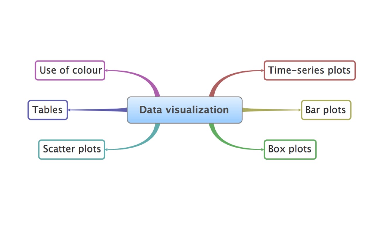

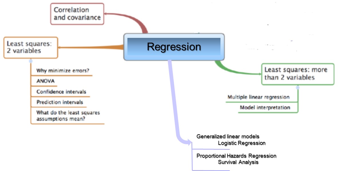


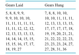
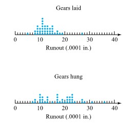

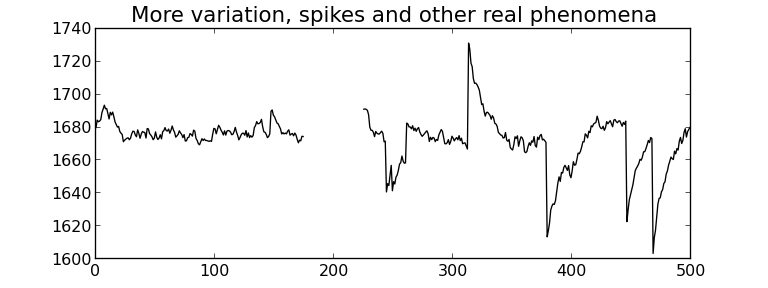
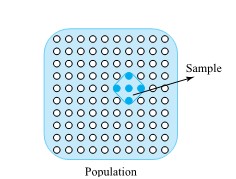
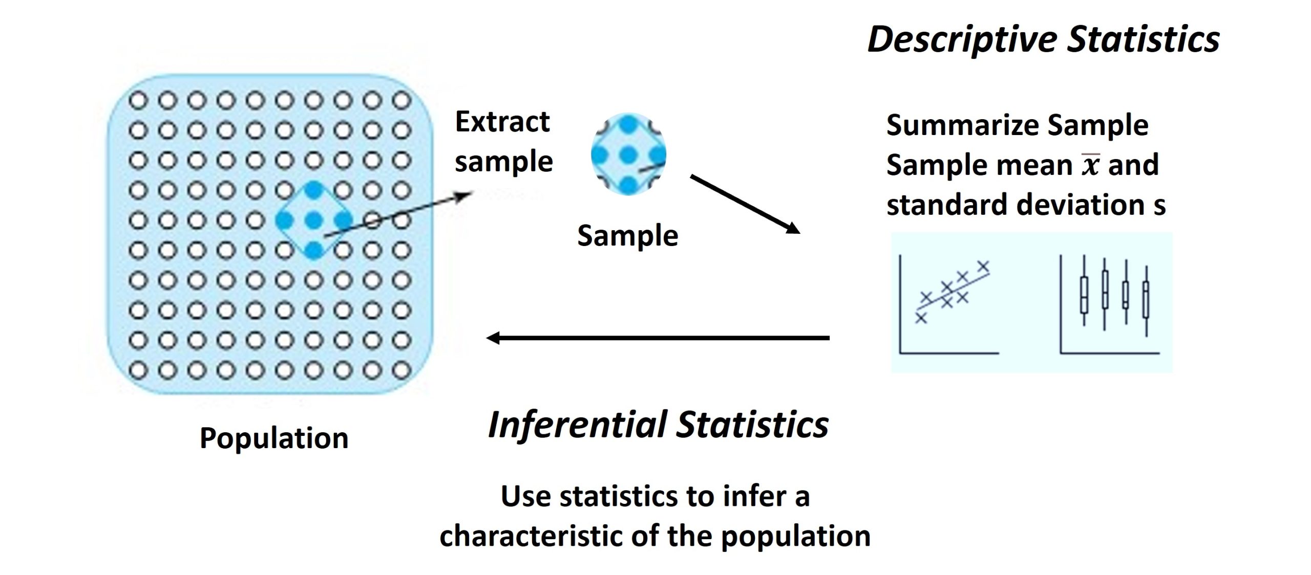

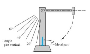
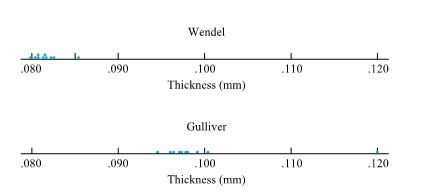
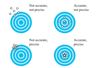
 =
= 
 in free fall an object will have velocity
 =
= 

 of a second. Table 1.1.7.1 gives measurements of such positions. (Dr. Frank Peterson of the ISU Physics and Astronomy Department supplied the tape.) Plotting the bob positions in the table at equally spaced intervals produces the approximately quadratic plot shown in Figure 1.1.7.2. Picking a parabola to fit the plotted points involves identifying an appropriate value for
  /
/ , not far from the commonly quoted value of 9.8
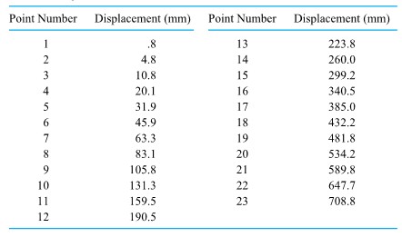
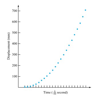

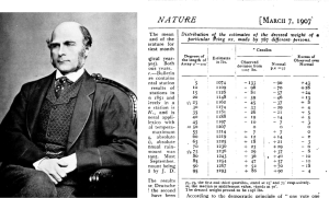

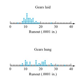
 from the target surface to the back of the bullets) for two bullet types. Figure 2.2.2.2 presents a corresponding pair of dot diagrams.
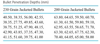
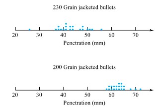

 ” and ”
  ” leaf positions for each possible leading digit, instead of only a single ”
  ” leaf for each leading digit.
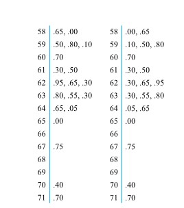

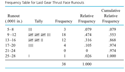
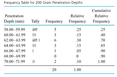
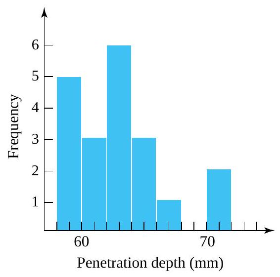

 required for bolts number 3 and 4), respectively, on 34 different components. Figure 2.1.4.1 is a scatterplot of the bivariate data from Table 2.1.4.1. In this figure, where several points must be plotted at a single location, the number of points occupying the location has been plotted instead of a single dot.

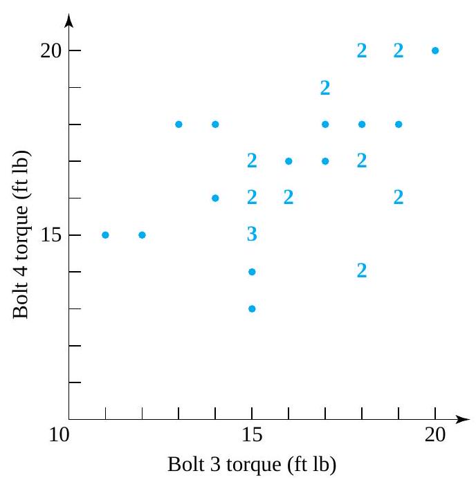
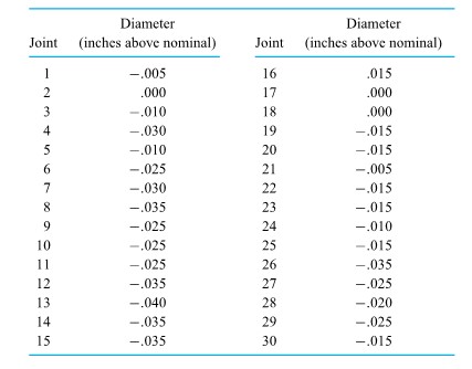

 of those taking the test had worse scores, and roughly
  had better scores. This concept is also useful in the description of engineering data. However, because it is often more convenient to work in terms of fractions between 0 and 1 rather than in percentages between 0 and 100, slightly different terminology will be used here: “Quantiles,” rather than percentiles, will be discussed. After the quantiles of a data set are carefully defined, they are used to create a number of useful tools of descriptive statistics: quantile plots, boxplots,
  plots, and normal plots (a type of theoretical
  between 0 and 1 , the
  of the distribution lies to the right. However, because of the discreteness of finite data sets, it is necessary to state exactly what will be meant by the terminology. Definition 1 gives the precise convention that will be used in this text.
 values that when ordered are
  ,
,
 for a positive integer
  , the
, the =Q\left(\frac{i-.5}{n}\right)=x_{i}")
 quantile.)
 and
and  that is not of the form
  , the
, the ") with corresponding
with corresponding ") will be used to denote the
will be used to denote the  and
and  / n") . To find
. To find  / n") for
for 
") th ordered data point.”
th ordered data point.”
 , one can easily find the
  , and .95 quantiles of the breaking strength distribution, as shown in Table 31.5.2.

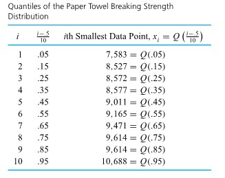
 data points, each one accounts for
  of the data set. Applying convention (1) in Definition 3.1.5.1 to find (for example) the .35 quantile, the smallest 3 data points and half of the fourth smallest are counted as lying to (continued) the left of the desired number, and the largest 6 data points and half of the seventh largest are counted as lying to the right. Thus, the fourth smallest data point must be the .35 quantile, as is shown in Table 2.1.5.2.
 of the way from .45 to .55 , linear interpolation gives:
=(1-.5) Q(.45)+.5 Q(.55)=.5(9,011)+.5(9,165)=9,088 \mathrm{~g}")
 of the way from .85 to .95 , linear interpolation gives:
=(1-.8) Q(.85)+.8 Q(.95)=.2(9,614)+.8(10,688)=10,473.2 \mathrm{~g}")
") is called the median of a distribution.
is called the median of a distribution.") and
and ") are called the first (or lower) quartile and third (or upper) quartile of a distribution, respectively.
are called the first (or lower) quartile and third (or upper) quartile of a distribution, respectively.") previously computed, for the (continued) breaking strength distribution
previously computed, for the (continued) breaking strength distribution=9,088 \mathrm{~g} \\\text { 1st quartile } & =Q(.25)=8,572 \mathrm{~g} \\\text { 3rd quartile } & =Q(.75)=9,614 \mathrm{~g}\end{aligned}")
") and then connecting consecutive plotted points with straight-line segments.
and then connecting consecutive plotted points with straight-line segments.
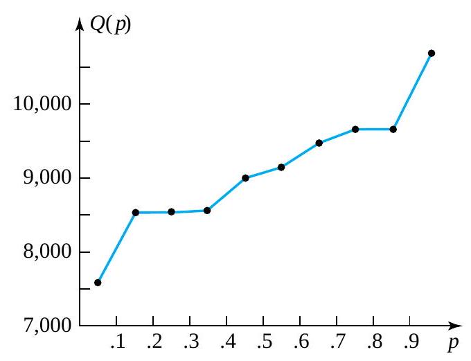
-Q(.25)")
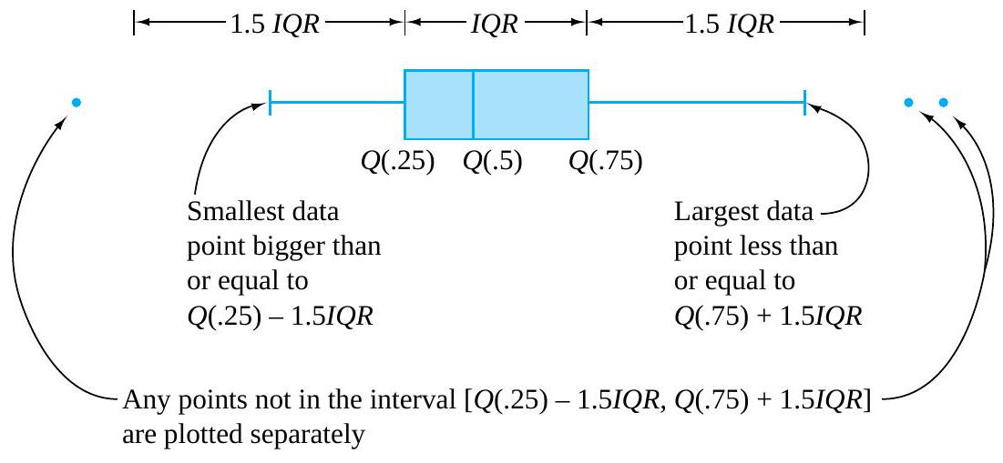
") and the largest data point within 1.5IQR of
and the largest data point within 1.5IQR of ![[Q(.25)-1.5 I Q R, Q(.75)+1.5 I Q R]](https://atu0g9ctah.execute-api.ca-central-1.amazonaws.com/latest/latex?latex=%5BQ%28.25%29-1.5%20I%20Q%20R%2C%20Q%28.75%29%2B1.5%20I%20Q%20R%5D&fg=000000&font=TeX&svg=1 "[Q(.25)-1.5 I Q R, Q(.75)+1.5 I Q R]") . Any that are not then get plotted individually and are thereby identified as outlying or unusual.
. Any that are not then get plotted individually and are thereby identified as outlying or unusual. & =8,572 \mathrm{~g} \\Q(.5) & =9,088 \mathrm{~g} \\Q(.75) & =9,614 \mathrm{~g}\end{aligned}")
-Q(.25)=9,614-8,572=1,042 \mathrm{~g}")

+1.5 I Q R=9,614+1,563=11,177 \mathrm{~g}")
-1.5 I Q R=8,572-1,563=7,009 \mathrm{~g}")
 to
to  , the boxplot is as shown in Figure 2.1.6.2.

 of the distribution. Some elements of distributional shape are indicated by the symmetry (or lack thereof) of the box and of the whiskers. And a gap between the end of a whisker and a separately plotted point serves as a reminder that no data values fall in that interval.
 quantiles for the two distributions of bullet penetration depth introduced in the previous section. For the 230 grain bullet penetration depths, interpolation yields
 & =.5 Q(.225)+.5 Q(.275)=.5(38.75)+.5(39.75)=39.25 \mathrm{~mm} \\Q(.5) & =.5 Q(.475)+.5 Q(.525)=.5(42.55)+.5(42.90)=42.725 \mathrm{~mm} \\Q(.75) & =.5 Q(.725)+.5 Q(.775)=.5(47.90)+.5(48.15)=48.025 \mathrm{~mm}\end{aligned}")
+1.5 I Q R & =61.188 \mathrm{~mm} \\Q(.25)-1.5 I Q R & =26.087 \mathrm{~mm}\end{aligned}")
 & =60.25 \mathrm{~mm} \\Q(.5) & =62.80 \mathrm{~mm} \\Q(.75) & =64.35 \mathrm{~mm} \\Q(.75)+1.5 I Q R & =70.50 \mathrm{~mm} \\Q(.25)-1.5 I Q R & =54.10 \mathrm{~mm}\end{aligned}")
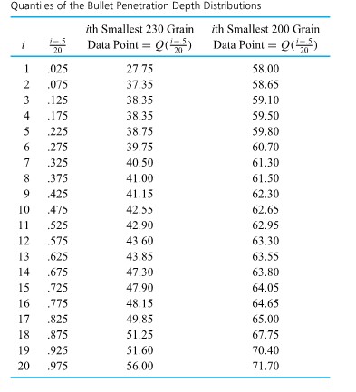

 plot.
plot.
 th smallest value in data set 1
+1")
 and
and  stand for the quantile functions of the two respective data sets, it is clear from display (2.1.7.1) that
=2 Q_{1}(p)+1")
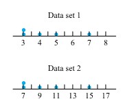

, \quad Q_{2}\left(\frac{i-.5}{5}\right)\right)")
 ) should be exactly linear. Figure 3.16 illustrates this-in fact Figure 3.16 is a
 , Q_{2}(p)\right)") for appropriate values of
for appropriate values of  . When two data sets of unequal sizes are involved, the values of
  and
and  (for the 230 grain data) is out of proportion to the gap between 63.55 and
  (for the 200 grain data). This hints that there was some kind of basic physical difference in the mechanisms that produced the smaller and larger 230 grain penetration depths. Once this kind of indication is discovered, it is a task for ballistics experts or materials people to explain the phenomenon.
") , there is also a drastic difference in the shapes of the extreme lower ends of the two distributions. In order to move that point back on line with the rest of the plotted points, it would need to be moved to the right or down (i.e., increase the smallest 230 grain observation or decrease the smallest 200 grain observation). That is, relative to the 200 grain distribution, the 230 grain distribution is long-tailed to the low side. (Or to put it differently, relative to the 230 grain distribution, the 200 grain distribution is short-tailed to the low side.) Note that the difference in shapes was already evident in the boxplot in Figure previously. Again, it would remain for a specialist to explain this difference in distributional shapes.
, there is also a drastic difference in the shapes of the extreme lower ends of the two distributions. In order to move that point back on line with the rest of the plotted points, it would need to be moved to the right or down (i.e., increase the smallest 230 grain observation or decrease the smallest 200 grain observation). That is, relative to the 200 grain distribution, the 230 grain distribution is long-tailed to the low side. (Or to put it differently, relative to the 230 grain distribution, the 200 grain distribution is short-tailed to the low side.) Note that the difference in shapes was already evident in the boxplot in Figure previously. Again, it would remain for a specialist to explain this difference in distributional shapes.

\right)")
 , locate the entry in the row labelled by the first digit after the decimal place and in the column labelled by the second digit after the decimal place. (For example,
 =-.33") .) A simple numerical approximation to the values given in Table 3.10 adequate for most plotting purposes is
.) A simple numerical approximation to the values given in Table 3.10 adequate for most plotting purposes is
 \approx 4.9\left(p^{.14}-(1-p)^{.14}\right)")
 . A possible frequency table for those 99 data points is given as Table 2.1.7.3. The tally column in Table 2.1.7.3 shows clearly the bell shape.
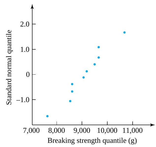
![Q-Q[l/atex] plotting here makes it possible to emphasize the relationship between probability plotting and (empirical) [latex]Q-Q](https://atu0g9ctah.execute-api.ca-central-1.amazonaws.com/latest/latex?latex=Q-Q%5Bl%2Fatex%5D%20plotting%20here%20makes%20it%20possible%20to%20emphasize%20the%20relationship%20between%20probability%20plotting%20and%20%28empirical%29%20%5Blatex%5DQ-Q&fg=000000&font=TeX&svg=1 "Q-Q[l/atex] plotting here makes it possible to emphasize the relationship between probability plotting and (empirical) [latex]Q-Q") plotting.
plotting.

 and/or the value 2 is replaced by
  .
.
 , is
, is
 .
.
=.5(.65)+.5(.92)=.785 \% \text { waste }")
=1.495 \% \text { waste }")
 \\ & =2.228 \% \text { waste }\end{aligned}")
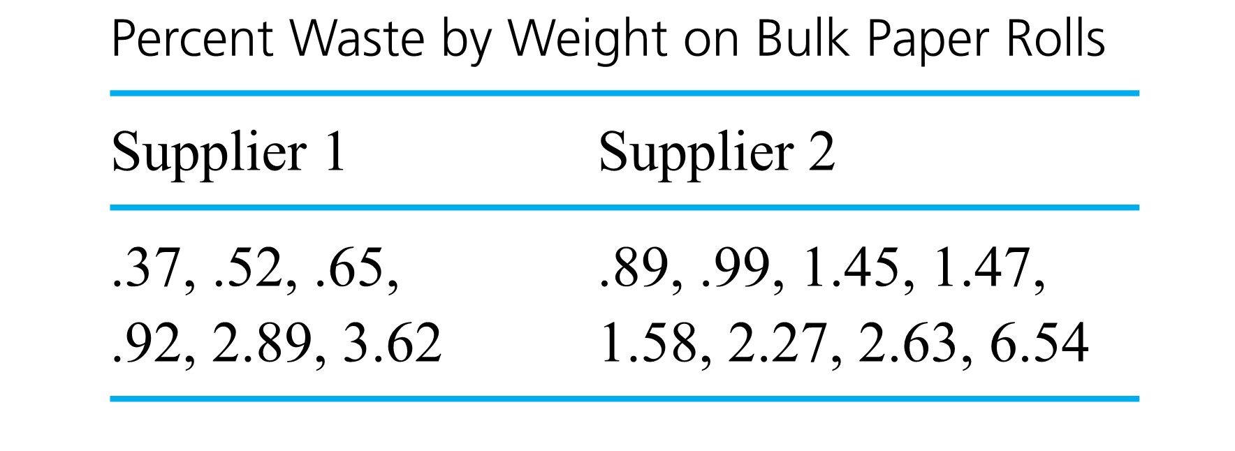

 is
is
=18") .” Since the range depends only on the values of the smallest and largest points in a data set, it is necessarily highly sensitive to extreme (or outlying) values. Because it is easily calculated, it has enjoyed long-standing popularity in industrial settings, particularly as a tool in statistical quality control.
.” Since the range depends only on the values of the smallest and largest points in a data set, it is necessarily highly sensitive to extreme (or outlying) values. Because it is easily calculated, it has enjoyed long-standing popularity in industrial settings, particularly as a tool in statistical quality control.
 is
is^{2}")
 , is the nonnegative square root of the sample variance.
 for
for  is an average squared distance of the data points from the central value
 =.52 \\& Q(.75)=2.89\end{aligned}")


^{2}+(.52-1.495)^{2}+(.65-1.495)^{2}+(.92-1.495)^{2}\right. \\& \left.+(2.89-1.495)^{2}+(3.62-1.495)^{2}\right) \\= & 1.945(\% \text { waste })^{2}\end{aligned}")


^{2}+(.99-2.228)^{2}+(1.45-2.228)^{2}+(1.47-2.228)^{2}\right. \\& \left.+(1.58-2.228)^{2}+(2.27-2.228)^{2}+(2.63-2.228)^{2}+(6.54-2.228)^{2}\right) \\= & 3.383(\% \text { waste })^{2}\end{aligned}")

 and
and ") to stand for the population mean and to write:
to stand for the population mean and to write:

 is used in place of
 ") to stand for the population variance and to define:
to stand for the population variance and to define:
^2")
 is then called the population standard deviation,
  .
.
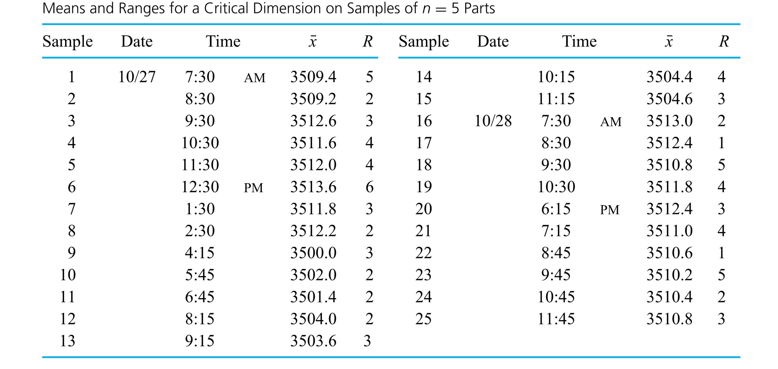
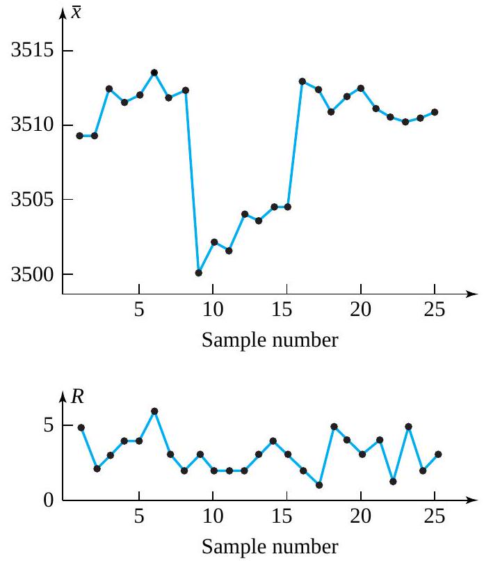
 different
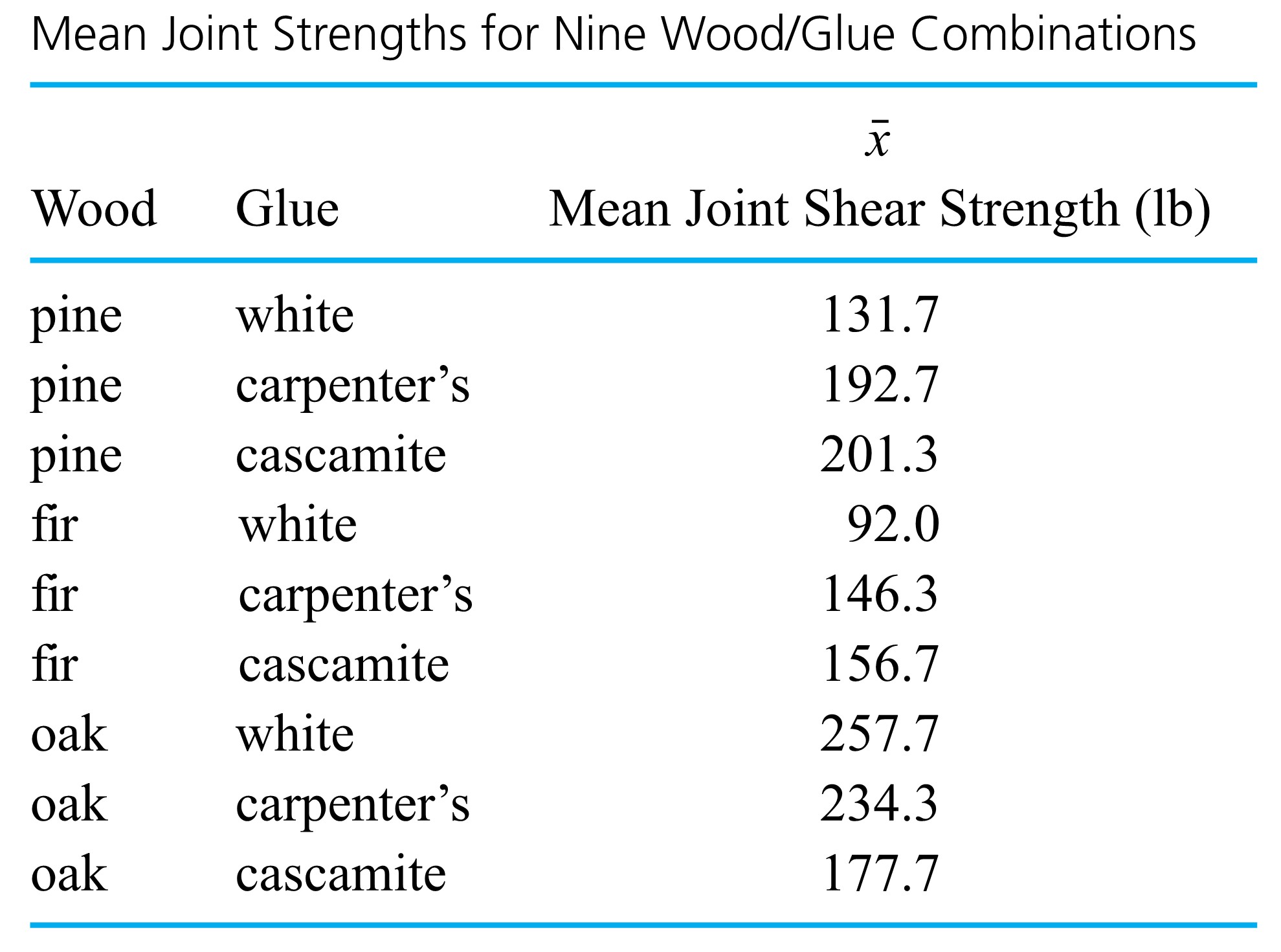
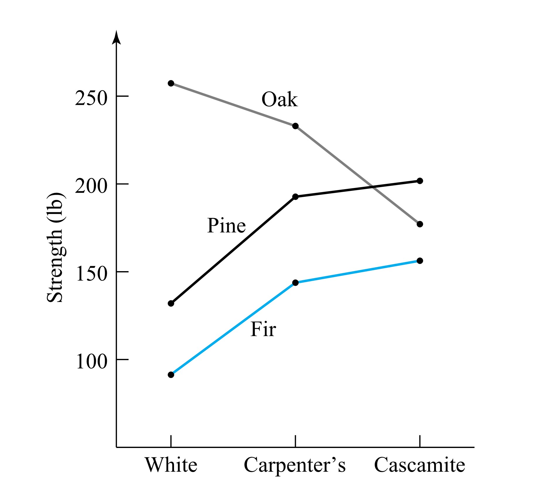
 or
or  that need to be compared. Bar charts and simple bivariate plots can be a great aid in summarizing these results.
![30 \times 100=3,000[latex] connectors were inspected over this period,</div> <div> <div style="text-align: center">[latex]\begin{aligned}& \hat{p}_{\mathrm{A}}=3 / 3000=.0010 \\& \hat{p}_{\mathrm{B}}=0 / 3000=.0000 \\& \hat{p}_{\mathrm{C}}=11 / 3000=.0037 \\& \hat{p}_{\mathrm{D}}=1 / 3000=.0003\end{aligned}](https://atu0g9ctah.execute-api.ca-central-1.amazonaws.com/latest/latex?latex=30%20%5Ctimes%20100%3D3%2C000%5Blatex%5D%20connectors%20were%20inspected%20over%20this%20period%2C%3C%2Fdiv%3E%20%20%3Cdiv%3E%20%20%3Cdiv%20style%3D%22text-align%3A%20center%22%3E%5Blatex%5D%5Cbegin%7Baligned%7D%26%20%5Chat%7Bp%7D_%7B%5Cmathrm%7BA%7D%7D%3D3%20%2F%203000%3D.0010%20%5C%5C%26%20%5Chat%7Bp%7D_%7B%5Cmathrm%7BB%7D%7D%3D0%20%2F%203000%3D.0000%20%5C%5C%26%20%5Chat%7Bp%7D_%7B%5Cmathrm%7BC%7D%7D%3D11%20%2F%203000%3D.0037%20%5C%5C%26%20%5Chat%7Bp%7D_%7B%5Cmathrm%7BD%7D%7D%3D1%20%2F%203000%3D.0003%5Cend%7Baligned%7D&fg=000000&font=TeX&svg=1 "30 \times 100=3,000[latex] connectors were inspected over this period,</div> <div> <div style=\"text-align: center\">[latex]\begin{aligned}& \hat{p}_{\mathrm{A}}=3 / 3000=.0010 \\& \hat{p}_{\mathrm{B}}=0 / 3000=.0000 \\& \hat{p}_{\mathrm{C}}=11 / 3000=.0037 \\& \hat{p}_{\mathrm{D}}=1 / 3000=.0003\end{aligned}")
") , because categories A through E represent a set of nonoverlapping and exhaustive classifications into which an individual connector must fall, so that the
, because categories A through E represent a set of nonoverlapping and exhaustive classifications into which an individual connector must fall, so that the 
 , having moderately serious defects but no serious or very serious defects. This bar chart is a presentation of the behavior of a single categorical variable.
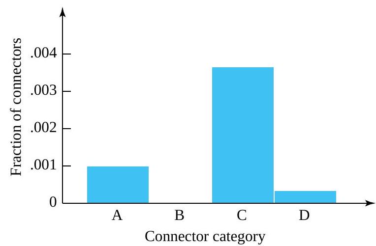

 , so
, so  for the fraction of tools without type 1 leaks. The
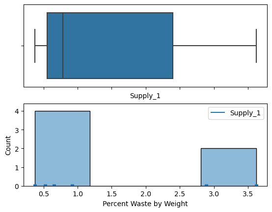

 where H = heads and T = tails are the outcomes. The sample space for flipping two fair coins once is shown: S = {(HH),(HT),(TH),(TT)}. We will also use capital letters to denote an event, like A and B. For example, we can define event A as realizing tails on the first coin and event B= tails on the second coin. This would be shown as
  and
and  . Using diagrams is helpful in representing the operations of multiple events together.
 is in neither
  nor
nor  . The Venn diagram is as follows:
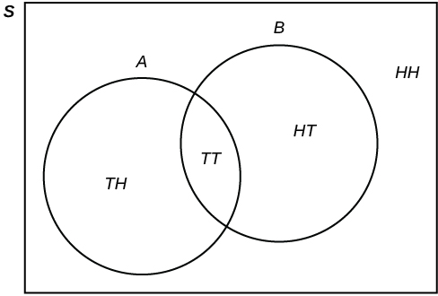
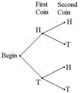
 . The marginal events are those shown on the margins of the table, and are those that occur for a single event with no regard for the other events in the table. For our example, we have marginal event A and the associated joint events,
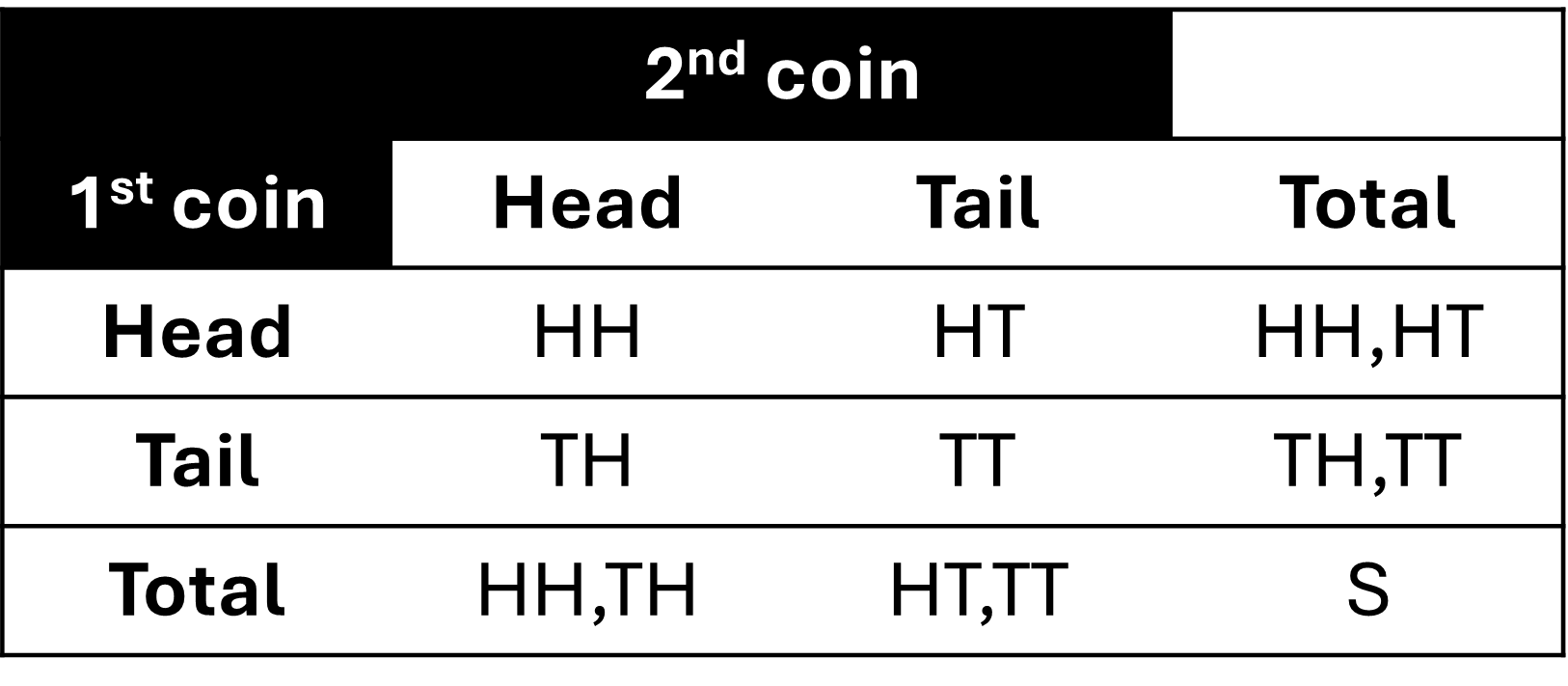
 .
. .
. .
. .
. is the set of outcomes that are in both
  is the set of outcomes that are in either
  . Therefore
  is the set of outcomes that are not in
  , with m being the number of outcomes in the the event A occurs and n being the total number of outcomes of the experiment. A claim of the frequentist approach is that, as the number of trials increases, the change in the relative frequency will diminish. Hence, one can view a probability as the limiting value of the corresponding relative frequencies. You can realize the relative frequency by either running real experiments and finding an empirical or estimated probability or by recognizing the theoretical model for the experiment and adopting a theoretical probability based on events from the sample space.
 = 0.5.
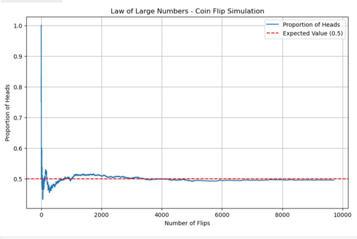
") , is assigned a number between zero and one, inclusive, and describes the proportion of time we expect the event to occur over the long-term. P(A) = 0 means the event A can never happen. P(A) = 1 means the event A always happens. P(A) = 0.5 means the event A is equally likely to occur or not to occur. For example, if you flip one fair coin repeatedly (from 20 to 2,000 to 20,000 times) the relative frequency of heads approaches 0.5 (the probability of heads).
, is assigned a number between zero and one, inclusive, and describes the proportion of time we expect the event to occur over the long-term. P(A) = 0 means the event A can never happen. P(A) = 1 means the event A always happens. P(A) = 0.5 means the event A is equally likely to occur or not to occur. For example, if you flip one fair coin repeatedly (from 20 to 2,000 to 20,000 times) the relative frequency of heads approaches 0.5 (the probability of heads). is 1 and the probability of the empty set is 0. This is: P(S) = 1 and P(∅) = 0.
 = \sum_{n= 1}^\infty P(A_n)")
 = \frac{P(A \cap B)}{P(B)}")
") as “the probability of A given B”.
as “the probability of A given B”. = P(A)P(B)") .
. = P(A)") .
. = P(B)") .
. are mutually independent if for any sub-collection
  there is:
 = P(A_{i_1}) \cdot P(A_{i_2}) \cdot \ldots \cdot P(A_{i_k})")
 cards. It consists of four suits. The suits are clubs, diamonds, hearts and spades. There are
  cards in each suit consisting of
  ,
,  (jack),
  (queen),
  (king) of that suit.
 cards remaining in the deck. It is the three of diamonds. You put this card aside and pick the third card from the remaining
  cards in the deck. The third card is the

![{\displaystyle [0,1]\subseteq \mathbb {R} }](https://atu0g9ctah.execute-api.ca-central-1.amazonaws.com/latest/latex?latex=%7B%5Cdisplaystyle%20%5B0%2C1%5D%5Csubseteq%20%5Cmathbb%20%7BR%7D%20%7D&fg=000000&font=TeX&svg=1 "{\displaystyle [0,1]\subseteq \mathbb {R} }") , which provides the probability measure on the set of all possible values of the random variable. Random variables are shown as Roman capital letters, often towards the end of the alphabet, such as
, which provides the probability measure on the set of all possible values of the random variable. Random variables are shown as Roman capital letters, often towards the end of the alphabet, such as  .
. to a measurable space of
  , where 1 is correspondent to H and -1 is correspondent to T, utilizing a random variable of
  =
=  = +1, written as
 ") .
.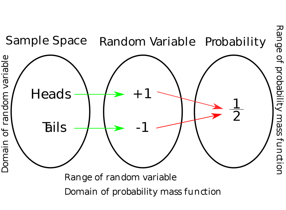
") for an event.
for an event.") .
.![{\displaystyle F\colon \mathbb {R} \rightarrow [0,1]}](https://atu0g9ctah.execute-api.ca-central-1.amazonaws.com/latest/latex?latex=%7B%5Cdisplaystyle%20F%5Ccolon%20%5Cmathbb%20%7BR%7D%20%5Crightarrow%20%5B0%2C1%5D%7D&fg=000000&font=TeX&svg=1 "{\displaystyle F\colon \mathbb {R} \rightarrow [0,1]}") , where
, where =0}") and
and =1}") . Every function with these four properties is a CDF: for every such function, a random variable can be defined such that the function is the cumulative distribution function of that random variable.
. Every function with these four properties is a CDF: for every such function, a random variable can be defined such that the function is the cumulative distribution function of that random variable.![F(x)=P[X \leq x]](https://atu0g9ctah.execute-api.ca-central-1.amazonaws.com/latest/latex?latex=F%28x%29%3DP%5BX%20%5Cleq%20x%5D&fg=000000&font=TeX&svg=1 "F(x)=P[X \leq x]")
 ,
, ,…, is a non-negative function f (x ), with f (
 ) giving the probability that X takes the value
 = the next measured torque for bolt 3 (recorded to the nearest integer), and we will treat Z as a discrete random variable. Now we want to give a plausible probility function for it. The relative frequencies for the bolt 3 torque measurements recorded introduce the relative frequency distribution:
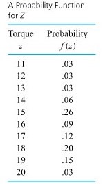
 = the torque value selected.
= \begin{cases}.1 & \text { for } w=0,1,2, \ldots, 9 \\ 0 & \text { otherwise }\end{cases}")
![F(16.3)=P[Z \leq 16.3]=P[Z \leq 16]=F(16)=.50](https://atu0g9ctah.execute-api.ca-central-1.amazonaws.com/latest/latex?latex=F%2816.3%29%3DP%5BZ%20%5Cleq%2016.3%5D%3DP%5BZ%20%5Cleq%2016%5D%3DF%2816%29%3D.50&fg=000000&font=TeX&svg=1 "F(16.3)=P[Z \leq 16.3]=P[Z \leq 16]=F(16)=.50")
![F(32)=P[Z \leq 32]=1.00](https://atu0g9ctah.execute-api.ca-central-1.amazonaws.com/latest/latex?latex=F%2832%29%3DP%5BZ%20%5Cleq%2032%5D%3D1.00&fg=000000&font=TeX&svg=1 "F(32)=P[Z \leq 32]=1.00")
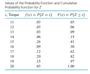

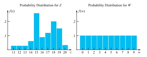
")
")
^2 f(x) \quad\left(=\sum x^2 f(x)-(E X)^2\right)")
 . Often the notation
  is used in place of Var X, and
  = 2.15 ft lb
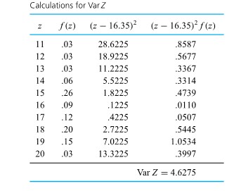
") .
.
-(E W)^2=28.5-(4.5)^2=8.25")


![X[latex] has the <strong>binomial (n, p) distribution</strong>.</div> <div> <div> <div class="textbox"> <strong>DEFINITION 3.2.5.1. Binomial Definition</strong> The binomial [latex](n, p)](https://atu0g9ctah.execute-api.ca-central-1.amazonaws.com/latest/latex?latex=X%5Blatex%5D%20has%20the%20%3Cstrong%3Ebinomial%20%28n%2C%20p%29%20distribution%3C%2Fstrong%3E.%3C%2Fdiv%3E%20%20%3Cdiv%3E%20%20%3Cdiv%3E%20%20%3Cdiv%20class%3D%22textbox%22%3E%20%20%20%20%3Cstrong%3EDEFINITION%203.2.5.1.%20Binomial%20Definition%3C%2Fstrong%3E%20%20%20%20The%20binomial%20%5Blatex%5D%28n%2C%20p%29&fg=000000&font=TeX&svg=1 "X[latex] has the <strong>binomial (n, p) distribution</strong>.</div> <div> <div> <div class=\"textbox\"> <strong>DEFINITION 3.2.5.1. Binomial Definition</strong> The binomial [latex](n, p)") distribution is a discrete probability distribution with probability function
distribution is a discrete probability distribution with probability function
= \begin{cases}\frac{n !}{x !(n-x) !} p^{x}(1-p)^{n-x} & \text { for } x=0,1, \ldots, n \\ 0 & \text { otherwise }\end{cases}")
 .
.
") for each trial producing a no go/failure outcome. And the
for each trial producing a no go/failure outcome. And the  !") term is a count of the number of patterns in which it would be possible to see
term is a count of the number of patterns in which it would be possible to see  nomial distribution derives from the fact that the values
 , f(1), f(2), \ldots, f(n)") are the terms in the expansion of
are the terms in the expansion of
)^{n}")
 , the resulting histogram is right-skewed. For
  , the resulting histogram is left-skewed. The skewness increases as
 is indeed a sensible figure for the chance that a given shaft will be reworkable. Suppose further that
![\begin{aligned}P[\text { at least two reworkable shafts] } & =P[U \geq 2] \\& =f(2)+f(3)+\cdots+f(10) \\& =1-(f(0)+f(1)) \\& =1-\left(\frac{10 !}{0 ! 10 !}(.2)^{0}(.8)^{10}+\frac{10 !}{1 ! 9 !}(.2)^{1}(.8)^{9}\right) \\&=.62\end{aligned}](https://atu0g9ctah.execute-api.ca-central-1.amazonaws.com/latest/latex?latex=%5Cbegin%7Baligned%7DP%5B%5Ctext%20%7B%20at%20least%20two%20reworkable%20shafts%5D%20%7D%20%26%20%3DP%5BU%20%5Cgeq%202%5D%20%5C%5C%26%20%3Df%282%29%2Bf%283%29%2B%5Ccdots%2Bf%2810%29%20%5C%5C%26%20%3D1-%28f%280%29%2Bf%281%29%29%20%5C%5C%26%20%3D1-%5Cleft%28%5Cfrac%7B10%20%21%7D%7B0%20%21%2010%20%21%7D%28.2%29%5E%7B0%7D%28.8%29%5E%7B10%7D%2B%5Cfrac%7B10%20%21%7D%7B1%20%21%209%20%21%7D%28.2%29%5E%7B1%7D%28.8%29%5E%7B9%7D%5Cright%29%20%5C%5C%26%3D.62%5Cend%7Baligned%7D&fg=000000&font=TeX&svg=1 "\begin{aligned}P[\text { at least two reworkable shafts] } & =P[U \geq 2] \\& =f(2)+f(3)+\cdots+f(10) \\& =1-(f(0)+f(1)) \\& =1-\left(\frac{10 !}{0 ! 10 !}(.2)^{0}(.8)^{10}+\frac{10 !}{1 ! 9 !}(.2)^{1}(.8)^{9}\right) \\&=.62\end{aligned}")
") 's have to sum up to 1 , is a common and useful one.)
's have to sum up to 1 , is a common and useful one.)
 , and the . 62 figure largely irrelevant. (The independence-of-trials assumption would be inappropriate in this situation.)

") .
.
 from it.

 is obtained as follows. Possible values for
 ![\begin{aligned}f(0)= & P[V=0] \\= & P[\text { first pellet selected is nonconforming and } \\& \text { subsequently the second pellet is also nonconforming }] \\f(2)= & P[V=2] \\= & P[\text { first pellet selected is conforming and } \\& \text { subsequently the second pellet selected is conforming }] \\f(1)= & 1-(f(0)+f(2))\end{aligned}](https://atu0g9ctah.execute-api.ca-central-1.amazonaws.com/latest/latex?latex=%5Cbegin%7Baligned%7Df%280%29%3D%20%26%20P%5BV%3D0%5D%20%5C%5C%3D%20%26%20P%5B%5Ctext%20%7B%20first%20pellet%20selected%20is%20nonconforming%20and%20%7D%20%5C%5C%26%20%5Ctext%20%7B%20subsequently%20the%20second%20pellet%20is%20also%20nonconforming%20%7D%5D%20%5C%5Cf%282%29%3D%20%26%20P%5BV%3D2%5D%20%5C%5C%3D%20%26%20P%5B%5Ctext%20%7B%20first%20pellet%20selected%20is%20conforming%20and%20%7D%20%5C%5C%26%20%5Ctext%20%7B%20subsequently%20the%20second%20pellet%20selected%20is%20conforming%20%7D%5D%20%5C%5Cf%281%29%3D%20%26%201-%28f%280%29%2Bf%282%29%29%5Cend%7Baligned%7D&fg=000000&font=TeX&svg=1 "\begin{aligned}f(0)= & P[V=0] \\= & P[\text { first pellet selected is nonconforming and } \\& \text { subsequently the second pellet is also nonconforming }] \\f(2)= & P[V=2] \\= & P[\text { first pellet selected is conforming and } \\& \text { subsequently the second pellet selected is conforming }] \\f(1)= & 1-(f(0)+f(2))\end{aligned}")
") is
is
=\frac{34}{100} \cdot \frac{33}{99}=.1133")
=\frac{66}{100} \cdot \frac{65}{99}=.4333")
=1-(.1133+.4333)=1-.5467=.4533")
 to
to  . Nevertheless, for most practical purposes,
  . To see this, note that
^{2}(.66)^{0}=.1156 \approx f(0) \\& \frac{2 !}{1 ! 1 !}(.34)^{1}(.66)^{1}=.4488 \approx f(1) \\& \frac{2 !}{2 ! 0 !}(.34)^{0}(.66)^{2}=.4356 \approx f(2)\end{aligned}")
 is not too extreme, and a binomial distribution is a decent description of a variable arising from simple random sampling.
 !} p^{x}(1-p)^{n-x}=n p")
^{2} \frac{n !}{x !(n-x) !} p^{x}(1-p)^{n-x}=n p(1-p)")
(.2)=2 \text { shafts } \\\sqrt{\operatorname{Var} U} & =\sqrt{10(.2)(.8)}=1.26 \text { shafts }\end{aligned}")
") distribution
distribution= \begin{cases}\frac{e^{-\lambda} \lambda^{x}}{x !} & \text { for } x=0,1,2, \ldots \\ 0 & \text { otherwise }\end{cases}")
 .
.
 . One is then led to the binomial
  ) distribution. In fact, for large
 ") probability function approximates the one specified in equation (5.10). So one might think of the Poisson distribution for counts as arising through a mechanism that would present many tiny similar opportunities for independent occurrence or non-occurrence throughout an interval of time or space.
probability function approximates the one specified in equation (5.10). So one might think of the Poisson distribution for counts as arising through a mechanism that would present many tiny similar opportunities for independent occurrence or non-occurrence throughout an interval of time or space.

 , whose probability histograms peak near their respective
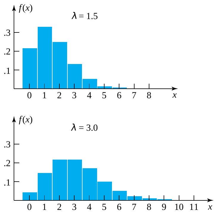

^{2} \frac{e^{-\lambda} \lambda^{x}}{x !}=\lambda")
 -Particles
 .
.

= \begin{cases}\frac{e^{-3.87}(3.87)^{s}}{s !} & \text { for } s=0,1,2, \ldots \\ 0 & \text { otherwise }\end{cases}")
 [at least 4 particles are recorded]
![=P[S \geq 4]](https://atu0g9ctah.execute-api.ca-central-1.amazonaws.com/latest/latex?latex=%3DP%5BS%20%5Cgeq%204%5D&fg=000000&font=TeX&svg=1 "=P[S \geq 4]")
+f(5)+f(6)+\cdots")
+f(1)+f(2)+f(3))")
^{0}}{0 !}+\frac{e^{-3.87}(3.87)^{1}}{1 !}+\frac{e^{-3.87}(3.87)^{2}}{2 !}+\frac{e^{-3.87}(3.87)^{3}}{3 !}\right)")


 , the reasonable choice of
 =12.5 \text { students }")

![\begin{aligned}P[10 \leq M \leq 15]= & f(10)+f(11)+f(12)+f(13)+f(14)+f(15) \\= & \frac{e^{-12.5}(12.5)^{10}}{10 !}+\frac{e^{-12.5}(12.5)^{11}}{11 !}+\frac{e^{-12.5}(12.5)^{12}}{12 !} \\& +\frac{e^{-12.5}(12.5)^{13}}{13 !}+\frac{e^{-12.5}(12.5)^{14}}{14 !}+\frac{e^{-12.5}(12.5)^{15}}{15 !} \\= & .60\end{aligned}](https://atu0g9ctah.execute-api.ca-central-1.amazonaws.com/latest/latex?latex=%5Cbegin%7Baligned%7DP%5B10%20%5Cleq%20M%20%5Cleq%2015%5D%3D%20%26%20f%2810%29%2Bf%2811%29%2Bf%2812%29%2Bf%2813%29%2Bf%2814%29%2Bf%2815%29%20%5C%5C%3D%20%26%20%5Cfrac%7Be%5E%7B-12.5%7D%2812.5%29%5E%7B10%7D%7D%7B10%20%21%7D%2B%5Cfrac%7Be%5E%7B-12.5%7D%2812.5%29%5E%7B11%7D%7D%7B11%20%21%7D%2B%5Cfrac%7Be%5E%7B-12.5%7D%2812.5%29%5E%7B12%7D%7D%7B12%20%21%7D%20%5C%5C%26%20%2B%5Cfrac%7Be%5E%7B-12.5%7D%2812.5%29%5E%7B13%7D%7D%7B13%20%21%7D%2B%5Cfrac%7Be%5E%7B-12.5%7D%2812.5%29%5E%7B14%7D%7D%7B14%20%21%7D%2B%5Cfrac%7Be%5E%7B-12.5%7D%2812.5%29%5E%7B15%7D%7D%7B15%20%21%7D%20%5C%5C%3D%20%26%20.60%5Cend%7Baligned%7D&fg=000000&font=TeX&svg=1 "\begin{aligned}P[10 \leq M \leq 15]= & f(10)+f(11)+f(12)+f(13)+f(14)+f(15) \\= & \frac{e^{-12.5}(12.5)^{10}}{10 !}+\frac{e^{-12.5}(12.5)^{11}}{11 !}+\frac{e^{-12.5}(12.5)^{12}}{12 !} \\& +\frac{e^{-12.5}(12.5)^{13}}{13 !}+\frac{e^{-12.5}(12.5)^{14}}{14 !}+\frac{e^{-12.5}(12.5)^{15}}{15 !} \\= & .60\end{aligned}")

 dx") = 1
= 1 dx")
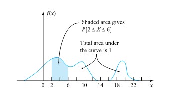
") to represent the curve.
to represent the curve.  f (x ) dx values as dx gets small. (In mechanics,
  X
X f(t) dt
 F(x) = f(x)
 and
and  . P(c<x<d) is the area under the curve, above the x-axis, to the right of
 =0") . The probability that
. The probability that  and
and  ). Since the probability is equal to the area, the probability is also zero.
") because probability is equal to area.
because probability is equal to area. d x") .
.^2 f(x) d x \quad\left(=\int_{-\infty}^{\infty} x^2 f(x) d x-(E X)^2\right)")
 is used in place of Var X ,and σ is used in place of
 =\frac{1}{\sqrt{2 \pi \sigma^2}} e^{-(x-\mu)^2 / 2 \sigma^2}")
^2 / 2 \sigma^2} d x=\mu")
^2 \frac{1}{\sqrt{2 \pi \sigma^2}} e^{-(x-\mu)^2 / 2 \sigma^2} d x=\sigma^2")
 (remember that the standard deviation =
  = σ). Figure 4.1.3.1 shows the notation for the standard normal distribution, and that the distribution shape depends on these parameters. Since the area under the curve must equal one, a change in the standard deviation, σ, causes a change in the shape of the curve; the curve becomes fatter or skinnier depending on σ. A change in μ causes the graph to shift to the left or right. This means there are an infinite number of normal probability distributions.

![P[a \leq X \leq b]=\int_a^b \frac{1}{\sqrt{2 \pi \sigma^2}} e^{-(x-\mu)^2 / 2 \sigma^2} d x=\int_{(a-\mu) / \sigma}^{(b-\mu) / \sigma} \frac{1}{\sqrt{2 \pi}} e^{-z^2 / 2} d z](https://atu0g9ctah.execute-api.ca-central-1.amazonaws.com/latest/latex?latex=P%5Ba%20%5Cleq%20X%20%5Cleq%20b%5D%3D%5Cint_a%5Eb%20%5Cfrac%7B1%7D%7B%5Csqrt%7B2%20%5Cpi%20%5Csigma%5E2%7D%7D%20e%5E%7B-%28x-%5Cmu%29%5E2%20%2F%202%20%5Csigma%5E2%7D%20d%20x%3D%5Cint_%7B%28a-%5Cmu%29%20%2F%20%5Csigma%7D%5E%7B%28b-%5Cmu%29%20%2F%20%5Csigma%7D%20%5Cfrac%7B1%7D%7B%5Csqrt%7B2%20%5Cpi%7D%7D%20e%5E%7B-z%5E2%20%2F%202%7D%20d%20z&fg=000000&font=TeX&svg=1 "P[a \leq X \leq b]=\int_a^b \frac{1}{\sqrt{2 \pi \sigma^2}} e^{-(x-\mu)^2 / 2 \sigma^2} d x=\int_{(a-\mu) / \sigma}^{(b-\mu) / \sigma} \frac{1}{\sqrt{2 \pi}} e^{-z^2 / 2} d z")

 / \sigma}^{(b-\mu) / \sigma} \frac{1}{\sqrt{2 \pi}} e^{-z^2 / 2} d z")
") and a value x associated with X , one converts to units of standard deviations above the mean via:
and a value x associated with X , one converts to units of standard deviations above the mean via: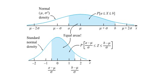
=F(z)=\int_{-\infty}^z \frac{1}{\sqrt{2 \pi}} e^{-t^2 / 2} d t")
") is used to stand for the standard normal cumulative probability function, instead of the more generic F.
is used to stand for the standard normal cumulative probability function, instead of the more generic F.") , the standard normal quantile function,
, the standard normal quantile function,\right) & =p \\ Q_z(\Phi(z)) & =z \end{array}\right\}")
 is not just a standard normal phenomenon but is true in general
=0.96")
-\Phi(0.57)")
 = .025 in the right tail of the standard normal
=.975") = .975. Locating .975 in the table body, one sees that z = 1.96.
= .975. Locating .975 in the table body, one sees that z = 1.96.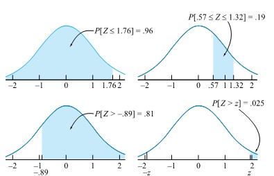

=.08")
 = 134.0 and w
 = 136.0 are converted to z-values (or units of standard deviations above the mean) as

-\Phi(-2.00)=.2266-.0228=.20")

=-2.33")


") , giving the probability that (simultaneously)
, giving the probability that (simultaneously)  . That is,
![f(x, y)=P[X=x \text { and } Y=y]](https://atu0g9ctah.execute-api.ca-central-1.amazonaws.com/latest/latex?latex=f%28x%2C%20y%29%3DP%5BX%3Dx%20%5Ctext%20%7B%20and%20%7D%20Y%3Dy%5D&fg=000000&font=TeX&svg=1 "f(x, y)=P[X=x \text { and } Y=y]")
 the next torque recorded for bolt 3
 the next torque recorded for bolt 4
 and
and ![Y=18]](https://atu0g9ctah.execute-api.ca-central-1.amazonaws.com/latest/latex?latex=Y%3D18%5D&fg=000000&font=TeX&svg=1 "Y=18]") might be
might be  , the relative frequency of this pair in the data set. Similarly, the assignments
![\begin{aligned}& P[X=18 \text { and } Y=17]=\frac{2}{34} \\& P[X=14 \text { and } Y=9]=0\end{aligned}](https://atu0g9ctah.execute-api.ca-central-1.amazonaws.com/latest/latex?latex=%5Cbegin%7Baligned%7D%26%20P%5BX%3D18%20%5Ctext%20%7B%20and%20%7D%20Y%3D17%5D%3D%5Cfrac%7B2%7D%7B34%7D%20%5C%5C%26%20P%5BX%3D14%20%5Ctext%20%7B%20and%20%7D%20Y%3D9%5D%3D0%5Cend%7Baligned%7D&fg=000000&font=TeX&svg=1 "\begin{aligned}& P[X=18 \text { and } Y=17]=\frac{2}{34} \\& P[X=14 \text { and } Y=9]=0\end{aligned}")

![[0,1]](https://atu0g9ctah.execute-api.ca-central-1.amazonaws.com/latest/latex?latex=%5B0%2C1%5D&fg=000000&font=TeX&svg=1 "[0,1]") and that they total to 1 . By summing up just some of the
and that they total to 1 . By summing up just some of the ![\begin{aligned}& P[X\geq Y], \\& P[|X-Y|\leq 1], \\& \text { and } P[X=17]\end{aligned}](https://atu0g9ctah.execute-api.ca-central-1.amazonaws.com/latest/latex?latex=%5Cbegin%7Baligned%7D%26%20P%5BX%5Cgeq%20Y%5D%2C%20%5C%5C%26%20P%5B%7CX-Y%7C%5Cleq%201%5D%2C%20%5C%5C%26%20%5Ctext%20%7B%20and%20%7D%20P%5BX%3D17%5D%5Cend%7Baligned%7D&fg=000000&font=TeX&svg=1 "\begin{aligned}& P[X\geq Y], \\& P[|X-Y|\leq 1], \\& \text { and } P[X=17]\end{aligned}")
![P[X \geq Y]](https://atu0g9ctah.execute-api.ca-central-1.amazonaws.com/latest/latex?latex=P%5BX%20%5Cgeq%20Y%5D&fg=000000&font=TeX&svg=1 "P[X \geq Y]") , the probability that the measured bolt 3 torque is at least as big as the measured bolt 4 torque. Figure 4.2.1.1 indicates with asterisks which possible combinations of
, the probability that the measured bolt 3 torque is at least as big as the measured bolt 4 torque. Figure 4.2.1.1 indicates with asterisks which possible combinations of ![\begin{aligned}P[X \geq Y]= & f(15,13)+f(15,14)+f(15,15)+f(16,16) \\& +f(17,17)+f(18,14)+f(18,17)+f(18,18) \\& +f(19,16)+f(19,18)+f(20,20) \\= & \frac{1}{34}+\frac{1}{34}+\frac{3}{34}+\frac{2}{34}+\cdots+\frac{1}{34}=\frac{17}{34}\end{aligned}](https://atu0g9ctah.execute-api.ca-central-1.amazonaws.com/latest/latex?latex=%5Cbegin%7Baligned%7DP%5BX%20%5Cgeq%20Y%5D%3D%20%26%20f%2815%2C13%29%2Bf%2815%2C14%29%2Bf%2815%2C15%29%2Bf%2816%2C16%29%20%5C%5C%26%20%2Bf%2817%2C17%29%2Bf%2818%2C14%29%2Bf%2818%2C17%29%2Bf%2818%2C18%29%20%5C%5C%26%20%2Bf%2819%2C16%29%2Bf%2819%2C18%29%2Bf%2820%2C20%29%20%5C%5C%3D%20%26%20%5Cfrac%7B1%7D%7B34%7D%2B%5Cfrac%7B1%7D%7B34%7D%2B%5Cfrac%7B3%7D%7B34%7D%2B%5Cfrac%7B2%7D%7B34%7D%2B%5Ccdots%2B%5Cfrac%7B1%7D%7B34%7D%3D%5Cfrac%7B17%7D%7B34%7D%5Cend%7Baligned%7D&fg=000000&font=TeX&svg=1 "\begin{aligned}P[X \geq Y]= & f(15,13)+f(15,14)+f(15,15)+f(16,16) \\& +f(17,17)+f(18,14)+f(18,17)+f(18,18) \\& +f(19,16)+f(19,18)+f(20,20) \\= & \frac{1}{34}+\frac{1}{34}+\frac{3}{34}+\frac{2}{34}+\cdots+\frac{1}{34}=\frac{17}{34}\end{aligned}")
![P[|X-Y| \leq 1]](https://atu0g9ctah.execute-api.ca-central-1.amazonaws.com/latest/latex?latex=P%5B%7CX-Y%7C%20%5Cleq%201%5D&fg=000000&font=TeX&svg=1 "P[|X-Y| \leq 1]") -the probability that the bolt 3 and 4 torques are within
-the probability that the bolt 3 and 4 torques are within  of each other. Figure 4.2.1.2 shows combinations of
 ![\begin{aligned}P[|X-Y| \leq 1]= & f(15,14)+f(15,15)+f(15,16)+f(16,16) \\& +f(16,17)+f(17,17)+f(17,18)+f(18,17) \\& +f(18,18)+f(19,18)+f(19,20)+f(20,20)=\frac{18}{34}\end{aligned}](https://atu0g9ctah.execute-api.ca-central-1.amazonaws.com/latest/latex?latex=%5Cbegin%7Baligned%7DP%5B%7CX-Y%7C%20%5Cleq%201%5D%3D%20%26%20f%2815%2C14%29%2Bf%2815%2C15%29%2Bf%2815%2C16%29%2Bf%2816%2C16%29%20%5C%5C%26%20%2Bf%2816%2C17%29%2Bf%2817%2C17%29%2Bf%2817%2C18%29%2Bf%2818%2C17%29%20%5C%5C%26%20%2Bf%2818%2C18%29%2Bf%2819%2C18%29%2Bf%2819%2C20%29%2Bf%2820%2C20%29%3D%5Cfrac%7B18%7D%7B34%7D%5Cend%7Baligned%7D&fg=000000&font=TeX&svg=1 "\begin{aligned}P[|X-Y| \leq 1]= & f(15,14)+f(15,15)+f(15,16)+f(16,16) \\& +f(16,17)+f(17,17)+f(17,18)+f(18,17) \\& +f(18,18)+f(19,18)+f(19,20)+f(20,20)=\frac{18}{34}\end{aligned}")
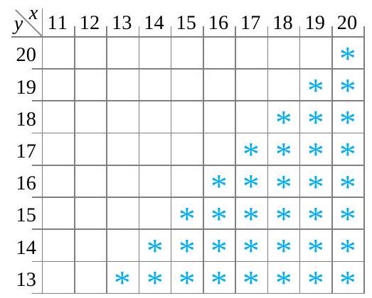

![P[X=17]](https://atu0g9ctah.execute-api.ca-central-1.amazonaws.com/latest/latex?latex=P%5BX%3D17%5D&fg=000000&font=TeX&svg=1 "P[X=17]") , the probability that the measured bolt 3 torque is
, the probability that the measured bolt 3 torque is  , is obtained by adding down the
  column in Table 4.2.1.1. That is,
![\begin{aligned} P[X=17] & =f(17,17)+f(17,18)+f(17,19) \\ & =\frac{1}{34}+\frac{1}{34}+\frac{2}{34} \\ & =\frac{4}{34} \end{aligned}](https://atu0g9ctah.execute-api.ca-central-1.amazonaws.com/latest/latex?latex=%5Cbegin%7Baligned%7D%20P%5BX%3D17%5D%20%26%20%3Df%2817%2C17%29%2Bf%2817%2C18%29%2Bf%2817%2C19%29%20%5C%5C%20%26%20%3D%5Cfrac%7B1%7D%7B34%7D%2B%5Cfrac%7B1%7D%7B34%7D%2B%5Cfrac%7B2%7D%7B34%7D%20%5C%5C%20%26%20%3D%5Cfrac%7B4%7D%7B34%7D%20%5Cend%7Baligned%7D&fg=000000&font=TeX&svg=1 "\begin{aligned} P[X=17] & =f(17,17)+f(17,18)+f(17,19) \\ & =\frac{1}{34}+\frac{1}{34}+\frac{2}{34} \\ & =\frac{4}{34} \end{aligned}")
") . And one can add across rows in the same table to get values for the probability function of
. And one can add across rows in the same table to get values for the probability function of ") . One can then write these sums in the margins of the two-way table. So it should not be surprising that probability distributions for individual random variables obtained from their joint distribution are called marginal distributions. A formal statement of this terminology in the case of two discrete variables is next.
. One can then write these sums in the margins of the two-way table. So it should not be surprising that probability distributions for individual random variables obtained from their joint distribution are called marginal distributions. A formal statement of this terminology in the case of two discrete variables is next.
=\sum_{y} f(x, y)")
=\sum_{x} f(x, y)")
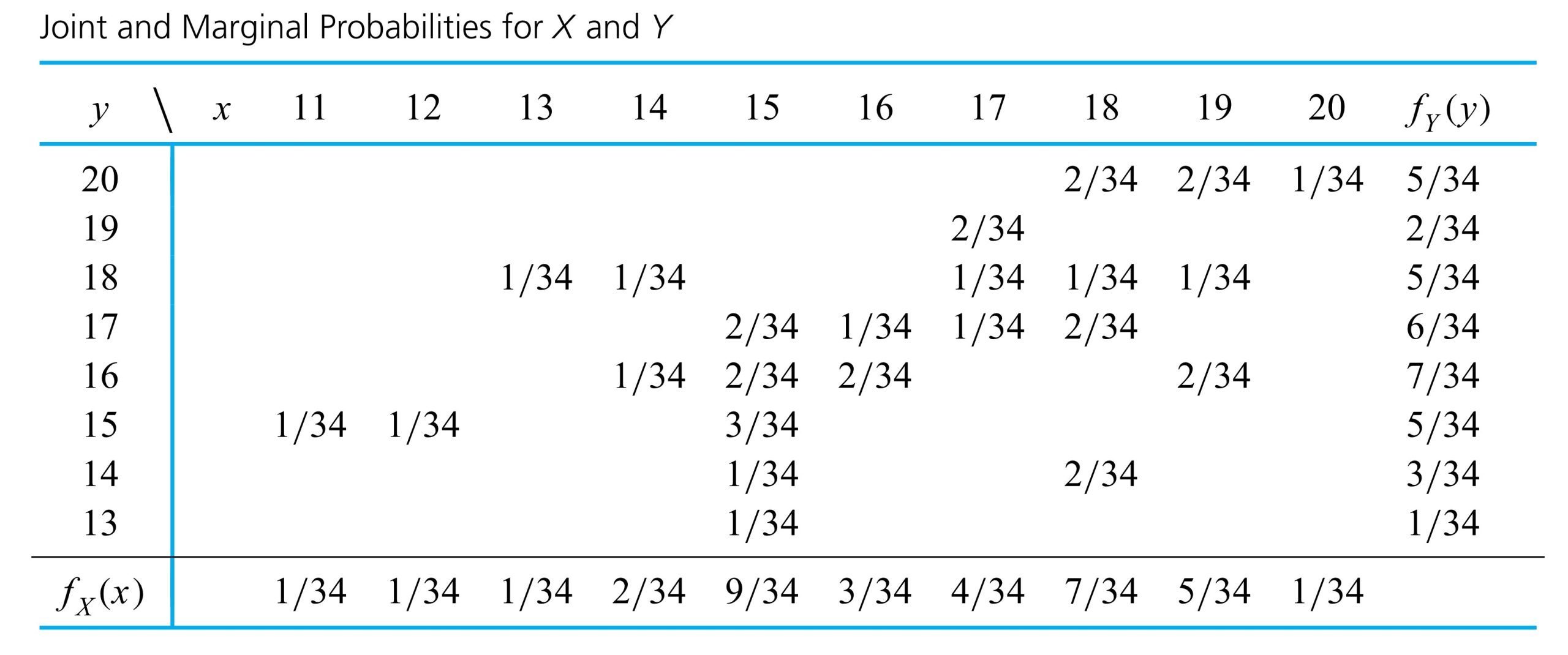

") and
and ") are known, is there then exactly one choice for
are known, is there then exactly one choice for 
") torque situation, a technician who has just loosened bolt 3 and measured the torque as
torque situation, a technician who has just loosened bolt 3 and measured the torque as  ought to have expectations for bolt 4 torque
 ") somewhat different from those described by the marginal distribution in Table 4.2.1.3. After all, returning to the data in that led to Table 4.2.1.1, the relative frequency distribution of bolt 4 torques for those components with bolt 3 torque of
somewhat different from those described by the marginal distribution in Table 4.2.1.3. After all, returning to the data in that led to Table 4.2.1.1, the relative frequency distribution of bolt 4 torques for those components with bolt 3 torque of  ought to make a probability distribution for
 is the function of
 =\frac{f(x, y)}{\sum_{x} f(x, y)}")
 given
given  is the function of
 =\frac{f(x, y)}{f_{Y}(y)}")
=\frac{f(x, y)}{f_{X}(x)}")
=\right.")
") ), so that they are renormalized to total to 1 . Similarly, equation (4.2.2.3) says that looking only at the column specified by
), so that they are renormalized to total to 1 . Similarly, equation (4.2.2.3) says that looking only at the column specified by  , the appropriate conditional distribution for
 =\frac{f(15, y)}{f_{X}(15)}")
 . So dividing values in the
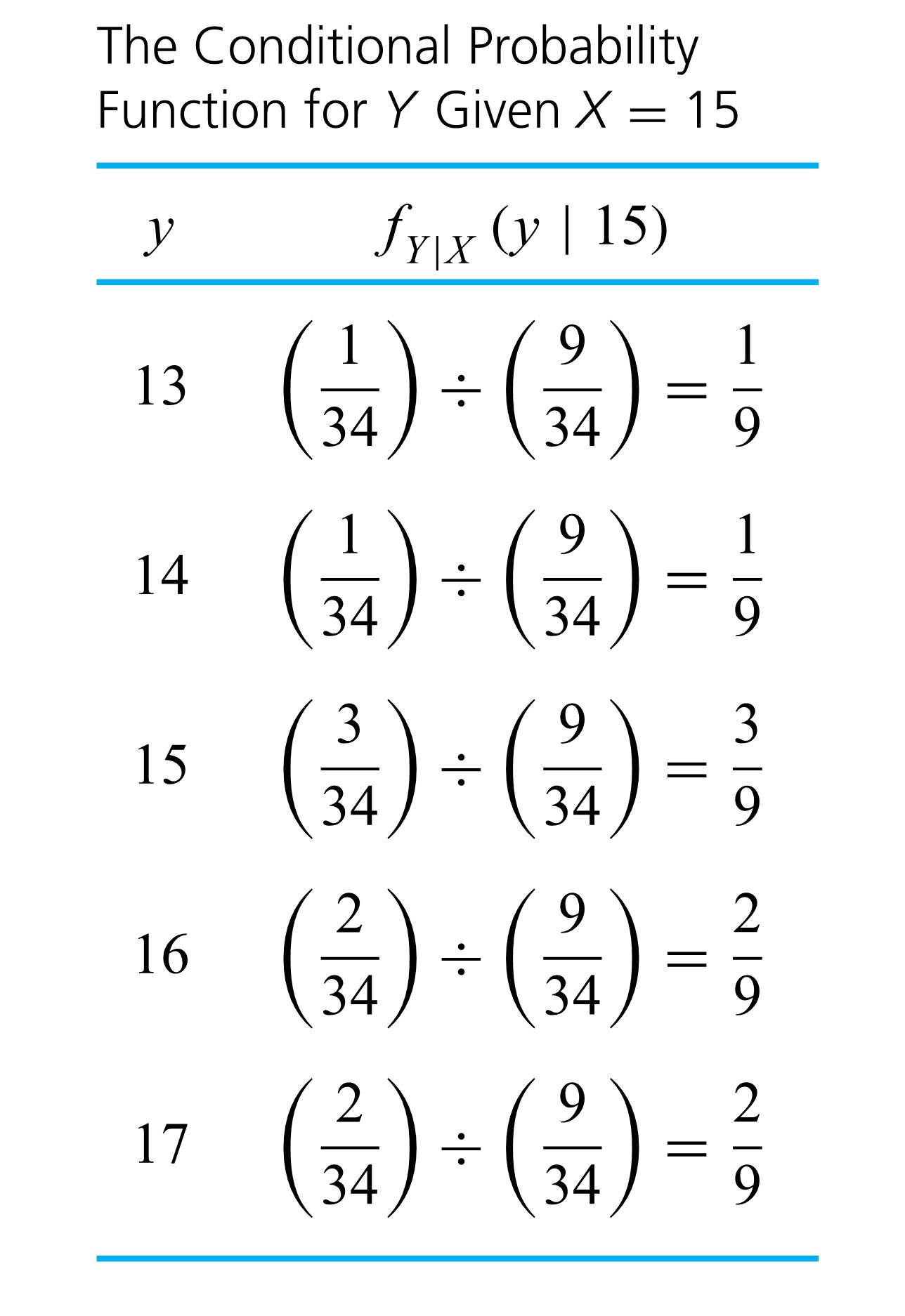
") specified by
specified by
=\frac{f(18, y)}{f_{X}(18)}")
 , shown in Table 4.2.2.3 . Tables 4.2.2.2 and 4.2.4.3 confirm that the conditional distributions of
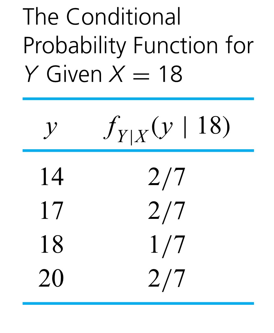
") . In this situation, equation (4.2.2.2) gives
. In this situation, equation (4.2.2.2) gives
=\frac{f(x, 20)}{f_{Y}(20)}")
 row of Table 4.2.1..2 divided by the marginal
 ") is given in Table 4.2.2.4.
is given in Table 4.2.2.4.
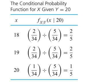
 provides some information about

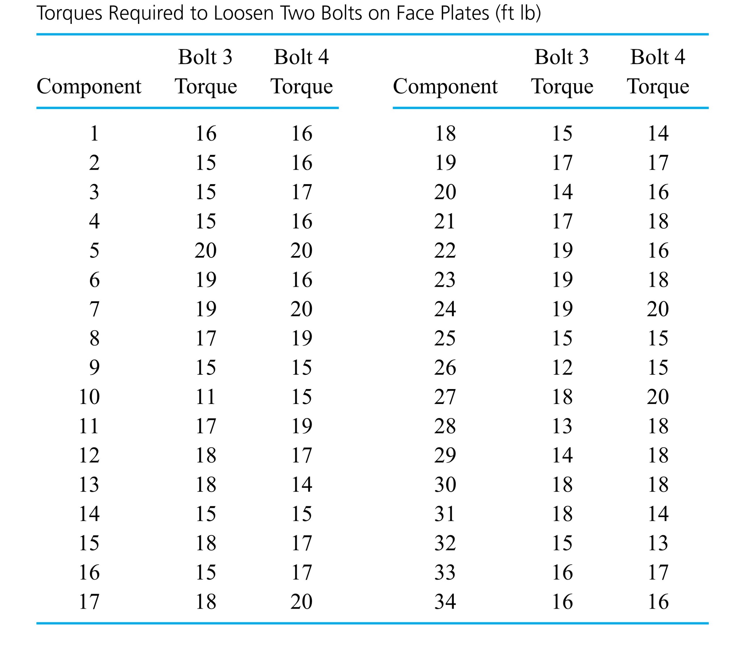
 and
and =f_{U}(u)")
=f_{V}(v)")
}{f_{V}(v)}=f_{U}(u)")
=f_{U}(u) f_{V}(v)")
=f_{X}(x) f_{Y}(y) \quad \text { for all } x, y")
 , one clearly wants
![f(13,13)=P[U=13 \text { and } V=13]=0](https://atu0g9ctah.execute-api.ca-central-1.amazonaws.com/latest/latex?latex=f%2813%2C13%29%3DP%5BU%3D13%20%5Ctext%20%7B%20and%20%7D%20V%3D13%5D%3D0&fg=000000&font=TeX&svg=1 "f(13,13)=P[U=13 \text { and } V=13]=0")
=\frac{1}{(34)^{2}}")
=0")
=f_{V}(13)=\frac{1}{34}")
 slips labeled with torques with relative frequencies as in Table 4.2.2.6. Then even if sampling is done without replacement, the probabilities developed earlier for
 =\frac{99}{3,399}")
=\frac{f(u, v)}{f_{U}(u)}")
=f_{V \mid U}(v \mid u) f_{U}(u)")
=\frac{99}{3,399} \cdot \frac{1}{34}")

 \approx \frac{1}{34} \cdot \frac{1}{34}")
 is much larger than the sample size
  all have the same marginal distribution and are independent, they are termed iid or independent and identically distributed.
") , the object is to predict the behavior of the random variable
, the object is to predict the behavior of the random variable")

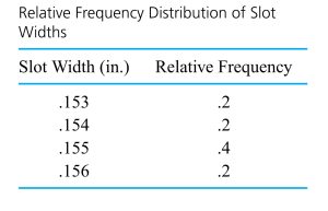

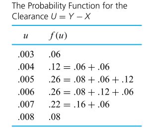
 are
are  are
are  constants, then the random variable
  has mean

 and the other
  ‘s equal to plus and minus 1 ‘s.
 , and
, and 
^{2} 6.9 \times 10^{-7}+(1)^{2} 1.04 \times 10^{-6}=1.73 \times 10^{-6}\end{aligned}")

 and [/latex]\operatorname{Var} U[/latex], there is no need to go through the intermediate step of deriving the distribution of
  . That is, in cases where random variables
 and
and =\mu")
![\begin{aligned}\operatorname{Var} \bar{X} & =\left(\frac{1}{n}\right)^{2} \operatorname{Var} X_{1}+\left(\frac{1}{n}\right)^{2} \operatorname{Var} X_{2}+\cdots+\left(\frac{1}{n}\right)^{2} \operatorname{Var} X_{n} \\& =n\left(\frac{1}{n}\right)^{2} \sigma^{2}=\frac{\sigma^{2}}{n}\end{aligned}</div> </div></blockquote> <div>.</div> <div>Since [latex]\sigma^{2} / n](https://atu0g9ctah.execute-api.ca-central-1.amazonaws.com/latest/latex?latex=%5Cbegin%7Baligned%7D%5Coperatorname%7BVar%7D%20%5Cbar%7BX%7D%20%26%20%3D%5Cleft%28%5Cfrac%7B1%7D%7Bn%7D%5Cright%29%5E%7B2%7D%20%5Coperatorname%7BVar%7D%20X_%7B1%7D%2B%5Cleft%28%5Cfrac%7B1%7D%7Bn%7D%5Cright%29%5E%7B2%7D%20%5Coperatorname%7BVar%7D%20X_%7B2%7D%2B%5Ccdots%2B%5Cleft%28%5Cfrac%7B1%7D%7Bn%7D%5Cright%29%5E%7B2%7D%20%5Coperatorname%7BVar%7D%20X_%7Bn%7D%20%5C%5C%26%20%3Dn%5Cleft%28%5Cfrac%7B1%7D%7Bn%7D%5Cright%29%5E%7B2%7D%20%5Csigma%5E%7B2%7D%3D%5Cfrac%7B%5Csigma%5E%7B2%7D%7D%7Bn%7D%5Cend%7Baligned%7D%3C%2Fdiv%3E%20%20%3C%2Fdiv%3E%3C%2Fblockquote%3E%20%20%3Cdiv%3E.%3C%2Fdiv%3E%20%20%3Cdiv%3ESince%20%5Blatex%5D%5Csigma%5E%7B2%7D%20%2F%20n&fg=000000&font=TeX&svg=1 "\begin{aligned}\operatorname{Var} \bar{X} & =\left(\frac{1}{n}\right)^{2} \operatorname{Var} X_{1}+\left(\frac{1}{n}\right)^{2} \operatorname{Var} X_{2}+\cdots+\left(\frac{1}{n}\right)^{2} \operatorname{Var} X_{n} \\& =n\left(\frac{1}{n}\right)^{2} \sigma^{2}=\frac{\sigma^{2}}{n}\end{aligned}</div> </div></blockquote> <div>.</div> <div>Since [latex]\sigma^{2} / n") is decreasing in
is decreasing in  having a probability distribution centered at the population mean
 ![\bar{X}/[latex] under random sampling with replacement, are also approximate descriptions of the behavior of [latex]\bar{X}](https://atu0g9ctah.execute-api.ca-central-1.amazonaws.com/latest/latex?latex=%5Cbar%7BX%7D%2F%5Blatex%5D%20under%20random%20sampling%20with%20replacement%2C%20are%20also%20approximate%20descriptions%20of%20the%20behavior%20of%20%5Blatex%5D%5Cbar%7BX%7D&fg=000000&font=TeX&svg=1 "\bar{X}/[latex] under random sampling with replacement, are also approximate descriptions of the behavior of [latex]\bar{X}") under simple random sampling in enumerative contexts. (Recall the discussion about the approximate independence of observations resulting from simple random sampling of large populations.)
under simple random sampling in enumerative contexts. (Recall the discussion about the approximate independence of observations resulting from simple random sampling of large populations.)
 .)
.) the last digit of the serial number observed next Monday at 9 A.M.
 the last digit of the serial number observed the following Monday at 9 A.M.
 is that they are independent, each with the marginal probability function
= \begin{cases}.1 & \text { if } w=0,1,2, \ldots, 9 \\ 0 & \text { otherwise }\end{cases}")
") has the probability function given in Table 4.2.2.1 and pictured in Figure 4.2.2.2
has the probability function given in Table 4.2.2.1 and pictured in Figure 4.2.2.2
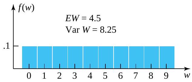
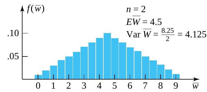
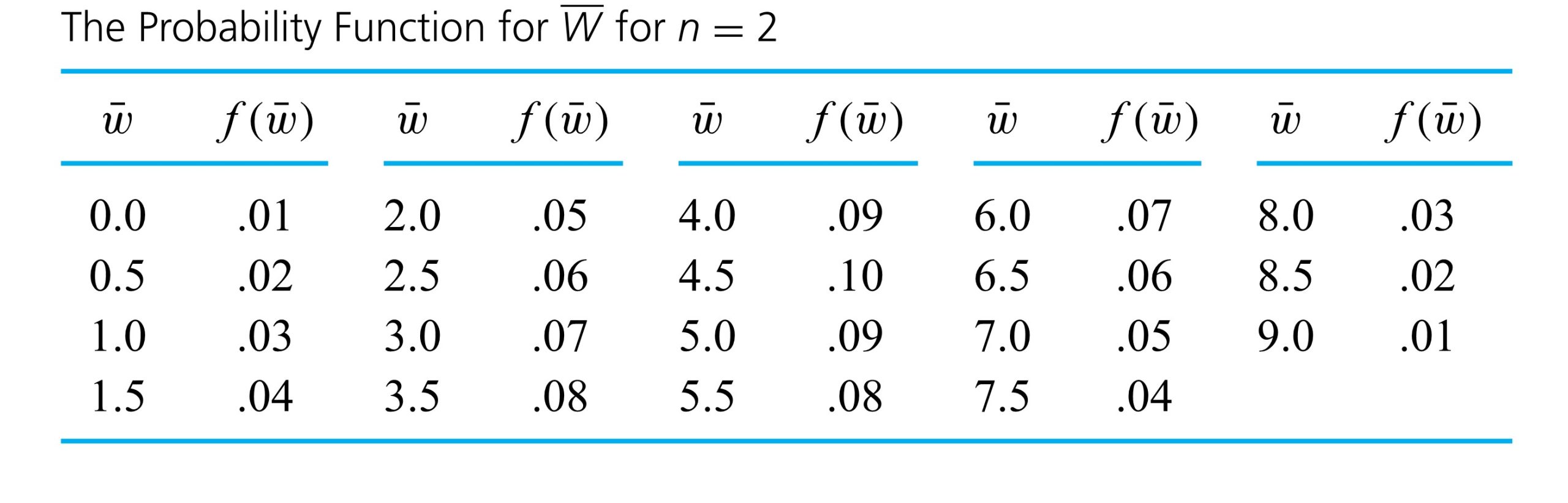
 and the small sample size of
  looks far more bell-shaped than the underlying distribution. It is clear why this is so. As you move away from the mean or central value of
  and
and  that can produce a given value of
  . For example, to observe
  , you must have
  and
and  -that is, you must observe not one but two extreme values. On the other hand, there are ten different combinations of
  .
.
 (with marginal distribution were simulated and each set averaged to produce 1,000 simulated values of
  . Figure 4.2.2.3 is a histogram of these 1,000 values. Notice the bell-shaped character of the plot. (The simulated mean of
  , while the variance of
  , in close agreement with formulas.)
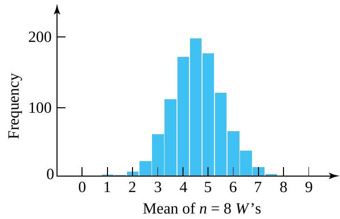
 or so is adequate to make
  excess service times, to produce
 the sample mean time (over a
  threshold) required to complete the next 100 stamp sales
![P[\bar{S}>17]](https://atu0g9ctah.execute-api.ca-central-1.amazonaws.com/latest/latex?latex=P%5B%5Cbar%7BS%7D%3E17%5D&fg=000000&font=TeX&svg=1 "P[\bar{S}>17]") .
.
 distribution is plausible for the individual excess service times,

 , via formulas. Further, in view of the fact that
 -values before consulting the standard normal table. In this case, the mean and standard deviation to be used are (respectively)
  and
and  . That is, a
![P[\bar{S}>17] \approx P[Z>.30]=1-\Phi(.30)=.38](https://atu0g9ctah.execute-api.ca-central-1.amazonaws.com/latest/latex?latex=P%5B%5Cbar%7BS%7D%3E17%5D%20%5Capprox%20P%5BZ%3E.30%5D%3D1-%5CPhi%28.30%29%3D.38&fg=000000&font=TeX&svg=1 "P[\bar{S}>17] \approx P[Z>.30]=1-\Phi(.30)=.38")


")
 .3 g
.3 g


 \frac{.7 \times 10^{-4}}{\sqrt{32}}")


 < z
< z


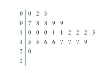

![P\left[\bar{x}-1.645 \frac{s}{\sqrt{n}}<\mu<\bar{x}+1.645 \frac{s}{\sqrt{n}}\right] \approx .90](https://atu0g9ctah.execute-api.ca-central-1.amazonaws.com/latest/latex?latex=P%5Cleft%5B%5Cbar%7Bx%7D-1.645%20%5Cfrac%7Bs%7D%7B%5Csqrt%7Bn%7D%7D%3C%5Cmu%3C%5Cbar%7Bx%7D%2B1.645%20%5Cfrac%7Bs%7D%7B%5Csqrt%7Bn%7D%7D%5Cright%5D%20%5Capprox%20.90&fg=000000&font=TeX&svg=1 "P\left[\bar{x}-1.645 \frac{s}{\sqrt{n}}<\mu<\bar{x}+1.645 \frac{s}{\sqrt{n}}\right] \approx .90")
 . Setting
^2")

(5.1)}{1}\right)^2 \approx 100")

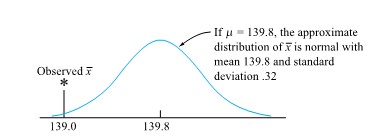
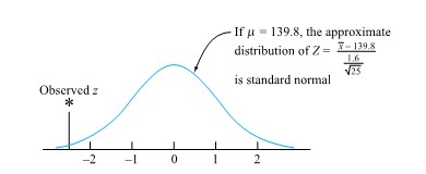
+(1-\Phi(2.5))=.01")
 .
.
 .It is of the same form as the corresponding null hypothesis, except that the equality sign


 itself. Using form (5.1.2.4), the reference distribution will always be the same—namely, standard normal.
 139.8.

![\begin{aligned} & P[\text { a standard normal variable } \leq-2.5] \\ & \quad+P[\text { a standard normal variable } \geq 2.5] \\ & \quad=P[\mid \text { a standard normal variable } \mid \geq 2.5] \\ & \quad=.01 \end{aligned}](https://atu0g9ctah.execute-api.ca-central-1.amazonaws.com/latest/latex?latex=%5Cbegin%7Baligned%7D%20%26%20P%5B%5Ctext%20%7B%20a%20standard%20normal%20variable%20%7D%20%5Cleq-2.5%5D%20%5C%5C%20%26%20%5Cquad%2BP%5B%5Ctext%20%7B%20a%20standard%20normal%20variable%20%7D%20%5Cgeq%202.5%5D%20%5C%5C%20%26%20%5Cquad%3DP%5B%5Cmid%20%5Ctext%20%7B%20a%20standard%20normal%20variable%20%7D%20%5Cmid%20%5Cgeq%202.5%5D%20%5C%5C%20%26%20%5Cquad%3D.01%20%5Cend%7Baligned%7D&fg=000000&font=TeX&svg=1 "\begin{aligned} & P[\text { a standard normal variable } \leq-2.5] \\ & \quad+P[\text { a standard normal variable } \geq 2.5] \\ & \quad=P[\mid \text { a standard normal variable } \mid \geq 2.5] \\ & \quad=.01 \end{aligned}")


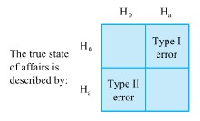
 is called the power of the significance test.
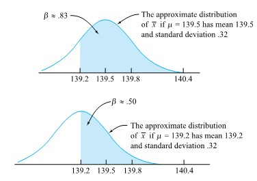

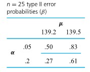
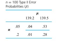


=.16")

=.02")

=\frac{\Gamma\left(\frac{v+1}{2}\right)}{\Gamma\left(\frac{v}{2}\right) \sqrt{\pi v}}\left(1+\frac{t^2}{v}\right)^{-(v+1) / 2}")
 distribution.
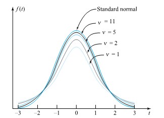
") exists. Instead, it is common to use tables (or statistical software) to evaluate common t distribution quantiles and to get at least crude bounds on the types of probabilities needed in significance testing. Table A1.2 in the Appendix 1 of statistical tables is a typical table of t quantiles. Across the top of the table are several cumulative probabilities. Down the left side are values of the degrees of freedom parameter,
exists. Instead, it is common to use tables (or statistical software) to evaluate common t distribution quantiles and to get at least crude bounds on the types of probabilities needed in significance testing. Table A1.2 in the Appendix 1 of statistical tables is a typical table of t quantiles. Across the top of the table are several cumulative probabilities. Down the left side are values of the degrees of freedom parameter, ![P[T<-1.9]=P[T>1.9]=1-P[T \leq 1.9]](https://atu0g9ctah.execute-api.ca-central-1.amazonaws.com/latest/latex?latex=P%5BT%3C-1.9%5D%3DP%5BT%3E1.9%5D%3D1-P%5BT%20%5Cleq%201.9%5D&fg=000000&font=TeX&svg=1 "P[T<-1.9]=P[T>1.9]=1-P[T \leq 1.9]")
 distribution. That is,
![P[T \leq 1.9] \leq .95](https://atu0g9ctah.execute-api.ca-central-1.amazonaws.com/latest/latex?latex=P%5BT%20%5Cleq%201.9%5D%20%5Cleq%20.95&fg=000000&font=TeX&svg=1 "P[T \leq 1.9] \leq .95")
![P[T<-1.9]<.10](https://atu0g9ctah.execute-api.ca-central-1.amazonaws.com/latest/latex?latex=P%5BT%3C-1.9%5D%3C.10&fg=000000&font=TeX&svg=1 "P[T<-1.9]<.10")
![P[T \leq 2.3]<.975](https://atu0g9ctah.execute-api.ca-central-1.amazonaws.com/latest/latex?latex=P%5BT%20%5Cleq%202.3%5D%3C.975&fg=000000&font=TeX&svg=1 "P[T \leq 2.3]<.975")


 random variable, we are in a position to work in exact analogy to what was done in Part 5 to find methods for confidence interval estimation and significance testing. That is, if a data-generating mechanism can be thought of as essentially equivalent to drawing independent observations from a single normal distribution, a two-sided confidence interval for µ has endpoints


 stress?” Since only n = 10 observations are available, the large-sample method of Part 5.1 is not applicable. Instead, only the method indicated by expression (5.2.1.5) is a possible option. For it to be appropriate, lifetimes must be normally distributed.
 distribution and chooses t > 0 such that


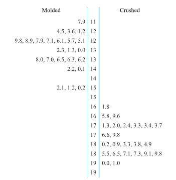
 and
and  stand for underlying distributional means corresponding to the first and second conditions and
  and
and  stand for corresponding sample means. Now if the two data-generating mechanisms are conceptually essentially equivalent to sampling with replacement from two distributions, Part 4 says that
  and
and  . The difference in sample means
 =\mu_1-\mu_2")
=\frac{\sigma_1^2}{n_1}+\frac{\sigma_2^2}{n_2}")
 and
and  are large (so that
 }{\sqrt{\frac{\sigma_1^2}{n_1}+\frac{\sigma_2^2}{n_2}}}")
 and
and  . Happily, for large
 }{\sqrt{\frac{s_1^2}{n_1}+\frac{s_2^2}{n_2}}}")


 = 8.34 g,
  = 9.31 g, the five-step testing format produces the following summary:


^2}{24}+\frac{(9.31)^2}{24}}}=18.3")
-1.645 \sqrt{\frac{(8.34)^2}{24}+\frac{(9.31)^2}{24}}")

")
")
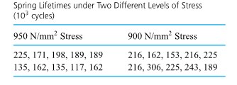


 and
and  ,the pooled sample variance,
  s_1^2+\left(n_2-1\right) s_2^2}{\left(n_1-1\right)+\left(n_2-1\right)}=\frac{\left(n_1-1\right) s_1^2+\left(n_2-1\right) s_2^2}{n_1+n_2-2}")
 , is the square root of
 (42.9)^2+(10-1)(33.1)^2}{(10-1)+(10-1)}=1,468\left(10^3 \text { cycles }\right)^2")
")
}{\sigma \sqrt{\frac{1}{n_1}+\frac{1}{n_2}}}")
-\left(\mu_1-\mu_2\right)}{s_{\mathrm{P}} \sqrt{\frac{1}{n_1}+\frac{1}{n_2}}}")


 distribution assigns to the interval between −t and t corresponds to the desired confidence. And under the same conditions,
 mm^2 stress level condition 1 and the 950 N/


 distribution is in order. Endpoints of the confidence interval for
  \pm 2.101(38.3) \sqrt{\frac{1}{10}+\frac{1}{10}}")


^2}{\frac{s_1^4}{\left(n_1-1\right) n_1^2}+\frac{s_2^4}{\left(n_2-1\right) n_2^2}}")
 is such that the
  degrees of freedom assigns that probability to the interval between
  and
and 
^2}{10}+\frac{(33.1)^2}{10}\right)^2}{\frac{(57.9)^4}{9(100)}+\frac{(33.1)^4}{9(100)}}=14.3")
 distribution is 2.145. So the 95% limits (5.3.3.8) for the (850 N/
 −
−  )are
)are^2}{10}+\frac{(33.1)^2}{10}}")


 distribution with numerator and denominator degrees of freedom parameters
  and
and  is a continuous probability distribution with probability density
= \begin{cases}\frac{\Gamma\left(\frac{v_1+v_2}{2}\right)\left(\frac{v_1}{v_2}\right)^{v_1 / 2} x^{\left(v_1 / 2\right)-1}}{\Gamma\left(\frac{v_1}{2}\right) \Gamma\left(\frac{v_2}{2}\right)\left(1+\frac{v_1 x}{v_2}\right)^{\left(v_1+v_2\right) / 2}} & \text { for } x>0 \\ 0 & \text { otherwise }\end{cases}")
 distribution.
 (the numerator degrees of freedom) and
  (the denominator degrees of freedom). The values of
  and
and  quantiles, quantiles for small
  stand for the
  stand for the quantile function for the
 =\frac{1}{Q_{v_{2}, v_{1}}(1-p)}")

 random variable. Consider finding the .95 and .01 quantiles of
  4.0] and
 ![P[V<.3]](https://atu0g9ctah.execute-api.ca-central-1.amazonaws.com/latest/latex?latex=P%5BV%3C.3%5D&fg=000000&font=TeX&svg=1 "P[V<.3]") .
. table of quantiles, in the
  column and
  row, produces the number 5.41. That is,
 =5.41") , or (equivalently)
, or (equivalently) ![P[V<5.41]=.95](https://atu0g9ctah.execute-api.ca-central-1.amazonaws.com/latest/latex?latex=P%5BV%3C5.41%5D%3D.95&fg=000000&font=TeX&svg=1 "P[V<5.41]=.95") .
. quantile of the
 =\frac{1}{Q_{5,3}(.99)}")
 column and
  row of the table of
  quantiles, one has
=\frac{1}{28.24}=.04")
![P[V>4.0]](https://atu0g9ctah.execute-api.ca-central-1.amazonaws.com/latest/latex?latex=P%5BV%3E4.0%5D&fg=000000&font=TeX&svg=1 "P[V>4.0]") , one finds (using the [/latex]v_{1}=3[/latex] columns and
, one finds (using the [/latex]v_{1}=3[/latex] columns and  ), in the
  distribution and then make use of expression (5.2.4.2). Using the
  and
and  of those underlying distributions. That is, when
  and
and ![s_{2}^{2}[latex] come from independent samples from normal distributions, the variable <blockquote> <p style="text-align: left"><strong>5.2.4.3 </strong> [latex]F=\frac{s_{1}^{2}}{\sigma_{1}^{2}} \cdot \frac{\sigma_{2}^{2}}{s_{2}^{2}}](https://atu0g9ctah.execute-api.ca-central-1.amazonaws.com/latest/latex?latex=s_%7B2%7D%5E%7B2%7D%5Blatex%5D%20come%20from%20independent%20samples%20from%20normal%20distributions%2C%20the%20variable%20%20%3Cblockquote%3E%20%20%3Cp%20style%3D%22text-align%3A%20left%22%3E%3Cstrong%3E5.2.4.3%C2%A0%20%C2%A0%20%C2%A0%20%C2%A0%20%C2%A0%20%C2%A0%20%C2%A0%20%C2%A0%20%C2%A0%20%C2%A0%3C%2Fstrong%3E%20%5Blatex%5DF%3D%5Cfrac%7Bs_%7B1%7D%5E%7B2%7D%7D%7B%5Csigma_%7B1%7D%5E%7B2%7D%7D%20%5Ccdot%20%5Cfrac%7B%5Csigma_%7B2%7D%5E%7B2%7D%7D%7Bs_%7B2%7D%5E%7B2%7D%7D&fg=000000&font=TeX&svg=1 "s_{2}^{2}[latex] come from independent samples from normal distributions, the variable <blockquote> <p style=\"text-align: left\"><strong>5.2.4.3 </strong> [latex]F=\frac{s_{1}^{2}}{\sigma_{1}^{2}} \cdot \frac{\sigma_{2}^{2}}{s_{2}^{2}}")
 distribution. (
  associated degrees of freedom and is in the numerator of this expression, while
  has
has  associated degrees of freedom and is in the denominator, providing motivation for the language introduced in Definition 5.2.4.1)
 . For example, it is possible to pick appropriate F quantiles L and U such that the probability that the variable (5.2.4.3) falls between L and U corresponds to a desired confidence level. (Typically, L and U are chosen to "split the 'unconfidence' " between the upper and lower
  <U
<U


 in displays (5.2.4.5) and (5.2.4.6), so that the null hypothesis is one of equality of variances, is the only one commonly used in practice.)

 < # and
  are (respectively) the left and right
  , the standard convention is to report twice the
  if
if  and to report twice the
  carbon steel. Part of their data are given in Table 5.2.4.1, where Rockwell hardness measurements for ten specimens from a lot of heat-treated steel specimens and five specimens from a lot of cold-rolled steel specimens are represented.
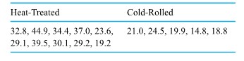


 and
and  , and a five-step significance test of equality of variances based on the variable (5.2.4.6) proceeds as follows:
![]\mathrm{H}_{0}: \frac{\sigma_{1}^{2}}{\sigma_{2}^{2}}=1](https://atu0g9ctah.execute-api.ca-central-1.amazonaws.com/latest/latex?latex=%5D%5Cmathrm%7BH%7D_%7B0%7D%3A%20%5Cfrac%7B%5Csigma_%7B1%7D%5E%7B2%7D%7D%7B%5Csigma_%7B2%7D%5E%7B2%7D%7D%3D1&fg=000000&font=TeX&svg=1 "]\mathrm{H}_{0}: \frac{\sigma_{1}^{2}}{\sigma_{2}^{2}}=1")


 distribution, and both large observed f and small observed f will constitute evidence against
  .
.
^{2}}{(3.52)^{2}}=4.6")
![2 P\left[\text { an } F_{9,4} \text { random variable } \geq 4.6\right]](https://atu0g9ctah.execute-api.ca-central-1.amazonaws.com/latest/latex?latex=2%20P%5Cleft%5B%5Ctext%20%7B%20an%20%7D%20F_%7B9%2C4%7D%20%5Ctext%20%7B%20random%20variable%20%7D%20%5Cgeq%204.6%5Cright%5D&fg=000000&font=TeX&svg=1 "2 P\left[\text { an } F_{9,4} \text { random variable } \geq 4.6\right]")
 . Now the .95 quantile of the
  distribution is 3.63, implying that the .05 quantile of the
  . Thus, a 90 % confidence interval for the ratio of standard deviations
 ^{2}}{6.0(3.52)^{2}}} \text { and } \sqrt{\frac{(7.52)^{2}}{(1 / 3.63)(3.52)^{2}}}")
 /
/ to be on the order of 1.5 and predicted a period of two years or less for the recovery of the capital improvement cost of equipping all the company’s ream cutters with automatic brakes.
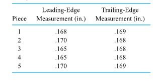
 , if n (the number of data pairs) is large, endpoints of a confidence interval for the underlying mean difference,
  , are
, are
 is the sample standard deviation of d1 , d2 ,…,


 =−.0008 in. and
  = .0023 in. So, first investigating the plausibility of a “no consistent difference” hypothesis in a five-step significance testing format, gives the following:

 random variable|≥.78], which can be seen from Table A1.2 to be larger than 2(.10) = .2. The data in hand are not convincing in favor of a systematic difference between leading- and trailing-edge measurements.
 =−.0008, is just a result of sampling variability.
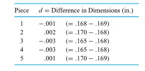
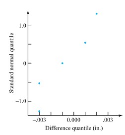
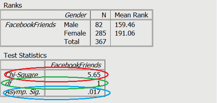
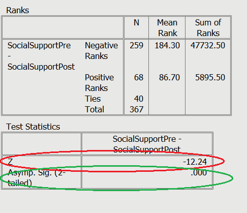
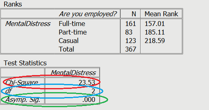

 amounts to making a scatterplot of compressive strength versus formula number. Such a plot is shown in Figure 6.1.1.1. The general message conveyed by Figure 6.1.1.1 is that there are clear differences in mean compressive strengths between the formulas but that the variabilities in compressive strengths are roughly comparable for the eight different formulas.
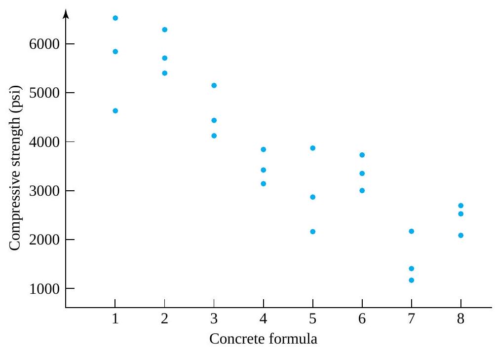
 springs of type 1 (a 4 in. design with a theoretical spring constant of 1.86),
  springs of type 2 (a 6 in. design with a theoretical spring constant of 2.63), and
  springs of type 3 (a 4 in. design with a theoretical spring constant of 2.12), using an
  load. The students’ experimental values are given in Table 6.1.1.2
 . spring types but that no such difference between the two 4 in. spring types is obvious. Of course, the information in Table 6.1.1.2 could also be presented in side-by-side dot diagram form, as in Figure 6.1.1.3.
 samples of respective sizes
  are independent samples from normal underlying distributions with a common variance-say,
  version of this one-way (as opposed, for example, to several-way factorial) model led to useful inference methods for
  , this general version will support a variety of useful inference methods for


 is the
  ,
,  are independent normal random variables with mean 0 and variance
  and the variance


 deterministic response + noise
 ") are meant to approximate the deterministic part of a system response
are meant to approximate the deterministic part of a system response ") , and
, and") are therefore meant to approximate the corresponding noise in the response
are therefore meant to approximate the corresponding noise in the response ") .
. in equation (6.1.2.1) are assumed to be iid normal
 ") random variables then suggests that the
random variables then suggests that the  ought to look at least approximately like a random sample from a normal distribution.
 is more than three times the size of
  . But the sample sizes here are so small that a largest ratio of sample standard deviations on the order of 3.2 is hardly unusual (for
  samples of size 3 from a normal distribution). Note from the
 ^{2} \approx 10.2") would yield a
would yield a  residuals. Some of the calculations necessary to compute residuals for the data in Table 6.1.1.1 (using the fitted values appearing as sample means in Table 6.1.2.1) are shown in Table 6.1.2.2. Figures 6.1.2.2 and 6.1.2.3 are, respectively, a plot of residuals versus fitted
  versus
  ) and a normal plot of all 24 residuals.

^{2}=4.38\right)") is not a compelling reason to abandon a one-way model description of the spring constants. (A look at the
is not a compelling reason to abandon a one-way model description of the spring constants. (A look at the  and
and  distribution .9 and .95 quantiles. So even if there were only two rather than three samples involved, a variance ratio of 4.38 would yield a
  are large enough that it makes sense to look at sample-by-sample normal plots of the spring constant data. Such plots, drawn on the same set of axes, are shown in Figure 6.1.2.4. Further, use of the fitted values
 ") listed in Table 6.1.2.3 with the original data given in Table 6.1.1.2 produces 19 residuals, as partially illustrated in Table 6.1.2.4. Then Figures 6.1.2.5 and 6.1.2.6, respectively, show a plot of residuals versus fitted responses and a normal plot of all 19 residuals.
listed in Table 6.1.2.3 with the original data given in Table 6.1.1.2 produces 19 residuals, as partially illustrated in Table 6.1.2.4. Then Figures 6.1.2.5 and 6.1.2.6, respectively, show a plot of residuals versus fitted responses and a normal plot of all 19 residuals.


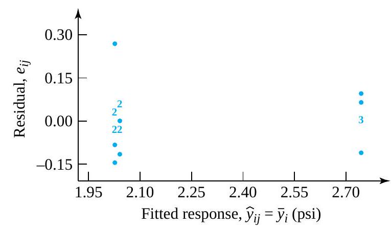
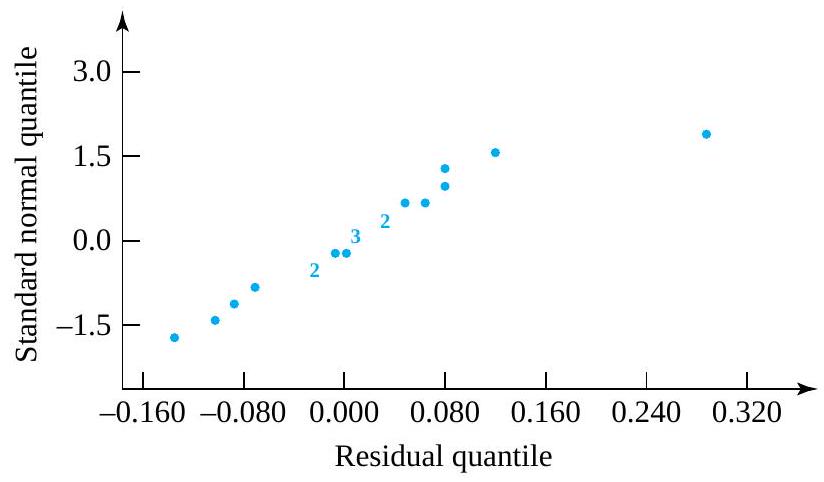
 . Similar to what was done in the
  , the pooled sample variance,
  , is the weighted average of the sample variances, where the weights are the sample sizes minus 1 . That is,
s_{1}^{2}+\left(n_{2}-1\right) s_{2}^{2}+\cdots+\left(n_{r}-1\right) s_{r}^{2}}{\left(n_{1}-1\right)+\left(n_{2}-1\right)+\cdots+\left(n_{r}-1\right)}")
 , is the square root of
  .
.
 based on two samples,
  and is a mathematically convenient form of compromise value.

=\sum_{i=1}^{r} n_{i}-\sum_{i=1}^{r} 1=n-r")
^{2}")
\left(\frac{1}{\left(n_{i}-1\right)} \sum_{j=1}^{n_{i}}\left(y_{i j}-\bar{y}_{i}\right)^{2}\right) & =\sum_{i=1}^{r} \sum_{j=1}^{n_{i}}\left(y_{i j}-\bar{y}_{i}\right)^{2} \\& =\sum_{i=1}^{r} \sum_{j=1}^{n_{i}} e_{i j}^{2}\end{aligned}")

 .
.
 are 3 , and
 ![\begin{aligned} s_{\mathrm{P}}^{2} & =\frac{(3-1)(965.6)^{2}+(3-1)(432.3)^{2}+\cdots+(3-1)(302.5)^{2}}{(3-1)+(3-1)+\cdots+(3-1)} \\ & =\frac{2\left[(965.6)^{2}+(432.3)^{2}+\cdots+(302.5)^{2}\right]}{16} \\ & =\frac{2,705,705}{8} \\ & =338,213(\mathrm{psi})^{2} \end{aligned}](https://atu0g9ctah.execute-api.ca-central-1.amazonaws.com/latest/latex?latex=%5Cbegin%7Baligned%7D%20s_%7B%5Cmathrm%7BP%7D%7D%5E%7B2%7D%20%26%20%3D%5Cfrac%7B%283-1%29%28965.6%29%5E%7B2%7D%2B%283-1%29%28432.3%29%5E%7B2%7D%2B%5Ccdots%2B%283-1%29%28302.5%29%5E%7B2%7D%7D%7B%283-1%29%2B%283-1%29%2B%5Ccdots%2B%283-1%29%7D%20%5C%5C%C2%A0%26%20%3D%5Cfrac%7B2%5Cleft%5B%28965.6%29%5E%7B2%7D%2B%28432.3%29%5E%7B2%7D%2B%5Ccdots%2B%28302.5%29%5E%7B2%7D%5Cright%5D%7D%7B16%7D%20%5C%5C%C2%A0%26%20%3D%5Cfrac%7B2%2C705%2C705%7D%7B8%7D%20%5C%5C%C2%A0%26%20%3D338%2C213%28%5Cmathrm%7Bpsi%7D%29%5E%7B2%7D%C2%A0%5Cend%7Baligned%7D&fg=000000&font=TeX&svg=1 "\begin{aligned} s_{\mathrm{P}}^{2} & =\frac{(3-1)(965.6)^{2}+(3-1)(432.3)^{2}+\cdots+(3-1)(302.5)^{2}}{(3-1)+(3-1)+\cdots+(3-1)} \\ & =\frac{2\left[(965.6)^{2}+(432.3)^{2}+\cdots+(302.5)^{2}\right]}{16} \\ & =\frac{2,705,705}{8} \\ & =338,213(\mathrm{psi})^{2} \end{aligned}")


 s_{\mathrm{P}}^{2}}{\sigma^{2}}")
 distribution. Thus, in a manner exactly parallel to the derivation in Part 5, a two-sided confidence interval for
 ![\sigma^{2}[latex] has endpoints</div> <div style="text-align: left">.</div> <blockquote> <div style="text-align: left"><strong>6.1.3.4 </strong>[latex]\frac{(n-r) s_{\mathrm{P}}^{2}}{U} \text { and } \frac{(n-r) s_{\mathrm{P}}^{2}}{L}](https://atu0g9ctah.execute-api.ca-central-1.amazonaws.com/latest/latex?latex=%5Csigma%5E%7B2%7D%5Blatex%5D%20has%20endpoints%3C%2Fdiv%3E%20%3Cdiv%20style%3D%22text-align%3A%20left%22%3E.%3C%2Fdiv%3E%20%3Cblockquote%3E%20%3Cdiv%20style%3D%22text-align%3A%20left%22%3E%3Cstrong%3E6.1.3.4%C2%A0%20%C2%A0%20%C2%A0%20%C2%A0%20%C2%A0%20%3C%2Fstrong%3E%5Blatex%5D%5Cfrac%7B%28n-r%29%20s_%7B%5Cmathrm%7BP%7D%7D%5E%7B2%7D%7D%7BU%7D%20%5Ctext%20%7B%20and%20%7D%20%5Cfrac%7B%28n-r%29%20s_%7B%5Cmathrm%7BP%7D%7D%5E%7B2%7D%7D%7BL%7D&fg=000000&font=TeX&svg=1 "\sigma^{2}[latex] has endpoints</div> <div style=\"text-align: left\">.</div> <blockquote> <div style=\"text-align: left\"><strong>6.1.3.4 </strong>[latex]\frac{(n-r) s_{\mathrm{P}}^{2}}{U} \text { and } \frac{(n-r) s_{\mathrm{P}}^{2}}{L}")
 and
and ") is the desired confidence level. And, of course, a one-sided interval is available by using only one of the endpoints (6.1.3.4) and choosing
is the desired confidence level. And, of course, a one-sided interval is available by using only one of the endpoints (6.1.3.4) and choosing ") is the desired confidence.
is the desired confidence.
 confidence interval for
  degrees of freedom are associated with
  distribution. These are 7.962 and 26.296, respectively. Thus a confidence interval for
 ^{2}}{26.296} \text { and } \frac{16(581.6)^{2}}{7.962}")
^{2}}{26.296}} \text { and } \sqrt{\frac{16(581.6)^{2}}{7.962}}")


 distribution. Hence, a two-sided confidence interval for the
 to
to  to
to  , the variable
}{s_{\mathrm{P}} \sqrt{\frac{1}{n_{i}}+\frac{1}{n_{i^{\prime}}}}}")
 has endpoints

 .
.
") (for
(for  ). The virtues of formulas (6.2.1.1) and (6.2.1.2) (in comparison to the corresponding formulas from Part 5) are that (when appropriate) for a given confidence, they will tend to produce shorter intervals than their Part 5 counterparts.
 and
and  . So the .95 quantile of the
  distribution, namely 1.746, is appropriate for use in both formulas (6.2.1.1) and (6.2.1.2).
 is 3 , the plus-or-minus part of formula (6.2.1.1) gives

 psi precision could be attached to any one of the sample means in Table 6.2.1.1 as an estimate of the corresponding formula’s mean strength. For example, since
  psi, a
  has endpoints


 \sqrt{\frac{1}{3}+\frac{1}{3}}=829.1 \mathrm{psi}")
 psi precision could be attached to any difference between sample means in Table 6.2.1.1 as an estimate of the corresponding difference in formula mean strengths. For instance, since
  , a
, a  has endpoints
 \pm 829.1")

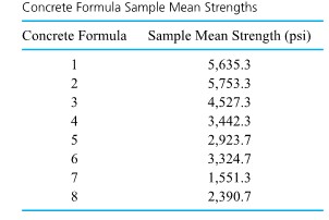
 and
and  reflects the reduction in uncertainty associated with
 ")
 confidence intervals have associated confidences
  , the Bonferroni inequality says that the simultaneous or joint confidence that all
  ) satisfies
+\left(1-\gamma_{2}\right)+\cdots+\left(1-\gamma_{k}\right)\right)")
") is no larger than the sum of the
is no larger than the sum of the  confidence levels have a joint or simultaneous confidence level of at least 95%.)
}{2}") pairs of mean responses
pairs of mean responses  . Section 6.2 argued thata single difference in mean responses,
  versus
  versus
  versus
  versus
  , and
, and  versus
  ). If one wishes to guarantee a reasonable simultaneous confidence level for all these comparisons via the crude Bonferroni idea, a huge individual confidence level is required for the intervals (6.2.3.1). For example, the Bonferroni inequality requires
  individual confidence for 28 intervals in order to guarantee simultaneous
  confidence.
 such that the set of two-sided intervals with endpoints

 ) is read from Table A5A or
  .99) is read from Table A5B) in the estimation of all differences
  ).
).
 \sqrt{\frac{1}{3}+\frac{1}{3}}")

 \sqrt{\frac{1}{3}+\frac{1}{3}}")

 row of Table A5A.)
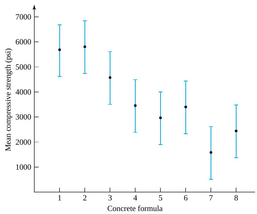


=0")


 and \#.


 , the number of observations in hand ignoring the fact that
  for the grand sample average of response
 but is a weighted average of the sample means
  . On the other hand,
  , and
, and  ,
,
=\frac{2}{5} \bar{y}_{1}+\frac{3}{5} \bar{y}_{2}")
=\frac{1}{4} y_{11}+\frac{1}{4} y_{12}+\frac{1}{6} y_{21}+\frac{1}{6} y_{22}+\frac{1}{6} y_{23}")
 is a natural estimate of the common mean. (All underlying distributions are the same, so the data in hand are reasonably thought of not as
  are indicators of possible differences among the
 ^{2}")
 or as an unweighted sum, where there is a term in the sum for each raw data point and therefore
or as an unweighted sum, where there is a term in the sum for each raw data point and therefore  s_{\mathrm{p}}^{2}") , giving
, giving
^{2}}{s_{\mathrm{P}}^{2}}")
 distribution. So the hypothesis of equality of
  : not
: not  and the 8 sample means
  , in this situation,
^2= & 3(1,941.7)^2+3(2,059.7)^2+\cdots \\ & +3(-2,142.3)^2+3(-1,302.9)^2 \end{aligned}")
^{2}")
}{(581.6)^{2}}=20.0")
 distribution. So
![p \text {-value }=P\left[\text { an } F_{7,16} \text { random variable } \geq 20.0\right]<.001](https://atu0g9ctah.execute-api.ca-central-1.amazonaws.com/latest/latex?latex=p%20%5Ctext%20%7B-value%20%7D%3DP%5Cleft%5B%5Ctext%20%7B%20an%20%7D%20F_%7B7%2C16%7D%20%5Ctext%20%7B%20random%20variable%20%7D%20%5Cgeq%2020.0%5Cright%5D%3C.001&fg=000000&font=TeX&svg=1 "p \text {-value }=P\left[\text { an } F_{7,16} \text { random variable } \geq 20.0\right]<.001")
 are not all equal.

 s^{2}=\sum_{i=1}^{r} n_{i}\left(\bar{y}_{i}-\bar{y}\right)^{2}+(n-r) s_{\mathrm{P}}^{2}")
^{2}=\sum_{i=1}^{r} n_{i}\left(\bar{y}_{i}-\bar{y}\right)^{2}+\sum_{i=1}^{r} \sum_{j=1}^{n_{i}}\left(y_{i j}-\bar{y}_{i}\right)^{2}")
 s^{2}=\sum_{i, j}\left(y_{i j}-\bar{y}\right)^{2}")
 s_{\mathrm{P}}^{2}=\sum_{i=1}^{r} \sum_{j=1}^{n_{i}}\left(y_{i j}-\bar{y}_{i}\right)^{2}")
 s^{2}") , the sum of squared differences between the raw data values and the grand sample mean, will be called the total sum of squares and denoted as SSTot.
, the sum of squared differences between the raw data values and the grand sample mean, will be called the total sum of squares and denoted as SSTot.^{2}") will be called the treatment sum of squares and denoted as SSTr.
will be called the treatment sum of squares and denoted as SSTr.^{2}") (which is
(which is  s_{\mathrm{p}}^{2}") in the unstructured situation) will be called the error sum of squares and denoted as SSE.
in the unstructured situation) will be called the error sum of squares and denoted as SSE.
 of
of  (corresponding to the source), degrees of freedom (corresponding to the source), Mean Square (corresponding to the source), and
  (for testing the significance of the source in contributing to the overall observed variability). The entries in the Source column of the table are shown here as being Treatments, Error, and Total. But the name Treatments is sometimes replaced by Between (Samples), and the name Error is sometimes replaced by Within (Samples) or Residual. The first two entries in the SS column must sum to the third, as indicated in equation (6.3.3.3). Similarly, the Treatments and Error degrees of freedom add to the Total degrees of freedom,
 ") . Notice that the entries in the
. Notice that the entries in the  column are those attached to the numerator and denominator, respectively, of the test statistic in equation (6.3.2.3). The ratios of sums of squares to degrees of freedom are called mean squares, here the mean square for treatments (MSTr) and the mean square for error (MSE). Verify that in the present context,
  and
and  is the numerator of the
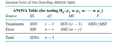
 s^2 \\ = & (5,800-3,693.6)^2+(4,598-3,693.6)^2+(6,508-3,693.6)^2 \\ & +\cdots+(2,631-3,693.6)^2+(2,490-3,693.6)^2 \\ = & 52,772,190(\mathrm{psi})^2 \end{aligned}")
^{2}") and
and  s_{\mathrm{P}}^{2}=5,411,410(\mathrm{psi})^{2}")
^{2}=47,360,780")
 .
.
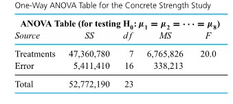
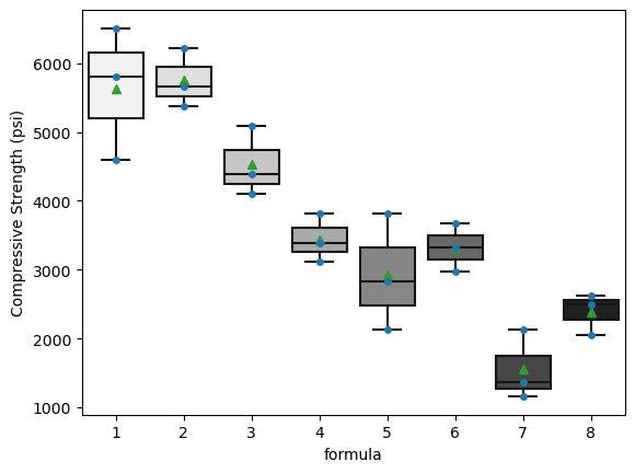
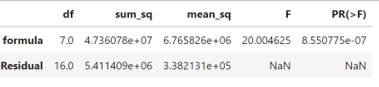

 , polyvinyl alcohol, and water was prepared, dried overnight, crushed, and sieved to obtain 100 mesh size grains. These were pressed into cylinders at pressures from 2,000 psi to 10,000 psi, and cylinder densities were calculated. Table 7.1.1.1 gives the data that were obtained, and a simple scatterplot of these data is given in Figure 7.1.1.1.

^2")
 are the observed responses and
  are corresponding responses predicted or fitted by the equation.

") and intercept
and intercept ") is
is=\sum_{i=1}^n\left(y_i-\left(\beta_0+\beta_1 x_i\right)\right)^2")
") is an exercise in calculus. The partial derivatives of
is an exercise in calculus. The partial derivatives of  and
and  may be set equal to zero, and the two resulting equations may be solved simultaneously for
  \beta_1=\sum_{i=1}^n y_i")
 \beta_0+\left(\sum_{i=1}^n x_i^2\right) \beta_1=\sum_{i=1}^n x_i y_i")
\left(y_i-\bar{y}\right)}{\sum\left(x_i-\bar{x}\right)^2}")

 and
and .
.^2= & (2,000-6,000)^2+(2,000-6,000)^2+\cdots+ \\ \sum y_i= & 2.486+2.479+\cdots+2.858=40.005, \\ \text { so } \bar{y}= & \frac{40.005}{15}=2.667 \\ \sum\left(y_i-\bar{y}\right)^2= & (2.486-2.667)^2+(2.479-2.667)^2+\cdots+ \\ & (2.858-2.667)^2=.289366 \\ \sum\left(x_i-\bar{x}\right)\left(y_i-\bar{y}\right)= & (2,000-6,000)(2.486-2.667)+\cdots+ \\ & (10,000-6,000)(2.858-2.667)=5,840 \end{aligned}")
 / \mathrm{psi}")
(6,000)=2.375 \mathrm{~g} / \mathrm{cc}")

=2.5693 \mathrm{~g} / \mathrm{cc}")
=2.5697 \mathrm{~g} / \mathrm{cc}")
=2.6183 \mathrm{~g} / \mathrm{cc}")
") is
is\left(y_i-\bar{y}\right)}{\sqrt{\sum\left(x_i-\bar{x}\right)^2 \cdot \sum\left(y_i-\bar{y}\right)^2}}")
^2 / \sum\left(y_i-\bar{y}\right)^2\right)^{1 / 2}") so that
so that (.289366)}}=.9911")
^2-\sum\left(y_i-\hat{y}_i\right)^2}{\sum\left(y_i-\bar{y}\right)^2}")

^2 \geq \sum\left(y_i-\hat{y}_i\right)^2") . Further,
. Further, ^2") is a measure of raw variability in y, while
is a measure of raw variability in y, while ^2") is a measure of variation in y remaining after fitting the equation. So the nonnegative difference
is a measure of variation in y remaining after fitting the equation. So the nonnegative difference ^2-\sum\left(y_i-\hat{y}_i\right)^2") is a measure of the variability in y accounted for in the equation-fitting process.
is a measure of the variability in y accounted for in the equation-fitting process.  values for all n = 15 data points in the original data set. These are given in Table 7.1.2.1
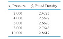
^2= & (2.486-2.4723)^2+(2.479-2.4723)^2+(2.472-2.4723)^2 \\ & +(2.558-2.5697)^2+\cdots+(2.879-2.8617)^2 \\ & +(2.858-2.8617)^2 \\ = & .005153 \end{aligned}")
^2=.289366") from equation 7.1.2.2
from equation 7.1.2.2
 and the fitted values
  . (Since in the present situation of fitting a line, the
  values,
^2=.9822=R^2")

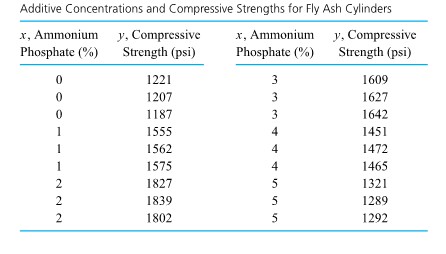

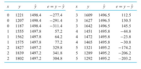
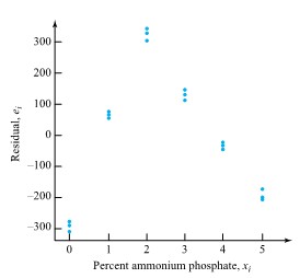

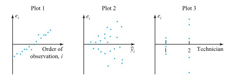
 were treated as a sample of 15 numbers and normal-plotted (using the methods we have introduced previously) to produce Figure 7.1.3.4.
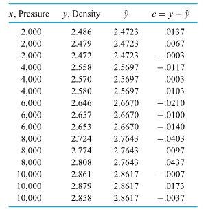
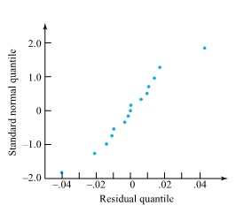

") is considered, along with inference for the average response at a given x . There follows a discussion of prediction and tolerance intervals for responses at a given setting of x . Next is an exposition of ANOVA ideas in the present situation. The section then closes with an illustration of how statistical software expedites the calculations introduced in the section.
is considered, along with inference for the average response at a given x . There follows a discussion of prediction and tolerance intervals for responses at a given setting of x . Next is an exposition of ANOVA ideas in the present situation. The section then closes with an illustration of how statistical software expedites the calculations introduced in the section. were treated as r unrestricted parameters. Turning now to the matter of inference based on data pairs
 ,\left(x_2, y_2\right), \ldots")
") exhibiting an approximately linear scatterplot, one once again proceeds by imposing a restriction on the one-way model (7.2.1.1). In words, the model assumptions will be that there are underlying normal distributions for the response y with a common variance
exhibiting an approximately linear scatterplot, one once again proceeds by imposing a restriction on the one-way model (7.2.1.1). In words, the model assumptions will be that there are underlying normal distributions for the response y with a common variance  that change linearly in
  ,
,
 . Figure 7.2.1.1 is a pictorial representation of the “constant variance, normal, linear (in x ) mean” model.


 ).
).^2=\frac{1}{n-2} \sum e^2")
 ).
). degrees of freedom and the standard error of the line-fitting model (
 , an estimated standard deviation of the response variable (
 ).
).

 estimates the level of basic background variation,
  (the pooled sample standard deviation) is another way of investigating the appropriateness of model 7.2.1.2. A
 ^2=.005153")
=.000396(\mathrm{~g} / \mathrm{cc})^2")

(.0070)^2+(3-1)(.0110)^2+\cdots+(3-1)(.0114)^2}{(3-1)+(3-1)+\cdots+(3-1)}")
^2")

 and
and 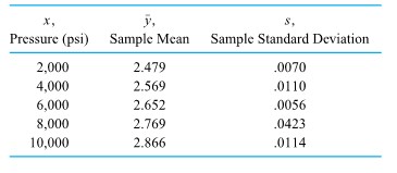
=\sigma^2\left(1-\frac{1}{n}-\frac{(x-\bar{x})^2}{\sum(x-\bar{x})^2}\right)")
^2}{\sum(x-\bar{x})^2}}}")
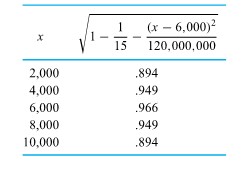
 times the appropriate entry of the second column of Table 7.2.1.3 then puts them all on equal footing, so to speak. Table 7.2.1.4 shows both the raw residuals
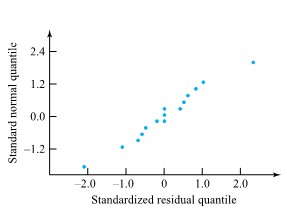

^2}")
^2}}}")
^2}}}")
 distribution. The standard arguments of Part 5 applied to expression 7.2.2.2 then show that
^2}}}")
 reference distribution. More importantly, under the simple linear re-
^2}}")
 / \mathrm{psi}")
 distribution in formula (7.2.2.5). That is, one can use endpoints

 / \mathrm{psi} \text { and } .0000526(\mathrm{~g} / \mathrm{cc}) / \mathrm{psi}")
 have mean responses differing by
  . One then simply multiplies endpoints of a confidence interval for
  \mathrm{g} / \mathrm{cc} \text { and } 2,000(.0000526) \mathrm{g} / \mathrm{cc}")

^2") is (i.e., the more spread out the
is (i.e., the more spread out the ![[a,b]](https://atu0g9ctah.execute-api.ca-central-1.amazonaws.com/latest/latex?latex=%5Ba%2Cb%5D&fg=000000&font=TeX&svg=1 "[a,b]") , taking
, taking  of them at
  and
and  produces the best possible precision for estimating the slope


^2}{\sum(x-\bar{x})^2}\right)")
^2") term appearing as a numerator in expression (7.2.3.3), the
term appearing as a numerator in expression (7.2.3.3), the ^2}{\sum(x-\bar{x})^2}}}")
^2}{\sum(x-\bar{x})^2}}}")

^2}{\sum(x-\bar{x})^2}}}")
^2}{\sum(x-\bar{x})^2}}")
") distribution. A one-sided interval is made in the usual way based on one endpoint from formula (7.2.3.7).
distribution. A one-sided interval is made in the usual way based on one endpoint from formula (7.2.3.7). \sqrt{\frac{1}{15}+\frac{(4,000-6,000)^2}{120,000,000}}=.0136 \mathrm{~g} / \mathrm{cc}")

 \sqrt{\frac{1}{15}+\frac{(5,000-6,000)^2}{120,000,000}}=.0118 \mathrm{~g} / \mathrm{cc}")

 \pm \sqrt{2 f} s_{\mathrm{LF}} \sqrt{\frac{1}{n}+\frac{(x-\bar{x})^2}{\sum(x-\bar{x})^2}}")
 probability assigned to the interval (0,
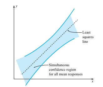
 and
and  degrees of freedom are involved in the use of formula (7.2.3.8), simultaneous limits of the form
} s_{\mathrm{LF}} \sqrt{\frac{1}{15}+\frac{(x-6,000)^2}{120,000,000}}")


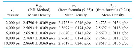
 is one additional observation, coming from the distribution of responses corresponding to a particular x ,and
 ^2}{\sum(x-\bar{x})^2}}}")
^2}{\sum(x-\bar{x})^2}}")
")
")
 is appropriately chosen (depending upon the data, p, x , and the desired confidence level).
 to
to ^2}{\sum(x-\bar{x})^2}}")
+A Q_z(\gamma) \sqrt{1+\frac{1}{2(n-2)}\left(\frac{Q_z^2(p)}{A^2}-Q_z^2(\gamma)\right)}}{1-\frac{Q_z^2(\gamma)}{2(n-2)}}")
 \sqrt{1+\frac{1}{15}+\frac{(4,000-6,000)^2}{120,000,000}}=2.5796-.0282")
^2}{120,000,000}}=.3162")
(1.645) \sqrt{1+\frac{1}{2(15-2)}\left(\frac{(1.282)^2}{(.3162)^2}-(1.645)^2\right)}}{1-\frac{(1.645)^2}{2(15-2)}}=2.149")

^2")


}")
 reference distribution, where large observed values of the test statistic constitute evidence against
  , which doesn’t depend on x . (Actually, a better interpretation of a test of hypothesis (7.2.5.2) is as a test of whether a linear term in x adds significantly to one’s ability to model the response y after accounting for an overall mean response.)
^2=.289366")
^2=.005153")

![[latex]\mathrm{H}_0: \beta_1=0](https://atu0g9ctah.execute-api.ca-central-1.amazonaws.com/latest/latex?latex=%5Blatex%5D%5Cmathrm%7BH%7D_0%3A%20%5Cbeta_1%3D0&fg=000000&font=TeX&svg=1 "[latex]\mathrm{H}_0: \beta_1=0") [/latex] is
[/latex] is![P\left[\text { an } F_{1,13} \text { random variable }>717\right]<.001](https://atu0g9ctah.execute-api.ca-central-1.amazonaws.com/latest/latex?latex=P%5Cleft%5B%5Ctext%20%7B%20an%20%7D%20F_%7B1%2C13%7D%20%5Ctext%20%7B%20random%20variable%20%7D%3E717%5Cright%5D%3C.001&fg=000000&font=TeX&svg=1 "P\left[\text { an } F_{1,13} \text { random variable }>717\right]<.001")
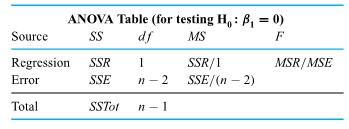
 =
=  and
and 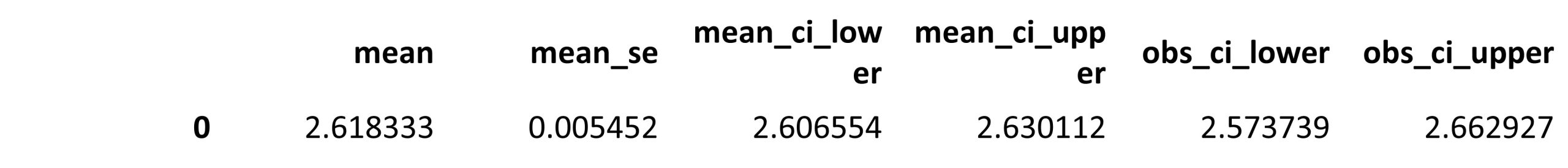
") data. Next comes the fitting of surfaces to data where a response
data. Next comes the fitting of surfaces to data where a response  . In both cases, the discussion will stress how useful
  and residual plotting are and will consider the question of choosing between possible fitted equations. Lastly, we include some additional practical cautions.


") is conceptually only slightly more difficult than the task of fitting equation (8.1.1.1). The function of
is conceptually only slightly more difficult than the task of fitting equation (8.1.1.1). The function of  variables
\right)^2 \\ & =\frac{g}{2}\left(\frac{x}{60}\right)^2+g\left(t_0-\frac{1}{60}\right)\left(\frac{x}{60}\right)+\frac{g}{2}\left(t_0-\frac{1}{60}\right)^2 \\ & =\frac{g}{7200} x^2+\frac{g}{60}\left(t_0-\frac{1}{60}\right) x+\frac{g}{2}\left(t_0-\frac{1}{60}\right)^2 \end{aligned}")
") equal to 0 , the set of normal equations is obtained for this least squares problem, generalizing the pair of equations from Part 7.1. There are
equal to 0 , the set of normal equations is obtained for this least squares problem, generalizing the pair of equations from Part 7.1. There are  . And typically, they can be solved simultaneously for a single set of values,
  , minimizing
  version of equation (8.1.1.2)

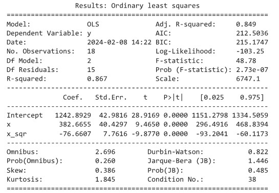


^{2}-\sum\left(y_{i}-\hat{y}_{i}\right)^{2}}{\sum\left(y_{i}-\bar{y}\right)^{2}}")

 produces
  . So
. So  of the raw variability in compressive strength is accounted for using the fitted quadratic. The sample correlation between the observed strengths
  and fitted strengths
  is
is  .
. , and
, and  for each
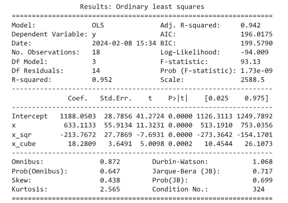

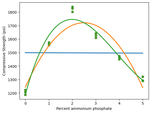
 . Unfortunately, this is where compressive strength is greatest—precisely the area of greatest practical interest.
 intervals beginning at some unknown time
  (less than

 ) will be
  . This is in fact how the value
  , quoted in Section 1.4, was obtained.
 ) with
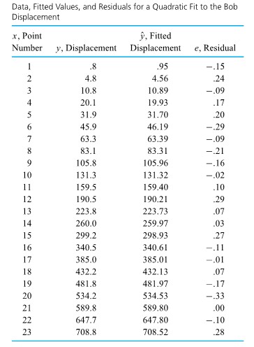

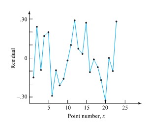
 current waveform is one matter to be addressed.
 . But having identified the region around
  ammonium phosphate. It is quite possible that a quadratic fit only to data with
  would be both adequate and helpful as a summarization of the follow-up data.
 in equation (8.1.1.2) can be replaced by any (known) functions of
 \approx \ln (\alpha)+\beta \ln (x)")
") that is linear in the parameters
that is linear in the parameters ") and
and ") . So, presented with a set of
. So, presented with a set of  (and thus
 \right)") and
and  .
.
") for some function
for some function ") .
.=\ln (y)") . To illustrate its use in the present context, normal plots of both discovery times and log discovery times are given in Figure 8.1.2.2. These plots indicate that Elliot, Kibby, and Meyer could not have reasonably applied standard methods of inference to the discovery times, but they could have used the methods with log discovery times. The second normal plot is far more linear than the first.
. To illustrate its use in the present context, normal plots of both discovery times and log discovery times are given in Figure 8.1.2.2. These plots indicate that Elliot, Kibby, and Meyer could not have reasonably applied standard methods of inference to the discovery times, but they could have used the methods with log discovery times. The second normal plot is far more linear than the first.
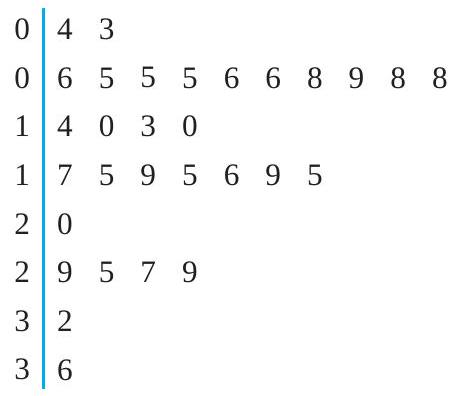

=(y-\gamma)^{\alpha}")
 , transformation (8.1.2.1) tends to lengthen the right tail of a distribution for
  , the transformation tends to shorten the right tail of a distribution for
 =\ln (y-\gamma)")
 power of the response mean, try transformation (4.34) with
  .
.
") versus
versus ") and see if there is approximate linearity. If so, a slope of roughly 1 makes (1) appropriate, while a slope of
and see if there is approximate linearity. If so, a slope of roughly 1 makes (1) appropriate, while a slope of  signals what version of (2) might be helpful.

") data points are pictured in three dimensions, along with a possible fitted surface of the form (8.1.3.1). To fit a surface defined by equation (8.1.3.1) to a set of
data points are pictured in three dimensions, along with a possible fitted surface of the form (8.1.3.1). To fit a surface defined by equation (8.1.3.1) to a set of ") via least squares, the function of
via least squares, the function of =\sum_{i=1}^{n}\left(y_{i}-\hat{y}_{i}\right)^{2}=\sum_{i=1}^{n}\left(y_{i}-\left(\beta_{0}+\beta_{1} x_{1 i}+\cdots+\beta_{k} x_{k i}\right)\right)^{2}")
") .
.
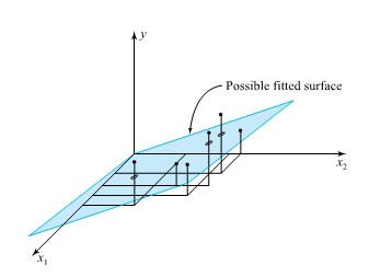
 , is the percent circulating minus 50 times 10 . The response variable,
  , and
, and 
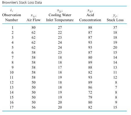

 . The coefficients in this equation can be thought of as rates of change of stack loss with respect to the individual variables
  can be interpreted as the increase in stack loss
  is positive indicates that the higher the rate at which the plant is run, the larger
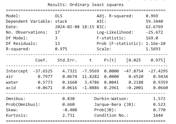
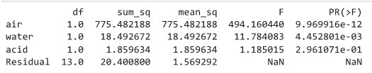
") data to “see” how an equation is fitting. About all that we can do at this point is to (1) offer the broad advice that what is wanted is the simplest equation that adequately fits the data and then (2) provide examples of how
data to “see” how an equation is fitting. About all that we can do at this point is to (1) offer the broad advice that what is wanted is the simplest equation that adequately fits the data and then (2) provide examples of how  of the raw variability in stack loss. Inclusion of
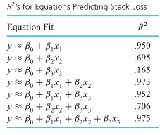
 \approx 1.5")
 the fitted rate of change in
 , and
, and  in equation (8.1.3.3) differ somewhat from the corresponding values in equation (8.1.3.2). That is, equation (8.1.3.3) was not obtained from equation
 will change depending on which
  term to the fitted equation (8.1.3.3).

 and residuals that show even less of a pattern than those for the fitted equation (8.1.3.3). In particular, the hint of curvature on the plot of residuals versus
 ![x_{3}[latex] and equation (8.1.3.4) does not.</div> </div> <div>.</div> <div> [caption id="attachment_450" align="aligncenter" width="546"]<img class="wp-image-450 size-full" src="https://ecampusontario.pressbooks.pub/app/uploads/sites/4023/2024/02/120_1.jpg" alt="" width="546" height="454" /> Figure 8.1.3.2 Plots of residuals from a two-variable equation fit to the stack loss data ( yˆ =−42.00 − .78x1 + .57x2 )[/caption] . Equation (8.1.3.4) is somewhat more complicated than equation (8.1.3.3). But because it still really only involves two different input [latex]x](https://atu0g9ctah.execute-api.ca-central-1.amazonaws.com/latest/latex?latex=x_%7B3%7D%5Blatex%5D%20and%20equation%20%288.1.3.4%29%20does%20not.%3C%2Fdiv%3E%20%20%3C%2Fdiv%3E%20%20%3Cdiv%3E.%3C%2Fdiv%3E%20%20%3Cdiv%3E%20%20%20%20%5Bcaption%20id%3D%22attachment_450%22%20align%3D%22aligncenter%22%20width%3D%22546%22%5D%3Cimg%20class%3D%22wp-image-450%20size-full%22%20src%3D%22https%3A%2F%2Fecampusontario.pressbooks.pub%2Fapp%2Fuploads%2Fsites%2F4023%2F2024%2F02%2F120_1.jpg%22%20alt%3D%22%22%20width%3D%22546%22%20height%3D%22454%22%20%2F%3E%20Figure%208.1.3.2%20Plots%20of%20residuals%20from%20a%20two-variable%20equation%20%EF%AC%81t%20to%20the%20stack%20loss%20data%20%28%20y%CB%86%20%3D%E2%88%9242.00%20%E2%88%92%20.78x1%20%2B%20.57x2%20%29%5B%2Fcaption%5D%20%20%20%20.%20%20%20%20Equation%20%288.1.3.4%29%20is%20somewhat%20more%20complicated%20than%20equation%20%288.1.3.3%29.%20But%20because%20it%20still%20really%20only%20involves%20two%20different%20input%20%5Blatex%5Dx&fg=000000&font=TeX&svg=1 "x_{3}[latex] and equation (8.1.3.4) does not.</div> </div> <div>.</div> <div> [caption id=\"attachment_450\" align=\"aligncenter\" width=\"546\"]<img class=\"wp-image-450 size-full\" src=\"https://ecampusontario.pressbooks.pub/app/uploads/sites/4023/2024/02/120_1.jpg\" alt=\"\" width=\"546\" height=\"454\" /> Figure 8.1.3.2 Plots of residuals from a two-variable equation fit to the stack loss data ( yˆ =−42.00 − .78x1 + .57x2 )[/caption] . Equation (8.1.3.4) is somewhat more complicated than equation (8.1.3.3). But because it still really only involves two different input [latex]x") 's and also eliminates the slight pattern seen on the plot of residuals for equation (8.1.3.3) versus
's and also eliminates the slight pattern seen on the plot of residuals for equation (8.1.3.3) versus 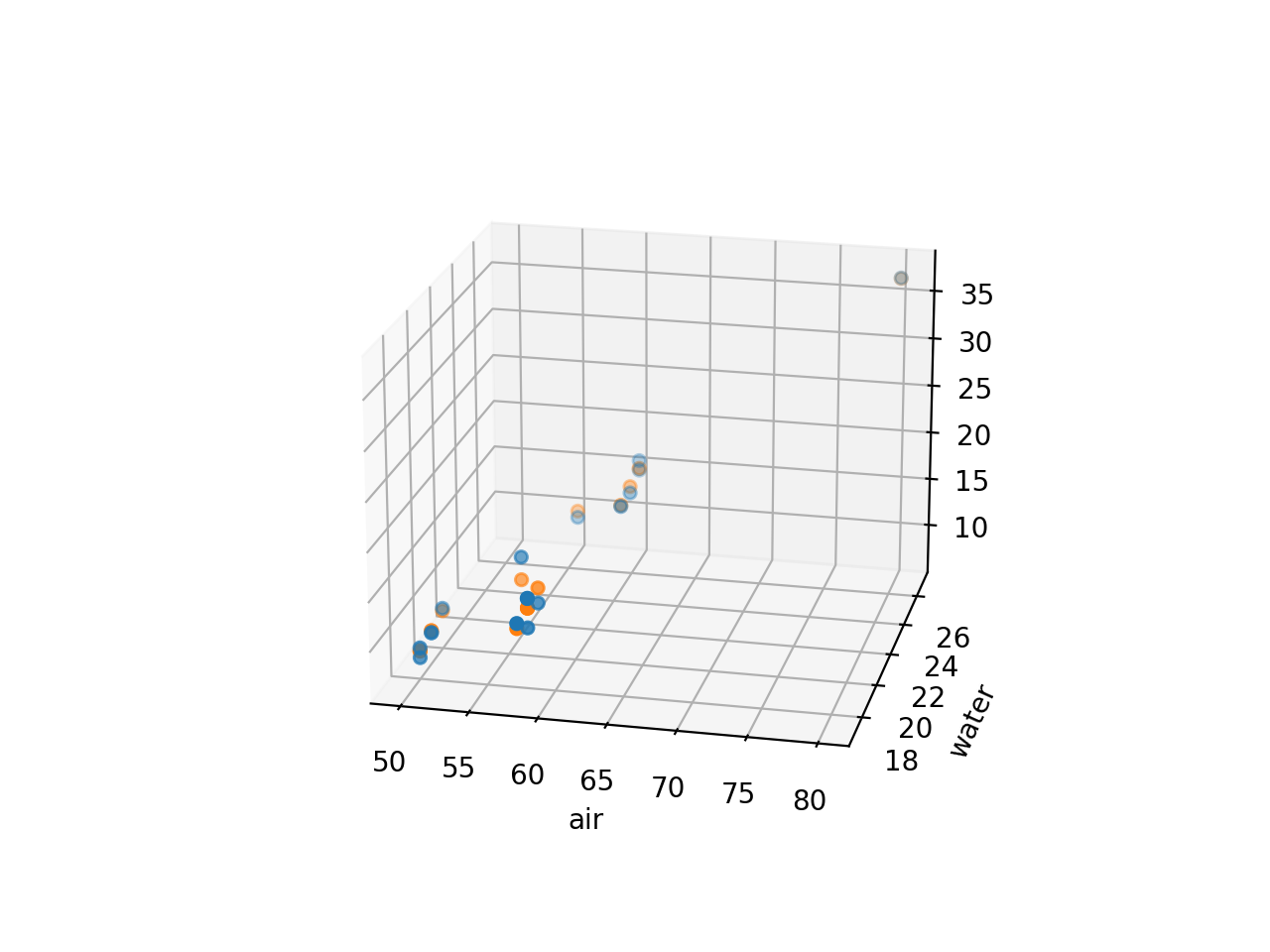
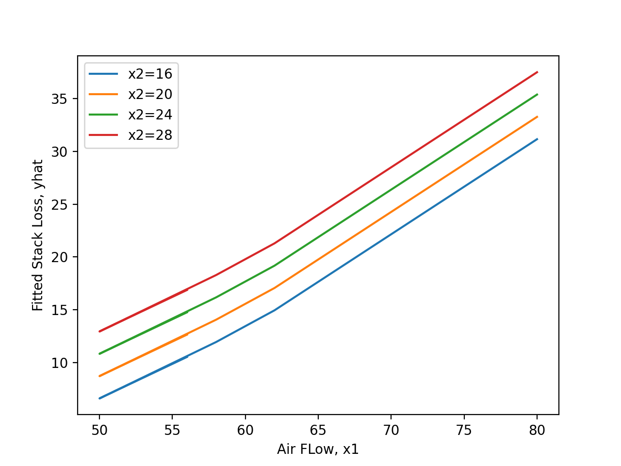
 canard placement in inches above the plane defined by the main wing
 tail placement in inches above the plane defined by the main wing


 and the fitted relationship

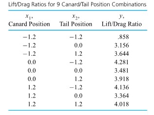
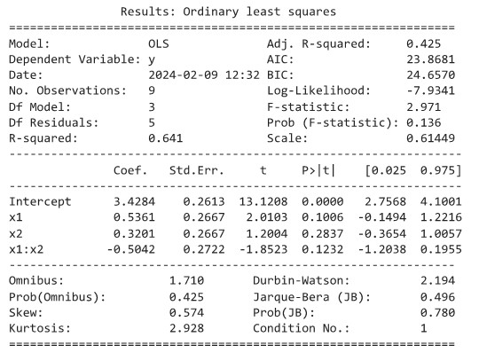

 products were created and
 ") surface would be parallel for various
surface would be parallel for various 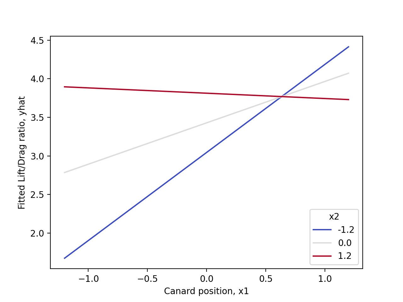

 and generally random-looking residuals. It can be verified by plotting
") pairs for the data in Table 8.1.3. It shows that by most qualitative standards, observation 1 in Table 8.1.3. is unusual or outlying.
pairs for the data in Table 8.1.3. It shows that by most qualitative standards, observation 1 in Table 8.1.3. is unusual or outlying.

 are obtained. Using equation (8.1.61) as a description of stack loss and limiting attention to
  version of a polynomial through each of these points. But in most physical problems, such a curve would do a much worse job of predicting
  codes for each category except the referent group (which is omitted). Several examples of categorical variables that can be represented in multiple regression with dummy variables include:
 , control
 ") for the “dummied” group. This is illustrated in Figure 8.2.1.1. In this illustration, the value of
for the “dummied” group. This is illustrated in Figure 8.2.1.1. In this illustration, the value of  (a continuous variable) and
  (a dummy variable). When
  , the value of
 .
.
 .
.
 women,
  men
men ") could be interacted with ideology
could be interacted with ideology  strong liberal,
  strong conservative) to predict levels of perceived risk of climate change (
  no risk,
  extreme risk). If your hypothesized interaction was correct, you would observe the kind of pattern as shown in Figure 8.2.1.2.
 . Using matrix notation, the same equation can be expressed in a more compact and (believe it or not!) intuitive form:
  .
.
 . In the following example,
 ![A_{m, n}=\left[\begin{array}{cccc}a_{1,1} & a_{1,2} & \cdots & a_{1, n} \\ a_{2,1} & a_{2,2} & \cdots & a_{2, n} \\ \vdots & \vdots & \ddots & \vdots \\ a_{m, 1} & a_{m, 2} & \cdots & a_{m, n}\end{array}\right]](https://atu0g9ctah.execute-api.ca-central-1.amazonaws.com/latest/latex?latex=A_%7Bm%2C%20n%7D%3D%5Cleft%5B%5Cbegin%7Barray%7D%7Bcccc%7Da_%7B1%2C1%7D%20%26%20a_%7B1%2C2%7D%20%26%20%5Ccdots%20%26%20a_%7B1%2C%20n%7D%20%5C%5C%20a_%7B2%2C1%7D%20%26%20a_%7B2%2C2%7D%20%26%20%5Ccdots%20%26%20a_%7B2%2C%20n%7D%20%5C%5C%20%5Cvdots%20%26%20%5Cvdots%20%26%20%5Cddots%20%26%20%5Cvdots%20%5C%5C%20a_%7Bm%2C%201%7D%20%26%20a_%7Bm%2C%202%7D%20%26%20%5Ccdots%20%26%20a_%7Bm%2C%20n%7D%5Cend%7Barray%7D%5Cright%5D&fg=000000&font=TeX&svg=1 "A_{m, n}=\left[\begin{array}{cccc}a_{1,1} & a_{1,2} & \cdots & a_{1, n} \\ a_{2,1} & a_{2,2} & \cdots & a_{2, n} \\ \vdots & \vdots & \ddots & \vdots \\ a_{m, 1} & a_{m, 2} & \cdots & a_{m, n}\end{array}\right]")
![A=\left[\begin{array}{ccc}10 & 5 & 8 \\ -12 & 1 & 0\end{array}\right]](https://atu0g9ctah.execute-api.ca-central-1.amazonaws.com/latest/latex?latex=A%3D%5Cleft%5B%5Cbegin%7Barray%7D%7Bccc%7D10%20%26%205%20%26%208%20%5C%5C%20-12%20%26%201%20%26%200%5Cend%7Barray%7D%5Cright%5D&fg=000000&font=TeX&svg=1 "A=\left[\begin{array}{ccc}10 & 5 & 8 \\ -12 & 1 & 0\end{array}\right]")
 and
and  .
.
![A=\left[\begin{array}{c}6 \\ -1 \\ 8 \\ 11\end{array}\right]](https://atu0g9ctah.execute-api.ca-central-1.amazonaws.com/latest/latex?latex=A%3D%5Cleft%5B%5Cbegin%7Barray%7D%7Bc%7D6%20%5C%5C%20-1%20%5C%5C%208%20%5C%5C%2011%5Cend%7Barray%7D%5Cright%5D&fg=000000&font=TeX&svg=1 "A=\left[\begin{array}{c}6 \\ -1 \\ 8 \\ 11\end{array}\right]")
![A=\left[\begin{array}{llll}1 & 2 & 8 & 7\end{array}\right]](https://atu0g9ctah.execute-api.ca-central-1.amazonaws.com/latest/latex?latex=A%3D%5Cleft%5B%5Cbegin%7Barray%7D%7Bllll%7D1%20%26%202%20%26%208%20%26%207%5Cend%7Barray%7D%5Cright%5D&fg=000000&font=TeX&svg=1 "A=\left[\begin{array}{llll}1 & 2 & 8 & 7\end{array}\right]")

 Surface Roughness and
  Water Contact Angle):
} \\ 1 & {R+} &{W-} &{(R+W-)} \\ 1 & {R-} & {W+} &{(R-W+)} \\ 1 & {R+} & {W+} &{(R+W+)}\\\end{bmatrix}\begin{bmatrix} b_0 \\ b_R \\ b_W \\ b_{RW}\\\end{bmatrix} +\begin{bmatrix} e_0 \\ e_R \\ e_W \\ e_{RW}\\\end{bmatrix}")

}") has only non-zero values on the diagonal. Therefore:
has only non-zero values on the diagonal. Therefore:^-1(X^Ty)}")


^-1(X^Ty)}=\begin{bmatrix} (1/4) & 0 & 0 & 0 \\ 0 & (1/4) &0 &0 \\ 0 & 0 & (1/4) &0 \\ 0 & 0 & 0 &(1/4)\\\end{bmatrix}\begin{bmatrix} 239 \\ 65 \\ 37 \\ -13 \\\end{bmatrix}=\begin{bmatrix} 59.75\\ 16.25 \\ 9.25 \\ -3.25 \\\end{bmatrix}")
 , can be interpreted the same manner as before. For example, a 1 unit increase in roughness corresponds to a 16.25 a.u. increase in cell viability. This method also explains why we had to divide by 2 a second time earlier since this coefficient represents the effect of changing surface roughness from 0 to 1 or from 325 to 350 µm. The same is true for water contact angle as well. Finally, the interaction term decreases cell viability by 3.25 units if both surface roughness and water contact angle are at the same level (both high or both low).
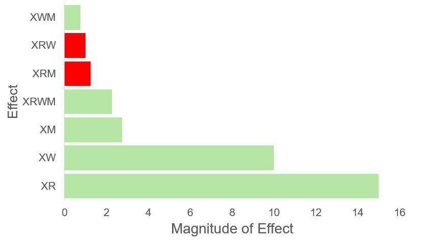
 Material Coefficient):

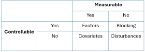
 ABC interaction effect + disturbance.
 ) will now be confounded with an interaction term.


 is confounded with the interaction of
  , since the model coefficient is the sum of these two effects. From this we can state that
  is an alias for
  , that
  is an alias for
  and that the intercept is aliased with the 3-factor interaction


 . Factors
  . This is called the generating relation.
 is a column of ones.

 . Take the generating relation and multiply both sides by Through some algebra we can also establish the defining relation of
  by the following equation:
 which tells us that
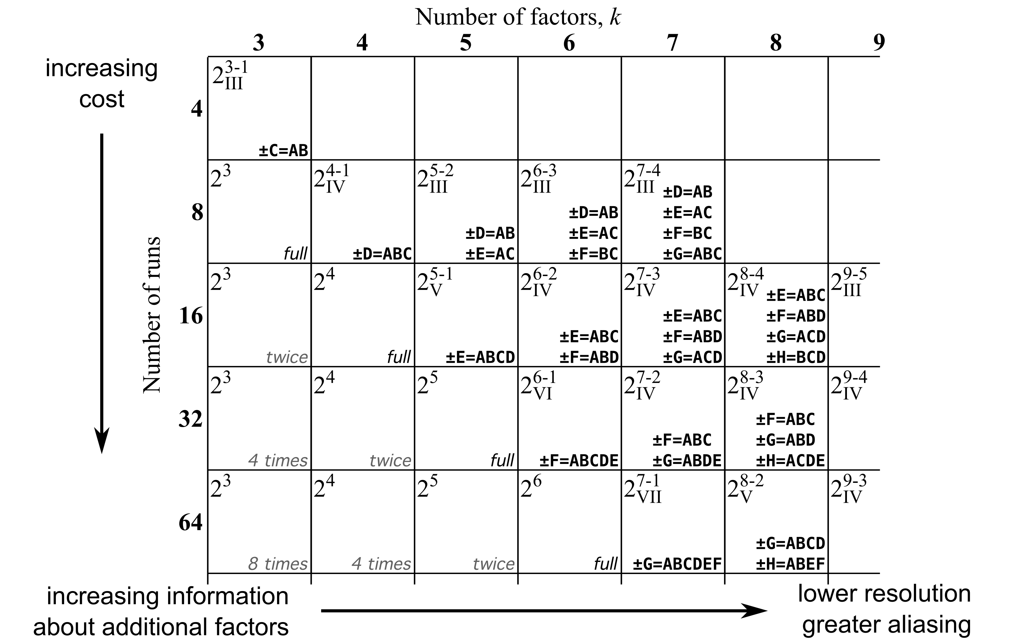
 . Here the roman numerals
  indicate the level of resolution for the design. This number is equivalent to the number of factors present in the defining relation. Since


![</span>\begin{split}\hat{y} &= b_0 + b_T x_T + b_S x_S + b_{TS} x_T x_S \\ \hat{y} &= 389.8 + 55 x_T + 134 x_S - 3.50 x_T x_S\end{split}</div> where <span class="math notranslate nohighlight">[latex]x_T = \dfrac{x_{T,\text{actual}} - \text{center}_T}{\Delta_T/2}](https://atu0g9ctah.execute-api.ca-central-1.amazonaws.com/latest/latex?latex=%3C%2Fspan%3E%5Cbegin%7Bsplit%7D%5Chat%7By%7D%20%26%3D%20b_0%20%2B%20b_T%20x_T%20%2B%20b_S%20x_S%20%2B%20b_%7BTS%7D%20x_T%20x_S%20%5C%5C%20%20%5Chat%7By%7D%20%26%3D%20389.8%20%2B%2055%20x_T%20%2B%20134%20x_S%20-%203.50%20x_T%20x_S%5Cend%7Bsplit%7D%3C%2Fdiv%3E%20%20where%20%3Cspan%20class%3D%22math%20notranslate%20nohighlight%22%3E%5Blatex%5Dx_T%20%3D%20%5Cdfrac%7Bx_%7BT%2C%5Ctext%7Bactual%7D%7D%20-%20%5Ctext%7Bcenter%7D_T%7D%7B%5CDelta_T%2F2%7D&fg=000000&font=TeX&svg=1 "</span>\begin{split}\hat{y} &= b_0 + b_T x_T + b_S x_S + b_{TS} x_T x_S \\ \hat{y} &= 389.8 + 55 x_T + 134 x_S - 3.50 x_T x_S\end{split}</div> where <span class=\"math notranslate nohighlight\">[latex]x_T = \dfrac{x_{T,\text{actual}} - \text{center}_T}{\Delta_T/2}")


K")
g/L")


 = (0,0)")


 .
.
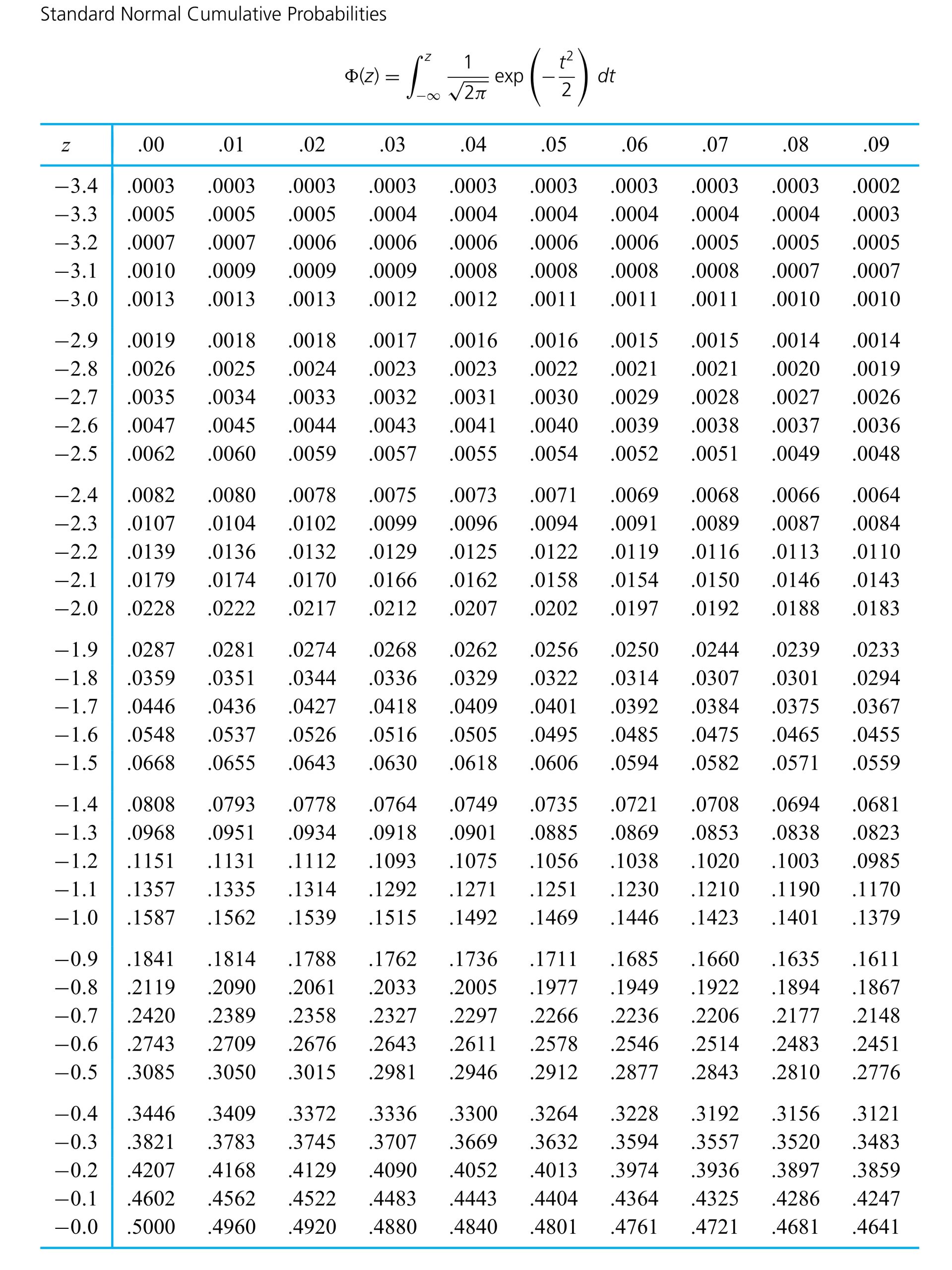
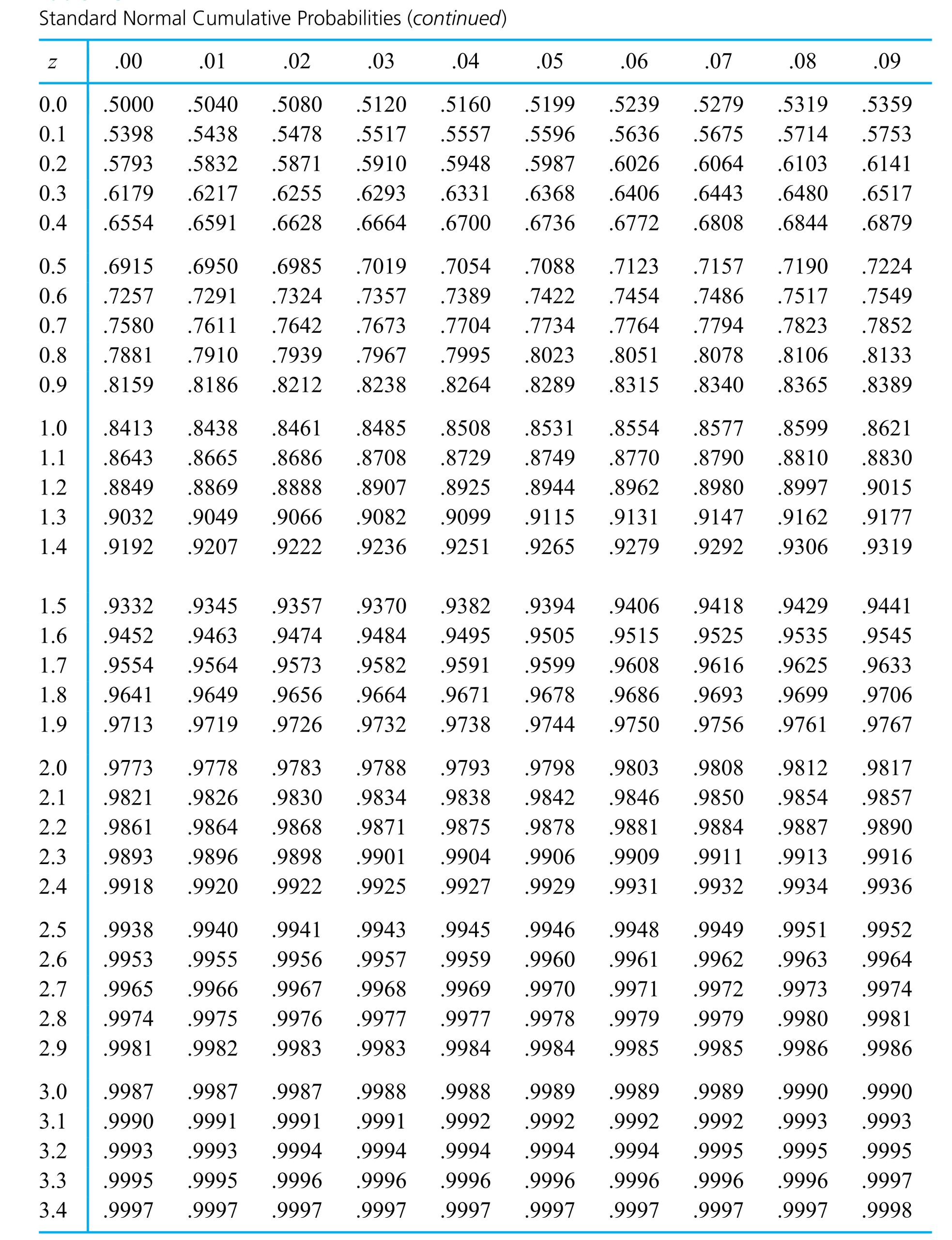

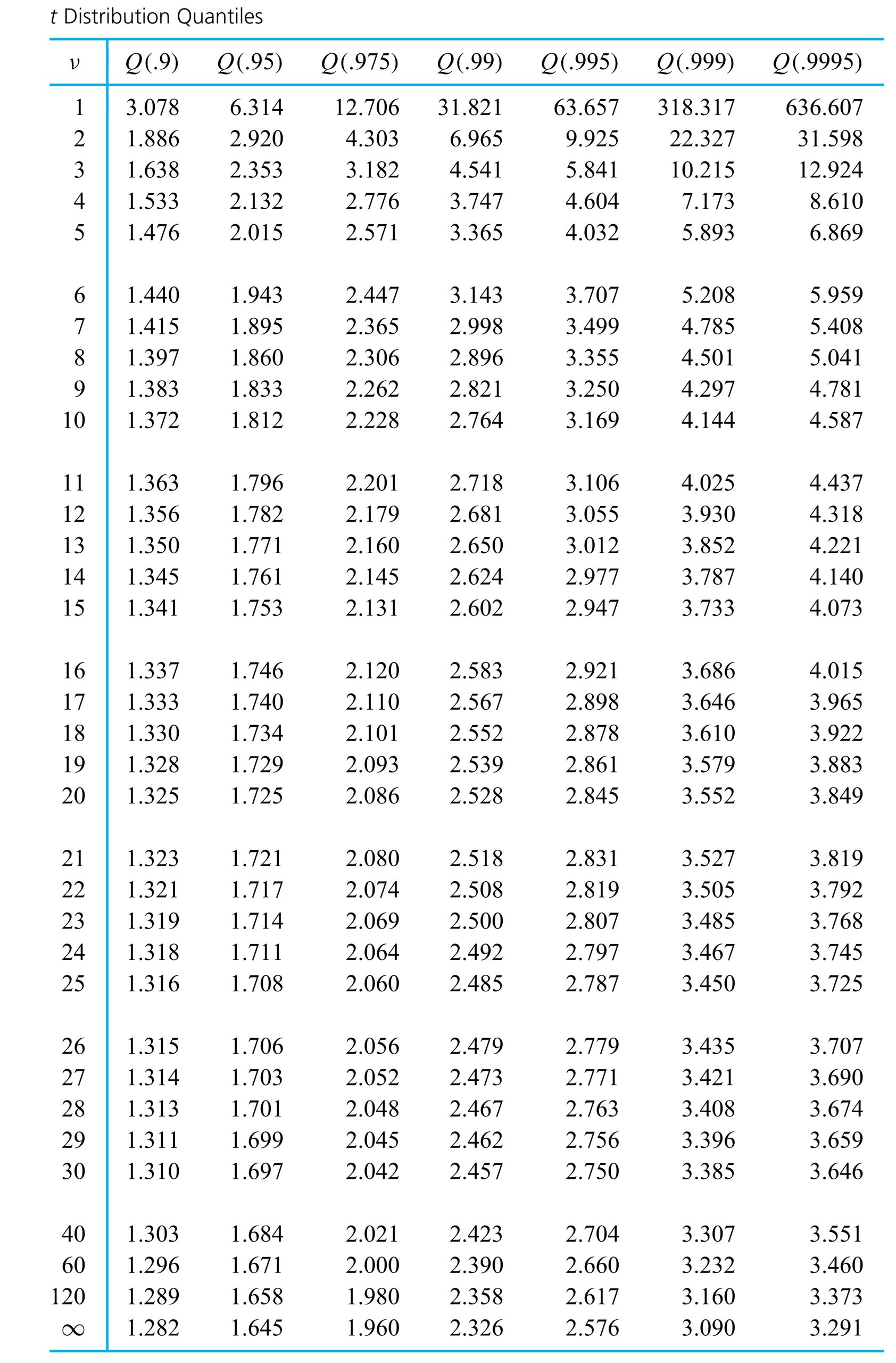

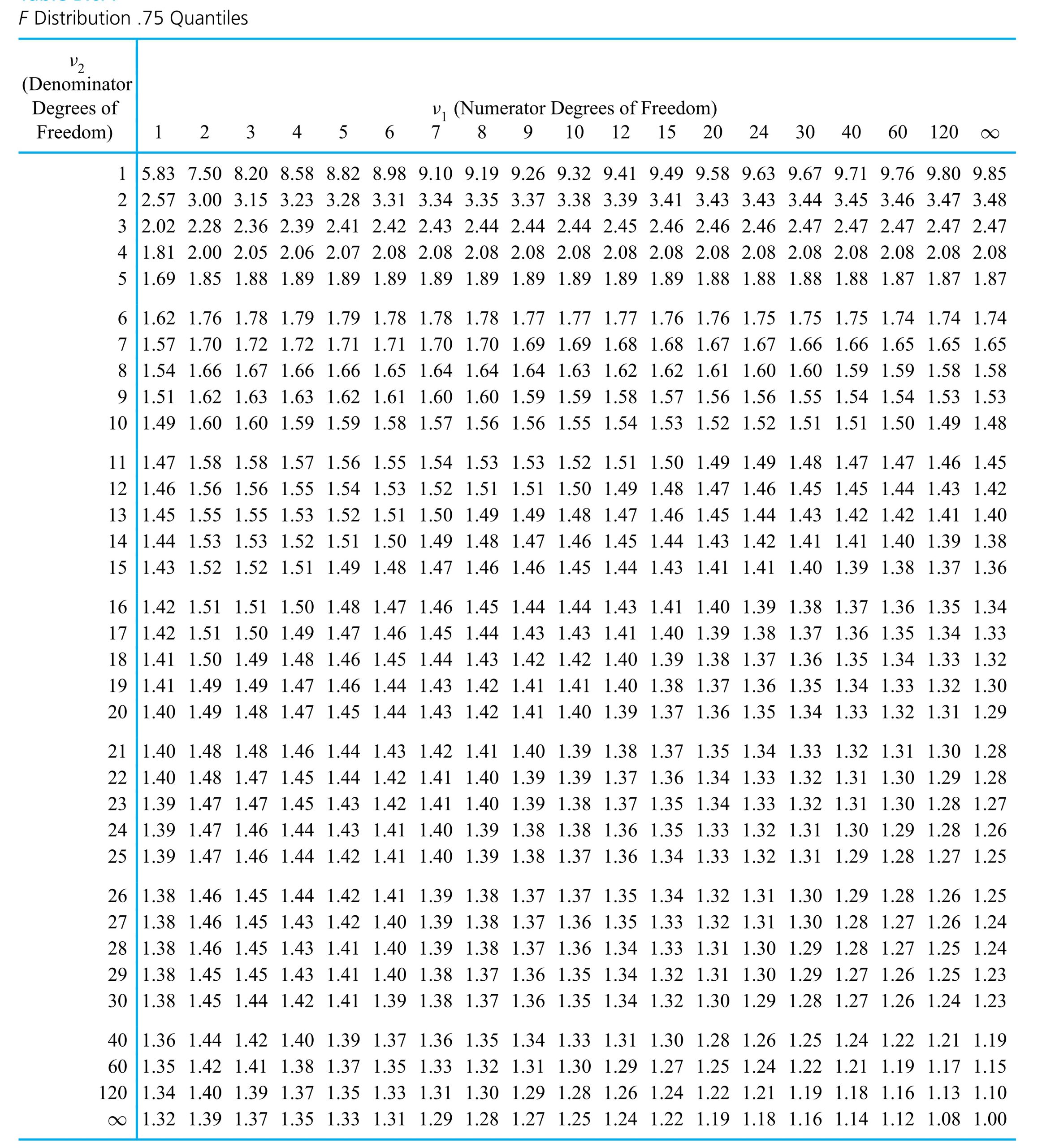

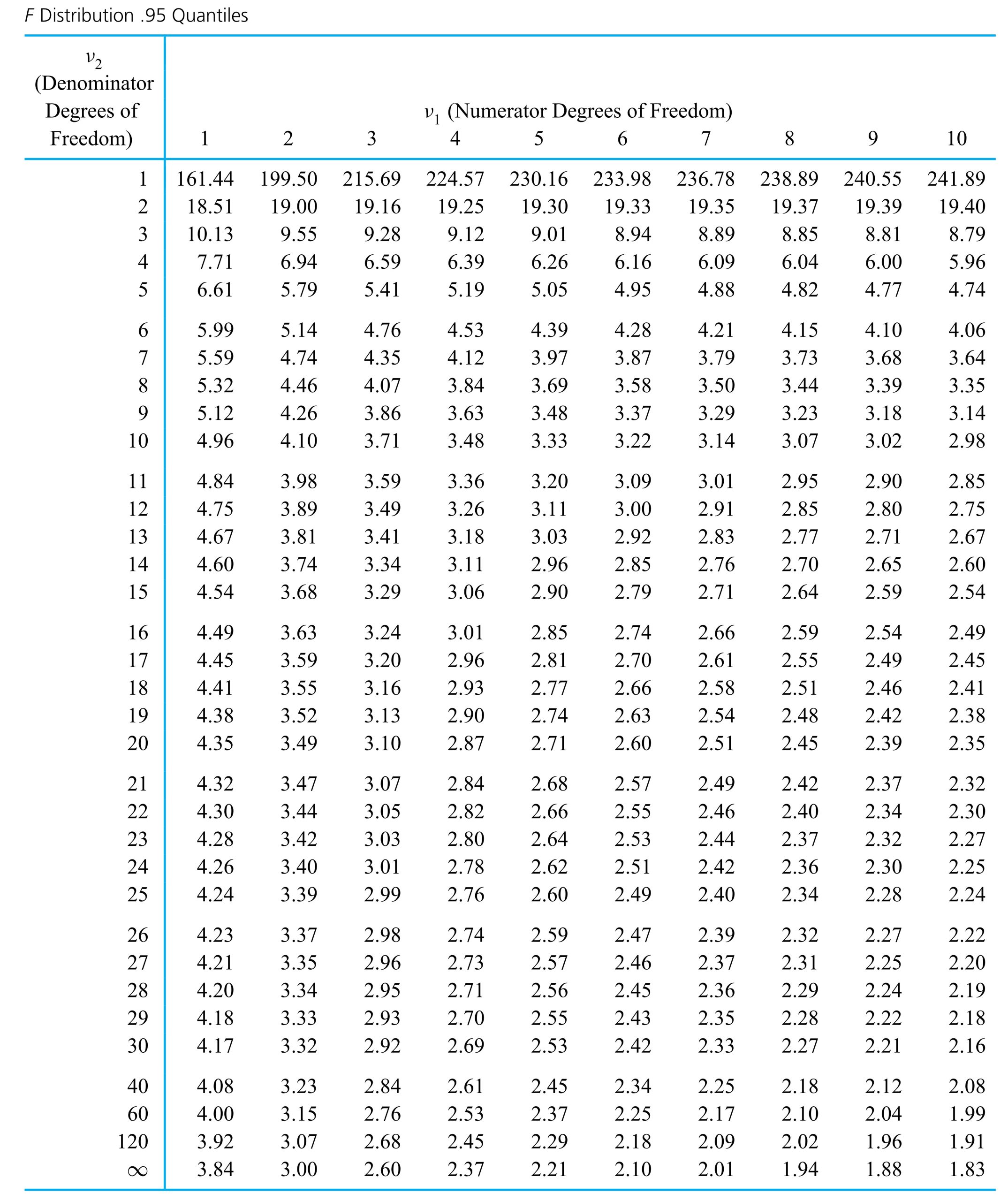
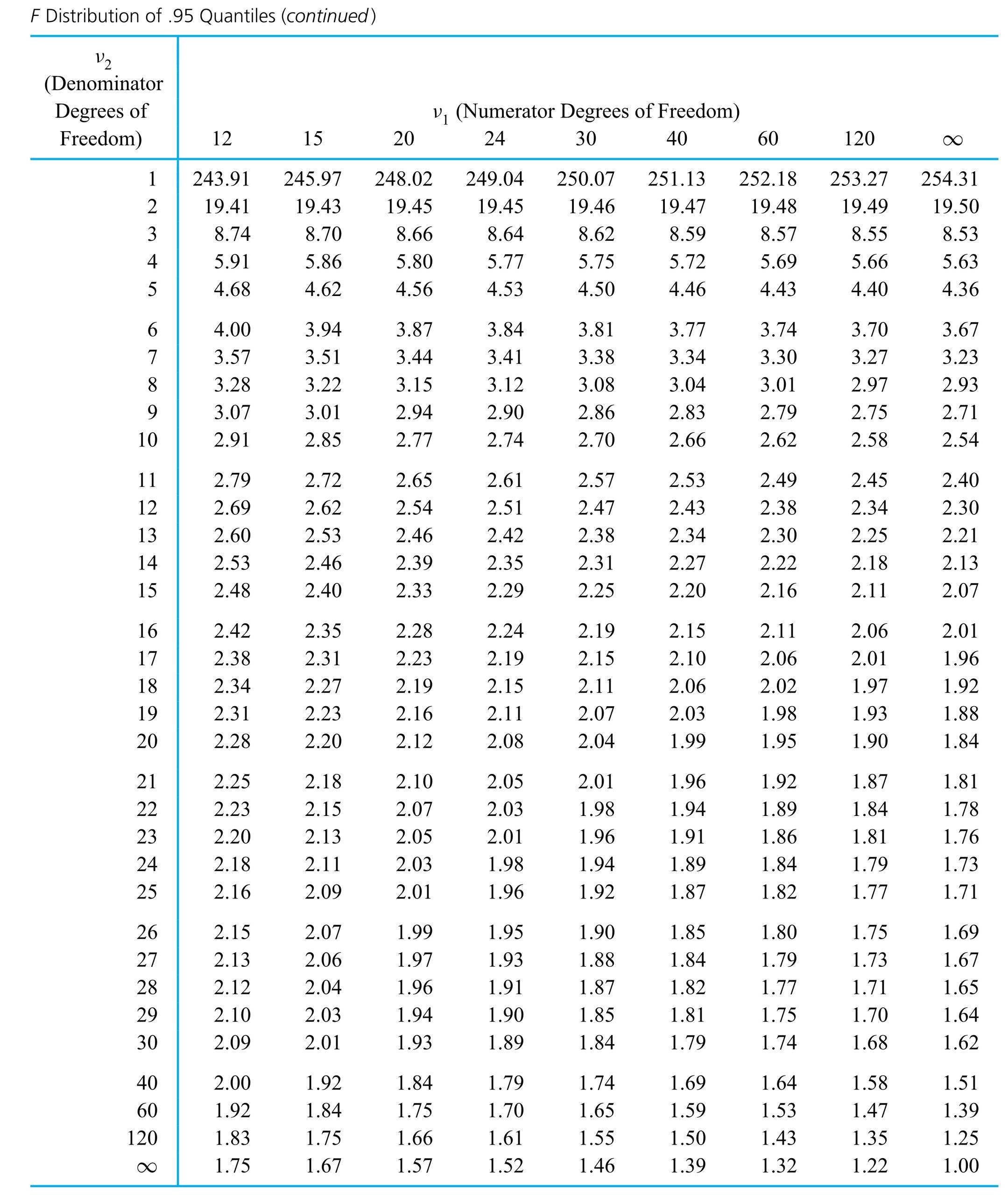
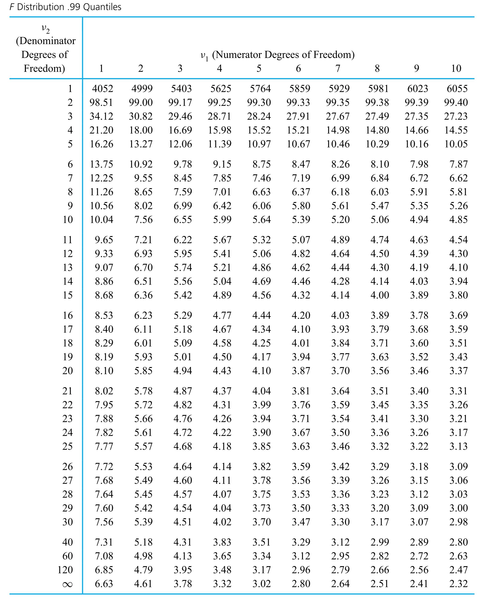
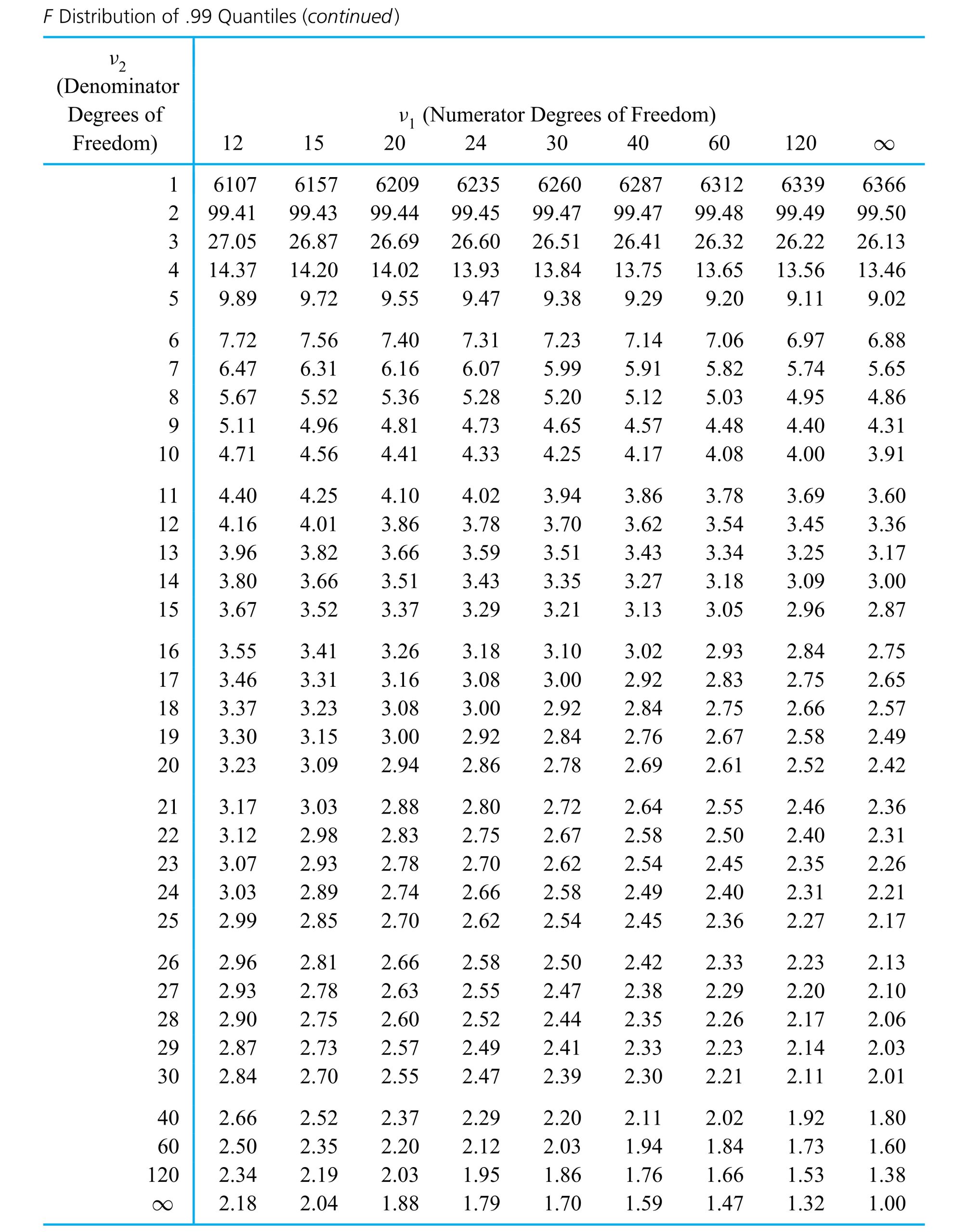

