Alex Hass
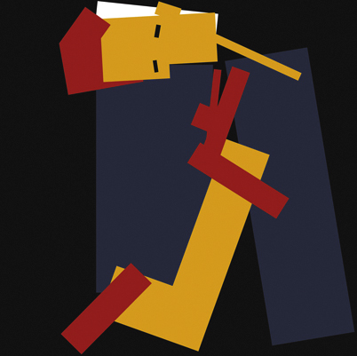
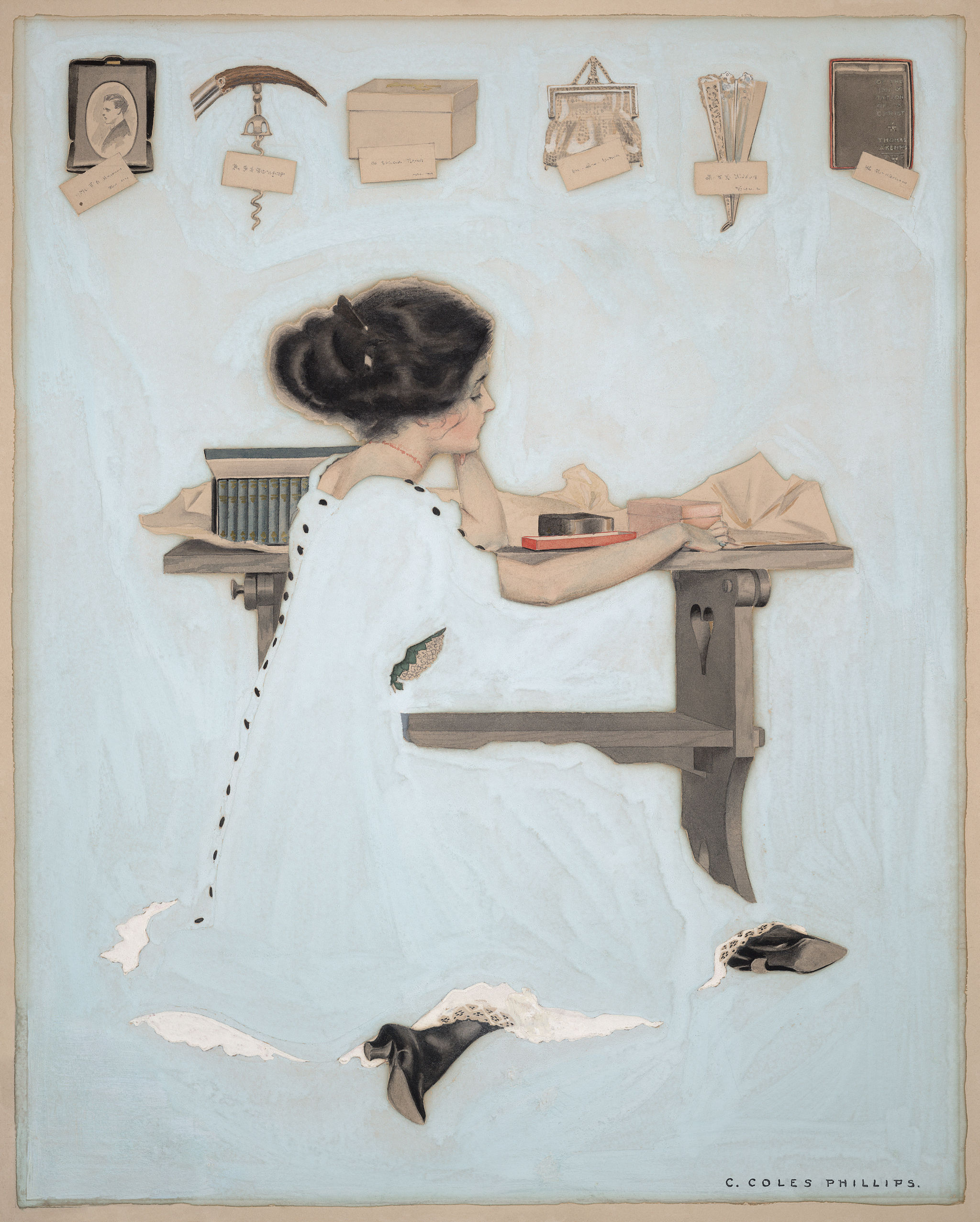
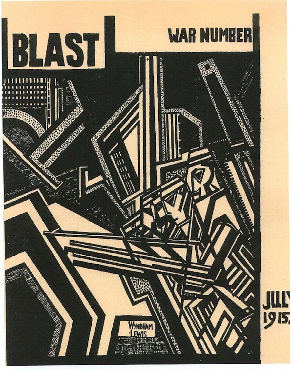
Point, line, and plane are the building blocks of design. From these elements, designers create images, icons, textures, patterns, diagrams, animations, and typographic systems. (Lupton & Phillips, 2014, p. 13)

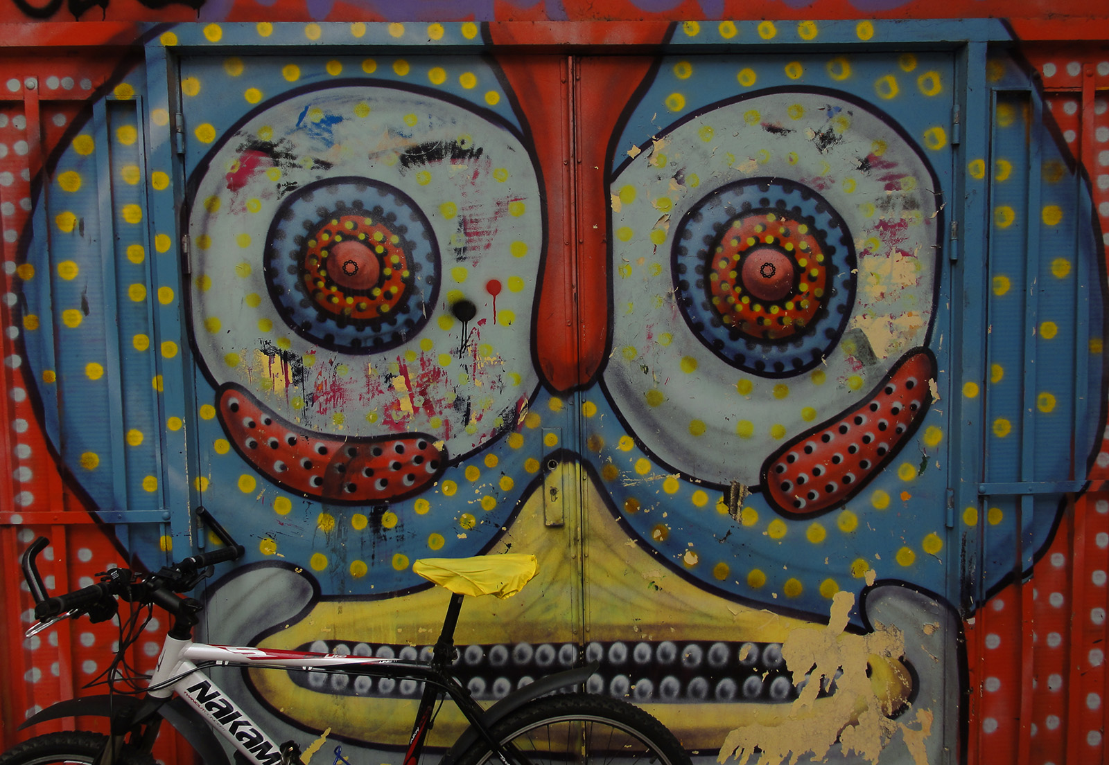
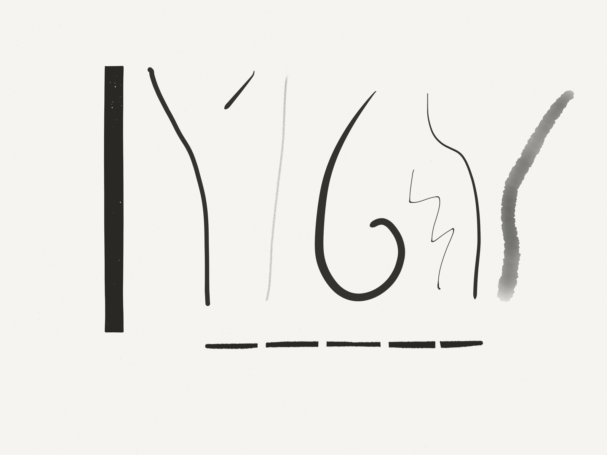
Figure 3.1 Design using points, lines, planes
Point
A point is a precise position or location on a surface. In purely mathematical terms, a point marks a set of coordinates — it has no mass at all. In this objective definition, a point is essentially a place. Visually, a point is a dot and therefore the basic building block of every variation of line, texture, and plane.
Subjectively, the term point has a lot of power. Point can direct attention, be the focus of attention, create emphasis, and cut through veiled information. The compositional term focal point brings the objective and subjective together by being the first place the eye is drawn to in a composition and usually contains the most important piece of visual communication.
Line
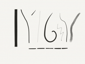
Figure 3.2 Lines (by Ken Jeffery)
A line is the second most basic element of design — a line is a collection of points arranged in a linear manner (see Figure 3.2). A line connects two points, or traces the path of a movement. A line can be actual or implied — for instance, as a composition of two or more objects in a row. Lines in nature act as defining planes — examples are a horizon or the silhouette of a forest against the sky. Long straight lines do not often occur in nature, and therefore when they are present, they tend to dominate the landscape visually. Natural settings are usually parsed by the eye into shorter sequences of curved or straight lines and organic shapes.
When made by the hand, a line is created by the stroke of a pencil, pen, brush, or any mark-making tool. These lines can be thin or wide, and are expressive and distinct, reflecting the texture of the tool used to make them. Lines can create a plane (a shape) by being clustered together or by defining a shape. If the line is thickened, it changes and becomes a plane. When lines are made digitally, they can acquire many of the same qualities possessed by hand-drawn lines through the application of effects.
Plane
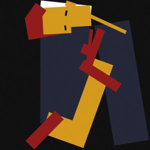
Figure 3.3 Planes
Like lines, planes (shapes) can be organically made or they can be geometric, as in the example shown in Figure 3.3. A plane is a flat surface that has defined borders. “A line closes to become a shape, a bounded plane” (Lupton & Phillips, 2014, p. 38). Planes are excellent compositional tools for clustering visual elements into visual fields. A plane can also act as a separating device and allow the viewer to see that one section of information is not linked to another.
In design software, a vector graphic is a shape created by defining its parameters with a line, and then filling it with a solid or textured fill. Grids help to create and define typographic planes that float or interact with solid planes of image, texture, or colour. In the physical world, everything is composed of shapes that are either two- or three-dimensional. How you choose to organize and arrange the planes in your photograph, your illustration, or your design will structure the composition and determine not only how the elements intersect with one another but also how the viewer interacts with the composition.
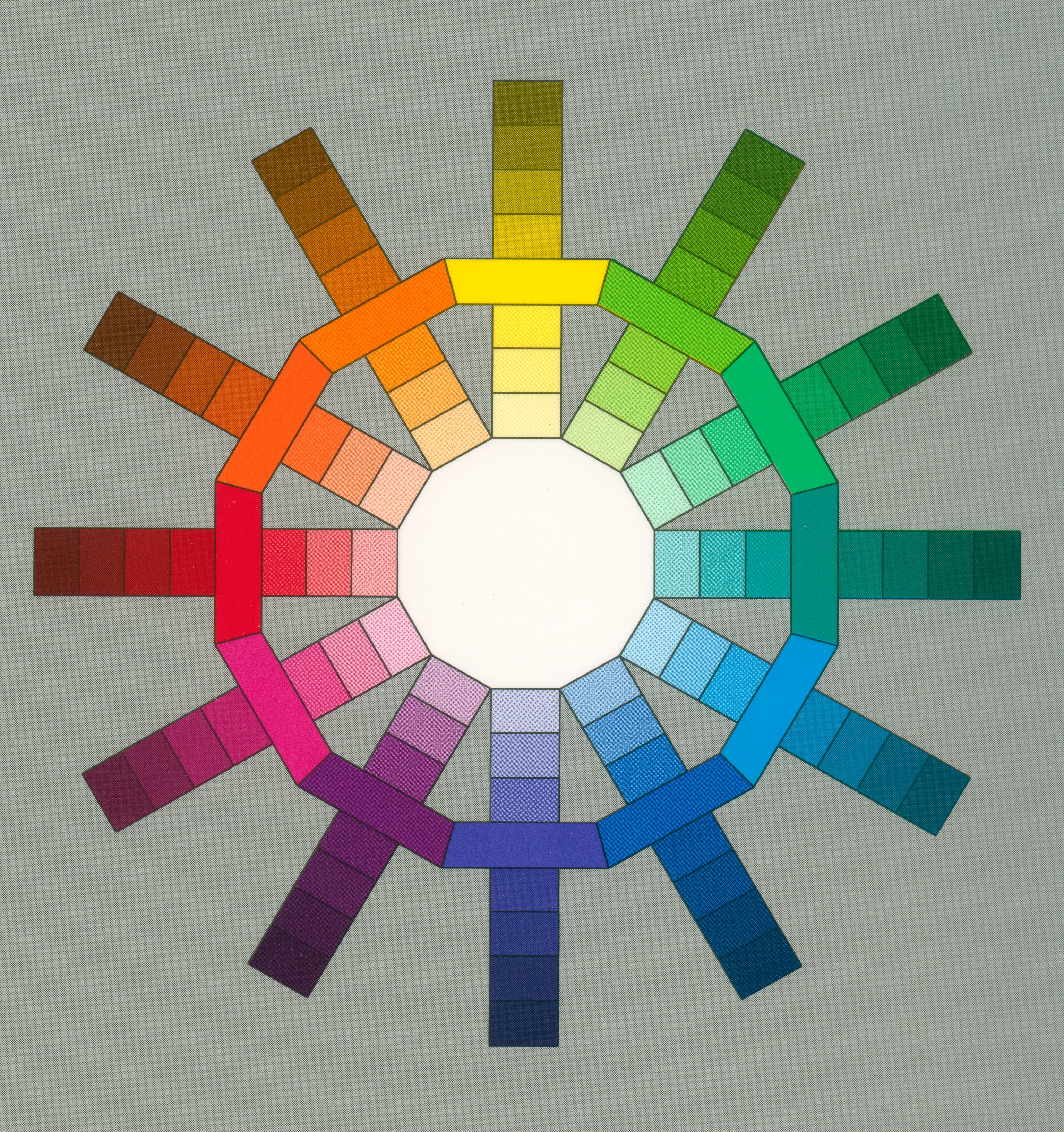
Colour

Figure 3.4 Colours
Graphic design has evolved over the last two centuries from a craft that designed text and images primarily in black and white for books and broadsheets, to a craft that works with full colour in analog and digital media and on every kind of substrate. Controlling and effectively using colour to support communication is now more important than it has ever been. Both media and advertising have become very sophisticated over the last few decades and are adept at creating exciting, sensuous, and energetic environments that are crafted with the skillful use of colour and texture. The public, in turn, has absorbed these unprecedented levels of image saturation with a variety of outcomes. One is an expectation that the visual palette match and enhance the message. A second outcome is a high expectation for strong and authentic visuals of places or objects. A third outcome is a cultural nostalgia for earlier looks created by various devices. Examples like 8-bit graphics or 1950s Kodachrome both possess unique colour and texture palettes and have properties the public can discern. When one of these nostalgic colour palettes is applied to an image, it adds another layer of meaning to the work, and that meaning has to make sense for the viewer.
The explosion of tools for making and sharing digital photography and graphics also reveals how good the general public has become at crafting visuals with relevant atmosphere and texture. The bar has been raised very high with colour use in contemporary times, and understanding colour basics is an absolute necessity.
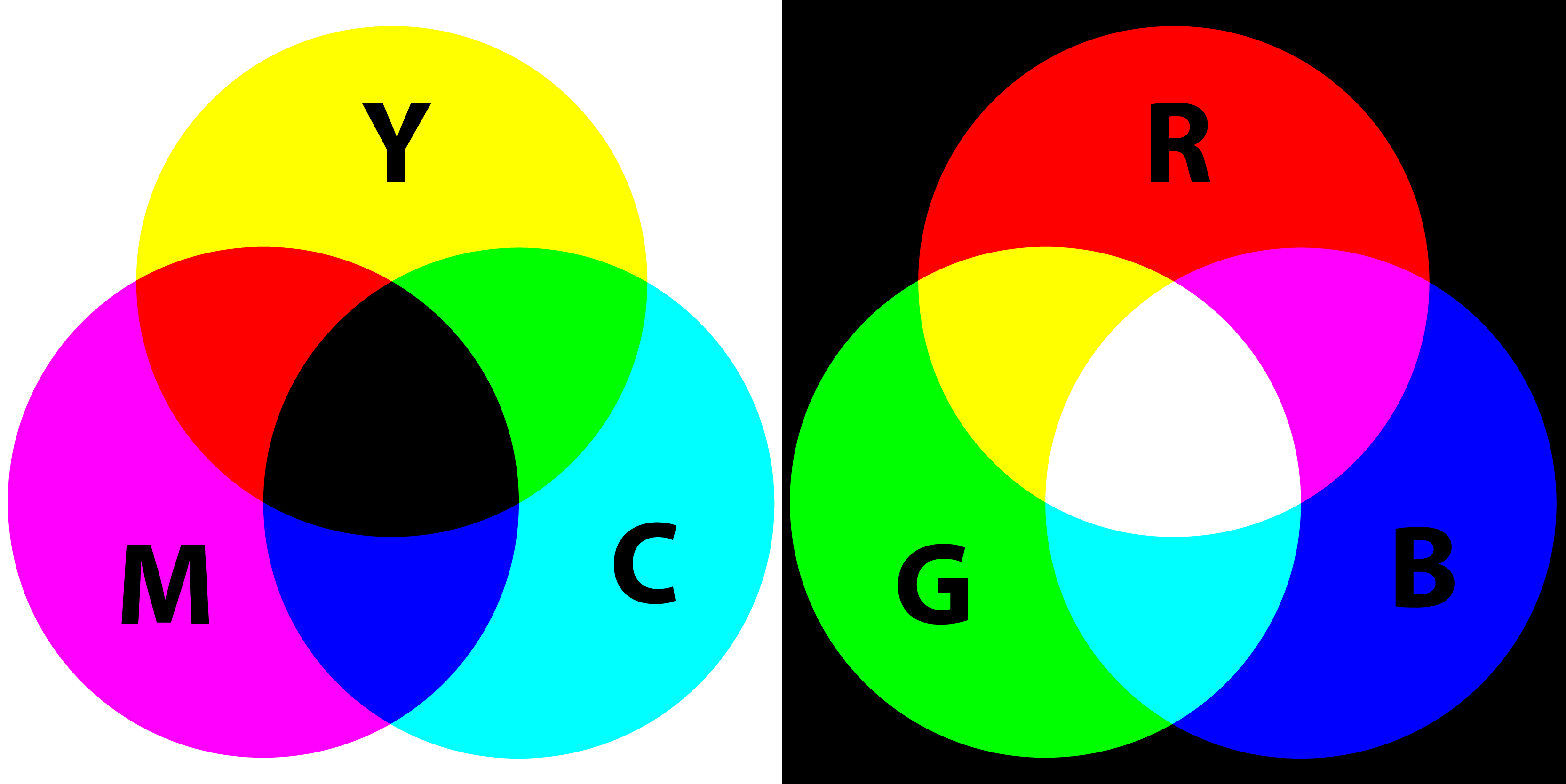
RBG and CMYK Colour Spaces
Given that design and colour are united in every project, it is important to realize that there are two colour systems, and often a project needs to work in both. Digital media works in the additive colour system, and its primary colours are red, green, and blue (RGB). In this system, the absence of colour equals black, while combining all colours results in white. RGB is the colour system of visible light (see Figure 3.5). This light system is called additive because the three primaries together create all the hues in the spectrum.
Subtractive colour is the system needed for print media, and its primary colours are cyan, magenta, yellow, and black (CMYK), as shown in Figure 3.5. In CMYK, the absence of colour equals white, while combining all colours creates black. Both of these systems have many overlapping colours but their colour spheres are not exactly the same. Understanding where the overlaps e xist and where they don’t correspond is vital to the success of a project. If your print materials cannot be replicated on screen, you will have a major design problem that will have to be corrected. Always choose colours that will work in both systems.

Figure 3.5 Primary colours for the additive and subtractive colour schemes
Environment is another aspect of colour choice that is very important. Both the natural world and the world within the screen vary from moment to moment and screen to screen. Colours are affected and influenced by the amount of atmospheric light available to them as well as by the colours in contact with the object they are viewing. Texture also changes our perception of a colour as does the brightness or darkness around it.
However much a designer hopes to define the parameters of a colour palette, there will always be unknown factors influencing the palette on the viewers’ end. Create a palette that is focused enough to create the right atmosphere and energy level for your project, but one that doesn’t rely too heavily on a specific colour. Careful, considered colour use will help define a message and create a mood that supports the composition and concept of a design work. Always create a palette that will work with both colour systems and also be robust enough to work in less than optimal environmental circumstances.
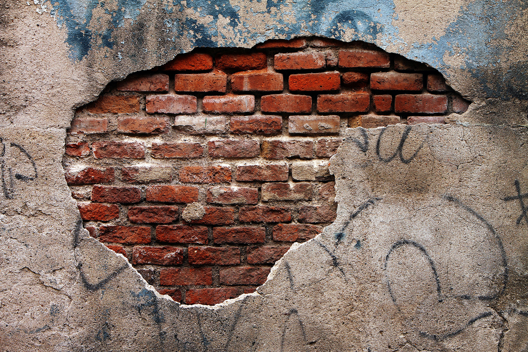
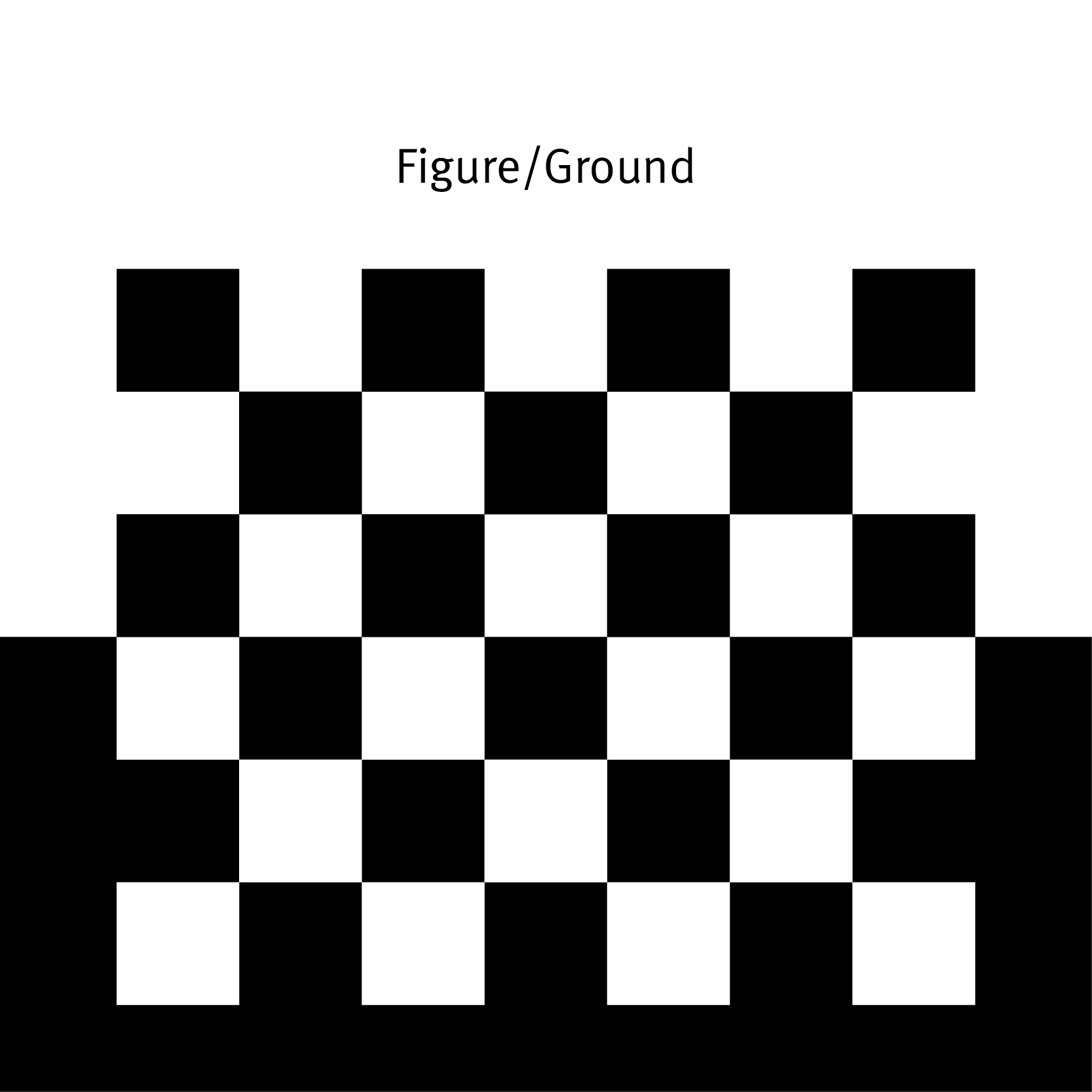
Negative Space
Negative space, which is also called white space, is the visually quiet area that surrounds the active area of a composition (see Figure 3.6). It is also referred to as figure/ground, and has a very important role in composition as it shapes the visual perception of the subject. Without negative space, there is no positive space — the effect is similar to seeing a polar bear in a snowstorm. Negative space is often thought of as as passive and unimportant, but the active elements or ‘figure’ are always perceived in relation to their surroundings by the mind of the viewer. The composition of the negative space frames and presents the active elements in a flat or dynamic way. If the surrounding area is busy with many other elements, the focal point loses its power because the elements all have a similar visual value. The works of Gustav Klimt exhibit this quality.
Figure 3.6 Example of negative or white space
If, on the other hand, the work is balanced and the negative space is active, it brings energy to the form and its space. The focal point or figure increases its visual power because there is contrast for the eye. Another way to look at this is to see that the range or gamut of visual activity is increased and therefore the experience is more satisfying to the eye.
When designers play with reducing or confusing positive and negative space, they create ambiguity. Ambiguity creates tension, which increases the interest of a composition to the viewer and also increases the visual energy of a design. There are three types of figure/ground relationships.
Stable figure/ground is the most common type. The positive element is clearly separate and defined against its negative space. A good example of this is text blocks in magazines or books.
Reversible figure/ground is the second type and is found in most of the work of M.C. Escher. Both the positive and negative space delivers ‘active’ information that feels equal to the eye and therefore creates a toggling effect in the viewer. One shape is comprehended while the other acts as its negative space, then the opposite happens and the negative space becomes meaningful and its opposite becomes the neutral ‘holding’ space.
Ambiguous figure/ground creates a confusing lack of focal point. The eye searches for a dominant visual ‘starting point’ in the composition but can’t find one. Often this creates energy, and if the effect is compelling, it invites the viewer to stay with the work for a long period of time, absorbing all of the visual information.

Figure 3.7 FedEx express truck
Designers often utilize figure/ground in the crafting of symbols, wordmarks, and logos because of its capacity to create meaning with the space surrounding a mark. An excellent example of figure/ground is the FedEx wordmark (see Figure 3.7). The negative space needed to define the letterforms also augments their meaning by creating a forward pointing arrow. In print design, negative space can also allude to what is outside the frame and makes the field of the page or poster larger that it physically is. On a static or moving screen, negative space has the ability to change the flow of time, to introduce a break, or to create space around an important point.
Composing strong figure/ground tension is an excellent skill to acquire for designers of any media. Crafting white space eventually becomes as important to a designer as selecting the words and the elements of a project. Composing the negative spaces of a composition will allow you to vary visual emphasis of the elements, and control and increase the visual energy overall.
Texture

Figure 3.8 Example of texture
Texture is a visual and a tactile quality that designers work with (see Figure 3.8). Texture is used both in composition and also on the printed substrate or media space. Designers create textures for their projects with anything at hand. A texture can be made with typography, generated in raster or vector software like Photoshop or Adobe Illustrator, or by using a camera and capturing elements in the material world.
Using texture thoughtfully will enhance a visual experience and amplify the context for the content. Often adding texture adds visual complexity and a bit of visceral depth to a two-dimensional design project. It can also tie one piece of design to another, or become a defining element of a brand or a series of communications.
The tactile aspect of a design work comes into play with the choices we make for the substrate we print on. The surface can be smooth or rough, glossy or matte, thick or thin, translucent or opaque, paper, plastic, concrete, metal, wood, or cloth. Paper can even have two or more of these qualities if we augment the original look of the paper with layers of varnish that reverse the tactile effect of the substrate. Often the choice of substrate is most effective if it is sympathetic to or contrasts with the concept and content of the piece. The choice of substrate texture affects how the viewer perceives the content — both physically and optically. Glossy substrates often feel sophisticated, hard, and cold. They are imbued with a sense of precision because the ink sits on top of the surface of the paper and retains almost all of its original integrity. A textured matte paper feels organic, accessible, and warm because the ink is partially absorbed by the paper, and is therefore influenced by and fused to its softer characteristics.
Pattern is part of the element of texture, but because of its special ability to hold content that is meaningful, and its long and significant cultural history, it deserves a special mention. All patterns can be reduced to dot and line and are organized by a grid system of some kind. Their ‘flavour’ is a reflection of the culture and time they come from and of the materials that created them. Patterns can be a subtle addition to the content of any design work. A pattern can be created using a relevant graphic (like a logo) or repeated multiple times, or it can support the organizational principles developed by the designer in a decorative way; for example, if a grid is based on the square and the texture of the pattern is also based on the square.
When the pattern is seen as a whole, its individual components melt away and lose their identity to the larger field of the pattern. This ability to focus on a pattern in multiple ways creates a second purpose for the graphic element (such as a circle, a square, a logo, or symbol) the designer has used. In modern design practice, pattern is an opportunity to augment the clean and simple material surfaces we work with and ornament a page or a website with a relevant texture.
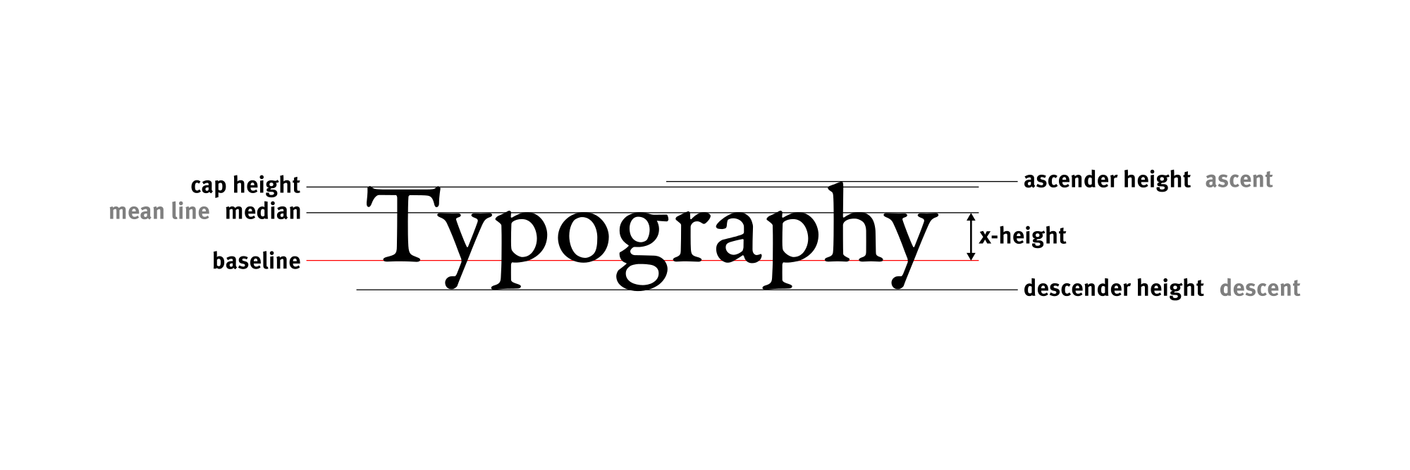
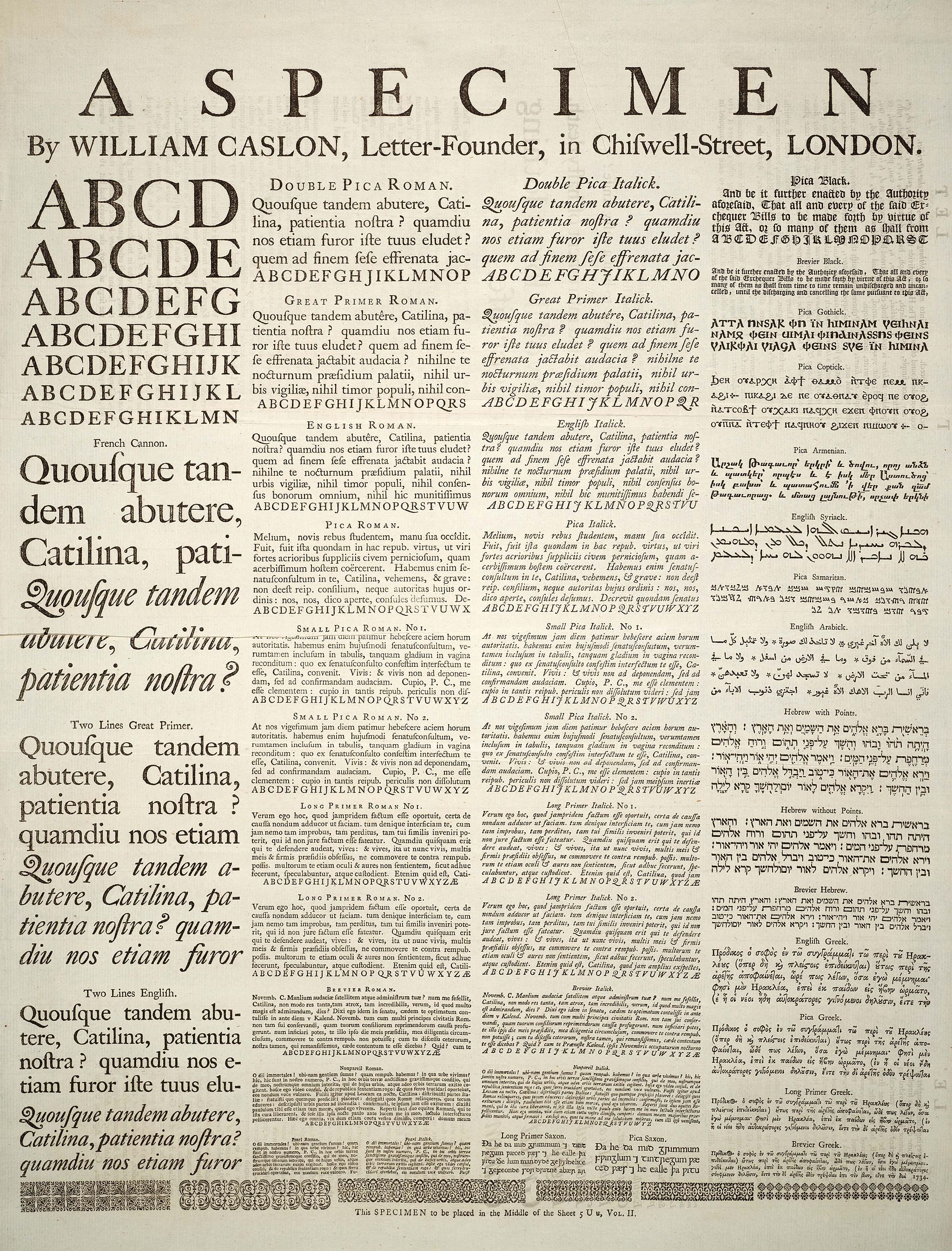
Typography
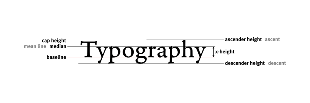
Figure 3.9 Typography
Typography is the medium of designers and the most important element we work with (see Figure 3.9). Typography not only carries a message but also imbues a message with visual meaning based on the character of a font, its style, and its composition. Words are meaningful in and of themselves, but the style and composition of words tells a reader you are serious, playful, exciting, or calm. Typography is the tonal equivalent of a voice and can be as personal or as general in flavour.
Typography traditionally has two functions in most design projects. One function is to call attention to or to ‘display’ the intent of a communication. This function is called titling or display typography and it is meant to call attention to itself. The second function is to present the in-depth details of a communication within a text block. This function requires a different typographic approach — one that is quiet and does not call attention to itself. Instead, it is intended to make the content accessible and easy to read.
Font Categories
There are many ways to categorize and subcategorize type. This overview discusses the seven major historical categories that build on one another. Serif fonts comprise four of these categories: humanist, old style, transitional, and modern. Italics, first designed in the 1500s, have evolved to become part of a font ‘family’ and were at one time a separate category. They were initially designed as independent fonts to be used in small pocket books where space was limited. They were not embraced as text fonts, but were considered valuable for adding emphasis within a roman text and so became part of the set of options and extensions a font possessed. The trajectory of use is the opposite for the sans serif category. Sans serif fonts have historically been used for display only, but in the 20th century, they became associated with the modern aesthetic of clean and simple presentation and have now become very popular for text-block design. Egyptian or slab serif fonts can be used as either display or text depending on the characteristic of the font design.
Blackletter
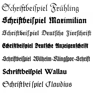
Figure 3.10 Example of Blackletter type
Blackletter was the medieval model for the first movable types (see Figure 3.10). It is also know as Block, Gothic, Fraktur, or Old English. The look of this font category is heavy and dark. The letterforms are often condensed and put together tightly in a text block creating a dark colour (tone) for a page — between 70% and 80% grey. To put the tone in context, the usual tone of a modern text page is between 55% and 70% grey. The look of the letterforms makes it hard to read the page, because legibility was not their first function as it is today. The beauty of the font and the form of the book was the primary goal for early publications. Books were considered to be objects of wealth and beauty, not solely as a means to convey information.
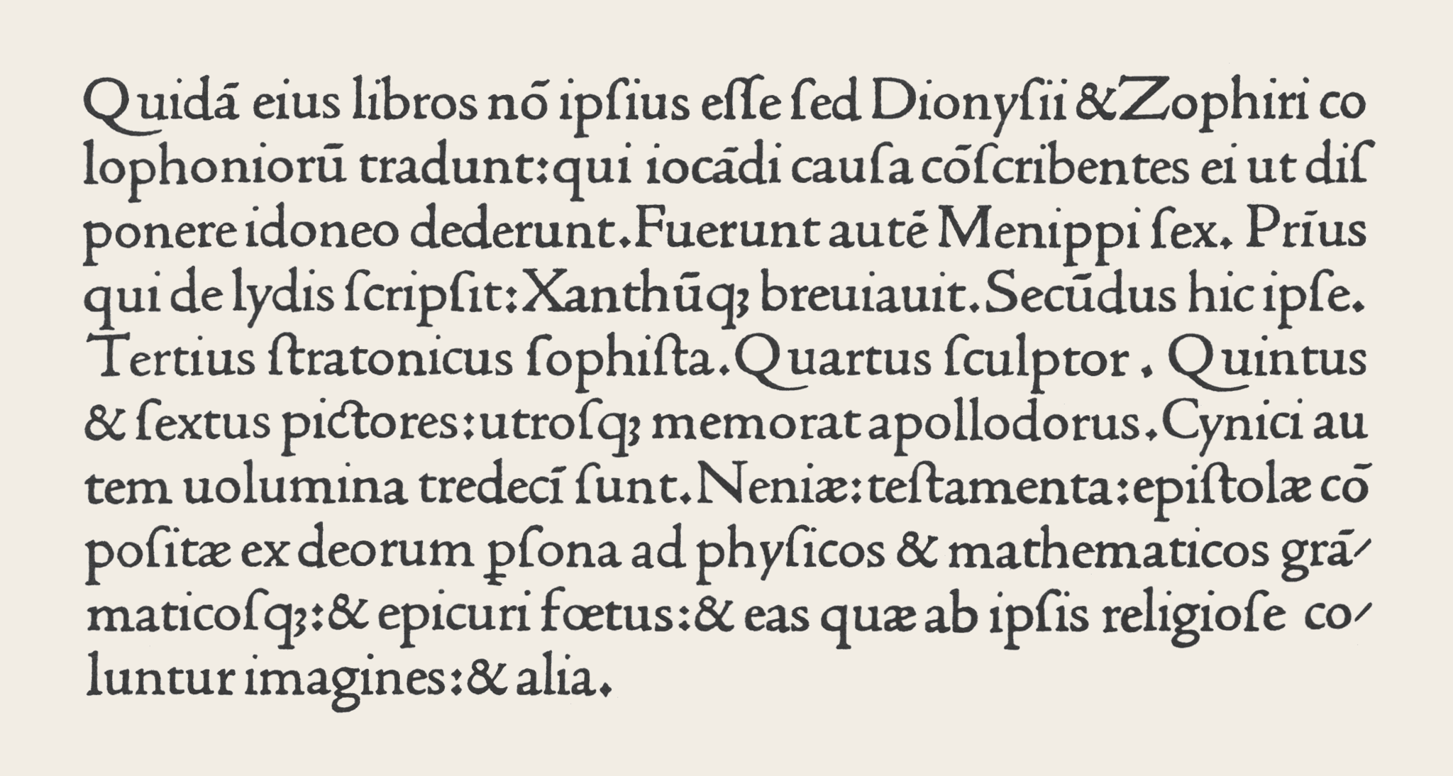
Humanist
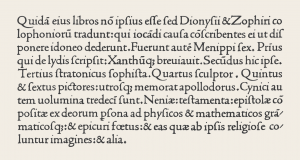
Figure 3.11 Example of Humanist type
Humanist fonts are also referred to as Venetian, because they were developed in and around Venice in the mid-15th century (see Figure 3.11). Their design was modelled on the lighter, open serif letterforms and calligraphy of the Italian humanist writers. The designers strove to replicate many of the characteristics found in this writing style, including multiple variations of a glyph (letterform) that a written document possessed. For instance, a font could have up to 10 different lowercase a’s to set a page with. Humanist types were the first roman types. Though they were much easier to read and lighter on the page than blackletter, they still created a visually dark and heavy text block in contrast to the fonts we have become accustomed to. Humanist fonts have little contrast between the thick and thin strokes — the strokes are usually heavy overall. The x-height of a humanist font is small compared to contemporary fonts, and this impedes quick comprehension and legibility. Humanist fonts are not often used for these reasons, though they are well respected because they are the original model so many other fonts are based on. It is important to remember that these fonts were a perfect match to the earliest printing technologies and that those presses could not have printed our light and delicate fonts. Fonts have evolved alongside the technological advancements of the printing industry.
Examples of humanist fonts include Jenson, Centaur, Verona, Lutetia, Jersey, and Lynton.
Old Style
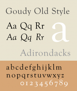
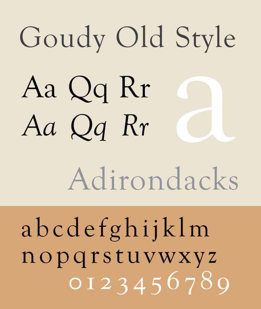
Figure 3.12 Example of Old Style type
Old style fonts, also known as Garalde fonts, are the next leap in font design, and their stylistic developments were driven by the technological advancement of presses and the improved skills of punchcutters (see Figure 3.12). Font designers began to explore the possibilities of their medium — both the metal of the punches and the abilities of the presses and their papers. The letterforms became more precise, their serifs more distinct. The contrast of the stroke weights was also increased, and the presses held true to the design and didn’t distort them. The aim of these new fonts ceased to be about replicating the look of handwriting and more about refining the letterforms to create a lighter overall tone.
Examples of old style fonts include Goudy Old Style, Granjon, Janson, Palatino, Perpetua, Plantin, and Sabon.
Transitional
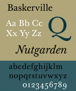
Figure 3.13 Example of Transitional type
A few centuries later, font design was again refined, and this time the impetus came from France and the Enlightenment movement. Fonts were created along the rationalist principles of the times. The strokes were contrasted further with very thick main strokes and very thin sub-strokes, and the serif, which capped the stroke, did not use bracketing (the rounding underneath the intersection of the two strokes). The letterforms took on a look that implied they were constructed mathematically and anchored within a grid. These new fonts broke with humanist and old style tradition and ceased to reference calligraphy.
Examples of transitional fonts include Baskerville, Bookman, Fournier, and Joanna (see Figure 3.13).
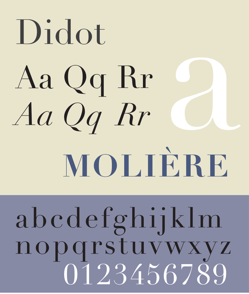
Modern
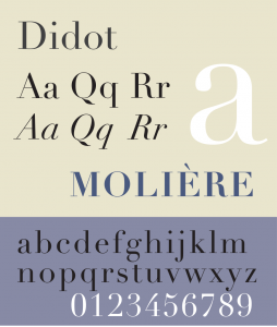
Figure 3.14 Example of Modern type
Modern fonts are also known as Didones and take the contrast started by the transitional fonts much, much further (see Figure 3.14). Bodoni is an excellent example font as nearly everyone can bring to mind the extreme contrast of its thick and thin strokes. The Frenchman Didot and the Italian Bodoni were the first to bring this design style to the public. Its major attributes align with the Romantic period’s aesthetics.
Romantic letters can be extraordinarily beautiful, but they lack the flowing and steady rhythm of the Renaissance forms. It is that rhythm which invites the reader to enter the text and read. The statuesque forms of Romantic letters invite the reader to stand outside and look at the letters instead. (Bringhurst, 2004, p. 130)
The major characteristics of modern fonts are extreme contrast between thick and thin strokes, clean, unbracketed, hairline serifs, and a completely vertical axis. These fonts have an almost mechanical look because of their precise, sharp, and clean appearance. They also possess an elegance that complrments the time period they emerged in. Modern fonts are often used as display fonts and can sometimes be used for text, though very carefully.
Examples of modern fonts include Fenice, Zapf Book, New Caledonia, Bodoni, and Didot.
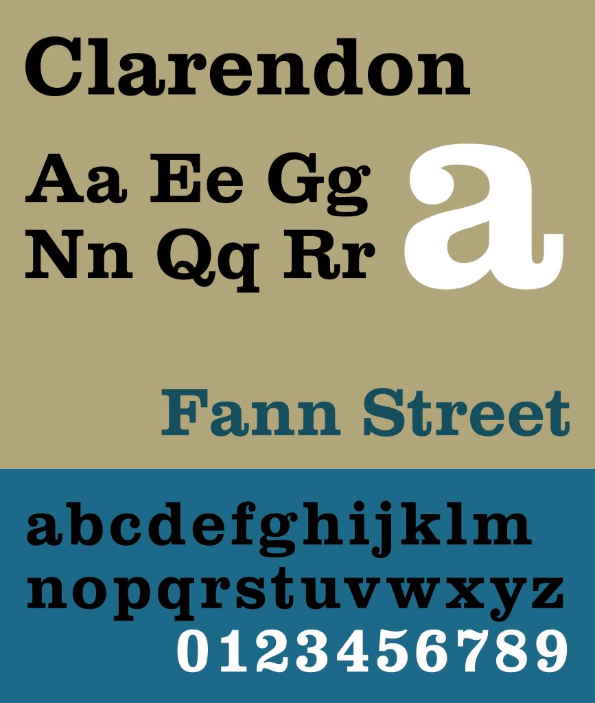
Egyptian
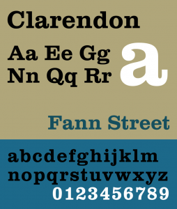
Figure 3.15 Example of Egyptian type
Egyptian is also known as slab serif, square serif, or mechanical (see Figure 3.15). This category of font was created in England in the 1880s — a design expression of the industrial revolution. The category was named Egyptian because of the popularity of all things Egyptian after Napoleon’s return from a three-year Egyptian expedition. The name of the style has nothing to do with any element of Egyptian culture. The style was created initially for display copy, but over the centuries, fonts like Clarendon have become popular for setting text blocks because they contain the quality of objectivity and yet still feel traditional.
Examples of Egyptian fonts include Officina Sans and Officina Serif, Clarendon, and every typewriter font.
Sans Serif
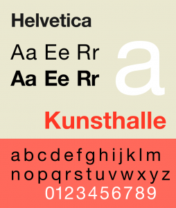
Figure 3.16 Example of Sans Serif
Sans serif fonts have existed since ancient times, but it was only in the late 19th century that font designers began to consider removing serifs and letting the letterforms stand on their own (see Figure 3.16). These fonts were initially considered appropriate only for titling and display purposes, and only became text fonts in the hands of the 20th-century modernists. The first sans serif forms were created on the early humanist and old style calligraphic forms, but eventually the forms were influenced by objective modernist principles and geometry.
Examples of sans serif fonts include Univers, Helvetica, and Akzidenz-Grotesk.
Attributions
Figure 3.1
Grafitti by Steve Collis is used under a CC BY 2.0 license.
Figure 3.3
Image is used under a CC BY NC SA 3.0 license.
Figure 3.4
Küppers Farben Sonne by Harald Küppers is used under a CC BY SA 3.0 license.
Figure 3.5
Image remixed from: Subtractive Color and Additive Color by SharkD is in the public domain.
Figure 3.7
FedEx Express truck by Coolcaesar is used under a CC BY SA 3.0 license.
Figure 3.8
An example of texture and color by Tomas Castelazo is used under a CC BY SA 3.0 license.
Figure 3.9
Typography line terms alternate by Damian Adrian is used under a CC BY SA 3.0 license.
Figure 3.10
Blackletter typefaces by Rudolf Koch by BK is in the public domain.
Figure 3.11
Sample of roman typeface by Nicolas Jenson is in the public domain.
Figure 3.12
Specimen of the typeface Goudy Old Style is used under a CC BY SA 3.0 license.
Figure 3.13
A specimen of the Baskerville typeface designed by John Baskerville by Paul Hunt is in the public domain.
Figure 3.14
Specimen of the typeface Didot by Pierre Rudloff is used under a CC BY SA 2.5 license.
Figure 3.15
Sample of Clarendon Typeface by Deviate-smart is used under a CC BY SA 3.0 license.
Figure 3.16
Specimen of the typeface Neue Helvetica by GearedBull is used under a CC BY SA 4.0 license.


.jpg)