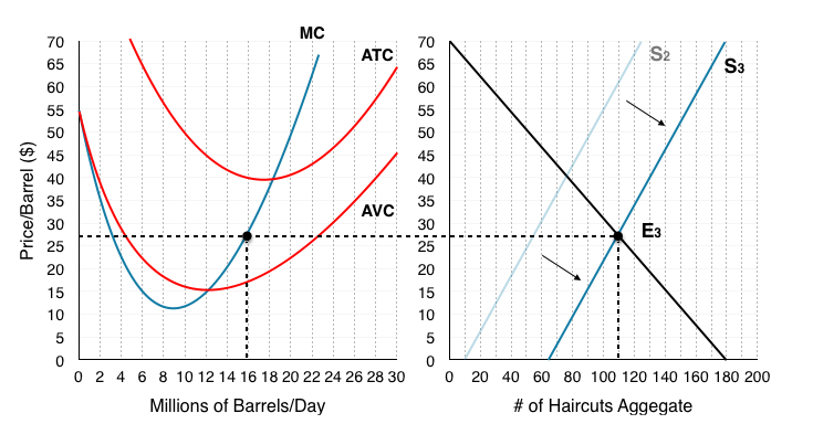
All the following questions are from previous exams for Economics 103. They are duplicates of the questions found in the Topic sub-sections.
Exercises 4.1
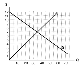
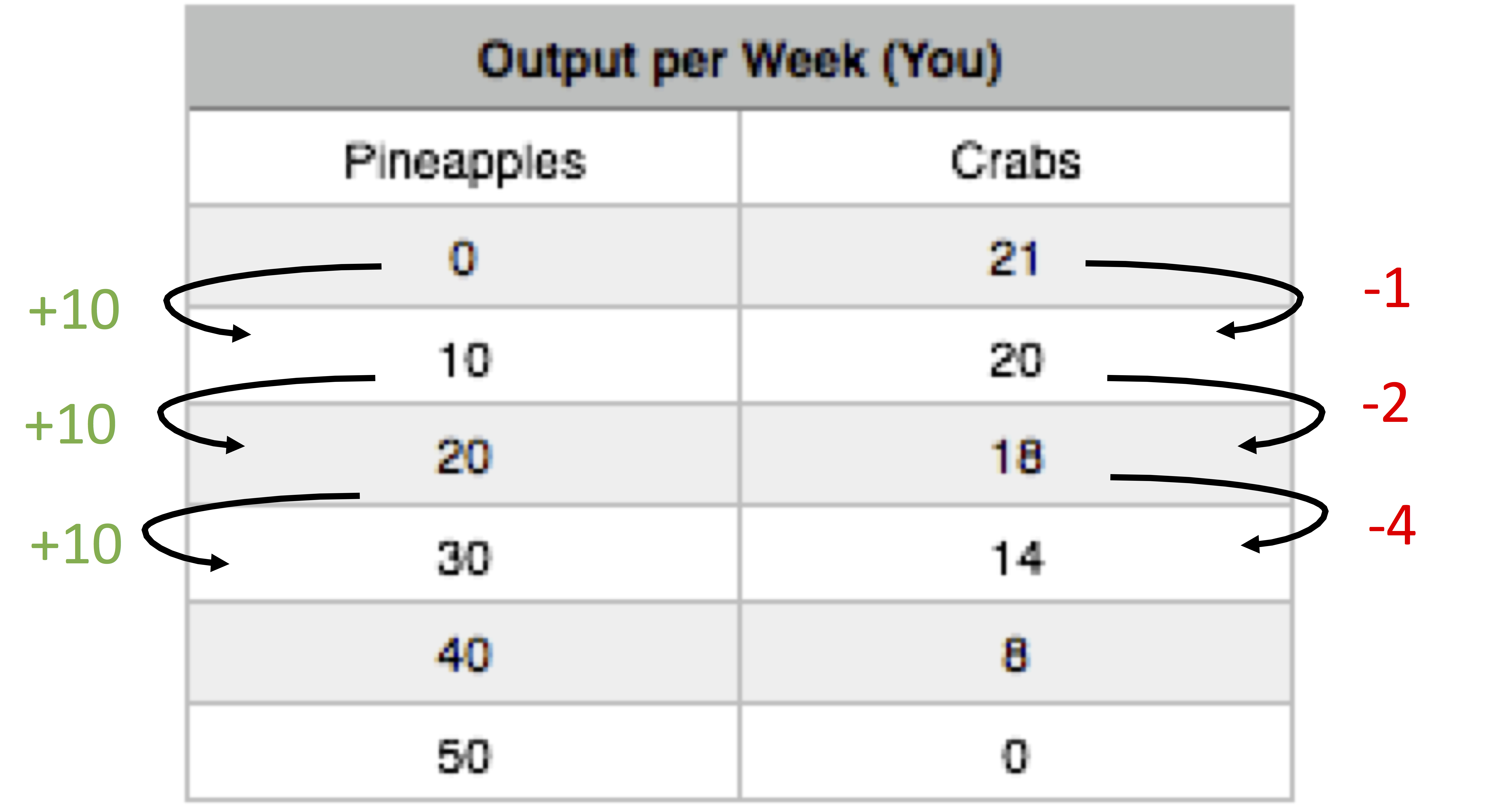
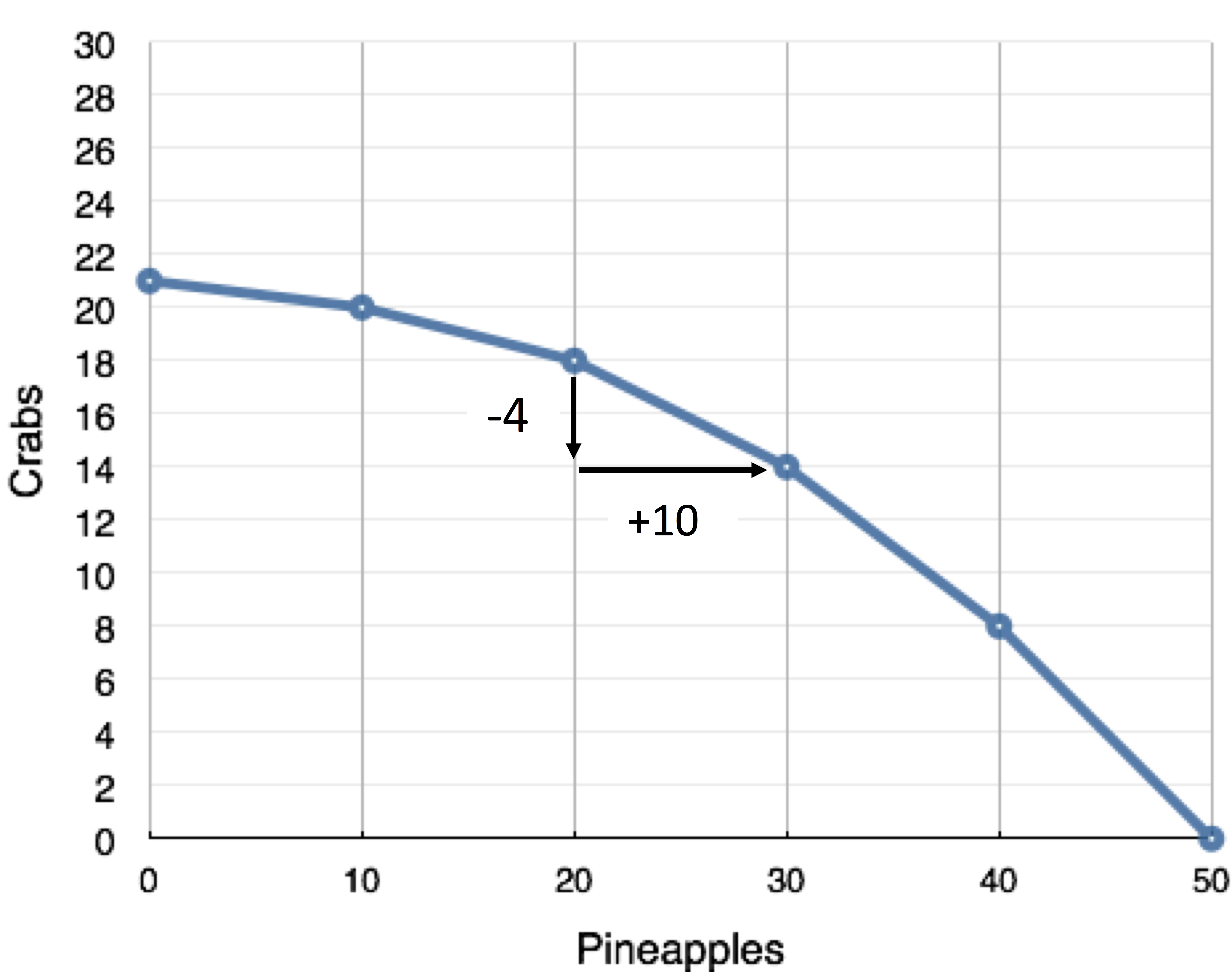
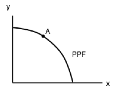
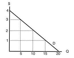
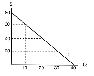
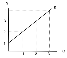
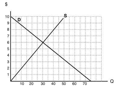
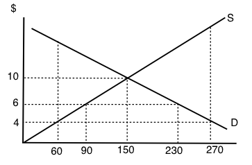
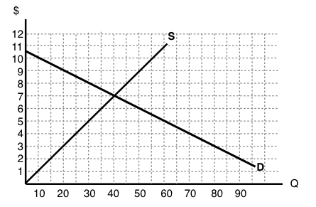
1. Use the demand curve diagram below to answer the following question.
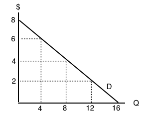
What is the own-price elasticity of demand as price increases from $2 per unit to $4 per unit? Use the mid-point formula in your calculation.
a) 1/3.
b) 6/10.
c) 2/3.
d) None of the above.
2. Suppose that a 2% increase in price results in a 6% decrease in quantity demanded. Own-price elasticity of demand is equal to:
a) 1/3.
b) 6.
c) 2
d) 3.
3. If own-price elasticity of demand equals 0.3 in absolute value, then what percentage change in price will result in a 6% decrease in quantity demanded?
a) 3%
b) 6%
c) 20%.
d) 50%.
4. Suppose you are told that the own-price elasticity of supply equal 0.5. Which of the following is the correct interpretation of this number?
a) A 1% increase in price will result in a 50% increase in quantity supplied.
b) A 1% increase in price will result in a 5% increase in quantity supplied.
c) A 1% increase in price will result in a 2% increase in quantity supplied.
d) A 1% increase in price will result in a 0.5% increase in quantity supplied.
5. Suppose that a 10 increase in price results in a 50 percent decrease in quantity demanded. What does (the absolute value of) own price elasticity of demand equal?
a) 0.5.
b) 0.2.
c) 5.
d) 10.
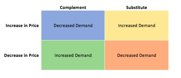
6. If goods X and Y are SUBSTITUTES, then which of the following could be the value of the cross price elasticity of demand for good Y?
a) -1.
b) -2.
c) Neither a) nor b).
d) Both a) and b).
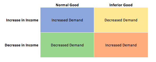
7. If pizza is a normal good, then which of the following could be the value of income elasticity of demand?
a) 0.2.
b) 0.8.
c) 1.4
d) All of the above.
8. If goods X and Y are COMPLEMENTS, the which of the following could be the value of cross price elasticity of demand?
a) 0.
b) 1.
c) -1.
d) All of the above could be the value of cross price elasticity of demand.
Exercises 4.2
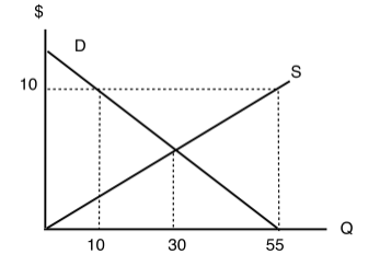
Use the demand curve diagram below to answer the following TWO questions.
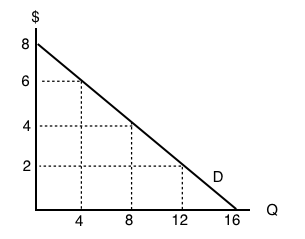
1. What is the own-price elasticity of demand as price decreases from $8 per unit to $6 per unit? Use the mid-point formula in your calculation.
a) Infinity.
b) 7.0
c) 2.0.
d) 1.75
2. At what point is demand unit-elastic?
a) P = $6, Q = 12.
b) P = $4, Q = 8.
c) P = $2, Q = 12.
d) None of the above.
3. Which of the following statements about the relationship between the price elasticity of demand and revenue is TRUE?
a) If demand is price inelastic, then increasing price will decrease revenue.
b) If demand is price elastic, then decreasing price will increase revenue.
c) If demand is perfectly inelastic, then revenue is the same at any price.
d) Elasticity is constant along a linear demand curve and so too is revenue.
4. Suppose BC Ferries is considering an increase in ferry fares. If doing so results in an increase in revenues raised, which of the following could be the value of the own-price elasticity of demand for ferry rides?
a) 0.5.
b) 1.0.
c) 1.5.
d) All of the above.
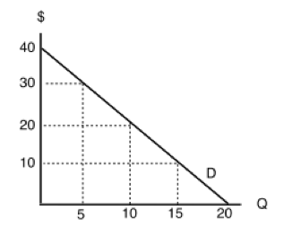
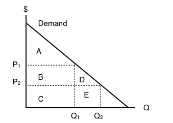
5. Use the demand diagram below to answer this question. Note that P × Q equals $900 at every point on this demand curve.
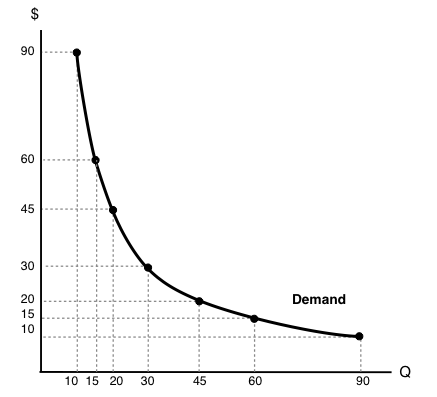
Which of the following statements correctly describes own-price elasticity of demand, for this particular demand curve?
I. Demand is unit elastic at a price of $30, and elastic at all prices greater than $30.
II. Demand is unit elastic at a price of $30, and inelastic at all prices less than $30.
III. Demand is unit elastic for all prices.
a) I and II only.
b) I only.
c) I, II and III.
d) III only.
6. Suppose that, if the price of a good falls from $10 to $8, total expenditure on the good decreases. Which of the following could be the (absolute) value for the own-price elasticity of demand, in the price range considered?
a) 1.6.
b) 2.3.
c) Both a) and b).
d) Neither a) or b).
7. Consider the demand curve drawn below.
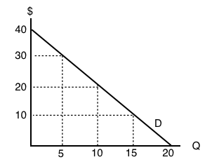
At which of the following prices and quantities is revenue maximized?
a) P = 40; Q = 0.
b) P = 30; Q = 5.
c) P = 20; Q = 10.
d) P = 0; Q = 20.
Exercises 4.3
1. Which of the following does NOT affect the magnitude of own-price elasticity of demand?
a) The length of the time horizon over which we are looking at the change in consumer behaviour.
b) The availability (or lack thereof) of close substitutes for the good in question.
c) The amount by which quantity supplied will change as price changes.
d) All of the above affect the own-price elasticity of demand.
2. If a demand curve is VERTICAL, then own-price elasticity of demand for this good is equal to:
a) Infinity.
b) Zero.
c) One.
d) None of the above.
3. If – given consumer preferences – a certain good has many close substitutes available, then:
a) The demand for that good will be relatively inelastic, compared to goods for which there are few close substitutes.
b) The supply of that good will be relatively inelastic, compared to goods for which there are few close substitutes.
c) The demand for that good will be relatively elastic, compared to goods for which there are few close substitutes.
d) The supply of that good will be relatively elastic, compared to goods for which there are few close substitutes.
4. If – given consumer preferences – a certain good has few close substitutes available, then:
a) The demand for that good will be relatively inelastic, compared to goods for which there are many close substitutes.
b) The supply of that good will be relatively inelastic, compared to goods for which there are many close substitutes.
c) The demand for that good will be relatively elastic, compared to goods for which there are many close substitutes.
d) The supply of that good will be relatively elastic, compared to goods for which there are many close substitutes.
Exercises 4.5
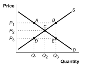
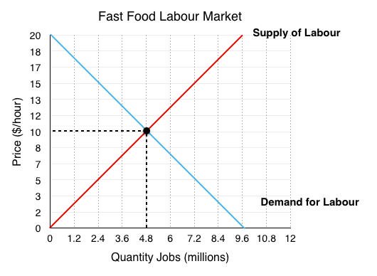
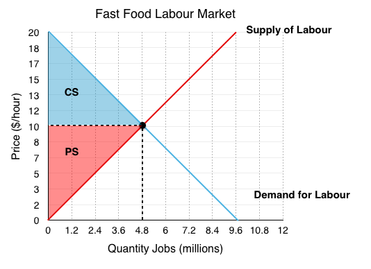
The following TWO questions refer to the supply and demand curves illustrated below.
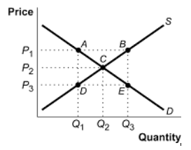
1. A price ceiling of P3 causes:
a) A deadweight loss triangle whose corners are ABC.
b) A deadweight loss triangle whose corners are ACD.
c) A deadweight loss triangle whose corners are BEC.
d) A deadweight loss triangle whose corners are CDE.
2. A price floor of P1 causes:
a) Excess demand equal to the distance AB.
b) Excess supply equal to the distance AB.
c) Excess supply equal to the distance DE.
d) Excess demand equal to the distance DE.
3. Which of the following statements about price ceilings is TRUE? (Assume the price ceiling is set below the unregulated equilibrium price.)
a) Price ceilings make sellers worse off.
b) Price ceilings make buyers better off.
c) Both a) and b) are true.
d) Neither a) nor b is true).
4. Which of the following statements about minimum wages is true?
a) Minimum wage laws may make some workers better off and others worse off.
b) Minimum wage laws make employers worse off.
c) Both a) and b) are true.
d) None of the above are true.
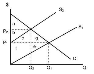
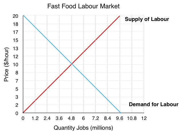
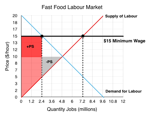
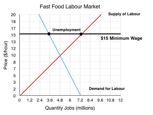
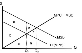
5. Consider diagram below, which illustrates the market for low-skilled labour.
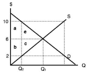
Suppose that the equilibrium quantity is reduced from Q1 to Q2 units, through the introduction of a price floor. Which of the following correctly describes the resulting decrease in MARKET surplus?
a) Market surplus will decrease by a – c.
b) Market surplus will decrease by by e + c.
c) Market surplus will decrease by a + b + e + c.
d) Market surplus will decrease by b – e.
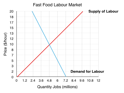
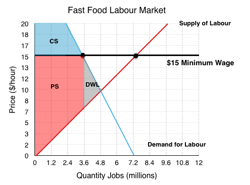
6. Consider diagram below, which illustrates the market for low-skilled labour.
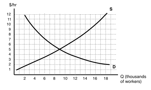
If the government introduces a minimum wage law set at $9 per hour, then, in the new equilibrium, which of the following statements is TRUE?
I. There will be 11,000 workers willing to work who cannot find work, given the wage.
II. The number of workers employed will decrease by 11,000.
III. The number of workers that employers are prepared to hire will decrease by 5,000.
a) I only.
b) I and II only.
c) I, II, and III.
d) I and III only.
7. Suppose that the BC government wishes to reduce the quantity of beer sold in the Province by 20%. It has calculated that this goal can be achieved EITHER through a price floor set at $2 per six-pack of beer OR a price ceiling of $20 per six-pack of beer. Assume that the current price of beer is $10 per six-pack. Which of the following statements about these policies is TRUE?
a) The deadweight loss from the price floor will be greater than the deadweight loss from the price ceiling.
b) The deadweight loss from the price ceiling will be greater than the deadweight loss from the price floor.
c) There is insufficient information to determine which policy will have the large deadweight loss.
d) None of the above statements is true.
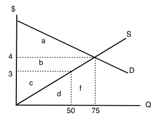
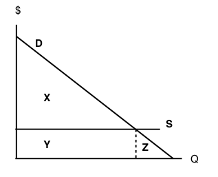
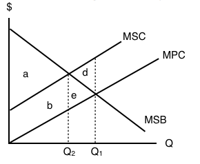
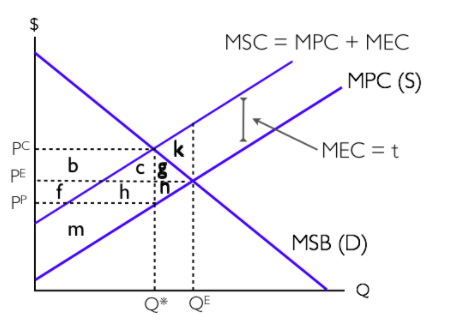
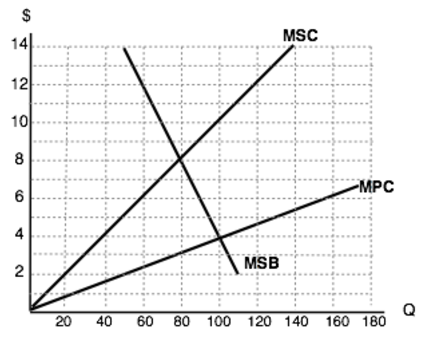
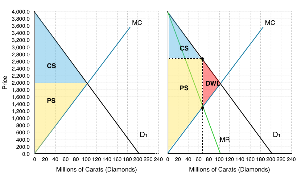
8. Consider the supply and demand diagram below. Assume no externalities.
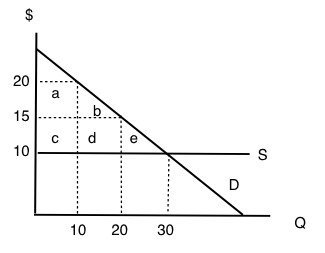
If a price floor of $20 is introduced, then which area will represent the deadweight loss?
a) e.
b) e + d.
c) e + b + d.
d) The deadweight loss will be zero.
9. If a price ceiling (set below the initial equilibrium price) is introduced in a market, then:
a) Producer surplus definitely decreases.
b) Consumer surplus definitely increases.
c) Neither a) nor b) are true.
d) Both a) and b) are true.
10. In Canada, the prices of most medical services are regulated by the Provinces (that is, they are subject to price ceilings). This type of regulation is likely to result in which of the following (relative to an unregulated market)?
a) An increase in the quantity of medical services provided.
b) Consumption of medical services such that the marginal benefit is less than the marginal cost.
c) Lower incomes for providers of medical services.
d) Higher tax revenues for Provincial governments.
Exercises 4.6
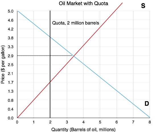
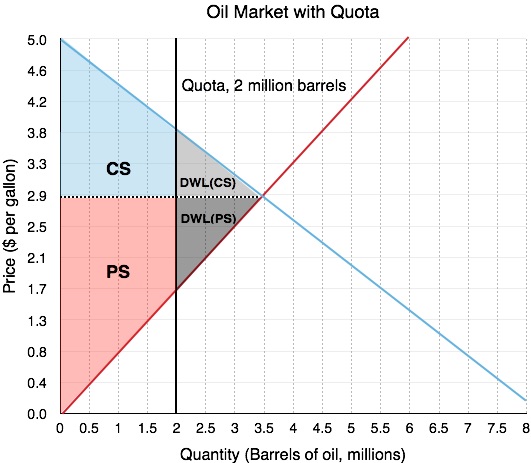
1. Which of the following CANNOT reduce the equilibrium quantity sold in a market?
a) A price ceiling.
b) A price floor.
c) A quota.
d) All of the above can decrease equilibrium quantity sold.
Exercises 4.7
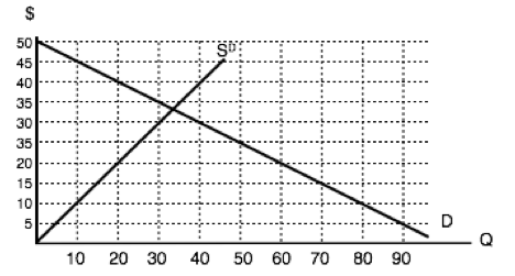
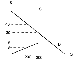
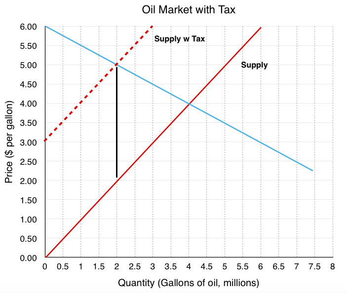
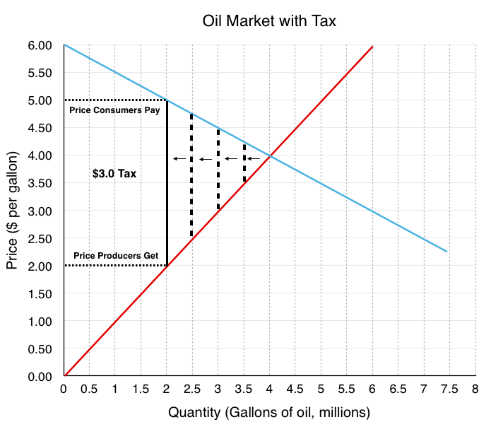
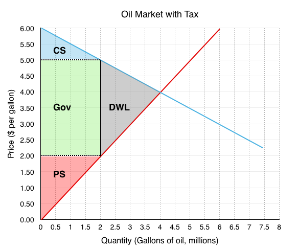
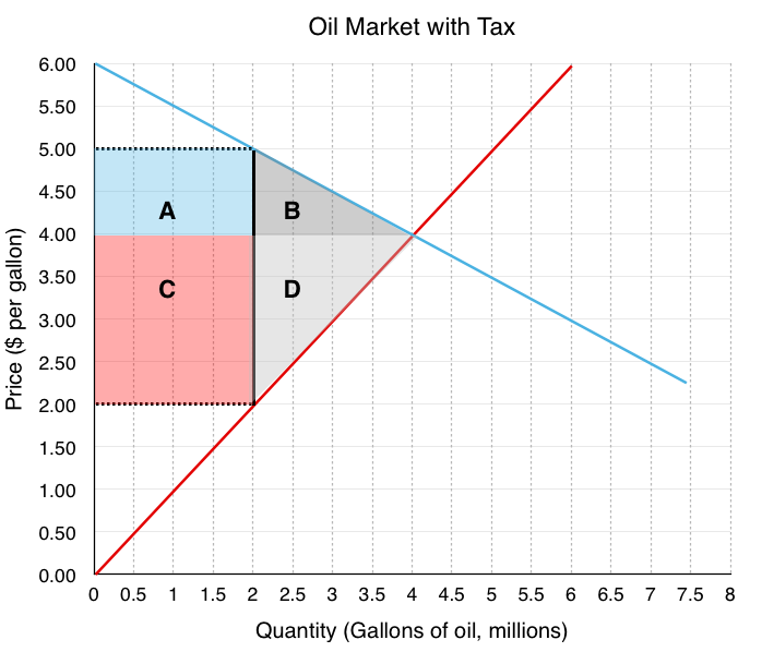
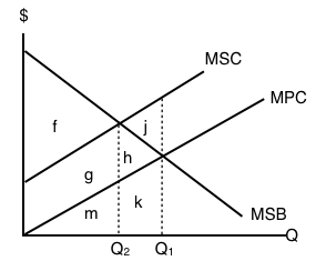
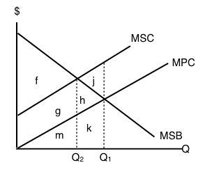
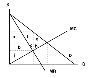
Refer to the supply and demand curves illustrated below for the following THREE questions. Consider the introduction of a $20 per unit tax in this market.
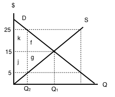
1. Which areas represent the loss to consumer AND producer surplus as a result of this tax?
a) k + f.
b) j + g.
c) k + j.
d) k + f + j + g.
2. Which areas represent the gain in government revenue as a result of this tax?
a) k + f.
b) j + g.
c) k + j.
d) k + f + j + g.
3. Which areas represent the deadweight loss associated with this tax?
a) f + g.
b) k – g.
c) j – f.
d) k + f + j + g.
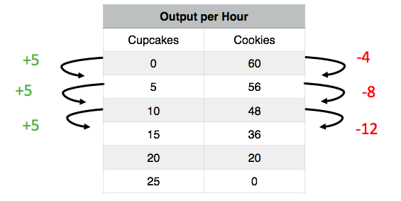
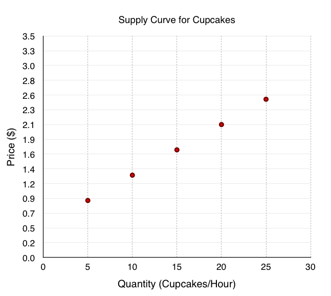
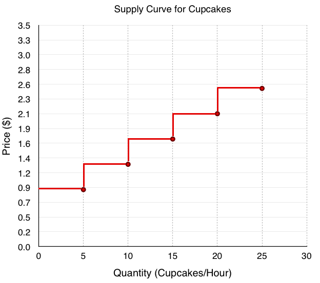
4. Assume that the marginal cost of producing socks is constant for all sock producers, and is equal to $5 per pair. If government introduces a constant per-unit tax on socks, then which of the following statements is FALSE, given the after-tax equilibrium in the sock market? (Assume a downward-sloping demand curve for socks.)
a) Consumers are worse off as a result of the tax.
b) Spending on socks may either increase or decrease as a result of the tax.
c) Producers are worse off as a result of the tax.
d) This tax will result in a deadweight loss.
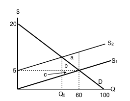
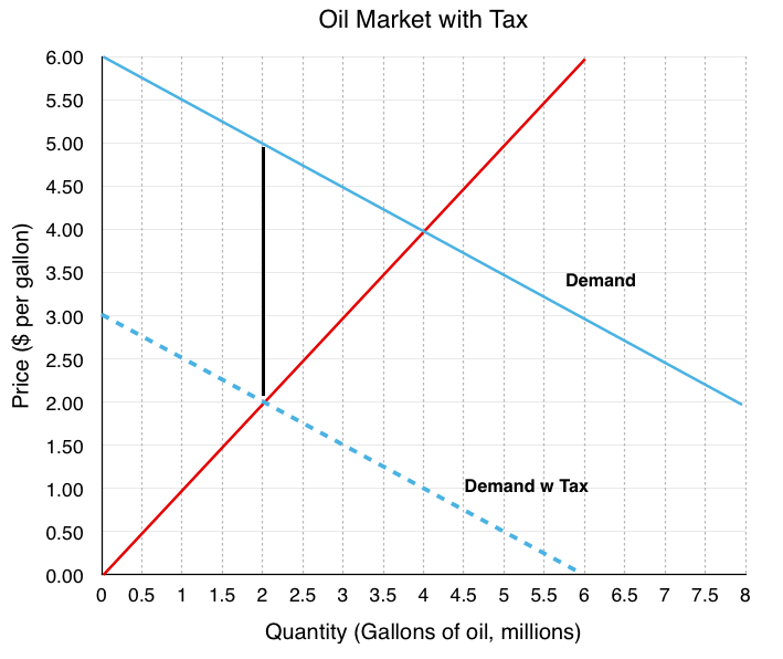
5. Refer to the supply and demand diagram below.
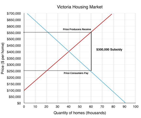
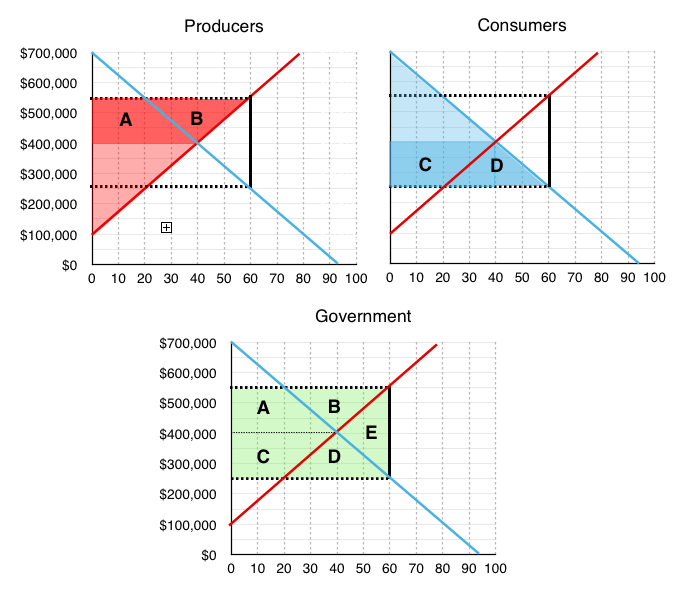
If an subsidy of $3 per unit is introduced in this market, the price that consumers pay will equal ____ and the price that producers receive net of the subsidy will equal _____.
a) $2; $5.
b) $3; $6.
c) $4; $7.
d) $5; $8.
6. If a subsidy is introduced in a market, then which of the following statement is TRUE? Assume no externalities
a) Consumer and producer surplus increase but social surplus decreases.
b) Consumer and producer surplus decrease but social surplus increases.
c) Consumer surplus, producer surplus, and social surplus all increase.
d) Consumer surplus, producer surplus, and social surplus all decrease
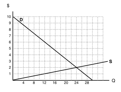
Use the diagram below to answer the following TWO questions.
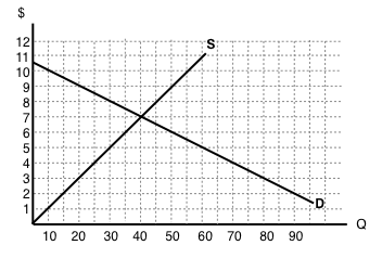
7. If a $6 per unit tax is introduced in this market, then the price that consumers pay will equal ____ and the price that producers receive net of the tax will equal _____.
a) $10; $4.
b) $9; $3.
c) $8; $2.
d) $7; $1.
8. If a $6 per unit tax is introduced in this market, then the new equilibrium quantity will be:
a) 20 units.
b) 40 units.
c) 60 units.
d) None of the above.
9. Which of the following statements about the deadweight loss of taxation is TRUE? (Assume no externalities.)
a) If there is a deadweight loss, then the revenue raised by the tax is greater than the losses to consumer and producers.
b) If there is no deadweight loss, then revenue raised by the government is exactly equal to the losses to consumers and producers.
c) Both a) and b).
d) Neither a) nor b).
10. Which of the following correctly describes the equilibrium effects of a per-unit tax, in a market with NO externalities?
a) Consumer and producer surplus increase but social surplus decreases.
b) Consumer and producer surplus decrease but social surplus increases.
c) Consumer surplus, producer surplus, and social surplus all increase.
d) Consumer surplus, producer surplus, and social surplus all decrease.
11. Which of the following correctly describes the equilibrium effects of a per unit subsidy?
a) Consumer price rises, producer price falls, and quantity increases.
b) Consumer price falls, producer price falls, and quantity increases.
c) Consumer price rises, producer price rises, and quantity increases.
d) Consumer price falls, producer price rises, and quantity increases.
12. Refer to the supply and demand diagram below.
If an output (excise) tax of $5 per unit is introduced in this market, the price that consumers pay will equal ____ and the price that producers receive net of the tax will equal _____.
a) $5; $10.
b) $6; $11.
c) $7; $12.
d) $8; $3.
13. Consider the supply and demand diagram below.
If a $2 per unit subsidy is introduced, what will be the equilibrium quantity?
a) 40 units.
b) 45 units.
c) 50 units.
d) 55 units.
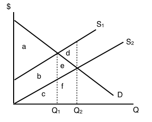
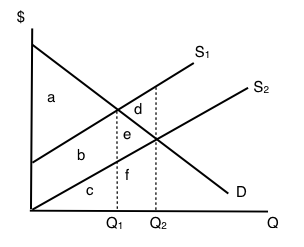
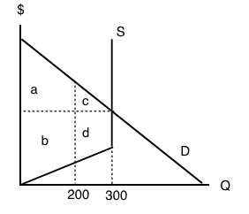
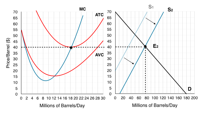
Consider the supply and demand diagram below. Assume that: (i) there are no externalities; and (ii) in the absence of government regulation the market supply curve is the one labeled S1.
14. If a $5 per unit tax is introduced in this market, which area represents the deadweight loss?
a) a.
b) a + b.
c) b + c.
d) a + b + c.
Exercises 4.8
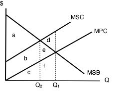
1. Suppose a tax is levied in a market in which demand is downward sloping and supply is perfectly elastic. Which of the following statements is/are TRUE? (Assume no externalities.)
I. Producer surplus decreases.
II. The deadweight loss is zero.
III. Consumers bear all the burden of the tax.
a) II only.
b) I and II only.
c) I, II, and III.
d) III only.
2. Which of the following statements about tax incidence and relative elasticities is TRUE?
If demand is relatively inelastic and supply is relatively elastic, then consumers bear more of the burden of a tax.
If supply is perfectly inelastic, then producers bear none of the burden of a tax, no matter what the value of own-price elasticity of demand.
If the relative elasticities of demand and supply are the same, the tax burden is shared equally across consumers and producers.
a) II only.
b) I and III only.
c) I, II, and III.
d) III only.
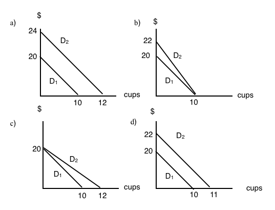
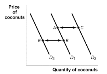
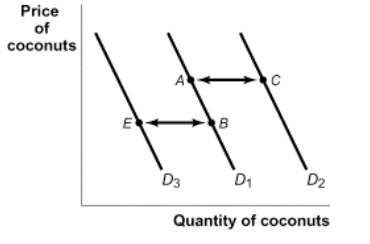
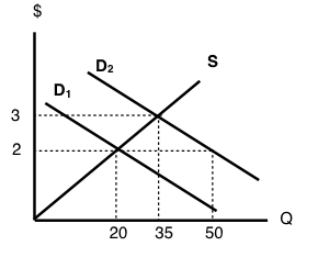
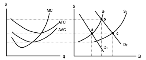
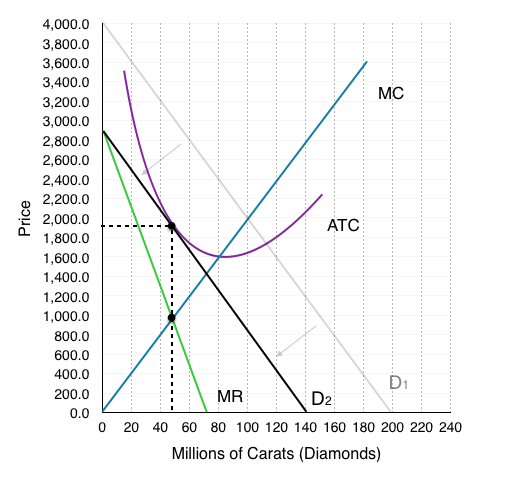
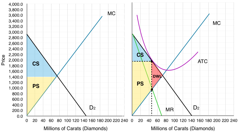
3. The diagram below illustrates the supply curve for a good, and two possible demand curves for that good.
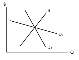
If a price floor (set above the initial equilibrium price) is introduced in this market then:
a) The deadweight loss will be smaller, if demand is D1 than if demand is D2.
b) The decrease in quantity will be smaller, if demand is D1 than if demand is D2.
c) Neither a) nor b) are true.
d) Both a) and b) are true.
4. In which of the following cases will the deadweight loss from taxation be zero?
a) If demand is perfectly elastic.
b) If demand is unit elastic.
c) If demand is perfectly inelastic.
d) Either a) or c) will result in zero deadweight loss from taxation.
5. Which of the following statements about the economic incidence of taxation is TRUE?
I. If demand is elastic, producers will bear a greater burden of the tax than consumers.
II. If supply is perfectly inelastic, producers will bear all the burden of the tax.
III. If the supply curve is perfectly elastic, consumers will bear none of the burden of the tax.
a) II only.
b) I and II only.
c) II and III only.
d) I, II and III.
6. Which of the following correctly describes the equilibrium effects of a per-unit tax, in a market with NO externalities?
a) Consumer and producer surplus increase but social surplus decreases.
b) Consumer and producer surplus decrease but social surplus increases.
c) Consumer surplus, producer surplus, and social surplus all increase.
d) Consumer surplus, producer surplus, and social surplus all decrease
7. Suppose that the price of a good increases. The increase in produce surplus will be:
a) Larger if demand is relatively elastic than if demand is relatively inelastic.
b) Smaller if demand is relatively elastic than if demand is relatively inelastic.
c) Smaller if supply is relatively elastic than if supply is relatively inelastic.
d) Larger if supply is relatively elastic than if supply is relatively inelastic.
Exercises 4.9
Use the diagram below, illustrates the domestic supply curve (SD) and demand curve for a good, to answer the following THREE questions. Assume that the world price is equal to $20 per unit, and initially there are no trade restrictions in place.
1. If a tariff of $10 per unit is introduced in the market, then, at the new equilibrium:
a) Consumers will pay a price of $20, quantity sold will be 60 units, of which 40 are imported.
b) Consumers will pay a price of $30, quantity sold will be 40 units, of which 30 are produced domestically.
c) Consumers will pay a price of $20, quantity sold will be 60 units, of which none are produced domestically.
d) Consumers will pay a price of $30, quantity sold will be 40 units, of which none are imported.
2. If a tariff of $10 per unit is introduced in the market, then the government will raise ____ in tariff revenue.
a) $400.
b) $300.
c) $200.
d) $100.
3. If a tariff of $10 per unit is introduced in the market, then the deadweight loss will equal:
a) $50.
b) $100.
c) $150.
d) None of the above.
The following two questions refer to the diagram below, which illustrates the domestic supply curve (SD) and demand curve for a good. Assume that the world price is equal to $5 per unit, and that initially there are no trade restrictions.
4. If a tariff of $10 per unit of imports is introduced, which area represents the deadweight loss?
a) a + f.
b) c + e.
c) a + b + c + e + f + g.
d) a + b + d + h + g + f.
5. If a tariff of $10 per unit of imports is introduced, which area represents the tariff revenue raised?
a) d.
b) d + h.
c) h.
d) b + h + g.
Use the diagram below – which illustrates the domestic supply and demand curves for a good – to answer the following TWO questions. Assume that the world price is equal to $2.
6. If there are no trade restrictions in place, what will be the equilibrium quantity of IMPORTS?
a) 40.
b) 50.
c) 60.
d) None of the above.
7. If a tariff of $2 is introduced, then:
a) Imports will decrease and social surplus will increase.
b) Imports will decrease and consumer surplus will increase
c) Imports will decrease and domestic producer surplus will increase.
d) All of the above will occur.
8. The diagram below illustrates the domestic supply curve (SD) and demand curve for a good. Assume that the world price is equal to $5 per unit.
If imports of this good are banned altogether, which area represents the deadweight loss?
a) a + b.
b) e.
c) c+d.
d) a + b + c + d + e.
9. The diagram below illustrates the domestic supply curve (SD) and demand curve for a good. Assume that the world price is equal to $10 per unit, and initially there are no trade restrictions.
If a tariff of $10 per unit is introduced, by how much to imports decrease?
a) 10 units.
b) 20 units.
c) 30 units.
d) 40 units.


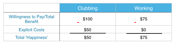
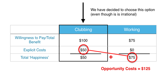


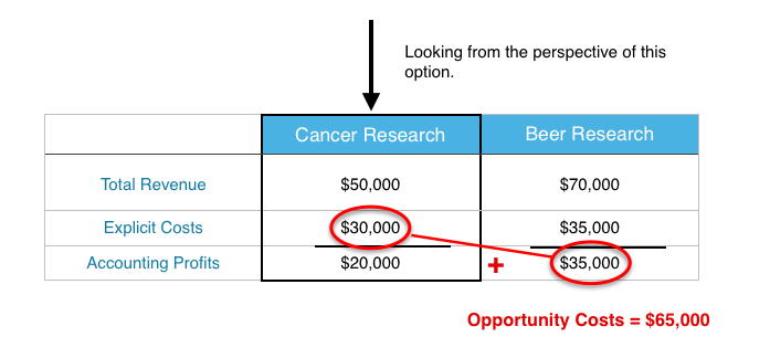
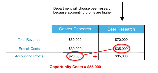
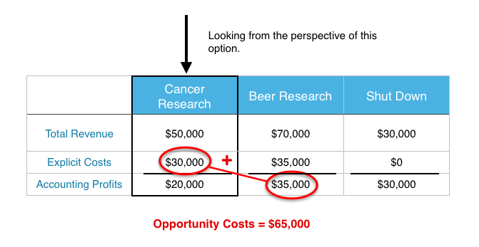
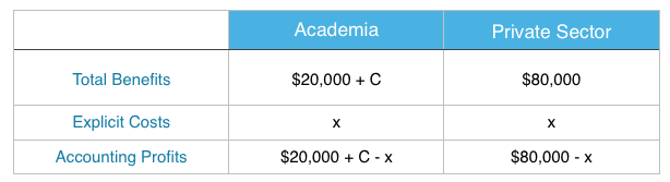


 Opportunity Cost At University


 , can be used for most elasticity problems, we just use different prices and quantities for different situations.
 , also written as
  .
.}{4}") ) there has been a 50% increase in quantity demanded. Using the same numbers, consider what happens when quantity demanded decreases from 6 coffees to 4 coffees, (
) there has been a 50% increase in quantity demanded. Using the same numbers, consider what happens when quantity demanded decreases from 6 coffees to 4 coffees, (}{6}") ) this change results in a 33% decrease in quantity demanded.
) this change results in a 33% decrease in quantity demanded.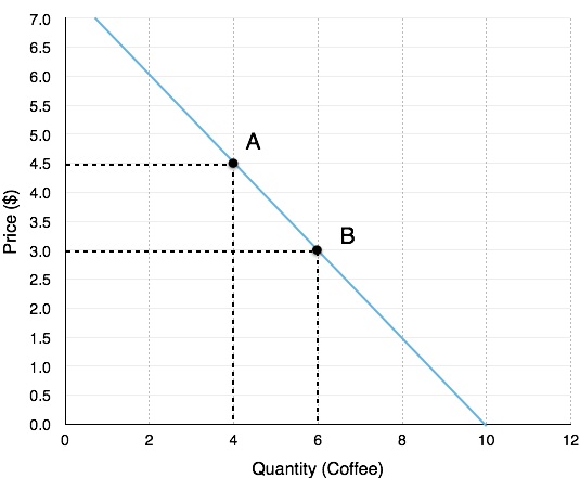
}{4.50}") = -33%. Price has fallen by 33%.
= -33%. Price has fallen by 33%. = 1.5*
}{3.00}") = 50%. Price has risen by 50%.
= 50%. Price has risen by 50%. = 0.67
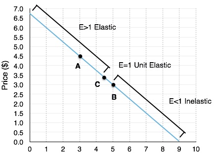
![\begin{array}{r @{{}={}} l}\%\;change\;in\;quantity & \frac { { Q }_{ 2 }-{ Q }_{ 1 } }{ ({ Q }_{ 2 }+{ Q }_{ 1 })/2 } \times 100 \\[1em] \%\;change\;in\;price & \frac { { P }_{ 2 }-{ P }_{ 1 } }{ ({ P }_{ 2 }+{ P }_{ 1 })/2 } \times 100 \end{array}](https://s0.wp.com/latex.php?latex=%5Cbegin%7Barray%7D%7Br+%40%7B%7B%7D%3D%7B%7D%7D+l%7D%5C%25%5C%3Bchange%5C%3Bin%5C%3Bquantity+%26+%5Cfrac+%7B+%7B+Q+%7D_%7B+2+%7D-%7B+Q+%7D_%7B+1+%7D+%7D%7B+%28%7B+Q+%7D_%7B+2+%7D%2B%7B+Q+%7D_%7B+1+%7D%29%2F2+%7D+%5Ctimes+100+%5C%5C%5B1em%5D+%5C%25%5C%3Bchange%5C%3Bin%5C%3Bprice+%26+%5Cfrac+%7B+%7B+P+%7D_%7B+2+%7D-%7B+P+%7D_%7B+1+%7D+%7D%7B+%28%7B+P+%7D_%7B+2+%7D%2B%7B+P+%7D_%7B+1+%7D%29%2F2+%7D+%5Ctimes+100+%5Cend%7Barray%7D&bg=T&fg=000000&s=0&zoom=1 "\begin{array}{r @{{}={}} l}\%\;change\;in\;quantity & \frac { { Q }_{ 2 }-{ Q }_{ 1 } }{ ({ Q }_{ 2 }+{ Q }_{ 1 })/2 } \times 100 \\[1em] \%\;change\;in\;price & \frac { { P }_{ 2 }-{ P }_{ 1 } }{ ({ P }_{ 2 }+{ P }_{ 1 })/2 } \times 100 \end{array}")
![\begin{array}{r @{{}={}} l}\%\;change\;in\;quantity & \frac { { 6 }-{ 4 } }{ ({ 6 }+{ 4 })/2 } \times 100 \\[1em] & \frac { 2 }{ 5 } \times 100 \\[1em] & 40\% \\[1em] \%\;change\;in\;price & \frac { { 3.00 }-{ 4.50 } }{ ({ 3.00 }+{ 4.50 })/2 } \times 100 \\[1em] & \frac { -1.50 }{ 3.75 } \times 100 \\[1em] & -40\% \\[1em] Price\;Elasticity\;of\;Demand & \frac { 40\% }{ 40\% } \\[1em] & 1 \end{array}](https://s0.wp.com/latex.php?latex=%5Cbegin%7Barray%7D%7Br+%40%7B%7B%7D%3D%7B%7D%7D+l%7D%5C%25%5C%3Bchange%5C%3Bin%5C%3Bquantity+%26+%5Cfrac+%7B+%7B+6+%7D-%7B+4+%7D+%7D%7B+%28%7B+6+%7D%2B%7B+4+%7D%29%2F2+%7D+%5Ctimes+100+%5C%5C%5B1em%5D+%26+%5Cfrac+%7B+2+%7D%7B+5+%7D+%5Ctimes+100+%5C%5C%5B1em%5D+%26+40%5C%25+%5C%5C%5B1em%5D+%5C%25%5C%3Bchange%5C%3Bin%5C%3Bprice+%26+%5Cfrac+%7B+%7B+3.00+%7D-%7B+4.50+%7D+%7D%7B+%28%7B+3.00+%7D%2B%7B+4.50+%7D%29%2F2+%7D+%5Ctimes+100+%5C%5C%5B1em%5D+%26+%5Cfrac+%7B+-1.50+%7D%7B+3.75+%7D+%5Ctimes+100+%5C%5C%5B1em%5D+%26+-40%5C%25+%5C%5C%5B1em%5D+Price%5C%3BElasticity%5C%3Bof%5C%3BDemand+%26+%5Cfrac+%7B+40%5C%25+%7D%7B+40%5C%25+%7D+%5C%5C%5B1em%5D+%26+1+%5Cend%7Barray%7D&bg=T&fg=000000&s=0&zoom=1 "\begin{array}{r @{{}={}} l}\%\;change\;in\;quantity & \frac { { 6 }-{ 4 } }{ ({ 6 }+{ 4 })/2 } \times 100 \\[1em] & \frac { 2 }{ 5 } \times 100 \\[1em] & 40\% \\[1em] \%\;change\;in\;price & \frac { { 3.00 }-{ 4.50 } }{ ({ 3.00 }+{ 4.50 })/2 } \times 100 \\[1em] & \frac { -1.50 }{ 3.75 } \times 100 \\[1em] & -40\% \\[1em] Price\;Elasticity\;of\;Demand & \frac { 40\% }{ 40\% } \\[1em] & 1 \end{array}")


 = 0.75, which means the inverse is 1/0.75 = 1.33. Plugging this information into our equation, we get:
 = 1.5
= 1.5/2}}{\frac{\Delta P}{(P1+P2)/2}}") =
= 
}{\left(Q1+Q2\right)}")


} > 1")

} = 1")

} < 1")
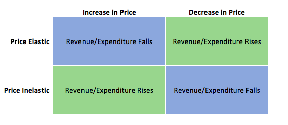
 = Elastic
 = Inelastic
 = Unit Elastic


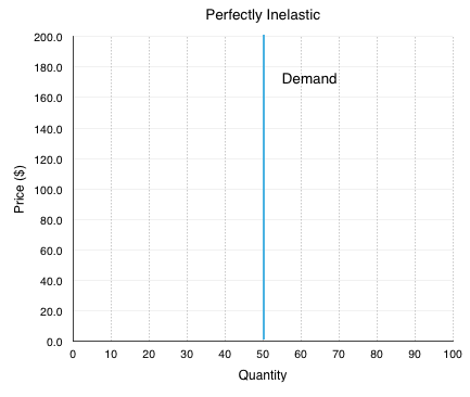
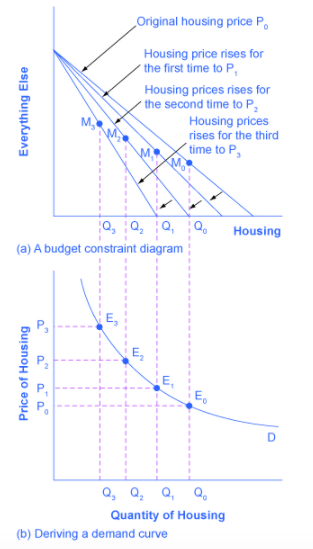
 is equal to the inverse of the slope. In the demand curve in Figure 4.3a, when the ΔP>0 then ΔQ is equal to ∞. This means that
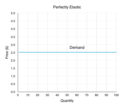


\cdot \left(8-4\right)}{2}") =
=  = $4.5 million
\cdot \left(8-5\right)}{2}") =
=  = $3.375 million
\cdot \left(8-4\right)}{2}") = $0.5 million
= $0.5 million\cdot \left(8-4\right)}{2}") = $4 million
= $4 million\cdot \left(8-5\right)}{2}") = $1.125 million
= $1.125 million\cdot \left(8-5\right)}{2}") = $2.25 million
= $2.25 million


\times \left(4.8\right)}{2}") = $24 million
= $24 million\times \left(4.8\right)}{2}") = $24 million
= $24 million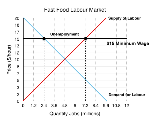
\times \left(2.4\right)}{2}") = -$6 million.
= -$6 million.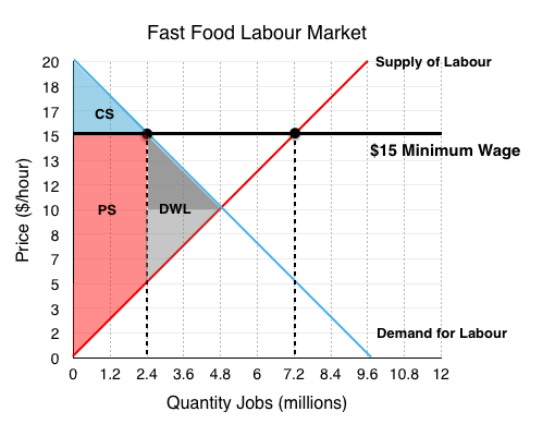
\times \left(2.4\right)}{2}") = $6 million
= $6 million
\times \left(4.8-3.6\right)}{2}") = $4.8 million.
= $4.8 million.


 –
–\left(65\right)}{2}")
\left(65\right)}{2}")
\left(100\right)}{2}")
\left(100\right)}{2}")


![\begin{array}{r @{{}={}} l}16-2P-2 & 2+5P-2 \\[0.5em] 14-2P & 5P \\[0.5em] 14-2P+2P & 5P+2P \\[0.5em] 14 & 7P \\[0.5em] \frac{14}{7} & \frac{7P}{7} \\[0.5em] 2 & P \end{array}](https://s0.wp.com/latex.php?latex=%5Cbegin%7Barray%7D%7Br+%40%7B%7B%7D%3D%7B%7D%7D+l%7D16-2P-2+%26+2%2B5P-2+%5C%5C%5B0.5em%5D+14-2P+%26+5P+%5C%5C%5B0.5em%5D+14-2P%2B2P+%26+5P%2B2P+%5C%5C%5B0.5em%5D+14+%26+7P+%5C%5C%5B0.5em%5D+%5Cfrac%7B14%7D%7B7%7D+%26+%5Cfrac%7B7P%7D%7B7%7D+%5C%5C%5B0.5em%5D+2+%26+P+%5Cend%7Barray%7D&bg=T&fg=000000&s=0&zoom=1 "\begin{array}{r @{{}={}} l}16-2P-2 & 2+5P-2 \\[0.5em] 14-2P & 5P \\[0.5em] 14-2P+2P & 5P+2P \\[0.5em] 14 & 7P \\[0.5em] \frac{14}{7} & \frac{7P}{7} \\[0.5em] 2 & P \end{array}")
 \\ & 16-4 \\ & 12 \end{array}")
 \\ & 2+10 \\ & 12 \end{array}")

![\begin{array}{r @{{}={}} l} & \frac {\$1.03\;trillion-\$1.00\;trillion}{(\$1.03\;trillion+\$1.00\;trillion)/2} \\[1em] & \frac{0.03}{1.015} \\[1em] & 0.0296 \\[1em] & 2.96\%\;growth \end{array}](https://s0.wp.com/latex.php?latex=%5Cbegin%7Barray%7D%7Br+%40%7B%7B%7D%3D%7B%7D%7D+l%7D+%26+%5Cfrac+%7B%5C%241.03%5C%3Btrillion-%5C%241.00%5C%3Btrillion%7D%7B%28%5C%241.03%5C%3Btrillion%2B%5C%241.00%5C%3Btrillion%29%2F2%7D+%5C%5C%5B1em%5D+%26+%5Cfrac%7B0.03%7D%7B1.015%7D+%5C%5C%5B1em%5D+%26+0.0296+%5C%5C%5B1em%5D+%26+2.96%5C%25%5C%3Bgrowth+%5Cend%7Barray%7D&bg=T&fg=000000&s=0&zoom=1 "\begin{array}{r @{{}={}} l} & \frac {\$1.03\;trillion-\$1.00\;trillion}{(\$1.03\;trillion+\$1.00\;trillion)/2} \\[1em] & \frac{0.03}{1.015} \\[1em] & 0.0296 \\[1em] & 2.96\%\;growth \end{array}")