1
Data and Information
David DiBiase
1.1. Overview
When I started writing this text in 1997, my office was across the street (and, fortunately, upwind) from Penn State’s power plant. The energy used to heat and cool my office is still produced there by burning coal mined from nearby ridges. Combustion transforms the potential energy stored in the coal into electricity, which solves the problem of an office that would otherwise be too cold or too warm. Unfortunately, the solution itself causes another problem, namely emissions of carbon dioxide and other more noxious substances into the atmosphere. Cleaner means of generating electricity exist, of course, but they too involve transforming energy from one form to another. And cleaner methods cost more than most of us are willing or able to pay.
It seems to me that a coal-fired power plant is a pretty good analogy for a geographic information system. For that matter, GIS is comparable to any factory or machine that transforms a raw material into something more valuable. Data is grist for the GIS mill. GIS is like the machinery that transforms the data into the commodity–information–that is needed to solve problems or create opportunities. And the problems that the manufacturing process itself creates include uncertainties resulting from imperfections in the data, intentional or unintentional misuse of the machinery, and ethical issues related to what the information is used for, and who has access to it.
This text explores the nature of geographic information. To study the nature of something is to investigate its essential characteristics and qualities. To understand the nature of the energy produced in a coal-fired power plant, one should study the properties, morphology, and geographic distribution of coal. By the same reasoning I believe that a good approach to understanding the information produced by GIS is to investigate the properties of geographic data and the technologies and institutions that produce it.
Objectives
The goal of Chapter 1 is to situate GIS in a larger enterprise known as Geographic Information Science and Technology (GIS&T), and in what the U.S. Department of Labor calls the “geospatial industry.” In particular, students who successfully complete Chapter 1 should be able to:
- Define a geographic information system;
- Recognize and name basic database operations from verbal descriptions;
- Recognize and name basic approaches to geographic representation from verbal descriptions;
- Identify and explain at least three distinguishing properties of geographic data; and
- Outline the kinds of questions that GIS can help answer.
1.2. Checklist
The following checklist is for Penn State students who are registered for classes in which this text, and associated quizzes and projects in the ANGEL course management system, have been assigned. You may find it useful to print this page out first so that you can follow along with the directions.
Chapter 1 Checklist (for registered students only)
| Step | Activity | Access/Directions |
|---|---|---|
| 1 | Read Chapter 1 | This is the second page of Chapter 1. Click on the links at the bottom of the page to continue or to return to the previous page, or to go to the top of the chapter. You can also navigate the text via the links in the GEOG 482 menu on the left. |
| 2 | Submit quizzes as you come across them in the chapter. Blue banners denote practice quizzes that are not graded. Red banners signal graded quizzes. (Note that Chapter 1 does not include a graded quiz.) | Go to ANGEL > [your course section] > Lessons tab > Chapter 1 folder > [quiz] |
| 3 | Perform “Try This” activities as you come across them in the chapter. “Try This” activities are not graded. | Instructions are provided for each activity. |
| 4 | Read comments and questions posted by fellow students. Add comments and questions of your own, if any. | Comments and questions may be posted on any page of the text, or in a Chapter-specific discussion forum in ANGEL. |
1.3. Data
“After more than 30 years, we’re still confronted by the same major challenge that GIS professionals have always faced: You must have good data. And good data are expensive and difficult to create.” (Wilson, 2001, p. 54)
Data consist of symbols that represent measurements of phenomena. People create and study data as a means to help understand how natural and social systems work. Such systems can be hard to study because they’re made up of many interacting phenomena that are often difficult to observe directly, and because they tend to change over time. We attempt to make systems and phenomena easier to study by measuring their characteristics at certain times. Because it’s not practical to measure everything, everywhere, at all times, we measure selectively. How accurately data reflect the phenomena they represent depends on how, when, where, and what aspects of the phenomena were measured. All measurements, however, contain a certain amount of error.
Measurements of the locations and characteristics of phenomena can be represented with several different kinds of symbols. For example, pictures of the land surface, including photographs and maps, are made up of graphic symbols. Verbal descriptions of property boundaries are recorded on deeds using alphanumeric symbols. Locations determined by satellite positioning systems are reported as pairs of numbers called coordinates. As you probably know, all of these different types of data–pictures, words, and numbers–can be represented in computers in digital form. Obviously, digital data can be stored, transmitted, and processed much more efficiently than their physical counterparts that are printed on paper. These advantages set the stage for the development and widespread adoption of GIS.
1.4. Information
Information is data that has been selected or created in response to a question. For example, the location of a building or a route is data, until they are needed to dispatch an ambulance in response to an emergency. When used to inform those who need to know “where is the emergency, and what’s the fastest route between here and there?,” the data are transformed into information. The transformation involves the ability to ask the right kind of question, and the ability to retrieve existing data–or to generate new data from the old–that help people answer the question. The more complex the question, and the more locations involved, the harder it becomes to produce timely information with paper maps alone.
Interestingly, the potential value of data is not necessarily lost when they are used. Data can be transformed into information again and again, provided that the data are kept up to date. Given the rapidly increasing accessibility of computers and communications networks in the U.S. and abroad, it’s not surprising that information has become a commodity, and that the ability to produce it has become a major growth industry.
1.5. Information Systems
Information systems are computer-based tools that help people transform data into information.
As you know, many of the problems and opportunities faced by government agencies, businesses, and other organizations are so complex, and involve so many locations, that the organizations need assistance in creating useful and timely information. That’s what information systems are for.
Allow me a fanciful example. Suppose that you’ve launched a new business that manufactures solar-powered lawn mowers. You’re planning a direct mail campaign to bring this revolutionary new product to the attention of prospective buyers. But since it’s a small business, you can’t afford to sponsor coast-to-coast television commercials, or to send brochures by mail to more than 100 million U.S. households. Instead, you plan to target the most likely customers – those who are environmentally conscious, have higher than average family incomes, and who live in areas where there is enough water and sunshine to support lawns and solar power.
Fortunately, lots of data are available to help you define your mailing list. Household incomes are routinely reported to banks and other financial institutions when families apply for mortgages, loans, and credit cards. Personal tastes related to issues like the environment are reflected in behaviors such as magazine subscriptions and credit card purchases. Firms like Claritas amass such data, and transform it into information by creating “lifestyle segments” – categories of households that have similar incomes and tastes. Your solar lawnmower company can purchase lifestyle segment information by 5-digit ZIP code, or even by ZIP+4 codes, which designate individual households.
It’s astonishing how companies like Claritas can create valuable information from the millions upon millions of transactions that are recorded every day. Their products are made possible by the fact that the original data exist in digital form, and because the companies have developed information systems that enable them to transform the data into information that companies like yours value. The fact that lifestyle information products are often delivered by geographic areas, such as ZIP codes, speaks to the appeal of geographic information systems.
TRY THIS
Try out the demo of what Claritas used to call the “You Are Where You Live” tool. The Nielson Company has acquired Claritas and the tool is now called “MyBestSegments.” Point your browser to the My Best Segments page. Click the button labeled “ZIP Code Look-up.”
Enter your ZIP code then choose a segmentation system. Do the lifestyle segments, listed on the left, seem accurate for your community? If you don’t live in the United States, try Penn State’s Zip code, 16802.
Does the market segmentation match your expectations? Registered students are welcome to post comments directly to this page.
1.6. Databases, Mapping, and GIS
One of our objectives in this first chapter is to be able to define a geographic information system. Here’s a tentative definition: A GIS is a computer-based tool used to help people transform geographic data into geographic information.
The definition implies that a GIS is somehow different from other information systems, and that geographic data are different from non-geographic data. Let’s consider the differences next.
1.7. Database Management Systems
Claritas and similar companies use database management systems (DBMS) to create the “lifestyle segments” that I referred to in the previous section. Basic database concepts are important since GIS incorporates much of the functionality of DBMS.
Digital data are stored in computers as files. Often, data are arrayed in tabular form. For this reason, data files are often called tables. A database is a collection of tables. Businesses and government agencies that serve large clienteles, such as telecommunications companies, airlines, credit card firms, and banks, rely on extensive databases for their billing, payroll, inventory, and marketing operations. Database management systems are information systems that people use to store, update, and analyze non-geographic databases.
Often, data files are tabular in form, composed of rows and columns. Rows, also known as records, correspond with individual entities, such as customer accounts. Columns correspond with the variousattributes associated with each entity. The attributes stored in the accounts database of a telecommunications company, for example, might include customer names, telephone numbers, addresses, current charges for local calls, long distance calls, taxes, etc.
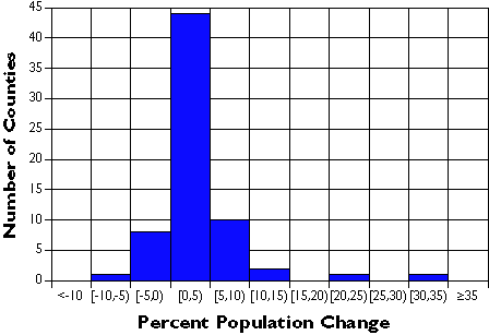
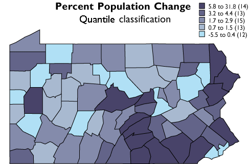
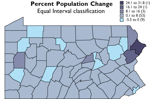
Geographic data are a special case: records correspond with places, not people or accounts. Columns represent the attributes of places. The data in the following table, for example, consist of records for Pennsylvania counties. Columns contain selected attributes of each county, including the county’s ID code, name, and 1980 population.
| FIPS Code | County | 1980 Pop |
|---|---|---|
| 42001 | Adams County | 78274 |
| 42003 | Allegheny County | 1336449 |
| 42005 | Armstrong County | 73478 |
| 42007 | Beaver County | 186093 |
| 42009 | Bedford County | 47919 |
| 42011 | Berks County | 336523 |
| 42013 | Blair County | 130542 |
| 42015 | Bradford County | 60967 |
| 42017 | Bucks County | 541174 |
| 42019 | Butler County | 152013 |
| 42021 | Cambria County | 163062 |
| 42023 | Cameron County | 5913 |
| 42025 | Carbon County | 56846 |
| 42027 | Centre County | 124812 |
The contents of one file in a database.
The example is a very simple file, but many geographic attribute databases are in fact very large (the U.S. is made up of over 3,000 counties, almost 50,000 census tracts, about 43,000 five-digit ZIP code areas and many tens of thousands more ZIP+4 code areas). Large databases consist not only of lots of data, but also lots of files. Unlike a spreadsheet, which performs calculations only on data that are present in a single document, database management systems allow users to store data in, and retrieve data from, many separate files. For example, suppose an analyst wished to calculate population change for Pennsylvania counties between the 1980 and 1990 censuses. More than likely, 1990 population data would exist in a separate file, like so:
| FIPS Code | 1990 Pop |
|---|---|
| 42001 | 84921 |
| 42003 | 1296037 |
| 42005 | 73872 |
| 42007 | 187009 |
| 42009 | 49322 |
| 42011 | 352353 |
| 42013 | 131450 |
| 42015 | 62352 |
| 42017 | 578715 |
| 42019 | 167732 |
| 42021 | 158500 |
| 42023 | 5745 |
| 42025 | 58783 |
| 42027 | 131489 |
Another file in a database. A database management system (DBMS) can relate this file to the prior one illustrated above because they share the list of attributes called “FIPS Code.”
If two data files have at least one common attribute, a DBMS can combine them in a single new file. The common attribute is called a key. In this example, the key was the county FIPS code (FIPS stands for Federal Information Processing Standard). The DBMS allows users to produce new data as well as to retrieve existing data, as suggested by the new “% Change” attribute in the table below.
| FIPS | County | 1980 | 1990 | % Change |
|---|---|---|---|---|
| 42001 | Adams | 78274 | 84921 | 8.5 |
| 42003 | Allegheny | 1336449 | 1296037 | -3 |
| 42005 | Armstrong | 73478 | 73872 | 0.5 |
| 42007 | Beaver | 186093 | 187009 | 0.5 |
| 42009 | Bedford | 47919 | 49322 | 2.9 |
| 42011 | Berks | 336523 | 352353 | 4.7 |
| 42013 | Blair | 130542 | 131450 | 0.7 |
| 42015 | Bradford | 60967 | 62352 | 2.3 |
| 42017 | Bucks | 541174 | 578715 | 6.9 |
| 42019 | Butler | 152013 | 167732 | 10.3 |
| 42021 | Cambria | 163062 | 158500 | -2.8 |
| 42023 | Cameron | 5913 | 5745 | -2.8 |
| 42025 | Carbon | 56846 | 58783 | 3.4 |
| 42027 | Centre | 124812 | 131489 | 5.3 |
A new file produced from the prior two files as a result of two database operations. One operation merged the contents of the two files without redundancy. A second operation produced a new attribute–”% Change”–dividing the difference between “1990 Pop” and “1980 Pop” by “1980 Pop” and expressing the result as a percentage.
Database management systems are valuable because they provide secure means of storing and updating data. Database administrators can protect files so that only authorized users can make changes. DBMS provide transaction management functions that allow multiple users to edit the database simultaneously. In addition, DBMS also provide sophisticated means to retrieve data that meet user specified criteria. In other words, they enable users to select data in response to particular questions. A question that is addressed to a database through a DBMS is called a query.
Database queries include basic set operations, including union, intersection, and difference. The product of aunion of two or more data files is a single file that includes all records and attributes, without redundancy. An intersection produces a data file that contains only records present in all files. A difference operation produces a data file that eliminates records that appear in both original files. (Try drawing Venn diagrams–intersecting circles that show relationships between two or more entities–to illustrate the three operations. Then compare your sketch to the venn diagram example. ) All operations that involve multiple data files rely on the fact that all files contain a common key. The key allows the database system to relate the separate files. Databases that contain numerous files that share one or more keys are called relational databases. Database systems that enable users to produce information from relational databases are calledrelational database management systems.
A common use of database queries is to identify subsets of records that meet criteria established by the user. For example, a credit card company may wish to identify all accounts that are 30 days or more past due. A county tax assessor may need to list all properties not assessed within the past 10 years. Or the U.S. Census Bureau may wish to identify all addresses that need to be visited by census takers, because census questionnaires were not returned by mail. DBMS software vendors have adopted a standardized language called SQL (Structured Query Language) to pose such queries.
PRACTICE QUIZ
1.8. Mapping Systems
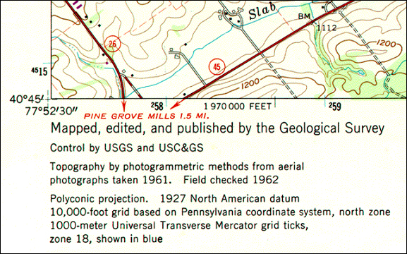
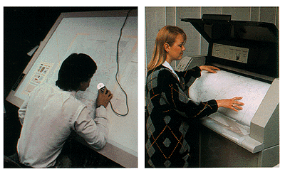
GIS (geographic information systems) arose out of the need to perform spatial queries on geographic data. A spatial query requires knowledge of locations as well as attributes. For example, an environmental analyst might want to know which public drinking water sources are located within one mile of a known toxic chemical spill. Or, a planner might be called upon to identify property parcels located in areas that are subject to flooding. To accommodate geographic data and spatial queries, database management systems need to be integrated with mapping systems. Until about 1990, most maps were printed from handmade drawings or engravings. Geographic data produced by draftspersons consisted of graphic marks inscribed on paper or film. To this day, most of the lines that appear on topographic maps published by the U.S. Geological Survey were originally engraved by hand. The place names shown on the maps were affixed with tweezers, one word at a time. Needless to say, such maps were expensive to create and to keep up to date. Computerization of the mapmaking process had obvious appeal.
Computer-aided design (CAD) CAD systems were originally developed for engineers, architects, and other design professionals who needed more efficient means to create and revise precise drawings of machine parts, construction plans, and the like. In the 1980s, mapmakers began to adopt CAD in place of traditional map drafting. CAD operators encode the locations and extents of roads, streams, boundaries and other entities by tracing maps mounted on electronic drafting tables, or by key-entering location coordinates, angles, and distances. Instead of graphic features, CAD data consist of digital features, each of which is composed of a set of point locations. Calculations of distances, areas, and volumes can easily be automated once features are digitized. Unfortunately, CAD systems typically do not encode data in forms that support spatial queries. In 1988, a geographer named David Cowen illustrated the benefits and shortcomings of CAD for spatial decision making. He pointed out that a CAD system would be useful for depicting the streets, property parcel boundaries, and building footprints of a residential subdevelopment. A CAD operator could point to a particular parcel, and highlight it with a selected color or pattern. “A typical CAD system”, Cowen observed, “could not automatically shade each parcel based on values in an assessor’s database containing information regarding ownership, usage, or value, however.” A CAD system would be of limited use to someone who had to make decisions about land use policy or tax assessment.
Desktop mapping An evolutionary stage in the development of GIS, desktop mapping systems like Atlas*GIS combined some of the capabilities of CAD systems with rudimentary linkages between location data and attribute data. A desktop mapping system user could produce a map in which property parcels are automatically colored according to various categories of property values, for example. Furthermore, if property value categories were redefined, the map’s appearance could be updated automatically. Some desktop mapping systems even supported simple queries that allow users to retrieve records from a single attribute file. Most real-world decisions require more sophisticated queries involving multiple data files. That’s where real GIS comes in.
Geographic information systems (GIS) As stated earlier, information systems assist decision makers by enabling them to transform data into useful information. GIS specializes in helping users transform geographic data into geographic information. David Cowen (1988) defined GIS as a decision support tool that combines the attribute data handling capabilities of relational database management systems with the spatial data handling capabilities of CAD and desktop mapping systems. In particular, GIS enables decision makers to identify locations or routes whose attributes match multiple criteria, even though entities and attributes may be encoded in many different data files.
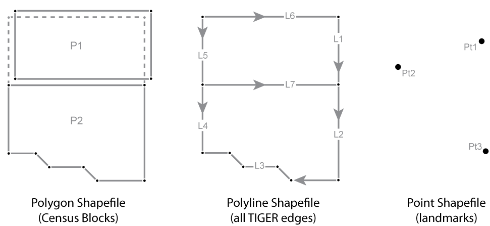
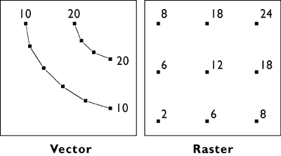
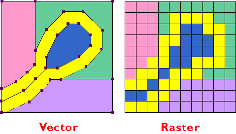
Innovators in many fields, including engineers, computer scientists, geographers, and others, started developing digital mapping and CAD systems in the 1950s and 60s. One of the first challenges they faced was to convert the graphical data stored on paper maps into digital data that could be stored in, and processed by, digital computers. Several different approaches to representing locations and extents in digital form were developed. The two predominant representation strategies are known as “vector” and “raster.”
1.9. Representation Strategies for Mapping
Recall that data consist of symbols that represent measurements. Digital geographic data are encoded as alphanumeric symbols that represent locations and attributes of locations measured at or near Earth’s surface. No geographic data set represents every possible location, of course. The Earth is too big, and the number of unique locations is too great. In much the same way that public opinion is measured through polls, geographic data are constructed by measuring representative samples of locations. And just as serious opinion polls are based on sound principles of statistical sampling, so too do geographic data represent reality by measuring carefully chosen samples of locations. Vector and raster data are, at essence, two distinct sampling strategies.
The vector approach involves sampling locations at intervals along the length of linear entities (like roads), or around the perimeter of areal entities (like property parcels). When they are connected by lines, the sampled points form line features and polygon features that approximate the shapes of their real-world counterparts.
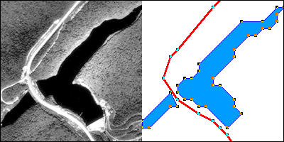
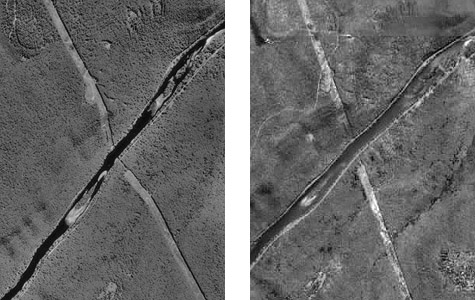
Two frames (the first and last) of an animation showing the construction of a vector representation of a reservoir and highway.
TRY THIS
Click the graphic above to download and view the animation file (vector.avi, 1.6 Mb) in a separate Microsoft Media Player window.
To view the same animation in QuickTime format (vector.mov, 1.6 Mb), click here. Requires the QuickTime plugin, which is available free at apple.com.
The aerial photograph above left shows two entities, a reservoir and a highway. The graphic above right illustrates how the entities might be represented with vector data. The small squares are nodes: point locations specified by latitude and longitude coordinates. Line segments connect nodes to form line features. In this case, the line feature colored red represents the highway. Series of line segments that begin and end at the same node form polygon features. In this case, two polygons (filled with blue) represent the reservoir.
The vector data model is consistent with how surveyors measure locations at intervals as they traverse a property boundary. Computer-aided drafting (CAD) software used by surveyors, engineers, and others, stores data in vector form. CAD operators encode the locations and extents of entities by tracing maps mounted on electronic drafting tables, or by key-entering location coordinates, angles, and distances. Instead of graphic features, CAD data consist of digital features, each of which is composed of a set of point locations.
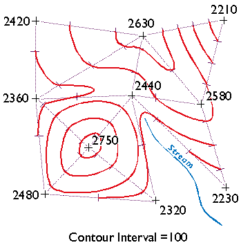
The vector strategy is well suited to mapping entities with well-defined edges, such as highways or pipelines or property parcels. Many of the features shown on paper maps, including contour lines, transportation routes, and political boundaries, can be represented effectively in digital form using the vector data model.
The raster approach involves sampling attributes at fixed intervals. Each sample represents one cell in a checkerboard-shaped grid.
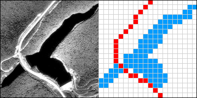
Two frames (the first and last) of an animation showing the construction of a raster representation of a reservoir and highway.
TRY THIS
Click the graphic above to download and view the animation file (raster.avi, 0.8 Mb) in a separate Microsoft Media Player window.
To view the same animation in QuickTime format (raster.mov, 0.6 Mb), click here. Requires the QuickTime plugin, which is available free at apple.com.
The graphic above illustrates a raster representation of the same reservoir and highway as shown in the vector representation. The area covered by the aerial photograph has been divided into a grid. Every grid cell that overlaps one of the two selected entities is encoded with an attribute that associates it with the entity it represents. Actual raster data would not consist of a picture of red and blue grid cells, of course; they would consist of a list of numbers, one number for each grid cell, each number representing an entity. For example, grid cells that represent the highway might be coded with the number “1″ and grid cells representing the reservoir might be coded with the number “2.”
The raster strategy is a smart choice for representing phenomena that lack clear-cut boundaries, such as terrain elevation, vegetation, and precipitation. Digital airborne imaging systems, which are replacing photographic cameras as primary sources of detailed geographic data, produce raster data by scanning the Earth’s surface pixel by pixel and row by row.
Both the vector and raster approaches accomplish the same thing: they allow us to caricature the Earth’s surface with a limited number of locations. What distinguishes the two is the sampling strategies they embody. The vector approach is like creating a picture of a landscape with shards of stained glass cut to various shapes and sizes. The raster approach, by contrast, is more like creating a mosaic with tiles of uniform size. Neither is well suited to all applications, however. Several variations on the vector and raster themes are in use for specialized applications, and the development of new object-oriented approaches is underway.
PRACTICE QUIZ
1.10. Automated Map Analysis
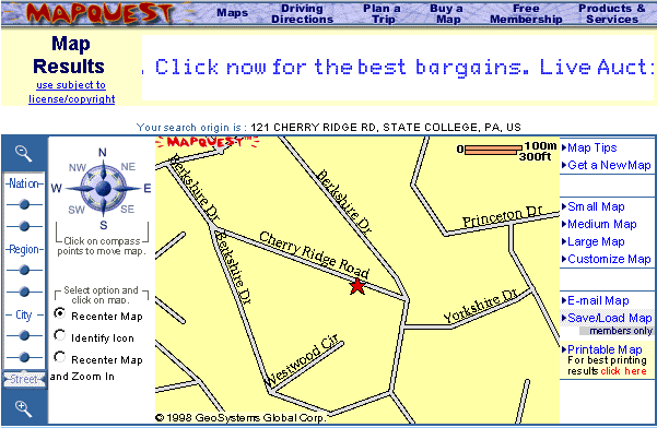
As I mentioned earlier, the original motivation for developing computer mapping systems was to automate the map making process. Computerization has not only made map making more efficient, it has also removed some of the technological barriers that used to prevent people from making maps themselves. What used to be an arcane craft practiced by a few specialists has become a “cloud” application available to any networked computer user. When I first started writing this course in 1997, my example was the mapping extension included in Microsoft Excel 97, which made creating a simple map as easy as creating a graph. Ten years later, who hasn’t used Google Maps or MapQuest?
As much as computerization has changed the way maps are made, it has had an even greater impact on how maps can be used. Calculations of distance, direction, and area, for example, are tedious and error-prone operations with paper maps. Given a digital map, such calculations can easily be automated. Those who are familiar with CAD systems know this from first-hand experience. Highway engineers, for example, rely on aerial imagery and digital mapping systems to estimate project costs by calculating the volumes of rock that need to be excavated from hillsides and filled into valleys.
The ability to automate analytical tasks not only relieves tedium and reduces errors. It also allows us to perform tasks that would otherwise seem impractical. Consider, for example, if you were asked to plot on a map a 100-meter-wide buffer zone surrounding a protected stream. If all you had to work with was a paper map, a ruler, and a pencil, you might have a lengthy job on your hands. You might draw lines scaled to represent 100 meters, perpendicular to the river on both sides, at intervals that vary in frequency with the sinuosity of the stream. Then you might plot a perimeter that connects the end points of the perpendicular lines. If your task was to create hundreds of such buffer zones, you might conclude that automation is a necessity, not just a luxury.
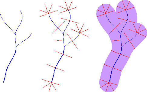
Surrounding a protected stream with a buffer polygon.
Some tasks can be implemented equally well in either vector- or raster- oriented mapping systems. Other tasks are better suited to one representation strategy or another. The calculation of slope, for example, or ofgradient–the direction of maximum slope along a surface–is more efficiently accomplished with raster data. The slope of one raster grid cell may be calculated by comparing its elevation to the elevations of the eight cells that surround it. Raster data are also preferred for a procedure called viewshed analysis that predicts which portions of a landscape will be in view, or hidden from view, from a particular perspective.
Some mapping systems provide ways to analyze attribute data as well as locational data. For example, the Excel mapping extension I mentioned above links the geographic data display capabilities of a mapping system with the data analysis capabilities of a spreadsheet. As you probably know, spreadsheets like Excel let users perform calculations on individual fields, columns, or entire files. A value changed in one field automatically changes values throughout the spreadsheet. Arithmetic, financial, statistical, and even certain database functions are supported. But as useful as spreadsheets are, they were not engineered to provide secure means of managing and analyzing large databases that consist of many related files, each of which is the responsibility of a different part of an organization. A spreadsheet is not a DBMS. And by the same token, a mapping system is not a GIS.
1.11. Geographic Information Systems
The preceding discussion leads me to revise my working definition:
As I mentioned earlier, a geographer named David Cowen defined GIS as a decision-support tool that combines the capabilities of a relational database management system with the capabilities of a mapping system (1988). Cowen cited an earlier study by William Carstensen (1986), who sought to establish criteria by which local governments might choose among competing GIS products. Carstensen chose site selection as an example of the kind of complex task that many organizations seek to accomplish with GIS. Given the necessary database, he advised local governments to expect that a fully functional GIS should be able to identify property parcels that are:
- At least five acres in size;
- Vacant or for sale;
- Zoned commercial;
- Not subject to flooding;
- Located not more than one mile from a heavy duty road; and
- Situated on terrain whose maximum slope is less than ten percent.
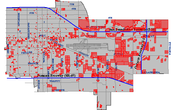
The first criterion–identifying parcels five acres or more in size–might require two operations. As described earlier, a mapping system ought to be able to calculate automatically the area of a parcel. Once the area is calculated and added as a new attribute into the database, an ordinary database query could produce a list of parcels that satisfy the size criterion. The parcels on the list might also be highlighted on a map, as in the example below.
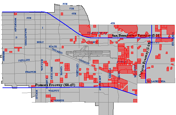
The cartographic result of a database query identifying all property parcels greater than or equal to five acres in size. (City of Ontario, CA, GIS Department. Used by permission.)
The ownership status of individual parcels would be an attribute of a property database maintained by a local tax assessor’s office. Parcels whose ownership status attribute value matched the criteria “vacant” or “for sale” could be identified through another ordinary database query.
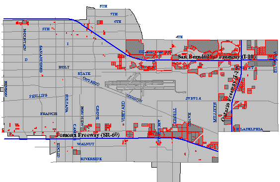
The cartographic result of a spatial intersection (or map overlay) operation identifying all property parcels zoned for commercial (C-1) development. (City of Ontario, CA, GIS Department. Used by permission.)
Carstensen’s third criterion was to determine which parcels were situated within areas zoned for commercial development. This would be simple if authorized land uses were included as an attribute in the community’s property parcel database. This is unlikely to be the case, however, since zoning and taxation are the responsibilities of different agencies. Typically, parcels and land use zones exist as separate paper maps. If the maps were prepared at the same scale, and if they accounted for the shape of the Earth in the same manner, then they could be superimposed one over another on a light table. If the maps let enough light through, parcels located within commercial zones could be identified.
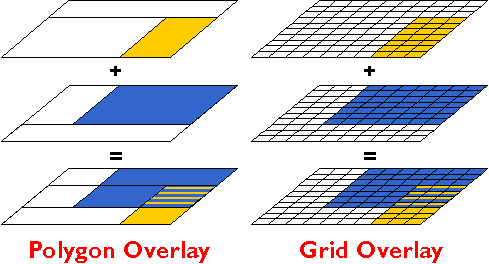
The GIS approach to a task like this begins by digitizing the paper maps, and by producing corresponding attribute data files. Each digital map and attribute data file is stored in the GIS separately, like separate maplayers. A fully functional GIS would then be used to perform a spatial intersection that is analogous to the overlay of the paper maps. Spatial intersection, otherwise known as map overlay, is one of the defining capabilities of GIS.
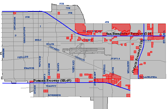
The cartographic result of a buffer operation identifying all property parcels located within a specified distance of a specified type of highway. (City of Ontario, CA, GIS Department. Used by permission.)
Another of Carstensen’s criteria was to identify parcels located within one mile of a heavy-duty highway. Such a task requires a digital map and associated attributes produced in such a way as to allow heavy-duty highways to be differentiated from other geographic entities. Once the necessary database is in place, abuffer operation can be used to create a polygon feature whose perimeter surrounds all “heavy duty highway” features at the specified distance. A spatial intersection is then performed, isolating the parcels within the buffer from those outside the buffer.
To produce a final list of parcels that meet all the site selection criteria, the GIS analyst might perform anintersection operation that creates a new file containing only those records that are present in all the other intermediate results.
The cartographic result of the intersection of the above three figures. Only the parcels shown in this map satisfy all of the site selection criteria. (City of Ontario, CA, GIS Department. Used by permission.)
I created the maps shown above in 1998 using the Geographic Information Web Server of the City of Ontario, California. Although it is no longer supported, the City of Ontario was one of the first of its kind to provide much of the functionality required to perform a site suitability analysis online. Today, many local governments offer similar Internet map services to current and prospective taxpayers.
TRY THIS
Find an online site selection utility similar to the one formerly provided by the City of Ontario. Registered Penn State students can post a comment to this page describing the site’s functionality, and comparing it with the capabilities of the example illustrated above.
1.12. Geographic Information Science and Technology
So far in this chapter I’ve tried to make sense of GIS in relation to several information technologies, including database management, computer-aided design, and mapping systems. At this point I’d like to expand the discussion to consider GIS as one element in a much larger field of study called “Geographic Information Science and Technology” (GIS&T). As shown in the following illustration, GIS&T encompasses three subfields including:
- Geographic Information Science, the multidisciplinary research enterprise that addresses the nature of geographic information and the application of geospatial technologies to basic scientific questions;
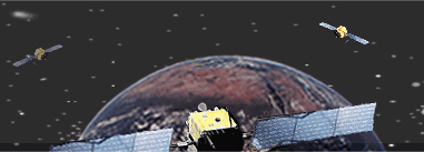
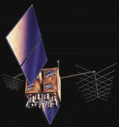
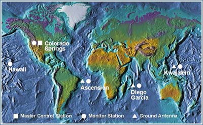
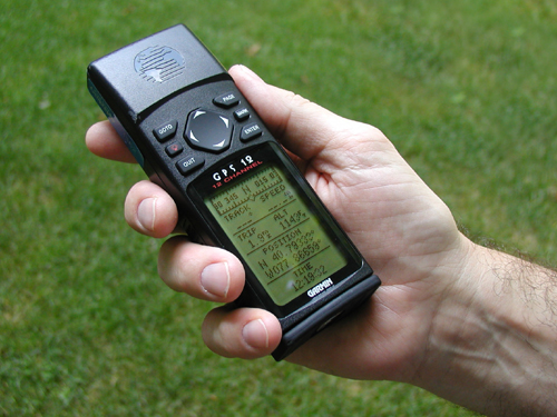
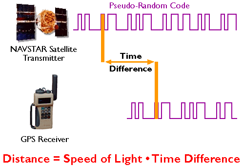
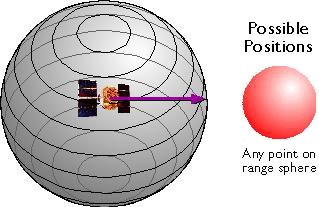
- Geospatial Technology, the specialized set of information technologies that support acquisition, management, analysis, and visualization of geo-referenced data, including the Global Navigation Satellite System (GPS and others), satellite, airborne, and shipboard remote sensing systems; and GIS and image analysis software tools; and
- Applications of GIS&T, the increasingly diverse uses of geospatial technology in government, industry, and academia.This is the subfield in which most GIS professionals work.
Arrows in the diagram below reflect relationships among the three subfields, as well as to numerous other fields, including Geography, Landscape Architecture, Computer Science, Statistics, Engineering, and many others. Each of these fields has influenced, and some have been influenced by, the development of GIS&T. It is important to note that these fields and subfields do not neatly correspond with professions like GIS analyst, photogrammetrist, or land surveyor. Rather, GIS&T is a nexus of overlapping professions that differ in backgrounds, disciplinary allegiances, and regulatory status.
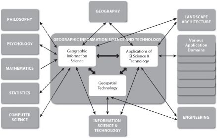
The field of Geographic Information Science and Technology (GIS&T) and its relations to other fields. Two-way relations that are half-dashed represent asymmetrical contributions between allied fields. (© 2006 Association of American Geographers and University Consortium for Geographic Information Science. Used by permission. All rights reserved.)
The illustration above first appeared in the Geographic Information Science and Technology Body of Knowledge (DiBiase, DeMers, Johnson, Kemp, Luck, Plewe, and Wentz, 2006), published by the University Consortium for Geographic Information Science (UCGIS) and the Association of American Geographers (AAG) in 2006. The Body of Knowledge is a community-developed inventory of the knowledge and skills that define the GIS&T field. Like the bodies of knowledge developed in Computer Science and other fields, the GIS&T BoK represents the GIS&T knowledge domain as a hierarchical list of knowledge areas, units, topics, and educational objectives. The ten knowledge areas and 73 units that make up the first edition are shown in the table below. Twenty-six “core” units (those in which all graduates of a degree or certificate program should be able to demonstrate some level of mastery) are shown in bold type. Not shown are the 329 topics that make up the units, or the 1,660 education objectives by which topics are defined. These appear in the full text of the GIS&T BoK. Unfortunately, the full text is not freely available online. An important related work produced by the U.S. Department of Labor is, however. We’ll take a look at that shortly.
KNOWLEDGE AREAS AND UNITS COMPRISING THE 1ST EDITION OF THE GIS&T BOK
-Knowledge Area AM. Analytical Methods
-Unit AM1 Academic and analytical origins
-Unit AM2 Query operations and query languages
-Unit AM3 Geometric measures
-Unit AM4 Basic analytical operations
-Unit AM5 Basic analytical methods
-Unit AM6 Analysis of surfaces
-Unit AM7 Spatial statistics
-Unit AM8 Geostatistics
-Unit AM9 Spatial regression and econometrics
-Unit AM10 Data mining
-Unit AM11 Network analysis
-Unit AM12 Optimization and location-allocation modeling
-Knowledge Area CF. Conceptual Foundations
-Unit CF1 Philosophical foundations
-Unit CF2 Cognitive and social foundations
-Unit CF3 Domains of geographic information
-Unit CF4 Elements of geographic information
-Unit CF5 Relationships
-Unit CF6 Imperfections in geographic information
-Knowledge Area CV. Cartography and Visualization
-Unit CV1 History and trends
-Unit CV2 Data considerations
-Unit CV3 Principles of map design
-Unit CV4 Graphic representation techniques
-Unit CV5 Map production
-Unit CV6 Map use and evaluation
-Knowledge Area DA. Design Aspects
-Unit DA1 The scope of GI S&T system design
-Unit DA2 Project definition
-Unit DA3 Resource planning
-Unit DA4 Database design
-Unit DA5 Analysis design
-Unit DA6 Application design
-Unit DA7 System implementation
-Knowledge Area DM. Data Modeling
-Unit DM1 Basic storage and retrieval structures
-Unit DM2 Database management systems
-Unit DM3 Tessellation data models
-Unit DM4 Vector and object data models
-Unit DM5 Modeling 3D, temporal, and uncertain phenomena
-Knowledge Area DN. Data Manipulation
-Unit DN1 Representation transformation
-Unit DN2 Generalization and aggregation
-Unit DN3 Transaction management of geospatial data
-Knowledge Area GC. Geocomputation
-Unit GC1 Emergence of geocomputation
-Unit GC2 Computational aspects and neurocomputing
-Unit GC3 Cellular Automata (CA) models
-Unit GC4 Heuristics
-Unit GC5 Genetic algorithms (GA)
-Unit GC6 Agent-based models
-Unit GC7 Simulation modeling
-Unit GC8 Uncertainty
-Unit GC9 Fuzzy sets
-Knowledge Area GD. Geospatial Data
–Unit GD1 Earth geometry
–Unit GD2 Land partitioning systems
-Unit GD3 Georeferencing systems
-Unit GD4 Datums
-Unit GD5 Map projections
-Unit GD6 Data quality
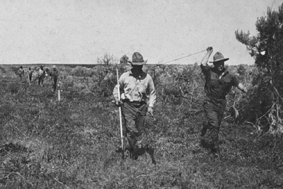
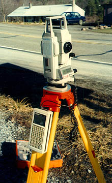
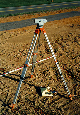
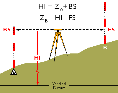
-Unit GD7 Land surveying and GPS
-Unit GD8 Digitizing
-Unit GD9 Field data collection
-Unit GD10 Aerial imaging and photogrammetry
-Unit GD11 Satellite and shipboard remote sensing
-Unit GD12 Metadata, standards, and infrastructures
-Knowledge Area GS. GIS&T and Society
-Unit GS1 Legal aspects
-Unit GS2 Economic aspects
-Unit GS3 Use of geospatial information in the public sector
-Unit GS4 Geospatial information as property
-Unit GS5 Dissemination of geospatial information
-Unit GS6 Ethical aspects of geospatial information and technology
-Unit GS7 Critical GIS
-Knowledge Area OI. Organizational and Institutional Aspects
-Unit OI1 Origins of GI S&T
-Unit O2 Managing the GI system operations and infrastructure
-Unit OI3 Organizational structures and procedures
-Unit OI4 GI S&T workforce themes
-Unit OI5 Institutional and inter-institutional aspects
-Unit OI6 Coordinating organizations (national and international)
Ten knowledge areas and 73 units comprising the 1st edition of the GIS&T BoK. Core units are indicated with bold type. (© 2006 Association of American Geographers and University Consortium for Geographic Information Science. Used by permission. All rights reserved.)
Notice that the knowledge area that includes the most core units is GD: Geospatial Data. This course focuses on the sources and distinctive characteristics of geographic data. This is one part of the knowledge base that most successful geospatial professionals possess. The Department of Labor’s Geospatial Technology Competency Model (GTCM) highlights this and other essential elements of the geospatial knowledge base. We’ll consider it next.
1.13. Geospatial Competencies and Our Curriculum
A body of knowledge is one way to think about the GIS&T field. Another way is as an industry made up of agencies and firms that produce and consume goods and services, generate sales and (sometimes) profits, and employ people. In 2003, the U.S. Department of Labor (DoL) identified “geospatial technology” as one of 14 “high growth” technology industries, along with biotech, nanotech, and others. However, the DoL also observed that the geospatial technology industry was ill-defined, and poorly understood by the public.
Subsequent efforts by the DoL and other organizations helped to clarify the industry’s nature and scope. Following a series of “roundtable” discussions involving industry thought leaders, the Geospatial Information Technology Association (GITA) and the Association of American Geographers (AAG) submitted the following “concensus” definition to DoL in 2006:
The geospatial industry acquires, integrates, manages, analyzes, maps, distributes, and uses geographic, temporal, and spatial information and knowledge. The industry includes basic and applied research, technology development, education, and applications to address the planning, decision making, and operational needs of people and organizations of all types.
In addition to the proposed industry definition, the GITA and AAG report recommended that DoL establish additional occupations in recognition of geospatial industry workforce activities and needs. At the time, the existing geospatial occupations included only Surveyors, Surveying Technicians, Mapping Technicians, and Cartographers and Photogrammetrists. Late in 2009, with input from the GITA, AAG, and other stakeholders, the DoL established six new geospatial occupations: Geospatial Information Scientists and Technologists, Geographic Information Systems Technicians, Remote Sensing Scientists and Technologists, Remote Sensing Technicians, Precision Agriculture Technicians, and Geodetic Surveyors.
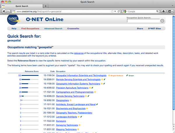
TRY THIS
Investigate the geospatial occupations at the U.S. Department of Labor’s “O*Net” database. Enter “geospatial” in the search field named “Occupation Quick Search.” Follow links to occupation descriptions. Note the estimates for 2008 employment and employment growth through 2018. Also note that, for some anomalous reason, the keyword “geospatial” is not associated with the occupation “Geodetic Surveyor.”
Meanwhile, DoL commenced a “competency modeling” initiative for high-growth industries in 2005. Their goal was to help educational institutions like ours meet the demand for qualified technology workers by identifying what workers need to know and be able to do. At DoL, a competency is “the capability to apply or use a set of related knowledge, skills, and abilities required to successfully perform ‘critical work functions’ or tasks in a defined work setting” (Ennis 2008). A competency model is “a collection of competencies that together define successful performance in a particular work setting.”
Workforce analysts at DoL began work on a Geospatial Technology Competency Model (GTCM) in 2005. Building on their research, a panel of accomplished practitioners and educators produced a complete draft of the GTCM, which they subsequently revised in response to public comments. Published in June 2010, the GTCM identifies the competencies that characterize successful workers in the geospatial industry. In contrast to GIS&T Body of Knowledge, an academic project meant to define the nature and scope of the field, the GTCM is an industry specification the defines what individual workers and students should aspire to know and learn.
TRY THIS
Explore the Geospatial Technology Competency Model (GTCM) at the U.S. Department of Labor’s Competency Model Clearinghouse. Under “Industry Competency Models,” follow the link “Geospatial Technology.” There, the pyramid (as shown below) is an image map which you can click to reveal the various competencies. The complete GTCM is also available as a Word doc and PDF file.
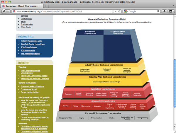
The GTCM specifies several “tiers” of competencies, progressing from general to occupationally specific. Tiers 1 through 3 (the gray and red layers), called Foundation Competencies, specify general workplace behaviors and knowledge that successful workers in most industries exhibit. Tiers 4 and 5 (yellow) include the distinctive technical competencies that characterize a given industry and its three sectors: Positioning and Data Acquisition, Analysis and Modeling, and Programming and Application Development. Above Tier 5 are additional Tiers corresponding to the occupation-specific competencies and requirements that are specified in the occupation descriptions published at O*NET Online, and in a Geospatial Management Competency Model that is in development as of January, 2012.
One way educational institutions and students can use the GTCM is as a guideline for assessing how well curricula align with workforce needs. The Penn State Online GIS program conducted such an assessment in 2011. Results appear in the spreadsheet linked below.
TRY THIS
Open the attached Excel spreadsheet to see how our Penn State Online GIS curricula address workforce needs identified in the GTCM.
The sheet will open on a cover page. At the bottom of the sheet are tabs that correspond to Tiers 1-5 of the GTCM. Click the tabs to view the worksheet associated with the Tier you want to see.
In each Tier worksheet, rows correspond to the GTCM competencies. Columns correspond to the Penn State Online courses included in the assessment. Courses that are required for most students are highlighted light blue. Course authors and instructors were asked to state what students actually do in relation to each of the GTCM competencies. Use the scroll bar at the bottom right edge of the sheet to reveal more courses.
Open the attached Flash movie to view a video demonstration of how to navigate the spreadsheet.
By studying this spreadsheet you’ll gain insight about how individual courses, and how the Penn State Online curriculum as a whole, relates to geospatial workforce needs. If you’re interested in comparing ours to curricula at other institutions, ask if they’ve conducted a similar assessment. If they haven’t, ask why not.
Finally, don’t forget that you can preview much of our online courseware through our Open Educational Resouces initiative.
1.14. Distinguishing Properties of Geographic Data
The claim that geographic information science is a distinct field of study implies that spatial data are somehow special data. Goodchild (1992) points out several distinguishing properties of geographic information. I have paraphrased four such properties below. Understanding them, and their implications for the practice of geographic information science, is a key objective of this course.
- Geographic data represent spatial locations and non-spatial attributes measured at certain times.
- Geographic space is continuous.
- Geographic space is nearly spherical.
- Geographic data tend to be spatially dependent.
Let’s consider each of these properties next.
1.15. Locations and Attributes
Geographic data represent spatial locations and non-spatial attributes measured at certain times.Goodchild (1992, p. 33) observes that “a spatial database has dual keys, allowing records to be accessed either by attributes or by locations.” Dual keys are not unique to geographic data, but “the spatial key is distinct, as it allows operations to be defined which are not included in standard query languages.” In the intervening years, software developers have created variations on SQL that incorporate spatial queries. The dynamic nature of geographic phenomena complicates the issue further, however. The need to pose spatio-temporal queries challenges geographic information scientists (GIScientists) to develop ever more sophisticated ways to represent geographic phenomena, thereby enabling analysts to interrogate their data in ever more sophisticated ways.
1.16. Continuity
Geographic space is continuous. Although dual keys are not unique to geographic data, one property of the spatial key is. “What distinguishes spatial data is the fact that the spatial key is based on two continuous dimensions” (Goodchild, 1992, p.33). “Continuous” refers to the fact that there are no gaps in the Earth’s surface. Canyons, crevasses, and even caverns notwithstanding, there is no position on or near the surface of the Earth that cannot be fixed within some sort of coordinate system grid. Nor is there any theoretical limit to how exactly a position can be specified. Given the precision of modern positioning technologies, the number of unique point positions that could be used to define a geographic entity is practically infinite. Because it’s not possible to measure, let alone to store, manage, and process, an infinite amount of data, all geographic data is selective, generalized, approximate. Furthermore, the larger the territory covered by a geographic database, the more generalized the database tends to be.
Geographic data are generalized according to scale. Click on the buttons beneath the map to zoom in and out on the town of Gorham. (U.S. Geological Survey). (Note: You will need to have the Adobe Flash player installed in order to complete this exercise. If you do not already have the Flash player, you can download it for free from Adobe.)
For example, the illustration above shows a town called Gorham depicted on three different topographic maps produced by the United States Geological Survey. Gorham occupies a smaller space on the small-scale (1:250,000) map than it does at 1:62,000 or at 1:24,000. But the relative size of the feature isn’t the only thing that changes. Notice that the shape of the feature that represents the town changes also. As does the number of features and the amount of detail shown within the town boundary and in the surrounding area. The name for this characteristically parallel decline in map detail and map scale is generalization.
It is important to realize that generalization occurs not only on printed maps, but in digital databases as well. It is possible to represent phenomena with highly detailed features (whether they be made up of high-resolution raster grid cells or very many point locations) in a single scale-independent database. In practice, however, highly detailed databases are not only extremely expensive to create and maintain, but they also bog down information systems when used in analyses of large areas. For this reason, geographic databases are usually created at several scales, with different levels of detail captured for different intended uses.
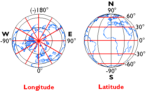
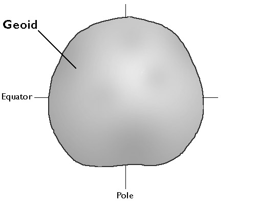
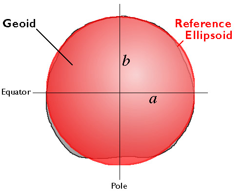
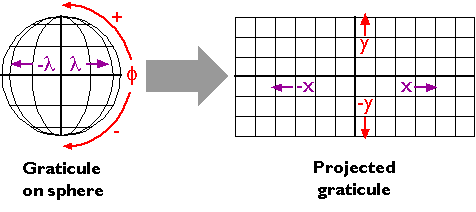
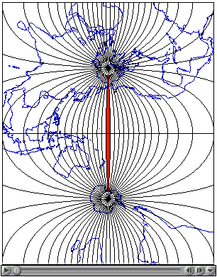
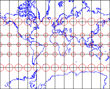
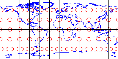
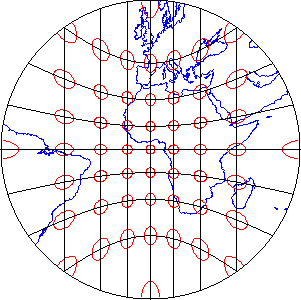
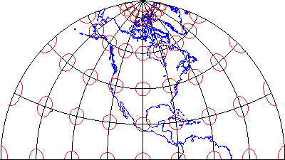
1.17. Nearly Spherical
Geographic space is nearly spherical. The fact that the Earth is nearly, but not quite, a sphere poses some surprisingly complex problems for those who wish to specify locations precisely.

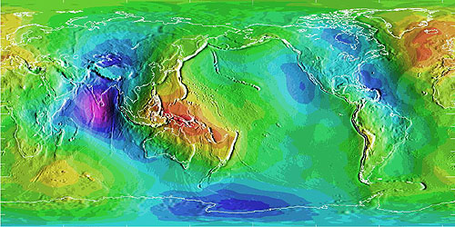
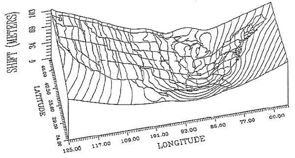
Differences in elevation between a geoid model and a reference ellipsoid. Deviations range from a high of 75 meters (colored red, over New Guinea) to a low of 104 meters (colored purple, in the Indian Ocean). (National Geodetic Survey, n. d.).
The geographic coordinate system of latitude and longitude coordinates provides a means to define positions on a sphere. Inaccuracies that are unacceptable for some applications creep in, however, when we confront the Earth’s “actual” irregular shape, which is called the geoid. Furthermore, the calculations of angles and distance that surveyors and others need to perform routinely are cumbersome with spherical coordinates.
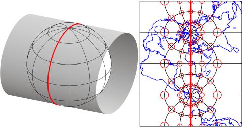
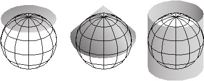
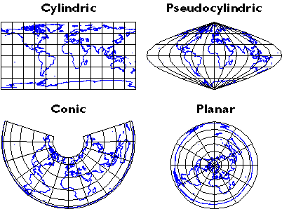
That consideration, along with the need to depict the Earth on flat pieces of paper, compels us to transform the globe into a plane, and to specify locations in plane coordinates instead of spherical coordinates. The set of mathematical transformations by which spherical locations are converted to locations on a plane–called map projections–all lead inevitably to one or another form of inaccuracy.
All this is trouble enough, but we encounter even more difficulties when we seek to define “vertical” positions (elevations) in addition to “horizontal” positions. Perhaps it goes without saying that an elevation is the height of a location above some datum, such as mean sea level. Unfortunately, to be suitable for precise positioning, a datum must correspond closely with the Earth’s actual shape. Which brings us back again to the problem of the geoid.
We will consider these issues in greater depth in Chapter 2. For now, suffice it to say that geographic data are unique in having to represent phenomena that are distributed on a continuous and nearly spherical surface.
1.18. Spatial Dependency
Geographic data tend to be spatially dependent. Spatial dependence is “the propensity for nearby locations to influence each other and to possess similar attributes” (Goodchild, 1992, p.33). In other words, to paraphrase a famous geographer named Waldo Tobler, while everything is related to everything else, things that are close together tend to be more related than things that are far apart. Terrain elevations, soil types, and surface air temperatures, for instance, are more likely to be similar at points two meters apart than at points two kilometers apart. A statistical measure of the similarity of attributes of point locations is called spatial autocorrelation.
Given that geographic data are expensive to create, spatial dependence turns out to be a very useful property. We can sample attributes at a limited number of locations, then estimate the attributes of intermediate locations. The process of estimating unknown values from nearby known values is calledinterpolation. Interpolated values are reliable only to the extent that the spatial dependence of the phenomenon can be assumed. If we were unable to assume some degree of spatial dependence, it would be impossible to represent continuous geographic phenomena in digital form.
PRACTICE QUIZ
19. Geographic Data and Geographic Questions
The ultimate objective of all geospatial data and technologies, after all, is to produce knowledge. Most of us are interested in data only to the extent that they can be used to help understand the world around us, and to make better decisions. Decision making processes vary a lot from one organization to another. In general, however, the first steps in making a decision are to articulate the questions that need to be answered, and to gather and organize the data needed to answer the questions (Nyerges & Golledge, 1997).
Geographic data and information technologies can be very effective in helping to answer certain kinds of questions. The expensive, long-term investments required to build and sustain GIS infrastructures can be justified only if the questions that confront an organization can be stated in terms that GIS is equipped to answer. As a specialist in the field, you may be expected to advise clients and colleagues on the strengths and weaknesses of GIS as a decision support tool. To follow are examples of the kinds of questions that are amenable to GIS analyses, along with questions that GIS is not so well suited to help answer.
QUESTIONS CONCERNING INDIVIDUAL GEOGRAPHIC ENTITIES
The simplest geographic questions pertain to individual entities. Such questions include:
QUESTIONS ABOUT SPACE
- Where is the entity located?
- What is its extent?
QUESTIONS ABOUT ATTRIBUTES
- What are the attributes of the entity located there?
- Do its attributes match one or more criteria?
QUESTIONS ABOUT TIME
- When were the entity’s location, extent or attributes measured?
- Has the entity’s location, extent, or attributes changed over time?
Simple questions like these can be answered effectively with a good printed map, of course. GIS becomes increasingly attractive as the number of people asking the questions grows, especially if they lack access to the required paper maps.
QUESTIONS CONCERNING MULTIPLE GEOGRAPHIC ENTITIES
Harder questions arise when we consider relationships among two or more entities. For instance, we can ask:
QUESTIONS ABOUT SPATIAL RELATIONSHIPS
- Do the entities contain one another?
- Do they overlap?
- Are they connected?
- Are they situated within a certain distance of one another?
- What is the best route from one entity to the others?
- Where are entities with similar attributes located?
QUESTIONS ABOUT ATTRIBUTE RELATIONSHIPS
- Do the entities share attributes that match one or more criteria?
- Are the attributes of one entity influenced by changes in another entity?
QUESTIONS ABOUT TEMPORAL RELATIONSHIPS
- Have the entities’ locations, extents, or attributes changed over time?
Geographic data and information technologies are very well suited to answering moderately complex questions like these. GIS is most valuable to large organizations that need to answer such questions often.
QUESTIONS THAT GIS IS NOT PARTICULARLY GOOD AT ANSWERING
Harder still, however, are explanatory questions–such as why entities are located where they are, why they have the attributes they do, and why they have changed as they have. In addition, organizations are often concerned with predictive questions–such as what will happen at this location if thus-and-so happens atthat location? In general, commercial GIS software packages cannot be expected to provide clear-cut answers to explanatory and predictive questions right out of the box. Typically, analysts must turn to specialized statistical packages and simulation routines. Information produced by these analytical tools may then be re-introduced into the GIS database, if necessary. Research and development efforts intended to more tightly couple analytical software with GIS software are underway within the GIScience community. It is important to keep in mind that decision support tools like GIS are no substitutes for human experience, insight, and judgment.
At the outset of the chapter I suggested that producing information by analyzing data is something like producing energy by burning coal. In both cases, technology is used to realize the potential value of a raw material. Also in both cases, the production process yields some undesirable by-products. Similarly, in the process of answering certain geographic questions, GIS tends to raise others, such as:
- Given the intrinsic imperfections of the data, how reliable are the results of the GIS analysis?
- Does the information produced through GIS analysis tend to systematically benefit some constituent groups at the expense of others?
- Should the data used to make the decision be made public?
- Does the use of GIS affect the organization’s decision-making processes in ways that are beneficial to its management, its employees, and its customers?
As is the case in so many endeavors, the answer to a geographic question usually includes more questions.
TRY THIS
Can you cite an example of a “hard” question that you and your GIS system have been called upon to address? Registered Penn State students can post a comment directly to this page.
1.20. Summary
It’s a truism among specialists in geographic information that the lion’s share of the cost of most GIS projects is associated with the development and maintenance of a suitable database. It seems appropriate, therefore, that our first course in geographic information systems should focus upon the properties of geographic data.
I began this first chapter by defining data in a generic sense, as sets of symbols that represent measurements of phenomena. I suggested that data are the raw materials from which information is produced. Information systems, such as database management systems, are technologies that people use to transform data into the information needed to answer questions, and to make decisions.
Spatial data are special data. They represent the locations, extents, and attributes of objects and phenomena that make up the Earth’s surface at particular times. Geographic data differ from other kinds of data in that they are distributed along a continuous, nearly spherical globe. They also have the unique property that the closer two entities are located, the more likely they are to share similar attributes.
GIS is a special kind of information system that combines the capabilities of database management systems with those of mapping systems. GIS is one object of study of the loosely-knit, multidisciplinary field called Geographic Information Science and Technology. GIS is also a profession–one of several that make up the geospatial industry. As Yogi Berra said, “In theory, there’s no difference between theory and practice. In practice there is.” In the chapters and projects that follow, we’ll investigate the nature of geographic information from both conceptual and practical points of view.
COMMENTS AND QUESTIONS
Registered students are welcome to post comments, questions, and replies to questions about the text. Particularly welcome are anecdotes that relate the chapter text to your personal or professional experience. In addition, there are discussion forums available in the ANGEL course management system for comments and questions about topics that you may not wish to share with the whole world.
To post a comment, scroll down to the text box under “Post new comment” and begin typing in the text box, or you can choose to reply to an existing thread. When you are finished typing, click on either the “Preview” or “Save” button (Save will actually submit your comment). Once your comment is posted, you will be able to edit or delete it as needed. In addition, you will be able to reply to other posts at any time.
Note: the first few words of each comment become its “title” in the thread.
1.21. Bibliography
Carstensen, L. W. (1986). Regional land information systems development using relational databases and geographic information systems. Proceedings of the AutoCarto, London, 507-516.
City of Ontario, California. (n.d.). Geographic information web server. Retrieved on July 6, 1999 from http://www.ci.ontario.ca.us/gis/index.asp(since retired).
Cowen, D. J. (1988). GIS versus CAD versus DBMS: What are the differences? Photogrammetric Engineering and Remote Sensing 54:11, 1551-1555.
DiBiase, D. and twelve others (2010). The New Geospatial Technology Competency Model: Bringing workforce needs into focus. URISA Journal22:2, 55-72.
DiBiase, D, M. DeMers, A. Johnson, K. Kemp, A. Luck, B. Plewe, and E. Wentz (2007). Introducing the First Edition of the GIS&T Body of Knowledge. Cartography and Geographic Information Science, 34(2), pp. 113-120. U.S. National Report to the International Cartographic Association.
Ennis, M. R. (2008). Competency models: A review of the literature and the role of the employment and training administration (ETA).http://www.careeronestop.org/COMPETENCYMODEL/info_documents/OPDRLiteratureReview.pdf.
GITA and AAG (2006). Defining and communicating geospatial industry workforce demand: Phase I report.
Goodchild, M. (1992). Geographical information science. International Journal of Geographic Information Systems 6:1, 31-45.
Goodchild, M. (1995). GIS and geographic research. In J. Pickles (Ed.),Ground truth: the social implications of geographic information systems(pp. of chapter). New York: Guilford.
National Decision Systems. A zip code can make your company lots of money! Retrieved on July 6, 1999 fromhttp://laguna.natdecsys.com/lifequiz (since retired).
National Geodetic Survey. (1997). Image generated from 15′x15′ geoid undulations covering the planet Earth. Retrieved 1999, fromhttp://www.ngs.noaa.gov/GEOID/geo-index.html (since retired).
Nyerges, T. L. & Golledge, R. G. (n.d.) NCGIA core curriculum in GIS, National Center for Geographic Information and Analysis, University of California, Santa Barbara, Unit 007. Retrieved November 12, 1997, fromhttp://www.ncgia.ucsb.edu/giscc/units/u007/u007.html (since retired).
United States Department of the Interior Geological Survey. (1977). [map]. 1:24 000. 7.5 minute series. Washington, D.C.: USDI.
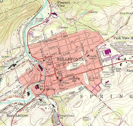
United States Geologic Survey. “Bellefonte, PA Quadrangle” (1971). [map]. 1:24 000. 7.5 minute series. Washington, D.C.:USGS.
University Consortium for Geographic Information Science. Retrieved April 26, 2006, from http://www.ucgis.org
Wilson, J. D. (2001). Attention data providers: A billion-dollar application awaits. GEOWorld, February, 54.
Worboys, M. F. (1995). GIS: A computing perspective. London: Taylor and Francis.


