Introduction to Web Accessibility

Introduction to Web Accessibility by Ryerson University, The Chang School is licensed under a Creative Commons Attribution-ShareAlike 4.0 International License, except where otherwise noted.
Essential Accessibility for Everyone
Ryerson University
Toronto
Introduction to Web Accessibility by Ryerson University, The Chang School is licensed under a Creative Commons Attribution-ShareAlike 4.0 International License, except where otherwise noted.
1
Welcome to Introduction to Web Accessibility. We are glad that you are here!
By the time you complete the reading and learning activities here, you should be able to:
There are no specific prerequisites; however, the following background knowledge will be helpful for understanding the discussions that will take place throughout:
You will need the following applications to complete the accompanying exercises:
For those who would like to go beyond what they’ve learned here, the Chang School has created a series of books on web accessibility for different audiences:
The information presented in the instruction that follows and any related materials provided to you by the authors and/or facilitators is for instructional purposes only and should not be construed as legal advice on any particular issue, including compliance with relevant laws. We specifically disclaim any liability for any loss or damage any participant may suffer as a result of the information contained.
2
The materials here are intended for a general audience. No previous knowledge of web accessibility is needed.
The topics will interest those who want to understand what “web accessibility” means both from a legislative perspective and from an inclusive or socially responsible perspective, ensuring people with disabilities can participate in a digital society at the same level as their fully able peers. The materials here will help you understand what needs to be done to comply with local and international accessibility laws.
People in the following roles can benefit from the information presented here:
3
Though we attempt to make all the materials here conform with international accessibility guidelines, we must acknowledge a few accessibility issues that are out of our control or are done on purpose to demonstrate barriers.
I
By the end of this unit, you will be able to:
1
Think about “curb cuts” as a great example of what is often thought of as inclusive design.
Curb cuts were originally added to streets to accommodate those in wheelchairs so they could get up from the road onto a sidewalk and vice versa. But curb cuts are helpful for many people — not just those in wheelchairs. A person pushing a baby stroller can now easily get on the sidewalk. A person riding a bike can more easily get on the sidewalk where the bike lockups are located. An elderly person, who may have difficulty stepping up to a curb or who may be using a walker, now has a smooth gradient and can walk onto the sidewalk rather than climb onto it. Curb cuts were designed to help those in wheelchairs but have come to benefit many.
From a web accessibility perspective, most of the accessibility features you might add to a website will have that so-called “curb cut effect.” For example, the text description one might include with an image to make the image’s meaning accessible to a person who is blind also makes it possible for search engines to index the image and make it searchable. It allows a person on a slow Internet connection to turn images off and still get the same information. Or it allows a person using a text-based browser, on a cell phone for instance, to access the same information as those using a typical visual browser. Virtually every such feature that might be put in place in web content to accommodate people with disabilities will improve access and usability for everyone else.

A YouTube element has been excluded from this version of the text. You can view it online here: https://pressbooks.library.ryerson.ca/iwacc/?p=68
Video: Web Accessibility by the Department of Social Services, Australian Government
2

A YouTube element has been excluded from this version of the text. You can view it online here: https://pressbooks.library.ryerson.ca/iwacc/?p=70
Video: The Business Case for Accessibility by The Chang School
Karl Groves wrote an interesting series of articles in 2011 and 2012 that looked at the reality of business arguments for web accessibility. He points out that any argument needs to answer affirmatively at least one of the following questions:
He outlines a range of potential arguments for accessibility:
What accessibility really boils down to is “quality of work,” as Groves states. So, in approaching web accessibility, one may be better off not thinking so much in terms of reducing the risk of being sued or losing customers because your site takes too long to load, but rather that the work you do is quality work and the website you present to your potential customers is a quality website.
If you’d like to learn more about business cases, here are a few references:
Suggested Reading:
3

A YouTube element has been excluded from this version of the text. You can view it online here: https://pressbooks.library.ryerson.ca/iwacc/?p=72
Video: AODA Background by The Chang School
For those studying the materials here from Ontario, Canada, we’ll provide occasional references to the Accessibility for Ontarians with Disabilities Act (AODA). For those outside Ontario, you might compare AODA’s web accessibility requirements with those in your local area. They will be similar in many cases, likely based on the W3C WCAG 2.0 Guidelines. The goal in Ontario is for all obligated organizations to meet the Level AA accessibility requirements of WCAG 2.0 by 2021, which, ultimately, is the goal of most international jurisdictions.
The AODA provided the motivation to create this resource. All businesses and organizations in Ontario with more than 50 employees (and all public sector organizations) are now required by law to make their websites accessible to people with disabilities (currently Level A). Many businesses still don’t know what needs to be done in order to comply with the new rules. This materials here aim to fill some of that need.
The AODA has its roots in the Ontario Human Rights Code, introduced in 1990. It essentially made it illegal to discriminate based on disability (among other forms of discrimination). The development of the AODA began in earnest in 1994 with the emergence of the Ontarians with Disabilities Act (ODA). Its aim was to legislate the removal and prevention of barriers that inhibit people with disabilities from participating as full members of society, improving access to employment, goods and services, and facilities. The Act was secured as law in 2001.
With the election of a new government in 2003, the movement that brought us the ODA sought to strengthen the legislation. The Accessibility Standards Advisory Council was established, and the AODA was passed as law in 2005, and in July of 2011 the Integrated Accessibility Standards Regulation (IASR) brought together the 5 standards of the AODA covering Information and Communication, Employment, Transportation, and Design of Public Spaces, in addition to the original Customer Service standard.
The AODA sets out to make Ontario fully accessible by 2025, with an incremental roll-out of accessibility requirements over a period of 20 years. These requirements span a whole range of accessibility considerations — from physical spaces to customer service to the Web, and much more.
Our focus here is on access to the Web. The timeline set out in the AODA requires government and large organizations to remove all barriers in web content between 2012 and 2021. The timeline for these requirements is outlined in the table below. Any new or significantly updated information posted to the Web must comply with the given level of accessibility by the given date. This includes both Internet and intranet sites. Any content developed prior to January 1, 2012, is exempt.
| Level A | Level AA | |
|---|---|---|
| Government | January 1, 2012 (except live captions and audio description) | January 1, 2016 (except live captions and audio description)
January 1, 2020 (including live captions and audio description) |
| Designated Organizations* | Beginning January 1, 2014, new websites and significantly refreshed websites must meet Level A (except live captions and audio description) | January 1, 2021 (except live captions and audio description) |
| *“Designated organizations” means every municipality and every person or organization as outlined in the Public Service of Ontario Act 2006 Reg. 146/10, or private companies or organizations with 50 or more employees, in Ontario. | ||
For more about the AODA, you can review the following references.
4
While the learning here is being delivered in the context of the Accessibility for Ontarians with Disabilities Act (AODA), the AODA and similar laws around the world are typically based on the W3C Web Content Accessibility Guidelines (WCAG). As a result, whenever we talk about AODA from an international perspective, you can think of it as WCAG.
In this day and age, we live in a global economy, so an understanding of accessibility laws around the world can be beneficial if you or your organization conducts (or is planning to conduct) international business. In many cases, if your organization complies with WCAG and local accessibility regulations, you will likely comply with regulations in the countries in which you do business.
Here, we’ll introduce the regulations around much of the world, starting with North America.
The W3C’s Web Content Accessibility Guidelines (WCAG 2.0) are broadly accepted as the definitive source for web accessibility rules around the world. Many jurisdictions are adopting it verbatim or with minor adjustments. WCAG 2.0 is used as the basis for accessibility laws that remove discrimination against people with disabilities from the Web.
Toolkit: WCAG 2.0 can be dry and time-consuming to read through and understand. We have created the downloadable 10 Key Guidelines (PDF) that summarizes and will help familiarize you with the more common web accessibility issues.
After reviewing the 10 Key Guidelines, start by learning about the Canadian and U.S. web accessibility regulations.
Note: Though most international legislation is based on WCAG 2.0, WCAG 2.1 was introduced in June 2018. This focus here is on WCAG 2.1, which includes all WCAG 2.0 guidelines and success criteria. In time, it is expected WCAG 2.1 will replace WCAG 2.0 as the basis for international IT accessibility laws.
Again, the reading and activities here been created in the context of the AODA, which came into effect in 2005 with the goal of making Ontario the most inclusive jurisdiction in the world by 2025. Part of this twenty-year rollout involves educating businesses in Ontario. Any businesses with 50 or more employees are obligated by the Act to make their websites accessible by the following timeline: (a) Level A compliant, between 2012 and 2014, and (b) Level AA compliant, between 2016 and 2021.
Key Point: AODA adopts WCAG 2.0 for its web accessibility requirements, with the exception of two success criteria:
Otherwise, AODA adopts WCAG 2.0 verbatim.
Toolkit: For key information on the adoption of WCAG 2.0 in the context of the AODA, refer to the Integrated Accessibility Standards (of the AODA).
In 2011, the Government of Canada (GOC) introduced its most recent set of web accessibility standards, made up of four sub standards that replace the previous Common Look and Feel 2.0 standards. The Standard on Web Accessibility adopts WCAG 2.0 as its web accessibility requirements with the exception of Success Criterion 1.4.5 Images of Text (Level AA), which applies in cases where “essential images of text” are used, in cases where “demonstrably justified” exclusions are required and for any archived web content. The standard applies only to Government of Canada websites.
Toolkit: For full details of Government of Canada accessibility requirements read the Standard on Web Accessibility.
In 2014, the British Columbia government released Accessibility 2024, a ten-year action plan designed around 12 building blocks intended to make the province the most progressive in Canada for people with disabilities. Accessible Internet is one of those building blocks. The aim is to have all B.C. government websites meet WCAG 2.0 AA requirements by the end of 2016.
The Accessibility for Manitobans Act (AMA) became law in 2013. Like the AODA, the AMA will be made up of several standards, one of which is the Accessible Information and Communications Standard, which will govern accessibility requirements for web content. This legislation is still a work in progress.
Currently a work in progress, the Canadians with Disabilities Act (CDA) intends to produce national accessibility regulations for Canada. Visit the Barrier-Free Canada website for more about the developing Canadians with Disabilities Act and the Government of Canada website on the consultation process.
The ADA does not have any specific technical requirements requiring websites to be accessible. However, there are a number of cases where organizations that are considered to be “places of public accommodation” have been sued due to the inaccessibility of their websites (e.g., Southwest Airlines and AOL), where the defendant organization was required to conform with WCAG 2.0 Level A and Level AA guidelines.
There is a proposed revision to Title III of the ADA (Federal Register, Volume 75, Issue 142, July 26, 2010) that would, if passed, require WCAG 2.0 Level A and AA conformance to make web content accessible under ADA.
Suggested Reading: Nondiscrimination on the Basis of Disability; Accessibility of Web Information and Services of State and Local Government Entities and Public Accommodations
The purpose of Section 508, which is part of the U.S. Rehabilitation Act, is to eliminate barriers in information technology. This applies to all federal agencies that develop, procure, maintain, or use electronic and information technology. Any company that sells to the U.S. government must also provide products and services that comply with the eleven accessibility guidelines in Section 508, as described in Section 1194.22 of the Rehabilitation Act.
Originally, these guidelines were based on a subset of the WCAG 1.0 Guidelines. Recently, the guidelines were updated to include WCAG 2.0 Level A and AA requirements for those obligated through Section 508. While Section 508 has been in effect since March 20, 2017, those affected by the regulation are required to comply with the updated regulation by January 18, 2018.
5
While the Equality Act (UK) does not specifically address how web accessibility should be implemented, Section 29(1) of the Equality Act places a requirement on service providers. Specifically, those who sell or provide services to the public must not discriminate against any person requiring the service. In effect, preventing a person with a disability from accessing a service on the Web constitutes discrimination.
Based on Sections 20 and 29(7) of the Act, it is an ongoing duty of service providers to make “reasonable adjustments” to accommodate people with disabilities. To this end, the British Standards Institution (BSI) provides a code of practice (BS 8878) on web accessibility, based on WCAG 1.0.
For more about BSI efforts, watch the following video:

A YouTube element has been excluded from this version of the text. You can view it online here: https://pressbooks.library.ryerson.ca/iwacc/?p=143
Video: BSI Documentary – Web accessibility – World Standards Day 14 Oct 2010 by BSI Group
Suggested Reading:
Throughout Europe, a number of countries have their own accessibility laws, each based on WCAG 2.0. In 2010, the European Union (EU) introduced web accessibility guidelines based on WCAG 2.0 Level AA requirements. Next, in 2014, the EU Parliament passed a law requiring all public sector websites and private sector websites that provide key public services to conform with WCAG 2.0 Level AA requirements. In addition, new content must conform to those requirements within one year; existing content, within three years; and multimedia content, within five years.
However, this does not mean that all countries in the EU must now conform. The law now goes before the EU Council, where heads of state will debate. Seemingly, this promises to draw out adoption for many years into the future, if it gets adopted at all.
Suggested Reading:
In Italy, the Stanca Act 2004 (Disposizioni per favorire l’accesso dei soggetti disabili agli strumenti informatici) governs web accessibility requirements for all levels of government; private firms that are licensees of public services, public assistance, and rehabilitation agencies; and transport and telecommunications companies, including ICT (information communications technology) service contractors.
The Stanca Act has 22 technical accessibility requirements originally based on WCAG 1.0 Level A guidelines, updated in 2013 to reflect changes in WCAG 2.0.
Suggested Reading: Stanca 2013 Requirements (Italian)
In Germany, BITV 2.0 (Barrierefreie Informationstechnik-Verordnung), which adopts WCAG 2.0 with a few modifications, requires accessibility for all government websites at Level AA (i.e., BITV Priority 1).
Suggested Reading: BITV (Appendix 1)
Accessibility requirements in France are specified in Law No 2005-102, Article 47, and its associated technical requirements are defined in RGAA 3 (based on WCAG 2.0). It is mandatory for all public online communication services, public institutions, and the state to conform with RGAA (WCAG 2.0).
Suggested Reading:
The web accessibility laws in Spain are Law 34/2002 and Law 51/2003, which require all government websites to conform with WCAG 1.0 Priority 2 guidelines. More recently, UNE 139803:2012 adopts WCAG 2.0 requirements and mandates the following organizations to comply with WCAG Level AA requirements: government and government-funded organizations; or organizations larger than 100 employees; or with trading column greater than six million euros; or those providing financial, utility, travel/passenger, or retail services online (See: Legislation in Spain).
Suggested Reading:
Though not specifically referencing the Web, Section 24 of the Disability Discrimination Act of 1992 makes it unlawful for a person who provides goods, facilities, or services to discriminate on the grounds of disability. This law was tested in 2000 when a blind man successfully sued the Sydney Organizing Committee for the Olympic Games (SOCOG) when its website prevented him from purchasing event tickets.
The Australian Human Rights and Equal Opportunity Commission (HREOC) shortly after released the Worldwide Web Access: Disability Discrimination Act Advisory Notes. These were last updated in 2014, and though they do not have direct legal force, they do provide web accessibility guidance (based on WCAG 2.0) for Australians on how to avoid discriminatory practices when developing web content.
Suggested Reading: World Wide Web Access: Disability Discrimination Act Advisory Notes
Suggested Reading:
For more about international web accessibility laws, see the following resources:
6
To understand where accessibility issues can arise, it is helpful to have a basic understanding of a range of disabilities and their related barriers found in digital content.
Not all people with disabilities encounter barriers in digital content, and those with different types of disabilities encounter different types of barriers. For instance, if a person is in a wheelchair, they may encounter no barriers at all in digital content. A person who is blind will experience different barriers than a person with limited vision. Many of the barriers that people with disabilities encounter on the Web are often barriers found in electronic documents and multimedia. Different types of disabilities and some of their commonly associated barriers are described here.
Watch the following video to see how students with disabilities experience the Internet.

A YouTube element has been excluded from this version of the text. You can view it online here: https://pressbooks.library.ryerson.ca/iwacc/?p=83
Video: Experiences of Students with Disabilities by Jared Smith
In this video, David Berman talks about types of disabilities and their associated barriers.

A YouTube element has been excluded from this version of the text. You can view it online here: https://pressbooks.library.ryerson.ca/iwacc/?p=83
Video: Web Accessibility Matters: Difficulties and Technologies: Avoiding Tradeoffs by davidbermancom
People who are blind tend to face the most barriers in digital content, given the visual nature of much digital content. They will often use a screen reader to access their computer or device, and they may use a refreshable Braille display to convert text to Braille.
Common barriers for this group include:
For a quick look at how a person who is blind might use a screen reader like JAWS to navigate the Web, watch the following video.

A YouTube element has been excluded from this version of the text. You can view it online here: https://pressbooks.library.ryerson.ca/iwacc/?p=83
Video: Accessing the web using screen reading software by rscnescotland
People with low vision are often able to see digital content if it is magnified. They may use a screen magnification program to increase the size and contrast of the content to make it more visible. They are less likely to use a screen reader than a person who is blind, though in some cases they will. People with low vision may rely on the magnification or text customization features in their web browser or word processor, or they may install other magnification or text reading software.
Common barriers for this group include:
See the following video for a description of some of the common barriers for people with low vision.
")
A YouTube element has been excluded from this version of the text. You can view it online here: https://pressbooks.library.ryerson.ca/iwacc/?p=83
Video: Creating an accessible web (AD) by the Centre for Inclusive Design
Most people who are deaf tend to face barriers when audio content is presented without text-based alternatives, and they encounter relatively few barriers in digital content otherwise. Those who are deaf and blind will face many more barriers, including those described for people who are blind. For those who communicate with American Sign Language (ASL) or other sign languages, like Langue des signes québécoise (LSQ), the written language of a website may produce barriers similar to those faced when reading in a second language.
Common barriers for this group include:
Mobility-related disabilities are quite varied. As mentioned earlier, one could be limited to a wheelchair for getting around and face no significant barriers in digital content. Those who have limited use of their hands or who have fine motor impairments that limit their ability to target and click elements in digital content with a mouse pointer may not use a mouse at all. Instead, they might rely on a keyboard or their voice to control movement (i.e., speech recognition) through digital content, along with switches to control mouse clicks.
Common barriers for this group include:
Learning and cognitive-related disabilities can be as varied as mobility-related disabilities, perhaps more so. These disabilities can range from a mild reading-related disability to very severe cognitive impairments that may result in limited use of language and difficulty processing complex information. For most of the disabilities in this range, there are some common barriers and others that only affect those with more severe cognitive disabilities.
Common barriers for this group include:
More specific disability-related issues include:
While we generally think of barriers in terms of access for people with disabilities, there are some barriers that impact all types of users, though these are often thought of in terms of usability. Usability and accessibility go hand-in-hand. Adding accessibility features improves usability for others. Many people, including those who do not consider themselves to have a specific disability (such as those over the age of 50) may find themselves experiencing typical age-related loss of sight, hearing, or cognitive ability. Those with varying levels of colour blindness may also fall into this group.
Some of these usability issues include:
Suggested Reading: To learn more about disabilities and associated barriers, read How People with Disabilities Use the Web.
7
When addressing accessibility, a main focus is to make web content compatible with screen readers (often used by people who are blind to access their computer, device, and the Web). That’s not to say that people with other types of disabilities don’t encounter barriers, but this group will certainly face the most barriers given the visual nature of the Web. Often, addressing screen reader compatibility issues will help resolve potential barriers for others as well.
Here we focus specifically on the ChromeVox screen reader add-on for the Chrome web browser because of its simplicity, good support for standards, and its availability across platforms as free, open-source software. We will first introduce you to a number of other screen readers before spending some time learning to use ChromeVox and to experience barriers firsthand.
For new or inexperienced users, learning to operate a screen reader can be difficult, particularly if you are not using one on a regular basis. Memorizing the basic commands provided in the upcoming pages is often enough for screen reader testing purposes, though there is much more functionality in screen readers that is not discussed here. You are encouraged to explore the full range of features that screen readers have to offer as time allows.
ChromeVox is ideal for introducing screen readers, though it does have its limitations, and people who are blind are more likely to use one of the more broadly used screen readers like JAWS, Window Eyes (now discontinued), NVDA, or VoiceOver. What may seem accessible with ChromeVox may not be accessible when using other screen readers.
There are a variety of screen readers available for different operating systems, whether you are using Windows, Mac, Linux, iOS, or Android, and there are also a few web-based screen readers. The more common screen readers are listed below for reference.
Screen readers should not be confused with text-to-speech (TTS) applications. Though both read text content aloud, TTS only reads content text, such as the text on this web page. Screen readers read content text, but they also read aloud elements of the browser’s interface and the operating system, as well as providing ways to navigate the content, with features for listing headings, links, or tables, for example. These features are not typically found in TTS applications.
(In addition to ChromeVox, you may also want to install and experiment with NVDA.)
(To toggle VoiceOver on and off, press Command + F5.)
For a more thorough list of screen readers, see Wikipedia’s Screen Reader entry.
It is not typically feasible to test with every screen reader available, so it is a good idea to choose the screen readers you use strategically. Understanding screen reader usage patterns can help you decide which one(s) to test with.
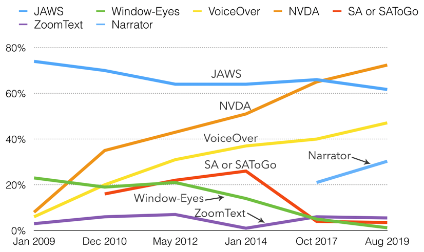
The WebAIM Screen Reader User Survey, conducted every one to two years since 2009, shows changing trends in screen reader usage. Up until the 2019 survey, the JAWS screen reader was the most commonly used. With built-in screen readers like VoiceOver on Mac and Narrator on Windows, and free open source screen readers like NVDA — each much improved in recent years — many users are opting for these less expensive options. JAWS, though highly functional, is expensive software and can be out of reach for some who need screen reader technology. In the 2019 survey NVDA users (72.4%) surpassed JAWS users (61.7%) for the first time. Mac’s VoiceOver users (47.1%) also increased since the 2017 survey (39.6%), as did Narrator users (30.3%) compared with users reporting in 2017 (21.4%). See the latest WebAIM Screen Reader User Survey for the latest statistics.
Mobile screen reader usage has increased exponentially over the last few years, from just 12% in 2009 to 88% in 2017, increasing again in 2019 to 96.5% — keep this in mind when screen reader testing. Testing with mobile screen readers should be considered.
The following table and graph from WebAIM shows usage statistics for screen readers commonly used for desktop and laptop computers.
| Screen Reader | % of Respondents |
| NVDA | 72.4% |
| JAWS | 61.7% |
| VoiceOver | 47.1% |
| ZoomText | 5.5% |
| Window-Eyes | 1.2% |
| System Access or System Access To Go | 3.5% |
| ChromeVox | 4.7% |
| Narrator | 30.3% |
| Other | 6.0% |
Figure: Screen readers commonly used, usage patterns in 2019
8
We are introducing you to the ChromeVox screen reader early in the materials here so you have plenty of opportunity to practice using it. It will be a useful tool for understanding what creates barriers in web content, and it will be used throughout the units here to experience and understand barriers firsthand.
For day-to-day screen reader testing, ChromeVox (particularly, the ChromeVox plugin for the Chrome web browser) is our screen reader of choice because of its simple installation and configuration, its ability to work across computer platforms, and it is free and open source.
While a relatively small number of screen reader users currently use ChromeVox, it is a highly effective tool for developers when testing web content. Also, ChromeVox is tailored to work with elements of Google Drive, so even for users of other screen readers, ChromeVox may be preferable when working with Google Docs, Sheets, and Slides.
Toolkit: Visit the Chrome store while using the Chrome web browser to install the ChromeVox screen reader. It will be a key element of your Toolkit.
Key Point: Though we recommend using ChromeVox for activities in the units that follow, if you already use another screen reader regularly, you are free to use it if you prefer.
Note: The Cvox key is held down while pressing other keys. For example, to turn ChromeVox on or off, press the Cvox key (e.g., Alt) and hold it, then quickly press the “A” key twice (i.e., Cvox + A + A).
The videos below show you how to install and begin using ChromeVox.

A YouTube element has been excluded from this version of the text. You can view it online here: https://pressbooks.library.ryerson.ca/iwacc/?p=147
Video: Installing ChromeVox by The Chang School

A YouTube element has been excluded from this version of the text. You can view it online here: https://pressbooks.library.ryerson.ca/iwacc/?p=147
Video: ChromeVox Demo by Google Open Online Education
Key Point: Download the ChromeVox Key Commands (Word), outlined in the table below. Print it or have it beside you when completing screen reader activities throughout the units that follow. Also, be sure you have the ChromeVox modifier key set up, or you are going to have difficulty with the activities.
*The ChromeVox modifier key (i.e., Cvox) is set in the ChromeVox Options. It is typically set to Alt, or Ctrl, or Alt + Ctrl.
Note: To stop reading, press the Ctrl key.
| Task | Task Description | Keyboard Command |
|---|---|---|
| Default Reading | When a web page loads, ChromeVox will read the element that takes focus on the page. Use the Cvox + arrow keys to read through content. Listen to the spoken output and note any inconsistencies from what one might expect to hear based on what is visible on the screen. | Cvox + up and down arrows |
| Tab Navigation | When a page has loaded, press the Tab key to navigate through operable elements of the page like links and forms. Listen to the output when these elements are in focus, and note any elements that are clickable but not focusable with the keyboard.
Also, listen for hidden elements such as bypass links or other elements that are not visible but are read aloud by ChromeVox. |
Tab, Shift Tab |
| Navigate through Headings | Step through all the headings on a page. Note whether all headings are announced as expected. Note the heading level announced. Are they sequenced to create semantic structure (i.e., nested in the proper order)? | Cvox + L + H
then up/down arrows |
| Navigate through Landmarks | Step through the landmarks, key navigation points on a page. Are all areas of the page contained in a landmarked region? Note any missing landmarks. | Cvox + L + ; (semi-colon)
then up/down arrows |
| List Links | List the links and navigate through them using the arrow keys, listen for meaningfulness, or listen for context when links are otherwise meaningless. | Cvox + L + L
then up/down arrows |
| Navigate through Forms | Navigate to forms on a page, then press the Tab or F keys to listen to each of the fields. Are fields announced effectively, including required fields? | Cvox + L + F
then up/down arrows |
| Navigate through Tables | Navigate to Tables on a page, press Enter to go to a table, press up/down arrow keys to move through cells in sequence (left to right, top to bottom), press Ctrl + Alt + arrow to move to adjacent cells, press Ctrl-Alt and 5 on the number pad to list column and row headers where applicable. Note whether header cells are read or not. Are Fieldset labels announced, where applicable? | Cvox + L + T
then up/down arrows then Enter to select Table Cvox + arrow to move within table Cvox +T > H to announce headers |
When you are navigating with ChromeVox, it will add its own highlighting around elements when they receive focus. Test for focus visibility (SC 2.4.7) when ChromeVox is not running.
For a complete list of key commands see the ChromeVox Options. Default commands are listed and can be changed if needed.

A YouTube element has been excluded from this version of the text. You can view it online here: https://pressbooks.library.ryerson.ca/iwacc/?p=147
Video: Making Accessible Web Apps Using HTML5 and ChromeVox by Google Developers
9

This exercise is intended to help those who do not encounter barriers on the Web understand accessibility firsthand by experiencing the Web as someone who is blind might experience it. If you have not already, go back to the ChromeVox page earlier in this unit and set up ChromeVox.
Be sure to review the ChromeVox Key Commands used to operate ChromeVox before completing this activity or have it open or printed for easy reference. Also, be sure the ChromeVox modifier key is set before attempting this activity.
For those who do not regularly use a screen reader, turn off your computer monitor and navigate with ChromeVox and just your keyboard (i.e., using the Tab key or the CVox key plus the arrow keys) through the Web Accessibility Auditing Showcase website to experience what it’s like to access accessible web content by screen reader only. After experimenting with the Showcase website for a while and listening to how the screen reader announces the site, try the same activity with the Lulu’s Lollipops website, a site designed to be inaccessible.
Answer each of the following questions with a sentence or two. Write no more than a short paragraph for each:
The goal of the activity above is to help people who do not use a screen reader understand better the challenges of navigating the Web without being able to see what one is navigating through. As a regular screen reader user, you already know these challenges. Take this opportunity to document your experience to help others understand those challenges.
Answer the following questions about your experience as a regular screen reader user. Feel free to describe other accessibility issues you encounter on the Web.
II
By the end of this unit, you will be able to:
10
The first thing to learn about WCAG 2.1 is its four principles. These principles are used to organize guidelines and potential barriers by common elements. Here, we’ll introduce the principles, and, in the next four units we’ll expand on the types of barriers each principle covers, along with examples you can experience for yourself.
The four WCAG principles are:
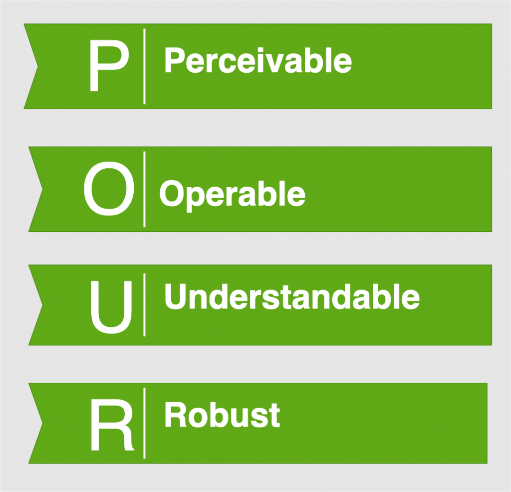
Web content must be:
To help remember the principles, think of the acronym POUR.
The four principles are the top layer of guidance on producing accessible web content. Each principle includes:
Each of these elements will be covered in the pages that follow.
11
WCAG 2.1 groups guidelines by their level of importance and their relative impact on accessibility. It is helpful to think of these levels as things that must, should, and could be done to eliminate potential barriers. The levels are Level A, Level AA, and Level AAA.
Level A guidelines address barriers that will prevent some groups from accessing web content. They MUST be addressed or the content will not be accessible to some people.
An example of a Level A barrier is an image that is not described in text (Success Criteria 1.1.1). There is little a person who is blind can do, without the help of another person, to determine what is being presented in an image when it is not described.
Level AA guidelines address barriers that may make it difficult to access web content, but it may still be possible through workarounds or added effort. They SHOULD be addressed, or the content will be more effortful to access than it needs to be.
An example of a Level AA barrier is keyboard focus that is not visible (Success Criteria 2.4.7). For someone with low vision who navigates web content with a keyboard, the inability to see when a link has focus, for instance, makes it difficult to know when to press Enter to activate the link. They may still be able to find their way to the link through trial and error, but a lot of unnecessary effort would be needed.
Level AAA guidelines address usability, more so than barriers. These items COULD be addressed to improve usability for everyone.
An example of a Level AAA usability issue is the lower-level high school reading–level requirement (Success Criteria 3.1.5). For instance, if someone reads in a second language, the use of simpler language, whenever possible, makes reading easier. The use of simpler language also improves accuracy when using automated translation tools. Even for typical readers reading in their first language, using simpler language is generally appreciated and easier to comprehend. For someone with a cognitive disability, simpler language will be easier to understand. In each case, however, the reading level does not prevent a person from accessing the content, but that content would be more usable if it were addressed.
Level AA is the generally accepted level of accessibility websites should aim to meet. If it is not possible to meet the requirements at this level, then Level A should be a temporary goal, while working toward Level AA over time. Very few websites will meet Level AAA requirements, and, in some cases, it may be counterproductive or undesirable to meet these guidelines. Take, for example, an online medical sciences book. If the Level AAA reading level guideline were followed, it would probably make the content unusable by the intended audience (medical students), if jargon and technical language is replaced with low level paraphrasing to meet this requirement. That said, most public websites that cater to a general audience should probably meet the lower-level high school reading–level requirement.
In addition to meeting Level AA requirements, websites can address some of the Level AAA guidelines, but meeting Level AAA should generally not be the goal.
12
There are 13 guidelines in WCAG 2.1 (e.g., Guideline 1.1), containing a total of 78 success criteria (e.g., Success Criterion 1.1.1), that represent basic goals web authors and developers should aim for. Compared with WCAG 2.0, WCAG 2.1 adds one additional guideline (2.5) and 17 additional success criteria. Guidelines provide a framework for organizing success criteria.
Examining a guideline below from WCAG 2.1, you can see the principle listed first (2. Operable), followed by a guideline associated with that principle (Guideline 2.1 Keyboard Accessible), followed by a success criterion associated with the guideline (Success Criterion 2.1.1 Keyboard).
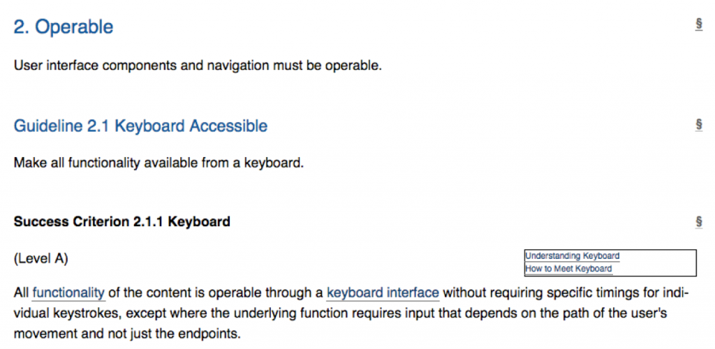
Note: The guidelines themselves are not meant to be testable. Success criteria are testable. You may also notice that success criteria are technology-neutral. That is, they are not specific to HTML, JavaScript, Flash, or any other web technology. Instead, these technology-specific references are found in the Sufficient and Advisory Techniques, described on the next page. These techniques can be found by following the “How to Meet” link to the right of each success criterion. Additional information about the guideline can be found by following the “Understanding” link.
WCAG documents are classified as either “normative” or “informative.” Guidelines and success criteria are normative. That is, they are required for conformance. Elements of WCAG that are normative are also stable and do not change until at least a new version of the guidelines is released. For example, the guidelines and success criteria in WCAG 2.1 will not change until WCAG 3.0 (or whatever version number it is assigned) is released.
On the other hand, the Understanding and Techniques documents are “informative” (also known as “non-normative”), which means they are not required for conformance. These documents are evolving and change as new information and new techniques become available in between releases of stable, normative, specification documents.
13
For each success criteria in WCAG, there are supporting techniques available that provide potential solutions or strategies that can be used to ensure barriers are removed in web content. The techniques documents continue to evolve over time (i.e., informative). New techniques are added as technology and our understanding of barriers and solutions improve. This is unlike the WCAG specification itself, which stays stable (i.e., normative) until a new version of the specification is created.
While techniques listed in the WCAG supporting documents are recommended, strategies for eliminating barriers are not required per se. There may be several techniques available to address a success criteria, or there may be techniques available that are not listed in the supporting documents. As such, techniques are not a requirement; success criteria are. Any technique can be used that reliably removes barriers associated with a particular success criterion.
There are two types of techniques that can be used to remove barriers: sufficient techniques and advisory techniques.
Sufficient techniques are techniques known to reliably address particular barriers. They are typically technology-specific, particular techniques with a related prefix for resolving HTML accessibility (H), scripting accessibility (SCR), Flash accessibility (FLASH), or one of the other technologies outlined in the following list:
An example of a sufficient technique for Guideline 1.1, Success Criteria 1.1.1 Non-text Content, is technique “H37 Using alt attributes on img elements.” Adding alt text to an image that requires a short description is sufficient to make the meaningful information in the image accessible. But also, “ARIA6: Using aria-label to provide labels for objects” is listed as a sufficient technique for this success criterion. While the latter technique may be sufficient for those using current technology, there is a possibility, for those using an older browser or assistive technology (AT), that the WAI-ARIA solution may not be supported by their AT. That is, despite being a sufficient technique, it is still a good idea to include some redundancy where newer solutions are being applied. An example of this backwards compatibility is using both alt text and aria-label to provide image descriptions. If aria-label fails, the alt text will be read in its place. This is sometimes referred to as “graceful degradation.”
Note: Don’t be too concerned about understanding WAI-ARIA techniques at this point. These are typically techniques web developers would apply, or it may be applied behind the scenes by authoring tools when creating web content. For example, consider the task of adding alt text to an image you should understand (i.e., an image that is not decorative). The alt text code will look like the example below when presented in the HTML of a web page. It may be added to images through a text, alt, or title field in the authoring tool used to insert the image into a web page.
Technical:
<img src="mycat.jpg" alt="My cat Bob relaxing in the sun" / >
Suggested Reading: See techniques for Success Criteria 1.1.1 and examine the other techniques associated with this success criteria in Guideline 1.1.
Advisory techniques may not reliably address barriers as can sufficient techniques, but they do address a particular barrier for particular people.
An example of an advisory technique might be “C22: Using CSS to control visual presentation of text” for Success Criteria 1.3.1 Info and Relationships. While this technique can be used to style text with various sizes, fonts, or indentations to represent document structure (the appearance of headings and subheadings), the visual appearance of the content will not be sufficient for those who cannot see the visual presentation. As a result, this technique needs to be used in addition to a sufficient technique that adds the structural semantics provided by the HTML heading elements, H1 to H6 (H42: Using h1-h6 to identify headings).
Suggested Reading: See techniques for 1.3.1 Info and Relationships for more about sufficient and advisory techniques for this success criteria.
There is a third category of techniques called failures. These are not techniques that could be used to resolve potential barriers. Rather, failures are techniques that, when used, potentially introduce barriers. Techniques listed in this category should be avoided.
An example of a failure is “F43: Failure of Success Criterion 1.3.1 due to using structural markup in a way that does not represent relationships in the content.” In this case, a web author or developer uses HTML heading markup to make text larger. As a result, the large text becomes part of the document’s topic structure. When read by assistive technologies, the text is announced as a heading, which may result in confusion since a heading structure is presented where none is expected. In a case like this, the C22 advisory technique mentioned above should be used to size the fonts instead of using the structural markup and larger text provided by HTML headings.
Suggested Reading: Read through the Failures for Success Criteria 1.3.1 Info and Relationships (scroll down to find them) to develop a sense of the type of strategies that content authors and web developers may use to create potential barriers.
14
Each level of accessibility can represent goals with which organizations and websites should aim to conform. Depending on the website — whether it’s a site being retrofitted to improve its state of accessibility or if it’s a new website being developed — the conformance goal may vary.
As you’ll recall, Level A allows most people to access the content of a website. While Level A conformance is an honourable accomplishment, it is generally considered “minimal conformance.” If you are working with a limited budget (or no budget) this may be an acceptable level of accessibility. However, as mentioned earlier, it is generally accepted that most sites should strive for Level AA and, perhaps, should conform with a few of the Level AAA success criteria (defined below).
If you are working on a new website, Level AA should be the goal from the start. Assuming the developers know what needs to be done, there is very little extra effort required to jump from Level A to Level AA. If you are working with an existing site that is receiving an accessibility retrofit, then you may want to first aim for Level A, then with time resolve all Level AA issues. Generally, it is less costly to build a site to be accessible from the start than it is to build a site and retrofit it later to conform.
Level AAA conformance is unattainable for many websites. While it is possible to conform with some of the requirements at this level, they can often be counterproductive or unnecessary. Take for instance the reading level requirement (WCAG 2.0, SC 3.1.5). Public organizations will want to meet this guideline, reducing the reading level required to understand their website’s content and thereby reaching the broadest audience possible. But for other sites that focus on a particular or highly educated audience, it may be impossible or even inadvisable to comply with this requirement. Imagine an advanced book in biomechanics written at the lower secondary school reading level required to satisfy this guideline. If it were possible, replacing the advanced terminology and jargon with low-level paraphrasing would likely make the content unusable by the intended audience.
In addition to meeting all the Level A, AA, or AAA requirements, there are other conformance requirements to consider before being able to claim conformance at one of these levels:
Once a website has addressed all the issues required for a certain level of conformance, it may be desirable to “claim” conformance, though there is no requirement that a claim be made in order to conform.
A basic claim must include the date the site was judged to be conformant. Since web content tends to change over time, conformance can typically only be claimed for a specific date (with exceptions such as numbered versions of web software). The basic claim must also include the specification or standard the site is claiming conformance with, and it must include the level of conformance. A basic conformance claim may look like the following:
On January 20, 2019, this site conformed with the Web Content Accessibility Guideline 2.0 at Level AA.
A conformance claim can be more extensive than just a basic claim like that described above. It can also provide documentation about the accessibility features found on a website, so those accessing the site with assistive technologies can read about these features rather than having to discover them on their own. This documentation is often found linked prominently in the navigation elements of a website, usually near the start of a page so it is easily found by assistive technology users, and it is often labelled “Accessibility” or “Accessibility Statement.”
If the conformance claim does not apply to the whole site (e.g., there may be some older content that remains inaccessible), the scope of the claim should also be specified. For instance, add to the basic claim above, “…for any content added to the site after January 1, 2012.” The claim can also list known issues if there are areas of the site that are known to be inaccessible, perhaps because there isn’t a suitable accessible alternative to a particular technology being used. For example, “…the video conferencing area of the site remains non-conformant due to the lack of an alternative accessible conferencing system.”
15
Currently, there are two versions of WCAG that are considered stable specifications.
Initially released in 2008, WCAG 2.0 is the basis for many international accessibility rules and regulations, and it remains a stable W3C Recommendation. However, since it was developed when the first smartphones were only just emerging, there is little in the specification to address accessibility through mobile devices. Also, there was little in WCAG 2.0 to address accessibility for people with cognitive disabilities.
On June 5, 2018, WCAG 2.1 was released as a W3C Recommendation. It is intended to extend WCAG 2.0, adding 17 new success criteria and one additional guideline that addresses mobile accessibility, as well as aspects of accessibility for people with cognitive disabilities, among other additions.
A goal in creating WCAG 2.1 has been to ensure that sites that comply with it also continue to comply with WCAG 2.0. This ensures that any obligations to conform with WCAG 2.0 are compatible with WCAG 2.1 conformance, if it is used as the basis for creating accessible web content. Organizations and websites should be aiming to conform with WCAG 2.1 into the future but can continue to conform with WCAG 2.0.
We won’t go into the details and differences between WCAG 2.0 and WCAG 2.1 here, but we will point out the new success criteria, and the one guideline, when we get into the details in the units that follow this one. Look for the following to denote success criteria that fall into WCAG 2.1.
Suggested Reading: Comparison of WCAG 2.0 and WCAG 2.1
Key Point: WCAG 3.0 is in development, though it is not expected as a W3C Recommendation for some time yet. It will extend WCAG further to include accessibility for emerging technologies, such as Internet of Things and virtual reality, among others. The current work is evolving under the code name “Silver,” which has the chemical symbol AG, which, incidentally, is the acronym for Accessibility Guidelines.
Suggested Reading: Learn more about Silver.
16
For those in Ontario who want to understand how WCAG 2.0 is related to the Accessibility for Ontarians with Disabilities Act (AODA), this is a brief discussion of how it applies. The AODA legislation outlines a gradual roll-out, initially adopting WCAG 2.0 Level A and working toward Level AA web content accessibility requirements with the exception of two success criteria.
These two exceptions are:
Suggested Reading: Review Section 14(3) of the Integrated Accessibility Standards of the AODA for details on the above exceptions.
Though the rest of WCAG 2.0 is adopted verbatim, obligated organizations in the province (except the Ontario government that has until January 1, 2020) are not required to provide captions for live events or audio description for prerecorded video. Both of these are Level AA success criteria in WCAG 2.0. Depending on where you are in the world, other jurisdictions will often require these success criteria be met.
There are no plans currently to adopt WCAG 2.1 as the basis for web accessibility in AODA, though AODA is currently going through one of its periodic reviews. Whether WCAG 2.1 will be adopted as the new basis for web accessibility remains to be seen.
Key Point: Input on the current AODA review was due October 1, 2018.
17
Now that you have been introduced to WCAG, this activity will give you an opportunity to explore the specification and develop familiarity with its parts.
To assist you, we have set up a scavenger hunt activity. Read the requirements that follow for details.
Your mission in this scavenger hunt is to find one sufficient technique for each of the following barriers and record the technique ID and its title/description. See the sample below for an example of what’s expected for this exercise. If there are multiple techniques, choose the one you think fits best, given the barrier described.
Hint: You will likely start by looking at some key words in the barrier description in order to locate the relevant Guideline or Success Criterion in WCAG 2.0 or WCAG 2.1. After that, look at How to Meet that guideline in order to identify a Sufficient Technique.
Here is your list of barriers:
Here is a sample:
Barrier: Pre-recorded video does not audibly describe meaningful visual activity.
Technique ID: G78: Providing a second, user-selectable audio track that includes audio descriptions.
III
By the end of this unit, you will be able to:
18
Information and user interface components must be presentable to users in ways they can perceive.
Definition
Perceive: 1. To become aware of (something) through the senses, especially the sight; recognize or observe. 2. To come to comprehend; grasp (dictionary.com)
As suggested in the first definition above, people must be able to perceive web content through one or more of their senses. When a person cannot see or hear, for instance, and an alternate means of perceiving is not available, then that content becomes inaccessible to them.
Content may not be perceivable if web authors:
Perceptual barriers occur when information is communicated entirely through one of the following:
Most people perceive web content through sight and sound. When content is communicated exclusively through one sense, such as sight, some people will not be able to perceive it.
These types of perceptual barriers are addressed through Guidelines 1.1, 1.2, and 1.4.
The second definition suggests people must be able to comprehend or grasp web content. The ability to comprehend web content can be affected by the structure, the relationships between elements, its complexity, or consistency in the presentation.
Perceptual barriers of this nature occur when:
These types of perceptual barriers are addressed by Success Criterion 1.3.3 (sensory characteristics), described later in this unit.
Suggested Reading: WCAG 2.1 Perceivable
19
Provide text alternatives for any non-text content so that it can be changed into other forms people need, such as large print, Braille, speech, symbols, or simpler language.
Level A
All non-text content that is presented to the user has a text alternative that serves the equivalent purpose, except for the situations listed below.
There is good reason why this guideline is the first. While barriers can affect a wide range of people, those who tend to face the most barriers are people whose visual senses are limited or absent. Given the visual nature of the Web, potential barriers are many. Anything visual that is not described in text is a potential barrier.
Why do I always need alternatives to images in my website?
If a website has photographs, artwork, drawings, or other graphic elements, adding text alternatives is an easy way to make the site accessible to people with certain disabilities. In addition, text alternatives benefit people who use text-based browsers, have slow Internet connections, or have limited data plans. Text alternatives also make it possible to search the Web for images.
One of the most common ways to remove barriers associated with visual content is to use the HTML alt attribute with images in web content. When people learn about web accessibility, “alt text” is often introduced first. Alt text for images is, in most cases, an easy accommodation. There is, however, an art to creating effective alt text.
Definition
Elements: Often referred to as HTML tags, these are the main features of HTML syntax. Examples include <p></p>, <table></table>, or <div></div>, among many others.
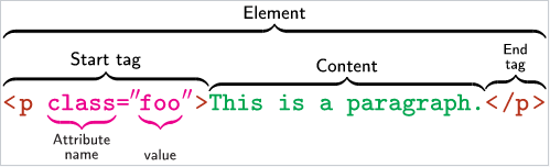
Definition
Attributes: These are the properties associated with an HTML element. In the image above, class is an example of an attribute. Attributes have values that define characteristics of an element. Other examples of attributes include style="", href="", src="", and title="", among many others.
What needs to be described in alt text must be done in 125 characters or less. Some screen readers will stop reading at this character length. There is often much more in an image (i.e., a picture is worth a thousand words) than can be described in alt text. Depending on the context, the same image may have different descriptions. Consider the following image in the two contexts described:
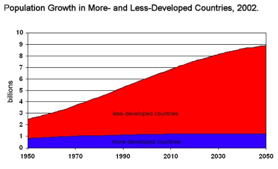
In a statistics book the actual data values in the graph may not be important. What may be important is the way that data is presented. Alt text in this case might read:
“When graphing population growth, population is presented on the y-axis, and years are presented on the x-axis.”
In an article that talks about birth rates around the world, the data values will be more important, and the way the data is presented less so. Alt text in this case might read:
“Since 1950, population growth for less-developed countries has increased at 5 times the rate of developed countries. See below.”
Note the reference to additional description with “See below.” With the limitation on the length of alt text, it is commonly necessary to provide additional details about an image in a long description. This can often be accomplished by providing an extended description in the text surrounding the image and in the alt text referring to that description. This extended description can be placed before or after the image or perhaps in a caption for the image. These long descriptions can be beneficial for many people, including those that do not have a disability but perhaps are not sure how to interpret the graph.
A long description for context 2, might then read:
“In 1950, the ratio of population growth between less- and more-developed countries was approximately 2.5:1. Since then, the ratio has increased steadily. Today, that ratio is approximately 6:1. By 2050, that ratio is expected to increase to 9:1, with developed countries maintaining a close-to-zero population growth, compared to a nearly 600% increase in less-developed countries.”
Key Point: Alt text should be no longer than 125 characters. Some screen readers will stop reading at this character length.
Key Point: The HTML image element (i.e., <img>) also has a longdesc attribute that can be added to it, in addition to alt text, that references a URL to a location where a more detailed description is provided, perhaps on another web page or perhaps farther down the page, accessed using an HTML anchor. Unfortunately, longdesc is not well-supported in any of the common browsers, so at this point using an alternative to longdesc, like describing in the surrounding text, is recommended.
One important characteristic of text is its adaptability. As mentioned, text makes images searchable and enables search engines to index the alt text of images. Some of the many ways text can be adapted, include:
In short, remember, providing text alternatives is usually a good way to make web content more accessible.
Suggested Reading:
Are You Human? Hiding from Spammers
Spam robots are constantly roaming through sites to find ways of accessing unprotected mail systems so they can be used to send unsolicited mail or to hide the origins of spam emails.
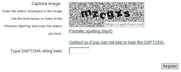
CAPTCHAs can be effective for warding off spambots, but they pose access barriers for some users. A person who is blind would not be able to see the characters in the CAPTCHA image and, thus, would be prevented from registering on the system without the help of a sighted person. It’s not possible to include a text alternative of the characters in the CAPTCHA image because spambots can easily be programmed to find them. CAPTCHAs are available with audio output to get around this problem, so the blind person can hear the characters in a CAPTCHA image. But this still leaves out deaf blind users, who cannot see or hear the CAPTCHA characters. For such cases the site maintainer should provide a means for registrants to contact the site administrator, who can register the person manually. A variety of CAPTCHA utilities are available on the Web, which can be copied into a site’s forms, and free services are available to generate audio CAPTCHAs:
20
Provide alternatives for time-based media.
Definition
Time-Based Media: Time-based media includes various forms of media like video, audio, slides, computer simulations, or any other media that has duration as a property and is presented over time.
Why do I need to include alternatives for “time-based media” (multimedia)?
If a website includes a multimedia presentation like a movie or video, some people will be unable to perceive (or will have difficulty perceiving) the visuals and/or the audio. By providing alternatives, web content authors improve accessibility for a wide range of individuals with and without disabilities:
Level A
For prerecorded audio-only and prerecorded video-only media, the following are true, except when the audio or video is a media alternative for text and is clearly labelled as such:
When audio content is presented, people who are deaf or hard of hearing may not be able to access it. When video content is presented (without audio), people who are blind may not be able to access it. In both cases, equivalent alternatives are required. In both cases, text equivalents can serve this purpose by reproducing the content of an audio track as text or describing what is going on in the video in text.

A YouTube element has been excluded from this version of the text. You can view it online here: https://pressbooks.library.ryerson.ca/iwacc/?p=170
Video: KQED Captioned Audio (text presentation of an audio-based news story) by dralegalorg

A YouTube element has been excluded from this version of the text. You can view it online here: https://pressbooks.library.ryerson.ca/iwacc/?p=170
Video: Frozen Trailer (Video-only with audio description) by IMSTVUK
Suggested Reading:
Level A
Captions are provided for all prerecorded audio content in synchronized media, except when the media is a media alternative for text and is clearly labelled as such.
Any video that contains meaningful spoken dialogue requires closed captions in order to make the audio portion of the video accessible to people who are deaf or hard of hearing. Captions should identify who is speaking and describe other meaningful audio elements that are relevant to comprehending the video.
Closed captions should be used instead of open captions. The latter type of captions are burned right into the video, cannot be hidden, and are not typically editable. In contrast, closed captions are contained in a text file and are presented over a video. Closed captions can be hidden away if they are not needed, and they are easily edited in a simple text editor.
Though captions are a Level A requirement in WCAG, they are not required when multimedia is being used as an alternative for text and is clearly identified as such. For example, in the previous unit you saw an ordered list used to describe the steps required to install ChromeVox. For some people, they may prefer to see it done rather than reading instructions. The video that was included with the instructions is an example of a media alternative for text. That video was captioned, but it did not need to be.
Key Point: Video producers should not rely on automatically generated captions through services like YouTube.
Depending on the quality of the dialogue in a video, errors are likely to occur when captions are automatically generated. However, auto-generated captions can be used as an initial set of captions, which a human being can edit to improve accuracy, provided the error rate is less than about 25%. With error rates higher than that, one would be better off captioning manually from scratch.
Automatically generated captions can be used as a temporary measure, if, for example, a video release is time sensitive, and captions cannot be created in time for that release. Video producers should still caption those videos using human captioners, as soon as it is feasible.

A YouTube element has been excluded from this version of the text. You can view it online here: https://pressbooks.library.ryerson.ca/iwacc/?p=170
Video: Learn more about YouTube captions and subtitles by YouTube Spotlight
Toolkit: Add the Amara Subtitles Editor to your toolkit. You’ll get a chance to use it in an activity later in this unit.
Suggested Reading:
Level A
An alternative for time-based media or audio description of the prerecorded video content is provided for synchronized media, except when the media is a media alternative for text and is clearly labelled as such.
There are two approaches to this success criteria. Both describe elements of a video, such as actions, characters, scene changes, or on-screen text, among other important information that is not spoken in the dialogue.
Key Point: In the next section you’ll see that SC 1.2.3 overlaps with both SC 1.2.5 and SC 1.2.7. Regarding AODA, SC 1.2.3 provides an option for media producers to include descriptions in a text transcript or, where possible, as part of a caption track where audio description is not provided.
21
Level AA
Captions are provided for all live audio content in synchronized media.
Key Point: Captions for live content, though a Level AA requirement in WCAG 2.1, is an exception for AODA. While they are not required to comply with AODA, they are recommended, where feasible, to reach the widest possible audience. In jurisdictions other than Ontario, captions for live content may be required.
People who are deaf or hard of hearing can watch real-time presentations by reading captions.
Captions identify who is speaking and what they are saying, plus other information conveyed through sound effects, music, and other sounds.
At present, human transcribers type the captions for real-time presentations. In the future, speech recognition technology may make it possible to automatically generate captions in real time.
Example: CBC News Live Captions
Suggested Reading: How are live captions delivered? See AI Live, for live captioning services and how it works and potential benefits for others who are not hearing impaired.
Suggested Reading:
Level AA
Audio description is provided for all prerecorded video content in synchronized media.
This is a slightly more stringent version of SC 1.2.3, which gives authors the option to provide an audio description or a full text alternative in a synchronized media presentation. If authors do one or the other, they are conforming at Level A.
SC 1.2.5 tells authors how to conform at Level AA: they must provide an audio description, a requirement already met if they chose that alternative for SC 1.2.3.
To conform to Level AAA, authors must include an extended audio description. This is covered in SC 1.2.7.
No audio description is necessary if all video track information is already provided in the audio track.
Suggested Reading:
![Thumbnail for the embedded element "Audio Descriptions on YouTube | Accessibility | #AudioDescribeYT [AD] [cc]"](https://i.ytimg.com/vi/MZ7YLTGNpao/hqdefault.jpg "Audio Descriptions on YouTube | Accessibility | #AudioDescribeYT [AD] [cc]")
A YouTube element has been excluded from this version of the text. You can view it online here: https://pressbooks.library.ryerson.ca/iwacc/?p=171
Video: Audio Description on YouTube
© James Rath. Released under the terms of a Standard YouTube License. All rights reserved.
Key Point: Audio description for prerecorded video, though a Level AA requirement under WCAG 2.1, is an exception under AODA for non-government organizations. Only Government of Ontario organizations are required to provide audio description for video by January 1, 2020. Non-government organizations should refer to SC 1.2.3 and provide a transcript that includes descriptions.
Suggested Reading: Have a look at the audio described shows/movies available on Netflix: Netflix Audio Described Titles.
22
Level AAA
Sign-language interpretation is provided for all prerecorded audio content in synchronized media.
American Sign Language (ASL) and other forms of sign language are languages in their own right. For one, they are not based on English. Much like French can be translated to English, ASL can also be translated to English. Some people who are Deaf (with a capital D representing a member of the Deaf community) may rely on ASL to communicate and may understand very little English. Hence, typical English captions may not always be understood effectively by a person who is Deaf.
Some people who are deaf grow up in hearing families and will often learn signed English, learn to read lips, and learn to write in English. As a result, they will understand English captions.
Video: Adding Phosphate to Water (American Sign Language Translation)
")
A YouTube element has been excluded from this version of the text. You can view it online here: https://pressbooks.library.ryerson.ca/iwacc/?p=172
© GovSnyder. Released under the terms of a Standard YouTube License. All rights reserved.
Video: Obama Tribute to Nelson Mandela: U.S. President Barack Obama in American Sign Language by Real Interpreter

A YouTube element has been excluded from this version of the text. You can view it online here: https://pressbooks.library.ryerson.ca/iwacc/?p=172
© Real Interpreter. Released under the terms of a Standard YouTube License. All rights reserved.
Suggested Reading:
Level AAA
Where pauses in foreground audio are insufficient to allow audio descriptions to convey the sense of the video, extended audio description is provided for all prerecorded video content in synchronized media.
Video: Vintage TV Commercial for Post GrapeNuts (with extended audio description)

A YouTube element has been excluded from this version of the text. You can view it online here: https://pressbooks.library.ryerson.ca/iwacc/?p=172
© AccessForEveryone. Released under the terms of a Standard YouTube License. All rights reserved.
Suggested Reading:
Level AAA
An alternative for time-based media is provided for all prerecorded synchronized media and for all prerecorded video-only media.
Suggested Reading:
Level AAA
An alternative for time-based media that presents equivalent information for live audio-only content is provided.
Suggested Reading:
23
Create content that can be presented in different ways without losing information or structure (e.g., a simpler layout).
Key Point: WCAG 2.0 included only Level A success criteria for Guideline 1.3. WCAG 2.1 added two additional Level AA requirements, plus one new Level AAA requirement that will be introduced on the page that follows.
Why should I make it possible to present content in different ways?
People need choices in how they use computers. One of the advantages of electronic documents over paper is flexibility. It is — or should be — easy to substitute one font for another or change colours, line spacing, margins, and dozens of other formatting characteristics. By following a handful of guidelines, web content authors make it easy for users to adjust the appearance and organization of web pages to suit users’ individual needs. For example:
Level A
Information, structure, and relationships conveyed through presentation can be programmatically determined or are available in text.
Definition
Programmatically Determined: Determined by software from author-supplied data provided in a way that different user agents, including assistive technologies, can extract and present this information to users in different modalities.
Definition
User Agent: Typically a web browser, though could be any software used to present web content to users, including assistive technologies.
Definition
Assistive Technology: Sometimes referred to as adaptive technology; software or hardware that acts as a user agent (or acts with a mainstream user agent) to provide functionality to meet the requirements of users with disabilities that go beyond those offered by mainstream user agents.
If you look “under the hood” of a web page, you will find a document that consists of all the words that appear on the page (the “content”) thickly interspersed with words, non-words, numbers, and symbols (the “code”). The code describes how the content should be formatted and what purpose it serves. For example, you might find something like this on a recipe website:
<h1>Recipes for Whole Wheat Bread</h1>
The pair of <h1> and </h1> tags that surround “Recipes for Whole Wheat Bread” means that the phrase appears larger and bolder than the text that surrounds it, and the phrase is the most important heading on the page.
Within that page of recipes there may be several types of whole wheat bread. Each of those would be presented with an <h2> to indicate their relationship as subtopics to the main topic of the page presented in an <h1>. Likewise, within each recipe, there may be an <h3> used to present ingredients, another to present preparation instructions, and yet another for serving suggestions. Each of those <h3> headings has a relationship to the parent <h2> but not to the other <h2> headings that represent other types of whole wheat bread. The following shows a semantic structure (i.e., the relationships of topics and subtopics) associated with the bread recipes.
Technical:
<h1>Recipes for Whole Wheat Bread</h1> //main topic
   <h2>Whole Grain Bread</h2> //type of bread
       <h3>Ingredients</h3> //recipe elements
       …
       <h3>Preparation</h3>
       …
       <h3>Serving</h3>
       …
   <h2>Multigrain Bread</h2> //type of bread
      <h3>Ingredients</h3> //recipe elements
      …
      <h3>Preparation</h3>
      …
      <h3>Serving</h3>
      …
   <h2>Sourdough Bread</h2> //type of bread
      <h3>Ingredients</h3> //recipe elements
       …
      <h3>Preparation</h3>
      …
      <h3>Serving</h3>
      …
The above semantic structure uses headings that represent topics, and subtopics could also be represented as a nested list. The following list maintains the same relationships defined by the headings above. In this case, there is a main list with one item, the main topic; three sublists with each type of bread; and one sublist under each of those representing the elements of a given recipe.
Technical:
<ul> //main list of bread recipes
<li>Recipes for Whole Wheat Bread
   <ul> //type of bread
      <li>Whole Grain Bread
      <ul> //recipe elements
         <li>Ingredients
         …
         </li>
         <li>Preparation
         …
         </li>
         <li>Serving
         …
         </li>
      </ul>
     </li>
  </ul> //End of Whole Grain type
  <ul> //type of bread
     <li>Multigrain Bread
     <ul> //recipe elements
        <li>Ingredients
        …
        </li>
        <li>Preparation
        …
        </li>
        <li>Serving
        …
        </li>
     </ul>
    </li>
  </ul> //End of Multigrain type
  <ul> //type of bread
     <li>Sourdough Bread
     <ul> //recipe elements
         <li>Ingredients
         …
         </li>
         <li>Preparation
         …
         </li>
         <li>Serving
         …
         </li>
     </ul>
     </li>
   </ul> //End of Sourdough type
</li>
</ul> //End of main list of bread recipes
SC 1.3.1 requires web content authors to use the right code to generate relationships and associate related information. When they do, browsers and assistive technologies automatically “understand” how content relates to other content on the page. (This is what is meant by “programmatically determined.”) For example:
<label> element, ensures that browsers and assistive technologies know that the first field contains the name and the second field contains the email address. In the example markup below, note that the for attribute with each label creates an association with the id attribute of the related input field. When an input field receives focus, the content of the associated label is read out.Technical:
<form>
   <label for="firstname">Name</label><input type="text" id="firstname"/>
   <label for="emailaddress">Email</label> <input type="text" id="emailaddress" />
…
</form>
<th>, ensures that browsers and assistive technologies associate the data cell (i.e., <td>) that says “11.4 million” with the header cell (i.e., <th>) “Ontario” and the data cell that says “3.3 million” with the header cell “Alberta.”Technical:
<table>
  <tr><th>Ontario</th><th>Alberta</th>...</tr>
  <tr><td>11.4 million</td><td>3.3 million</td>...</tr>
   ...
</table>
Key Point: This success criterion overlaps with SC 2.4.6 Headings and Labels and SC 2.4.10 Section Headings. While SC 1.3.1 requires the use of markup to create associations, these latter success criteria do not. These will be addressed further when Guideline 2.4 is discussed in the next unit.
Suggested Reading:
Level A
When the sequence in which content is presented affects its meaning, a correct reading sequence can be programmatically determined.
Definition
Meaningful sequence: A sequence is meaningful if the order of content in the sequence cannot be changed without affecting its meaning.
There are a range of scenarios where web content must be arranged in a particular order to be effectively understood. For example, when looking up the address for a company, we would expect to find information in this order:
ABC Company
123 Main Street
Suite 456
Toronto
Ontario
M7N 8X9
We might become confused if the information appeared in this order:
ABC Company
Toronto
123 Main Street
Ontario
Suite 456
M7N 8X9
The latter sequence is the presentation order to a screen reader user if the web content author were to use the following layout table to format the address in two columns. By default, screen readers read left to right and top to bottom, thus reading the left then right cells in the first row, left then right cells in the second row, and so on.
| ABC Company | Toronto |
| 123 Main Street | Ontario |
| Suite 456 | M7N 8X9 |
Sometimes content can be presented in any order without compromising comprehensibility. For example:
Another common sequencing error occurs with modal dialogs, like the one described below. For a modal dialog to comply with this success criteria, when a user clicks an element (in this case, the button labeled “Add Delivery Address”) to open the dialog, focus must be sent to a focusable element in the dialog. The cursor must then remain trapped in the dialog until the user explicitly dismisses it, either by pressing the escape key or clicking one of the buttons.
Modal dialog sequencing failures occur when:
Definition
Modal Dialog: A dialog window that typically opens on top of existing web content and forces the user to interact with the dialog before access to the existing content can be re-established. The modal dialog takes focus, and, typically, the content in behind the dialog is greyed to reduce its visibility while the dialog is open.
Definition
CSS: Acronym for Cascading Style Sheets. CSS, introduced around the same time as HTML 4, is a way to separate presentation from its associated HTML content, thus improving the accessibility of web content. CSS makes it possible for users to override a default presentation and customize it to their needs (among other benefits).
Suggested Reading:
Level A
Instructions provided for understanding and operating content do not rely solely on sensory characteristics of components such as shape, size, visual location, orientation, or sound.
Note: For sensory characteristics related to colour, refer to Guideline 1.4.
Some users with disabilities cannot perceive shape, position, colour, or location due to the nature of their disability and/or the assistive technologies they use.
Here’s an example: There are three buttons at the bottom of a survey form. The instructions read: “Click the brown button to exit the survey without saving. Click the square button to save in-progress survey results. Click the large button to submit your results.” A screen reader user cannot determine which button is brown, square, or large.
The form buttons in the example above can be made accessible by labelling the brown button “Exit without saving;” the square button “Save partial results;” and the large button “Submit your results.”
In addition to the button examples above, phrases like “make a choice from the menu on the left” will be more accessible as “immediately following the main menu near the top of the page, make a choice from the content menu on the left.” In the latter case, the user can find the main menu, assuming it is labelled as such, and, when it is announced, understand what follows will be the content menu.
When including instructions that describe how to interact with the content of a web page, do not state the instructions exclusively in terms of a single sensory characteristic. Instead, provide additional or alternate descriptions.
24
WCAG 2.1 added two new Level AA and one new Level AAA Success Criteria for Guideline 1.3.
WCAG 2.1
Level AA
Content does not restrict its view and operation to a single display orientation, such as portrait or landscape, unless a specific display orientation is essential.
When WCAG 2.0 was introduced in 2008, the first iPhone had only just been released. At that time there was no real consideration regarding device orientation because, typically, there was no need. Today, however, mobile devices have become as prevalent as computer screens, and orientation is a key characteristic of such devices. Even computer monitors these days typically have an orientation setting that allow a monitor to be turned to a vertical orientation.
It is common for people to mount a mobile device on their wheelchair arm, for instance. Depending on preference, the device may be positioned in either a portrait or landscape orientation. If web content is limited to a particular orientation, it can make content difficult to access effectively in cases like this.
There are occasions where orientation has to be limited to landscape or to portrait, but in general, such a limitation should be avoided.
Some examples where orientation may be restricted could include:
Suggested Reading:
WCAG 2.1
Level AA
The purpose of each input field collecting information about the user can be programmatically determined when:
For people with cognitive disabilities, low vision, or some types of learning disabilities, it can be difficult to determine the purpose of a form field or the correct format for the data being entered. This success criteria indicates that browsers and assistive technologies must be able to determine the expected input.
While browsers have been able to do this for some time, it’s only recently that browsers have used their own strategies to automatically fill (autofill) forms with predefined data using technology-specific algorithms. For instance, Firefox will remember values entered into a field named “name” or “telephone.” So, the next time a field with the same name is encountered, it will offer up the values that were previously entered into a field with the same name. While this does provide some indication of the expected input, they are general and not exact. That is, “name” could refer to first or last name; “telephone” could include a country code, area code, and extension, and so on.
In HTML 5.2, the “autocomplete” attribute was added to help developers meet this requirement in WCAG 2.1. It can be used to provide specific descriptions about the purpose for form fields. For the name example, one could add autocomplete="given-name" and autocomplete="family-name" to make it clearer what name is expected for respective form fields. If these values have been previously saved, they would be offered to the user to choose from, so they are not required to type their name.
There is fairly good support for the autocomplete attribute across current browsers. Form developers are encouraged to use it to make it easier for people with disabilities to fill out forms. Consequently, it makes filling out forms more efficient for everyone, including frequent online shoppers, for example. For more about “autocomplete” see the suggested readings below.
Also, try the demo site with a current version of Firefox and see what happens. You may notice some inconsistencies between the two browsers.
Suggested Reading:
WCAG 2.1
Level AAA
In content implemented using markup languages, the purpose of User Interface Components, icons, and regions can be programmatically determined.
In addition to roles associated with various user interface elements that identify what an element is (e.g., role="link" for a link), this success criteria adds a purpose to that role (e.g., a link to the site’s home page).
These “purposes” are defined by the W3C’s Cognitive and Learning Disabilities Accessibility Task Force (COGA). It will likely be introduced with the next version of WAI-ARIA, which will provide standard ways to define purpose that will help make content on the Web easier to understand, particularly for those with cognitive disabilities.
Definition
WAI-ARIA: The two parts of the acronym represent “Web Accessibility Initiative,” the group at the World Wide Web Consortium (i.e., W3C) that works on accessibility specifications, and “Accessible Rich Internet Applications,” the specification introduced around the same time as HTML5. WAI-ARIA is used to add semantics for custom web elements (like a slider or popup menu) and web interactivity (like a control bar for a video player) to make them understandable by assistive technologies such as screen readers.
For example, icons may be used to provide a visual representation of an element. The home link, for instance, might include a house icon, along with the word “home” to represent the link. Those who are then unable to read the word can make use of the visual representation. Being defined in a standard way (e.g., aria-function="home-link"), technology will be able to read (i.e., programmatically determine) these “purpose” attributes, making it possible for users to replace the icons with their own, perhaps using an arrow icon to represent home, for instance, which may be more meaningful to a particular person than a house icon.
Though standardizing how purpose will be identified is still a work in progress, there are already WAI-ARIA landmark roles that function to define the purpose of regions on a web page (e.g., banner, navigation, main, or complementary). This then makes it possible for technology to identify those regions. A user can potentially hide away everything except the main region on the page, which contains the primary content, so, for example, a person with an attention-related disability is not distracted by other elements on the page.
Personalization of this nature is an evolving area of research at W3C and elsewhere, which promises to optimize using the Web for each individual user in the not-too-distant future.
25
Make it easier for users to see and hear content including separating foreground from background.
Level A
Colour is not used as the only visual means of conveying information, indicating an action, prompting a response, or distinguishing a visual element.
Note: This success criterion addresses colour perception specifically. Other forms of perception are covered in Guideline 1.3, including programmatic access to colour and other visual-presentation coding.
Most estimates suggest that about 8% of males and 0.5% of females have some form of colour-blindness, ranging from an inability to see colour at all to minor deficiencies seeing specific colours.
Use of colour becomes a barrier for some people when it is used on its own in a meaningful way. For example, “click the green button to start and the red button to stop” is going to be problematic for people who may have trouble seeing greens or reds (the majority of colour-blind individuals) not to mention problematic for people who are blind. A solution in a case like this might be to add the word “Start” to the green button and “Stop” to the red button. Or, in the instructions, suggest using the first/left/top button to start and using the second/right/bottom button to stop.
A common issue in web content occurs when error feedback messages are presented in red or success feedback is presented in green, without some other indicator of what the text represents. A simple fix might be to include a checkmark icon with the success feedback (with alt text of course), and an X icon with an error message. Or, just include the word “Error” with an error message and “Feedback” or “Warning,” and so on with other forms of feedback.
Whenever colour is used in a meaningful way, some other element with equivalent meaning is required. Text as an alternative to colour is often a good choice.
Key Point: Forms of Colour-Blindness
To experience colour-blindness, try the colour-blindness simulator.
Suggested Reading:
Level A
If any audio on a web page plays automatically for more than three (3) seconds, either a mechanism is available to pause or stop the audio, or a mechanism is available to control audio volume independently from the overall system-volume level.
Note: Since any content that does not meet this success criterion can interfere with a user’s ability to use the whole page, all content on the web page (whether or not it is used to meet other success criteria) must meet this success criterion. See: Conformance Requirement 5: Non-Interference.
When audio begins playing automatically when a web page loads, it can make it difficult for screen reader users to navigate. Since they rely on the output from their screen reader, other sounds playing at the same time can make it difficult to comprehend either audio stream. Even if there is a way to stop the automatically played audio, finding the stop control can be difficult if one has to distinguish between the audio and the screen reader output in order to find the control.
Though automatically playing audio when a web page loads is discouraged, in cases where it is necessary you must include a way to control the audio volume independent of the system’s audio controls, which also moderates the volume of the screen reader output. Users should be able to reduce the automatically playing audio volume or turn it off without affecting the volume of the screen reader.
Web content developers should avoid using the HTML autoplay attribute.
Turn on ChromeVox. Then view this embedded YouTube video with your monitor turned off. Try to find the stop button using only your keyboard.

A YouTube element has been excluded from this version of the text. You can view it online here: https://pressbooks.library.ryerson.ca/iwacc/?p=175
Video: Accessible Employment Standard for Small Businesses by ONgov
Suggested Reading:
26
Level AA
The visual presentation of text and images of text has a contrast ratio of at least 4.5:1, except for the following:
For those with low vision or significant colour vision deficiency, low contrast between text colour and background colour can make reading difficult or impossible. These may be people with congenital (genetic) or acquired vision loss, including those with typical reduced visual acuity associated with aging.
Larger font (e.g., 18+ pt or 14 pt bold) is easier to read at lower contrast than typical text, like the text you are reading now, so the required contrast level (a.k.a., relative luminance) can be lower, at a contrast ratio of 3:1. Typical fonts (e.g., approximately 12 pt or less) require a higher contrast to be readable for some people, at a minimum contrast ratio of 4.5:1. These ratios are calculated based on the contrast required by someone with 20/40 visual acuity to effectively read text without the assistance of system or software contrast enhancements (see also: SC 1.4.6 Contrast Enhanced).
A common contrast issue occurs when the colour of link text has its typical underline removed using CSS styles. The resulting link text may not provide sufficient contrast with the surrounding text. In such cases, links that are embedded in a paragraph, for instance, become invisible to many users. The link text may only be discovered by inadvertently passing a mouse pointer over the link, causing the finger pointer to appear. Web content developers will often remove the standard link underline for aesthetic reasons, perhaps not realizing that this creates a barrier for some people. In contrast, for links in navigation menus, removing the underline is less of an issue, since the function of these links is usually obvious. Developers should distinguish between navigation links and links embedded in content, styling the latter with an underline. The underline for links is the default, so they have to be removed intentionally. Developers should avoid removing the underline in such cases.
Colour contrast is relatively easy to check. There are many tools available that take codes for foreground (text) and background colours, then calculate the contrast ratio. These colour codes can be found by using a tool like ColorZilla or by using a browser’s Inspect Element window. In order to use Inspect Element, try selecting an element in the HTML window to the left, then observing the associated colour code in the CSS window on the right, as seen in the figure below.
Toolkit:
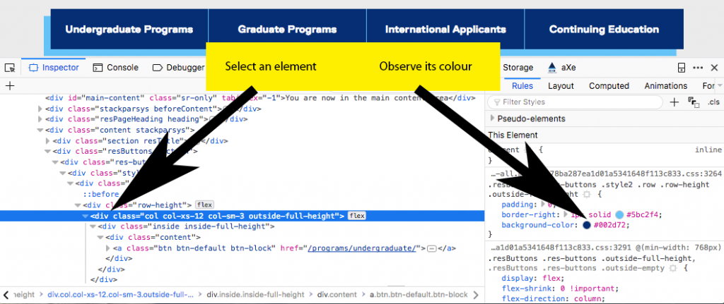
Figure: In a browser’s Inspect Element window, arrows pointing to an HTML element on the left and its associated colour in the CSS on the right.
Using your browser’s Inspect Element feature, select text and background colours from an element on a familiar website and determine its contrast ratio using the contrast checker above.
Suggested Reading:
Level AA
Except for captions and images of text, text can be resized without assistive technology up to 200 percent without loss of content or functionality.
The goal of this success criteria is to ensure that people with mild visual disabilities can read content without the need for assistive technology to magnify text. This group of people includes the large population of individuals over 50 years of age, who tend to lose visual acuity with age and often need to increase text size just a little to make it readable.
Current browsers have a built-in zoom feature that will magnify the content on a web page, including images, regardless of how they have been sized. Typically, web content should be sized using relative measures (em or %) rather than absolute measures (pt or px) to ensure that elements throughout a page of web content magnify at the same rate. This includes container elements sized with absolute measures that have relatively sized text in them. If the container is sized with absolute measures, they run the risk of text magnifying but the container remaining the same size. This scenario may result in the magnified text presented one word per line, making it difficult to read. Or magnified text may float over or under adjacent text or other elements on the page, again making it difficult to read.
Relative sizing is also a requirement for responsive designs, which have become the norm for websites in recent years. Most websites are now developed in a way that adapt to the size of the screen they are being viewed on (i.e., they are responsive to screen size). Sizing text with relative measures thus accommodates people who need larger text to make it readable and ensures websites adapt effectively for a range of screen sizes.
Also see SC 1.4.10 Reflow for more about web content adapting to screen size.
Open a YouTube video and magnify the content of the page using your browser’s zoom function (CMD and + on Mac; CTRL and + on Windows). Notice what zooms and what does not. Depending on the browser you’re using, you may notice differences in the way browsers magnify content.
Try this activity with Firefox, Chrome, Internet Explorer, or Edge browsers. If testing on Firefox, you can also try zooming on the text only by selecting “Zoom Text Only” from the View > Zoom menu.
Also, try making the width of your browser narrow. Grab the right edge of the browser window with your mouse pointer and drag the edge of the window to the left. Notice whether the content adjusts its layout and resizes (or does not resize) to fit into the smaller available space.
Suggested Reading:
Level AA
If the technologies being used can achieve the visual presentation, text is used to convey information rather than images of text except for the following:
Note: Logotypes (text that is part of a logo or brand name) are considered essential.
Most bitmap (or raster) images are made up of pixels or dots, which makes these images lose their crisp appearance when magnified. In contrast, vector-based images consist of points, lines, and curves and can adapt well to being resized. The vast majority of images on the Web are bitmap images (png, gif, or jpeg).
When bitmap images contain meaningful text and are magnified, the letters will typically pixelate, resulting in ragged edges around letters thereby making text more difficult to read for a person with low vision using browser-based zooming.
Images of text will also be inaccessible to people who are blind and using a screen reader to read web content. Screen readers are not able to extract text from images. While it is possible in some cases to reproduce the text in the alt text for an image or in a long description, this won’t accommodate people with low vision.
While there are some cases where images of text are necessary, generally web content developers should avoid using them. Wherever possible, actual text should be used. Actual text will magnify while keeping its crisp appearance, unlike the pixelated text in a magnified image.
Another reason why web developers may want text instead of images of text is for search engine indexing. Search engines can index text to make it searchable, while images of text cannot be indexed, apart from indexing the associated alt text. Text also uses much less bandwidth than an image of the same text, an important point for developers who are conscious of page loading times and bandwidth usage. By opting for smaller, faster-loading pages, websites can be considerate of data usage for visitors who may have limited data plans or who may turn off images to reduce their data consumption.
Using your browser’s zoom function, magnify the following letters and notice any changes in their appearance as they get larger. The image of text will degrade while the text and the SVG versions stay crisp and easy to read.
An interactive or media element has been excluded from this version of the text. You can view it online here:
https://pressbooks.library.ryerson.ca/iwacc/?p=176
Suggested Reading:
Level AAA
The visual presentation of text and images of text has a contrast ratio of at least 7:1, except for the following:
This success criteria is a more stringent version of SC 1.4.3. While SC 1.4.3 is intended to accommodate readers with 20/40 vision without the need for assistive technology, SC 1.4.6 is intended to accommodate those with 20/80 vision without the need for assistive technology. These are typical low-vision users who do not use assistive technology. Those with vision loss greater than 20/80 tend to use assistive technology such as magnifiers or contrast-enhancing software. Also, see SC 1.4.3 Contrast Minimum.
Using the WebAim Color Contrast Checker, introduced above, enter the colour values for black (#000000) as the background colour and white (#FFFFFF) as the foreground colour, and notice the contrast ratio the checker reports. Then reverse the colours. Is there any change in the contrast ratio?
Do you find it easier to read white text on a black background or black text on a white background? Why do you think that is, despite the contrast in each case being equal?
Also, try other opposing colours like blue and yellow, and red and green, and switching between foreground and background colours. Notice which colour combinations you find easier to read.
Though a controversial topic, the science is fairly clear: Why light text on dark background is a bad idea.
Suggested Reading:
Level AAA
For prerecorded audio-only content that (a) contains primarily speech in the foreground, (b) is not an audio CAPTCHA or audio logo, and (c) is not vocalization intended to be primarily musical expression such as singing or rapping, at least one of the following is true:
Note: Per the definition of “decibel,” background sound that meets this requirement will be approximately four times quieter than the foreground speech content.
This success criteria is intended to ensure that people with mild to moderate hearing loss are able to distinguish between foreground speech and background sounds and still understand what is being said. The optimal approach is not to have background audio. In cases where background audio is necessary, users should be able to disable the background audio. Alternatively, you should ensure that there is at least 20 decibels between speech volume and the volume of the background audio.
Measuring the separation between foreground speech and background sounds requires audio editing software. Samples are taken from an audio track at two instances: when just the background sound is audible and when both speech and background sounds are audible. Then, the decibel output of each is compared.
Alternatively, someone with good hearing listens to the speech over the background sounds, and if there are any parts that require added attention to comprehend, there is likely less than 20 dB of separation. For someone with a hearing impairment, those parts will be even more difficult to comprehend.
Suggested Reading:
Level AAA
For the visual presentation of blocks of text, a mechanism is available to achieve the following:
This success criteria essentially requires that the presentation of blocks of text be adaptable to the text/font preferences of the reader. This adaptability can benefit people with low vision and people with some cognitive or learning disabilities.
Some people find it easier to read with non-standard text and background colours (e.g., yellow on black). Some people with cognitive or certain learning disabilities will find it easier to read text with a little extra white space between lines. Others find text easier to read when spacing between words is consistent, as opposed to variable spacing in the case of justified text. While the text does not necessarily have to meet all these requirements by default, it must be possible to override the default presentation so readers are able to apply their own styles that meet their particular needs.
Plain text will generally comply with this success criteria. Failures occur when authors or web developers prevent text from adapting. Here are more examples of failures:
Toolkit: Install the User CSS Chrome extension, used to create a user-specific custom style sheet.
After installing User CSS for Chrome, create a custom style yourself.
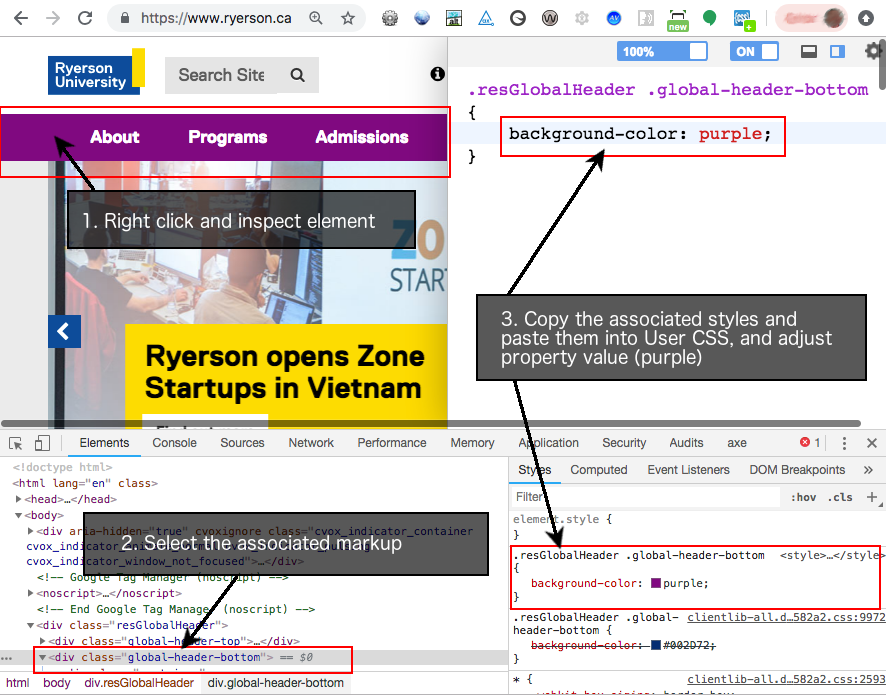
Steps:
Suggested Reading:
Level AAA
Images of text are only used for pure decoration or where a particular presentation of text is essential to the information being conveyed.
Note: Logotypes (text that is part of a logo or brand name) are considered essential.
While SC 1.4.5 allows the use of text in images in some cases (provided there is an actual text alternative available), SC 1.4.9 requires that no images of text are used, apart from logos, essential images of text, or images used only for decoration.
This requirement ensures that those who benefit from adaptable text presentation, as described for SC 1.4.8, are able to apply their text adaptations for all text. Images of text would not otherwise be adaptable to these individuals.
Suggested Reading:
WCAG 2.1
Level AA
Content can be presented without loss of information or functionality and without requiring scrolling in two dimensions for the following:
The above applies except for parts of the content that require two-dimensional layout for usage or meaning.
Note: 320 CSS pixels is equivalent to a starting viewport width of 1280 CSS pixels wide at 400% zoom. For web content that is designed to scroll horizontally (e.g., with vertical text), the 256 CSS pixels is equivalent to a starting viewport height of 1024 px at 400% zoom.
Note: Examples of content that require two-dimensional layout are images, maps, diagrams, video, games, presentations, data tables, and interfaces where it is necessary to keep toolbars in view while manipulating content.
The aim of this success criteria has two parts: (1) Allow people with significant vision loss, who do not use screen readers or magnifiers, to magnify web content to 400% using only a browser’s zoom; and (2) allow content to adapt such that there is no need to scroll left or right (or to scroll up and down for vertical languages). When scrolling is required, it can be difficult to move from the end of one line of text to the start of the next. Also, when scrolling is required, there is also the risk that content that is not in the visible area of the screen may go unnoticed.
While reflowing content is very helpful for this group, it is also a prerequisite for responsive designs that adapt to various screen sizes and orientations.
Definition
Responsive design is an approach to web page creation that makes use of flexible layouts, flexible images, and Cascading Style Sheet media queries. The goal of responsive design is to build web pages that detect the visitor’s screen size and orientation and change the layout accordingly. (Source: WhatIs.com)
Definition
Viewport is another name for a browser window, or for a mobile phone or tablet screen. It is the visible space available to display a web page. Responsive designs were introduced to accommodate the wide range of viewport sizes across desktop and mobile device displays.
In the figure below, you will see a standard desktop display of the Ryerson website on the left and a reflow version (responsive) on the right. Dragging the right side of the browser window to the left to narrow its width causes the elements on the page to reflow to fit the available space. Likewise, when using your browser’s zoom to increase the view to 400%, the content reflows into a single column, so it can be viewed with ease by someone who needs magnification but does not use an assistive technology.
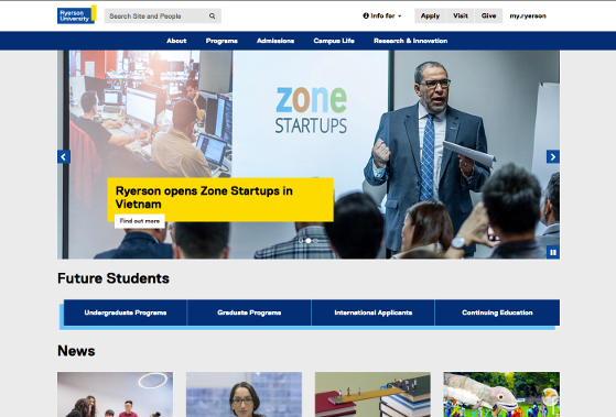

Figure: A desktop display of a website on the left, adapted through responsive design to fit a narrow screen on the right.
Visit the Ryerson.ca website yourself. Try dragging the right side of your browser window left to reproduce the above effect. Next, use your browser’s zoom feature (in the View menu) to zoom in to 400%. In both cases, notice how the content of the page rearranges itself to fit the available space.
Try the activity on a couple of other websites you are familiar with, and notice whether they adapt, or reflow, to fit your browser window at different sizes.
There are a few exceptions to the reflow rule. Larger images, for example, that when viewed full width in a desktop browser window at 100% will flow off the side of the screen when magnified to 400%. Depending on the content of the image, developers may be able to set the maximum width of images to 100% of the browser window, so it increases in size until it reaches the width of the window. You may notice this happening on the Ryerson website in the activity above.
Data tables are another exception. Header cells and data cells have a particular relationship that cannot be changed without changing the meaning in the table. Both images and data tables are out of scope for this success criteria.
WCAG 2.1
Level AA
The visual presentation of the following have a contrast ratio of at least 3:1 against adjacent colour(s):
This success criteria builds on SC 1.4.3 Contrast Minimum, which ensures text is readable over its background colour, extending the need for good contrast to functional elements in web content such as links and forms, as well as other visual elements such as icons, graphs or charts, and infographics, among other graphical objects.
Take links, for example. It is common for web content developers to remove the underline from links for aesthetic reasons. In some cases, removing the underline is okay, when the function of links, such as links in a menu, is obvious to the users. Often link text is blue by default, which over a typical white background will provide sufficient contrast to be readable. However, readers may not be able to distinguish between the blue link text (with the underline removed) and the surrounding black paragraph text. Such links may go unnoticed. The default contrast between the link colour and the surrounding text colour will fail this success criteria.
Another common non-text contrast issue occurs when disabled buttons are greyed out to indicate they are not functional. This may very well be desirable to de-emphasize the button until a particular task is complete or data entered, for example. But it may also create a barrier for low-vision users who may not be able to effectively see the disabled button to know that some task needs to be completed before continuing. In such a case, there are competing needs between those who can see and those who may have difficulty seeing. If higher contrast is required to make the disabled button more visible, it may make the disabled state less distinguishable for those who can see the buttons.
Readers should refer to SC 1.3.5 and SC 1.3.6 for more about potential solutions to competing needs. Icons, for example, might be used in the future with disabled elements, so those who may not be able to see the element have an alternative available through a preference setting that inserts an icon where a disabled element is present.
Suggested Reading:
WCAG 2.1
Level AA
In content implemented using markup languages that support the following text style properties, no loss of content or functionality occurs by setting all of the following and by changing no other style property:
Exception: Human languages and scripts that do not make use of one or more of these text style properties in written text can conform using only the properties that exist for that combination of language and script.
You were introduced to text sizing in SC 1.4.4 Resize Text and in SC 1.4.8 Visual Presentation, both of which ensure that readers are able to modify the presentation of text to make it more readable. SC 1.4.12 builds on customizing text properties, adding line height, paragraph spacing, letter spacing, and word spacing to that mix.
This success criteria does not require authors to set these text properties. It requires that they do not prevent users from setting them. It is users who are responsible for applying these properties though tools such as User CSS, introduced earlier. Much like sizing with relative measures (%, em), as discussed with SC 1.4.4, relative sizing should be used for line height and for paragraph, letter, and word spacing. In this way, all elements related to text presentation, including text containers, increase in size at the same rate, rather than floating over adjacent text or floating under an adjacent image or text container, for example.
Similarly, older HTML attributes, such as height and width, should be avoided, as well as inline styles controlling these properties when defining text sizes. The same is true for the four properties associated with this success criteria. HTML attributes and inline styles can make it difficult or impossible for users to adjust text presentation to their liking.
WCAG 2.1
Level AA
Where receiving and then removing pointer hover or keyboard focus triggers additional content to become visible and then hidden, the following are true:
Exception: The visual presentation of the additional content is controlled by the user agent and is not modified by the author.
Note: Examples of additional content controlled by the user agent include browser tooltips created through use of the HTML title attribute.
Note: Custom tooltips, submenus, and other non-modal popups that display on hover and focus are examples of additional content covered by this criterion.
SC 1.4.13 Content on Hover or Focus applies to elements like tooltips, popup menus, and other non-modal dialogs (i.e., popups). Modal dialogs are covered under SC 1.3.2 Meaningful Sequence and should not open on hover or focus.
As described in the success criteria above, when a tooltip or small dialog window opens with a definition, for example, users must be able to dismiss the new content without having to move the mouse or having to move focus away from the element that triggered the popup content. This is typically accomplished by scripting the Escape key to dismiss the content. This allows a user who may have screen magnification set high (e.g., 400% or more) to dismiss a popup that is accidentally opened when a mouse pointer or keyboard focus inadvertently hits a trigger, without being forced to navigate away and potentially lose their place in the original content.
Users must also be able to move the mouse pointer away from the trigger to hover in the popup content, without losing the popup when focus on the trigger is removed. Users who have their screen magnified may need to drag their mouse pointer away from the trigger and off the side of the visible screen, in order to bring the whole popup into view.
Finally, popup content must persist until the user explicitly dismisses it. It can take longer for some people with disabilities to read content, so this tactic ensures there is enough time to read through the content of the popup before it disappears.
In the example below, users can dismiss the tooltips by moving focus away from the triggers, accessing another trigger, or pressing the Escape key. Tooltips persist by clicking the trigger, until clicking out, pressing the Escape key, or clicking another trigger.
An interactive or media element has been excluded from this version of the text. You can view it online here:
https://pressbooks.library.ryerson.ca/iwacc/?p=176
27
Video content poses different types of potential barriers for different groups with disabilities. There are three potential adaptations for multimedia content that can make it accessible to a broader range of users. These include:
These elements can often be combined to produce video content that is adaptable to a wide range of users. Though audio description for multimedia is an exception in Ontario, many jurisdictions will require it. In Ontario, what might have gone into audio descriptions can be added as text to closed captions instead. These descriptions are often included in [square brackets] to indicate their function within captions, distinguishing them from the spoken dialogue of the video. These can include a description of the setting, visual activity in the video, names of people speaking, and any other important information that one may not be able to determine from listening to the video’s audio track.
In this activity, you will produce closed captions for one minute of video (or the full video if it is shorter than one minute).
Step 1: Select a video to caption.
Step 2: Get set up to caption a video on Amara.
Step 3: Caption the video.
Step 4: Download the captions file, and create a transcript file.
YouTube Studio (Login)
If you already have a YouTube account and have videos of your own there, you can produce your captions using the YouTube Caption editor instead.
NOTE: YouTube updates fairly regularly, and the new YouTube Studio was in beta at the time of writing. As a result the instructions above, and the labels described, may vary from what is currently available on YouTube. Explore, if necessary, to find the caption or subtitle editor if the above instructions have become outdated.
If you are completing this activity as part of a course, your instructor may ask you to submit your work. Your submission should contain two parts (or as instructed by your instructor):
Part 1: Your captioning work
Part 2: A few lines or a paragraph about your experience using the caption editor
Some questions you might answer in your paragraph:
IV
By the end of this unit, you will be able to:
28
User interface components and navigation must be operable.
If you follow Principle 1 guidelines, visitors will be able to perceive the content of your website. Principle 2 takes things to the next level: Once visitors can perceive the content, they must be able to act on it. In other words, the content must be operable.
There are four “operable” guidelines:
29
User interface components and navigation must be operable.
Why must web pages be accessible without a mouse?
Some people cannot use or have difficulties using a mouse. For example:
Level A
All functionality of the content is operable through a keyboard interface without requiring specific timings for individual keystrokes, except where the underlying function requires input that depends on the path of the user’s movement and not just the endpoints.
The computer mouse is ubiquitous today, but before 1984 most computer users did not use one. The mouse only became pervasive during the mid–1990s. In recent years, other mouse-like devices have been introduced, including trackballs, touchpads, and trackpoints. Now, a mouse (or a similar pointing device) comes with every computer, and most people would be lost without one.
Yet some people cannot use — or have difficulties using — a mouse. For example:
In addition, there are individuals who find that pressing a few keys on the keyboard is faster, easier, and more accurate than pointing and clicking. Many “average” computer users know a few keyboard shortcuts, and some “power users” rarely touch the mouse at all.
Many tasks that are typically done with a mouse can be (or should be) easily keyboard accessible, including “clicking” hypertext links, drawing straight lines and regular geometric shapes, and resizing windows. There are even keyboard equivalents for dragging and dropping. But when a task cannot be performed without a mouse, some people will be prevented from taking full advantage of a site.
WCAG 2.1 acknowledges that some tasks cannot reasonably be done with a keyboard, such as real-time flight simulations. Tasks that depend on continuous, time-sensitive movements that do not have start and end points are excluded. But the highest conformance level that such a website can attain for Guideline 2.1 is Level A. To achieve Level AAA, all content must be keyboard accessible. Also, see SC 2.1.3 Keyboard (No Exceptions).
Many of the assistive technologies that people with disabilities rely upon emulate the functionality of a keyboard. Content that is accessible by keyboard can also be accessed by devices that emulate keyboards. For this reason, the ability to interact with web content using only a keyboard is core to web accessibility.
Key Point: SC 2.1.1 Keyboard is as important as SC 1.1.1 Text Alternatives. If neither are addressed, a website will have insurmountable barriers that some users with disabilities may have no way to work around.
One common keyboard-inaccessible culprit around the Web is drag-and-drop widgets. Developers often have trouble making these accessible, though there are a number of strategies available to make them usable with a screen reader.
The following two examples of drag-and-drop sortable lists may look identical, but there is one difference. Mouse users will find that both function exactly the same way; however, for keyboard users, only the first one is accessible.
To test each sortable list:
Notice that there is no way to reorder the list using a keyboard alone in the second example below. The first example would pass, and the latter would fail accessibility testing.
Also, notice how the screen reader announces the accessible version. These semantics are created using WAI-ARIA. WAI-ARIA will be covered in more detail later in later unit and will be covered in great detail in our Web Accessibility for Developers book.
Example 1: Accessible Sortable List
An interactive or media element has been excluded from this version of the text. You can view it online here:
https://pressbooks.library.ryerson.ca/iwacc/?p=189
Example 2: Inaccessible Sortable List
An interactive or media element has been excluded from this version of the text. You can view it online here:
https://pressbooks.library.ryerson.ca/iwacc/?p=189
Suggested Reading:
Level A
If keyboard focus can be moved to a component of the page using a keyboard interface, then focus can be moved away from that component using only a keyboard interface. If it requires more than unmodified arrow or Tab keys or other standard exit methods, the user is advised of the method for moving focus away.
A “keyboard trap” is an area of a web page where a person gets stuck when navigating without a mouse. You can navigate to a spot by pressing a sequence of keystrokes, but you cannot leave — unless you use a mouse.
Keyboard traps usually occur when applications are embedded in web pages. The main culprits are text editors, spreadsheets, and media players. For example, on some online forums, it is possible to navigate to a built-in text editor by repeatedly pressing the Tab key but impossible to exit it without a mouse.
If there is a non-intuitive keystroke (or series of keystrokes) to escape a keyboard trap, let users know about it. One option would be to provide instructions within the embedded application: “To exit this spreadsheet, press Ctrl + W (Windows) or Command + W (Mac).”
This example requires a Flash plugin be installed with your browser and enabled (right-click the space below to enable if the calculator does not appear).
Using two or more different browsers to view this page, use the keyboard’s Tab key to navigate to the Flash calculator below. Notice whether you are able to use the calculator without the aid of a mouse. Notice what happens when you try to navigate away from the calculator using just your keyboard.
Note: Current browsers will add a play button to the Flash object below. You may need to click the play button to make the Flash object available. Click the link below to open the calculator if it does not appear here.
An interactive or media element has been excluded from this version of the text. You can view it online here:
https://pressbooks.library.ryerson.ca/iwacc/?p=189
Suggested Reading:
WCAG 2.1
Level A
If a keyboard shortcut is implemented in content using only letter (including upper- and lower-case), punctuation, number, or symbol characters, then at least one of the following is true:
This success criteria was introduced in WCAG 2.1 to take into account a growing awareness of the need for keyboard access on the Web, for both desktop and mobile applications. It is intended to address access via single, printable keyboard characters, including numbers, letters, and punctuation used to control websites and web application features. An example might be using the “F” key to open a File menu.
While these shortcuts can be very handy for keyboard-only users, they can be quite problematic for voice users, using speech recognition software to control their computer or mobile device. When using speech recognition software, it is typically possible to switch between command and dictation modes, which can be quite inefficient. Speech users will often use an all-encompassing mode, with pauses between dictation and commands. However, if the pause is too short, commands may end up being dictated into a form or document. These types of errors are typically easy to revert and are more an annoyance than a barrier.
Real problems occur when spoken words in command mode fire off a series of commands associated with the letters in a word. It can be even more problematic when spoken words are picked up in the background, especially from other speakers. The result can completely disorient a user. Watch the following video to see what happens when spoken words are interpreted as commands.

A YouTube element has been excluded from this version of the text. You can view it online here: https://pressbooks.library.ryerson.ca/iwacc/?p=189
Video: Single key shortcuts affecting speech input by Kim Patch
To prevent these types of occurrences, keyboard commands programmed into websites and web applications can include a non-printable character key as a modifier, much like Alt, or Ctrl, or Alt + Ctrl together as the ChromeVox modifier keys. Or, if single characters are to be used, a feature is available to disable character keys or remap them, which allows users to define their own key combinations for various controls.
Key Point: This success criteria does not affect the use of HTML access keys because they will always include a non-printable character key as a modifier, such as Alt or Ctrl. It applies only when single character keys are used, typically keys that are scripted for controls in web applications.
30
Level AAA
All functionality of the content is operable through a keyboard interface without requiring specific timings for individual keystrokes.
This is a more stringent version of SC 2.1.1 that states that everything, without exception, must be keyboard accessible.
A web page that has, for example, an embedded helicopter simulator that cannot be piloted without a mouse may conform at Level A. However, if the developers of the simulation devise a way to pilot the helicopter using the arrow keys, the space bar, the Enter key, and the Shift key, then the site may conform at Level AAA.
31
Provide users enough time to read and use content.
Why do some people need extra time on the Web?
Individuals who rely on assistive technologies often need time to find what they are looking for on a web page. For example, sighted users can understand a page at a glance, but screen reader users often need to explore a page before they understand how the page is organized.
As people age, they need more time to process information. In addition to helping seniors, flexible time limits benefit individuals who are not technically savvy, are new to electronic information systems, or are not native speakers of the language on the site.
Level A
For each time limit that is set by the content, at least one of the following is true:
People who have disabilities sometimes need more time to complete tasks than people who do not have disabilities. They may need longer to think, remember, read, react physically, or zero in on pertinent information. Or they may rely on assistive technologies that increase the time they need to write or read.
Additionally, as people age, they may need more time to process information. Flexible time limits help many people, not only seniors. It also benefits individuals who are not technically savvy or who are new to electronic information systems.
SC 2.2.1 lists three ways to ensure that people are not prevented from completing tasks due to lack of time:
Exceptions are allowed. For example, it may not be possible to change time limits for time-sensitive events, such as online auctions or tests that measure reaction speed.
In situations that are not time sensitive, 20 hours is given as an upper time limit.
Imagine most people read at a rate of 600 words per minute (actually, most read about 200 to 250 wpm), but you have a disability that only lets you read at 200 wpm. The following content is created for most people, but you are not most people. As a result it becomes inaccessible to you, unless there’s a way to pause the timer or extend it so that, as a slow reader, you are able to read all the content at your reading rate before it disappears.
Include a way to stop the timer:
An interactive or media element has been excluded from this version of the text. You can view it online here:
https://pressbooks.library.ryerson.ca/iwacc/?p=191
Include a way to extend time:
An interactive or media element has been excluded from this version of the text. You can view it online here:
https://pressbooks.library.ryerson.ca/iwacc/?p=191
Suggested Reading:
Level A
For moving, blinking, scrolling, or auto-updating information, all of the following are true:
This section applies when content conveys a sense of motion or updates itself automatically. Content that moves or changes may distract some users.
Examples of content that conveys a sense of motion:
Automatically updating content is often confined to one area of a web page. Familiar examples include:
There are two requirements to keep in mind:
Here are three examples of how to meet this requirement:
32
Level AAA
Timing is not an essential part of the event or activity presented by the content, except for non-interactive synchronized media and real-time events.
Many people need extra time to perform tasks. Some individuals take longer to think, remember, process information, react physically, or deal with the quirks of assistive technologies. If completing a task within a time limit is not essential, then give people all the time they need.
This requirement does not apply to events that occur in real time, such as fast-paced auctions, multiplayer gaming sites, and similar competitive events.
Examples of how this requirement can be met:
Suggested Reading:
Level AAA
Interruptions can be postponed or suppressed by the user, except interruptions involving an emergency.
Some websites feature late-breaking news, weather reports, stock quotes, and so on that update regularly. There are people, however, who are distracted by frequent updates or do not want them.
Let users postpone automatic updates by giving them the option to disable automatic content updates and/or to specify the frequency of automatic content updates.
For example, the homepage of a news service displays headline updates every 15 minutes. To meet this requirement, the web authors added a drop-down list so that visitors can choose how often to refresh headlines. It has four options: every 15, 30, 60 minutes, or never.
A common error that fails this success criterion occurs when developers use the refresh meta tag to reload the whole page at a set interval to update the content. This can be highly disruptive for some assistive technology users, and, for some people with a cognitive disability, causing them to lose their position in the content, forcing them to start over from the top of the page when it reloads.
It is okay to update the content in the event of an emergency, including threats to life, health, safety, or property.
Suggested Reading:
Level AAA
When an authenticated session expires, the user can continue the activity without loss of data after re-authenticating.
Completing forms, entering credit card information, and using web-based email programs are everyday activities on the Internet. For security reasons, websites usually limit the period of inactivity before a session expires. These time limits cause problems for people who need extra time to input information, especially when they are forced to begin “from scratch” every time.
Make it possible for visitors to continue a transaction after a session expires without losing the information they already entered. Doing this will allow more people to complete authenticated transactions.
Samantha Smith, who has limited use of her hands, logs in to a shopping site. She chooses groceries and proceeds to the checkout. It takes her so long to type her credit card number that the session expires. After logging in again, her grocery order is intact, and the check-out screen contains all of the information that she had entered up to the point that the session expired. No data was lost because the server stored her submission even though the session had timed out.
Suggested Reading:
WCAG 2.1
Level AAA
Users are warned of the duration of any user inactivity that could cause data loss, unless the data is preserved for more than 20 hours when the user does not take any actions.
Note: Privacy regulations may require explicit user consent before user identification has been authenticated and before user data is preserved. In cases where the user is a minor, explicit consent may not be solicited in most jurisdictions, countries, or regions. Consultation with privacy professionals and legal counsel is advised when considering data preservation as an approach to satisfy this success criterion.
This success criterion extends SC 2.2.1 Timing Adjustable in cases where a timeout is necessary and where other means of managing time limits described in SC 2.2.1 are not provided. In such cases, keep in mind the following:
This makes it possible for people with disabilities, as well as older users who may need to take breaks, to potentially complete online activities over multiple sessions without losing their data.
Shopping online is a good example where this success criteria can benefit many users, including people who do not have a disability. Users can typically add items to a “shopping cart” and return later to complete the transaction.
This success criteria does not apply to timeouts that are out of the control of the provider, such as a user closing a browser window or reloading it while it contains unsaved data.
Suggested Reading:
33
Do not design content in a way that is known to cause seizures or physical reactions.
What do I need to know so that content does not cause seizures?
People who have epilepsy can have seizures when exposed to flashing or flickering lights. There are three causes of flickering lights on computer screens:
Although web authors have no control over the first two, they can ensure that flicker is not caused by the content, such as a movie of strobe flashes or an animation of rapid-fire explosions.
To conform at Level AA, WCAG 2.1 describes how to determine safe values for flashing content. To conform at Level AAA, a page must avoid all flashing content.
Level A
Web pages do not contain anything that flashes more than three times in any one second period, or the flash is below the general flash and red flash thresholds.
People with a form of epilepsy called photosensitive seizure disorder have seizures when exposed to flashing or flickering lights. Many colours can cause these seizures, but flashing red lights are known to trigger seizures more readily than other colours, and the larger the area flashing, the greater the possibility of inducing a seizure.
To meet this requirement, web authors must ensure that flickering is not caused by the content itself, such as a movie of strobe flashes or an animation with rapidly switching colours.
SC 2.3.1 allows content to flash if it is dim enough and confined to a small area. W3C publishes formulas for determining safe values for “general flash” and “red flash” thresholds. But even these so-called safe values can trigger seizures. Research suggests the greatest sensitivity to flashing is between 10 hz and 25 hz. The next section, SC 2.3.2, is more stringent.
Humans can only detect flashing (i.e., the flicker rate) up to about 50 hz (or 50 flashes per second), after which a screen or content appears continuous. You may recall seeing computer or television screens flickering or the rolling bar that cycles across the screen in cases where a monitor is being viewed in a video or TV program. The cause is the difference in the flash rate of the monitor and the flash rate of the camera recording the monitor.
Even though you cannot see it due to the flash rate being faster than the eye can detect, all screens do flicker.
See the flash of a video recorded monitor:

A YouTube element has been excluded from this version of the text. You can view it online here: https://pressbooks.library.ryerson.ca/iwacc/?p=193
Video: How to make screens look good on camera by Kyle Lawrence
Movie and television producers are now quite aware of flashing screens. Technology is used to prevent it from occurring, which is why you may need to go back to fairly old movies or television programs to see it happening.
34
Level AAA
Web pages do not contain anything that flashes more than three times in any one second period.
Some people are so sensitive that it is not possible to completely prevent them from having seizures. However, by eliminating all flashing between three and 50 flashes per second everywhere on the screen, the chances of a person having a seizure are reduced.
SC 2.3.1 Three Flashes or Below Threshold (Level A) allows flashing if it is dim enough or is confined to a small enough area. SC 2.3.2 (Level AAA) does not allow flashing at all between three and 50 flashes per second, regardless of brightness or size.
Even a single flashing pixel violates this criterion. The intent is to guard against flashing areas that are larger than a single pixel; but, since an individual may require magnification or high contrast settings, the prohibition is against any flashing.
To experience three flashes per second, open the MoodLight at the link above; choose two opposing colours that contrast well, like red and green; adjust the slider to “3 times per second” then press the “Turn On” button. Also, try flashing between 10 and 25 times per second — the range where the greatest sensitivity occurs — to experience what these frequencies look like.
Note: The script that controls the flash rate does not work well at higher rates, so it isn’t currently possible to experience the point at which the flashing becomes solid (at about 50 hz).
Suggested Reading:
WCAG 2.1
Level AAA
Motion animation triggered by interaction can be disabled, unless the animation is essential to the functionality or the information being conveyed.
While SC 2.2.2 Pause, Stop, Hide (Level A) addresses animation that is part of web content, SC 2.3.3 Animation from Interactions (Level AAA) addresses cases where movement occurs on the screen as a result of the user interacting with the content.
People with vestibular disorders, which affect eye movement and balance control, may become dizzy (vertigo) or experience nausea or headaches when encountering content of significant size moving across their visual field. Rapidly paging through an ebook mimics the effect. A similar effect is motion sickness caused by looking out a side window of a moving car. Effects can be quite severe, potentially causing vomiting and requiring bed rest to reduce the symptoms.
As a result, any user-initiated animation should be avoided, or users should be provided with a way to disable such animations.
This success criteria does not apply to essential user-initiated animation. Scrolling, for example, is essential. In this case, users are in control and can adjust their scrolling speed to avoid any motion-related symptoms.
One form of motion in web content that is known to initiate vestibular dysfunction is parallax scrolling. This occurs when, while scrolling, the foreground and background scroll at different rates. If there is a significant difference in the scrolling rate, vestibular symptoms can be brought on.
If you have not experienced motion sickness before, this activity may not affect you. For many, though, animations like the following, when stared at for a period of time, can make them feel queasy. For those with a significant vestibular disorder, it may not take long before they start to feel sick. Scan through the following animations and choose one of the larger ones, with motion across the whole image. Stare at the image for a minute or two. Stop if or when you begin to feel off.
Did you experience any reaction?
Page with motion GIFs (click on an image to view it on its own, or choose one below):
35
Provide ways to help users navigate, find content, and determine where they are.
Why is it important to help visitors navigate?
Navigation on web pages serves two purposes:
These tasks are often more difficult for people with disabilities. This section describes how to help visitors find content and keep track of their location. The same rules that simplify navigation for people with disabilities also improves navigation for users who do not have disabilities.
Level A
A mechanism is available to bypass blocks of content that are repeated on multiple web pages.
People who cannot use a mouse often use the Tab key to navigate around web pages: they press Tab to move “forward” through the content; Shift + Tab to move “backward”; and Enter to activate links and buttons. At best, Tab key navigation is a tedious way to get around, but for some non-mouse users, it is the best option.
Many web pages have content that is repeated on every page. For example, a site may have the same navigation links on the top of all pages. If there are 20 navigation links, a non-mouse user could be forced to press the Tab key 20 times just to reach the main content — and do this on every page.
By meeting this requirement, keyboard users can go directly to the main content without the need to press a lot of keys. A simple way to achieve this is to place a “Skip to Content” link as the first link on every page.
“Skip to Content” links also benefit people who use portable web-enabled devices, such as cell phones. Because the screens of these devices are so small, it may be more convenient to click a “Skip to Content” link than to scroll through many screens to reach the content.
There are a variety of ways to provide navigation elements that allow non-mouse users to navigate effectively and reduce or eliminate the need to navigate through web content in the sequence elements appearing on the page. These include:
All three of these strategies can be used together to accommodate a broad range of users. For instance, landmarks may work well for screen reader users but not so well for low-vision users who may not be using a screen reader. Bypass links may be a more effective means for the latter group.
Using ChromeVox, navigate the Web Accessibility Auditing Showcase site using the available bypass links, then using headings, then using landmarks, to develop a practical understanding of how these navigation elements function with a screen reader. Refer to the ChromeVox shortcut keys handout introduced earlier, if you need a refresher on ChromeVox shortcut keys.
Suggested Reading:
When a screen reader begins reading a page after it has finished loading, the first thing it reads is the page title. A descriptive title immediately tells the listener they are in the right place (or in the wrong place). Without the title, users have to navigate into the page before making that determination.
For most current browsers, holding a mouse pointer over a tab across the top of the browser window reveals the title of the page being viewed. The title is added to a web page using the HTML <title> element.
A good title summarizes a page in a few words, so users do not have to read an entire page to know what it is about. Many screen reader users take advantage of titles to keep track of where they are. A title may be based on the main heading on the page, then followed by the name of the site. If not the same as the main heading, the title should be equivalent in meaning to it. When linking to a page, the link text may be the same as the title of the page the link leads to, thus users can make a direct association between the link they clicked and the page that opens.
Descriptive titles also help people interpret search engine results. Many search engines, including Google, display search results as a list of page titles. Not using descriptive titles can also affect a website’s searchability, and its search ranking, whether it appears near the top of the results for a related search query or not.
When writing web page titles, it is recommended that each title:
Examples of descriptive titles:
It is advisable to position the subject of a page before the name of the site in a page title, just in case the title is truncated to fit available space. Placing the subject before the site/page title allows that unique topic to be informatively displayed in search results or in a browser tab, if the latter part of the title gets truncated.
Suggested Reading:
Level A
If a web page can be navigated sequentially and the navigation sequences affect meaning or operation, focusable components receive focus in an order that preserves meaning and operability.
Content should make sense when navigating by keyboard. Many people who cannot handle (or have difficulty handling) a mouse rely on Tab-key navigation to interact with a web page. That is, they press Tab to move forward through the content; Shift + Tab to move backwards; and Enter to activate links and buttons. Knowing a handful of other hotkeys (keyboard shortcuts) makes it possible for non-mouse users to interact with any web page.
When navigating through a web page via keyboard, people should encounter information in a logical order. This is especially important for screen reader users, who cannot observe how pages are visually organized. When designing for the Web, strive to make the visual organization and the tabbing order correspond.
Here you have two login forms that look identical. However, the first is created with default HTML, which results in the focus order being illogical for someone listening with a screen reader. When encountering such a form, one might be expected to register first, then login by entering a username, then a password, choose the optional auto-login, then press the sign-in button to complete the login.
Illogical focus order:
The focus order for this form does NOT follow a logical sequence. Use the Tab key to navigate through this first form.
An interactive or media element has been excluded from this version of the text. You can view it online here:
https://pressbooks.library.ryerson.ca/iwacc/?p=195
Logical focus order:
The focus order for this form does follow a logical sequence. Use the Tab key to navigate through this second form.
An interactive or media element has been excluded from this version of the text. You can view it online here:
https://pressbooks.library.ryerson.ca/iwacc/?p=195
Also, see SC 1.3.2 Meaningful Sequence and SC 3.2.3 Consistent Navigation, both related to SC 2.4.3.
Suggested Reading:
Level A
The purpose of each link can be determined from the link text alone or from the link text together with its programmatically determined link context, except where the purpose of the link would be ambiguous to users in general.
Definition
Programmatically determined: Code is used to associate a link with additional meaning. This could be via a preceding link, as described below or through other means, such as a WAI-ARIA label or description or an HTML title attribute, among other means. The added meaning in each of these is available to assistive technologies when they encounter a link.
Links that make sense by themselves enhance usability for everybody. The preferred way to meet the requirement is to write link text that clearly indicates what to expect if the link is followed.
For example:
On an online weight training forum:
While using meaningful words that describe the destination of a link is always recommended, this success criteria does allow the use of less meaningful words, provided there is context that adds meaning to those words. SC 2.1.4 refers to the phrase “programmatically determined,” which means essentially, assistive technologies are able to gather meaning from the context in which a link appears, giving the link meaning.
For example: Imagine a news website, like the one in the screenshot below, that presents a series of news headlines. Each headline is followed by a sentence or two to introduce the article, followed by a “continue reading” link that leads to the full article. The words “continue reading” on their own do not contain any useful information about the article; however, if the article title that precedes the meaningless link is also a link to the article, users navigating through the links on the page will hear the title followed by “continue reading,” in which case the article title gives meaning to the otherwise meaningless link, by answering “continue reading what?”

Key Point: Though the W3C description for SC 2.4.4 suggests that text in a surrounding paragraph can add meaning to an otherwise meaningless link embedded in the paragraph, technically this means of providing context is not “programmatically determined.” In other words a user would need to manually search through the surrounding content to determine the destination of a “click here” link, for example. They would not be able to gather that information from the link itself, as in the programmatically determined link contexts described above.
In the two examples that follow, the first is a typically frowned upon “click here” link that based on the W3C description of the success criteria, passes the requirements as described. The reality is, however, this creates unnecessary effort for assistive technology users, who may be “tabbing” through the links on the page.
Not only do those using assistive technology require extra effort to determine the meaning of “click here,” anyone, with a disability or not, who may be scanning the links on a page, will have to read through the surrounding content to determine the destination of the link.
By meeting this requirement, a site conforms at Level A. To conform at Level AAA, see SC 2.4.9.
Meaningful link text is a good example of a “curb cut.” Meaningful links are useful for everyone.
Below are two collapsed blocks of web content with timers. In Exercise 1, you’ll be asked to engage with a web page that contains several meaningless “click here” links. In contrast, in Exercise 2, you’ll see a web page that uses meaningful links. In both exercises, links do not function; no need to click.
IMPORTANT: Read all the instructions before attempting the activity.
While it’s easy to “cheat” on this task, follow through with this exercise as instructed to experience the effect. It’s an opportunity to experience first-hand the contrast between meaningless and meaningful links.
Task: Find the link to contact a sales representative for more booking information.
An interactive or media element has been excluded from this version of the text. You can view it online here:
https://pressbooks.library.ryerson.ca/iwacc/?p=195
Task: Find the link that takes you to the quiz to determine if you need a vacation.
Once you have finished, compare the duration of time it took for each exercise in this activity. What you’ve experienced shows “the curb cut effect” of meaningful link text.
An interactive or media element has been excluded from this version of the text. You can view it online here:
https://pressbooks.library.ryerson.ca/iwacc/?p=195
37
WCAG 2.1
Make it easier for users to operate functionality through various inputs beyond keyboard.
Why is it important to allow for multiple input modes?
A keyboard was the first input mode for accessing a computer. The mouse was then introduced, greatly improving navigation through web content — for those who could operate a mouse. Various other mouse-like input devices soon followed, like track pads, track balls, eye-gaze pointers, speech control, joysticks, and various other input methods that mimic mouse functions.
Then, mobile devices with touch screens came along and introduced a new range of input methods — these are typically referred to as gestures. Gestures include physical movements like tapping, double tapping, pressing and holding, swiping, dragging, and so on.
Needless to say, limiting input modes can greatly reduce the number of people who are able to use a site. Fortunately, in many cases, designing for both mouse and keyboard access will also allow other input modes. A tap, for instance, is possible for elements that can be clicked with a mouse. A swipe function is much like Tab key navigation. However, it is when developers create custom elements in which mouse and/or keyboard access are scripted that input modes may be limited.
WCAG 2.1
Level A
All functionality that uses multipoint or path-based gestures for operation can be operated with a single pointer without a path-based gesture, unless a multipoint or path-based gesture is essential.
Note: This requirement applies to web content that interprets pointer actions (i.e., this does not apply to actions that are required to operate the user agent or assistive technology).
With the introduction of smartphones and touch pads, multipoint gestures have become fairly common place. A multipoint gesture typically requires two or three fingers to perform the gesture. One example is a pinch zoom, placing two fingers on a device screen and spreading them apart, causing the screen to magnify. Some people will not be able to perform such a gesture, so some other means is needed to zoom, such as [-] or [+] buttons that zoom with a single tap or click. Single-point gestures will be more accessible to some and can often be mimicked with a keypress.
These are some examples of multipoint and single-point gestures:
Multipoint gestures:
Single-point gestures:
Another type of gesture is a path gesture. In the case of a path gesture, users draw a pattern to unlock a screen, or they drag a slider thumb to select a value along a particular range. In both cases, some people will not be able to click-and-drag or point-and-drag, so an alternative will be required. For a slider, users should be able to click on any spot along the slider, and, with a single click, they move the slider thumb to a select position along the slider bar. Users should also be able to control the slider thumb using a keyboard, though this is covered by SC 1.3.1 Keyboard (Level A).
Swipe gestures can also be difficult for some people. For example, a photo gallery may use a swipe to navigate from one image to the next. Next and Previous buttons or links can be added to the gallery viewer so those who are unable to swipe can click. Next and Previous buttons, with some scripting, can also be associated with left and right arrows on the keyboard, so those unable to swipe or point and click can also operate the gallery with a keypress.
This success criterion applies to web content rather than operating system–level gestures. For example, Android phones may have users draw a pattern to unlock the phone. In this case a preference setting is available to switch to a code or to use a fingerprint scanner instead of drawing the pattern. In this case, an operating system–level path gesture can be replaced with a single point method of unlocking the phone.
Suggested Reading:
WCAG 2.1
Level A
For functionality that can be operated using a single pointer, at least one of the following is true:
Note: Functions that emulate a keyboard or numeric-keypad keypress are considered essential.
Note: This requirement applies to web content that interprets pointer actions (i.e., this does not apply to actions that are required to operate the user agent or assistive technology).
The aim of this success criterion is to prevent accidental pointer input, whether through a mouse click or through a touch gesture to activate web content. For instance, by default, activation of a link or button occurs when a click is released or when a finger is lifted. In both cases, it gives a user an opportunity to abort the click or press by moving the pointer away from the element that was clicked before releasing it.
In most cases, activation should not occur during the down action (e.g., mousedown, touchstart); rather, it should occur when the action is released (e.g., mouseup, touchend). One exception occurs in cases where a down-event pops open a dialog, which closes when the up event occurs. Drag-and-drop elements also activate on the down action, i.e., holding down the element while it is moved. Then, the up action occurs when the element is in its new location. In this case, users should be able to release the action outside the allowable drop zone to abort, which returns the element to its initial location.
There are other conventional behaviours that also rely on a down-event, such as typing letters into a form field or clicking a key on a piano app. In such cases, it would be counter-intuitive to have the action occur on the up-event.
Suggested Reading:
WCAG 2.1
Level A
For user interface components with labels that include text or images of text, the name contains the text that is presented visually.
Note: A best practice is to have the text of the label at the start of the name.
This success criterion ensures that people who are using speech input or text-to-speech output are able to draw a connection between what they see on the screen and what their assistive technology reads to them. Assistive technologies read the “accessible name” associated with interface elements, which can be assembled with text gathered from a number of sources, such as a role (e.g., menuitem), state (e.g., enabled), and properties (e.g., haspopup menu) associated with the element, in addition to the text displayed on the screen. The W3C defines “accessible name” as follows:
Definition
Accessible Name: The accessible name is the name of a user interface element. Each platform accessibility API provides the accessible name property. The value of the accessible name may be derived from a visible (e.g., the visible text on a button) or invisible (e.g., the text alternative that describes an icon) property of the user interface element. See related accessible description.
A simple use for the accessible name property may be illustrated by an “OK” button. The text “OK” is the accessible name. When the button receives focus, assistive technologies may concatenate the platform’s role description with the accessible name. For example, a screen reader may speak “push-button OK” or “OK button.” The order of concatenation and specifics of the role description (e.g., “button”, “push-button”, “clickable button”) are determined by platform accessibility APIs or assistive technologies.
For those using speech input through voice recognition software, they may encounter a form button created using an image, and in that image is the word “search.” They can speak the word “search” to activate the button but only if the alt text for the image is the same as the text in the button image. In this case, alt is the accessible name, joined with the role “button.”
Key Point: By default, screen readers will read the longer of either the text of an element (or alt text, as in the case above) or the text of the title attribute. As result, any text content associated with an element should be included in the title text if it is being used.
On the other hand, a developer might also include additional information in a title attribute for the button, with words such as “enter keywords or phrases.” This text is hidden by default but displays when a mouse pointer hovers over the button. For a speech input user, they see the word “search” in the image, though in this case the accessible text would be “enter keywords and phrases.”
As a result of the accessible name differing from the text label for the button, a speech user may be unable to activate the button, in which the visible button text (“search”) and the accessible name (“enter keywords or phrases”) differ. In this case, the text in the button image should be prefixed on the title text. So you end up with an accessible name like “search: enter keywords and phrases.” In this case, the user can speak the word “search” to send focus to the button via its title text.
In the markup for this button, the text associated with the image would appear as follows:
<button title="Search: enter keywords or phrases">
<img src="search_icon.png" alt="Search">
</button>
Key Point: Common screen readers handle title text in different ways. In the current version of JAWS (version 18, at the time of this book’s release), title text is no longer read. In the past, JAWS would read the longer of the link text or title text as the default setting. Users could also set JAWS to read the title text, the link text, or the longer of the two, through a preference setting. By default, it now reads the link text, and despite the option available to read the title text or the longer, these settings no longer function in the current version of JAWS.
NVDA, on the other hand, reads both the link text and the title text by default. ChromeVox reads link text but does not read title text on links.
As a result of this inconsistent support for the title attribute, do not use title text on links if it contains critical information. Except for NVDA, it will not be read by screen readers.
Screen reader support for HTML title attribute
| Link text | Link title | Link image alt | Link image title | |
|---|---|---|---|---|
| JAWS | Yes | No* | Yes | No* |
| NVDA | Yes | Yes | Yes | Yes |
| ChromeVox | Yes | No | No** | Yes |
*Despite a setting to read title text, title text is not read by JAWS 18
**When title text is present for linked images, title is read, and alt is not read.
Suggested Reading:
WCAG 2.1
Level A
Functionality that can be operated by device motion or user motion can also be operated by user interface components and responding to the motion can be disabled to prevent accidental actuation, except when:
Most smartphones today include sensors, such as an accelerometer and/or gyroscope, that detect motion of the device. For example, they would detect shaking, which might act as an undo function. Some phones can also detect user gestures through the device’s camera, such as a hand wave to turn the page of an electronic book for instance.
Some people, however, who are unable to move the device (e.g., if it is attached to a wheelchair) or are unable to produce gestures (e.g., are unable to use their hands), will need alternative means of activating these functions. In the case of the undo function, there may be a button alternative that can be pressed when the device is stationary. Or, in the case of an electronic book, speech might be used to turn the page, to tap on the right side of the screen, to swipe left, and so on.
Likewise, motion actuation needs to be an option that can be disabled. If, for instance, a user has a shaky hand, they may inadvertently activate motion-based functions. They may need to disable motion activation. For any function that is activated via motion, an alternative means of activating the function is required that does not require moving the device or gesturing to it.
Suggested Reading:
38
WCAG 2.1
Level AAA
The size of the target for pointer inputs is at least 44 by 44 CSS pixels except when:
This success criterion was added in WCAG 2.1 to ensure that people are able to activate actions either with a mouse click or a touch. Some people may have difficulty targeting small objects with a mouse pointer, perhaps having difficulty holding the mouse pointer steady enough to click a tiny target area.
One common way to make tiny web elements, such as radio buttons or checkboxes, targetable, is to label them with the HTML label element. When it is used the label itself becomes clickable, creating a larger target area to activate these tiny form elements.
Where target sizes often become problematic is in responsive designs. When web content is viewed on larger screens, target areas may meet the 44 by 44 pixel minimum dimensions, though when viewed on a small device, content may reflow and elements may be reduced in size to fit in the smaller space available. On mobile devices, targets need to be (a) large enough to be touchable with a finger tip without activating other nearby elements unintentionally, and (b) large enough so a finger tip does not completely obscure the element.
Exceptions:
Key Point:
What does 44 by 44 CSS pixels look like?
Suggested Reading:
WCAG 2.1
Level AAA
Web content does not restrict use of input modalities available on a platform except where the restriction is essential, required to ensure the security of the content, or required to respect user settings.
This success criterion was added in WCAG 2.1 to ensure that users are not limited in the input method they use to access web content. For a mobile device, a finger tip is typically the main input method. For a person who may have limited use of their fingers, however, they might choose to attach a mouse and keyboard to their device to make it easier to operate. Web content must not prevent the use of these or other alternate input devices.
Input type restrictions typically occur when JavaScript is used to handle input. If, for example, a developer chooses to use a touch-specific event handler (e.g., touchstart) without providing alternative access through a mouse event handler (e.g., mousedown), it may make the content unusable by someone who is unable to touch a screen or target elements on the screen. To avoid such limitation, developers can create functions that handle a variety of input methods (e.g., finger, mouse, keyboard, stylus, or joystick), or they can use device-independent event handlers (e.g. focus, blur, or click) that do not rely on any specific input device.
Key Point: Despite the “click” event being associated with a mouse action, over time it has become a device-independent event handler that works with any device (like how focus and blur events behave).
Suggested Reading:
39
There are a variety of tools available on the Internet, as well as plugins or add-ons for web browsers, that can be used to test the accessibility of web content. But it is important to know that these tools differ in the accuracy and coverage of what they test.
While automated accessibility checkers are a great way to get a quick review of a website’s accessibility, they cannot be relied upon to identify all potential barriers or even to identify them accurately. Some barriers, particularly those that involve meaning in one way or another, can’t be measured with automated checkers (at least, not with the current state of the technology). Checkers are also not able to determine whether some types of inaccessible content have accessible alternatives.
In this activity, you will look at two popular automated accessibility testing tools, AChecker and Wave, plus another one of your choosing. You will describe what they are identifying and not identifying as barriers. Some tools are quite clear about what they test and list the checks they run. Other tools hide away the checks from the end user, making it difficult to know exactly what is being tested. Some have hundreds of checks they run. Others have just a handful. Some checkers are customizable to the needs of each user; others have little or no customization. The bottom line is accessibility checkers are not created equal.
Using the homepage from the two test sites listed above (i.e., Showcase and Lulu’s), compare the reports generated by AChecker, Wave, and an accessibility checker of your choice (being sure to name it).
Answer the following questions:
V
By the end of this unit, you will be able to:
40
Information and the operation of user interface must be understandable.
If you have ever poked around an attractive-looking website written in a language you do not recognize, you know that it is possible to explore a site without understanding a single word.
Principle 3 builds on the principles that come before it. Conforming to Principle 1 ensures that users can perceive a site. Conforming to Principle 2 ensures that users can act upon a site. But, even if visitors can see and interact with content, a site is not fully accessible if users cannot make sense of it. Principle 3 is about increasing the odds that visitors actually understand the content.
Even if content is written in your own language, it does not make the content understandable. For example, a page may contain:
Barriers to understanding content are felt acutely by users with disabilities. Take, for example, the following scenarios:
By following Principle 3 guidelines, visitors will be better able to understand the content. Principle 3 is organized around three ideas. For web content to be understandable, these three items must be followed:
41
Make text content readable and understandable.
What makes content ”readable?”
“Readable” means content can be understood by an educated person, with or without assistive technologies. Also, additional information necessary to understand the content is made available.
The easiest “readability” provision to implement is specifying the language (or languages) that appear on a web page. Language is specified in the page markup and is invisible to readers. Nevertheless, encoding the language — or changes in language — is important. Some browsers and assistive technologies cannot present content correctly unless the web author identifies the language or languages.
Level A
The default human language of each web page can be programmatically determined.
Different languages use different alphabets. English, French, and German use the Latin alphabet; Russian and Ukrainian, the Cyrillic alphabet; and Greek, the Greek alphabet. Even when two languages share an alphabet, they may not use the same letters. For example, both English and Slovak are based on the Latin alphabet; however, English has 26 letters, while Slovak has 46.
Although SC 3.1.1 mostly affects individuals who are involved with the technical side of web production, anyone who creates online content should be aware of the rule: every web page must specify the language in which it is written (e.g., English, French, Hebrew, Japanese, and so on). When this rule is followed, browsers, media players, and assistive technologies automatically present text properly.
Specifying the language ensures the following:
When a web page uses several languages, specify the language that is used most. If several languages share the spotlight, choose the first language that appears on the page.
The language of a page is defined in the opening html element on the page. The html element should have the lang attribute added, with the appropriate language code as its value. The two-letter language codes for HTML are defined in the ISO 639-1 standard, which are applied as seen in the following markup.
<html lang="en">
Toolbox: HTML Language Code Reference (ISO 639-1)
42
Level AA
The human language of each passage or phrase in the content can be programmatically determined, except for proper names, technical terms, words of indeterminate language, and words or phrases that have become part of the vernacular of the immediately surrounding text.
SC 3.1.1 requires you to specify the language of each page. Some pages, however, are written mostly in one language and contain words or phrases in a second language. In these cases, SC 3.1.2 requires you to specify the language of those words and phrases. For example:
By following SC 3.1.2, browsers display the appropriate alphabet for these passages, and screen readers pronounce them correctly.
Exceptions: There is no need to specify language changes for the following:
Similar to how language of a page is defined by adding the lang attribute to the opening tag, the language of parts is defined by adding the lang attribute to the HTML element containing language that is not the primary language of the page. In the example below, the French language embedded in otherwise English text is defined as French by adding lang="fr" to a tag enclosing the French text.
Defining language of parts by adding the lang attribute to HTML elements containing language other than the language of the page, like the following:
<span lang="fr">Je ne comprends pas</span>
Key Point: Of the screen readers you have been introduced to so far, only JAWS supports language of parts. It will read French, for instance, with French pronunciation in an otherwise English web page. NVDA and ChromeVox will read French with English pronunciation.
Key Point: Though there is significant variation in support for accessibility standards across the common screen readers (and browsers), developers should still implement accessibility features as they are described in the standards (e.g., WCAG). Implementation in assistive technologies often occur when there is sufficient adoption of standards. For example, language of parts is more likely to be supported in assistive technologies if the HTML lang attribute is being broadly used in web content where changes in language occur.
Suggested Reading:
Level AAA
A mechanism is available for identifying specific definitions of words or phrases used in an unusual or restricted way, including idioms and jargon.
“Unusual words” are words or phrases that readers are unlikely to understand from context alone. This includes:
There are many ways to meet SC 3.1.3. For example:
Content that meets SC 3.1.3 benefits:
Suggested Reading:
Level AAA
A mechanism for identifying the expanded form or meaning of abbreviations is available.
Abbreviations and acronyms are convenient for people who know them but confusing for people who don’t.
Examples of ways to reduce the confusion that abbreviations may cause:
Content that meets SC 3.1.4 benefits:
Suggested Reading:
Level AAA
When text requires reading ability more advanced than the lower secondary education level after removal of proper names and titles, supplemental content, or a version that does not require reading ability more advanced than the lower secondary education level, is available.
Clear and simple writing benefits everybody. There are people with reading disabilities (e.g., dyslexia) who are highly educated and possess specialized knowledge. It may be possible to accommodate some of these individuals by making text more readable.
Ways to make text more readable include:
SC 3.1.5 acknowledges that difficult and complex writing is appropriate for certain audiences. The comprehensibility of these texts can be improved by adding content that aids understanding, such as a summary or a chart.
Suggested Reading:
Level AAA
A mechanism is available for identifying specific pronunciation of words where meaning of the words, in context, is ambiguous without knowing the pronunciation.
If the pronunciation of a word is crucial to understanding a passage, indicate how the word should be pronounced.
SC 3.1.6 rarely applies to documents in English and French, where the meaning of words can usually be determined from context. Pronunciation issues are more likely to arise in documents written in other languages, such as Japanese.
A common example in English content, particularly in accessibility resources such as this one, is WCAG (i.e., wuh-kag).
Suggested Reading:
43
Make web pages appear and operate in predictable ways.
What does “predictability” have to do with being understandable?
When reading web pages, people are not only seeing words, they are also “reading” patterns, such as the layout and organization of the page, the position and order of links, and the colour and shape of headers. These patterns orient readers to what information is where, and they help users focus in on the desired content.
Consistent patterns help readers understand content. Unpredictable patterns increase the cognitive effort that readers need to make sense of information.
Presenting information in a predictable order across a site is good design. It simplifies access for all users, and it may make a crucial difference for people with visual, learning, and cognitive disabilities, who may become disoriented when information or controls appear in different places on different pages.
Level A
When any user interface component receives focus, it does not initiate a change of context.
When designing a web page, do not confuse users by unexpectedly changing the context when they navigate or explore.
Examples of context changes include:
Conforming to SC 3.2.1 minimizes the chance that users will become confused or disoriented when interacting with a web page:
Suggested Reading:
Level A
Changing the setting of any user interface component does not automatically cause a change of context unless the user has been advised of the behaviour before using the component.
When designing online forms, ensure that (a) entering data in a text field, (b) checking or unchecking a checkbox, or (c) selecting or deselecting a radio button does not unexpectedly change the context.
Again, examples of context changes include:
SC 3.2.2 helps ensure that users can predict what will happen when interacting with form controls. Context changes may confuse users who cannot easily perceive the page or who are distracted by the changes. A context change is appropriate only when the user is notified that the change will happen in response to an action.
Example: A form contains three fields for entering telephone numbers. The first field contains the three-digit area code. The second field contains the first three digits. The third field contains the last four digits. When a user completes entry of the first field, focus automatically moves to the second field. This is a context change. If this behaviour is described at the beginning of the form, the page conforms to SC 3.2.2. If the behaviour is not described, it does not conform.
Suggested Reading:
44
Level AA
Navigational mechanisms that are repeated on multiple web pages within a set of web pages occur in the same relative order each time they are repeated, unless a change is initiated by the user.
When designing a website, keep information that is repeated on every page in the same order.
Content is easier to find when the location of repeated information is predictable. The phrase “same order” does not imply that expanding and contracting navigation menus must be avoided. By adding or removing links between existing navigation links, navigation within a subsection is enabled, and the relative order is maintained.
Conforming to SC 3.2.3 helps users predict the location of the content they are looking for and find content more quickly when they encounter it again. Consistencies in site layout are especially helpful to individuals who rely on visual cues or their spatial memory. People with low vision who use screen magnification software consequently see only a small portion of the screen at one time. These users can take advantage of page boundaries and other cues to quickly locate repeated content.
Using templates to ensure consistency across a site helps web authors meet SC 3.2.3.
Suggested Reading:
Level AA
Components that have the same functionality within a set of web pages are identified consistently.
When designing a website, be consistent when identifying elements that have the same function. For example:
Suggested Reading:
Level AAA
Changes of context are initiated only by user request or a mechanism is available to turn off such changes.
When designing a website, give users control over context changes, including:
In giving users this control, provide an option to disable context changes.
SC 3.2.5 aims to eliminate confusion caused by unexpected context changes. Unexpected context changes may complicate access for people with motor impairments, people with low vision, people who are blind, and people with certain cognitive disabilities.
Some context changes are not disruptive to everybody or benefit only certain people. For example, context changes are an integral part of slide shows that automatically advance. Content that automatically changes context conforms to SC 3.2.5, but users must have the option to turn the feature on or off.
Other examples of conformance to SC 3.2.5:
Suggested Reading:
45
Help users avoid and correct mistakes.
What is “input assistance?” How does it support understandability?
“Input assistance” is WCAG 2.1 jargon for techniques that help people avoid mistakes, especially when filling out forms. When people do make mistakes, it refers to the techniques that help them recover from errors.
Definition
Input assistance: Techniques that encourage users to understand the process of entering information. These techniques include providing clear instructions, a chance to check work before submitting it, and context-sensitive help.
Everyone makes mistakes, but some people with disabilities may be more prone to input errors than people without disabilities. For example, someone with a tremor may press keys by accident. An individual who is blind may have trouble determining which fields are mandatory and which are optional. A person who relies on speech recognition software may produce words that are different than the dictated words.
This guideline seeks to reduce the number of serious errors that users make, increase the likelihood that users will notice their errors, and help users understand what they must do to correct errors.
Level A
If an input error is automatically detected, the item that is in error is identified and the error is described to the user in text.
When designing a website or online form, use text to indicate and describe errors.
It is okay to signal errors with images and colour changes provided there are also text descriptions.
Example: A bank encourages customers to apply for loans online. A customer submits a form with his or her name, address, phone number, email address, and account number. If the customer does not complete the form correctly, the form is re-displayed with an alert — three question marks ??? displayed after the prompt — for all missing or incorrect fields.
In addition, the fields in error are highlighted yellow to make them easier to spot.
SC 3.3.1 is a special benefit to screen reader users. Since screen readers only read text, screen reader users may have trouble understanding non-text error messages.
Suggested Reading:
Level A
Labels or instructions are provided when content requires user input.
When designing online forms, help users enter information by providing clear instructions and examples. Conformance to SC 3.3.2 helps users avoid mistakes when their input is required.
When filling out forms, people who use certain assistive technologies are more likely to make mistakes than users without disabilities. Similarly, when recovering from mistakes, these users may have trouble focusing in on and fixing problems.
Instructions and cues that are visually and programmatically connected to form controls help users complete forms successfully the first time. If they do make mistakes, instructions and cues make it easier to find and fix them.
Examples of providing clear cues and instructions:
Suggested Reading:
46
Level AA
If an input error is automatically detected and suggestions for correction are known, then the suggestions are provided to the user, unless it would jeopardize the security or purpose of the content.
When designing online forms, provide suggestions for fixing problems when input errors are detected.
This is a more stringent version of SC 3.3.1, which requires that errors be identified. To conform to SC 3.3.3, the errors must not only be identified, but suggestions on how to correct them must be provided.
Explaining how to correct input errors may help people who, due to disability, have difficulties completing and submitting online forms. This includes people with learning disabilities, cognitive disabilities, visual impairments, and motor impairments.
For example, an input field asks users to type a month name. If a user enters “12,” suggestions for correction may include:
Suggested Reading:
Level AA
For web pages that cause legal commitments or financial transactions for the user to occur, that modify or delete user-controllable data in data storage systems, or that submit user test responses, at least one of the following is true:
When designing websites that allow people to make financial transactions, establish legal commitments, update data, or take tests, you need to help users avoid serious consequences of their mistakes.
The aim of SC 3.3.4 is to give users a second chance if they accidentally input the wrong information or activate the wrong control. In the following examples, the mistakes involve transactions that occur immediately and without the ability to alter them:
Some people with disabilities are more likely to make mistakes than people without disabilities. People with certain reading disabilities may transpose numbers and letters. People with motor disabilities may hit keys by accident.
To conform to SC 3.3.4, allow users to correct mistakes that could result in serious consequences before they happen. Provide one of the following:
Suggested Reading:
When designing online forms, provide context-sensitive help when prompts cannot be made sufficiently descriptive.
By providing context-sensitive help, users can learn what to do without losing track of where they are. Context-sensitive help is only required when it is impractical to include full details in the prompts and labels.
It might be appropriate to offer context-sensitive help on an application for an employment program for newcomers to Canada. Applicants are asked to list their college and university degrees. Context-sensitive help reminds applicants that they are not obliged to include the years that degrees were granted.
One way to provide context-sensitive help is to place “Help” links next to questions.
Conforming to SC 3.3.5 helps:
Suggested Reading:
Level AAA
For web pages that require the user to submit information, at least one of the following is true:
SC 3.3.6 amplifies SC 3.3.4 (above), which applies only to certain kinds of websites. SC 3.3.6 applies to all websites that require users to submit information.
Give users a second chance if they accidentally input the wrong information or activate the wrong control. To conform to SC 3.3.6, make it possible for users to correct submission errors.
Provide one of the following:
Example: Reginald is a grade 8 student. Due to an accident, he has little use of his hands. He operates a computer via speech-recognition software instead of a keyboard and mouse. Recognition is excellent but not perfect.
While signing up for an online science forum, Reginald dictates his first name into the “Name” field. The speech recognition software thinks he said “Register,” which causes the mouse to click the “Register” button. Because the forum conforms to SC 3.3.6, the system gives him a chance to add his name before it commits the information to the database.
Suggested Reading:
47
For any website intended for use by a general audience, the level of language used should not exceed that which could be understood by a “lower-level high school” reader. That is, language you might expect a grade 8 or 9 student, 12- to 15-years-old, to comprehend effectively on first reading. Some content developers may consider reading level an optional requirement, given WCAG 2.1, SC 3.1.5 Reading Level is a Level AAA success criterion. When writing for a general audience, however, it is always a good idea to write using the simplest language possible as a way to reach the broadest audience. Simpler, more readable language is appreciated by even the most educated of readers. And for those with cognitive- or reading-related disabilities, as well as those reading in a second language, simple language is often required to ensure they understand what is being said.
In this activity, you will be evaluating the reading level required to effectively understand a paragraph of text. You’ll then revise the text to make it comply with the WCAG Reading Level requirement.
This may involve:
There are many tools available on the Web for analyzing readability. Often these tools will combine a variety of tests to come up with a general grade-level score. Look for the general grade-level statistic when using these tools to complete this assignment. You may use the tools listed below.
Rewrite the sample text so it can be understood by a lower-level high school student (grade 9 or less, or 15 years of age or younger) using the tools above.
The sample paragraph below that you will rewrite was awarded a Golden Bull Award in 2003, recognizing the worst examples of written type. This was a response to a customer who had asked “Do you still carry blank CDs?” The obvious answer might simply be “No.” For the purposes of this exercise, however, your task is to deliver the same message, explaining why blank CDs are no longer carried in a more readable, understandable way that meets the reading-level requirement of WCAG SC 3.1.5.
—
“We are currently in the process of consolidating our product range to ensure that the products that we stock are indicative of our brand aspirations. As part of our range consolidation we have also decided to revisit our supplier list and employ a more intelligent system for stock acquisition. As a result of the above certain product lines are now unavailable through jungle.com, whilst potentially remaining available from more mainstream suppliers.”
Source: Plain English Campaign
—
Note: If you are reading here as part of a course, we suggest using the WebFX Readability Test Tool to test the reading level of your rewritten text.
VI
By the end of this unit, you will be able to:
48
Content must be robust enough that it can be interpreted reliably by a wide variety of user agents, including assistive technologies.
If you open the browser’s View Source feature while viewing a web page, you will find a document that consists of all the words that appear on the page (the content). Thickly interspersed with those words, there are non-words, numbers, and symbols (the code). The code describes how the content should be formatted and what purpose it serves.
During the process of creating a web page, errors tend to creep into the code. In fact, mistakes are almost inevitable. These errors almost always affect the appearance and functionality of the page. The effects may be minor (the formatting is slightly off) or major (the page does not display at all).
Principle 4 is about making websites robust. A robust web page meets the following conditions:
Browsers, web-enabled devices, and assistive technologies do their best to compensate for coding errors. But there are limits to what can be repaired. To conform to Principle 4, web authors are required to avoid specific kinds of coding errors.
49
Maximize compatibility with current and future user agents, including assistive technologies.
Why is compatibility important?
The goal of Guideline 4.1 is to ensure that web pages display correctly and work as the author intends in the following cases:
Not all users have up-to-date technologies. Compatible web pages also work reasonably well in older and obsolete browsers, web-enabled devices, and assistive technologies. Obviously, not all features available on modern websites are compatible with older technologies.
Guideline 4.1 requires web authors to confirm the following:
Web technologies change quickly, and assistive technology developers are constantly playing catch-up. When web authors code according to specification, they maximize the chances that assistive technologies will work seamlessly with present and future technologies.
Level A
In content implemented using markup languages, elements have complete start and end tags, elements are nested according to their specifications, elements do not contain duplicate attributes, and any IDs are unique, except where the specifications allow these features.
Note: Start and end tags that are missing a critical character in their formation, such as a closing angle bracket or a mismatched attribute-value quotation mark are not complete.
Ensure web pages conform to all markup language specifications.
Conforming to SC 4.1.1 ensures that browsers, web-enabled devices, and assistive technologies interpret, parse, and display content accurately. Improper markup may cause content to display differently in different browsers or devices, display incorrectly, not display at all, or be inaccessible to assistive technologies.
An easy way to test SC 4.1.1 is to use a validation tool, such as the W3C Markup Validation Service. A good validator will detect incomplete start and end tags, missing quotation marks, problems with attributes, duplicate IDs, and more.
Toolkit: Add the W3C Markup Validation Service to your toolkit and use it to test how well websites comply with the HTML5 standard.
Suggested Reading:
Level A
For all user interface components (including, but not limited to, form elements, links, and components generated by scripts), the name and role can be programmatically determined; states, properties, and values that can be set by the user can be programmatically set; and notification of changes to these items is available to user agents, including assistive technologies.
Note: This success criterion is primarily for web authors who develop or script their own user interface components. For example, standard HTML controls already meet this success criterion when used according to specification.
Ensure that assistive technologies can gather information about, activate, set, and update user-interface controls.
SC 4.1.2 does not apply when web authors use standard controls according to specification. When web authors create custom controls or code (or script) interface elements, measures must be taken to ensure that the controls and assistive technologies are able to communicate.
Use a programmatically determinable name for all user interface components. Providing the role, state, and value of all user interface components enables compatibility with assistive technologies.
WAI-ARIA, which is covered on the next page, and in another resource in this series, is typically used to define roles, states, and properties (and their values).
Toolkit: Add the Lighthouse extension to Chrome and use it to test that the WAI-ARIA added to custom interface components is being used correctly.
Toolkit: Also add the aXe Chrome extension to Chrome, which can also be used to validate WAI-ARIA.
Suggested Reading:
WCAG 2.1
Level AA
In content implemented using markup languages, status messages can be programmatically determined through role or properties such that they can be presented to the user by assistive technologies without receiving focus.
SC 4.1.3 helps ensure that assistive technology users, particularly people who are blind, receive feedback after completing an action. For typical website visitors, feedback such as confirmation, error, or warning messages are presented to them on the screen, often updating the content of the page without reloading it. They are usually visually recognizable. For screen reader users, this dynamically added content will typically go unnoticed if it has not been created in a way that screen readers are able to identify.
Fortunately, with the introduction of WAI-ARIA, providing feedback to screen readers is relatively simple. It’s as uncomplicated as adding a type of live region role that announces itself to a screen reader when the content of the associated element changes. There are a number of live region roles that can be added to feedback messages to ensure they are announced, such as:
role="alert"role="status"role="log"After submitting a registration form, a feedback message may appear on the page after it has been submitted. Having the content of the feedback automatically read when the page loads ensures the screen reader user gets the message and is not left wondering whether the action just completed was successful or not. In this case, a status message can be presented to the user, as in the following feedback message:
Technical:
<div role="status">
Thank you for submitting your registration.
You will be contacted shortly.
</div>
An error message might be injected into a form next to a required email field, after leaving the email field empty. The page does not reload, but instead a highlighted message is inserted next to the email field using JavaScript. The message reads automatically when it appears.
Technical:
<span role="alert">
Email address is required
</span>
Suggested Reading:
50
An important and recent addition to the family of accessibility standards created by the W3C is WAI-ARIA. This acronym stands for “Web Accessibility Initiative,” the W3C subgroup that created the standard, and “Accessible Rich Internet Applications,” the name of the standard itself. Here we touch on WAI-ARIA without going into much detail. It is primarily aimed at developers who create custom web applications and widgets using non-standard HTML. For example, a developer might create a checkbox out of an HTML <div>element. WAI-ARIA allows a developer to assign checkbox semantics to that <div>, like its role (i.e., role="checkbox") and its state (i.e., aria-checked="true" or aria-checked="false"), so when it is encountered by an assistive technology, the technology recognizes that <div> as a checkbox.
What is a <div>?
The <div> tag defines a division or a section in an HTML document.
The <div> element is often used as a container for other HTML elements to style them with CSS or to perform certain tasks with JavaScript.
You were indirectly introduced to some of the semantics described in the paragraph above in Activity 1. As you were navigating through the Showcase demo website, you would have heard a number of WAI-ARIA elements announced by your screen reader.
As part of what you are learning here, just knowing of the existence of WAI-ARIA will be sufficient. Here, we will provide an overview of how it works and when it should be used, along with an example you can try with your screen reader to develop a little practical experience with it.
Though primarily aimed at developers and programmers, there is some WAI-ARIA that can be used in a static form. That is, a person writing HTML can write WAI-ARIA right into the HTML. The landmark navigation elements you were introduced to earlier is one example of a static use of HTML. These landmarks are a type of role, specifically used to define regions on a web page. There are eight landmark roles, listed here.
Other roles can also be used statically, though it is generally necessary to update their associated states and properties using JavaScript. Let’s take the WAI-ARIA semantics for a menu as an example. The main WAI-ARIA elements for defining menus are as follows:
Now that you’ve been introduced to some of the WAI-ARIA elements that might be used with a menu, revisit the menu on the Showcase site (reproduced below) using your screen reader. Navigate through the first menu below using the Tab and arrow keys. Listen carefully to what the screen reader is announcing. Then, do the same for the second menu below. Are you able to pick out the difference? Though they both operate exactly the same, only the first menu has WAI-ARIA menu semantics added to it.
(Note: The links in the menu items are not active.)
An interactive or media element has been excluded from this version of the text. You can view it online here:
https://pressbooks.library.ryerson.ca/iwacc/?p=302
An interactive or media element has been excluded from this version of the text. You can view it online here:
https://pressbooks.library.ryerson.ca/iwacc/?p=302
It is important to understand when and when not to use WAI-ARIA. If incorrectly used, it can create more problems than it resolves. Any standard uses of HTML do not need WAI-ARIA. For example, an HTML <form> does not need its role defined as a form (i.e., role="form"). It already has this role defined by default.
As described above, if a developer wanted to create a custom checkbox using a <div> element, in that case, role="checkbox" would be added as an attribute of the <div>. Assistive technologies would then recognize the <div> as a checkbox. That said, however, when there is an HTML element that serves a particular purpose, like a checkbox, it is generally better to use the standard checkbox rather than creating a custom one.
When navigating through the menu examples above, you may notice that the list semantics of the second menu are suppressed in the first menu. In this case, replacing the list semantics with menu semantics is desired. On the other hand, if HTML headings were being used as headers in a collapsible menu, adding the role="menu" attribute to the heading would suppress the structural semantics associated with the heading. This potentially upsets the structure of the document and removes headings as a means of navigation.
Suggested Reading: For a detailed, technical look at WAI-ARIA, see Web Accessibility for Developers.
51
One of the main requirements under the robust principle is using web technologies as they were intended to be used. Assistive technologies rely on standard uses of HTML, for instance, to effectively read out content on the Web. When HTML is used in non-standard ways, i.e., when it is used incorrectly, it can often affect accessibility.
Surprisingly, it can be difficult to find websites that actually use valid HTML. More often than not, websites contain a range of markup errors, which may or may not affect accessibility. In many cases, broken HTML markup won’t cause problems. Browsers are pretty good at dynamically correcting HTML. But there are difficult-to-predict errors that sometimes interact with other errors in HTML markup, which prevent assistive technologies from accessing parts of the content.
From the perspectives of search engines (a site’s ranking in search results) and responsive design (a site’s ability to work effectively across a range of browsers and operating systems), using valid HTML is important for each of these reasons (i.e., the curb cut effect).
In this activity, you’ll review the validity of the HTML used on three (3) websites that you are familiar with. It could be your own site, your employer’s site, perhaps a site where you shop online, or maybe your banking site (though not limited to these). Choose sites that you use regularly or that you would expect others to use regularly and examine the validity of the HTML used to create the site.
Choose only one page from each site. The homepage is a good candidate, or choose another important page like a shopping cart page or a registration/login page. Enter the URL to that page into the validator at the link that follows:
Some common issues to watch for that can affect accessibility:
In your answers for this activity include the following details for each website:
Note 1: Warnings generated by the validator typically have no effect on accessibility. Although, in some cases, they can affect other aspects of the site, like search engine rankings or cross-browser compatibility.
Note 2: If the site you are validating uses HTML5 (as most do nowadays), the validator will default to using the NU HTML Checker. This checker is still a work in progress, so there may be issues identified that are not actual issues. If you encounter issues that do not seem right, you can mention those in your false positives.
Site 1
“Error: Element style not allowed as child of element div in this context. (Suppressing further errors from this subtree.)
From line 800, column 2; to line 800, column 8”
Site 2
…
Site 3
…
1
The material here focuses on describing the accessibility requirements of the W3C Web Content Accessibility Guidelines, also known as WCAG 2.1. This latest version of the guidelines was released in late 2018, building on WCAG 2.0. It adds guidelines and success criteria for accessibility as it relates to mobile devices, and includes additional success criteria for making web content accessible to people with cognitive disabilities.
Before getting into the details of WCAG, this first unit provides background on why these guidelines are needed. You are introduced to the idea of “curb cuts,” which are representative of accommodations for people with disabilities that have come to improve access and usability for more than just those with disabilities. Business cases are also introduced, showcasing why addressing accessibility is good for businesses in a variety of ways. For those in Ontario and for those who want to know about how Ontario is addressing accessibility for people with disabilities, theAccessibility for Ontarians with Disabilities Act (AODA) is introduced, as well as accessibility laws emerging around the world. Many of these base their web accessibility requirements on WCAG. To round off the unit, you are introduced to disabilities and the types of barriers different groups encounter. In addition, you learn how to use a screen reader, the primary technology used by people who are blind to access computers and the Web.
This unit introduces the parts of WCAG. The four guiding principles state that web content must be: perceivable, operable, understandable, and robust. Next, Levels of Accessibility help prioritize potential accessibility issues based on their impact on people with disabilities, with Level A being the most important. WCAG consists of Guidelines and Success Criteria, which describe the general requirements to meet those guidelines. Each success criterion is accompanied by Sufficient and Advisory Techniques, which are technology-specific strategies that can be used to remove barriers or improve accessibility. The idea of compliance is introduced, along with what is needed in order to claim compliance. You also learn why the WCAG 2.1 update is needed and how WCAG is related to AODA and other accessibility laws around the world.
The perceivable principle and its associated guidelines and success criteria are covered in detail in this unit, which looks at each success criterion from a practical perspective. In general, content needs to be presented in a way that can be perceived through multiple senses, so if a person is missing a sense (e.g., sight), they are able to access content through other senses (e.g., hearing and touch). Since people who are blind tend to face the most barriers in web content, a significant focus is placed on providing alternatives for visual content, like images and multimedia.
This principle also introduces the idea of adaptable content. This is content which can be accessed in different ways, not only through multiple senses but also through a variety of devices and assistive technologies, using different learning strategies or styles.
Being able to perceive content also means being able to distinguish that content from the background in which it appears. In the case of colour, foreground text needs to provide sufficient contrast with its background in order to be readable by those with low vision. Additionally, when colour is used to represent meaning, that meaning must be communicated through some means other than colour. In the case of audio, spoken dialogue in multimedia needs to be sufficiently loud enough to be distinguishable from background noise.
Finally, in this unit, you have an opportunity to use captioning tools, like Amara or YouTube, to create captions and a transcript for a short video.
Next to providing alternatives for visual and audio content, it is critical that content, such as forms, links, interactive applications, and widgets, be operable with both keyboard and mouse. Since people who are blind typically cannot see a mouse cursor on the screen, they will generally rely on a keyboard to navigate. Many others rely on a keyboard to access content. Developers, often mouse users themselves, may not be aware how critical keyboard accessibility is.
This unit also introduces you to keyboard traps, which create problems for those who rely on a keyboard to access content. These traps are created when navigating into an object, like a Flash-based activity or an embedded content editor, then getting stuck there. A trap may prevent access to any content that follows it.
Timing is also a potential barrier. People with disabilities often take longer to complete tasks, so when timing is used, there needs to be ways to either extend time or to disable it.
Flashing content is discussed, along with its potential to initiate seizures and other physical reactions in people with various photosensitive disorders. Moving content can cause physical reactions similar to motion sickness for people with vestibular disorders. Web content developers should avoid content that flashes between 3 and 50 flashes per second. And, where there is content that moves, developers should provide a way to disable movement.
Part of being operable is the ability to navigate through web content effectively. This involves providing consistent, logically arranged, and conventional navigation features throughout a website or application, so users only need to learn to navigate once. Then they can use their past experience with that web content to help make sense of navigation elements across websites. Navigable also means being able to move through pages of content in efficient ways, perhaps by using bypass links, WAI-ARIA landmarks, and properly nested headings. When these elements are missing, navigating through complex content can be unnecessarily time-consuming for people who rely on a keyboard.
With the introduction of smart mobile devices in 2007 with the first iPhone, a new set of potential barriers was created. The first smartphones typically relied on the ability to complete various gestures, like tapping, pinch zooming, and swiping, among other means of navigating and operating smaller screens. For those with various types of mobility disabilities, gestures can be difficult and sometimes impossible. WCAG 2.1 introduced one new guideline and a series of related success criteria to provide guidance on developing for mobile devices in a way that does not create barriers.
Finally, the activity in this unit introduced you to automated accessibility checkers. While these checkers are a good first pass to identify potential barriers, they cannot be relied upon to identify all potential accessibility problems. When evaluating accessibility, it is important to include a variety of test strategies, including automated checkers, manual tests, and human decision making.
One of the primary requirements under the understandable principle is that content should be readable. Readable can mean different things. First, the language of a page of web content needs to be defined. This is done in the opening HTML of a web page by defining the language in a lang attribute, using a standard language code as its value (e.g., lang=”en”). Typically, assistive technologies will default to pronouncing content with English pronunciation if no language has been defined. It is particularly important to define languages when other languages are used, so the appropriate pronunciation is used by the assistive technology. Otherwise, languages such as French, German, or Chinese will sound strange (at best) or not be understandable at all (at worst). The same is true for changes in the language of content, for example, having French phrases in an otherwise English document. Those phrases in French need their language defined, so assistive technologies will switch from English to French, reading the French text with French pronunciation, then continue to read in English.
Abbreviations and acronyms can also be problematic, not only for those using assistive technologies (which often try to pronounce short forms) but also for readers who may not be familiar with a short form. Providing the full text of an abbreviation or acronym will be helpful for many people and may be necessary for those using assistive technologies to comprehend it.
Reading level is also discussed in this unit. Typically, the content of a web page should be written at a level appropriate for the audience. However, when the audience is the general public, it should be written to be understandable by a 15-year-old (i.e., lower-level high school student). You were introduced to a number of tools that can be used to measure the reading level of text, including strategies that can be used to reduce reading level, like reducing the length of sentences, using more common words, and writing in the active voice.
An important element for comprehension is predictability. This is related in part to convention, discussed under the operability principle. Many features on the Web function the same way, no matter where you might access them. An HTML Select box, for example, functions the same way regardless of the website it appears on or the browser/device used to display it. When developers create custom elements that function differently than what one might predict, confusion can often set in.
Changes in context may also upset predictability. These changes often occur when web content changes without the user explicitly requesting the change. For example, a splash page may redirect to a new location after 15 seconds, or a form element may load a new page when it receives focus. These are both examples of unrequested changes in context. These kinds of changes can be quite disorienting for some assistive technology users, who may become lost or confused as a result.
Another important part of understanding is being able to recover from an error and knowing that a process or series of steps has completed successfully, without errors. Providing accessible messaging is important for many people. Preventing errors before they happen, typically with warning messages, can greatly reduce the effects of errors, not only for people with disabilities but for everyone. Feedback after completing an action, such as submitting a form, is a necessary element for people using assistive technologies, who may spend a significant amount of time confirming that a form they submitted was successful. And, for anyone else, reading a simple “The form was submitted successfully” is a more efficient way of confirming that than having to go through the content that was submitted to make that confirmation.
This final unit is most useful for developers and programmers, though, for non-developers who are studying web accessibility, it is important to be aware of some of the technical aspects of implementing web accessibility. The aim of this principle and its associated guidelines is to ensure that web content works with as broad a range of technologies as possible and will continue to work into the future as associated web technologies evolve. This typically means using web technologies, like HTML, to standard. When there are non-standard uses, a standard fallback should be provided.
Developers will want to use a markup validator to ensure that the HTML of the web pages they create is valid HTML. When web content contains broken or invalid HTML, assistive technologies may behave inconsistently and even be unable to access the content contained in the broken markup. Though current web browsers are pretty good at fixing broken markup on the fly, they cannot be relied upon to correct all markup errors.
You were introduced to the importance of effective messaging with the discussion on error feedback, and in this unit you are introduced to WAI-ARIA’s version of effective feedback. WAI-ARIA alert, status, and log roles can be used to automatically announce feedback messages injected into already rendered web content without reloading the page.
To wrap up we discuss WAI-ARIA. It can be used to make custom web content accessible, using a combination of static and dynamically generated WAI-ARIA. WAI-ARIA elements, like landmarks, can be added directly to HTML, while much of it requires JavaScript to control states, and sometimes properties, as various interactions within the custom content occurs.
2
Toolkit: Here is the full list of tools gathered throughout the units.
3
This resource is based on the Understanding Web Accessibility online course developed in 2008 by Greg Gay (the current author) and Alan Cantor, as part of a Government of Ontario Enabling Change project undertaken by the Inclusive Design Research Centre at OCAD University. This update is also supported by funding from Enabling Change with the goal of providing educational opportunities for Ontarians (and anyone else) to learn about web accessibility.
4
The pages of this open education resource (OER) can be embedded directly into existing web pages using a standard iframe, or using a tool like the H5P iframe embedder if available. Once embedded, the navigation elements associated with Pressbooks, where the original version resides, and the title of the page, are removed to provide a seamless integration.
The CSS associated with the iframe should set the width to 100% and the height set manually for each page to remove the typical scrollbar that appears with an iframe.
The following example markup can be adapted. Or, in the case below, the content recap is embedded using the H5P iframe embedder:
<iframe src="https://pressbooks.library.ryerson.ca/iwacc/back-matter/book-recap/" style="border:none; width:100%;height:5600px;></iframe>
An interactive or media element has been excluded from this version of the text. You can view it online here:
https://pressbooks.library.ryerson.ca/iwacc/?p=1313