What You Can Do to Remove Barriers on the Web

What You Can Do to Remove Barriers on the Web

Making Websites Accessible

Digital Education Strategies, The Chang School

Greg Gay

Contents

I

Introduction

This ebook accompanies the Accessibility Maze, a game developed by The G. Raymond Chang School of Continuing Education at Ryerson University, to teach the basics of digital accessibility for those new to the topic. If you have not yet played the game, we suggest playing it first then returning to the book.Accessibility Maze screenshot

Understanding Barriers in Web Content

Barriers are often created in web content when authors and developers are unaware of how people with disabilities access the Web.

Though those with different kinds of disabilities experience different kinds of barriers, the group that experiences the most are people who are blind. Ensuring that content is accessible to those who are blind will also help make content more accessible, and usable, for others as well. Here the focus will lean more toward making web content accessible to blind readers, but this resource will also touch on issues that affect people who are deaf or have cognitive disabilities.

People who are blind will typically use a screen reader to access the Web. A screen reader reads the text on a screen and provides different ways to navigate through a page of content. They will also read elements of an operating system, such as buttons, icons, and dialog boxes, that one might encounter using a computer. Examples of desktop screen readers include JAWS, NVDA, Narrator for Windows, and Voiceover for Macs. Screen readers are also available for mobile devices, including Voiceover for iPhones and iPads and Talkback for Android devices.

It is helpful for sighted users to experiment with a screen reader to better understand the challenges people who are blind encounter when navigating the Web. The ChromeVox screen reader plugin for the Chrome web browser is a useful tool for learning how screen readers work, and for experiencing barriers firsthand. It is available through the Chrome Web Store. You are encouraged to install it and experiment.


Tools: ChromeVox Screen Reader

The accessibility issues described below will focus mainly on issues that occur for screen reader users. While they will look at the more common issues, it is not an exhaustive list. Readers should refer to the W3C Web Content Accessibility Guidelines V2.1 for more detailed coverage of potential accessibility issues on the Web.

Tools: W3C Web Content Accessibility Guidelines V2.1

II

Accessibility Guidelines

Forms and buttons are properly labelled


When creating forms in web content, authors often describe the expected input for a form field in a text label, typically located just before or above the field. In some cases, however, the text positioned next to a form field becomes disconnected if the screen size or orientation changes.

To ensure that labels are always available to describe a form field, web content authors should use the <label> element to explicitly associate the descriptive text with a field. This ensures that regardless of where the label might appear on the screen, it will always describe the expected input when a screen reader encounters its associated form field.

Using the <label> element also makes it possible to click the label to bring focus to its associated form field. It provides a larger target area to click for those people who may have trouble targeting a tiny form element with a mouse pointer, like a checkbox or a radio button.

The following is an example of HTML that explicitly associates a text label with a form field. Note the value for the “for” attribute with the label markup matches the value for the “id” attribute with the text input markup. That match is what creates the explicit association. No matter where the label appears, a screen reader will always read “First Name” from the label when it encounters the “firstname” text field.


Technical Details: Explicit labels for form fields

<label for=”firstname”>First Name</label>

<input type=”text” id=”firstname” value=””/>

In the Accessibility Maze you would have experienced the importance of proper labels in Level 2. Without the plate that shows the connection between the letters, here used as labels, and the buttons used to enter the combination that opens the door, it can be very difficult to figure out which buttons are associated with which letters. There are 24 potential combinations.

1

Web content that includes timing can be paused or have its time extended


Some people take longer to complete tasks than other people. A person who is blind will typically have to navigate with their screen reader to discover content where others can do a quick visual scan to find what they need. When content is timed to allow the average person to complete a task, it creates a barrier for those who take longer.

There are many examples. A slideshow, or carousel as they are often called, is one example. The time it takes for a typical reader to read content on a slide before it rotates to the next one might only be enough time for a screen reader user to get to the content, let alone read it.  Others with reading or cognitive disabilities may also have trouble reading content on slides fast enough before the slide rotates to the next.

Other examples of timed content that can create barriers include website splash screens that redirect to a home page after a short period; timed quizzes or tests; time limits for completing a form to purchase tickets online; and games with timed elements.

To ensure timing is not creating a barrier for some people, it is important to provide a way to extend the time or stop timing completely.

For a slideshow, when the slides are in focus, auto-rotating slides might be disabled in favour of a next or previous button that is pressed manually when a user is ready to proceed to the next slide.

For a splash screen, the redirect could be set to a very long time (e.g. 20 times longer than a typical user would need to read or interact with the content) and have a manual button or link a user clicks to “Proceed to the Home Page.”

For timed tests, test authors should be able to allow more time for some individuals.

For online ticket purchases, the user could be presented with a warning when time is about to expire and given the option to extend that time.

In most cases it should be possible to pause or stop content, but there will be occasions where timing is a key element of an activity, such as a reaction time test. In cases like this it can be acceptable to maintain the time limits, but users should be warned ahead of time that there may be a barrier for some people.

In the Accessibility Maze you would have experienced a timing barrier when attempting to get through the door from Level 3 to Level 4. After opening the door with the lever, it is pretty much impossible to get through the door before it closes. Freezing the lever would be much like stopping the timing, making it possible to get to the door before it closes.

2

Interactive Web content functions with both mouse and keyboard


To ensure all functional elements on the Web (e.g. links, buttons, forms, interactive widgets) are accessible, they must operate with both a mouse and a keyboard. Many people cannot use a mouse, and some power users may prefer to use a keyboard for efficiency with repetitive tasks, for instance.

When functional elements lack keyboard operability they can create insurmountable barriers for people who cannot use a mouse and reduced usability for those expert keyboard users. A person who is blind is very unlikely to use a mouse (though it’s not impossible). This seems obvious, yet missing keyboard functionality is a very common barrier. Developers are often mouse users themselves, and it may not even occur to them that some people can’t use a mouse.

An easy way to check for keyboard accessibility is to navigate through a page using only the Tab key. Any functional elements that do not receive focus when navigating with the Tab key are probably going to be inaccessible to many people.

In the Accessibility Maze you would have had a similar experience getting through Level 4. In the game you use the keyboard throughout, which may be new to you if you’re a typical mouse user, but then suddenly the keyboard no longer functions.

When you reached the room with the bubbles, you may have experienced a “now what?!” moment. Your keyboard no longer worked, and there was no tool or device in the level to pop the bubbles. You eventually figured it out, perhaps even before the clues, but that moment would have been much like that which a screen reader user experiences when encountering an interactive element on a web page that only functions with a mouse. Perhaps some confusion, maybe even anger sets in. Screen reader users will have these moments often.

3

Meaningful visual content is described with text


When visual elements such as graphics, photos, charts, and graphs, among other things, are presented in web content, the meaningful information in that visual must be described in text to make it accessible to people who cannot see the image.

Images first require a short text description, up to 125 characters, that describes briefly the key meaning one might expect a person to take away from viewing the image. What gets described often depends on the context. Describing a graph in a statistics course may differ from the description of that very same graph in a social sciences course, for example. One perhaps describing the structure of the graph for a stats audience, and the other describing the data being represented for a social sciences audience.

Text descriptions are usually added with the “alt” attribute for an image element, like that presented below.


Technical Details: Text description with alt

<img src=”/images/bobthecat.jpg” alt=”A picture of my cat Bob.” />

There are other ways to add a text description to an image, but alt text is sure to be supported by all available screen readers. Other ways of describing an image may involve using an “aria-label” attribute that has text equivalent to what might appear as alt text, or an “aria-labelledby” attribute that refers to the ID of an element elsewhere on the page that contains the description. These latter methods using ARIA are relatively new, though their use is encouraged, and may not be supported across all available technologies. When these are used, for the time being, duplicate alt text should also be provided. The examples below demonstrate how ARIA attributes can be used to describe an image, but with alt text as a backup if the ARIA fails.


Technical Details: Text description with aria-label

<img src=”/images/bobthecat.jpg” alt=”A picture of my cat Bob.” aria-label=”A picture of my cat Bob” />

Or

Technical Details: Text description with aria-labelledby

<img src=”/images/bobthecat.jpg” alt=”A picture of my cat Bob.” aria-labelledby=”bobdescription” />

<p id=”bobdescription”>This is a picture of Bob, my cat.<p>

Most web content authoring tools will have a field available when adding an image to include a text description. It may be referred to as “alt text,” though some tools may call it a title or a description, or something else.

If an image requires more description than can fit in 125 characters, a longer description can be provided in addition to the alt text. This may be a few sentences in a surrounding paragraph or perhaps in a figure caption. This longer description could be referenced in the alt text by adding words like “…as described below” to refer to the location of the description. Or, aria-labelledby might be used to associate the text of a paragraph (or whatever element contains the description) with the image, which gets read automatically by current screen readers when an image has focus without having to navigate to the description.

NOTE: You may come across the HTML “longdesc” attribute, which was intended to refer to a URL location where a long description for an image is located. Avoid using this attribute for long descriptions. It is not supported in current browsers and assistive technologies.

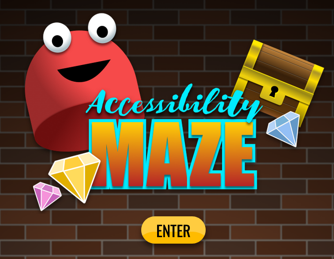
In the Accessibility Maze you would have experienced the need for a text alternative in Level 1. The combination to open the lock is the cat’s name, but the name on the cat’s collar is not visible because ink was spilled over the area where the name appears. You are essentially blind for a moment, not being able to see the meaningful information in the image. The name of the cat on the back of the photo acts as the text alternative, presenting the meaningful information in the image that sighted users would normally be able to read.

4

Content is structured with proper headings and list elements.


When authoring web content it is important to use proper HTML headings to create a semantically meaningful document structure, organizing topics and subtopics so their relationships are easily determined through the sequence of headings.

Headings should be arranged in sequence, without skipping levels. That is, an H1 should always be followed by an H2, or another H1, but not followed by an H3 or H4, etc. Generally, a document should have one H1 for the main title, followed by H2 for the main topics, and H3 for subtopics within each of the main topics. The following sequence of headings provides a proper semantic structure:


Technical Details: Semantically arrange headings

<h1>Main Document Title</h1>

<h2>First topic</h2>

<h3>Subtopic of the first topic</h3>

<h4>Subtopic of the first subtopic of the first topic</h4>

<h2>Second topic</h2>

<h3>Subtopic of the second topic</h3>

<h4>Subtopic of the first subtopic of the second topic</h4>

For screen reader users a proper heading structure can provide an overview of the topics and subtopics on a page to help in deciding which content to read. Headings also provide screen reader users with an additional means to navigate a web page. A screen reader can list all the headings on a page, and if a user so chooses, can jump to any one of the headings and begin reading from there. Without proper headings, a user may be forced to read through all the content to find a relevant section, without the option to jump directly to that section.

The visual appearance of headings should not be created using typical paragraph text styled to look large and bold. Though for a sighted person this may provide the visual appearance of structure, for screen reader users this text is not semantically different from other paragraph text. And large, bold text cannot be listed with a screen reader’s list headings feature and cannot be used for navigating through the content.

Likewise, HTML heading markup should not be used to create large, bold text to highlight an important statement. Using a heading for this purpose upsets the semantic structure of a document and will often lead to confusion or difficulty understanding when a heading appears where one is not expected.

A common accessibility error occurs when web content developers choose headings based on their size. For instance, an H2 may appear too large, so the author opts for an H3, which is slightly smaller and perhaps fits the overall design of a document. As a result, the document structure is upset. Instead use an H2 as expected and style it to appear smaller to fit the document design.

Structure is also provided in web content when lists are formatted with proper HTML list elements, as opposed to creating a series of short paragraphs with an asterisk or a number at the start of each. When proper list markup is used, screen readers will announce the list, and the number of items in the list. While navigating through the list, they will often announce the position of a focused list item within the full list (e.g., “item 4 of 7”). These list structures help users comprehend. Without them it can be more difficult to understand a series of items as a list and to recall them afterwards.

6

Content is understandable by a grade 9 student, where possible


As a general rule, content created for the public should be written with a level of language that can be understood by a grade 9 student, or older, on first reading. This generally means using more common words, shorter sentences, and words with fewer syllables and rewording more complex terms. A number of tools are available on the Web for determining reading level. Follow the link below and try pasting some text (like this paragraph) into the tool to see the reading level required to understand it effectively.


Tools: WebFX Readability Test Tool

Even well-educated readers appreciate simpler language over unnecessary use of more complex language. Simpler language will make text more readable to less educated readers or readers with reading or cognitive disabilities. It also makes it easier for those reading in a second language to translate the text to their primary language.

Of course, for audiences other than the general public, write to the level of language appropriate for that audience, but do watch for language that could be simplified.

7

Text contrasts well over any background colours or images


Good contrast makes text more readable for everyone. For those with poor vision or some forms of colourblindness, good contrast can be the difference between being able to read content, or not.

For typical 10- or 12-point paragraph text like what you are reading right now, the minimum contrast ratio must be 4.5:1. That is, the foreground text is at least 4.5 times brighter than the background (or vice versa), technically referred to as luminosity. Larger text, like 18 point or larger, perhaps bolded, requires a luminosity contrast ratio of 3:1 or greater.

The highest contrast (i.e., black on white) is 21:1. Though the minimum contrast ratios mentioned above are sufficient to pass an accessibility review, they are minimums. Ideally, contrast ratios should be higher than the minimum where possible.

You may notice, however, that white text on a black background, though having the same contrast ratio as black on white, is more difficult to read for most users.

This is due to the eye’s reaction to the dark background that is reflecting less light, and white text that is reflecting more light, causing the light to scatter more than it would from black text.

When the text is light grey, it reflects less light, making it more readable than the same white text over the black background.

So, despite the contrast ratios being the same when dark and light foreground and background colours are switched, when choosing colours it is generally better to have darker text over a lighter background.

When images are used as a background, which may have a variety of darker and lighter colours throughout, it is important to ensure that the text over that background does not lose its contrast when the screen size or resolution changes and the text floats over a different part of the image. If images are being used as backgrounds, be sure to test contrast with different screen sizes and resolutions. If text loses its contrast when the screen size changes, an opaque background colour might be used behind the text, so the text always appears over the same background colour, regardless of where it might be positioned over the image in behind the opaque background.

Testing for colour contrast

Colour contrast is tested by comparing two colour hex codes (e.g #ffffff for white and #000000 for black). Some tools will also test RGB triplet values (e.g. 255, 145, 125). To find colour codes, you can right click on an element in a web page that you want the colour code for, then choose “Inspect” from the right-click context menu. In the panel that opens, scan through the styles panel to find the colour codes. You may need to click through elements in the HTML panel to bring up the text and background colours, which are often associated with different elements. Paste the codes into a contrast checker, like the one below from WebAIM.

Tools: WebAIM Contrast Checker

8

Multimedia with spoken dialogue has captions (and a transcript)


Captions should be provided for all video that has meaningful spoken dialogue in it, so people who are deaf or have significant hearing loss are able to get the same meaningful information from the video that those who can hear receive.

Though captions are the only requirement for multimedia content to pass an accessibility review, it is also a good idea to provide a transcript when possible. A simple transcript is easily created by removing the time stamps from a closed caption file.

In addition to making audio accessible to people who are deaf, captions make it possible for people in a noisy environment, perhaps watching a sporting event at a bar,  reading the dialogue from the announcers, or in a quiet environment, in bed with a sleeping partner, watching the end of a movie with the volume turned down. Captions also make it possible for search engines to index video, thus making it possible to search for particular terms or phrases within the video.

If you’ve ever watched YouTube videos with captions on, you may have noticed that auto-generated captions can be found with many videos. While auto-generated captions are preferable over no captions, video producers should never rely on them to provide an accurate account of the dialogue in the video. Depending on a variety of factors, auto-generated captions can contain many errors, sometimes to the point of absurdity or offensiveness. Auto-generated captions are okay in a pinch, where a video posting is time sensitive, but they can only be a temporary measure, with captions created by a human added as soon as possible.

Many multimedia authoring tools will have tools for adding captions. YouTube also has tools for creating captions. On YouTube it can be helpful to use the auto-generated captions it creates as a starting point for human-generated captions. Depending on the number of errors in the auto-generated captions, up to about 30%, a human can correct the errors manually to produce accurate captions. Beyond about 30% errors, it is generally more efficient to start over.

A useful tool for anyone wanting to caption video is the Amara Subtitle Editor. Create an account, log in, and experiment with the editor by pasting the URL to an uncaptioned video, perhaps one from YouTube. Though a little time-consuming in the beginning, it does not take long to develop a routine using the editor, so caption files can be generated fairly quickly. A common file format for captions is an “.srt” file. These are text-based files with time stamps and caption text that can be uploaded or imported into a video to add captions. They can also be used to create a transcript for the video, once the time stamps are stripped out.


Tools: Amara Subtitle Editor

9

Use accessibility checkers


For web content there are many web-based accessibility checkers, as well as browser-based plugins, that will check for accessibility errors in HTML content. Though these tools are a good first step for identifying potential barriers in web content, there is much variation in coverage and accuracy across the many tools available. It is generally a good idea to test with at least a couple. Even when multiple checkers are used, there are a variety of potential barriers that automated checkers cannot identify with any certainty. In general, any issues that involve meaning will require a human to make a decision. For example, all accessibility checkers can determine whether an image has alt text or not, but none of them can tell if alt text accurately describes its associated image.

Here are a few accessibility checkers you can try:

Tools:

Web-Based

Chrome Browser Plugins

FireFox Browser Plugins

Many current document authoring tools have accessibility checkers built into them, though sometimes they get buried in a sub menu. Be sure to look for an accessibility checker in whatever authoring tool you are using and run it to identify any accessibility problems that might be in your document.

Microsoft Word and Adobe Acrobat Pro have fairly good accessibility checkers built in that should be run, with necessary adjustments made to the content, before making a document publicly available. Other Microsoft and Adobe products have accessibility checkers as well. The ones mentioned here are the most commonly used.

1

Want to Learn More?

Read and share free OER accessibility ebooks and enroll in The Chang School–moderated accessibility courses.

Textbooks:

Moderated Courses:

Credits

Cover barrier image source:

Barrier Free Stock Photo