P01: Perception and Attention Lab
Sevda Montakhaby Nodeh
Perception and Attention Lab
As a cognitive researcher at the Cognition and Attention Lab at McMaster University, you are at the forefront of exploring the intricacies of proactive control within attention processes. This line of research is profoundly significant, given that the human sensory system is overwhelmed with a vast array of information at any given second, exceeding what can be processed meaningfully. The essence of research in attention is to decipher the mechanisms through which sensory input is selectively navigated and managed. This is particularly crucial in understanding how individuals anticipate and adjust in preparation for upcoming tasks or stimuli, a phenomenon especially pertinent in environments brimming with potential distractions.
In everyday life, attentional conflicts are commonplace, manifesting when goal-irrelevant information competes with goal-relevant data for attentional precedence. An example of this (one that I’m sure we are all too familiar with) is the disruption from notifications on our mobile devices, which can divert us from achieving our primary goals, such as studying or driving. From a scientific standpoint, unravelling the strategies employed by the human cognitive system to optimize the selection and sustain goal-directed behaviour represents a formidable and compelling challenge.
Your ongoing research is a direct response to this challenge, delving into how proactive control influences the ability to concentrate on task-relevant information while effectively sidelining distractions. This facet of cognitive functionality is not just a theoretical construct; it’s the very foundation of daily human behaviour and interaction.
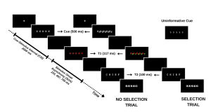
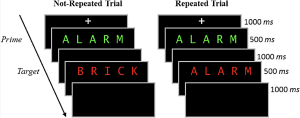
Your study methodically assesses this dynamic by engaging participants in a task where they must identify a sequence of words under varying conditions. The first word (T1) is presented in red, followed rapidly by a second word (T2) in white. The interval between the appearance of T1 and T2, known as the stimulus onset asynchrony (SOA), serves as a critical measure in your experiment. The distinctiveness of your study emerges in the way you manipulate the selective attention demands in each trial, classified into:
- No-Selection Trials: T1 appears alone, typically leading to superior identification accuracy for T1 and T2 due to a diminished cognitive load.
- Selection Trials: T1 is interspersed with a green distractor word. In these more demanding trials, the green distractor competes for attention with the red target word, resulting in decreased identification accuracy for both T1 and T2.
By introducing informative and uninformative cues, your investigation probes the role of proactive control. Informative cues give participants a preview of the upcoming trial type, allowing them to prepare mentally for the impending challenge. Conversely, uninformative cues act as control trials and offer no insight into the trial type. The hypothesis posits that such informative cues enable participants to proactively fine-tune their attentional focus in preparation for attentional conflict, potentially enhancing performance on selection trials with informative cues compared to those with uninformative cues.
For an overview of the different trial types please refer to the figure included below.
In this designed study, you are not only tackling the broader question of the role of conscious effort in attention but also contributing to a nuanced understanding of human cognitive processes, paving the way for applications that span from enhancing daily life productivity to optimizing technology interfaces for minimal cognitive disruption.
Getting Started: Loading Libraries, setting the working directory, and loading the dataset
Let’s begin by running the following code in RStudio to load the required libraries. Make sure to read through the comments embedded throughout the code to understand what each line of code is doing.
Note: Shaded boxes hold the R code, with the “#” sign indicating a comment that won’t execute in RStudio.
# Here we create a list called "my_packages" with all of our required libraries
my_packages <- c("tidyverse", "rstatix", "readxl", "xlsx", "emmeans", "afex",
"kableExtra", "grid", "gridExtra", "superb", "ggpubr", "lsmeans")
# Checking and extracting packages that are not already installed
not_installed <- my_packages[!(my_packages %in% installed.packages()[ , "Package"])]
# Install packages that are not already installed
if(length(not_installed)) install.packages(not_installed)
# Loading the required libraries
library(tidyverse) # for data manipulation
library(rstatix) # for statistical analyses
library(readxl) # to read excel files
library(xlsx) # to create excel files
library(kableExtra) # formatting html ANOVA tables
library(superb) # production of summary stat with adjusted error bars(Cousineau, Goulet, & Harding, 2021)
library(ggpubr) # for making plots
library(grid) # for plots
library(gridExtra) # for arranging multiple ggplots for extraction
library(lsmeans) # for pairwise comparisons
Make sure to have the required dataset (“ProactiveControlCueing.xlsx“) for this exercise downloaded. Set the working directory of your current R session to the folder with the downloaded dataset. You may do this manually in R studio by clicking on the “Session” tab at the top of the screen, and then clicking on “Set Working Directory”.
If the downloaded dataset file and your R session are within the same file, you may choose the option of setting your working directory to the “source file location” (the location where your current R session is saved). If they are in different folders then click on “choose directory” option and browse for the location of the downloaded dataset.
You may also do this by running the following code:
Once you have set your working directory either manually or by code, in the Console below you will see the full directory of your folder as the output.
Read in the downloaded dataset as “cueingData” and complete the accompanying exercises to the best of your abilities.
# Read xlsx file
cueingData = read_excel("ProactiveControlCueing.xlsx")
Files to download:
- ProactiveControlCueing.xlsx
An interactive H5P element has been excluded from this version of the text. You can view it online here:
https://ecampusontario.pressbooks.pub/radpnb/?p=22#h5p-1
Answer Key
Exercise 1: Data Preparation and Exploration
Note: Shaded boxes hold the R code, while the white boxes display the code’s output, just as it appears in RStudio.
The “#” sign indicates a comment that won’t execute in RStudio.
1. Display the first few rows to understand your dataset.
head(cueingData) #Displaying the first few rows
## # A tibble: 6 × 6
## ID CUE_TYPE TRIAL_TYPE SOA T1Score T2Score
## <dbl> <chr> <chr> <dbl> <dbl> <dbl>
## 1 1 INFORMATIVE NS 233 100 94.6
## 2 2 INFORMATIVE NS 233 100 97.2
## 3 3 INFORMATIVE NS 233 89.2 93.9
## 4 4 INFORMATIVE NS 233 100 91.9
## 5 5 INFORMATIVE NS 233 100 100
## 6 6 INFORMATIVE NS 233 100 97.3
2. Set up your factors and check for structure. Make sure your dependent measures are in numerical format, and that your factors and levels are set up correctly.
cueingData <- cueingData %>%
convert_as_factor(ID, CUE_TYPE, TRIAL_TYPE, SOA) #setting up factors
str(cueingData) #checking that factors and levels are set-up correctly. Checking to see that dependent measures are in numerical format.
## # A tibble: 6 × 6
## ID CUE_TYPE TRIAL_TYPE SOA T1Score T2Score
## <dbl> <chr> <chr> <dbl> <dbl> <dbl>
## 1 1 INFORMATIVE NS 233 100 94.6
## 2 2 INFORMATIVE NS 233 100 97.2
## 3 3 INFORMATIVE NS 233 89.2 93.9
## 4 4 INFORMATIVE NS 233 100 91.9
## 5 5 INFORMATIVE NS 233 100 100
## 6 6 INFORMATIVE NS 233 100 97.3
## tibble [192 × 6] (S3: tbl_df/tbl/data.frame)
## $ ID : Factor w/ 16 levels "1","2","3","4",..: 1 2 3 4 5 6 7 8 9 10 ...
## $ CUE_TYPE : Factor w/ 2 levels "INFORMATIVE",..: 1 1 1 1 1 1 1 1 1 1 ...
## $ TRIAL_TYPE: Factor w/ 2 levels "NS","S": 1 1 1 1 1 1 1 1 1 1 ...
## $ SOA : Factor w/ 3 levels "233","467","700": 1 1 1 1 1 1 1 1 1 1 ...
## $ T1Score : num [1:192] 100 100 89.2 100 100 ...
## $ T2Score : num [1:192] 94.6 97.2 93.9 91.9 100 ...
3. Perform basic data checks for missing values and data consistency.
sum(is.na(cueingData)) # Checking for missing values in the dataset
summary(cueingData) # Viewing the summary of the dataset to check for inconsistencies
## ID CUE_TYPE TRIAL_TYPE SOA T1Score
## 1 : 12 INFORMATIVE :96 NS:96 233:64 Min. : 32.43
## 2 : 12 UNINFORMATIVE:96 S :96 467:64 1st Qu.: 77.78
## 3 : 12 700:64 Median : 95.87
## 4 : 12 Mean : 86.33
## 5 : 12 3rd Qu.:100.00
## 6 : 12 Max. :100.00
## (Other):120
## T2Score
## Min. : 29.63
## 1st Qu.: 83.97
## Median : 95.76
## Mean : 87.84
## 3rd Qu.:100.00
## Max. :100.00
- Is your data a balanced or an unbalanced design? (Hint: Use code to show the number of observations per combination of factors)
table(cueingData$CUE_TYPE, cueingData$TRIAL_TYPE, cueingData$SOA) #checking the number of observations per condition or combination of factors. Data is a balanced design since there is an equal number of observations per cell.
## , , = 233
##
##
## NS S
## INFORMATIVE 16 16
## UNINFORMATIVE 16 16
##
## , , = 467
##
##
## NS S
## INFORMATIVE 16 16
## UNINFORMATIVE 16 16
##
## , , = 700
##
##
## NS S
## INFORMATIVE 16 16
## UNINFORMATIVE 16 16
Exercise 2: Computing Summary Statistics
5. The Superb library requires your dataset to be in a wide format. So convert your dataset from a long to a wide format. Save it as “cueingData.wide”.
cueingData.wide <- cueingData %>%
pivot_wider(names_from = c(TRIAL_TYPE, SOA, CUE_TYPE),
values_from = c(T1Score, T2Score) )
6. Using superbPlot() and cueingData.wide calculate the mean, and standard error of the mean (SEM) measure for T1 and T2 scores at each level of the factors. Make sure to calculate Cousineau-Morey corrected SEM values.
- You must do this separately for each of your dependent measures. Save your superbplot function for T1Score as “EXP1.T1.plot” and as “EXP1.T2.plot” for T2Score.
- Re-name the levels of the factors in each plot. Currently, the levels are numbered. We want the levels of SOA to be 233, 467, and 700; the levels of cue-type as Informative and Uninformative, and the levels of trial-type as Selection and No Selection (Hint: to access the summary data use EXP1.T1.plotinsertfactorname).
EXP1.T1.plot <- superbPlot(cueingData.wide,
WSFactors = c("SOA(3)", "CueType(2)", "TrialType(2)"),
variables = c("T1Score_NS_233_INFORMATIVE", "T1Score_NS_467_INFORMATIVE",
"T1Score_NS_700_INFORMATIVE", "T1Score_NS_233_UNINFORMATIVE",
"T1Score_NS_467_UNINFORMATIVE", "T1Score_NS_700_UNINFORMATIVE",
"T1Score_S_233_INFORMATIVE", "T1Score_S_467_INFORMATIVE",
"T1Score_S_700_INFORMATIVE", "T1Score_S_233_UNINFORMATIVE",
"T1Score_S_467_UNINFORMATIVE", "T1Score_S_700_UNINFORMATIVE"),
statistic = "mean",
errorbar = "SE",
adjustments = list(
purpose = "difference",
decorrelation = "CM",
popSize = 32
),
plotStyle = "line",
factorOrder = c("SOA", "CueType", "TrialType"),
lineParams = list(size=1, linetype="dashed"),
pointParams = list(size = 3))
## superb::FYI: Here is how the within-subject variables are understood:
## SOA CueType TrialType variable
## 1 1 1 T1Score_NS_233_INFORMATIVE
## 2 1 1 T1Score_NS_467_INFORMATIVE
## 3 1 1 T1Score_NS_700_INFORMATIVE
## 1 2 1 T1Score_NS_233_UNINFORMATIVE
## 2 2 1 T1Score_NS_467_UNINFORMATIVE
## 3 2 1 T1Score_NS_700_UNINFORMATIVE
## 1 1 2 T1Score_S_233_INFORMATIVE
## 2 1 2 T1Score_S_467_INFORMATIVE
## 3 1 2 T1Score_S_700_INFORMATIVE
## 1 2 2 T1Score_S_233_UNINFORMATIVE
## 2 2 2 T1Score_S_467_UNINFORMATIVE
## 3 2 2 T1Score_S_700_UNINFORMATIVE
## superb::FYI: The HyunhFeldtEpsilon measure of sphericity per group are 0.134
## superb::FYI: Some of the groups' data are not spherical. Use error bars with caution.
EXP1.T2.plot <- superbPlot(cueingData.wide,
WSFactors = c("SOA(3)", "CueType(2)", "TrialType(2)"),
variables = c("T2Score_NS_233_INFORMATIVE", "T2Score_NS_467_INFORMATIVE",
"T2Score_NS_700_INFORMATIVE", "T2Score_NS_233_UNINFORMATIVE",
"T2Score_NS_467_UNINFORMATIVE", "T2Score_NS_700_UNINFORMATIVE",
"T2Score_S_233_INFORMATIVE", "T2Score_S_467_INFORMATIVE",
"T2Score_S_700_INFORMATIVE", "T2Score_S_233_UNINFORMATIVE",
"T2Score_S_467_UNINFORMATIVE", "T2Score_S_700_UNINFORMATIVE"),
statistic = "mean",
errorbar = "SE",
adjustments = list(
purpose = "difference",
decorrelation = "CM",
popSize = 32
),
plotStyle = "line",
factorOrder = c("SOA", "CueType", "TrialType"),
lineParams = list(size=1, linetype="dashed"),
pointParams = list(size = 3)
)
## superb::FYI: Here is how the within-subject variables are understood:
## SOA CueType TrialType variable
## 1 1 1 T2Score_NS_233_INFORMATIVE
## 2 1 1 T2Score_NS_467_INFORMATIVE
## 3 1 1 T2Score_NS_700_INFORMATIVE
## 1 2 1 T2Score_NS_233_UNINFORMATIVE
## 2 2 1 T2Score_NS_467_UNINFORMATIVE
## 3 2 1 T2Score_NS_700_UNINFORMATIVE
## 1 1 2 T2Score_S_233_INFORMATIVE
## 2 1 2 T2Score_S_467_INFORMATIVE
## 3 1 2 T2Score_S_700_INFORMATIVE
## 1 2 2 T2Score_S_233_UNINFORMATIVE
## 2 2 2 T2Score_S_467_UNINFORMATIVE
## 3 2 2 T2Score_S_700_UNINFORMATIVE
## superb::FYI: The HyunhFeldtEpsilon measure of sphericity per group are 0.226
## superb::FYI: Some of the groups' data are not spherical. Use error bars with caution.
# Re-naming levels of the factors
levels(EXP1.T1.plot$data$SOA) <- c("1" = "233", "2" = "467", "3" = "700")
levels(EXP1.T2.plot$data$SOA) <- c("1" = "233", "2" = "467", "3" = "700")
levels(EXP1.T1.plot$data$TrialType) <- c("1" = "No Selection", "2" = "Selection")
levels(EXP1.T2.plot$data$TrialType) <- c("1" = "No Selection", "2" = "Selection")
levels(EXP1.T1.plot$data$CueType) <- c("1" = "Informative", "2" = "Uninformative")
levels(EXP1.T2.plot$data$CueType) <- c("1" = "Informative", "2" = "Uninformative")
7. Let’s create a beautiful printable HTML table of the summary stats for T1 and T2 Scores. This summary table can then be used in your manuscript. I suggest that you visit the following link for guides on how to create printable tables.
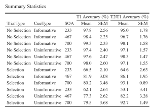
- (a) Begin by extracting the summary stats data with group means and CousineauMorey SEM values from each plot function and save them as a data frame separately for T1 and T2 data (you should have two data frames with your summary stats named “EXP1.T1.summaryData” and “EXP1.T2.summaryData”)
- (b) In your two data frames with the summary stats, round your means to 1 decimal place and your SEM values to two decimal places.
- (c) Merge T1Score and T2Score summary data and save it as “EXP1_summarystat_results”
- (d) From this merged table, delete the columns with the negative SEM values (lowerwidth SEM values)
- (e) From this merged table, delete the columns with the negative SEM values (lowerwidth SEM values)
- (f) Rename the columns in this merged data frame such that the name of the columns with T1Score and T2Score means is “Means” and the columns with SEM scores for either dependent variable is “SEM”.
- (g) Caption your table as “Summary Statistics”
- (h) Set the font of your text to “Cambria” and the font size to 14
- (i) Set the headers for T1Score means and SEM columns as “T1 Accuracy (%)”.
- (j) Set the headers for T2Score means and SEM columns as “T2 Accuracy (%)”.
# Extracting summary data with CousineauMorey SEM Bars
EXP1.T1.summaryData <- data.frame(EXP1.T1.plot$data)
EXP1.T2.summaryData <- data.frame(EXP1.T2.plot$data)
# Rounding values in each column
# round(x, 1) rounds to the specified number of decimal places
EXP1.T1.summaryData$center <- round(EXP1.T1.summaryData$center,1)
EXP1.T1.summaryData$upperwidth <- round(EXP1.T1.summaryData$upperwidth,2)
EXP1.T2.summaryData$center <- round(EXP1.T2.summaryData$center,1)
EXP1.T2.summaryData$upperwidth <- round(EXP1.T2.summaryData$upperwidth,2)
# merging T1 and T2|T1 summary tables
EXP1_summarystat_results <- merge(EXP1.T1.summaryData, EXP1.T2.summaryData, by=c("TrialType","CueType","SOA"))
# Rename the column name
colnames(EXP1_summarystat_results)[colnames(EXP1_summarystat_results) == "center.x"] ="Mean"
colnames(EXP1_summarystat_results)[colnames(EXP1_summarystat_results) == "center.y"] ="Mean"
colnames(EXP1_summarystat_results)[colnames(EXP1_summarystat_results) == "upperwidth.x"] ="SEM"
colnames(EXP1_summarystat_results)[colnames(EXP1_summarystat_results) == "upperwidth.y"] ="SEM"
# deleting columns by name "lowerwidth.x" and "lowerwidth.y" in each summary table
EXP1_summarystat_results <- EXP1_summarystat_results[ , ! names(EXP1_summarystat_results) %in% c("lowerwidth.x", "lowerwidth.y")]
#removing suffixes from column names
colnames(EXP1_summarystat_results)<-gsub(".1","",colnames(EXP1_summarystat_results))
# Printable ANOVA html
EXP1_summarystat_results %>%
kbl(caption = "Summary Statistics") %>%
kable_classic(full_width = F, html_font = "Cambria", font_size = 14) %>%
add_header_above(c(" " = 3, "T1 Accuracy (%)" = 2, "T2|T1 Accuracy (%)" = 2))
Exercise 3: Visualizing Your Data
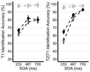
8. Use the unedited summary statistics table from Exercise 2 (EXP1.T1.summaryData and EXP1.T3.summaryData) and the ggplot() function to create separate summary line plots for T1 and T2 scores. The Line plot will visualize the relationship between SOA and the dependent measure while considering the factors of cue-type and trial-type. Your plot must have the following characteristics:
- (a) Plot SOA on the x-axis and label the x-axis as “SOA (ms)”
- (b) Plot the dependent measure on the y-axis and label the y-axis as “T1 Identification Accuracy” for T1 plot, and “T2|T1 Identification Accuracy (%)” for the T2 plot.
- (c) Define the colour of your lines by trial type.
- (d) Define the shape of the points for each value in the line by cue–type
- (e) Use the geom_point() function to customize your point shapes. Use solid circles for informative cues, and hollow circles for uninformative cues.
- (f) Use scale_color_manual() to customize line colours. Set the colour for lines plotting selection trials to ‘black’, and the lines for no-selection trials to ‘gray78’.
- (g) Use geom_line() to customize line type. Set line type to dashed and line width to 1.2.
- (h) Customize your y-axis. Set the minimum value to 30 and the maximum value to 100.
- (i) Use the scale_y_continuous() function to have the values on the y-axis increase in increments of 10.
- (j) Use the geom_errorbar() function to plot error bars using your calculated SEM values from the summary table.
- (k) Set plot theme to theme_classic()
- (l) Use the theme() function to customize the x-axis font size and line width. Change the font size of the axis main title to 16, and the x-axis labels to 14
- (m) Add horizontal grid lines.
- (n) Do not include a figure legend.
- (o) Store your two plots as “T1.ggplotplot” and “T2.ggplotplot”
EXP1.T1.ggplotplot <- ggplot(EXP1.T1.summaryData, aes(x=SOA, y=center, color=TrialType, shape = CueType,
group=interaction(CueType, TrialType))) +
geom_point(data=filter(EXP1.T1.summaryData, CueType == "Uninformative"), shape=1, size=4.5) + # assigning shape type to level of factor
geom_point(data=filter(EXP1.T1.summaryData, CueType == "Informative"), shape=16, size=4.5) + # assigning shape type to level of factor
geom_line(linetype="dashed", linewidth=1.2) + # change line thickness and line style
scale_color_manual(values = c("gray78", "black") ) +
xlab("SOA (ms)") +
ylab("T1 Identification Accuracy (%)") +
theme_classic() + # It has no background, no bounding box.
theme(axis.line=element_line(size=1.5), # We make the axes thicker...
axis.text = element_text(size = 14, colour = "black"), # their text bigger...
axis.title = element_text(size = 16, colour = "black"), # their labels bigger...
panel.grid.major.y = element_line(), # adding horizontal grid lines
legend.position = "none") +
coord_cartesian(ylim=c(30, 100)) +
scale_y_continuous(breaks=seq(30, 100, 10)) + # Ticks from 30-100, every 10
geom_errorbar(aes(ymin=center+lowerwidth, ymax=center+upperwidth), width = 0.12, size = 1) # adding error bars from summary table
EXP1.T2.ggplotplot <- ggplot(EXP1.T2.summaryData, aes(x=SOA, y=center, color=TrialType, shape=CueType,
group=interaction(CueType, TrialType))) +
geom_point(data=filter(EXP1.T2.summaryData, CueType == "Uninformative"), shape=1, size=4.5) + # assigning shape type to level of factor
geom_point(data=filter(EXP1.T2.summaryData, CueType == "Informative"), shape=16, size=4.5) + # assigning shape type to level of factor
geom_line(linetype="dashed", linewidth=1.2) + # change line thickness and line style
scale_color_manual(values = c("gray78", "black")) +
xlab("SOA (ms)") +
ylab("T2|T1 Identification Accuracy (%)") +
theme_classic() + # It has no background, no bounding box.
theme(axis.line=element_line(size=1.5), # We make the axes thicker...
axis.text = element_text(size = 14, colour = "black"), # their text bigger...
axis.title = element_text(size = 16, colour = "black"), # their labels bigger...
panel.grid.major.y = element_line(), # adding horizontal grid lines
legend.position = "none") +
guides(fill = guide_legend(override.aes = list(shape = 16) ),
shape = guide_legend(override.aes = list(fill = "black"))) +
coord_cartesian(ylim=c(30, 100)) +
scale_y_continuous(breaks=seq(30, 100, 10)) + # Ticks from 30-100, every 10
geom_errorbar(aes(ymin=center+lowerwidth, ymax=center+upperwidth), width = 0.12, size = 1) # adding error bars from summary table
9. Use ggarrange() to display your plots together.
ggarrange(EXP1.T1.ggplotplot, EXP1.T2.ggplotplot,
nrow = 1, ncol = 2, common.legend = F,
widths = 8, heights = 5)
Exercise 4: Main Analysis
10. Use the data in long format (“cueingData”) and the anova_test() function, and compute a two-way ANOVA for each dependent variable, but on selection trials only. Set up cue-type and SOA as within-participants factors. (Hint: use the filter() function)
- (a) Set your effect size measure to partial eta squared (pes)
- (b) Make sure to generate the detailed ANOVA table.
- (c) Store your computations and “T1_2anova” and “T2_2anova”.
- (d) Using get_anova_table() function display your ANOVA tables.
T1_2anova <- anova_test(
data = filter(cueingData, TRIAL_TYPE == "S"), dv = T1Score, wid = ID,
within = c(CUE_TYPE, SOA), detailed = TRUE, effect.size = "pes")
T2_2anova <- anova_test(
data = filter(cueingData, TRIAL_TYPE == "S"), dv = T2Score, wid = ID,
within = c(CUE_TYPE, SOA), detailed = TRUE, effect.size = "pes")
get_anova_table(T1_2anova)
## ANOVA Table (type III tests)
##
## Effect DFn DFd SSn SSd F p p<.05 pes
## 1 (Intercept) 1.00 15.00 534043.211 30705.523 260.886 6.80e-11 * 0.946
## 2 CUE_TYPE 1.00 15.00 253.665 506.454 7.513 1.50e-02 * 0.334
## 3 SOA 1.29 19.35 5091.853 2660.275 28.710 1.16e-05 * 0.657
## 4 CUE_TYPE:SOA 2.00 30.00 77.140 1061.051 1.091 3.49e-01 0.068
get_anova_table(T2_2anova)
## ANOVA Table (type III tests)
##
## Effect DFn DFd SSn SSd F p p<.05 pes
## 1 (Intercept) 1 15 593913.106 11288.706 789.169 2.19e-14 * 0.981
## 2 CUE_TYPE 1 15 661.761 426.947 23.250 2.24e-04 * 0.608
## 3 SOA 2 30 20001.563 3852.629 77.875 1.33e-12 * 0.838
## 4 CUE_TYPE:SOA 2 30 519.154 1298.144 5.999 6.00e-03 * 0.286
Exercise 5: Post-hoc tests
11. Filter for selection trials first, then group your data by SOA and use the pairwise_t_test() function to compare informative and uninformative trials at each level of SOA store and display your computation as “T2_sel_pwc”.
T2_sel_pwc <- filter(cueingData, TRIAL_TYPE == "S") %>%
group_by(SOA) %>%
pairwise_t_test(T2Score ~ CUE_TYPE, paired = TRUE, p.adjust.method = "holm", detailed = TRUE) %>%
add_significance("p.adj")
T2_sel_pwc <- get_anova_table(T2_sel_pwc)
T2_sel_pwc
## # A tibble: 3 × 16
## SOA estimate .y. group1 group2 n1 n2 statistic p df
## <fct> <dbl> <chr> <chr> <chr> <int> <int> <dbl> <dbl> <dbl>
## 1 233 11.5 T2Score INFORMATIVE UNINFO… 16 16 4.36 5.55e-4 15
## 2 467 3.89 T2Score INFORMATIVE UNINFO… 16 16 1.97 6.8 e-2 15
## 3 700 0.356 T2Score INFORMATIVE UNINFO… 16 16 0.190 8.52e-1 15
## # ℹ 6 more variables: conf.low <dbl>, conf.high <dbl>, method <chr>,
## # alternative <chr>, p.adj <dbl>, p.adj.signif <chr>
P02: Cognition and Memory Lab
Sevda Montakhaby Nodeh
Cognition and Memory Lab
Welcome! In this assignment, we will be entering a cognition and memory lab at McMaster University. Specifically, we will be examining data from an intriguing cognitive psychology study that explores the role of repetition in recognition memory.
Most of us are familiar with the phrase ‘practice makes perfect’. This motivational idiom aligns with intuition and is confirmed by many real-world observations. Much empirical research also supports this view–repeated opportunities to encode a stimulus improve subsequent memory retrieval and perceptual identification. These observations suggest that stimulus repetition strengthens underlying memory representations.
The present study focuses on a contradictory idea, that stimulus repetition can weaken memory encoding. The experiment comprised of three stages: a study phase, a distractor phase, and a surprise recognition memory test.
In the study phase participants aloud a red target word preceded by a briefly presented green prime word. On half of the trials, the prime and target were the same (repeated trials), and on the other half of the trials, the prime and target were different (not-repeated trials). In the figure below you can see an overview of the two different trial types. Following the study phase, participants engaged in a 10-minute distractor task consisting of math problems they had to solve by hand.
The final phase was a surprise recognition memory test where on each test trial they were shown a red word and asked to respond old if the word on the test was one they had previously seen at study, and new if they had never encountered the word before. Half of the trials at the test were words from the study phase and the other half were new words.
Let’s begin by running the following code to load the required libraries. Make sure to read through the comments embedded throughout the code to understand what each line of code is doing.
Note: Shaded boxes hold the R code, with the “#” sign indicating a comment that won’t execute in RStudio.
# Load necessary libraries
library(rstatix) #for performing basic statistical tests
library(dplyr) #for sorting data
library(readxl) #for reading excel files
library(tidyr) #for data sorting and structure
library(ggplot2) #for visualizing your data
library(plotrix) #for computing basic summary stats
Make sure to have the required dataset (“RepDecrementdataset.xlsx”) for this exercise downloaded. Set the working directory of your current R session to the folder with the downloaded dataset. You may do this manually in R studio by clicking on the “Session” tab at the top of the screen, and then clicking on “Set Working Directory”.
If the downloaded dataset file and your R session are within the same file, you may choose the option of setting your working directory to the “source file location” (the location where your current R session is saved). If they are in different folders then click on “choose directory” option and browse for the location of the downloaded dataset.
You may also do this by running the following code
Once you have set your working directory either manually or by code, in the Console below you will see the full directory of your folder as the output.
Read in the downloaded dataset as “MemoryData” and complete the accompanying exercises to the best of your abilities.
MemoryData <- read_excel('RepDecrementdataset.xlsx')
Files to Download:
- RepDecrementdataset.xlsx
An interactive H5P element has been excluded from this version of the text. You can view it online here:
https://ecampusontario.pressbooks.pub/radpnb/?p=26#h5p-2
Answer Key
Exercise 1: Data Preparation and Exploration
Note: Shaded boxes hold the R code, while the white boxes display the code’s output, just as it appears in RStudio.
The “#” sign indicates a comment that won’t execute in RStudio.
1. Display the first few rows of your dataset to familiarize yourself with its structure and contents.
head(MemoryData) #Displaying the first few rows
## # A tibble: 6 × 7
## ID Hits_NRep Hits_Rep FalseAlarms Misses_Nrep Misses_Rep CorrectRej
## <dbl> <dbl> <dbl> <dbl> <dbl> <dbl> <dbl>
## 1 1 46 34 13 14 26 107
## 2 2 43 44 27 17 16 93
## 3 3 43 35 23 17 24 97
## 4 4 37 36 56 23 24 64
## 5 5 39 35 49 21 25 71
## 6 6 38 43 28 22 17 92
str(MemoryData) #Checking structure of dataset
## tibble [24 × 7] (S3: tbl_df/tbl/data.frame)
## $ ID : num [1:24] 1 2 3 4 5 6 7 8 9 10 ...
## $ Hits_NRep : num [1:24] 46 43 43 37 39 38 20 24 36 38 ...
## $ Hits_Rep : num [1:24] 34 44 35 36 35 43 11 29 43 27 ...
## $ FalseAlarms: num [1:24] 13 27 23 56 49 28 4 11 46 9 ...
## $ Misses_Nrep: num [1:24] 14 17 17 23 21 22 40 36 23 22 ...
## $ Misses_Rep : num [1:24] 26 16 24 24 25 17 49 31 17 33 ...
## $ CorrectRej : num [1:24] 107 93 97 64 71 92 116 109 74 111 ...
## [1] "ID" "Hits_NRep" "Hits_Rep" "FalseAlarms" "Misses_Nrep"
## [6] "Misses_Rep" "CorrectRej"
2. Calculate Total Trials for Each Condition:
- (a) For each participant, sum the number of hits for non-repeated trials and missed non-repeated trials. Store this total in a new column named “TotalNRep”. The value should be 60 for all participants, reflecting the total number of non-repeated trial types.
- (b) Repeat the process for repeated trials, storing the sum in “TotalRep” (60 trials).
- (c) Similarly, sum the number of false alarms and correct rejections to represent the total number of new trials (120 trials) and store this in “TotalNew”.
Note that if the value in “TotalNRep” and “TotalRep” is less than 60 for a participant, it indicates that certain word trials were excluded during the study phase due to issues (e.g., the participant read aloud the prime word instead of the target, leading to trial spoilage).
MemoryData <- MemoryData %>%
mutate(TotalNRep = Hits_NRep + Misses_Nrep)
MemoryData <- MemoryData %>%
mutate(TotalRep = Hits_Rep + Misses_Rep)
MemoryData <- MemoryData %>%
mutate(TotalNew = FalseAlarms + CorrectRej)
3. Transform the counts in the hits, misses, false alarms, and correct rejections columns into proportions. Do this by dividing each count by the total number of trials for the respective condition (e.g., divide hits for non-repeated trials by “TotalNRep”).
MemoryData$Hits_NRep <- (MemoryData$Hits_NRep/MemoryData$TotalNRep)
MemoryData$Misses_Nrep <- (MemoryData$Misses_Nrep/MemoryData$TotalNRep)
MemoryData$Hits_Rep <- (MemoryData$Hits_Rep/MemoryData$TotalRep)
MemoryData$Misses_Rep <- (MemoryData$Misses_Rep/MemoryData$TotalRep)
MemoryData$CorrectRej <- (MemoryData$CorrectRej/MemoryData$TotalNew)
MemoryData$FalseAlarms <- (MemoryData$FalseAlarms/MemoryData$TotalNew)
4. Once the proportions are calculated, remove the “TotalNew”, “TotalRep”, and “TotalNRep” columns from the dataset as they are no longer needed for further analysis.
MemoryData <- MemoryData[, !names(MemoryData) %in% c("TotalNew", "TotalRep","TotalNRep")]
5. Use the pivot_longer() function from the tidyr package to convert your data from wide to long format. Pivot the columns “Hits_NRep”, “Hits_Rep”, and “FalseAlarms”, setting the new column names to “Condition” and “Proportion” for the reshaped data.
long_df <- MemoryData %>%
pivot_longer(
cols = c(Hits_NRep, Hits_Rep, FalseAlarms),
names_to = "Condition",
values_to = "Proportion"
)
Exercise 2: Computing Summary Stats and Correcting for Within-Subjects Variability
6. Using your long formatted dataset, group your data by ID and calculate the per-subject mean and the grand mean of the Proportions column.
- (a) Adjust each individual’s score by subtracting their mean and adding the grand mean.
- (b) Calculate the mean and SEM of the adjusted scores for each condition.
- (c) Use the adjusted scores to calculate the within-subject SEM. d.Group the data by Condition and calculate the mean and SEM.
data_adjusted <- long_df %>%
group_by(ID) %>%
mutate(SubjectMean = mean(Proportion, na.rm = TRUE)) %>%
ungroup() %>%
mutate(GrandMean = mean(Proportion, na.rm = TRUE)) %>%
mutate(AdjustedScore = Proportion - SubjectMean + GrandMean)
# Calculate the mean and SEM of the adjusted scores
summary_df <- data_adjusted %>%
group_by(Condition) %>%
summarize(
AdjustedMean = mean(AdjustedScore, na.rm = TRUE),
AdjustedSEM = sd(AdjustedScore, na.rm = TRUE) / sqrt(n())
)
Exercise 3: Visualizing your data
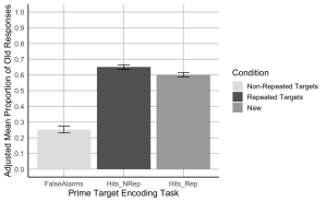
7. Create a bar plot where the x-axis represents the Prime-target Encoding task conditions, the y-axis shows the adjusted mean proportion of old responses, and include error bars represent the adjusted SEM. Begin by setting custom colours for each condition. The colour for the bar presenting the false alarms or “New” should be “gray89”; the colour for “Hits_Nrep” or “Non-Repeated Targets” bar should be “gray39”; the colour for the “Hits_Rep” or “Repeated Targets” bar should be “darkgrey”.
- (a) The x-axis should be titled “Prime Target Encoding Task”.
- (b) The y-axis should be titled “Adjusted Mean Proportion of Old Responses”
- (c) Add error bars to each bar to represent the corrected SEM.
- (d) Make the x and y-axis lines solid black.
- (e) Ensure the plot has a minimalistic design with major grid lines only.
- (f) Add a legend to indicate the Condition categories, the legend should read, Non-Repeated Targets instead of “Hits_Nrep”, Repeated Targets instead of “Hits_Rep”, and New instead of “False Alarms”.
- (g) Set the minimum and maximum values on your y-axis to 0 and 1, respectively.
- (h)The values on the y-axis should go up by 0.1
# Create the bar plot with adjusted SEM error bars
ggplot(summary_df, aes(x = Condition, y = AdjustedMean, fill = Condition)) +
geom_bar(stat = "identity", position = position_dodge()) +
geom_errorbar(aes(ymin = AdjustedMean - AdjustedSEM, ymax = AdjustedMean + AdjustedSEM), width = 0.2, position = position_dodge(0.9)) +
scale_fill_manual(values = c("Hits_NRep" = "gray39", "Hits_Rep" = "darkgrey", "FalseAlarms" = "gray89"),
labels = c("Non-Repeated Targets", "Repeated Targets", "New")) +
labs(
x = "Prime Target Encoding Task",
y = "Adjusted Mean Proportion of Old Responses",
fill = "Condition"
) +
scale_y_continuous(breaks = seq(0, 1, by = 0.1), limits = c(0, 1)) +
theme_minimal(base_size = 14) +
theme(
axis.line = element_line(color = "black"),
axis.title = element_text(color = "black"),
panel.grid.major = element_line(color = "grey", size = 0.5),
panel.grid.minor = element_blank(),
legend.title = element_text(color = "black")
)
Exercise 4: Computation
8. Using the wide formatted data file “MemoryData” conduct a two-paired sample t-test comparing the hit rate collapsed across the two repetition conditions (repeated/not-repeated) to the false alarm rate to assess participants’ ability to distinguish old from new items.
- (a) Calculate the mean hit rate by averaging the hit rates from the ‘Hits_NRep’ (non-repeated) and ‘Hits_Rep’ (repeated) conditions for each participant.
- (b) Conduct a paired sample t-test to compare the hit rate (collapsed across the two repetition conditions) to the false alarm rate to assess participants’ ability to distinguish old from new items.
collapsed_hitdata <- MemoryData %>%
mutate(HitRate = (Hits_NRep + Hits_Rep) / 2)
# Conduct paired sample t-tests
t_test_results <- t.test(collapsed_hitdata$HitRate, collapsed_hitdata$FalseAlarms, paired = TRUE)
print(t_test_results)
##
## Paired t-test
##
## data: collapsed_hitdata$HitRate and collapsed_hitdata$FalseAlarms
## t = 11.621, df = 23, p-value = 4.179e-11
## alternative hypothesis: true mean difference is not equal to 0
## 95 percent confidence interval:
## 0.3071651 0.4401983
## sample estimates:
## mean difference
## 0.3736817
#Hit rates were higher than false alarm rates, t(23) = 11.62, p < .001.
9. Using the wide formatted data file “MemoryData” conduct a two-paired sample t-test comparing the hit rates for the not-repeated and repeated targets.
# Conduct paired sample t-tests for non-repeated vs repeated hit rates
t_test_results_hits <- t.test(collapsed_hitdata$Hits_NRep, collapsed_hitdata$Hits_Rep, paired = TRUE)
# Print the results for the hit rate comparison
print(t_test_results_hits)
##
## Paired t-test
##
## data: collapsed_hitdata$Hits_NRep and collapsed_hitdata$Hits_Rep
## t = 2.5431, df = 23, p-value = 0.01817
## alternative hypothesis: true mean difference is not equal to 0
## 95 percent confidence interval:
## 0.009071364 0.088174399
## sample estimates:
## mean difference
## 0.04862288
#Hit rates were higher for not-repeated targets than for repeated targets, t(23) = 2.54, p = .018.
P03: Early Childhood Development Lab
Sevda Montakhaby Nodeh
Early Childhood Development Lab
You are a researcher at the Early Childhood Development Research Center. Your latest project investigates how infants respond to different combinations of face race and music emotion. In specific you are interested in whether infants associate own- and other-race faces with music of different emotional valences (happy and sad music).
Your project was completed in collaboration with your colleagues in China. While you were responsible for designing your experiment, your collaborators were responsible for recruiting participants and collecting your data.
Chinese infants (3 to 9 months old) were recruited to participate in your experiment. Each infant was randomly assigned to one of the four face-race + music conditions where they saw a series of neutral own- or other-race faces paired with happy or sad musical excerpts.
- Own-race + happy-music condition (own-happy)
- Own-race + sad-music (own-sad)
- Other-race + happy music (other-happy)
- Other-race + sad music (other-sad)
In the own-happy, infants watched six Asian face videos sequentially paired with six happy musical excerpts. In other-sad, infants watched six African face videos sequentially paired with happy musical excerpts. In general, conditions were procedurally the same, except for the face-music composition. Infant eye movements were recorded using an eye tracker.
Your goal is to determine how face race and music emotion, as well as their interaction, influence the looking behaviour of infants.
Your independent variables:
- Face.Race(Chinese/African)
- Music.Emotion(Happy/Sad)
Your dependent variables:
- First.Face.Looking.Time: this is the looking time on the first face video in all four conditions
- Total.Looking.Time: Summ of each infant’s looking times to the subsequent five faces to create a measure of their total looking time to the five faces after.
Let’s begin by loading the required libraries and the dataset as “BabyData”. To do so download the file “infant_eye_tracking_study.csv” and run the following code. Remember to replace ‘path_to_your_downloaded_file’ with the actual path to the dataset on your system.
Note: Shaded boxes hold the R code, with the “#” sign indicating a comment that won’t execute in RStudio.
BabyData <- read.csv('path_to_your_downloaded_file/infant_eye_tracking_study.csv')
library(rstatix) #for performing basic statistical tests
library(dplyr) #for sorting data
library(tidyr) #for data sorting and structure
library(ggplot2) #for visualizing your data
library(readr)
library(ggpubr)
library(gridExtra)
Files to Download:
- infant_eye_tracking_study.csv
Please complete the accompanying exercises to the best of your abilities.
An interactive H5P element has been excluded from this version of the text. You can view it online here:
https://ecampusontario.pressbooks.pub/radpnb/?p=30#h5p-3
Answer Key
Exercise 1: Data Preparation and Exploration
Note: Shaded boxes hold the R code, while the white boxes display the code’s output, just as it appears in RStudio.
The “#” sign indicates a comment that won’t execute in RStudio.
1. Display the first few rows to understand your dataset.
summary(BabyData) # Viewing the summary of the dataset to check for inconsistencies
## Age.in.Days Condition Face.Race Music.Emotion Age.Group
## 1 93 Other-Race Happy Music African happy 3
## 2 98 Other-Race Happy Music African happy 3
## 3 93 Other-Race Happy Music African happy 3
## 4 93 Other-Race Happy Music African happy 3
## 5 93 Other-Race Happy Music African happy 3
## 6 100 Other-Race Happy Music African happy 3
## Total.Looking.Time First.Face.Looking.Time Participant.ID
## 1 44.035 8.273 HJOGM7704U
## 2 18.324 6.938 JHSEG5414N
## 3 24.600 4.225 OCQFX4970K
## 4 12.919 7.537 KLDOF5559R
## 5 12.755 4.230 HHPGJ9661Y
## 6 38.777 9.351 NVCPX9518V
2. Use relocate() to re-order your columns such that your “Participant.ID” column appears as the first column in your dataset.
BabyData <- BabyData %>% relocate(Participant.ID, .before = Age.in.Days)
3. Check your data for any missing values. Remove any rows with missing or NA values from the dataset.
sum(is.na(BabyData)) # Checking for missing values in the dataset
BabyData <- BabyData[!is.na(BabyData$First.Face.Looking.Time), ]
## Participant.ID Age.in.Days Condition Face.Race
## Length:193 Min. : 79.0 Length:193 Length:193
## Class :character 1st Qu.:127.0 Class :character Class :character
## Mode :character Median :185.0 Mode :character Mode :character
## Mean :189.3
## 3rd Qu.:246.0
## Max. :316.0
##
## Music.Emotion Age.Group Total.Looking.Time First.Face.Looking.Time
## Length:193 Min. :3.000 Min. : 1.654 Min. : 0.160
## Class :character 1st Qu.:3.000 1st Qu.:20.671 1st Qu.: 5.309
## Mode :character Median :6.000 Median :30.381 Median : 7.495
## Mean :6.093 Mean :29.196 Mean : 7.041
## 3rd Qu.:9.000 3rd Qu.:38.196 3rd Qu.: 9.185
## Max. :9.000 Max. :50.000 Max. :11.823
## NA's :3
4. Check your data again for any missing values and check data consistency.
sum(is.na(BabyData)) # Checking for missing values in the dataset
summary(BabyData) # Viewing the summary of the dataset to check for inconsistencies
## Participant.ID Age.in.Days Condition Face.Race
## Length:193 Min. : 79.0 Length:193 Length:193
## Class :character 1st Qu.:127.0 Class :character Class :character
## Mode :character Median :185.0 Mode :character Mode :character
## Mean :189.3
## 3rd Qu.:246.0
## Max. :316.0
##
## Music.Emotion Age.Group Total.Looking.Time First.Face.Looking.Time
## Length:193 Min. :3.000 Min. : 1.654 Min. : 0.160
## Class :character 1st Qu.:3.000 1st Qu.:20.671 1st Qu.: 5.309
## Mode :character Median :6.000 Median :30.381 Median : 7.495
## Mean :6.093 Mean :29.196 Mean : 7.041
## 3rd Qu.:9.000 3rd Qu.:38.196 3rd Qu.: 9.185
## Max. :9.000 Max. :50.000 Max. :11.823
## NA's :0
5. Check for structure and ensure that your factor columns (Music.Emotion, Face.Race, and Condition) are set-up correctly.
## 'data.frame': 190 obs. of 8 variables:
## $ Participant.ID : chr "HJOGM7704U" "JHSEG5414N" "OCQFX4970K" "KLDOF5559R" ...
## $ Age.in.Days : int 93 98 93 93 93 100 93 91 98 100 ...
## $ Condition : chr "Other-Race Happy Music" "Other-Race Happy Music" "Other-Race Happy Music" "Other-Race Happy Music" ...
## $ Face.Race : chr "African" "African" "African" "African" ...
## $ Music.Emotion : chr "happy" "happy" "happy" "happy" ...
## $ Age.Group : int 3 3 3 3 3 3 3 3 3 3 ...
## $ Total.Looking.Time : num 44 18.3 24.6 12.9 12.8 ...
## $ First.Face.Looking.Time: num 8.27 6.94 4.22 7.54 4.23 ...
BabyData$Face.Race <- as.factor(BabyData$Face.Race)
BabyData$Music.Emotion <- as.factor(BabyData$Music.Emotion)
BabyData$Condition <- as.factor(BabyData$Condition)
6. Check to see if your design is balanced or unbalanced.
table(BabyData$Age.Group, BabyData$Condition) #unbalanced design
##
## Other-Race Happy Music Other-Race Sad Music Own-Race Happy Music
## 3 16 12 12
## 6 15 19 19
## 9 14 17 17
##
## Own-Race Sad Music
## 3 17
## 6 15
## 9 17
Exercise 2: Conducting a Multi-Variable Linear Regression Analysis
7. Conduct a multi-variable linear regression on the first face looking time as the predicted variable, with Group, face race, and their interactions as the predictors. Display the result.
lm_model1 <- lm(First.Face.Looking.Time ~ Age.Group*Face.Race, data = BabyData)
summary(lm_model1)
##
## Call:
## lm(formula = First.Face.Looking.Time ~ Age.Group * Face.Race,
## data = BabyData)
##
## Residuals:
## Min 1Q Median 3Q Max
## -7.4524 -1.4478 0.3645 2.0507 4.5670
##
## Coefficients:
## Estimate Std. Error t value Pr(>|t|)
## (Intercept) 5.50710 0.75573 7.287 8.75e-12 ***
## Age.Group 0.22815 0.11542 1.977 0.0496 *
## Face.RaceChinese -0.04233 1.05722 -0.040 0.9681
## Age.Group:Face.RaceChinese 0.05036 0.16071 0.313 0.7544
## ---
## Signif. codes: 0 '***' 0.001 '**' 0.01 '*' 0.05 '.' 0.1 ' ' 1
##
## Residual standard error: 2.658 on 186 degrees of freedom
## Multiple R-squared: 0.05411, Adjusted R-squared: 0.03885
## F-statistic: 3.546 on 3 and 186 DF, p-value: 0.01564
8. Conduct a multivariable linear regression similar to the one described in the previous question. You predicted variable should be Total looking time, with Age.Group, Face.Race, Musical.Emotion, and their interactions as the predictors.
lm_model2 <- model <- lm(Total.Looking.Time ~ Age.Group * Face.Race * Music.Emotion, data = BabyData)
summary(lm_model2)
##
## Call:
## lm(formula = Total.Looking.Time ~ Age.Group * Face.Race * Music.Emotion,
## data = BabyData)
##
## Residuals:
## Min 1Q Median 3Q Max
## -24.8431 -8.0316 -0.1786 8.2809 27.7472
##
## Coefficients:
## Estimate Std. Error t value
## (Intercept) 28.0472 4.5406 6.177
## Age.Group -0.5167 0.7144 -0.723
## Face.RaceChinese -11.5424 6.6960 -1.724
## Music.Emotionsad -15.2955 6.6960 -2.284
## Age.Group:Face.RaceChinese 3.0376 1.0229 2.970
## Age.Group:Music.Emotionsad 3.4057 1.0229 3.330
## Face.RaceChinese:Music.Emotionsad 26.8342 9.3820 2.860
## Age.Group:Face.RaceChinese:Music.Emotionsad -5.7421 1.4252 -4.029
## Pr(>|t|)
## (Intercept) 4.16e-09 ***
## Age.Group 0.47045
## Face.RaceChinese 0.08645 .
## Music.Emotionsad 0.02351 *
## Age.Group:Face.RaceChinese 0.00338 **
## Age.Group:Music.Emotionsad 0.00105 **
## Face.RaceChinese:Music.Emotionsad 0.00473 **
## Age.Group:Face.RaceChinese:Music.Emotionsad 8.22e-05 ***
## ---
## Signif. codes: 0 '***' 0.001 '**' 0.01 '*' 0.05 '.' 0.1 ' ' 1
##
## Residual standard error: 11.72 on 182 degrees of freedom
## Multiple R-squared: 0.1742, Adjusted R-squared: 0.1425
## F-statistic: 5.486 on 7 and 182 DF, p-value: 9.76e-06
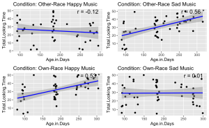
9. Given the significant three-way interaction, conduct Pearson correlation analyses to examine the linear relationship between total face looking time and participant age in days in each condition.
- (a) Begin by identifying all the unique conditions present in the dataset.
- (b) Performs a Pearson correlation analysis between Age group and Total Looking Time for each unique condition.
- (c) Stores and prints the correlation results, including correlation coefficients and p-values, for each condition.
unique_conditions <- unique(BabyData$Condition) #Get unique conditions
correlation_results <- list() ## Initialize a list to store results
# Loop through each condition and perform Pearson correlation
for (condition in unique_conditions) {
# Subset data for the current condition
subset_data <- subset(BabyData, Condition == condition)
subset_data$Age.Group <- as.numeric(as.character(subset_data$Age.Group))
# Perform Pearson correlation
correlation_test <- cor.test(subset_data$Age.Group, subset_data$Total.Looking.Time, method = "pearson")
# Store the result
correlation_results[[condition]] <- correlation_test
}
# Print the results
correlation_results
## $`Other-Race Happy Music`
##
## Pearson's product-moment correlation
##
## data: subset_data$Age.Group and subset_data$Total.Looking.Time
## t = -0.64059, df = 43, p-value = 0.5252
## alternative hypothesis: true correlation is not equal to 0
## 95 percent confidence interval:
## -0.3799180 0.2020743
## sample estimates:
## cor
## -0.09722666
##
##
## $`Other-Race Sad Music`
##
## Pearson's product-moment correlation
##
## data: subset_data$Age.Group and subset_data$Total.Looking.Time
## t = 4.4535, df = 46, p-value = 5.356e-05
## alternative hypothesis: true correlation is not equal to 0
## 95 percent confidence interval:
## 0.3136678 0.7206311
## sample estimates:
## cor
## 0.5488839
##
##
## $`Own-Race Happy Music`
##
## Pearson's product-moment correlation
##
## data: subset_data$Age.Group and subset_data$Total.Looking.Time
## t = 3.8943, df = 46, p-value = 0.0003166
## alternative hypothesis: true correlation is not equal to 0
## 95 percent confidence interval:
## 0.2490419 0.6851408
## sample estimates:
## cor
## 0.4979416
##
##
## $`Own-Race Sad Music`
##
## Pearson's product-moment correlation
##
## data: subset_data$Age.Group and subset_data$Total.Looking.Time
## t = 0.25438, df = 47, p-value = 0.8003
## alternative hypothesis: true correlation is not equal to 0
## 95 percent confidence interval:
## -0.2466891 0.3149919
## sample estimates:
## cor
## 0.03707966
Exercise 3: Visualizing Your Data
10. Visualize the relationship between total face looking time and participant age in days, categorized by different experimental conditions. Each condition should be represented in its own panel within a single figure. Additionally, for each panel:
- (a) Plot each infant’s total face looking time as a function of their age in days.
- (b) Add a blue linear regression line to indicate the trend.
- (c) Display the Pearson correlation coefficient you calculated in the previous question in the upper-right corner of each panel. Round your calculations for display to two decimal places.
- (d) Use different panels for each experimental condition and arrange them in a grid layout.
- (e) Ensure that a significant correlation (p < .05) is indicated with an asterisk.
# Get unique conditions
conditions <- unique(BabyData$Condition)
# Create a list to store plots
plot_list <- list()
# Loop through each condition and create a plot
for (condition in conditions) {
# Subset data for the condition
subset_data <- subset(BabyData, Condition == condition)
# Perform linear regression
fit <- lm(Total.Looking.Time ~ Age.in.Days, data = subset_data)
# Calculate Pearson correlation
cor_test <- cor.test(subset_data$Age.in.Days, subset_data$Total.Looking.Time)
# Create a scatter plot with regression line
p <- ggplot(subset_data, aes(x = Age.in.Days, y = Total.Looking.Time)) +
geom_point() +
geom_smooth(method = 'lm', color = 'blue') +
ggtitle(paste('Condition:', condition)) +
annotate("text", x = Inf, y = Inf, label = paste('r =', round(cor_test$estimate, 2), ifelse(cor_test$p.value < 0.05, "*", "")),
hjust = 1.1, vjust = 1.1, size = 5)
# Add plot to list
plot_list[[condition]] <- p
}
do.call(grid.arrange, c(plot_list, ncol = 2))
Exercise 4: Conducting Independent Sample T-tests
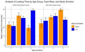
11. Analyze the impact of music emotional valence on the looking time for own- and other-race faces among different infant age groups (3, 6, and 9 months). Specifically, you are required to perform a series of independent sample t-tests.
- (a) Using the Age.Group column, conduct independent sample t-tests to examine the effects of music emotional valence (Music. Emotion) on the looking time (Total.Looking.Time) for own- and other-race faces (Face.Race) in each age group.
- (b) Ensure your script accounts for different combinations of age groups and music emotional valences.
- (c) Store and display the results of these t-tests in an organized manner.
# Ensure Age.Group is treated as a factor
BabyData$Age.Group <- as.factor(BabyData$Age.Group)
# Perform t-tests for each combination of Age.Group, Music.Emotion, and Face.Race
results <- list()
for(age_group in levels(BabyData$Age.Group)) {
for(music_emotion in unique(BabyData$Music.Emotion)) {
# Filter data for specific age group and music emotion
subset_data <- BabyData %>%
filter(Age.Group == age_group, Music.Emotion == music_emotion)
# Perform the t-test comparing Total.Looking.Time for own- vs. other-race faces
t_test_result <- t.test(Total.Looking.Time ~ Face.Race, data = subset_data)
# Store the results
result_name <- paste(age_group, music_emotion, sep="_")
results[[result_name]] <- t_test_result
}
}
# Print results
print(results)
## $`3_happy`
##
## Welch Two Sample t-test
##
## data: Total.Looking.Time by Face.Race
## t = -0.3153, df = 22.294, p-value = 0.7555
## alternative hypothesis: true difference in means between group African and group Chinese is not equal to 0
## 95 percent confidence interval:
## -12.465591 9.173257
## sample estimates:
## mean in group African mean in group Chinese
## 22.76875 24.41492
##
##
## $`3_sad`
##
## Welch Two Sample t-test
##
## data: Total.Looking.Time by Face.Race
## t = -1.0492, df = 22.86, p-value = 0.3051
## alternative hypothesis: true difference in means between group African and group Chinese is not equal to 0
## 95 percent confidence interval:
## -17.297369 5.658457
## sample estimates:
## mean in group African mean in group Chinese
## 21.32725 27.14671
##
##
## $`6_happy`
##
## Welch Two Sample t-test
##
## data: Total.Looking.Time by Face.Race
## t = 0.43226, df = 27.324, p-value = 0.6689
## alternative hypothesis: true difference in means between group African and group Chinese is not equal to 0
## 95 percent confidence interval:
## -6.401791 9.821475
## sample estimates:
## mean in group African mean in group Chinese
## 32.90100 31.19116
##
##
## $`6_sad`
##
## Welch Two Sample t-test
##
## data: Total.Looking.Time by Face.Race
## t = -0.62019, df = 27.075, p-value = 0.5403
## alternative hypothesis: true difference in means between group African and group Chinese is not equal to 0
## 95 percent confidence interval:
## -9.635393 5.162123
## sample estimates:
## mean in group African mean in group Chinese
## 30.20163 32.43827
##
##
## $`9_happy`
##
## Welch Two Sample t-test
##
## data: Total.Looking.Time by Face.Race
## t = -6.0414, df = 21.29, p-value = 5.08e-06
## alternative hypothesis: true difference in means between group African and group Chinese is not equal to 0
## 95 percent confidence interval:
## -27.28467 -13.31931
## sample estimates:
## mean in group African mean in group Chinese
## 19.13607 39.43806
##
##
## $`9_sad`
##
## Welch Two Sample t-test
##
## data: Total.Looking.Time by Face.Race
## t = 3.0179, df = 26.642, p-value = 0.005546
## alternative hypothesis: true difference in means between group African and group Chinese is not equal to 0
## 95 percent confidence interval:
## 3.335708 17.533234
## sample estimates:
## mean in group African mean in group Chinese
## 38.68853 28.25406
Exercise 5 Creating a Bar Plots
12. Create a bar plot to visualize the effects of music emotional valence on the looking time of infants at different ages for own- and other-race faces.
- (a) The plot should display the mean total looking time on the own- and other-race faces paired with happy or sad music for each age group.
- (b) Include standard error bars in your plot.
- (c) Organize the bars such that bars representing own-race faces are grouped together and labelled “Own Race Asian Faces”, followed by bars for other-race faces grouped together and labelled “Other Race African Faces”.
- (d) The colour of the bars should represent the music emotion: use blue for sad music and orange for happy music.
- (e) Label the x-axis as “Age (months)” and the y-axis as “Mean Looking Time (seconds)”.
- (f) Set the title of your plot as “Analysis of Looking Time by Age Group, Face Race, and Music Emotion”
- (g) Set the theme of your plot to minimal. Make sure the x- and y-axis lines are solid black lines.
- (h)Your plot should not display minor grid lines, major grid lines only.
# Calculate means and standard errors
data_summary <- BabyData %>%
group_by(Age.Group, Face.Race, Music.Emotion) %>%
summarize(Mean = mean(Total.Looking.Time),
SE = sd(Total.Looking.Time)/sqrt(n())) %>%
ungroup()
## `summarise()` has grouped output by 'Age.Group', 'Face.Race'. You can override
## using the `.groups` argument.
# Create the bar plot
ggplot(data_summary, aes(x = factor(Age.Group), y = Mean, fill = Music.Emotion)) +
geom_bar(stat = "identity", position = position_dodge()) +
geom_errorbar(aes(ymin = Mean - SE, ymax = Mean + SE),
position = position_dodge(0.9), width = 0.25) +
scale_fill_manual(values = c("happy" = "orange", "sad" = "blue")) +
facet_wrap(~ Face.Race, scales = "free_x", labeller = labeller(Face.Race = c(Chinese = "Own Race Asian Faces", African = "Other Race African Faces"))) +
labs(x = "Age (months)", y = "Mean Looking Time (seconds)", title = "Analysis of Looking Time by Age Group, Face Race, and Music Emotion") +
theme_minimal() +
theme(
panel.grid.minor = element_blank(),
panel.grid.major = element_line(color = "gray", size = 0.5, linetype = "solid"), # Major grid lines
axis.line = element_line(color = "black", size = 0.5) # Axis lines
)
P04: Perception and Sensorimotor Lab
Sevda Montakhaby Nodeh
Perception and Sensorimotor Lab
Welcome to the Perception and Sensorimotor Lab at McMaster University. As a budding cognitive psychologist here, you are about to embark on an explorative journey into the depth effect—a captivating psychological phenomenon that suggests visual events occurring in closer proximity (near space) are processed more efficiently than those farther away (far space). This effect provides a unique window into the cognitive architecture underpinning our sensory experiences, possibly implicating the involvement of the dorsal visual stream, which processes spatial relationships and movements in near space, and the ventral stream, known for its role in recognizing detailed visual information.
Your goal is to dissect whether the depth effect is task-dependent, aligning strictly with the dorsal/ventral stream dichotomy, or whether it represents a universal processing advantage for stimuli in near space across various cognitive tasks.
Your research journey begins in your lab. Imagine the lab as a gateway to a three-dimensional world, where the concept of depth is not only a subject of study but also a lived sensory experience for your participants! Seated inside a darkened tent, each participant grips a steering wheel, their primary tool for interaction and inputting responses. Before them, a screen comes to life with a 3D virtual environment meticulously engineered to test the frontiers of depth perception.
The virtual landscape participants encounter is a model of simplicity and complexity; as illustrated in the figure below, before the participants a ground plane extends into the depth of the screen, intersected by two sets of upright placeholder walls at varying depths—near and far. The walls stand on either side of the central axis, mirrored perfectly across the midline. The textures of the ground and placeholders—a random dot matrix and a checkerboard pattern, respectively—maintain a consistent density. These visual hints, alongside the textural gradients and the retinal size variance between near and far objects, act as subtle cues for depth perception.
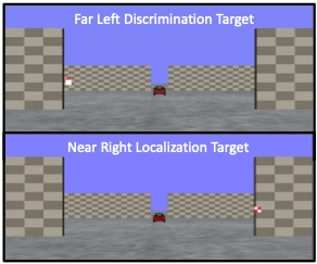
From their first-person point of view, participants are asked to:
- Either discriminate the orientation of a red triangular target or localize a checkered square within this 3D dimensional immersive environment.
- The targets could appear in both near and far spaces, demanding keen sensory discrimination and localization.
Through this experiment, you are not just observing the depth effect; you are dissecting it, unearthing the cognitive processes that allow humans to navigate the intricate dance of depth in our daily lives!
Let’s begin by loading the required libraries and the dataset. To do so download the file “NearFarRep_Outlier.csv” and run the following code.
Note: Shaded boxes hold the R code, with the “#” sign indicating a comment that won’t execute in RStudio.
# Loading the required
libraries library(tidyverse) # for data manipulation
library(rstatix) # for statistical analyses
library(emmeans) # for pairwise comparisons
library(afex) # for running anova using aov_ez and aov_car
library(kableExtra) # formatting html ANOVA tables
library(ggpubr) # for making plots
library(grid) # for plots
library(gridExtra) # for arranging multiple ggplots for extraction
library(lsmeans) # for pairwise comparisons
Read in the downloaded dataset “NearFarRep_Outlier.csv” as “NearFarData”. Remember to replace ‘path_to_your_downloaded_file’ with the actual path to the dataset on your system.
NearFarData <- read.csv('path_to_your_downloaded_file/NearFarRep_Outlier.csv')
The dataset contains the response times of participants and includes the following columns:
- “Response” indicates the type of task (Discrimination or Localization)
- “Con” indicating the target depth (Near or Far)
- “TarRT” represents the target response times.
Files to Download:
- NearFarRep_Outlier.csv
Please complete the accompanying exercises to the best of your abilities.
An interactive H5P element has been excluded from this version of the text. You can view it online here:
https://ecampusontario.pressbooks.pub/radpnb/?p=34#h5p-4
Answer Key
Exercise 1: Data Preparation and Exploration
Note: Shaded boxes hold the R code, while the white boxes display the code’s output, just as it appears in RStudio.
The “#” sign indicates a comment that won’t execute in RStudio.
1. Display the first few rows to understand your dataset. Display all column names in the dataset.
head(NearFarData) #Displaying the first few rows
## X ID Response Con TarRT
## 1 1 10 Loc Near 0.6200754
## 2 2 10 Loc Near 0.2219719
## 3 3 1 Loc Near 0.2270377
## 4 4 9 Loc Near 0.5270686
## 5 5 25 Loc Near 0.2272455
## 6 6 18 Loc Near 0.2292785
## [1] "X" "ID" "Response" "Con" "TarRT"
2. Set up “Response” and “Con” as factors, then check the structure of your data to make sure your factors and levels are set up correctly.
NearFarData <- NearFarData %>%
convert_as_factor(Response, Con)
str(NearFarData)
## 'data.frame': 11154 obs. of 5 variables:
## $ X : int 1 2 3 4 5 6 7 8 9 10 ...
## $ ID : int 10 10 1 9 25 18 4 9 8 18 ...
## $ Response: Factor w/ 2 levels "Disc","Loc": 2 2 2 2 2 2 2 2 2 2 ...
## $ Con : Factor w/ 2 levels "Far","Near": 2 2 2 2 2 2 2 2 2 2 ...
## $ TarRT : num 0.62 0.222 0.227 0.527 0.227 ...
3. Perform basic data checks for missing values and data consistency.
sum(is.na(NearFarData)) # Checking for missing values in the dataset
4. Convert the values in your dependent measures column “TarRT” to seconds.
NearFarData$TarRT <- NearFarData$TarRT * 1000
Exercise 2: Visualizing Your Data
- Using the “dplyr” package, write R code to calculate the mean response time and the standard error of the mean (SERT) for each combination of your two factors (Response and Con).
# Calculate means and standard errors for each combination of 'Response' and 'Con'
summary_df <- NearFarData %>%
group_by(Response, Con) %>%
summarise(
MeanRT = mean(TarRT),
SERT = sd(TarRT) / sqrt(n())
)
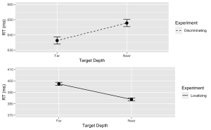
6. Using the “ggplot2” package, create a line plot with error bars for the Discrimination task.
- (a) The x-axis should represent the target depth (Con), and be labelled “Target Depth”.
- (b) The y-axis should represent the mean response time (MeanRT), and be labelled “RT (ms)”
- (c) Error bars should represent the standard error of the mean (SERT).
- (d) Ensure the line type is solid.
- (e) Set the minimum value of your y-axis to 630 and the maximum to 660.
# Now, using ggplot to create the plot
Disc.plot <- ggplot(data = filter(summary_df, Response=="Disc"), aes(x = Con, y = MeanRT, group = Response)) +
geom_line(aes(linetype = "Discriminating")) + # Add a linetype aesthetic
geom_errorbar(aes(ymin = MeanRT - SERT, ymax = MeanRT + SERT), width = 0.1) +
geom_point(size = 3) +
theme_gray() +
labs(
x = "Target Depth",
y = "RT (ms)",
color = "Experiment",
linetype = "Experiment") +
scale_linetype_manual(values = "dashed") + # Set the linetype for "Disc" to dashed
ylim(630, 660) # Set the y-axis limits
7. Similarly, create a line plot with error bars for the Localization task. Use a dashed line for this plot with the following exceptions:
- (a) Ensure the line type is dashed
- (b) Set the minimum value of your y-axis to 370 and the maximum to 410.
Loc.plot <- ggplot(data = filter(summary_df, Response=="Loc"), aes(x = Con, y = MeanRT, group = Response)) +
geom_line(aes(linetype = "Localizing")) + # Add a linetype aesthetic
geom_errorbar(aes(ymin = MeanRT - SERT, ymax = MeanRT + SERT), width = 0.1) +
geom_point(size = 3) +
theme_gray() +
labs(
x = "Target Depth",
y = "RT (ms)",
color = "Experiment",
linetype = "Experiment") +
scale_linetype_manual(values = "solid") + # Set the line type for "Disc" to dashed
ylim(370, 410) # Set the y-axis limits
8. Finally, use the grid.arrange() function from the “gridExtra” package to stack the plots for the Discrimination and Localization tasks on top of each other.
grid.arrange(Disc.plot, Loc.plot, ncol = 1) # Stack the plots on top of each other
Exercise 3: ANOVA Analysis
9. Using the “anova_test” function, conduct a two-way between-subjects ANOVA to investigate the effects of Con (Condition) and Response (Task type) on the target response times (TarRT). After running the ANOVA, use the “get_anova_table” function to present the results.
anova <- anova_test(
data = NearFarData, dv = TarRT, wid = ID,
between = c(Con, Response), detailed = TRUE, effect.size = "pes")
## Warning: The 'wid' column contains duplicate ids across between-subjects
## variables. Automatic unique id will be created
get_anova_table(anova)
## ANOVA Table (type III tests)
##
## Effect SSn SSd DFn DFd F p p<.05
## 1 (Intercept) 2.972143e+09 111582983 1 11150 296993.268 0.00e+00 *
## 2 Con 3.185839e+03 111582983 1 11150 0.318 5.73e-01
## 3 Response 1.762985e+08 111582983 1 11150 17616.741 0.00e+00 *
## 4 Con:Response 4.390483e+05 111582983 1 11150 43.872 3.67e-11 *
## pes
## 1 9.64e-01
## 2 2.86e-05
## 3 6.12e-01
## 4 4.00e-03
Exercise 4: Post Hoc Analysis
- Use “lm” function to fit a linear model to your data. Make sure to specify your dependent variable, independent variables, and interaction terms.
## Fitting a linear model to data
lm_model <- lm(TarRT ~ Con * Response, data = NearFarData)
- Use the “emmeans” function to get the estimated marginal means for your factors and their interaction. Then, use the pairs function to perform pairwise comparisons.
- (a) Set the adjust parameter in the test function to “Tukey” for Tukey’s honest significant difference test, to adjust for multiple comparisons to control the family-wise error rate.
# Get the estimated marginal means
emm <- emmeans(lm_model, specs = pairwise ~ Con * Response)
12. Print and review the results of your post hoc analysis. The output will provide a comparison of each pair of group levels, the estimated difference, the standard error, the t-value, and the adjusted p-value for each comparison.
# View the results
print(post_hoc_results)
## contrast estimate SE df t.ratio p.value
## Far Disc - Near Disc -11.5 2.70 11150 -4.250 0.0001
## Far Disc - Far Loc 238.9 2.67 11150 89.348 <.0001
## Far Disc - Near Loc 252.6 2.67 11150 94.581 <.0001
## Near Disc - Far Loc 250.4 2.69 11150 93.131 <.0001
## Near Disc - Near Loc 264.0 2.68 11150 98.341 <.0001
## Far Loc - Near Loc 13.6 2.66 11150 5.124 <.0001
##
## P value adjustment: tukey method for comparing a family of 4 estimates
Sevda Montakhaby Nodeh
EdCog Lab
You are a researcher in the EdCog Lab at McMaster University. The Lab is conducting a study aimed at understanding the beliefs of instructors about student abilities in STEM (Science, Technology, Engineering, and Math) disciplines. This study is motivated by a growing body of literature suggesting that instructors’ beliefs about intelligence and success—categorized into brilliance belief (the idea that success requires innate talent), universality belief (the belief that success is achievable by everyone versus only a select few), and mindset beliefs (the view that intelligence and skills are either fixed or can change over time)—play a crucial role in educational practices and student outcomes. Understanding these beliefs is particularly important in STEM fields, where perceptions of innate talent versus learned skills can significantly influence teaching approaches and student engagement.
Experimental Design:
The survey was distributed through LimeSurvey to instructors across the Science, Health Sciences, and Engineering faculties. Participants were asked a series of Likert-scale questions (ranging from strongly disagree to strongly agree) aimed at assessing their beliefs in each of the three areas. Additional demographic and background questions were included to control for variables such as years of teaching experience, field of specialization, and level of education.
- Brilliance Belief: The belief that only those with raw, innate talent can achieve success in their field.
- Universality Belief: The belief that success is achievable for everyone, assuming the right effort and strategies are employed.
- Mindset Beliefs: Instructors’ views on the nature of intelligence and skills—whether they are fixed traits or can be developed over time.
The sample data file (“EdCogData.xlsx) for this exercise is structured as such:
- ID: A unique identifier for each respondent.
- Brilliance1 to Brilliance5: Responses to statements measuring the belief in brilliance as a requirement for success.
- A higher score in these columns indicates a belief that brilliance is a requirement for success.
- MindsetGrowth1 to MindsetGrowth5: Responses to questions aimed at assessing the belief in a growth mindset, suggesting that intelligence and abilities can develop over time.
- A higher score in these columns indicates a strong growth mindset.
- Nonuniversality1 to Nonuniversality5: Responses to statements measuring beliefs counter to universality, meaning that not everyone can succeed (i.e., success is not universal).
- A higher score in these columns indicates a non-universal mindset to success.
- Universality1 to Universality5: Responses to statements measuring the belief in universality, or the idea that success is achievable by anyone with sufficient effort.
- A higher score in these columns indicates a belief that with enough effort success is achievable (i.e., success is universal)
- MindsetFixed1 to MindsetFixed5: Responses to questions aimed at assessing the belief in a fixed mindset regarding intelligence and abilities. A fixed mindset believes that intelligence, talents, and abilities are fixed traits. They think these traits are innate and cannot be significantly developed or improved through effort or education.
- A higher score in these columns indicates a strong fixed mindset.
Getting Started: Loading Libraries, setting the working directory, and loading the dataset
Let’s begin by running the following code in RStudio to load the required libraries. Make sure to read through the comments embedded throughout the code to understand what each line of code is doing.
Note: Shaded boxes hold the R code, with the “#” sign indicating a comment that won’t execute in RStudio.
# Here we create a list called "my_packages" with all of our required libraries
my_packages <- c("tidyverse", "readxl", "xlsx", "dplyr", "ggplot2")
# Checking and extracting packages that are not already installed
not_installed <- my_packages[!(my_packages %in% installed.packages()[ , "Package"])]
# Install packages that are not already installed
if(length(not_installed)) install.packages(not_installed)
# Loading the required libraries
library(tidyverse) # for data manipulation
library(dplyr) # for data manipulation
library(readxl) # to read excel files
library(xlsx) # to create excel files
library(ggplot2) # for making plots
Make sure to have the required dataset (“EdCogData.xlsx“) for this exercise downloaded. Set the working directory of your current R session to the folder with the downloaded dataset. You may do this manually in R studio by clicking on the “Session” tab at the top of the screen, and then clicking on “Set Working Directory”.
If the downloaded dataset file and your R session are within the same file, you may choose the option of setting your working directory to the “source file location” (the location where your current R session is saved). If they are in different folders then click on “choose directory” option and browse for the location of the downloaded dataset.
You may also do this by running the following code:
Once you have set your working directory either manually or by code, in the Console below you will see the full directory of your folder as the output.
Read in the downloaded dataset as “edcogData” and complete the accompanying exercises to the best of your abilities.
# Read xlsx file
edcog = read_excel("EdCogData.xlsx")
Files to Download:
- EdCogData.xlsx
An interactive H5P element has been excluded from this version of the text. You can view it online here:
https://ecampusontario.pressbooks.pub/radpnb/?p=39#h5p-5
Answer Key
Exercise 1: Data Preparation and Exploration
Note: Shaded boxes hold the R code, while the white boxes display the code’s output, just as it appears in RStudio. The “#” sign indicates a comment that won’t execute in RStudio.
Load the dataset into RStudio and inspect its structure.
- How many rows and columns are in the dataset?
- What are the column names?
head(edcogData) # View the first few rows of the dataset
ncol(edcogData) #Q1
#[1] "ID" "Brilliance1" "Brilliance2" "Brilliance3" "Brilliance4"
#[6] "Brilliance5" "MindsetGrowth1" "MindsetGrowth2" "MindsetGrowth3" "MindsetGrowth4"
#[11] "MindsetGrowth5" "MindsetFixed1" "MindsetFixed2" "MindsetFixed3" "MindsetFixed4"
#[16] "MindsetFixed5" "Nonuniversality1" "Nonuniversality2" "Nonuniversality3" "Nonuniversality4"
#[21] "Nonuniversality5" "Universality1" "Universality2" "Universality3" "Universality4"
#[26] "Universality5"
Exercise 2: Data Preprocessing
Prepare the data for analysis by ensuring it is in the correct format.
1. Are there any missing values in the dataset?
Exercise 3: Aggregating Scores
1. Create aggregate scores for each dimension (Brilliance, Fixed, Growth, Nonuniversal, Universal).
edcogData$Brilliance <- rowMeans(edcogData[,c("Brilliance1", "Brilliance2", "Brilliance3", "Brilliance4", "Brilliance5")])
edcogData$Growth <- rowMeans(edcogData[,c("MindsetGrowth1", "MindsetGrowth2", "MindsetGrowth3", "MindsetGrowth4", "MindsetGrowth5")])
edcogData$Fixed <- rowMeans(edcogData[,c("MindsetFixed1", "MindsetFixed2", "MindsetFixed3", "MindsetFixed4", "MindsetFixed5")])
edcogData$Universal <- rowMeans(edcogData[,c("Universality1", "Universality2", "Universality3", "Universality4", "Universality5")])
edcogData$Nonuniversal <- rowMeans(edcogData[,c("Nonuniversality1", "Nonuniversality2", "Nonuniversality3", "Nonuniversality4", "Nonuniversality5")])
2. Create a new data frame named “edcog.agg.wide” that contains only the ID column and the aggregated score columns from “edcogData”.
edcog.agg.wide <- edcogData %>% select(ID, Brilliance, Fixed, Growth, Nonuniversal, Universal)
3. Convert “edcog.agg.wide” from a wide to a long format named “edcog.agg.long”, with the following columns:
- ID
- Dimension (with values of Brilliance, Fixed, Growth, Universal, and Nonuniversal)
- AggregateScore
edcog.agg.long <- edcog.agg.wide %>%
select(ID, Brilliance, Fixed, Growth, Nonuniversal, Universal) %>%
pivot_longer(
cols = -ID, # Select all columns except for ID
names_to = "Dimension",
values_to = "AggregateScore" )
Exercise 4: Creating Plots
1. Create a boxplot to visualize the distribution of aggregate scores across different dimensions (Brilliance, Fixed, Growth, Nonuniversal, Universal) from the survey data with the following specifications:
- The x-axis should represent different ‘Dimensions’ of beliefs.
- The y-axis should represent the ‘Score’ on a scale from 1 to 5.
- Each ‘Dimension’ should have a different color fill for its box.
- Set the y-axis label to “Response (on a 1 to 5 scale)” and the x-axis label to “Dimension”.
- Use a minimal theme and remove the legend.
- Hint: Use “edcog.agg.long”
ggplot(edcog.agg.long, aes(x = Dimension, y = AggregateScore, fill = Dimension)) +
geom_boxplot() +
scale_fill_manual(values = c("Brilliance" = "pink", "Fixed" = "yellow",
"Growth" = "green", "Nonuniversal" = "blue",
"Universal" = "purple")) +
labs(y = "Response (on a 1 to 5 scale)", x = "Dimension") +
theme_minimal() +
theme(legend.position = "none") # Hide the legend since color coding is evident
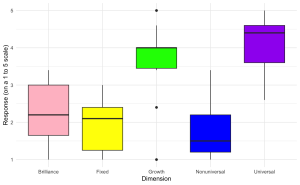
2. Generate a violin plot to visualize the distribution of aggregate scores for different dimensions (Brilliance, Fixed, Growth, Nonuniversal, Universal) from the survey data with the following specifications:
- The x-axis should represent different ‘Dimensions’ of beliefs.
- The y-axis should represent the ‘Score’ on a scale from 1 to 5.
- Each ‘Dimension’ should have a distinct color.
- Label the axes appropriately.
- Apply a minimalistic theme and consider removing the legend if it is not necessary.
ggplot(edcog.agg.long, aes(x = Dimension, y = AggregateScore, fill = Dimension)) +
geom_violin(trim = FALSE) +
scale_fill_manual(values = c("Brilliance" = "pink", "Fixed" = "yellow",
"Growth" = "green", "Nonuniversal" = "blue",
"Universal" = "purple")) +
labs(y = "Response (on a 1 to 5 scale)", x = "Dimension") +
theme_minimal() + theme(legend.position = "none")
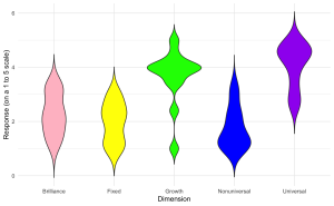
3. Enhance the violin plot by overlaying individual data points to show the raw data distribution alongside the aggregated density estimates.
ggplot(edcog.agg.long, aes(x = Dimension, y = AggregateScore, fill = Dimension)) +
geom_violin(trim = FALSE) +
geom_jitter(width = 0.1, size = 2, alpha = 0.5) + # Adjust 'width' for jittering, 'size' for point size, and 'alpha' for transparency
scale_fill_manual(values = c("Brilliance" = "pink", "Fixed" = "yellow",
"Growth" = "green", "Nonuniversal" = "blue",
"Universal" = "purple")) +
labs(y = "Response (on a 1 to 5 scale)", x = "Dimension") +
theme_minimal() +
theme(legend.position = "none")
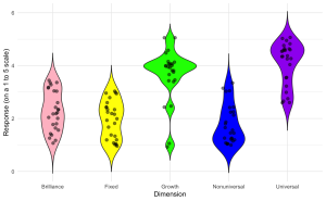
P06: Evolutionary Psychology of Depression Lab
Carmen Tu
Grief-Related Rumination
You are a clinical researcher at the Hamilton General Hospital, and your lab is studying how people grieve and cope with the loss of a loved one. Specifically, some people ruminate when they grieve, and so your lab is interested in understanding the different ways in which this grief-related rumination manifests in people. Andrews et al. (2021) recently developed the Bereavement Analytical Rumination Questionnaire (BARQ) to evaluate two dimensions of rumination: 1) the cause of the loss (i.e., root cause analysis – RCA) and 2) how an individual reinvests their time meaningfully following the loss (i.e., reinvestment analysis – RIA).
Your lab is curious about the following questions:
- Do grieving women ruminate more than grieving men?
- Do people ruminate more when the loved one’s death is traumatic?
- Does grief-related rumination vary with the type of relationship with the deceased?
- Does rumination depend on the age of the deceased?
- Does rumination depend on the age of the participant?
- Does rumination depend on the time that has passed since the loved one died?
- Which dimension of the BARQ is more associated with depression?
Similar to Andrews et al. (2021), your lab decides to collect the following information from a questionnaire distributed to 50 respondents:
- The age of the deceased at the time of death
- The amount of time that has passed since the time of death
- The respondent’s current age while completing the questionnaire
- The respondent’s gender (male, female, or other)
- The relationship of the deceased to the respondent (i.e., child, parent, spouse, or other)
- Whether the death was traumatic (yes or no)
- The average hours of sleep per night after the death (i.e., less than 3 hours, 4-5 hours, 6-8 hours, more than 9 hours)
- Whether the respondent was prescribed psychiatric medications
- If the respondent was prescribed psychiatric medications, did that include an antidepressant?
- Responses to 7 items on the BARQ. Four items form the latent factor RCA, while three items form the latent factor RIA. Respondents rated each of the seven items on a 4-point Likert scale (1 = “Never”, 2 = “Sometimes”, 3 = “Often”, 4 = “All the time”).
To answer the lab’s questions, please run the following analyses.
- Load the data “P06_dataset.csv”. Run descriptive statistics on the following demographics traits of the sample.
- What is the mean age of the deceased at the time of death in this sample?
- What is the mean time that has passed since the time of death in this sample?
An interactive H5P element has been excluded from this version of the text. You can view it online here:
https://ecampusontario.pressbooks.pub/radpnb/?p=41#h5p-6
-
- What proportion of the respondents were female?
- What proportion of the respondents lost a child?
- What proportion of deaths were traumatic?
- What proportion of the respondents were prescribed antidepressant medication
An interactive H5P element has been excluded from this version of the text. You can view it online here:
https://ecampusontario.pressbooks.pub/radpnb/?p=41#h5p-54
2. Conduct a confirmatory factor analysis (CFA) on the seven items of the BARQ. Items 1-4 should form the latent factor RCA, and items 5-7 should form the latent factor RIA.
-
- What is the root mean square error of approximation (RMSEA) of the two-factor CFA?
An interactive H5P element has been excluded from this version of the text. You can view it online here:
https://ecampusontario.pressbooks.pub/radpnb/?p=41#h5p-55
-
- What is the Comparative Fit Index (CFI) and the standardized root mean square residual (srmr) of the two-factor CFA? Use CFI >= .95 and srmr <= .08 as the threshold values.
An interactive H5P element has been excluded from this version of the text. You can view it online here:
https://ecampusontario.pressbooks.pub/radpnb/?p=41#h5p-56
3. Compare RCA and RIA latent factor means between the following groups. Which comparisons have statistically significant differences in the RCA and RIA means?
-
- Respondents who take antidepressant medication vs. those who do not
- Women vs. men
- Respondents whose deceased loved one experienced a traumatic death vs. those who did not
- Respondents who lost a child vs. those who did not
An interactive H5P element has been excluded from this version of the text. You can view it online here:
https://ecampusontario.pressbooks.pub/radpnb/?p=41#h5p-57
4. The three time variables in the questionnaire may exhibit multilinearity with one another: age of the deceased, current age of the respondent, and the time passed since death. For instance, the age of the deceased and the age of the respondent may be collinear with one another, especially if the relationship of the deceased to respondent is that of a child. To test for multilinearity, assess the variance inflation factor (VIF) of a regression model that includes the three time variables as predictors for RCA and RIA. A VIF of 1 means there is no correlation between predictor variables, while a VIF above 5 indicates a high correlation.
An interactive H5P element has been excluded from this version of the text. You can view it online here:
https://ecampusontario.pressbooks.pub/radpnb/?p=41#h5p-58
5. Create a scatterplot of the participant’s latent RCA factor score (y-axis) against the age of the deceased child (x-axis).
An interactive H5P element has been excluded from this version of the text. You can view it online here:
https://ecampusontario.pressbooks.pub/radpnb/?p=41#h5p-59
Files to Download:
- P06_dataset.csv
References for further reading
Andrews, P. W., Altman, M., Sevcikova, M., & Cacciatore, J. (2021). An evolutionary approach to grief-related rumination: Construction and validation of the Bereavement Analytical Rumination Questionnaire. Evolution and Human Behavior, 42(5), 441-452.
P07: Narrative Psychology Lab
Carmen Tu
Can Movie Characteristics Predict Audience Reception?
Hollywood studios and movie producers are keenly interested in determining what types of story scripts will resonate with audiences and critics. A few budding screenwriters approach you, a social psychology researcher specializing in qualitative content analysis, to conduct an analysis of movie plots in order to help them determine the types of storylines that may appeal to mainstream viewers. 150 movies from the last five years were randomly selected and analyzed for plot and character traits. You decide to analyze the following six narrative characteristics for the exploratory study: 1) genre, 2) plot shape, 3) protagonist goal type, 4) protagonist agency, 5) protagonist cooperativeness, and 6) protagonist assertiveness. You are interested to see how these characteristics relate to the following outcomes: 1) average critic rating of the movie (as a percentage score) and 2) the net profit of the movie (in US dollars).
To analyze these six narrative characteristics, you adopt Brown & Tu’s (2020) scheme for plot and Berry & Brown’s (2017) classification scheme for literary characters. The coding scheme for the five narrative characteristics are as follows:
-
Genre
| Label |
Code |
| Drama |
1 |
| Comedy |
2 |
| Romance |
3 |
| Action |
4 |
| Horror |
5 |
-
Plot Shape
| Label |
Code |
| Fall-Rise |
1 |
| Fall-Rise-Fall |
2 |
| Rise-Fall |
3 |
| Rise-Fall-Rise |
4 |
-
Protagonist Goal
| Label |
Code |
| Striving |
1 |
| Coping |
2 |
-
Protagonist Cooperativeness
| Label |
Code |
| High |
1 |
| Medium |
2 |
| Low |
3 |
-
Protagonist Assertiveness
| Label |
Code |
| High |
1 |
| Medium |
2 |
| Low |
3 |
You also recruit a second coder in order to determine whether there is inter-rater reliability in your coding method.
- Load the datafile “P07_dataset.csv”. Run descriptive statistics (e.g., measures of frequency, measures of central tendency including mean, median, and mode where applicable) on each of the six narrative characteristics, using Rater 1 (R1)’s coding data. Answer the following questions:
-
- What is the most common type of movie genre in the corpus?
- What is the most common type of plot shape in the corpus?
- What is the most common type of protagonist goal in the corpus?
- What is the most common type of protagonist agency in the corpus?
- What is the most common type of protagonist cooperativeness in the corpus?
- What is the most common type of protagonist assertiveness in the corpus?
An interactive H5P element has been excluded from this version of the text. You can view it online here:
https://ecampusontario.pressbooks.pub/radpnb/?p=43#h5p-60
-
- What is the mean protagonist agency across the 150 films in the corpus?
- What is the mean protagonist cooperativeness across the 150 films in the corpus?
- What is the mean protagonist assertiveness across the 150 films in the corpus?
An interactive H5P element has been excluded from this version of the text. You can view it online here:
https://ecampusontario.pressbooks.pub/radpnb/?p=43#h5p-61
- Answer the following questions about the two outcome variables:
- Which are the five films with the highest mean critic rating?
- Which are the five films with the greatest net profit?
- Which are the five films with the lowest net profit?
An interactive H5P element has been excluded from this version of the text. You can view it online here:
https://ecampusontario.pressbooks.pub/radpnb/?p=43#h5p-62
- The six narrative variables are a mix of nominal data (genre, plot shape, protagonist goal) and ordinal data (protagonist agency, cooperativeness, assertiveness). Genre is the only variable that is not coded by raters. What are the relationships between the nominal variables? To determine this, please answer the following questions:
- Which genre of film has the highest percentage of type 1 (fall-rise) plot shapes?
- What is the percent distribution of plot shapes in each genre?
An interactive H5P element has been excluded from this version of the text. You can view it online here:
https://ecampusontario.pressbooks.pub/radpnb/?p=43#h5p-63
4. Visualize these plot shape distributions across each genre in a grouped bar plot. Be sure to label the y-axis, x-axis, and legend.
-
- As practice, create grouped bar graphs between any other pair of variables in order to visualize any interactions between the variables.
An interactive H5P element has been excluded from this version of the text. You can view it online here:
https://ecampusontario.pressbooks.pub/radpnb/?p=43#h5p-64
5. Run comparative analyses to see which, if any, of the six characteristics are related to one another. Because the six characteristics are not normally distributed, use non-parametric tests, such as Chi-Square. For example, is the relationship between genre and plot statistically significant?
-
- The null hypothesis is that the difference between the observed data and expected data is due to chance.
- A significant Chi-square result will allow us to reject the null hypothesis and consider an alternative hypothesis where the difference may be due to the relationship between the two variables.
An interactive H5P element has been excluded from this version of the text. You can view it online here:
https://ecampusontario.pressbooks.pub/radpnb/?p=43#h5p-65
6. Run an analysis of variance test to see which, if any, of the five rater-coded variables are related with either of the two outcome variables. Consider if you should run a 2-way or 3-way factorial ANOVA. What assumptions do you need to consider and test before running an ANOVA?
An interactive H5P element has been excluded from this version of the text. You can view it online here:
https://ecampusontario.pressbooks.pub/radpnb/?p=43#h5p-66
7. Run a cluster analysis to see if which, if any, of the categories in the six narrative characteristics variables cluster together.
An interactive H5P element has been excluded from this version of the text. You can view it online here:
https://ecampusontario.pressbooks.pub/radpnb/?p=43#h5p-67
8. Determine the inter-rater reliability between the two coders for each of the five rater-coded variables. A Cohen’s Kappa score of greater than 0.8 reflects strong inter-rate agreement.
An interactive H5P element has been excluded from this version of the text. You can view it online here:
https://ecampusontario.pressbooks.pub/radpnb/?p=43#h5p-68
Files to Download:
- P07_dataset.csv
References for further reading
Berry, M., & Brown, S. (2017). A classification scheme for literary characters. Psychological Thought, 10(2).
Brown, S., & Tu, C. (2020). The shapes of stories: A “resonator” model of plot structure. Frontiers of Narrative Studies, 6(2), 259-288.
P08: Voice and Personality Lab
Carmen Tu
Voice pitch and personality traits
A new science fiction massive multiplayer online role-playing game (MMORPG) was released that allows players to design the sound of their avatar’s voice. The game features a sliding pitch scale for players to select the fundamental pitch (f0) and formant frequencies (pf) (both measured in hertz) of their avatar’s voice. As players engage with the game world and interact with other players through their avatar, specific personality traits for their avatar would emerge. In order to determine whether the avatars created within this science fiction game world resemble the vocal and personality patterns found in the real-world, the designers of the game collaborated with psychologists to investigate this comparison. The game designers were particularly inspired by Stern et al. (2021)’s study that explored how voice pitch is related to self-reported extraversion, dominance, and sociosexuality in men and women.
The current video game study recruited a sample of 475 players from the game, 200 men and 275 women, all aged from 20 to 45. In Stern et al. (2021)’s study, participants would read short text passages so that the researchers could determine the fundamental pitch and formant frequencies of the participants’ voice. However, the game designers are able to extract the information about an avatar’s voice from the selections that the player made on the sliding pitch scale when the player created their avatar. The game designers asked the 475 players to each fill out a questionnaire about their avatar’s personality traits (Likert ratings on a scale from 1-5 from the Big 5), dominance (Likert ratings on a scale from 1-5 from the Interpersonal Adjective List, and sociosexuality (Likert ratings on a scale from 1-5 from the SOI-R). The sociosexuality score is the mean of the ratings for the three dimensions of sociosexuality: behaviour, attitude, and desire. The game designers have already calculated the Cronbach’s alpha for the raw scores of the scales and found that there was good reliability. As certain MMORPGS can provide the potential for players to explore and express their sexuality through their avatars, such as the current new science fiction MMORPG that is the focus of this scenario, the game designers are curious as to whether there is a relationship between these self-reported traits and the type of voice that the player has designed for their avatar.
To help the game designers investigate this, please answer the following questions:
Load the data. Data can be found in voiceData.
An interactive H5P element has been excluded from this version of the text. You can view it online here:
https://ecampusontario.pressbooks.pub/radpnb/?p=45#h5p-69
- Create scatterplots that plot f0 and pf against the nine personality traits: neuroticism, extraversion, openness, agreeableness, conscientiousness, dominance, and sociosexual behaviour, attitude, and desire. Colour-code the data points by gender.
- Apply a thin plate regression spline smooth on the scatterplots to visually diagnose nonlinearity. Do you see any possible interactions, linear, or nonlinear relationships in the bivariate comparisons?
An interactive H5P element has been excluded from this version of the text. You can view it online here:
https://ecampusontario.pressbooks.pub/radpnb/?p=45#h5p-70
2. Create violin plots comparing gender with f0, pf, and the nine personality trait variables. Visually inspect the violin plots and answer the following questions:
-
- What is the mean f0 for females and males?
- What is the mean pf for females and males?
- What is the mean reported Likert rating for extraversion for females and males?
- What is the mean reported Likert rating for agreeableness for females and males?
- What is the mean reported Likert rating for dominance for females and males?
- What is the mean reported Likert rating for sociosexual behaviour for females and males?
- Does the shape of the violin plot show that the data has a bimodal, uniform, or normal distribution?
An interactive H5P element has been excluded from this version of the text. You can view it online here:
https://ecampusontario.pressbooks.pub/radpnb/?p=45#h5p-71
- Run a linear regression analysis to answer the following questions:
- Do participants with avatars with lower fundamental pitch report their avatars as higher on neuroticism?
- Do participants with avatars with lower fundamental pitch report their avatars as higher on extraversion?
- Do participants with avatars with lower fundamental pitch report their avatars as higher on dominance?
- Do participants with avatars with lower fundamental pitch report their avatars as higher on sociosexual behaviour?
An interactive H5P element has been excluded from this version of the text. You can view it online here:
https://ecampusontario.pressbooks.pub/radpnb/?p=45#h5p-72
References for further reading
Stern, J., Schild, C., Jones, B. C., DeBruine, L. M., Hahn, A., Puts, D. A., … & Arslan, R. C. (2021). Do voices carry valid information about a speaker’s personality?. Journal of Research in Personality, 92, 104092.
P09: Musical Synchrony LIVELab
Carmen Tu
Musical Synchrony and Interpersonal Coordination
You are a researcher at an academy of music in Ontario. You would like to understand how musicians in a string quartet coordinate and synchronize with one another. To do this, you recruit two groups of musicians to the Large Interactive Virtual Environment laboratory (LIVELab, https://livelab.mcmaster.ca) at McMaster University where the musician’s live behavioural data can be recorded. Specifically, body sway was measured using an infrared optical motion capture system, which requires each musician to wear a felt cap with reflective markers.
The two groups of musicians are two string quartets. A string quartet consists of a first violinist (labeled as M1), a second violinist (M2), one violist (M3), and one cellist (M4). Both string quartets performed the same 2-minute musical excerpt three times (i.e., three trials). One string quartet performed the excerpt in the same room (the “sight” condition), while the other string quartet performed in a room where there were dividers between the musicians to prevent them from seeing one another (the “no sight” condition).
Body sway was measured as the change of position in millimeters in the anterior-posterior direction. The data can be found below. Measurements were taken at a frequency of 8hz (i.e., 8 time samples per second). A 2-minute recording will therefore yield 960 time sample data points per musician.
Musical synchrony and interpersonal coordination can be analyzed by comparing how similar a musician’s body sway time series is to another musician’s time series (i.e., a cross-correlation between two time series) as well as whether one musician’s time series is able to predict another musician’s time series (i.e., granger causality analysis between time series), which is also known as the information flow.
As a researcher of the academy of music, you would like to understand the following questions:
- Do the string quartets in both the sight and no-sight conditions become more synchronized with each successive trial?
- Is the string quartet in the sigh condition more synchronized than the string quartet in the no-sight condition?
- Does the first violinist time series “forecast” the time series of the other musicians?
To answer the above question, please complete the following statistical analyses:
- Plot a line graph time series for each musician in each trial. Visually compare the line series between the quartets in the sight condition vs. the no-sight condition.
An interactive H5P element has been excluded from this version of the text. You can view it online here:
https://ecampusontario.pressbooks.pub/radpnb/?p=47#h5p-73
2. Convert the timeline data of each musician to z-scores.
An interactive H5P element has been excluded from this version of the text. You can view it online here:
https://ecampusontario.pressbooks.pub/radpnb/?p=47#h5p-74
3. Run a window cross-correlation analysis between the following pairs of musicians in each trial and in each condition (there are six possible pair combinations):
-
- M1 and M2
- M1 and M3
- M1 and M4
- M2 and M3
- M2 and M4
- M3 and M4
An interactive H5P element has been excluded from this version of the text. You can view it online here:
https://ecampusontario.pressbooks.pub/radpnb/?p=47#h5p-76
4. Run a granger causality analysis between the following pairs of musicians in each trial and each condition (there are 12 possible pair combinations)
-
- M1 -> M2 and M2 <-M1
- M1 -> M3 and M3 <- M1
- M1 -> M4 and M4 <- M1
- M2 -> M3 and M3 <- M2
- M2 -> M4 and M4 <- M2
- M3 -> M4 and M3 <- M3
An interactive H5P element has been excluded from this version of the text. You can view it online here:
https://ecampusontario.pressbooks.pub/radpnb/?p=47#h5p-77
Files to Download:
- P09_dataset.csv
References for further reading
Wood, E. A., Chang, A., Bosnyak, D., Klein, L., Baraku, E., Dotov, D., & Trainor, L. J. (2022). Creating a shared musical interpretation: Changes in coordination dynamics while learning unfamiliar music together. Annals of the New York Academy of Sciences, 1516(1), 106-113.
P10: Social Perceptions Lab
Carmen Tu
Children’s Essentialist Views on National Groups
You are a social perceptions researcher and are interested in whether there are differences in how children from Country A and children from Country B perceive nationality. You were specifically inspired by Siddiqui, Cimpian, and Rutherford (2020)’s study comparing the degree of essentialist perspectives of national groups between Canadian and American children.
To investigate whether there are any differences in essentialist views about national groups, you recruited 50 children from the ages of 5-8 years old from Country A and 50 children from the ages of 4-9 years old from Country B.
You ask the children to answer questions pertaining to the following categories of essentialism:
- Stability
- If children assume that each national group has “essences”, then they should also perceive the membership in the national group as being “unstable”. Example: A child is shown a picture of a girl whom is labelled as a citizen of Country A. The child is asked if the girl will still be a citizen of Country A even if she moves away.
- Heritability
- Is nationality heritable? Example: a child is told that a couple from Country B has a baby, and the baby is adopted by a family from a different country. Is the baby still a citizen of Country A?
- Inductive Potential
- Do children perceive members from the same group as having similar traits? Example: A child is told that a girl from Country A likes apples, while a boy from Country B likes oranges. The child is asked what fruit would a boy from Country A like.
- Insides
- Is membership biological? Example: Children are asked if an individual could be identified as being from Country A by looking at their “insides”, such as the individual’s bones.
- Tradition
- Do children attribute national traditions to the common preferences of the citizens of that country (e.g., maple syrup is a common condiment in Canadian meals because it is liked by Canadians) or to the environmental factors of the country (e.g., maple syrup is a common condiment in Canadian meals because maple trees are common).
- Meaning
- What does it mean to be a citizen of a certain country? Example: Do children attribute national identity to a trait of behaviour, such as being kind? Or do children attribute national identity to where an individual lives?
- Acquisition
- How do children assume an individual can become a citizen of a country? Example: Do children assume that being kind makes an individual a member of a national group? Or do children believe that moving to that country allows that individual to become a member of that national group?
The response options were binary for each question, where one answer would receive a score of 1, while another answer would receive a score of zero. Questions within the same category were averaged to give an essentialism score for that category. Scores that are closer to 1 indicate high essentialism. The responses from the children can be found below.
To compare whether essentialist views differ between children from Country A and Country B, please run the following statistical analyses:
- Calculate the mean for the following:
- Age of child participant in Country A
- Age of child participant in Country B
- Essentialism score for the children in Country A for each of the seven categories
- Essentialism score for the children in Country B for each of the seven categories
An interactive H5P element has been excluded from this version of the text. You can view it online here:
https://ecampusontario.pressbooks.pub/radpnb/?p=49#h5p-78
2. Create a scatterplot graph to show the essentialism scores
An interactive H5P element has been excluded from this version of the text. You can view it online here:
https://ecampusontario.pressbooks.pub/radpnb/?p=49#h5p-79
3. Run pairwise t-test comparisons between the essentialism scores for each of the seven categories between Country A and Country B.
An interactive H5P element has been excluded from this version of the text. You can view it online here:
https://ecampusontario.pressbooks.pub/radpnb/?p=49#h5p-80
4. Because there are multiple comparisons, the risk of type-1 error is increased. Run a Bonferroni correction to account for this.
An interactive H5P element has been excluded from this version of the text. You can view it online here:
https://ecampusontario.pressbooks.pub/radpnb/?p=49#h5p-81
5. Create a mixed effects linear model using the categories of essentialism as a categorical predictor and Children’s age as a continuous predictor.
An interactive H5P element has been excluded from this version of the text. You can view it online here:
https://ecampusontario.pressbooks.pub/radpnb/?p=49#h5p-82
Files to Download:
- P10_dataset.csv
References for further reading
Siddiqui, H., Cimpian, A., & Rutherford, M. D. (2020). Canadian children’s concepts of national groups: A comparison with children from the United States. Developmental psychology, 56(11), 2102.
N01: Electroencephalogram (EEG)
Matin Yousefabadi
EEG Analysis in R: An Educational Guide
Introduction to electroencephalography (EEG)
Electroencephalography, or EEG, is a non-invasive neuroimaging technique that measures and records the electrical activity of the brain. It involves placing electrodes on the scalp to detect the voltage fluctuations resulting from ionic current within the neurons of the brain. EEG provides a real-time representation of brain activity and is widely used in computational neuroscience to study neural processes and understand brain function.
In computational neuroscience, EEG data is analyzed using advanced algorithms and mathematical models to extract valuable information about cognitive processes, sensory perception, and various neurological disorders. Researchers use EEG to investigate patterns of neural activity, brain connectivity, and the temporal dynamics of information processing. The versatility and temporal precision of EEG make it a valuable tool for studying brain function and contributing to our understanding of the complex interplay of neurons in the human brain.
EEG Frequency Bands
EEG signals are characterized by different frequency bands that reflect the underlying neural activity. The frequency bands are defined based on the frequency range of the EEG signal, and each band is associated with a specific type of brain activity. The frequency bands are as follows:
- Delta (δ) waves (0.5-4 Hz):
- Delta waves are prominent during deep sleep and indicate the brain’s slowest oscillations.
- Abnormalities in delta activity may be linked to certain sleep disorders and neurological conditions.
- Theta (θ) waves (4-8 Hz):
- Theta activity is observed during drowsiness, meditation, and REM (rapid eye movement) sleep.
- Increased theta waves are associated with creative thinking and memory consolidation.
- Alpha (α) waves (8-12 Hz):
- Predominant during relaxed wakefulness, with eyes closed.
- Alpha waves are linked to a calm and alert mental state.
- Beta (β) waves (12-30 Hz):
- Present during active wakefulness and cognitive tasks.
- Higher beta frequencies are associated with increased mental alertness and concentration.
- Gamma (γ) waves (30-100 Hz):
- Associated with high-level cognitive processes, perception, and problem-solving.
- Abnormal gamma activity may be linked to certain neurological disorders.
Studying the interplay of these EEG bands provides valuable information about brain function, aiding researchers and clinicians in understanding cognitive processes, diagnosing disorders, and developing therapeutic interventions. EEG data analysis allows for the exploration of brain dynamics and can unlock new insights into the complexities of the human mind.
EEG Channels and Electrode Placement
In EEG (Electroencephalography) data, channels refer to the specific locations on the scalp where electrodes are placed to record electrical activity produced by the brain. These electrodes are part of an EEG cap or array. Each channel corresponds to a unique electrode, and the signals collected from these channels collectively provide a comprehensive view of brain activity.
The placement of channels is crucial for capturing signals from different regions of the brain. Common international standards, such as the 10-20 system, are used to define the locations of these channels. The system is named after the fact that the distance between adjacent electrodes is approximately 20% of the total front-to-back or right-to-left distance of the skull, depending on the region. Each channel records the voltage fluctuations over time, reflecting the electrical activity of the neurons in the underlying brain region. Analyzing EEG data from multiple channels allows researchers and clinicians to examine the spatial distribution of brain activity and identify patterns associated with various cognitive states, disorders, or specific tasks.
EEG data analysis in R
In this section, we focus on analyzing EEG data using R. Even though EEG data analysis can be performed using both MATLAB and R, and the choice between the two often depends on the preferences of the researcher, the availability of specific toolboxes or packages, and the nature of the analysis, MATLAB is a more popular choice for EEG data analysis due to its wide range of packages for EEG data analysis.
Key R Packages:
There are various packages and tools to preprocess, visualize, and extract meaningful insights from the EEG recordings. Below is a brief overview of the some typical steps involved in EEG data analysis using R:
eegkit: A package for importing and preprocessing EEG data in R.eegUtils: A package for performing basic EEG preprocessing and plotting of EEG data.ERP: A package for analyzing, identifying and extracting event-related potentials (ERPs) related to specific stimuli or events in R.
Key Software:
EEGLAB: A MATLAB toolbox for processing and analyzing EEG data. It includes a variety of functions for importing, preprocessing, visualizing, and analyzing EEG data. EEGLAB also provides a graphical user interface (GUI) for performing EEG data analysis.FieldTrip: A MATLAB toolbox for analyzing EEG and MEG data. It includes algorithms for simple and advanced analysis of MEG and EEG data, such as time-frequency analysis, source reconstruction using dipoles, distributed sources, and beamformers, connectivity analysis, and non-parametric statistical testing.Brainstorm: A MATLAB toolbox dedicated to the analysis of brain recordings: MEG, EEG, fNIRS, ECoG, depth electrodes and multiunit electrophysiology
EEG Processing and Statistical Analysis in R
EEG Preprocessing
This process aims to remove noise, artifacts, and other unwanted elements while preserving the integrity of the neural signals. Effective preprocessing ensures reliable results in subsequent analyses, focusing on genuine neural activity. Here are key steps involved in EEG data preprocessing:
- Filtering:
- Remove unwanted noise and artifacts by applying filters. Low-pass filters eliminate high-frequency noise, while high-pass filters remove slow drifts.
- Notch filters can be used to eliminate specific frequencies, such as power line interference.
- Artifact Removal:
- Identify and remove artifacts caused by eye movements, muscle activity, or external interference.
- Techniques like Independent Component Analysis (ICA) can help separate and eliminate artifacts from the EEG signal.
- Segmentation:
- Divide the continuous EEG signal into shorter segments, making it easier to analyze specific events or tasks.
- Segmentation allows researchers to focus on epochs of interest, such as stimulus presentation or motor responses.
- Baseline Correction:
- Adjust the EEG signal to have a consistent baseline, often by subtracting the average signal over a specific pre-stimulus period.
- Baseline correction helps in comparing the relative changes in EEG amplitudes during different experimental conditions.
- Referencing:
- Choose an appropriate reference for the EEG data. Common references include average reference or linked mastoids.
- Referencing ensures that the recorded signals reflect the activity relative to a defined point.
- Interpolation:
- Handle missing or bad channels by interpolating their values based on surrounding electrode information.
- This step maintains the spatial integrity of the EEG data.
- Normalization:
- Normalize EEG amplitudes if necessary, facilitating comparisons across different subjects or experimental conditions.
By implementing these preprocessing steps, researchers can enhance the quality of EEG data, reduce noise, and improve the accuracy of subsequent analyses, leading to more reliable insights into brain function and cognition.
Statistical Analysis of EEG Data
Statistical analysis of EEG (Electroencephalography) data is crucial for drawing meaningful conclusions from experimental results. EEG experiments often involve comparing conditions, groups, or time points to uncover patterns of brain activity associated with specific cognitive processes or experimental manipulations. Here’s an overview of key considerations and methods in the statistical analysis of EEG data:
- Descriptive Statistics:
- Utilize measures such as mean, median, and standard deviation to provide a summary of the central tendency and variability of EEG signals.
- Descriptive statistics offer a preliminary understanding of the data’s characteristics.
- Inferential Statistics:
- Apply inferential statistics to make predictions or inferences about the larger population based on the observed EEG data.
- Common tests include t-tests, ANOVA, and regression analysis to assess the significance of differences between conditions or groups.
- Time-Frequency Analysis:
- Employ techniques like Fast Fourier Transform (FFT) to analyze the frequency content of EEG signals over time.
- Time-frequency analysis provides insights into dynamic changes in brain activity associated with different tasks or stimuli.
- Event-Related Potentials (ERPs):
- Extract and analyze ERPs to examine neural responses associated with specific events or stimuli.
- Statistical methods help identify significant ERP components and differences between experimental conditions.
- Clustering and Classification:
- Use clustering algorithms to group EEG patterns, revealing hidden structures in the data.
- Classification methods, such as machine learning algorithms, can discriminate between different cognitive states or conditions.
- Correlation Analysis:
- Explore relationships between EEG features and behavioral or clinical variables.
- Correlation analysis helps identify associations that contribute to a comprehensive understanding of brain-behavior relationships.
- Multiple Comparison Correction:
- Implement correction methods, such as Bonferroni or False Discovery Rate (FDR), to address the issue of inflated Type I error rates when conducting multiple statistical tests.
- Topographic Mapping:
- Create topographic maps to visualize spatial distributions of EEG activity.
- Statistical analyses can highlight significant differences in brain regions during various experimental conditions.
By employing these statistical approaches, researchers can draw robust conclusions from EEG data, uncover patterns, and elucidate the neurophysiological mechanisms underlying cognitive processes or clinical conditions.
Using eegkit for EEG Data Analysis in R
# Install eegkit package
install.packages("eegkit")
# Load eegkit package
library(eegkit)
# Load EEG data
data("eegdata")
# View the first 5 rows of the data
head(eegdata)
eegsmooth Smooths single- or multi-channel electroencephalography (EEG) with respect to space and/or time
- Example: Smoothing the data with respect to time
## get "PZ" electrode of "c" subjects
idx <- which(eegdata$channel=="PZ" & eegdata$group=="c")
eegdata1 <- eegdata[idx,]
## temporal smoothing
eegmod <- eegsmooth(eegdata1$voltage,time=eegdata1$time)

## define data for prediction
time <- seq(min(eegdata1$time),max(eegdata1$time),length.out=100)
yhat <- predict(eegmod,newdata=time,se.fit=TRUE)

## plot results using eegtime
eegtime(time*1000/255,yhat$fit,voltageSE=yhat$se.fit,ylim=c(-4,4),main="Pz")
 `eegtime` Creates plot of single-channel electroencephalography (EEG) time course with optional confidence
interval. User can control the plot orientation, line types, line colors, etc.
Example: Plotting a single channel
`eegtime` Creates plot of single-channel electroencephalography (EEG) time course with optional confidence
interval. User can control the plot orientation, line types, line colors, etc.


Example: Plotting a single channel
## get "PZ" electrode from "eegdata" data
idx <- which(eegdata$channel=="PZ")
eegdata2 <- eegdata[idx,]

## get average and standard error (note se=sd/sqrt(n))
eegmean <- tapply(eegdata2$voltage,list(eegdata2$time,eegdata2$group),mean)
eegse <- tapply(eegdata2$voltage,list(eegdata2$time,eegdata2$group),sd)/sqrt(50)

## plot results with legend
tseq <- seq(0,1000,length.out=256)
eegtime(tseq,eegmean[,2],voltageSE=eegse[,2],ylim=c(-10,6),main="Pz")
eegtime(tseq,eegmean[,1],vlty=2,vcol="red",voltageSE=eegse[,1],scol="pink",add=TRUE)
legend("bottomright",c("controls","alcoholics"),lty=c(1,2),
       lwd=c(2,2),col=c("blue","red"),bty="n")
Further Reading and References:
An example of an statistical EEG Study: Group Differences in Voltage Levels
In a study examining EEG recordings, data from 10 alcoholics and 10 control subjects were collected during a 10-second experiment. The dataset comprises four columns: “ID,” “Group,” “Timestep,” and “Voltage.”
Exploratory Analysis in R
- Load the EEG dataset using the
read.csv() command in R.
- In the dataset,
Group is a factor with two levels: Control and Alcohol.
Statistical Analysis in R
Perform the following analyses using the loaded data:
- EEG Plotting:
- Create a line plot to visualize the EEG voltage over time for the participant with ID 1.
- Descriptive Statistics:
- Calculate descriptive statistics (mean, standard deviation, etc.) for the “Voltage” column within each group (alcoholics and control subjects).
- T-Test:
- Perform an independent samples t-test to assess if there is a significant difference in mean voltage values between alcoholics and control subjects. Make inferences based on the results.
- ANOVA Analysis:
- Conduct an analysis of variance (ANOVA) to evaluate whether there are significant differences in mean voltage values among the groups. Make inferences based on the results.
This study aims to explore and statistically analyze the EEG data to determine if there are discernible differences in voltage levels between alcoholics and control subjects. The combination of exploratory visualization and statistical tests provides a comprehensive understanding of the EEG patterns and potential group distinctions.
Files to Download:
- eeg.csv
Answer Key
# Read the CSV file
## Note: this is a simplified simulated EEG data from 10 alcoholic and 10 control subjects participating in a 10 second experiment
## the voltage is recorded with dt=0.01s
data <- read.csv("eeg.csv")
# Plot EEG of one participant
participant_id <- 1 # Change this to the desired participant ID
participant_data <- data[data$ID == participant_id, ]
# Plot EEG data
plot(participant_data$Timestep, participant_data$Voltage, type = "l",
main = paste("EEG Plot for Participant", participant_id),
xlab = "Time (s)", ylab = "Voltage")
# Calculate descriptive statistics for each group
control_group <- subset(data, Group == "Control")
alcoholic_group <- subset(data, Group == "Alcoholic")
# Calculate statistics for the control group
control_stats <- c(mean(control_group$Voltage), sd(control_group$Voltage),
min(control_group$Voltage), max(control_group$Voltage))
control_stats
# Calculate statistics for the alcoholic group
alcoholic_stats <- c(mean(alcoholic_group$Voltage), sd(alcoholic_group$Voltage),
min(alcoholic_group$Voltage), max(alcoholic_group$Voltage))
# Create a data frame to store group statistics
group_stats <- data.frame(Group = c("Control", "Alcoholic"),
Mean = c(control_stats[1], alcoholic_stats[1]),
SD = c(control_stats[2], alcoholic_stats[2]),
Min = c(control_stats[3], alcoholic_stats[3]),
Max = c(control_stats[4], alcoholic_stats[4]))
group_stats
# Perform a t-test between groups to determine if there is a statistically significant difference in the mean voltage values between the control group and the alcoholic group
t_test_result <- t.test(data$Voltage ~ data$Group)
t_test_result
# Perform ANOVA to compare
anova_result <- aov(Voltage ~ Group, data = data)
summary(anova_result)
Matin Yousefabadi
MRI Analysis in R: An Educational Guide
Introduction to Magnetic Resonance Imaging (MRI)
Magnetic Resonance Imaging (MRI) is a pivotal medical imaging technique using nuclear magnetic resonance for producing detailed internal body structures, particularly effective for visualizing soft tissues with superior clarity compared to X-rays or CT scans. This modality is extensively applied in diagnosing a wide range of conditions, notably in brain imaging for detecting tumors, strokes, and other neurological conditions.
MRI involves a patient lying inside a large magnet, where radio waves target the body. The MRI sensors detect the energy emitted from the body and convert this data into images. Unlike methods involving ionizing radiation, MRI’s safety profile allows for repeated usage. However, its strong magnetic field may be contraindicated in patients with specific metal implants, and some may find the lengthy, motionless procedure challenging.
In the field of neuroscience, MRI’s non-invasive and detailed imaging capabilities are indispensable for accurately distinguishing brain tissues and detecting abnormalities, playing a critical role in diagnosing and monitoring neurological diseases like multiple sclerosis and Alzheimer’s.
MRI Data Analysis Using R Programming
In this section, we focus on visualizing and analyzing MRI data using R programming.
Data Format:
MRI images are commonly available in NIFTI format, with file extensions such as .nii or .nii.gz (compressed). NIFTI files are compatible with various neuroimaging analysis software.
Key R Packages:
oro.nifti: Essential for loading and manipulating NIFTI objects.neurobase: Extends oro.nifti capabilities, offering additional imaging functions.
Loading MRI Data in R:
# Loading the oro.nifti and neurobase packages
library(oro.nifti)
library(neurobase)

# Reading a NIFTI file
mri_img = readnii("training01_01_mri_img.nii.gz")
Visualizing MRI Data:
- Three different planes:
ortho2(mri_img)
The neurobase::ortho2 function displays nifti objects in 3 different planes.
- Lightbox View:
image(mri_img, useRaster= TRUE)
This function from oro.nifti provides a lightbox view, showcasing all slices of an MRI image.
- Viewing Specific Slices:
oro.nifti::slice(mri_img, z = c(60, 80))
Viewing specific slices is vital for detailed examination of particular brain regions.
Analyzing Voxel Value Distributions:
In MRI imaging, voxels (short for “volumetric pixels”) function similarly to pixels in 2D images but they represent the smallest distinguishable three-dimensional units of the scanned volume.
Voxel values in MRI data can be analyzed to understand the distribution of different tissue types.
Segmenting Brain Regions (ROIs):
A critical aspect of MRI analysis in neuroscience is the segmentation of the brain into biologically significant regions of interest (ROIs). This includes tissue segmentation, identifying deep gray matter structures, and segmenting pathology such as multiple sclerosis lesions or tumors.
Further Reading and References:
For more detailed information and advanced techniques in MRI analysis using R, the following resources are recommended:
- The basics of MRI interpretation – This article provides a systematic approach to MRI interpretation, which is crucial for understanding MRI images.
- Free Interactive Course on Magnetic Resonance Imagin – This comprehensive online course is designed to explain how magnetic resonance imaging works in a simple way. It covers a wide range of topics, including nuclear spin, MRI instrumentation and safety, NMR signal and MRI contrast, spatial encoding in MRI, MRI image formation, sequences, improving MRI contrast, image quality, and artifacts.
- Neuroimaging Analysis within R – This is a great tutorial for using R to do MRI analysis.
MRI Image Processing and Statistical Analysis in R
Preprocessing MRI Images
Preprocessing is a critical step in MRI image analysis, pivotal for ensuring accuracy and reliability of results. This process involves several key steps:
- Artifact Correction and Noise Reduction: Addressing artifacts from patient motion and equipment errors, as well as reducing noise, is essential for obtaining clear images.
- Standardization of Images: Standardizing images compensates for physiological factors and differences in scanning protocols, allowing for consistent comparison across different scans and subjects.
- Spatial Normalization and Brain Segmentation: These processes align images to a common space and separate brain tissues, respectively, essential for accurate analysis.
- Adjustment for Confounders: Correcting for various confounders ensures that the results of the analysis are not skewed by external factors.
Preprocessing enhances image quality, interpretability, and increases the statistical power of analyses. It lays the groundwork for advanced analyses, including functional MRI studies and machine learning approaches.
While preprocessing is critical, it is not the focus of this tutorial. For detailed preprocessing methods of MRI images in R, taking a look at this tutorial from John Muschelli and Kristin Linn is highly recommended.
For the purposes of this tutorial, we will assume preprocessing is already completed.
Statistical Analysis of MRI Images
Statistical analysis in MRI data encompasses a variety of techniques, each offering unique insights into brain structure and function:
- Voxel-Based Analysis: Involves comparing individual voxels across subjects or conditions using statistical tests (e.g., t-tests, ANOVAs) to identify differences in brain structure or function.
- Region of Interest (ROI) Analysis: Utilizes statistical methods to compare characteristics of predefined brain regions, aiding in the study of specific diseases or functions.
- Pattern Recognition and Machine Learning: These advanced methods, including machine learning algorithms, help identify patterns in MRI data indicative of specific diseases or conditions.
- Longitudinal Analysis: Statistical models are employed for studies tracking brain changes over time, essential in understanding disease progression or development.
- Network Analysis: Focuses on analyzing brain connectivity, using statistical methods to understand complex brain networks and their disruption in neurological disorders.
Voxel-Based Morphometry
Voxel-based morphometry is a popular technique in MRI analysis. This process involves focusing on specific regions of interest (ROIs) in the brain and analyzing the volume of these regions. The volume of a region can be calculated by multiplying the number of voxels in the region with the volume of each voxel.
Volume of an ROI
While our primary focus isn’t on calculating the volume of a ROI, those interested can follow these steps to mask an ROI and calculate its volume. Note that these steps require specific software and libraries.
Prerequisites
Ensure you have the necessary libraries installed. Installation of ANTsR is more complex than typical R packages. You can find detailed installation instructions here.
Step-by-Step Guide
- Load Libraries:
library(ANTsR)
library(oro.nifti)
- Read the MRI Image (NIfTI format):
mri_image <- niftiImageRead("path_to_your_mri_image.nii", reorient = FALSE)
- Preprocess the Image:
This includes normalization, noise reduction, etc., and is highly dependent on your data and requirements.
- Image Segmentation:
The technique will depend on the quality of your image and specific requirements. ANTsR provides various tools for this purpose.For example, using Atropos (a multi-class segmentation method):
segmentation_results <- atropos(a = mri_image, m = '[3,1x1x1]', c = '[2,0]', i = 'kmeans[3]', x = 1)
- Extract and Save Segmented Images:
This depends on how segmentation labels are defined. For instance:
csf <- segmentation_results$segmentation == 1
gm <- segmentation_results$segmentation == 2
wm <- segmentation_results$segmentation == 3

niftiImageWrite(csf, "csf_segmented.nii")
niftiImageWrite(gm, "gm_segmented.nii")
niftiImageWrite(wm, "wm_segmented.nii")
- Calculate the Volume of Each Voxel:
vres = voxres(t1, units = "cm")
vol_csf = csf * vres
An example of an statistical study: Voxel-Based Morphometry in Alzheimer’s Disease
Consider a study with 30 adults over 55 with Alzheimer’s and 30 controls. The study spans over 2 years, tracking hippocampal volume changes.
- Load the
alzheimer_hippo_vol.csv using read.csv() command in R.
- In the dataset,
condition is a factor with two levels: control and alzheimer.
- At the begining of the study, MRI images are recoreded and Hippocampus volumes are calculated. The volume is listed in the
initial_vol column.
- After 2 years, MRI scans are taken again, and the difference in volume is listed in the
loss column.
Statistical Analysis in R
Perform the following analyses using the loaded data:
1. Plotting Marginal Means of Diagnosis: Visualize the average hippocampal volume loss in Alzheimer’s patients compared to controls.
An interactive H5P element has been excluded from this version of the text. You can view it online here:
https://ecampusontario.pressbooks.pub/radpnb/?p=58#h5p-7
2. ANOVA Analysis: Conduct an ANOVA to evaluate the effect of Alzheimer’s on volume loss. This analysis will help determine if the volume loss is significantly different between Alzheimer’s patients and controls.
An interactive H5P element has been excluded from this version of the text. You can view it online here:
https://ecampusontario.pressbooks.pub/radpnb/?p=58#h5p-8
3. ANCOVA Challenge: As an advanced challenge, use ANCOVA to evaluate the effect of Alzheimer’s on volume loss while controlling for the linear association between volume loss and initial volume. This analysis accounts for the initial volume of the hippocampus, providing a more nuanced understanding of the disease’s impact.
An interactive H5P element has been excluded from this version of the text. You can view it online here:
https://ecampusontario.pressbooks.pub/radpnb/?p=58#h5p-9
This case study provides a practical application of MRI image processing and statistical analysis in R, demonstrating the power of these techniques in understanding complex neurological conditions like Alzheimer’s disease.
Files to download:
- alzheimer_hippo_vol.csv
Matin Yousefabadi
Introduction to Functional Magnetic Resonance Imaging (fMRI)
Functional Magnetic Resonance Imaging (fMRI) is a non-invasive neuroimaging technique that has revolutionized our understanding of the brain. It is primarily used to observe and measure brain activity, providing an invaluable tool for neuroscience research. fMRI operates on the principle that cerebral blood flow and neuronal activation are coupled. When a brain area is more active, it consumes more oxygen, and to meet this increased demand, blood flow to the active area also increases. This phenomenon is known as the hemodynamic response.
The Basics of fMRI
1. Principle of Operation:
- Blood Oxygenation Level Dependent (BOLD) Contrast: fMRI primarily uses BOLD contrast, which relies on the different magnetic properties of oxygenated and deoxygenated blood. Oxygenated blood (which is less magnetic) and deoxygenated blood (which is more magnetic) affect the MR signal differently, allowing the detection of changes in blood flow related to neural activity.
2. Imaging Procedure:
- Non-invasive and Safe: fMRI uses a strong magnetic field and radio waves to generate detailed images of the brain. Unlike other imaging techniques, it does not involve exposure to ionizing radiation, making it safe for repeated use.
- Temporal and Spatial Resolution: While offering a relatively high spatial resolution (ability to detect where the activity is happening in the brain), fMRI has a modest temporal resolution (ability to detect when the activity occurs). This is due to the time it takes for the hemodynamic response to occur following neuronal activity.
3. fMRI data:
The raw data from fMRI scans are typically in the form of 3D images or volumes. These are acquired over time, resulting in a 4D dataset (3D space + time).
Applications in Neuroscience Research
1. Brain Mapping:
- Identifying Functional Areas: fMRI is extensively used to map the functional areas of the brain. This includes locating regions responsible for motor functions, language, vision, and other cognitive processes.
2. Understanding Brain Disorders:
- Disease Diagnosis and Treatment: Researchers use fMRI to study the brain functions of individuals with various neurological and psychiatric disorders, aiding in diagnosis and treatment strategies.
3. Cognitive and Behavioral Studies:
- Insights into Cognitive Processes: fMRI allows scientists to observe the brain while it is processing information, providing insights into complex cognitive processes like memory, attention, and problem-solving.
4. Neuroplasticity:
- Monitoring Changes Over Time: fMRI can be used to study the changes in brain activity over time, helping to understand neuroplasticity – the brain’s ability to reorganize itself by forming new neural connections.
Some Limitations and Challenges
1. Indirect Measurement:
- The BOLD response is an indirect measure of neural activity, relying on blood flow changes rather than directly measuring neuronal action potentials.
2. Temporal Resolution:
- The slow nature of the hemodynamic response limits the temporal precision of fMRI.
3. Artifact and Noise:
- fMRI data can be affected by various types of noise and artifacts, including patient movement and physiological processes like breathing and heartbeat.
4. Cost and Accessibility:
- fMRI is an expensive technique requiring specialized equipment and expertise, limiting its accessibility.
Common Tools for fMRI Data Analysis:
- SPM (Statistical Parametric Mapping):
- Primarily based on MATLAB, SPM is a widely used tool for analyzing brain imaging data. It focuses on the statistical analysis of brain function using voxel-based methods.
- FSL (FMRIB Software Library):
- FSL is a comprehensive library of analysis tools for FMRI, MRI, and DTI brain imaging data. It’s known for its robust preprocessing pipelines and advanced statistical analysis capabilities.
- AFNI (Analysis of Functional NeuroImages):
- AFNI is a suite of C programs for processing, analyzing, and displaying functional MRI (fMRI) data. It is particularly adept at time-series analysis for examining changes in brain activity.
- FreeSurfer:
- FreeSurfer is primarily used for processing and analyzing structural and functional neuroimaging data from MRI scans. It excels in brain segmentation and cortical surface reconstruction.
- nilearn (Python):
- Nilearn is a Python module for fast and easy statistical learning on NeuroImaging data. It leverages scikit-learn and is suited for machine learning approaches in neuroimaging.
Preprocessing the fMRI Data:
Preprocessing of fMRI data is essential for enhancing data quality, standardizing data across sessions and subjects, removing artifacts due to subject movement and physiological processes, and optimizing the interpretation of the BOLD signal, thereby ensuring accurate and reliable subsequent analyses.
Steps in fMRI Data Preprocessing:
- Slice Timing Correction:
- Corrects for the time difference in image acquisition between different slices of the brain. This is important because not all slices are acquired simultaneously.
- Motion Correction:
- Adjusts for the subject’s head movements during the scan. Even small movements can significantly affect the quality of the data.
- Spatial Normalization:
- Transforms all the brain images into a common space (often a standard brain template like the MNI template), enabling comparisons across subjects.
- Smoothing:
- Applies a spatial filter to the data to increase the signal-to-noise ratio. Smoothing makes the data less noisy but can also blur fine details.
- Temporal Filtering:
- Removes fluctuations not related to the brain’s hemodynamic response, such as high-frequency noise or low-frequency drifts in the signal.
- Artifact Detection and Correction:
- Identifies and corrects for physiological artifacts like heartbeat and respiration, as well as other sporadic events that can distort the data.
- Co-registration:
- Aligns functional images with structural images (like T1-weighted scans) to ensure accurate localization of brain activity.
fMRI Analysis Using R
In this section, we will focus on how you can view and work with fMRI data in R.
While fMRI data can be saved in raw formats like DICOM or scanner-specific PAR/REC, the most common types for analysis are processed formats like the widely used NIfTI, which stores brain volume data and information, and BIDS, a standardized directory structure facilitating data sharing and compatibility with various analysis tools. Choosing the right type depends on analysis stage and compatibility needs, but NIfTI and BIDS are generally preferred for processed data due to their flexibility and widespread adoption. For this tutorial we use NIFTI file formats.
From here you can download a sample fMRI data saved in NIFTI.
1. Installing and Loading Necessary Packages:
install.packages(c("oro.nifti", "fmri", "neurobase", "fslr"))
library(oro.nifti)
library(fmri)
library(neurobase)
library(fslr)
2. Loading fMRI Data:
# Load a NIfTI file
fmri_data <- readNIfTI("path/to/your/fmri.nii")

# Check the dimensions and structure
dim(fmri_data)  # Check dimensions (x, y, z, time)
# As you can see fMRI has 4 dimensions which are 3D space + time.
str(fmri_data)  # View data structure
3. Visualizing fMRI Data:
- Slice-wise Visualization:
# Display a single slice
ortho2(fmri_data, xyz = c(40, 40, 20))  # Visualize slice at coordinates (40, 40, 20)
- Time Series Visualization:
In fMRI, a voxel is a tiny 3D brain chunk like a pixel in an image. It measures blood flow changes linked to brain activity, giving us a detailed picture of what’s happening where and when.
# Extract time series from a specific voxel.
voxel_time_series <- fmri_data[25, 30, 15, ]

# Plot the time series
plot(voxel_time_series, type = "l", xlab = "Time", ylab = "BOLD Signal")
An example of an study: Neural Responses to Visual Stimuli
In a neuroimaging study, a fMRI experiment was conducted to investigate brain responses to visual stimuli. The study employed a block design paradigm where participants were shown images of a baby at fixed intervals. Specifically, each participant was exposed to a picture of a baby for 15 seconds, followed by a 15-second interval where no image was displayed (black screen). This sequence was repeated for 10 cycles, resulting in a total experiment duration of 300 seconds, or 5 minutes.
The accompanying dataset voxels.csv contains time series data from 10 selected brain voxels of one participant, providing a focused insight into localized brain activity during the experiment. The data is structured to facilitate analysis of brain response patterns in relation to the visual stimulus. Additionally, the dataset includes a stimuli column that chronicles the timing of the visual stimuli presented to the participant. In this column, a value of 1 denotes the presence of the baby image on the screen, while a 0 indicates a phase where no image was shown (black screen). The fMRI data has been recorded every 1 second therefore there are 300 time-steps in the data.
Certainly! Here are some questions that you could ask students related to each part of the provided R code, aimed at testing their understanding of data analysis and visualization in R:
Loading the Dataset
- Write the R code to load a CSV file named ‘voxels.csv’ into a variable called
voxels_data. Explain what each part of the command does.
Data Inspection
- How can you display the first few rows of the dataset
voxels_data in R? Why is this step important before proceeding with data analysis?
- What function would you use to understand the structure of
voxels_data? What kind of information does this function provide?
Data Preparation
- In data analysis, why is it important to prepare or clean your data before conducting statistical analysis? Give an example of a data preparation step you might need to do for this dataset.
Statistical Analysis
- Write a code snippet to calculate the correlation between each voxel’s time series and the stimuli. Explain how the
apply function is used in this context.
- What does the
cor() function do? In this specific context, what are we trying to find out by using cor()?
Visualization
- Create a bar plot in R using ggplot2 that displays the correlation coefficients for each voxel. Explain how you set the x and y aesthetics in your plot.
- Why is visualization important in data analysis, particularly in the context of this neuroimaging study?
Files to Download
- voxels.csv
References for further reading
For more detailed information and advanced techniques in statistical analysis of fMRI using R, the following resources are recommended:
- Validating fMRI methods
- A Tutorial on Modeling fMRI Data using a General Linear Model. – A very comprehensive example of an statistical analysis on fMRI using R
Maheshwar Panday
Have you ever wondered how to make sense of a dataset? Sometimes datasets are available but in formats that seem confusing? Well, sometimes, the organizational format in which you receive a dataset might not make very much sense or be of much value to tell you much about the data. To gain insights from your data, sometimes you need to make use of data organization tools – in R, we call this series of tools data wrangling.
Loading the tidyverse series of packages – a group of packages (tidyr, dplyr, and ggplot2) we can readily organize, tidy and visualise our data to check that our data are being organized into sensible formats.
In this markdown, we’ll be taking a look through some of the core tidyverse operations that are among the most commonly used, and use them to wrangle a categorical dataset to succinctly present information.
A few handy resources : here are some core “cheatsheets” for data cleaning and wrangling in RStudio using the tidyverse series of packages (cheatsheets developed by posit) :
Data Wrangling : https://www.rstudio.com/wp-content/uploads/2015/02/data-wrangling-cheatsheet.pdf
Tidyr : https://bioinformatics.ccr.cancer.gov/docs/rintro/resources/tidyr_cheatsheet.pdf
Dplyr : https://nyu-cdsc.github.io/learningr/assets/data-transformation.pdf
Loading libraries
library(tidyverse)
library(dplyr)
library(ggplot2)
library(RColorBrewer)
library(here)
library(gridExtra)
The dataset for this series of tidyverse exercise come from the UC Irvine Machine learning dataset repository. Summary information about the dataset and variables therein can be found at the following link : https://archive.ics.uci.edu/dataset/915/differentiated+thyroid+cancer+recurrence
Further reading about the dataset and use can be found in the source paper :
Borzooei, S., Briganti, G., Golparian, M. et al. Machine learning for risk stratification of thyroid cancer patients: a 15-year cohort study. Eur Arch Otorhinolaryngol (2023). https://doi.org/10.1007/s00405-023-08299-w
Understanding the pipe operator & using it to wrangle your data.
The first thing to understand how to use is the pipe operator %>%. This little data wrangling champion allows you to cleanly write and “daisy chain” a series of data handling and wrangling operations to seamlessly carry out a series of data manipulations to produce the desired structure of dataframe with the requisite columns and rows needed to produce the visualisations that best present the information contained therein.
First, the pipe operator can be applied to vectors as well as dataframes. In the same way we can “pipe” outputs of vectors into operations, we can “pipe” columns or entire dataframes into data wrangling functions to produce a required data structure.
to start for the next series of questions you will need to be comfortable using the pipe operator to wrangle your data from the thyroid cancer dataframe you loaded into RStudio. the first activity involves wrangling the dataframe to count how many thyroid cancer cases there are for each of the 4 different pathologies in the dataset.
no.piped.mean <- mean(c(1,2,3,4,5,6,7,8,9, 10, 11, 12))
piped.mean <- c(1,2,3,4,5,6,7,8,9,10,11, 12) %>% mean()
print (paste("mean without pipe operator: ", no.piped.mean,
"mean with pipe operator: ", piped.mean))
thyroid.by.pathology <- thyroid.data %>% group_by(Pathology)
print (head(thyroid.by.pathology))
pathology.frequencies<- thyroid.by.pathology %>% summarise (Frequency = n())
print (head(pathology.frequencies))
Visual organization of your data – getting info about your data from your data
There are 4 unique cancer pathologies in this dataset – Follicular, Hurthel Cell, Micropapillary, and Papillary. How many cases of each type are in this dataset? Present your results as a frequency histogram. Annotate the bars of the frequency histogram to show the number of cases in each pathology.
Hint : use the tidyverse series of packages to wrangle your data
pathology_freq <- thyroid.data %>%
group_by(Pathology) %>%
summarise(Frequency = n())
print(pathology_freq)
thyroid.cancer.freqplot <- ggplot(pathology_freq, aes(x = Pathology, y = Frequency)) +
geom_bar(stat = "identity", fill = "lightsteelblue3") +
geom_text(aes(label = Frequency), vjust = 1.5, hjust = 0.5) +
theme(axis.text.x = element_text(angle = 45, hjust = 1)) +
theme_classic()+
labs(x = "Pathology", y = "Frequency", title = "Frequency Distribution : Pathology Categories")
print (thyroid.cancer.freqplot)
This first plot of a frequency histogram is nice because it readily visualises how many cases of each type of cancer pathology are in the dataset, but it’s important to also note that there are additional patient data that are also valuable, but not present in the previous visualisation. Supposed you would like to also know how many males and females there are for each pathology. How woud you obtain the proportions of males and females for each pathology and modify the frequency histogram above to visualise the counts of males and females for each pathology group?
Modify the frequency histogram above to show the proportions of males and females in each pathology, and annotate each bar with the counts of males and females in each pathology group.
gender_pathology_freq <- thyroid.data %>%
group_by(Pathology, Gender) %>%
summarise(Frequency = n())
thyroid.freqplot.by.Gender <- ggplot(gender_pathology_freq, aes(x = Pathology, y = Frequency, fill = Gender)) +
geom_bar(stat = "identity") +
geom_text(aes(label = Frequency), position = position_stack(vjust = 0.5)) +
theme(axis.text.x = element_text(angle = 45, hjust = 1)) +
theme_classic()+
labs(x = "Pathology", y = "Frequency", fill = "Gender", title = "Frequency Distribution of Each Pathology Category by Gender")
print (thyroid.freqplot.by.Gender)
Visualising the different proportions of physical examinations by pathology
Frequency histograms are a useful way to visualise counts and prorportions, but suppose you would like to see the proportion of one set of diagnostic conditions across a series of cancer pathologies. For each patient, physical examination of the thyroid gland has been categorised into one of 5 options : diffuse goiter, multinodular goiter, normal, single nodular goiter – left, and single nodular goiter-right.
There are four distinct pathologies (as you know from the previous exercise). Suppose you are making sense of these data and want to see the prorportions of each physical diagnosis category across each of the pathologies. Yes, you could use a frequency histogram as developed previously, but alternatively you could use a pie chart to make proportions of physical diagnostic categories readily visible.
Prepare a series of 4 pie charts – one pie chart for each pathology and in each pie chart show the proportion of cases for each physical examination category.
colour.palette <- c("maroon3", "mediumslateblue", "olivedrab3", "cadetblue2", "darkgoldenrod2" )
pathology_exam_freq <- thyroid.data %>%
group_by(Pathology, Physical.Examination) %>%
summarise(Frequency = n())
total_pathology <- pathology_exam_freq %>%
group_by(Pathology) %>%
summarise(Total = sum(Frequency))
pathology_exam_freq <- left_join(pathology_exam_freq, total_pathology, by = "Pathology")
pathology_exam_freq <- pathology_exam_freq %>%
mutate(Proportion = Frequency / Total)
Diagnosis.by.Pathology <- pathology_exam_freq %>%
ggplot(aes(x = "", y = Proportion, fill = Physical.Examination)) +
geom_bar(width = 1, stat = "identity") +
geom_text(aes(label = Frequency), position = position_stack(vjust = 0.5)) +
coord_polar("y", start = 0) +
facet_wrap(~Pathology) +
theme_void() +
theme(legend.position = "right") +
scale_fill_manual(values = colour.palette)+
labs(fill = "Physical Examination", title = "Proportion of Cases in Each Physical Examination Category by Pathology")
print (Diagnosis.by.Pathology)
Now this is a nice way to show how many of each physical examination characteristics make up each cancer pathology. Now, just like you did for the frequency histogram above, separate these data to show the proportions of physical examination categories across each cancer pathology by Gender. This time, you need to create two series of 4 plots. One series for males and another for females. Each plot showing the proportion of physical examination categories for a given pathology.
colour.palette <- c("maroon3", "mediumslateblue", "olivedrab3", "cadetblue2", "darkgoldenrod2" )
gender_pathology_exam_freq <- thyroid.data %>%
group_by(Gender, Pathology, Physical.Examination) %>%
summarise(Frequency = n())
total_gender_pathology <- gender_pathology_exam_freq %>%
group_by(Gender, Pathology) %>%
summarise(Total = sum(Frequency))
gender_pathology_exam_freq <- left_join(gender_pathology_exam_freq, total_gender_pathology, by = c("Gender", "Pathology"))
gender_pathology_exam_freq <- gender_pathology_exam_freq %>%
mutate(Proportion = Frequency / Total)
Diagnosis.by.Pathology.by.Gender<- gender_pathology_exam_freq %>%
ggplot(aes(x = "", y = Proportion, fill = Physical.Examination)) +
geom_bar(width = 1, stat = "identity") +
geom_text(aes(label = Frequency), position = position_stack(vjust = 0.5)) +
coord_polar("y", start = 0) +
facet_grid(Gender ~ Pathology) +
theme_void() +
theme(legend.position = "top",
plot.title = element_text(hjust = 0.5)) +
scale_fill_manual(values = colour.palette)+
labs(fill = "Physical Examination", title = "Proportion of Cases for Each Physical Examination Category by Pathology and Gender")
print (Diagnosis.by.Pathology.by.Gender)
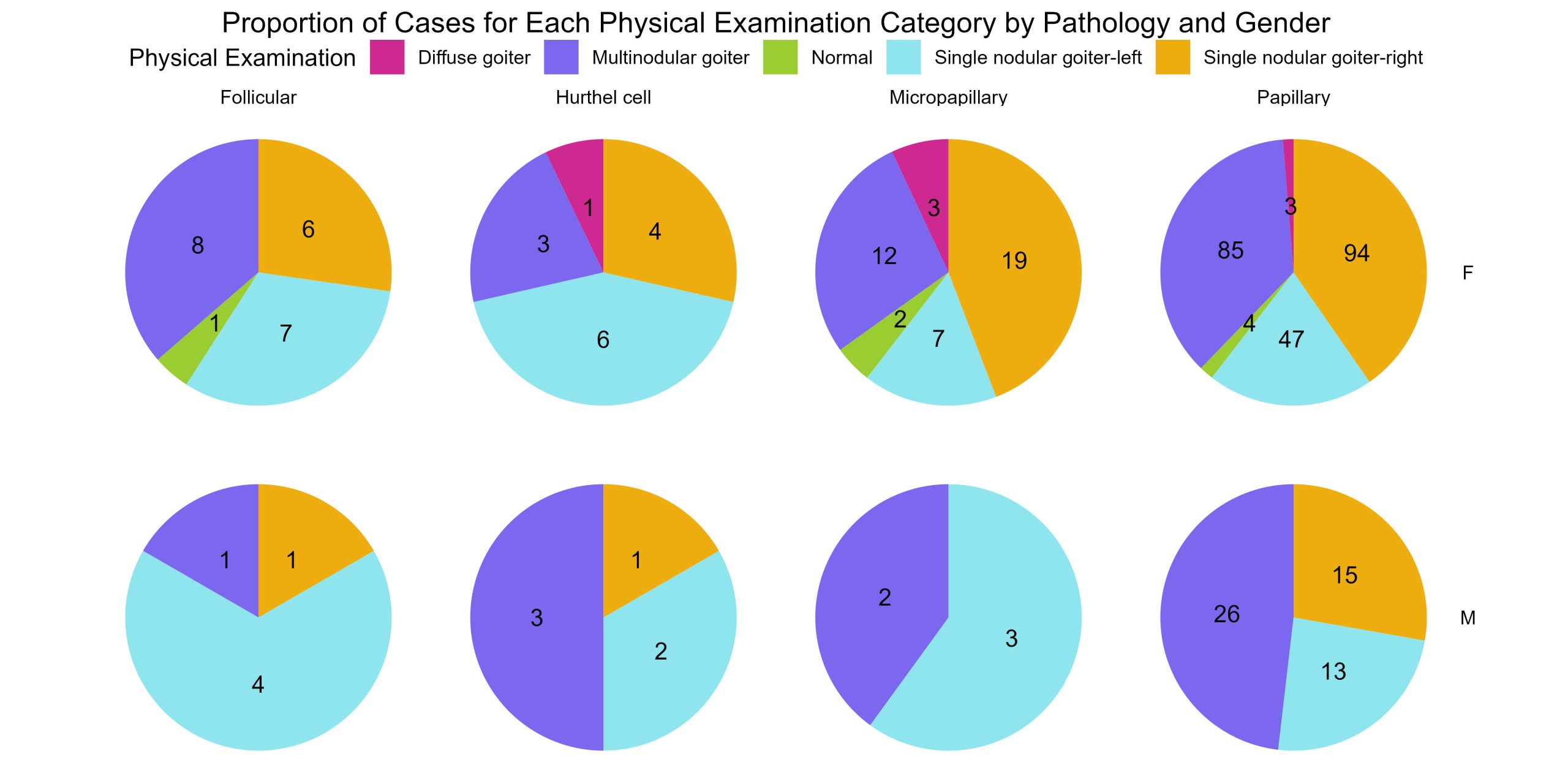
Give boxplots of age by gender for each physical diagnosis by pathology
The data wrangling grammar given by core packages in the tidyverse provide a crucial way to group and organise your data to visualise trends, counts, and proportions more simply with compelling, succinct visualisations.
A prime example of this would be to create a series of boxplots. The series of 8 piecharts you just generated in the last exercise show the proportions of physical examination categories for each pathology for each Gender. But every patient in this dataset is not the same age. It would be important to know age demographics as well. Create a series of boxplots showing the age by gender for each physical examination category for each cancer pathology. This is a series of 16 boxplots.
This time we need to use boxplots instead of piecharts or frequency histograms because we want to show the range of ages by gender for each group of categories.
thyroid.age.boxplots <- thyroid.data %>%
ggplot(aes(x = Gender, y = Age, fill = Gender)) +
geom_boxplot() +
facet_grid(Pathology ~ Physical.Examination) +
theme(axis.text.x = element_text(angle = 45, hjust = 1)) +
labs(x = "Gender", y = "Age", fill = "Gender", title = "Boxplots of Age by Gender for Each Physical Examination Category by Pathology")
print (thyroid.age.boxplots)
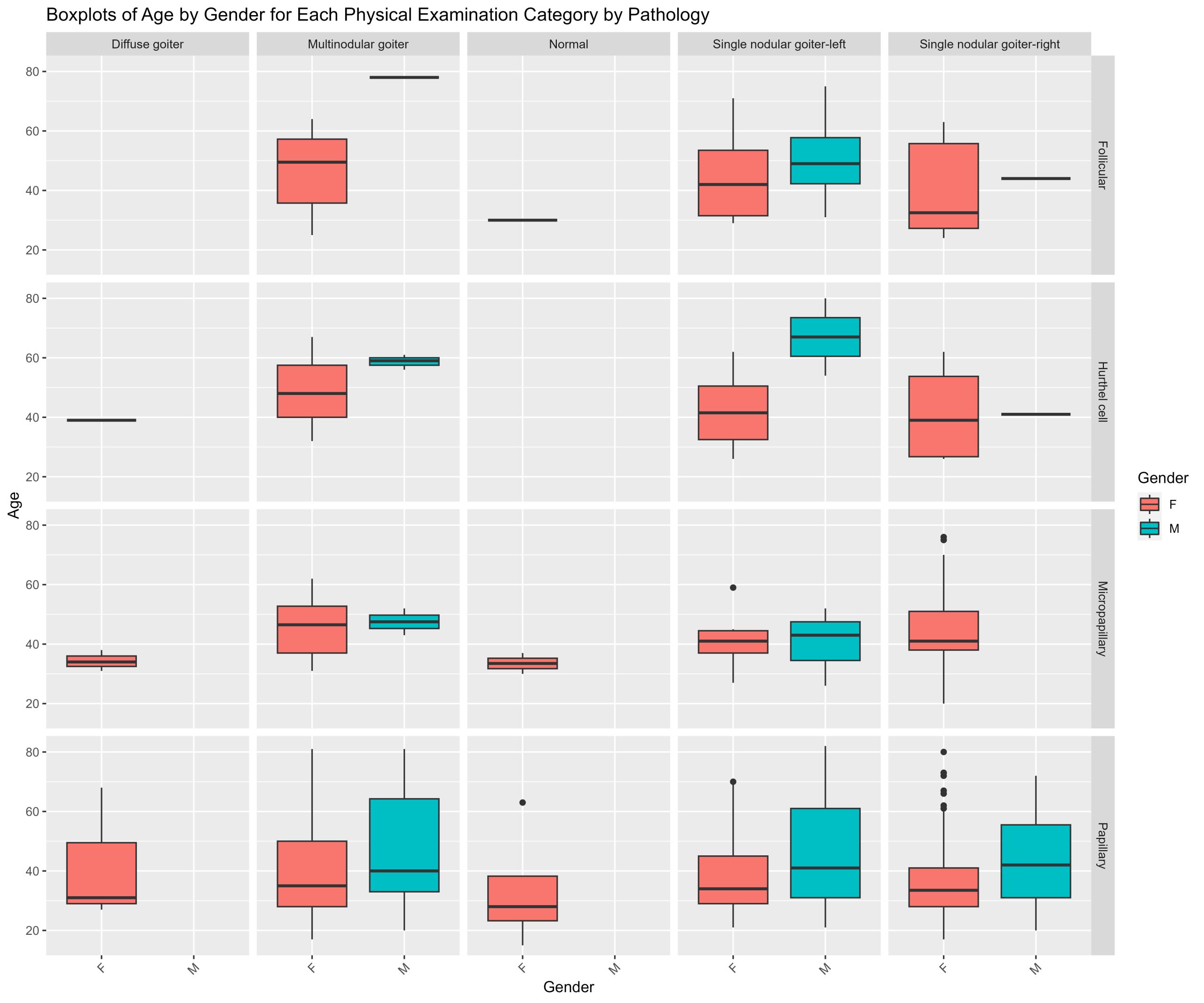
Pie charts for each feature
Although you could prepare a series of counts, prorportions or boxplots for various combinations of features nested together. One critical step is to understand what your features are, what the categorical information contained in each feature means, and what proportions of your data are found across each feature. You can accomplish this by creating pie charts for every feature except for patient age. Though you would probably perform this at the beginning before you undertake your own analysis of a categorical dataset, this process is a little more complicated so we’re saving it for last. The process involves both a series of wrangling operations and visualisation tools.
It’s from exploratory analyses like the plots generated in this grid of pie charts that chaining feature information from pathology, gender, physical examination, and age seemed interesting!
data_without_age <- thyroid.data[ , !(names(thyroid.data) %in% "Age")]
plot_list <- list()
for (column_name in names(data_without_age)) {
proportions <- data_without_age %>%
group_by(.data[[column_name]]) %>%
summarise(n = n()) %>%
mutate(prop = n / sum(n))
pie_chart <- ggplot(proportions, aes(x = "", y = prop, fill = .data[[column_name]])) +
geom_bar(width = 1, stat = "identity") +
coord_polar("y", start = 0) +
labs(title = paste("Pie Chart for", column_name), x = NULL, y = NULL, fill = column_name) +
theme(plot.margin = margin (1,1,1,1, "cm"))+
theme_void()
plot_list[[column_name]] <- pie_chart
}
plotgrid <- grid.arrange(grobs = plot_list, ncol = 4, returnGrob= TRUE)
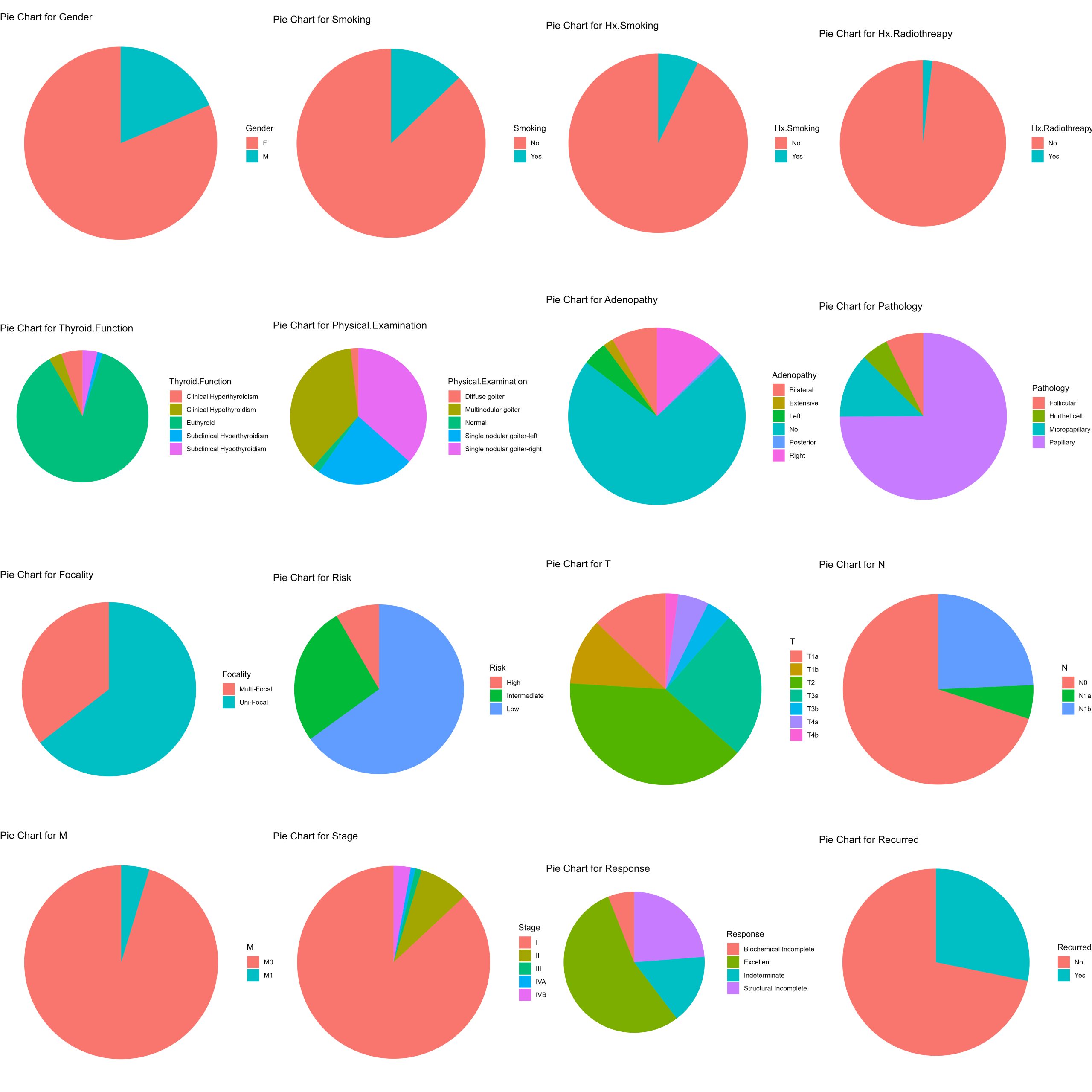
Files to download:
To download, right-click and press “Save File As” or “Download Linked File”
- Thyroid_Diff.csv
N05: High Dimensional Data
Maheshwar Panday
Wisconsin Breast Cancer Data: Analyzing High Dimensional Data
You are a pathologist and have taken the measurements of 569 nuclei of cells from needle aspirates of breast tissue masses. Samples come from either benign (B) or malignant (M) masses. You would like to perform an analysis of the cell shapes and sizes between the malignant and benign cells to better understand the differences between them. You would also like to explore using machine learning to see how well simple clustering algorithms can identify benign cells from malignant ones based SOLELY on their size and shape features. Using the Wisconsin Breast Cancer Dataset
———– Text from Kaggle ——————– The breast cancer data includes 569 examples of cancer biopsies, each with 32 features. One feature is an identification number, another is the cancer diagnosis and 30 are numeric-valued laboratory measurements. The diagnosis is coded as “M” to indicate malignant or “B” to indicate benign.
The other 30 numeric measurements comprise the mean, standard error and worst (i.e. largest) value for 10 different characteristics of the digitized cell nuclei, which are as follows:-
Radius Texture Perimeter Area Smoothness Compactness Concavity Concave Points Symmetry Fractal dimension ——————– Dataset Link Below ————— Breast Cancer Dataset available from : https://archive.ics.uci.edu/dataset/17/breast+cancer+wisconsin+diagnostic
for further reading on the Wisconsin Breast Cancer Dataset,specifically how each of the features in this dataset were calculated, please consult:
Street, W.N., Wolberg, W.H., & Mangasarian, O.L. (1993). Nuclear feature extraction for breast tumor diagnosis. Electronic imaging.
(1) Loading packages for statistics, clustering, dimensionality reduction and data visualisation
Install and load the following packages into R
library(dabestr)
library(ggplot2)
library(pheatmap)
library(tidyverse)
library(dplyr)
library(stats)
library(RColorBrewer)
library(Rtsne)
Download the dataset from the UCI Machine Learning Repository. Load the csv file of measurements into RStudio
BreastCancer.Data <- read.csv("WisconsinBreastCancerData.csv")
BreastCancer.Data$X <- NULL
print (head(BreastCancer.Data))
(3) Prepare the dataframes for tsne and subsequent clustering
The entire BreastCancer.Data dataframe is structured such that each row is a cell and each column is a parameter. However, there are certain columns that are not features (quantitative descriptions of the cells). When a column is not a feature, it’s a label. Labels are ways to identify or tag specific cells once we understand how they are characterised by their features.
Before we can explore the dataset, we need to separate the labels from the features.There are two columns in the dataframe that label the cells – id -> the unique identification number assigned to a cell – diagnosis -> whether the cell is from a benign (B) or malignant (M) Sample)
The remaining columns are features that serve as quantitative descriptions of the cell sizes and shapes
- Your first task with these data is to subset the entire Breast Cancer Dataframe into two dataframes
- Diagnostic.Labels – which will contain the labels
- Diagnostic.Features – which will contain the features
- Because the magnitudes of the measures range over difference scales, you need to bring your data into a common space to allow for variations and differences to become apparent across features for the entire dataset. Z-score your dataset using the scale() operation in R on your Diagnostic.Features
Diagnostic.Labels <- select(BreastCancer.Data, id, diagnosis)
feature.columns <- setdiff (colnames(BreastCancer.Data), colnames(Diagnostic.Labels))
Diagnostic.Features <- BreastCancer.Data[, feature.columns]
Diagnostic.Features.Scored <- scale(Diagnostic.Features)
view(Diagnostic.Features.Scored)
print (colnames(Diagnostic.Features.Scored)
(4) Explore the dataset using tsne
Tsne or T-distributed Stochastic Neighbour Embedding is a technique used to visualise high-dimensional data in 2 dimensions. Termed a dimensionality-reduction method, it allows us to explore the data one feature at a time. In this breast cancer dataset, there are 32 measures that describe the size, shape, and texture of masses in breast tissue that then go on to be either benign (B) or malignant (M).
For further reading on T-sne, please consult : Van der Maaten, L., Hinton, G. Visualizing Data using T-sne. Journal of Machine Learning Research 9 (2008) 2579-2605
Let’s use tsne to visualise how these features are distributed across the dataset.
N.B. I ran this for loop of seed by perplexity combinations because it is important to test these parameters when wrorking with T-sne. The perplexity controls how much of the local vs. global data structure elements contribute to the final visualisation as the data pass through dimensionality reduction. Variations in perplexity for the same random seed can have very dramatic effects on the final visualisation despite the data not changing.
perplexities <- c(10, 15, 20, 25, 30)
seeds <- c(123, 456, 789, 246, 135 )
tsne_data <- data.frame()
for (i in 1:length(perplexities)) {
for (j in 1:length(seeds)) {
tsne_model <- Rtsne(Diagnostic.Features.Scored, perplexity = perplexities[i], seed = seeds[j])
tsne_temp <- data.frame(
tSNE1 = tsne_model$Y[, 1],
tSNE2 = tsne_model$Y[, 2],
Perplexity = perplexities[i],
Seed = seeds[j],
Diagnosis = Diagnostic.Labels$diagnosis
)
tsne_data <- rbind(tsne_data, tsne_temp)
}
}
tsne.stampcollection <- ggplot(tsne_data, aes(x = tSNE1, y = tSNE2, colour = Diagnosis)) +
geom_point() +
facet_wrap(Perplexity ~ Seed, scales = "free") +
theme_bw()
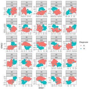
(4) Student exercise – tsne to explore benign vs malignant cells using dimensionality reduction
Use the following parameters in your initial tsne: – seed <- 789 – perplexity <- 30
Construct a T-sne map of the Diagnostic.Features dataframe. Plot the resulting T-sne map using ggplot making sure to colour the points by their diagnosis label. What do you notice about the T-sne map when it’s annotated by diagnosis?
As an exercise – vary the perplexity for the seed of 789, try ranging from 10 to 50 by skips of 10. What do you notice about the T-sne map as you vary the perplexity? What do you think the perplexity parameter controls in the T-sne algorithm?
set.seed (789)
perplexity <- 30
seed <- 789
tsne_model <- Rtsne(Diagnostic.Features.Scored, perplexity = perplexity, seed = seed)
tsne_data <- data.frame(
tSNE1 = tsne_model$Y[, 1],
tSNE2 = tsne_model$Y[, 2],
Diagnosis = Diagnostic.Labels$diagnosis
)
library(ggplot2)
tsne.by.diagnosis <- ggplot(tsne_data, aes(x = tSNE1, y = tSNE2, colour = Diagnosis)) +
geom_point() +
labs( x = "T-SNE Component 1", y= "T-SNE Component 2")
theme_bw()
print(tsne.by.diagnosis)
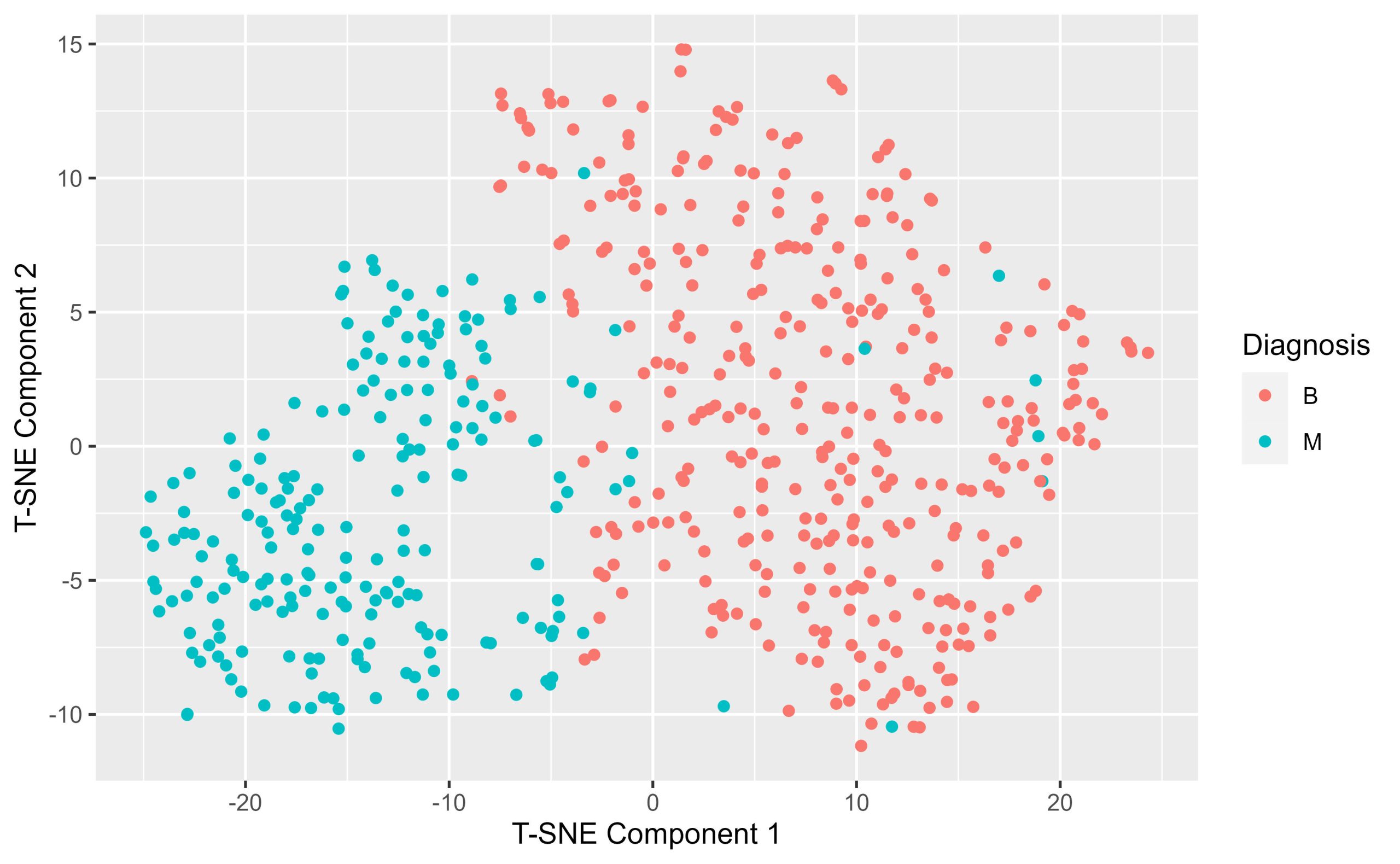
(5) Hierarchical clustering of malignant samples
What if there were a way to readily identify cells as being benign or malignant depending on their size and shape parameters? Clustering algorithms are an example of a data-driven approach to grouping your data together based on the patterns present in the features. Of course, the data contain labels, but what if you clustered on the feature values, the measurements, without providing any information about the cell diagnosis? Select 2 clusters – we want to see whether hierarchical clustering separates benign vs malignant cells based on their shapes and size information only.
The steps to performing hierarchical clustering are as follows : 1.construct a dissimilarity matrix of the z-scored features. Use Euclidean Distances 2.call the hclust function on the dissimilarity matrix and specify the method is ward.D2 3.annotate the dendrogram to show where the data are partitioned into clusters 4. visualise the results of your clustering by constructing a heatmap of the dissimilarity matrix organised with an annotated surrounded dendrogram.
num.clusters <- 2
dissimilarity.matrix <- dist(Diagnostic.Features.Scored, method = "euclidean")
h.clusters <- hclust(dissimilarity.matrix, method = "ward.D2")
clusters <- cutree(h.clusters, k = num.clusters)
All.Samples.zscored <- cbind(Diagnostic.Labels,
Diagnostic.Features.Scored)
All.Samples.zscored$hclust_clusters <- clusters
annotation.df <- data.frame(Cluster = as.factor(clusters))
rownames(annotation.df) <- rownames(Diagnostic.Features)
k.cluster.colourpalette <- c("olivedrab2", "maroon3")
colourmapping <- setNames(k.cluster.colourpalette, levels (annotation.df$Cluster))
annotation.colours = list(Cluster = k.cluster.colourpalette)
names(annotation.colours$Cluster) <- levels(annotation.df$Cluster)
div.spectral.red.blue <- c("#4a100e", "#731331", "#a52747", "#c65154", "#e47961", "#f0a882", "#fad4ac", "#ffffff",
"#bce2cf", "#89c0c4", "#5793b9", "#397aa8", "#1c5796", "#163771", "#10194d" )
div.spectral.blue.red <- rev(div.spectral.red.blue)
continuous.spectral.redblue <- colorRampPalette(div.spectral.red.blue) (256)
continuous.spectral.bluered <- colorRampPalette(div.spectral.blue.red)(256)
palette.breaks <- seq(from= 0, to = 8, length.out = length (continuous.spectral.redblue) + 1)
hclust.dissimilarity.heatmap <- pheatmap(dissimilarity.matrix,
cluster_rows = h.clusters,
cluster_cols = h.clusters,
annotation_row = annotation.df,
annotation_colors = annotation.colours,
color = continuous.spectral.redblue,
breaks = palette.breaks)
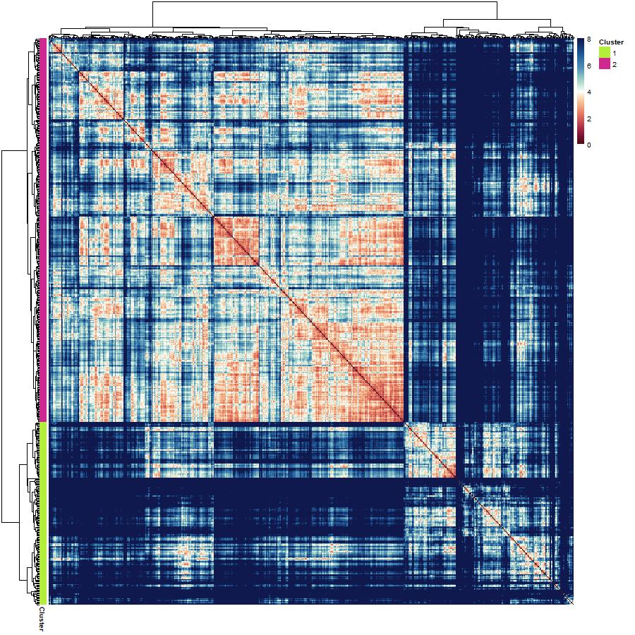
(6) Inspecting the results of your hierarchical clustering :
You have just produced a hierarchical clustering result. You can visualise the clustering with a heatmap with an annotated surrounding dendrogram, but that doesn’t tell you about which cells were relegated into which cluster. You can also produce a stacked proportion barplot that shows you the proportion of benign and malignant cells in a cluster.
- prepare a dataframe of proportions – group the data by cluster and diagnosis and calculate percentages.
- prepare a stacked proportion barplot using ggplot and geom_bar element. Based on the results of the clustering how well did hierarchical clustering do in clustering benign and malignant cells apart from each other?
library(dplyr)
All.Samples.zscored.grouped <- All.Samples.zscored %>%
group_by(hclust_clusters, diagnosis) %>%
summarise(n = n()) %>%
mutate(freq = n / sum(n))
view (All.Samples.zscored.grouped)
Hclust.barplot <- ggplot(All.Samples.zscored.grouped, aes(fill=diagnosis, y=freq, x=hclust_clusters)) +
geom_bar(position="fill", stat="identity") +
theme_minimal() +
labs(x="Cluster", y="Proportion", fill="Diagnosis") +
scale_x_continuous(breaks = c(1,2))+
theme(axis.text.x = element_text(angle = 90, hjust = 1))
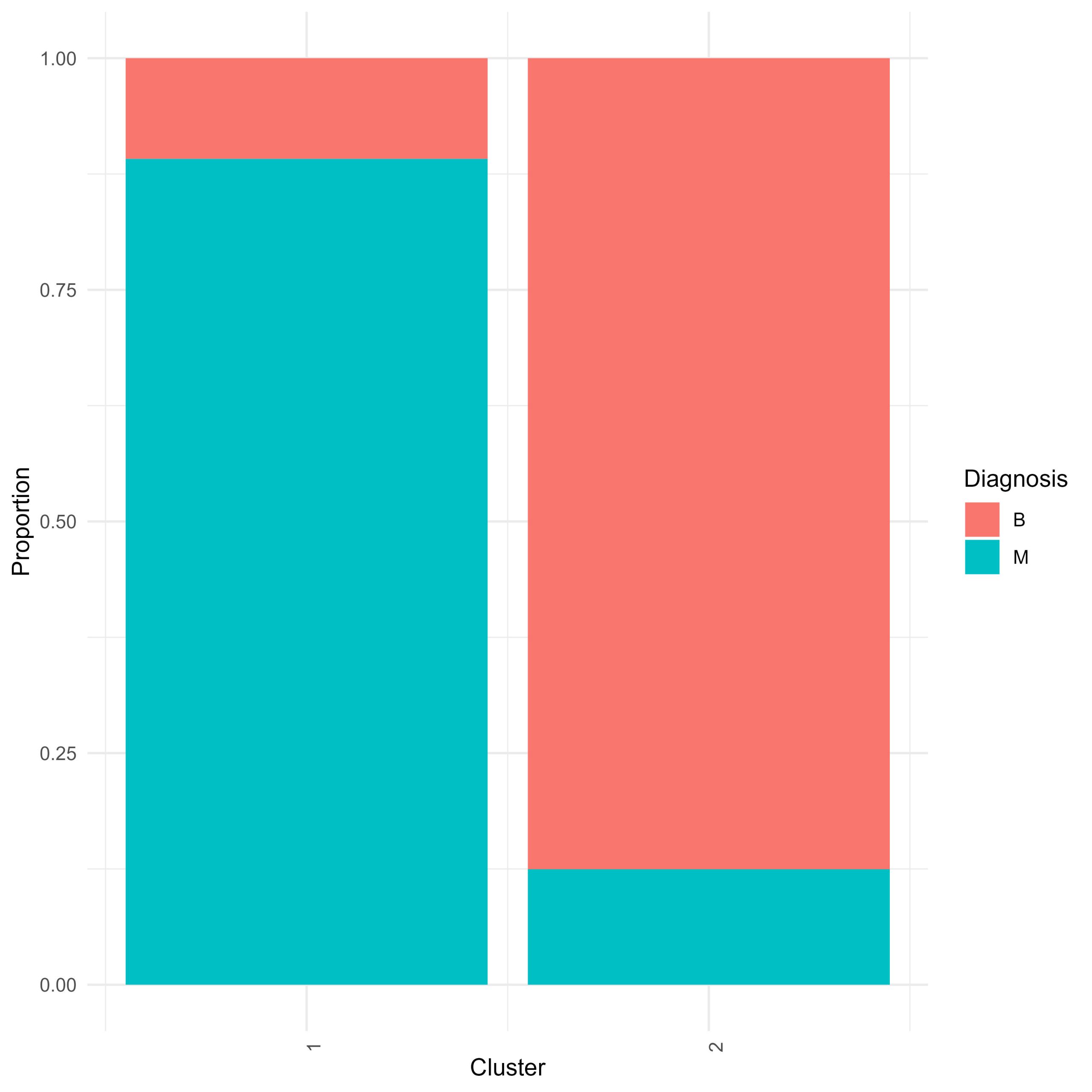
– Student Question – Across the features in your dataframe there are patterns in those data that can distinguish benign from malignant cells. You want to assess how different the benign and malignant cells are.
(9) Compare the Hierarchical Clustering to Diagnosis Labels with Dimensionality Reduction
Another way to interrogate how well clustering assigned clusters based on diagnosis label is to annotate the T-SNE plot you constructed earlier but this time instead of colouring the points by their known diagnosis label, you can annotate by their hierarchically-defined clusters.
Use the same perplexity and random seed as before.This way you can compare how the hclust clusters map on to the high dimensional space against how the diagnostic labels map onto the same space. When comparing tsne maps annotated by diagnosis, and by hclust cluster, what do you notice? What similarities and differences stand out to you?
set.seed (789)
perplexity <- 30
seed <- 789
tsne_model <- Rtsne(Diagnostic.Features.Scored, perplexity = perplexity, seed = seed)
tsne_data <- data.frame(
tSNE1 = tsne_model$Y[, 1],
tSNE2 = tsne_model$Y[, 2],
hclust_cluster = as.factor(All.Samples.zscored$hclust_clusters)
)
view( tsne_data)
library(ggplot2)
hclust.colours <- c("maroon3", "olivedrab2")
tsne.by.hcluster <- ggplot(tsne_data, aes(x = tSNE1, y = tSNE2, colour = hclust_cluster)) +
geom_point() +
labs( x = "T-SNE Component 1", y= "T-SNE Component 2") +
theme_bw() +
scale_color_manual(values = hclust.colours)
print(tsne.by.hcluster)
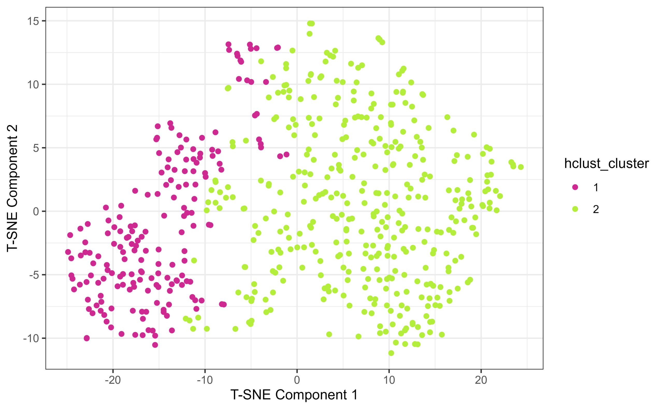
(10) Some final food for thought
(something for students to think about – can be made into a discussion about clustering algorithms, and why it’s important to verify and validate clustering outputs)
You compared the true diagnostic labels for breast cancer cells – benign and malignant to hierarchical clusters constructed solely from size and shape features. Based on how well the clustering algorithm separated benign and malignant cells, think about how useful this approach would have been if you did not know a priori that the cells were classified into benign and malignant diagnostic categories. After you clustered them into two groups and compared their statistics, what would you need to do to confirm the cells of one cluster being malignant and the others are benign?
Files to Download:
- WisconsinBreastCancerData.csv
B01: Bedbug Female Fitness
Brendan McEwen
Bedbug Female Fitness
You are an evolutionary biologist studying sexual conflict and the effect of mating frequency on female lifetime fitness. Your study system is the notorious bedbug Climex lectularis. Bedbugs live in mixed-sex aggregations where females are subject to frequent reproductive harassment from males. Due to this reproductive harassment, females vary in their mating rates in natural groups where some females mate relatively infrequently, and others mate much more frequently. Higher mating rates for females increase the number of offspring produced per unit time, but may impose a longevity penalty as the physical process of reproduction is costly. This trade-off begs the question of whether variation in mating rate leads to a change overall lifetime fitness (number of viable offspring produced). To answer this question, you subjected females to a high-frequency (High) or low-frequency (Low) mating frequency treatment (Treatment). You counted the number of total viable offspring each female produced in her lifetime (Hatchlings), as well as her total lifetime in days (Longevity). You recorded your results in the dataframe held in “femalefitness.csv”.
- Load the data. Create a new column called FemaleID, which contains a unique identifier label for each row. Rearrange the columns so that FemaleID is the left-most column of the dataframe.
An interactive H5P element has been excluded from this version of the text. You can view it online here:
https://ecampusontario.pressbooks.pub/radpnb/?p=79#h5p-11
- Produce two boxplots:
- One in base r graphics, showing the variation in hatchlings produced by low-frequency mating females versus high-frequency mating females
- One in ggplot, showing the variation in longevity of low-frequency mating females versus high-frequency mating females. Distinguish between treatments such that the low-frequency female box is light green, and the high frequency mating box is light blue
An interactive H5P element has been excluded from this version of the text. You can view it online here:
https://ecampusontario.pressbooks.pub/radpnb/?p=79#h5p-12
- Create separate histograms of hatchlings produced for the Low and High mating frequency treatment females. Adjust the x-axis limits so that the histograms are printed on the same scale
An interactive H5P element has been excluded from this version of the text. You can view it online here:
https://ecampusontario.pressbooks.pub/radpnb/?p=79#h5p-13
- Using the simplest possible statistical test that is appropriate for this scenario, test whether mating rate has an effect on female lifetime fitness. Verbally explain the null hypothesis, and give an inferential statement for your result.
An interactive H5P element has been excluded from this version of the text. You can view it online here:
https://ecampusontario.pressbooks.pub/radpnb/?p=79#h5p-14
- Using the simplest possible statistical test that is appropriate for this scenario, test whether mating rate has an effect on female longevity
An interactive H5P element has been excluded from this version of the text. You can view it online here:
https://ecampusontario.pressbooks.pub/radpnb/?p=79#h5p-15
- Compute the odds ratio between a female in the low mating frequency treatment living past 70 days versus a female in the High mating frequency treatment living past 70 days. Give a verbal explanation of what this actually ‘means’. An interactive H5P element has been excluded from this version of the text. You can view it online here:
https://ecampusontario.pressbooks.pub/radpnb/?p=79#h5p-16
Files to download:
To download, right-click and press “Save File As” or “Download Linked File”
- femalefitness.csv
Laboratory and Institution or PI
Cognitive Ecology Lab, Dr. Reuven Dukas, McMaster University Department of Psychology, Neuroscience, & Behaviour https://psych.mcmaster.ca/dukas/index.htm
References and Further Reading
Yan, J. L., & Dukas, R. (2022). The social consequences of sexual conflict in bed bugs: social networks and sexual attraction. Animal Behaviour, 192, 109-117.
Parker, G. A. (2006). Sexual conflict over mating and fertilization: an overview. Philosophical Transactions of the Royal Society B: Biological Sciences, 361(1466), 235-259.
Maklakov, A. A., Bilde, T., & Lubin, Y. (2005). Sexual conflict in the wild: elevated mating rate reduces female lifetime reproductive success. the american naturalist, 165(S5), S38-S45.
Brendan McEwen
Frog Aggression
You are behavioural ecologist interested in territoriality and aggression in frogs. The brilliant-thighed poison frog Allobates femoralis relies on the presence of small pools of water for their reproduction. Males of this species engage in territorial competition to secure areas that contain these pools of water. It is unknown, however, at which point in the frogs’ development the territorial behaviour emerges. To test this, you traveled to a field site in eastern Ecuador and captured 50 A. femoralis of various developmental stages. You recorded each frog’s sex, measured each frog’s Snout-Vent Length (SVL; in mm), then subjected the frogs to a mirror test. In the mirror test, you recorded whether they expressed aggressive behaviours (e.g. lunges, bites, or grappling) towards their reflections on the mirror.
Note: This scenario involves a more advanced statistical analysis known as ‘Logistic Regression’, not covered in either Descriptive or Inferential Statistics. The general premise of Logistic Regression is to determine whether a predictor variable has an effect on the outcome of a categorical response variable. In this scenario our categorical outcome is binary (no aggression, 0, versus aggression, 1). This makes this scenario more specifically a ‘Binomial Regression’, which is a subset of Logistic Regression. For a primer on how to conduct Binomial Regression in R, see:
https://bookdown.org/ndphillips/YaRrr/logistic-regression-with-glmfamily-binomial.html
- Load the data. Print the SVL range for males, and the SVL range for females
An interactive H5P element has been excluded from this version of the text. You can view it online here:
https://ecampusontario.pressbooks.pub/radpnb/?p=81#h5p-17
- Using the glm() command in R, determine whether there is an association between either sex or body size with aggressive behaviour in these frogs. Do not fit an interaction between body size and sex.
An interactive H5P element has been excluded from this version of the text. You can view it online here:
https://ecampusontario.pressbooks.pub/radpnb/?p=81#h5p-18
- For both sex and body size, write an inferential statement based on the results of your binomial regression model that included both sex and body size.
- Create a binomial regression model using only SVL as a predictor variable, and save it into an object called ‘mod’.
An interactive H5P element has been excluded from this version of the text. You can view it online here:
https://ecampusontario.pressbooks.pub/radpnb/?p=81#h5p-19
- Using Base R graphics, plot the predicted values for a vector of theoretical snout-vent lengths of 5mm to 30mm, using the SVL Binomial Regression model
An interactive H5P element has been excluded from this version of the text. You can view it online here:
https://ecampusontario.pressbooks.pub/radpnb/?p=81#h5p-20
Files to download:
To download, right-click and press “Save File As” or “Download Linked File”
- FrogAggro.csv
Laboratory and Institution or PI
Behavioural and Sensory Ecology Lab, Dr. James B. Barnett, Department of Zoology, Trinity College Dublin, Ireland
References and Further Reading
Chaloupka, S., Peignier, M., Stückler, S., Araya-Ajoy, Y., Walsh, P., Ringler, M., & Ringler, E. (2022). Repeatable territorial aggression in a Neotropical poison frog. Frontiers in ecology and evolution, 10, 881387.
Rodríguez, C., Fusani, L., Raboisson, G., Hödl, W., Ringler, E., & Canoine, V. (2022). Androgen responsiveness to simulated territorial intrusions in Allobates femoralis males: evidence supporting the challenge hypothesis in a territorial frog. General and comparative endocrinology, 326, 114046.
Brendan McEwen
Frog Colouration
You are a visual ecologist studying warning colouration and mimicry in poison dart frogs. Your study system is the toxic Ameerega bilinguis and the non-toxic Allobates zaparo, a pair of sympatric terrestrial frog species native to the Ecuadorian Amazon. Ameerega bilinguis utilizes a multi-component warning signal, with a red dorsum, bright yellow limb-pit spots, and a bright blue belly. Allobates zaparo has evolved to mimic this colouration, but exhibits ‘imperfect mimicry’ – the exact quantitative properties of the color components are not perfectly matched. You collected 20 adult individuals of each species from the field and took color-calibrated photographs of each of their body regions. You then used the micaToolbox in ImageJ to simulate avian vision and compute the strength of the chromatic (i.e. hue) and achromatic (i.e. brightness) contrast of each of four color components (Front Spots, Back Spots, Dorsum, Venter) against a natural leaf-litter background, for each species. Visual contrast values are presented in the unit of ‘JND’, or ‘Just Noticeable Difference’, where higher values indicate that the color patch contrasts more strongly with the background. In other words, higher values mean that signal component is more conspicuous.
- Load the data. Create histograms for chromatic and achromatic contrast each component (Front Spot, Back Spot, Dorsum, Venter) with both species’ data laid on the same panel (2 total figures; 4 panels per figure, 16 total histograms).
- Use the facet_wrap() layer in ggplot2 to create a separate panel for each colour region in the same figure
- Make the model Am. bilinguis’ fill turquoise, and the mimic Al. zaparo’s fill red.
- Make both species’ fills semi-transparent so any potential distribution overlap is apparent
- Label the x-axis “Color Contrast (JND)” and “Luminance Contrast (JND)” respectively
An interactive H5P element has been excluded from this version of the text. You can view it online here:
https://ecampusontario.pressbooks.pub/radpnb/?p=83#h5p-21
- Using the ddply() function (package: “plyr”) to create a summary dataframe for each of color and luminance contrast values, with columns of Species, Component, and n, as well as mean JND, sd, se, Ci.lwr, and Ci.upr values for both chromatic and achromatic contrast
An interactive H5P element has been excluded from this version of the text. You can view it online here:
https://ecampusontario.pressbooks.pub/radpnb/?p=83#h5p-22
- Using the summary dataframe, create a figure visualizing the mean chromatic (x-axis) and achromatic (y-axis) contrasts of each species’ signal components
- Use the ggplot package to create a scatter plot
- Color the dots by species, with the model in cyan and mimic in red
- Separate the colour regions by dot shape
- Create a vertical dashed line and a horizontal dashed line, each with intercept = 3
- Make the x and y scale identical, to show relationship between achromatic and chromatic contrast values
- Save the plot as “AvianBackgroundContrasts”
An interactive H5P element has been excluded from this version of the text. You can view it online here:
https://ecampusontario.pressbooks.pub/radpnb/?p=83#h5p-23
- Perform a pair of factorial anovas (1 for each chromatic and achromatic contrast) to determine whether background contrast is affected by signal component, species, or an interaction between the two.
- Using the histogram figures as guides, compute follow-up LSD t-tests between model and mimic for regions that appear to differ in their background contrast by species. Report directional differences, i.e. directional imperfect mimicry by zaparo.
An interactive H5P element has been excluded from this version of the text. You can view it online here:
https://ecampusontario.pressbooks.pub/radpnb/?p=83#h5p-24
Files to download:
To download, right-click and press “Save File As” or “Download Linked File”
- FrogJNDs.csv
Laboratory and Institution or PI
Behavioural and Sensory Ecology Lab; Dr. James Barnett @ Trinity College Dublin
https://www.jbbarnett.co.uk/
References and Further Reading
McEwen, B.L., Yeager, J.D., Kinley, I., Anderson, H.M., Barnett, J.B.B. (Under Review). Body posture and viewing angle modulate detectability and mimic fidelity in a poison frog system.
Darst, C. R., & Cummings, M. E. (2006). Predator learning favours mimicry of a less-toxic model in poison frogs. Nature, 440(7081), 208-211.
Stevens M, Párraga CA, Cuthill IC, Partridge JC, Troscianko TS. (2007). Using digital photography to study animal coloration. Biol. J. Linn. 90, 211-237
Brendan McEwen
Invasive Lizards
You are a herpetologist interested in biological invasions in urban habiats. The brown anole Anolis sagrei is invasive to Southern Florida, where it now competes with the native green anole Anolis carolinensis. Males of both species fight over territory in their now shared habitat. The males aggressively signal using a series of pushups to display their physical condition to other males. Males that perform more pushups are deemed more aggressive than males who perform fewer pushups You are wondering whether the invasive brown anoles are better space competitors than the native green anoles, and whether space competition in these species is linked to their aggressive behaviour. To test this, you transported wild-captured individuals of both species to the lab. You administered three rounds of an aggression assay, in which the lizard was presented with a mirror and recorded. Males perceive their reflection to be an intruder, and engage in pushup display behaviour. You recorded the number of pushups performed in each of three separate trials, then calculated an ‘average aggression’ level for each lizard. You then placed one native A. carolinensis and one invasive A. sagrei into an arena and recorded the area of space they occupied over the course of three days (cm3) in a variable called ‘space use’, as a measure of their ability to compete for space.
Analyze this dataset to see whether species ID or aggression level has an effect on space competition ability.
- Run the following chunk of code, unedited, to simulate this dataset
An interactive H5P element has been excluded from this version of the text. You can view it online here:
https://ecampusontario.pressbooks.pub/radpnb/?p=85#h5p-25
- Using the lm() command, create and analyze a statistical model that tests for the effect of species, aggression, and their interaction on square-root-transformed space use.
- Give a verbal inferential statement for each effect in this model
An interactive H5P element has been excluded from this version of the text. You can view it online here:
https://ecampusontario.pressbooks.pub/radpnb/?p=85#h5p-26
- Using ggplot, produce a plot with a histogram of the average aggression level for both green anoles and brown anoles on a single panel. Colour the green anole distribution green, and the brown anole distribution brown. Make the colours transparent so that overlap is visible.
An interactive H5P element has been excluded from this version of the text. You can view it online here:
https://ecampusontario.pressbooks.pub/radpnb/?p=85#h5p-27
- In base R plotting, Create a boxplot comparing space use occupied by green versus brown anoles. Again colour the green anole boxplot green, and the brown anole boxplot brown.
An interactive H5P element has been excluded from this version of the text. You can view it online here:
https://ecampusontario.pressbooks.pub/radpnb/?p=85#h5p-28
- In ggplot, create a scatterplot of space use as a function of average aggression. Add a colour factor, so that the dots are coloured according to their species label (green for green anoles, brown for brown anoles).
- Overlay a lm-based line of fit for each species, as well as a measure of estimated error for those lines of fit.
- Position your legend such that it appears in a convenient blank spot on the figure panel
An interactive H5P element has been excluded from this version of the text. You can view it online here:
https://ecampusontario.pressbooks.pub/radpnb/?p=85#h5p-29
Files to download:
To download, right-click and press “Save File As” or “Download Linked File”
- invasivelizards.csv
Laboratory and Institution or PI
Unpublished work – PhD Candidate Brendan McEwen
References and Further Reading
Farrell, W. J., & Wilczynski, W. (2006). Aggressive experience alters place preference in green anole lizards, Anolis carolinensis. Animal Behaviour, 71(5), 1155-1164.
Rodríguez, C., Fusani, L., Raboisson, G., Hödl, W., Ringler, E., & Canoine, V. (2022). Androgen responsiveness to simulated territorial intrusions in Allobates femoralis males: evidence supporting the challenge hypothesis in a territorial frog. General and comparative endocrinology, 326, 114046.
Brendan McEwen
Fly Sociality
You are a sociobiologist investigating the genetic basis of sociability in fruit flies. A genetic screening study has identified several ‘candidate genes’ that may play a role in regulating social behaviour in Drosophila melanogaster. You decide to investigate the candidate gene Sec5, by performing a knockdown experiment. Male and female cohorts of flies were subjected to RNA Interference Gene Silencing (RNAi), effectively eliminating Sec5 gene activity in those individuals. Another genetically un-altered cohort of males and females were kept as controls. You assembled groups of same-sex flies into sociability arenas, and tracked their aggregation behaviour over time. A ‘sociability index’ score was calculated for each group, where higher scores indicate that the flies were more closely aggregated towards one another – a stronger signal of social grouping.
Analyze this dataset to see whether males and females differ in their levels of sociality, and whether the silencing of the Sec5 gene affected sociality in either males or females
- Load in the data and use the head() command to preview the top of the dataframe
An interactive H5P element has been excluded from this version of the text. You can view it online here:
https://ecampusontario.pressbooks.pub/radpnb/?p=87#h5p-30
- Create a new column called condition, that represents the factorial combinations of Sex and Gene Treatment
An interactive H5P element has been excluded from this version of the text. You can view it online here:
https://ecampusontario.pressbooks.pub/radpnb/?p=87#h5p-31
- In GGplot, produce a set of sociality index histograms of the four condition combinations. Facet the panel by condition, such that all four conditions’ distributions are laid out on the plot at once.
An interactive H5P element has been excluded from this version of the text. You can view it online here:
https://ecampusontario.pressbooks.pub/radpnb/?p=87#h5p-32
- Using the lmer() function from the lme4 package, create a linear mixed model to determine whether Sex, Treatment, or their interaction have a significant effect on sociability index scores on the flies in your experiment. Use a Type III Sum-of-Squares approach to analyze your model, using the Anova() function from the car package in R. After constructing your model, check its diagnostics using the check_model() function from the performance package
- For information on linear mixed modeling, see: This Blog Post
- Also see: This Instructional Video
- Hint: the ‘Arena’, ‘Time’, and ‘Day’ variables should be present in your random effects.
- For a primer on Type I / II / III Sums-of-Squares ANOVA analyses, see: This Blog Post
An interactive H5P element has been excluded from this version of the text. You can view it online here:
https://ecampusontario.pressbooks.pub/radpnb/?p=87#h5p-33
- Using GGplot, produce a rainplot showing the sociability scores of each of the four condition combinations
An interactive H5P element has been excluded from this version of the text. You can view it online here:
https://ecampusontario.pressbooks.pub/radpnb/?p=87#h5p-34
Files to download:
To download, right-click and press “Save File As” or “Download Linked File”
- FlySociality.csv
Laboratory and Institution or PI
Cognitive Ecology Lab, Dr. Reuven Dukas, McMaster University Department of Psychology, Neuroscience, & Behaviour https://psych.mcmaster.ca/dukas/index.htm
References and Further Reading
Torabi-Marashi, A. (2023). Investigating the genetic basis of natural variation in sociability within Drosophila melanogaster (Doctoral dissertation)
Scott, A. M., Dworkin, I., & Dukas, R. (2022). Evolution of sociability by artificial selection. Evolution, 76(3), 541-553
B06: Learning Outcomes of Subordinate Fish
Sina Zarini
Learning Outcomes of Subordinate Fish
As a behavioural ecologist at the Hamilton Research Institute, you are delving into the interesting social dynamics of Neolamprologus pulcher, the group-living cichlid fish native to Lake Tanganyika in Africa. Your primary objective is to explore the impact of social rank on learning abilities within N. pulcher groups. In this captivating study, each social unit of N. pulcher comprises two dominant breeders and a varying number of subordinate helpers, often reaching up to 20 individuals. Your research unfolds through a series of three experiments, all documented in a comprehensive dataset. The dataset encompasses key variables, including fish ID, sex, size, and three critical aspects of learning:
Initial Learning (Experiment 1): Fish were individually trained to move a coloured disc (blue) to uncover a hidden food source. Data are in clomun “LearnedInitial”.
Associate Learning (Experiment 2): A second disc, coloured yellow and immovable, was introduced to evaluate the fish’s ability to associate it with food. Data are in column “LearnedAssos”.
Reverse Learning (Experiment 3): In this experiment, the colour of the disc that could be moved was switched, challenging the fish to adapt and reverse their learned behaviour. Data are in column “LearnedReverse”.
1. Dominant Fish Length:
- What is the median length of dominant fish?
- What is the range of lengths for dominant fish?
- What is the mean length of dominant fish?
- Please create a histogram to visually explore the length distribution of dominant fish.
An interactive H5P element has been excluded from this version of the text. You can view it online here:
https://ecampusontario.pressbooks.pub/radpnb/?p=89#h5p-35
2. Subordinate Fish Length:
- What is the median length of subordinate fish?
- What is the range of subordinate fish lengths?
- What is the mean length of subordinate fish?
- Generate a histogram illustrating the length distribution of subordinate fish.
An interactive H5P element has been excluded from this version of the text. You can view it online here:
https://ecampusontario.pressbooks.pub/radpnb/?p=89#h5p-36
3. Learning Outcomes for Dominant Fish:
- What percentage of dominant fish successfully learned the initial task?
- What percentage of dominant fish successfully associated the yellow disc with food?
- What percentage of dominant fish successfully reversed their learning?
- Create bar plots to visually represent the percentages of dominant fish that successfully learned the initial task, associated the yellow disc with food, and reversed their learning. Use shades of red for clarity.
An interactive H5P element has been excluded from this version of the text. You can view it online here:
https://ecampusontario.pressbooks.pub/radpnb/?p=89#h5p-37
4. Learning Outcomes for Subordinate Fish:
- What percentage of subordinate fish successfully learned the initial task?
- What percentage of subordinate fish successfully associated the yellow disc with food?
- What percentage of subordinate fish successfully reversed their learning?
- Generate bar plots indicating the percentages of subordinate fish achieving successful outcomes in learning tasks. Visualize the data using shades of blue.
An interactive H5P element has been excluded from this version of the text. You can view it online here:
https://ecampusontario.pressbooks.pub/radpnb/?p=89#h5p-38
5. Size Differences:
- Is the length distribution of fish normal? (Conduct a normality test)
- Based on normality results, what statistical test would be appropriate to examine significant differences in fish lengths between dominants and subordinates? Run the test and report the result.
- Please provide a boxplot to compare the length distributions of dominant and subordinate fish.
An interactive H5P element has been excluded from this version of the text. You can view it online here:
https://ecampusontario.pressbooks.pub/radpnb/?p=89#h5p-39
Files to Download:
- b06_simulated_learningdataset.csv
Sina Zarini
Fish Diet
As a researcher investigating the dietary habits of juvenile round goby (Neogobius melanostomus) in Hamilton Harbour, you’re delving into the intricacies of their feeding behavior during both day and night. Round goby, a small freshwater fish native to Eurasia, has become established in various regions across North America, including the Great Lakes. These goby, known for their voracious appetites and adaptability, play a significant role in local ecosystems as both predators and prey.
In Hamilton Harbour, juvenile round goby primarily prey on two main types of organisms: cladocerans and rotifers. Your dataset provides valuable insights into the stomach contents of these juveniles, revealing their consumption patterns across different times of the day. Recorded variables include the fish ID, the time of collection, and the quantities of cladocerans and rotifers found in each fish’s stomach.
1. Cladoceran and Rotifer Consumption:
- What is the median number of cladocerans consumed by the juvenile round goby?
- What is the range of the number of cladocerans consumed?
- What is the mean number of rotifers consumed by the juvenile round goby?
- Generate boxplots to visually explore the distribution of cladoceran and rotifer consumption by the juvenile round goby.
An interactive H5P element has been excluded from this version of the text. You can view it online here:
https://ecampusontario.pressbooks.pub/radpnb/?p=91#h5p-40
2. Day and Night Feeding Patterns:
- What is the median number of cladocerans consumed during the day versus night?
- What is the range of the number of rotifers consumed during the day versus night?
- Compare the mean number of cladocerans and rotifers consumed during the day and night.
- Create separate boxplots to visually compare the distribution of cladoceran and rotifer consumption during the day and night.
An interactive H5P element has been excluded from this version of the text. You can view it online here:
https://ecampusontario.pressbooks.pub/radpnb/?p=91#h5p-41
3. Prey Preference:
- What is the percentage of total prey composed of cladocerans?
- What is the percentage of total prey composed of rotifers?
- Generate a stacked bar chart to illustrate the composition of prey (cladocerans and rotifers) in the diet of juvenile round goby.
An interactive H5P element has been excluded from this version of the text. You can view it online here:
https://ecampusontario.pressbooks.pub/radpnb/?p=91#h5p-42
4. Overall Feeding Behaviour:
- What is the total number of prey consumed by the juvenile round goby?
- Is there a correlation between the number of cladocerans and rotifers consumed?
- Plot a scatter plot to visualize the relationship between the number of cladocerans and rotifers consumed.
- Is there a significant difference between the consumption of cladocerans and rotifers during the day and night (consider day and night samples independent)? First check for normality and then run the appropriate tests.
An interactive H5P element has been excluded from this version of the text. You can view it online here:
https://ecampusontario.pressbooks.pub/radpnb/?p=91#h5p-43
Files to Download:
- b07_simulated_diet.csv
Sina Zarini
Dispersal Behaviour
In this experiment, researchers investigated the dispersal behaviour of round goby in a controlled laboratory setting, exploring how it varies under day and night conditions. Additionally, the activity levels of the goby were recorded within the experimental tank. Each goby was categorized based on its size (Small, Medium, or Large) and whether it exhibited dispersal behaviour. The activity level of each goby was also measured. The dataset comprises crucial information on the size of each goby, their dispersal behaviour, and their activity levels within the experimental environment.
1. Dispersal Behaviour:
- What percentage of round goby exhibited dispersal behaviour?
- Among the goby that dispersed, what was the average activity level?
- Create a bar plot to visualize the proportion of goby exhibiting dispersal behaviour for each size category.
An interactive H5P element has been excluded from this version of the text. You can view it online here:
https://ecampusontario.pressbooks.pub/radpnb/?p=93#h5p-44
2. Activity Levels:
- What was the median activity level of the round goby in the experimental tank?
- Compare the activity levels of goby exhibiting dispersal behaviour versus those that did not. Is there a significant difference?
- Generate a boxplot to visually compare the distribution of activity levels between goby that exhibited dispersal behaviour and those that did not.
An interactive H5P element has been excluded from this version of the text. You can view it online here:
https://ecampusontario.pressbooks.pub/radpnb/?p=93#h5p-45
3. Size and Dispersal:
- Is there an association between the size of the round goby and their likelihood of dispersal? Perform a chi-square test to determine significance.
- Calculate the percentage of goby of each size category that exhibited dispersal behaviour.
- Create a stacked bar chart to illustrate the distribution of dispersal behaviour among goby of different sizes.
An interactive H5P element has been excluded from this version of the text. You can view it online here:
https://ecampusontario.pressbooks.pub/radpnb/?p=93#h5p-46
4. Size and Activity:
- Is there a significant difference in activity levels among different sizes of round goby? Visualize the relationship between the size of the goby and their activity levels using a box plot, and perform a one-way ANOVA to test for differences.
An interactive H5P element has been excluded from this version of the text. You can view it online here:
https://ecampusontario.pressbooks.pub/radpnb/?p=93#h5p-47
Files to Download:
- b08_simulated_dispersal.csv
Sina Zarini
Population Dynamics
Investigating the population dynamics of round goby (Neogobius melanostomus) in Lake Ontario, we delve into the biological characteristics of individuals sampled from this lake. The dataset includes details such as fish sex, length, and mass, crucial for understanding the demographics of this invasive species. By analyzing these attributes, we aim to gain insights into the distribution, growth patterns, and potential impacts of round goby within the lake’s ecosystem.
1. Descriptive Statistics:
- What is the median length of the round goby sampled from Lake Ontario?
- What is the range of lengths observed in the sampled round goby population?
- Calculate the mean mass of the round goby specimens.
- Calculate the standard deviation of lengths observed in the sampled round goby population.
- Calculate the percentage of male and female round goby in the sampled population.
An interactive H5P element has been excluded from this version of the text. You can view it online here:
https://ecampusontario.pressbooks.pub/radpnb/?p=95#h5p-48
2. Graphical Analysis:
Length Distribution:
- Create a histogram to visualize the distribution of lengths among the round goby specimens.
Mass Distribution:
- Generate a histogram to visualize the distribution of masses among the round goby specimens.
Length vs. Mass Relationship:
- Create a scatter plot to visualize the relationship between length and mass among the round goby specimens.
Comparison by Sex:
- Generate side-by-side boxplots to compare the distributions of lengths and masses between male and female round goby.
An interactive H5P element has been excluded from this version of the text. You can view it online here:
https://ecampusontario.pressbooks.pub/radpnb/?p=95#h5p-49
3. Statistical Tests:
Correlation Analysis:
- Check for the normality of mass and length.
- Is there a correlation between length and mass among the round goby specimens? Perform the appropriate correlation test and report the correlation coefficient.
Sex Differences:
- Are there significant differences in length between male and female round goby?
Sex Ratio Hypothesis Test:
- Conduct a chi-square test to determine if the observed sex ratio in the sampled round goby population differs significantly from an expected 1:1 ratio.
An interactive H5P element has been excluded from this version of the text. You can view it online here:
https://ecampusontario.pressbooks.pub/radpnb/?p=95#h5p-50
Files to Download:
- b09_simulated_population.csv
Sina Zarini
Swimming Behaviour
In our study, we investigate the swimming behaviour of juvenile round goby (Neogobius melanostomus) using a swim tunnel experiment. This controlled environment allows us to observe two primary behaviours: active swimming, characterized by continuous movement and exploration, and station holding, where the fish maintain a relatively stationary position. By recording these behaviours, we aim to understand the activity patterns and preferences of round goby in response to varying conditions. Our dataset includes measurements of swimming and holding durations, as well as fish size categorization, providing insights into their locomotor dynamics and ecological interactions.
1. Descriptive Statistics:
- What is the median swimming duration of the juvenile round goby in the swim tunnel experiment?
- What is the range of swimming durations observed among the juvenile round goby specimens?
- Calculate the mean swimming duration of the juvenile round goby in the swim tunnel experiment.
- Calculate the standard deviation of swimming durations observed among the juvenile round goby specimens.
- Calculate the percentage of fish categorized as small, medium, and large in the sampled population.
An interactive H5P element has been excluded from this version of the text. You can view it online here:
https://ecampusontario.pressbooks.pub/radpnb/?p=97#h5p-51
2. Graphical Analysis:
- Create a histogram to visualize the distribution of swimming durations among the juvenile round goby specimens.
- Generate a histogram to visualize the distribution of holding durations among the juvenile round goby specimens.
Swimming vs. Holding Duration Relationship:
- Create a scatter plot to visualize the relationship between swimming and holding durations among the juvenile round goby specimens.
Comparison by Size:
- Generate side-by-side boxplots to compare the distributions of swimming and holding durations between small, medium, and large round goby.
An interactive H5P element has been excluded from this version of the text. You can view it online here:
https://ecampusontario.pressbooks.pub/radpnb/?p=97#h5p-52
3. Statistical Tests:
- Check for normality of swimming and holding durations using Q-Q plot and Shapiro-Wilk test.
- Is there a correlation between swimming and holding durations among the juvenile round goby specimens? Perform a correlation test and report the correlation coefficient.
- Are there significant differences in swimming durations between different size categories of juvenile round goby? Conduct the appropriate test and interpret the results. Perform post-hoc tests if needed.
An interactive H5P element has been excluded from this version of the text. You can view it online here:
https://ecampusontario.pressbooks.pub/radpnb/?p=97#h5p-53
Files to Download:
- b10_simulated_swimming.csv