Usage Notes
At the time of testing (December 2019), Google Slides lacks several features that enable accessible office document authoring, most notably: a separate document title field and the ability to indicate headings for rows and columns. With this in mind, be cautious of templates available in the Google Slides template gallery and be sure that they comply the techniques discussed here.
While there is no accessibility checking feature built into Google Slides, you can install a third-party add-on called Grackle Slides. Grackle is a third-party plug-in that includes an accessibility checker along with other features that enhance accessibility on Grackle Slides (see Technique 11). Due to the nature of Google Slides, some accessibility features, such as tables, are only fully accessible when exporting the document to another format, like a HTML or PDF file.
What’s an “Office Document”?
You should use these techniques when you are using Google Slides to create documents that are:
- Intended to be used by people (i.e., not computer code),
- Text-based (i.e., not simply images, although they may contain images),
- Fully printable (i.e., where dynamic features are limited to automatic page numbering, table of contents, etc. and do not include audio, video, or embedded interactivity),
- Self-contained (i.e., without hyperlinks to other documents, unlike web content), and
- Typical of office-style workflows (Reports, letters, memos, budgets, presentations, etc.).
If you are creating forms, web pages, applications, or other dynamic and/or interactive content, these techniques will still be useful to you, but you should also consult the W3C-WAI Web Content Accessibility Guidelines (WCAG 2.0) because these are specifically designed to provide guidance for highly dynamic and/or interactive content.
File Formats
Google Slides does not have a default file format, as it is a web-based authoring tool.
Google Slides offers a number of presentation processor and web format saving options. Most of these have not been checked for accessibility, but some information and/or instructions are available for the following formats in Technique 12.
- Microsoft PowerPoint (.pptx)
- ODP Document (.odp)
- PDF Document (.pdf)
- Plain Text (.txt)
- JPEG image (.jpg, current slide)
- PNG image (.png, current slide)
- Scalable Vector Graphics (.svg, current slide)
Document Conventions
We have tried to formulate these techniques so that they are useful to all authors, regardless of whether they use a mouse. However, for clarity there are several instances where mouse-only language is used. Below are the mouse-only terms and their keyboard alternatives:
- *Right-click: To right-click with the keyboard, select the object using the Shift+Arrow keys and then press either (1) the “Right-Click” key (some keyboard have this to the right of the spacebar) or Shift+F10.
Disclaimer and Testing Details
Following these techniques will increase the accessibility of your documents, but it does not guarantee accessibility to any specific disability groups. In cases where more certainty is required, it is recommended that you test the office documents with end users with disabilities, including screen reader users. Files are easily saved as various file formats (see Technique 12).
Editor’s note: Since the content of this page has been heavily updated from the original article (Authoring Techniques for Accessible Office Documents: Google docs: Presentations), the usual editor’s notes that flag new content will be omitted. The application-specific steps and screenshots were updated in December 2019.
Technique 1. Use Accessible Templates
At this time (December 2019), Google Slides lacks support for accessibility features such as table headings.
All office documents start with a template, which can be as simple as a blank standard-sized page or as complex as a nearly complete document with text, graphics and other content. For example, a “Meeting Minutes” template might include headings for information relevant to a business meeting, such as “Actions” above a table with rows to denote time and columns for actions of the meeting.
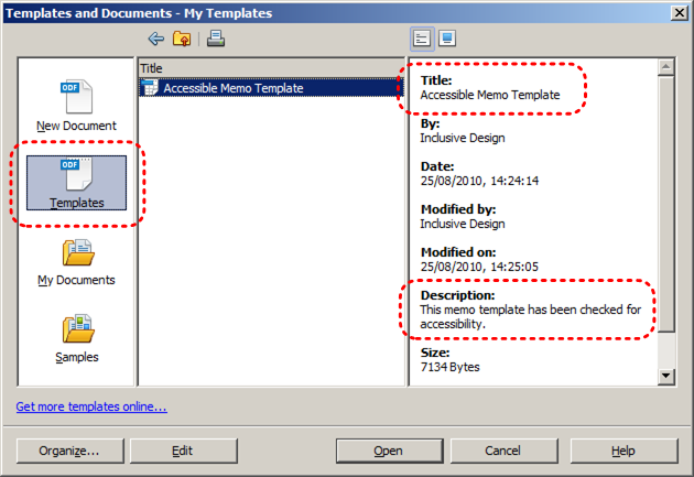
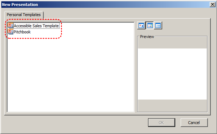
Because templates provide the starting-point for so many documents, accessibility is critical. If you are unsure whether a template is accessible, you should check a sample document produced when the template is used (see Technique 11).
Google Slides’s default template for new documents is a blank presentation. The basic installation also includes a wide variety of templates for business presentations. These are all accessible by virtue of being blank.
It is possible to create your own templates from scratch in Google Slides. As well, you can edit and modify the existing templates, ensuring their accessibility as you do so and saving them as a new template.
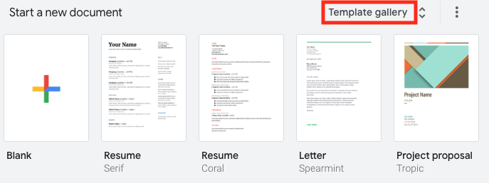
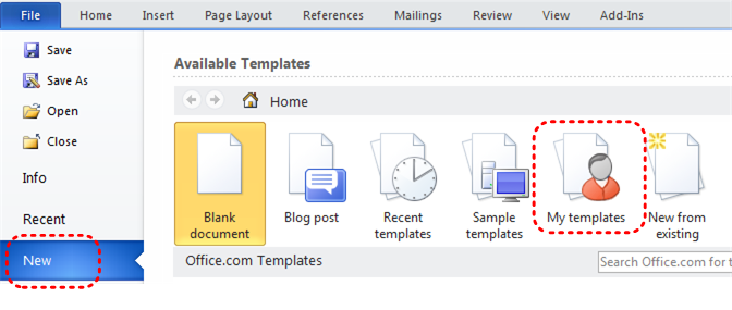
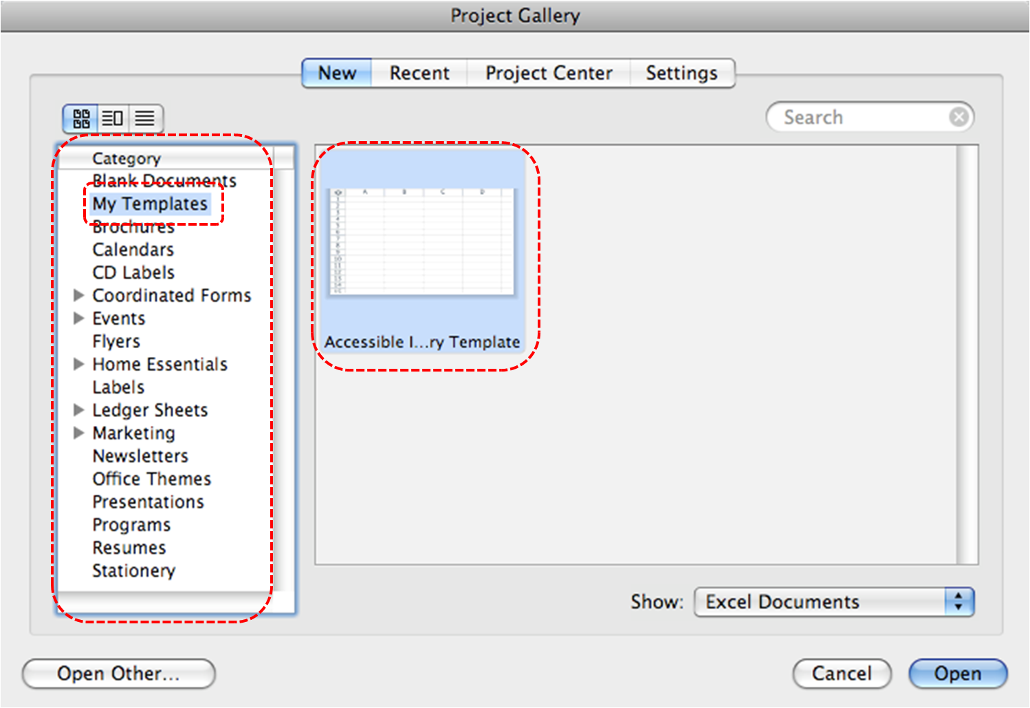
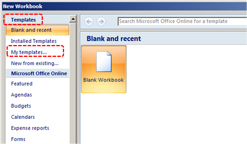
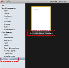
To select a template
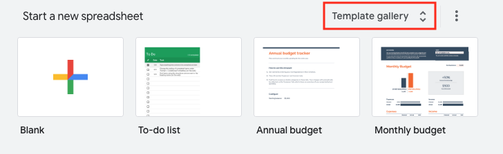
- Go to Google Sheets.
- At the top right, click on Template Gallery.
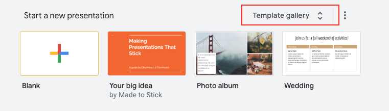
- Select a template.
- A copy of the template will open.
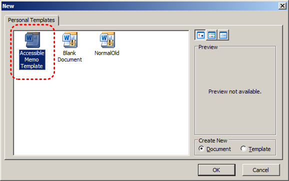
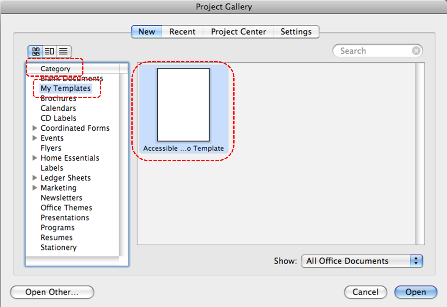
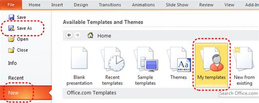
To create an accessible template
- Create a new document (from the default template or from an existing template).
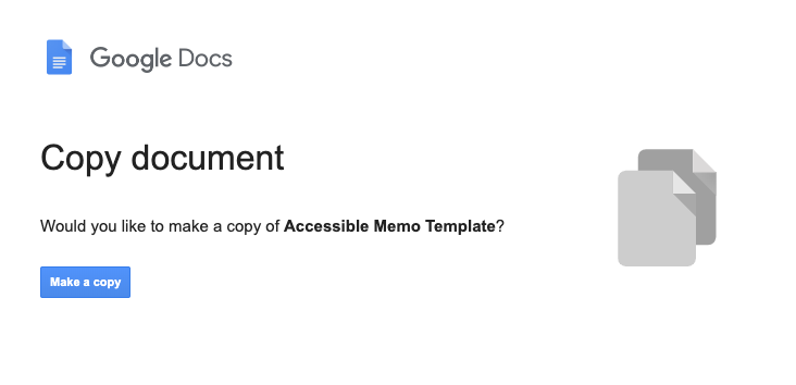
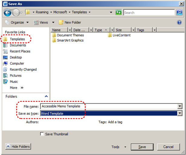
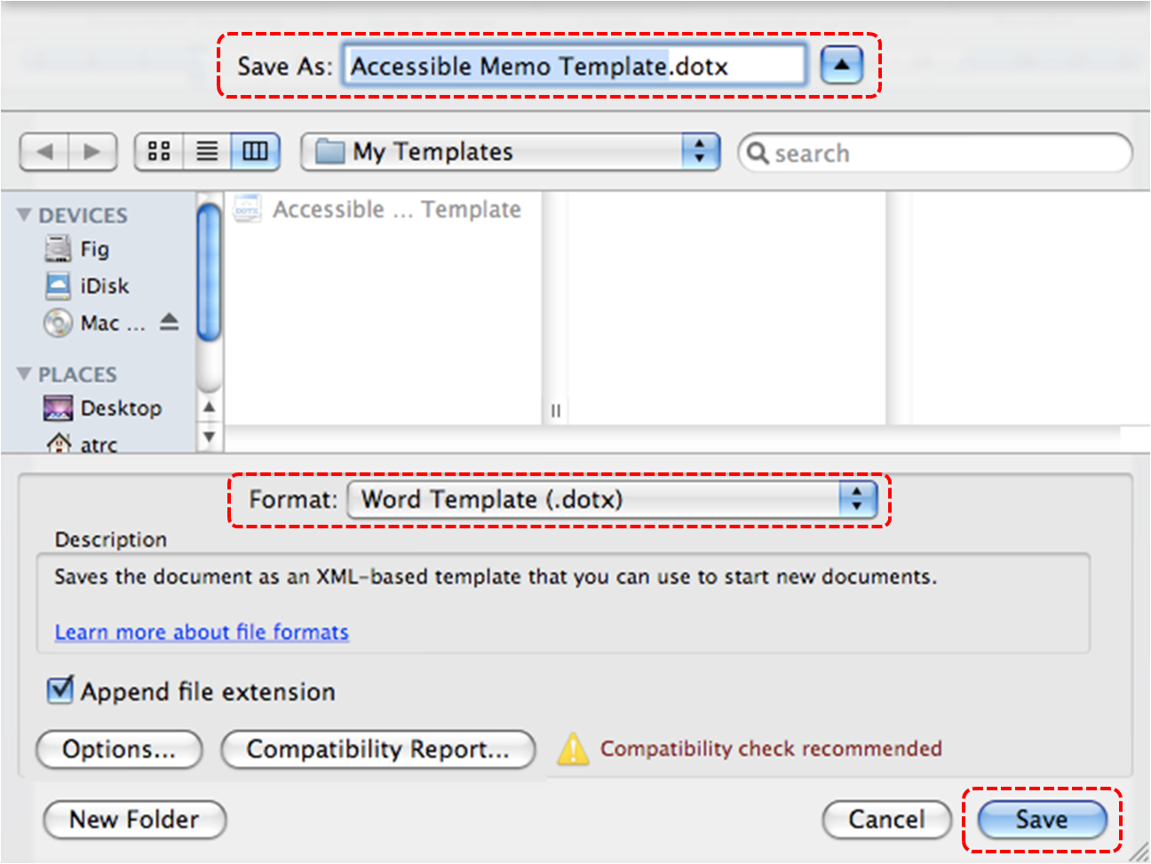
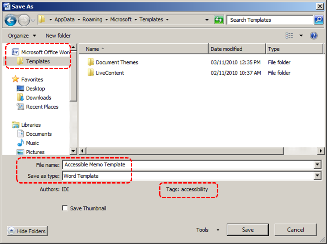
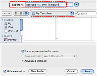
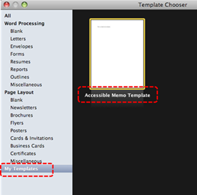
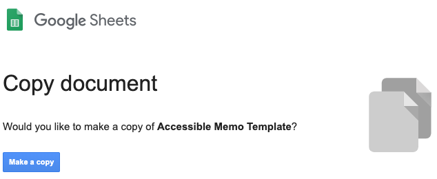
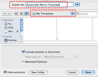
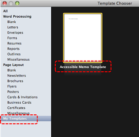
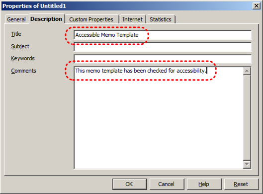
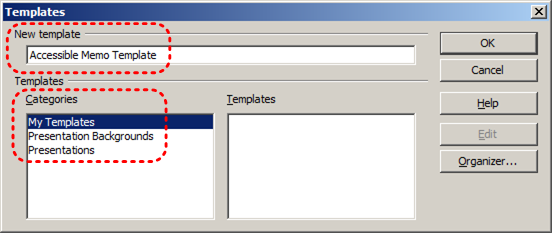
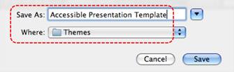
Note: If creating a template from an existing document, go to File > Make a copy. Type a name and choose where to save it, then, click Ok. - Rename your document. Be sure to indicate that the document is an accessible template by using terms such as “accessible” (e.g., “Accessible Memo Template”). This will improve its searchability and promote its use as an accessible template.
- Ensure that you follow techniques in this document. You may also check the accessibility (see Technique 11).
To share your accessible template as a new document
You can share your accessible template, but it may be more useful to share the file as copy that other users can add to their Google Drive.
- Go to the address bar change the end of the URL before sending it.
- Replace “edit” at the end of the URL with “copy”.
For example:
Before: http://docs.google.com/document/d/12345678/edit
After: http://docs.google.com/document/d/12345678/copy - Send the modified copy link.
- When the recipient follows the modified copy link, they’re instructed to click on Make a copy.
- They can then work on a copy of the accessible template.
For more information, see the resources below:
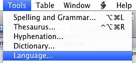
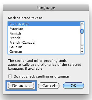
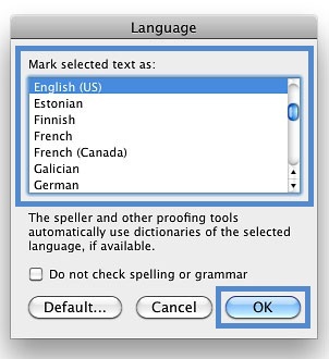
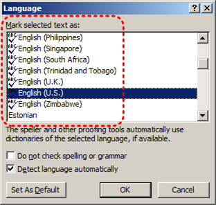
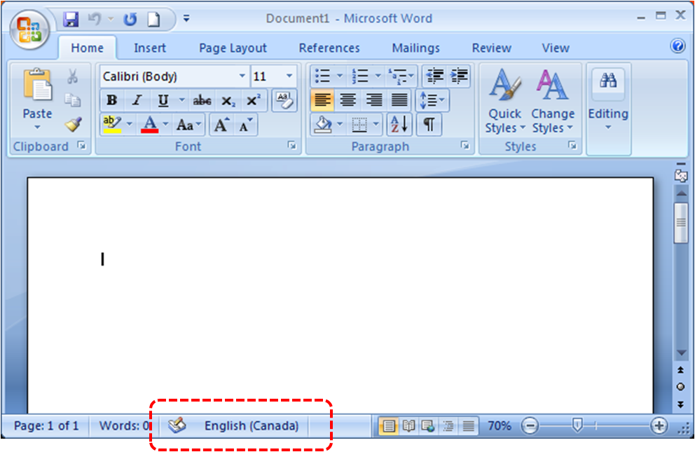
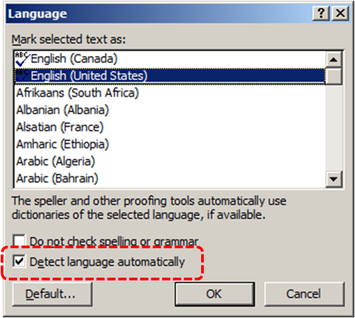
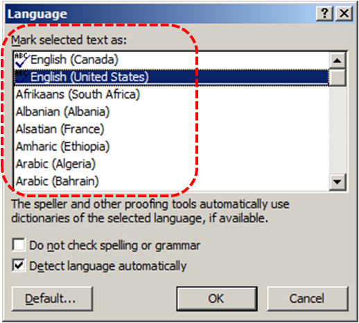
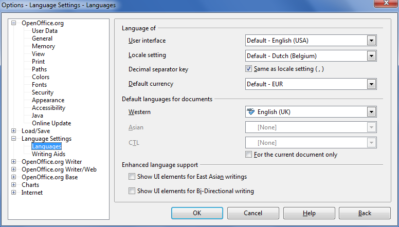
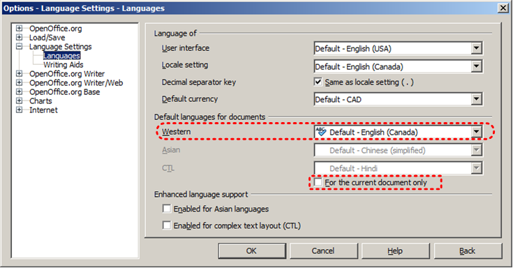
Technique 2. Set Document Language
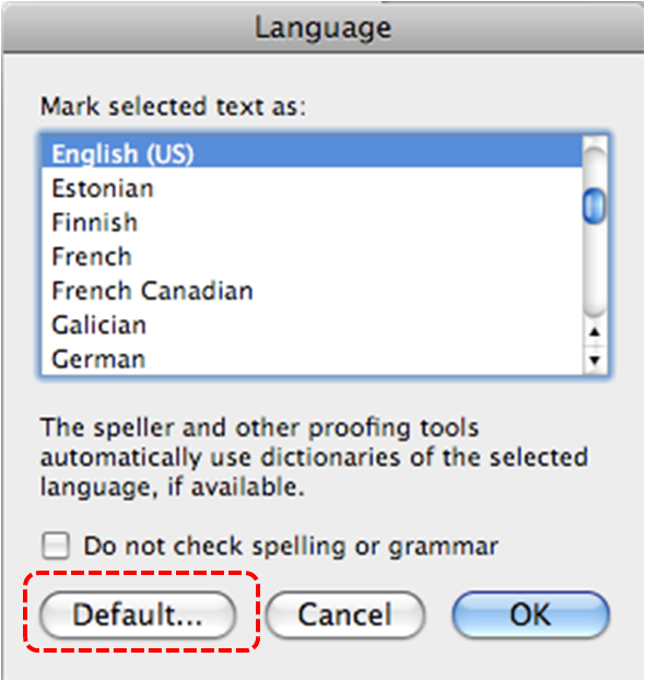
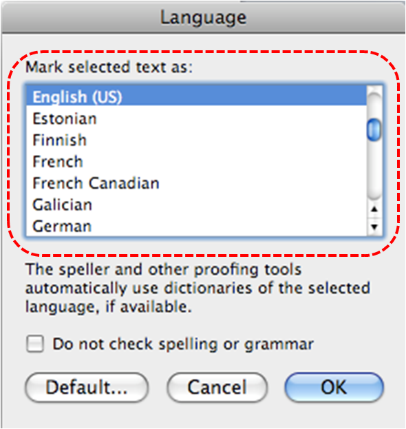
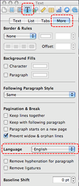
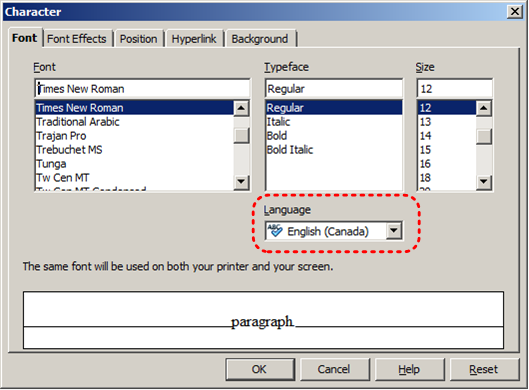
At this time, Google Slides does not offer an explicit language selection mechanism to indicate the natural language of your document or changes in natural language at any point within the content. Google Slides defaults the natural language to the language selected for your Google Account. When exporting to other document formats, there is no guarantee that the natural language of your Google Account will be indicated as the natural language of your document.
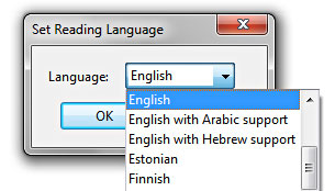
In order for assistive technologies (e.g., screen readers) to be able to present your document accurately, it is important to indicate the natural language of the document. If a different natural language is used for a paragraph or selected text, this also needs to be clearly indicated.
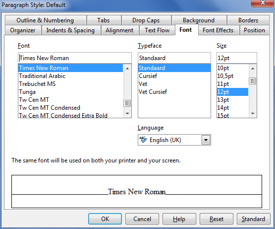
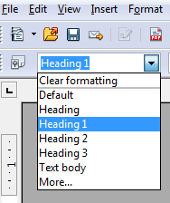
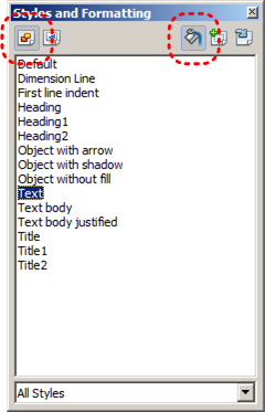
Technique 3. Use Built-In Layout and Styling Features
Google Slides does not offer “True Headings” or “Named Styles”.
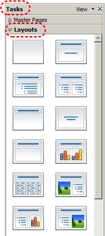
3.1 Use Built-In Slide Layouts
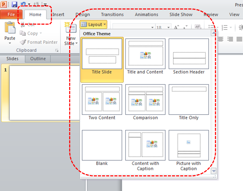
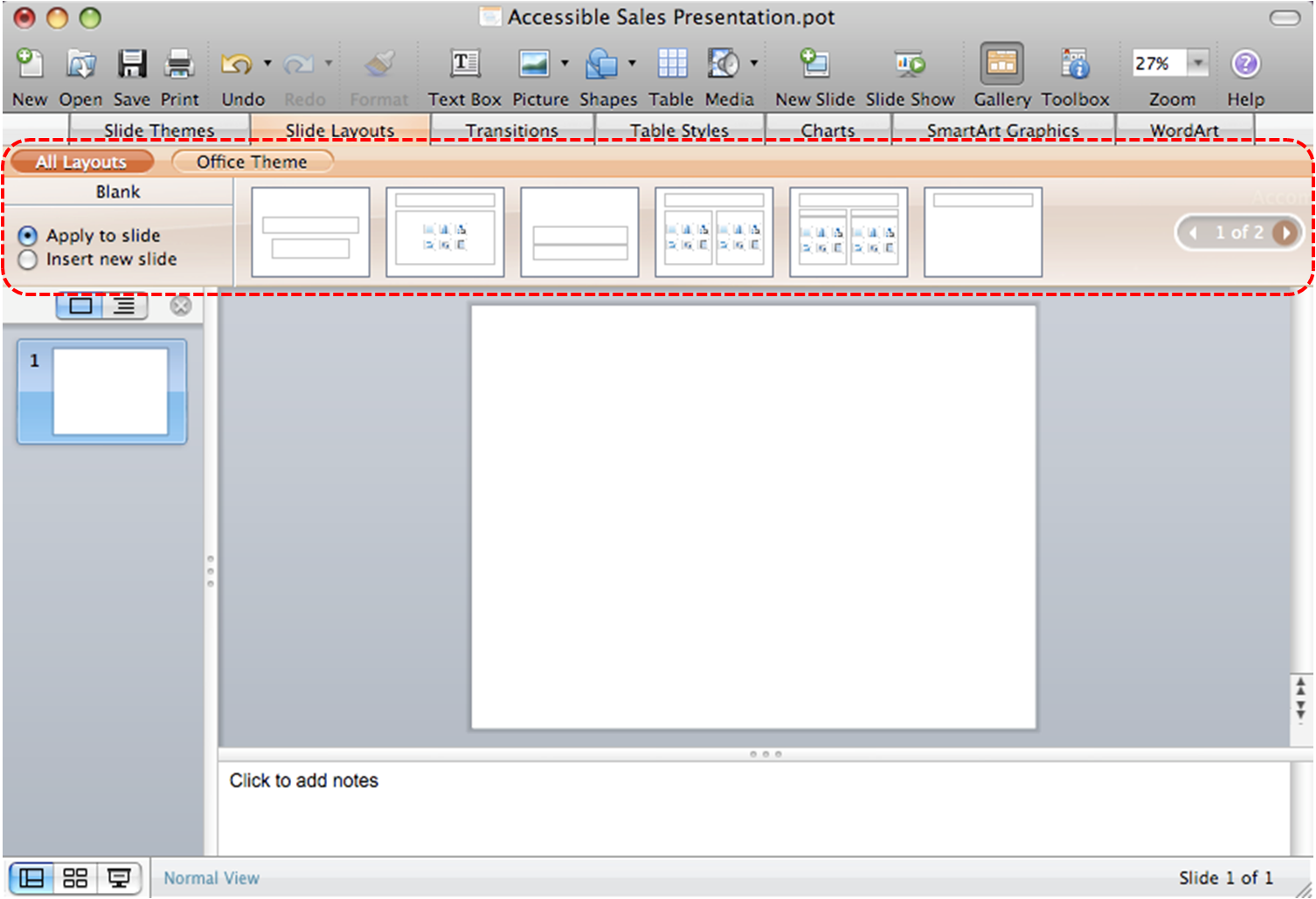
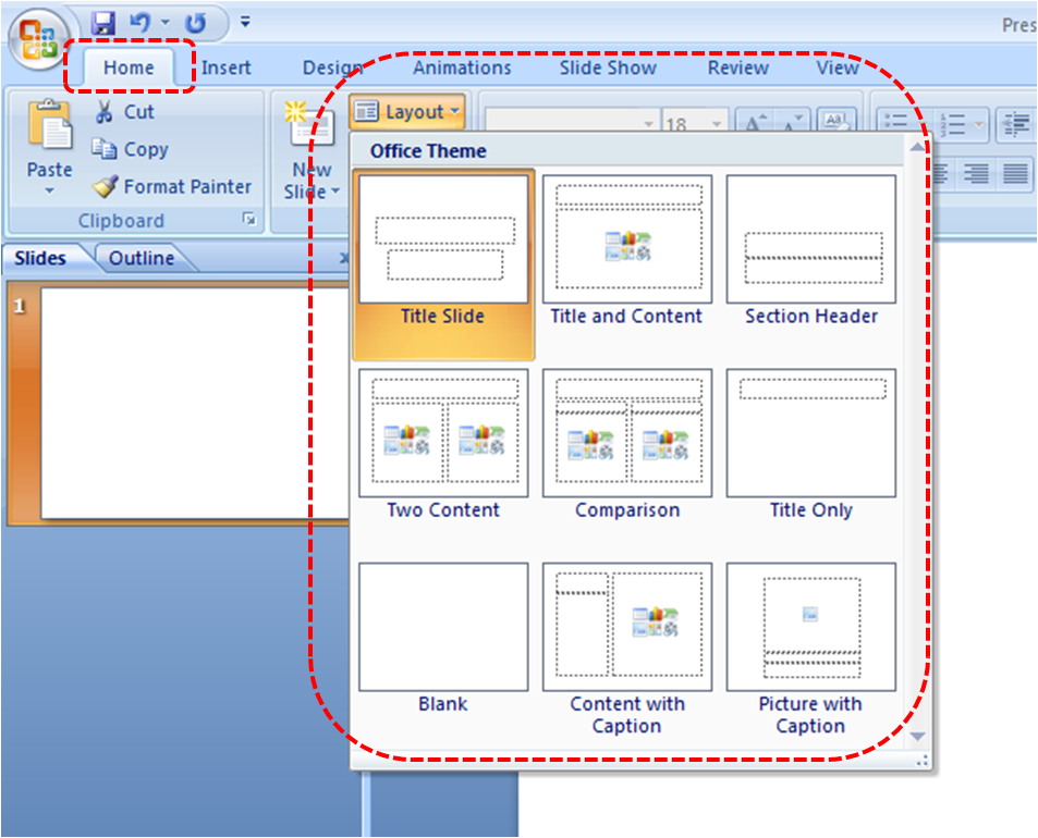
Instead of creating each slide in your presentation by starting from a blank slide, check whether there is a suitable built-in layout.
Note: The built-in layouts can be more accessible to users of assistive technologies because they technologies sometimes read the floating items on the slide in the order that they were placed on the slide. The built-in layouts have usually taken this into account (e.g., “Title” first followed by other items, left to right and from top to bottom). If you create slide layouts from scratch, it is sometimes difficult to keep track of the order elements were placed.
To apply “true layout” to a slide
- Go to menu item: Slide > New Slide… (Ctrl+M).
- In the Layout drop-down on the toolbar, select a slide layout from the options.
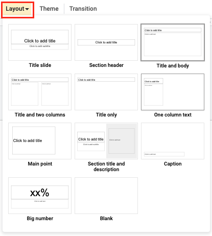
- A new slide will be inserted into the presentation with the layout you selected
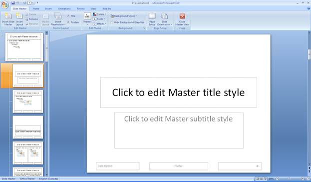
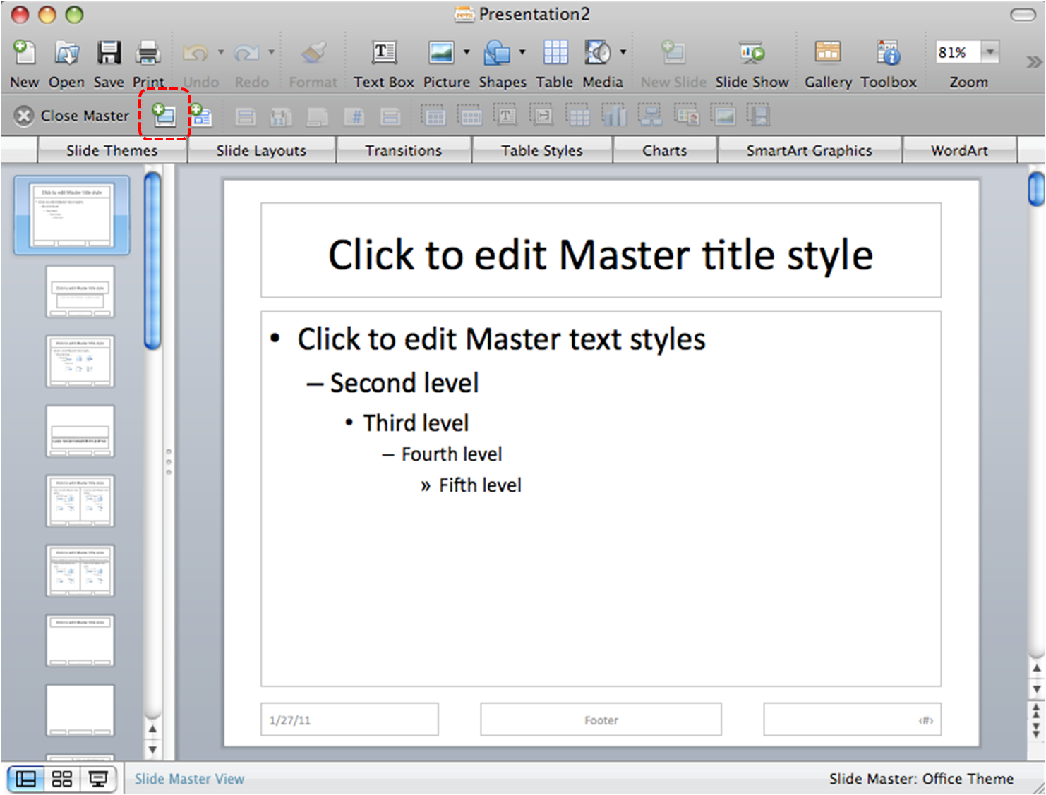
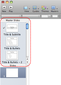
3.2 Customize Using Master Slides
Google Slides is packaged with master slides available for your use. If a layout must be customized, it is recommended that Master Slides be used.
Every slide layout in a presentation is defined by its master slide. A master slide determines the formatting style for various elements of the slide layout. This includes font styles, character formatting, and the positioning of elements. Essentially, each master slide acts as a design template for the slide layout.
If you edit any aspect of the slide layout in the master slide, the change will affect all slides that were created based on it. For this reason, it is good practice to edit the master slide and use the slide layouts before building individual slides. It is essential that you create and use master slides that meet the accessibility requirements outlined in this document.
One way around this is to format a slide, ensuring its accessibility, and then create duplicates of that slide within your presentation. You can then edit the content of the duplicate slides, while ensuring that its layout meets accessibility requirements. In this way, the original slide acts as design template for the slides derived from it.
To duplicate a slide
- Go to menu item: Slide > Duplicate slide.
- Edit the content of your duplicate slide, ensuring your changes do not negatively affect accessibility of the slide.
To change a theme
- Go to the menu item Slide, then select Change theme.
- On the right sidebar, select the theme you want.
Note: If you would like to include a unique slide layout for a single slide, see Google: Learn how to apply a theme to only one slide.
To customize a master slide
- Go to the menu item Slide > Edit master.
Optional: Before editing the master, you can first select a theme that is similar to the design you want before editing the master (select Theme, then select a theme from the right). - In the master template editor, select the Master slide at the top.
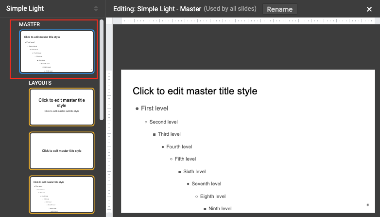
- Make your edits to the master slide.
- When finished, select the “x” at the top-righthand side of the menu to close.
- Your presentation should be updated with the changes.
For more details on how to customize your presentation, see Google: Change the theme, background, or layout in Google Slides.
Technique 4. Set a Logical Tab Order
Many presentation applications create content composed almost exclusively of “floating” objects. This means that they avoid the transitions between in-line content and secondary “floating” objects (text boxes, images, etc.) that can cause accessibility issues in word processors.
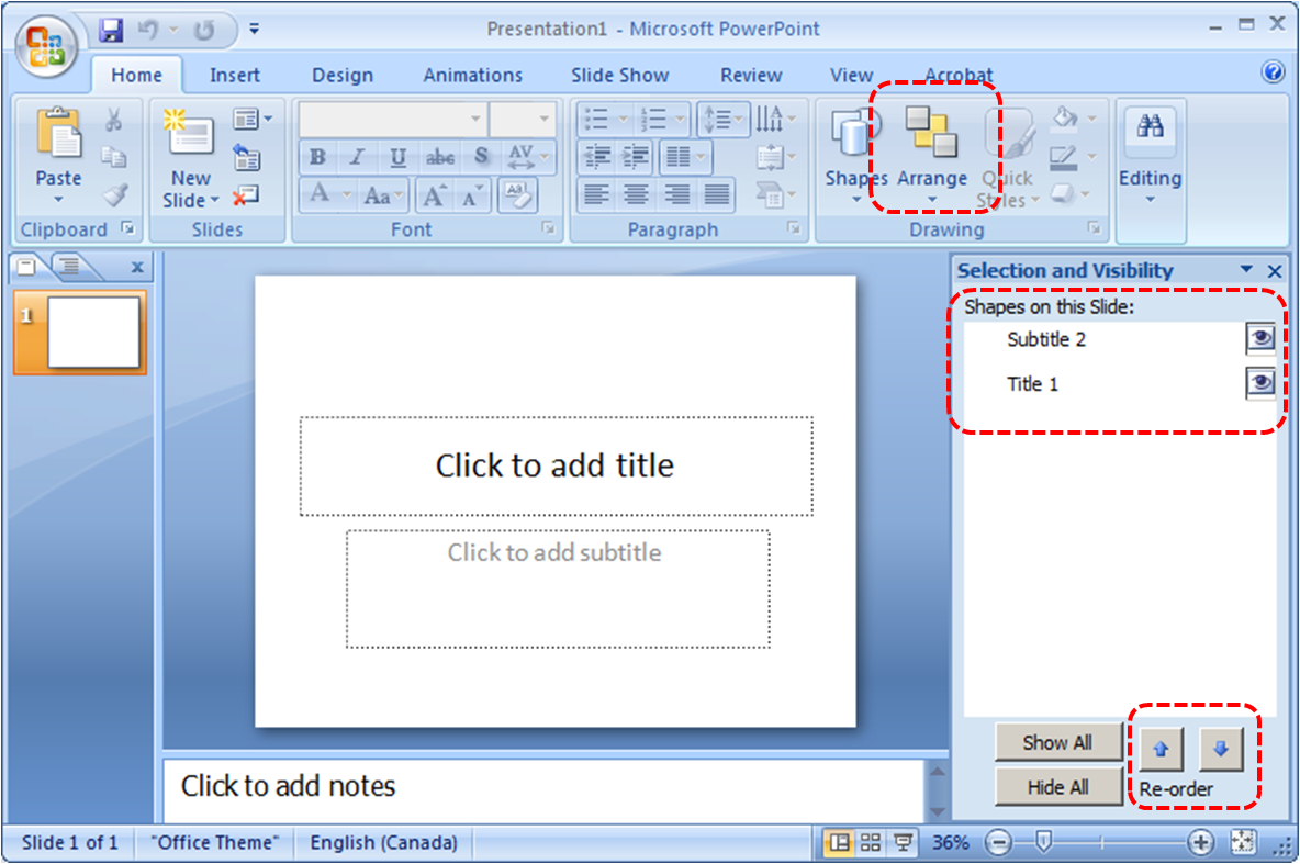
However, when you are working with “floating” objects, it is important to remember that the way objects are positioned in two dimensions on the screen may be completely different from how the objects will be read by a screen reader or navigated using a keyboard. The order that content is navigated sequentially is called the “Tab Order” because often the “Tab” key is used to navigate from one “floating” object to the next.
Tips for setting a logical “tab order” for “floating” objects
- The tab order of floating objects is usually from the “lowest” object on the slide to the “highest”.
- Because objects automatically appear “on top” when they are inserted, the default tab order is from the first object inserted to the last. However, this will change if you use features such as “bring to front” and “send to back”.
- The slide’s main heading should be first in the tab order.
- Headings should be placed in the tab order immediately before the items (text, diagrams, etc.) for which they are acting as a heading.
- Labels should be in the reading order placed immediately before the objects that they label.
- For simple slide layouts, it may be possible to simply insert objects in a logical tab order.
- For more complex layouts, it may be easier to simply to create the slide as usual and then set the tab order (see below).
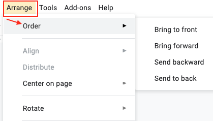
To set the tab order
- Select the object.
- Go to menu item Arrange > Order > Bring to front, Bring forward, Send backward, or Send to back.
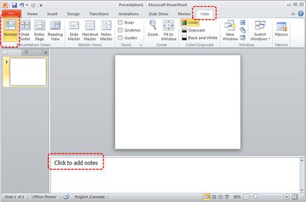
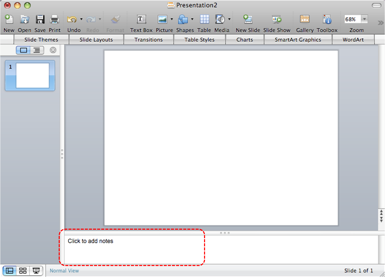
Technique 5. Use Slide Notes
A useful aspect of presentation applications is the facility to add notes to slides, which can then be read by assistive technologies. You can use these slide notes to explain and expand on the contents of your slides in text format. Slide notes can be created as you build your presentation.
To add notes to your slides
- Go to menu item: View > Show Speaker Notes
Note: Once you have selected this option, the Speaker notes pane will appear on the right side of the window for each slide. If you close the Speaker notes pane, you will have to perform the above step to access it again. - In the Speaker notes pane on the right, enter notes to accompany each slide.
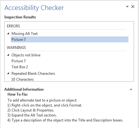
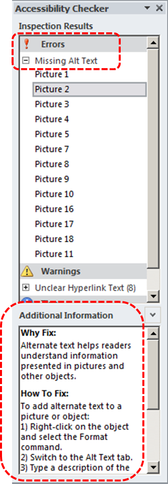
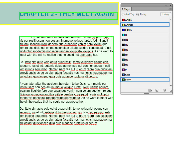
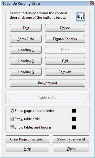
Technique 6. Provide Text Alternatives for Images and Graphical Objects
Google Slides offers a mechanism for adding alternative text to images and objects where it can be readily accessed by screen reader users. While you can add alt text, you will need to ensure that you provide the longer descriptions in the body of the document, near the images and objects. While this solution is not optimal for screen reader users and will complicate your own accessibility testing, it is necessary until long descriptions are supported.
When using images or other graphical objects, such as charts and graphs, it is important to ensure that the information you intend to convey by the image is also conveyed to people who cannot see the image. This can be accomplished by adding concise alternative text of each image. If an image is too complicated to concisely describe in the alternative text alone (artwork, flowcharts, etc.), provide a short text alternative and a longer description as well.
Tips for writing alternative text
- Try to answer the question “what information is the image conveying?”
- If the image does not convey any useful information, leave the alternative text blank
- If the image contains meaningful text, ensure all of the text is replicated
- Alternative text should be fairly short, usually a sentence or less and rarely more than two sentences
- If more description is required (e.g., for a chart or graph), provide a short description in the alternative text (e.g., a summary of the trend) and more detail in the long description, see below
- Test by having others review the document with the images replaced by the alternative text
Tips for writing longer descriptions
- Long descriptions should be used when text alternatives (see above) are insufficient to answer the question “what information is the image conveying?”
- In some situations, the information being conveyed will be how an image looks (e.g., an artwork, architectural detail, etc.). In these cases, try to describe the image without making too many of your own assumptions.
- One approach is to imagine you are describing the image to a person over the phone
- Ensure that you still provide concise alternative text to help readers decide if they are interested in the longer description
Alternatively, you can include the same information conveyed by the image within the body of the document, providing the images as an alternate to the text. In that case, you do not have to provide alternate text within the image.
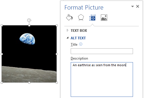
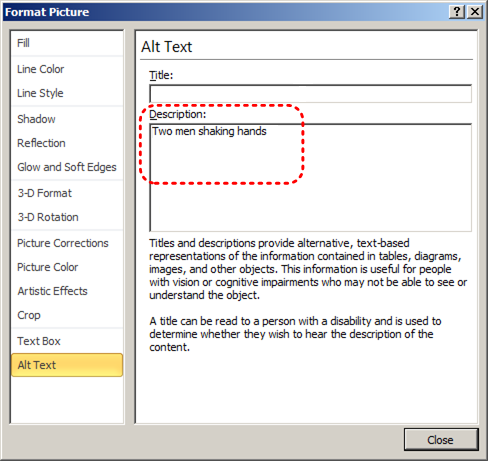
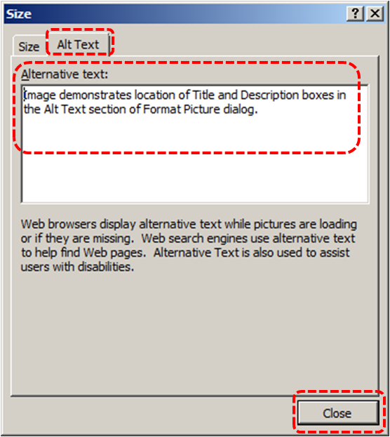
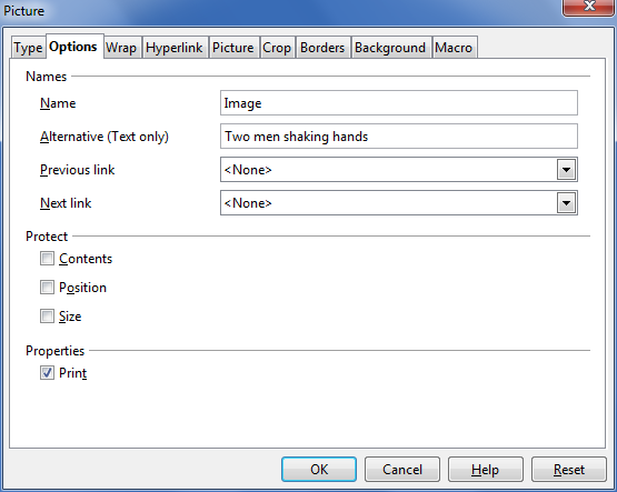
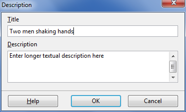
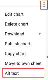
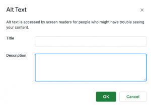
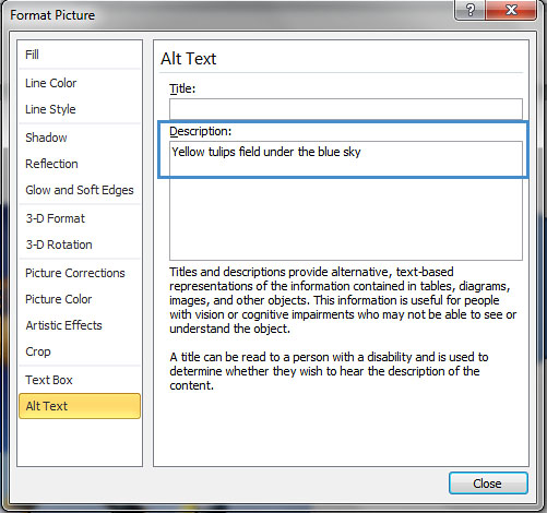
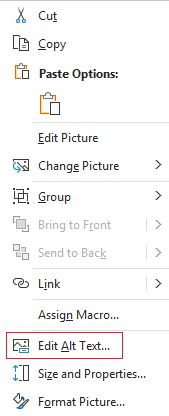
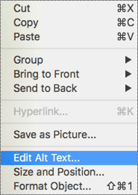
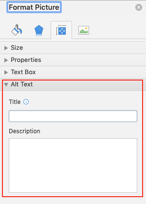
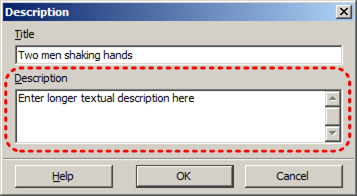
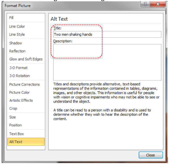
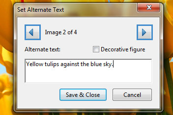
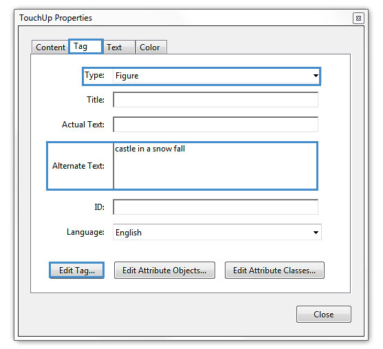
To add alternative text to images and graphical objects
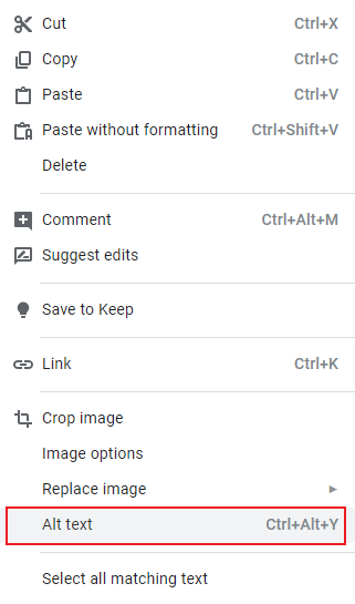
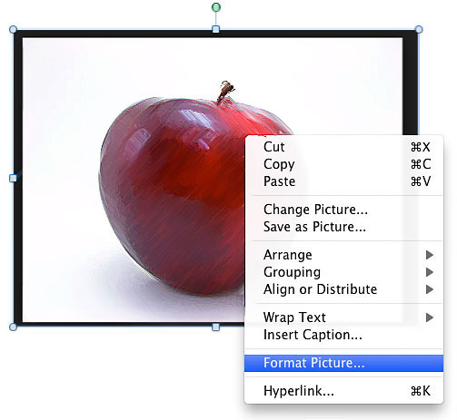
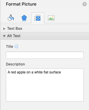
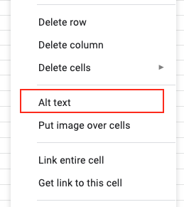
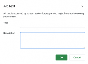
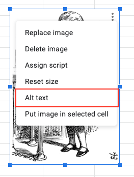
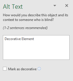
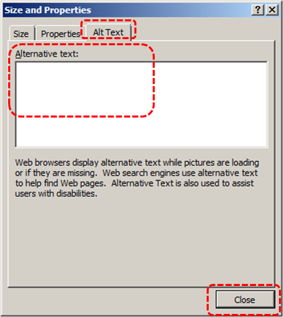
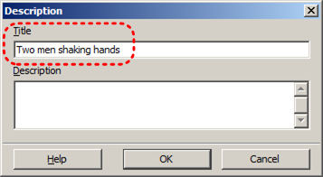
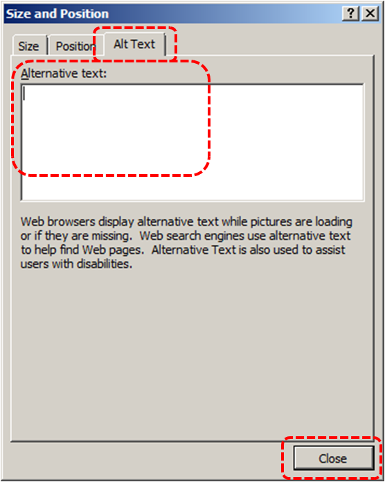
- Right-click* on the image.
- Select Alt Text from the contextual menu.
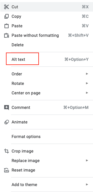
- Add your alt text to the Description field.
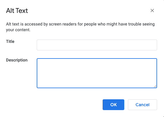
- Press OK to saveNote: Enter a description in the Title field will show a pop-up tooltip when users hover over the image with their mouse. However, it is recommended to put the image description in the Description field.
Technique 7. Use Built-In Structuring Features
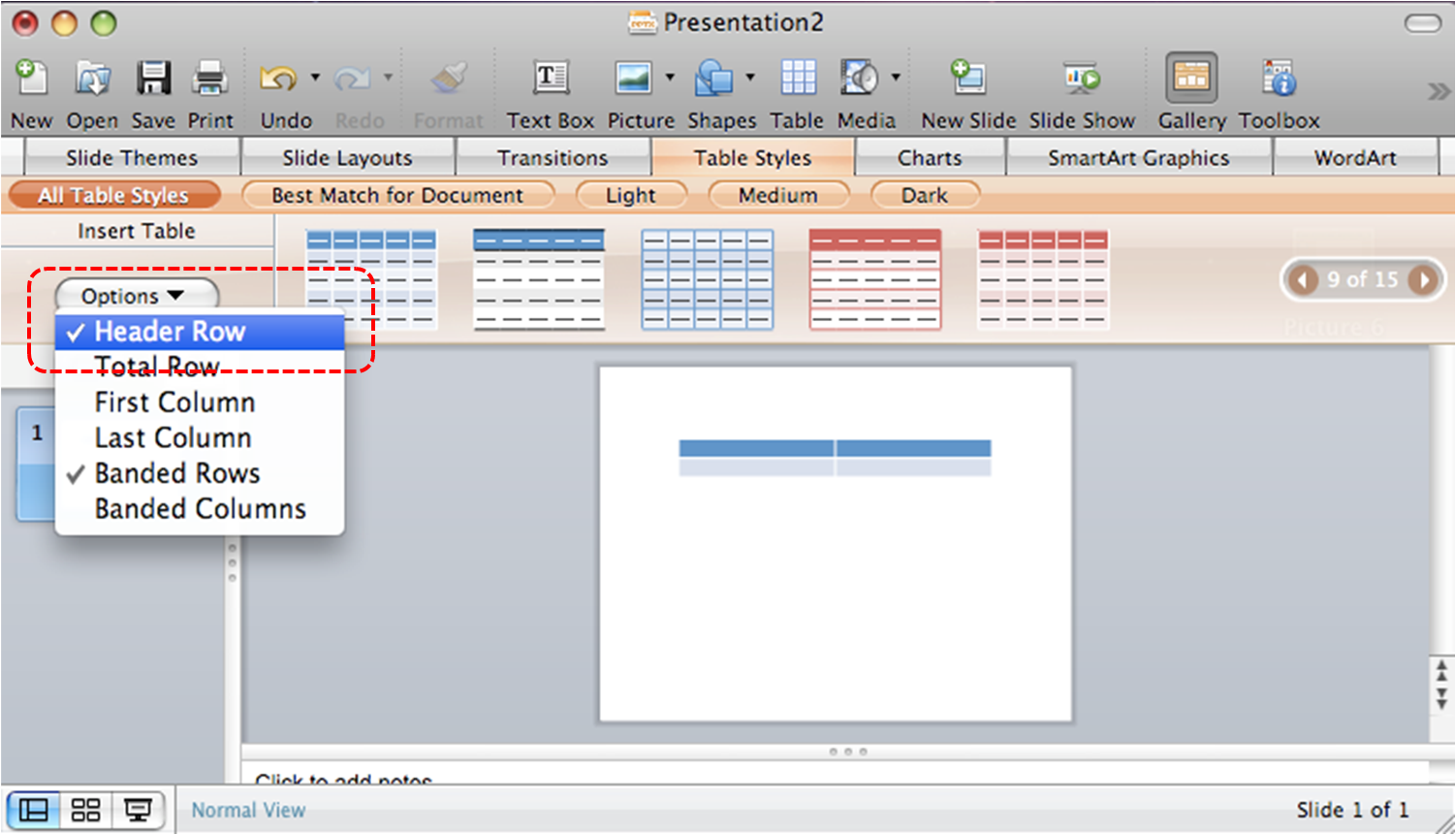
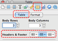
7.1 Tables
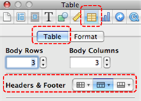
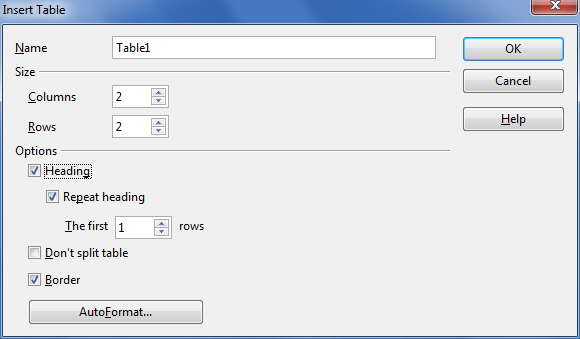
At this time (December 2019), Google Slides does not offer a mechanism that allows you to select and indicate headings for rows and columns. Since it is not possible to create complex tables in Google Slides that are accessible, avoid creating complex tables since table headers cannot be designated.
If you use the Grackle Slides add-on, tables can be given structure and table headings can be indicated. While these fixes won’t be useful for making tables more accessible in Google Slides, it does allow you to export the document into another format with appropriate table tags intact. For more on Grackle Slides, see Technique 11.
When using tables, it is important to ensure that they are clear and appropriately structured. This helps all users to better understand the information in the table and allows assistive technologies (e.g., screen readers) to provide context so that the information within the table can be conveyed in a meaningful way.
Tips for tables
- Only use tables for tabular information, not for formatting.
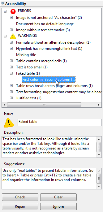
- Use “real tables” rather than text formatted to look like tables using the TAB key or space bar. These will not be recognized by assistive technology.
- Keep tables simple by avoiding merged cells and dividing complex data sets into separate smaller tables, where possible.
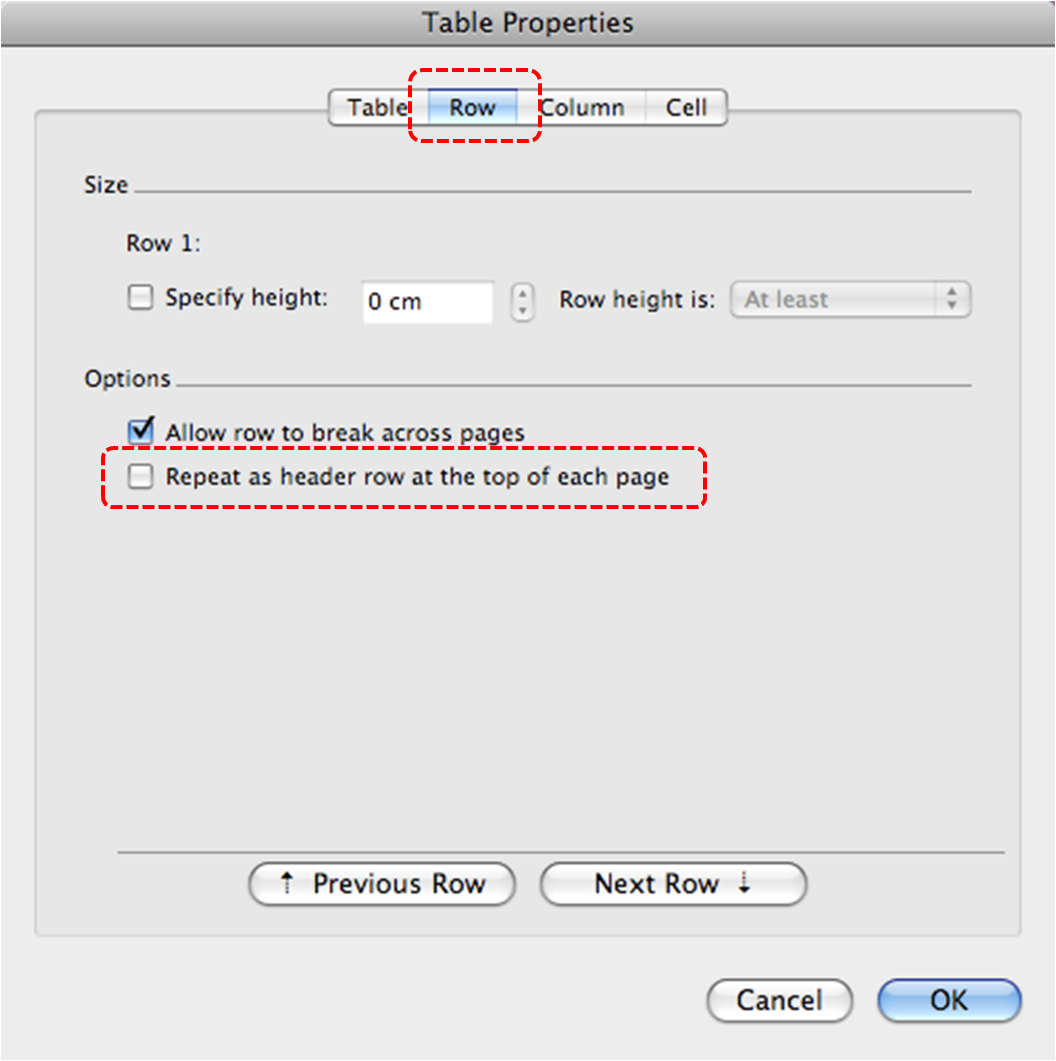
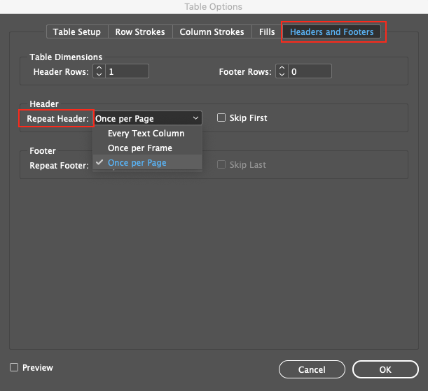
- If tables split across pages, set the header to show at the top of each page. Also set the table to break between rows instead of in the middle of rows.
- Create a text summary of the essential table contents. Any abbreviations used should be explained in the summary.
- Table captions or descriptions should answer the question “what is the table’s purpose and how is it organized?” (e.g., “A sample order form with separate columns for the item name, price and quantity”).
- Table cells should be marked as table headers when they serve as labels to help interpret the other cells in the table.
- Table header cells labels should be concise and clear.
- Ensure the table is not “floating” on the page (see Technique 4).
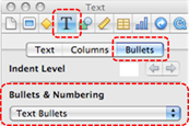
7.2 Lists
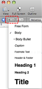
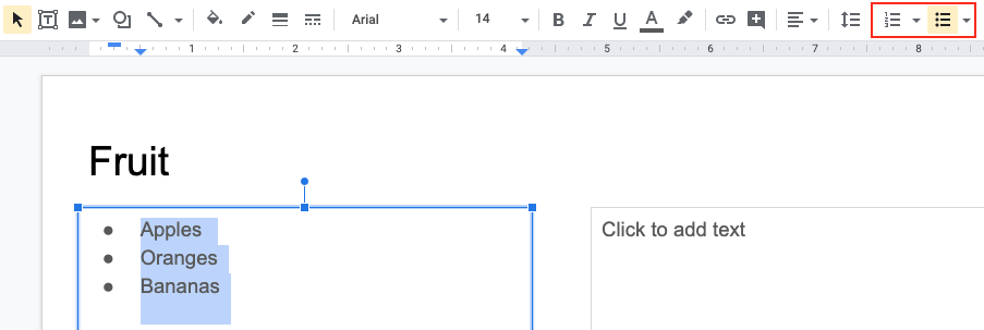
When you create lists, it is important to format them as “real lists”. Otherwise, assistive technologies will interpret your list as a series of short separate paragraphs instead of a coherent list of related items.
To create an ordered or unordered list
- Select the text box or highlight the text
- Go to the menu bar
- Click the Numbered list or Bullet list button
7.3 Columns
Use Columns feature for placing text in columns.
Note: Because columns can be a challenge for users of some assistive technologies, consider whether a column layout is really necessary.
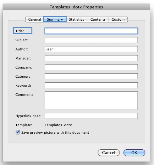
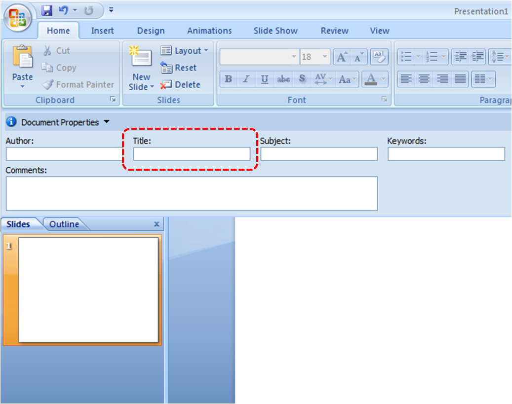
7.4 Document Title
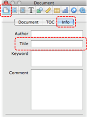
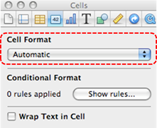
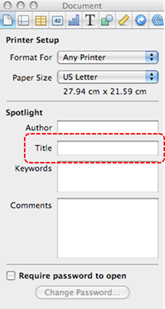
At this time (December 2019), Google Slides makes use of a single document name. Within Google Slides, this serves well as a title, but when exporting to ODT, the document name is used to form the file name, and the ODT “Title” properties field is left blank, or it lists the title used in the first slide of the presentation.
In case the document is ever converted into HTML, it should be given a descriptive and meaningful title.
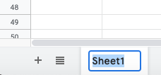
To change the file name of the current document
- Go to menu item: File > Rename
- In the Rename Document dialog, enter a new document name
- Click OK
Technique 8. Create Accessible Charts
In Google Slides, you can insert data charts linked to an existing Google Sheet file (see Google Help: Link a chart or table to Google Slides for instructions).
Charts can be used to display data in meaningful ways for your audience. It is important to ensure that your chart is as accessible as possible to all members of your audience. All basic accessibility considerations that are applied to the rest of your document must also be applied to your charts and the elements within your charts. For example, use shape and color, rather than color alone, to convey information. As well, some further steps should be taken to ensure that the contents are your chart are appropriate labeled to give users reference points that will help to correctly interpret the information.
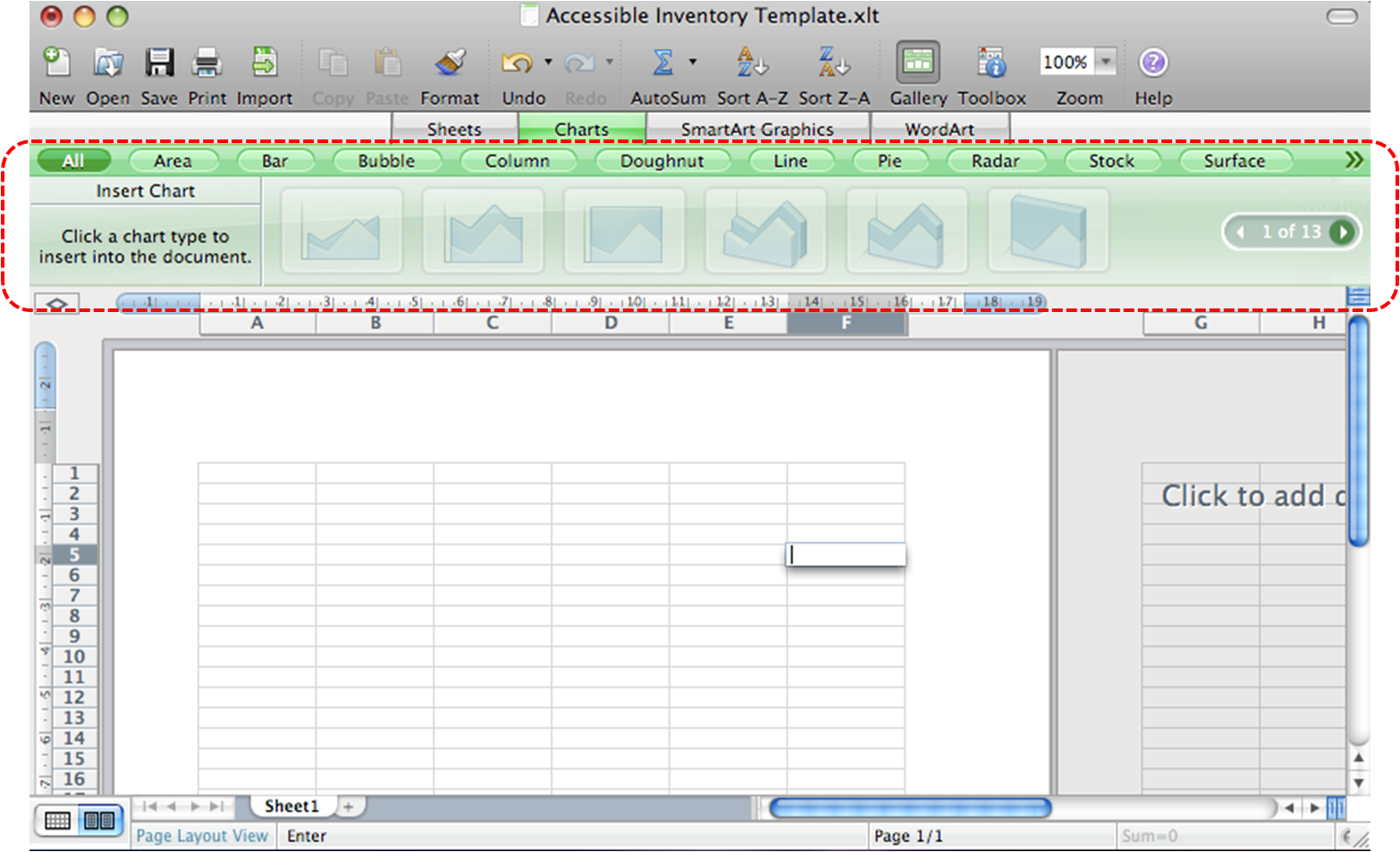
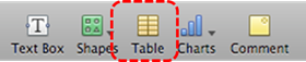
To add a new chart to a presentation
- Go to Insert > Chart.
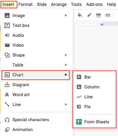
- Select the type of chart you want to add.
Note: To edit a chart, see Google Help: Edit or Update Chart Data.
Note: To learn more about how to customize the chart you created, see BrightCarbon: Google Slides: The ULTIMATE guide (blog post).
Other Chart Considerations
- When creating line charts, use the formatting options to create different types of dotted lines to facilitate legibility for users who are color blind
- When creating bar charts, it is helpful to apply textures instead of colors to differentiate the bars
- Change the default colors to a color safe or gray-scale palette
- Use the formatting options to change predefined colors, ensuring that they align with sufficient contrast requirements (see Technique 9.2)
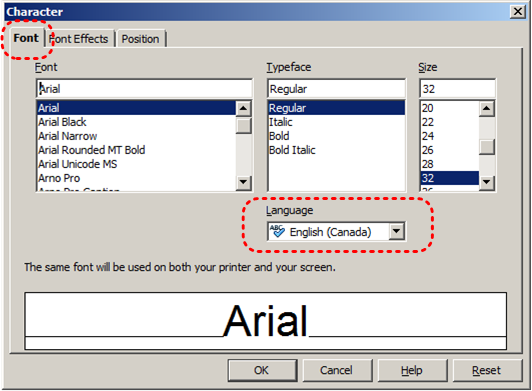
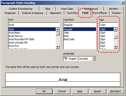
Technique 9. Make Content Easier to See
9.1 Format of Text
When formatting text, especially when the text is likely to be printed, try to:
- Use font sizes between 12 and 18 points for body text.
- Use fonts of normal weight, rather than bold or light weight fonts. If you do choose to use bold fonts for emphasis, use them sparingly.
- Use standard fonts with clear spacing and easily recognized upper and lower case characters. Sans serif fonts (e.g., Arial, Verdana) may sometimes be easier to read than serif fonts (e.g., Times New Roman, Garamond).
- Avoid large amounts of text set all in caps, italic or underlined.
- Use normal or expanded character spacing, rather than condensed spacing.
- Avoid animated or scrolling text.
But can’t users just zoom in? Office applications do typically include accessibility features such as the ability to magnify documents and support for high contrast modes. However, because printing is an important aspect of many workflows and changing font sizes directly will change documents details such the pagination, the layout of tables, etc., it is best practice to always format text for a reasonable degree of accessibility.
9.2 Use Sufficient Contrast
The visual presentation of text and images of text should have a contrast ratio of at least 4.5:1. To help you determine the contrast, here are some examples on a white background:
- Very good contrast (Foreground=black, Background=white, Ratio=21:1)
- Acceptable contrast (Foreground=#767676, Background=white, Ratio=4.54:1)
- Unacceptable contrast (Foreground=#AAAAAA, Background=white, Ratio=2.32:1)
Also, always use a single solid color for a text background rather than a pattern.
In order to determine whether the colors in your document have sufficient contrast, you can consult an online contrast checker, such as:
9.3 Avoid Using Color Alone
Color should not be used as the only visual means of conveying information, indicating an action, prompting a response, or distinguishing a visual element. In order to spot where color might be the only visual means of conveying information, you can create a screenshot of the document and then view it with online gray-scale converting tools, such as:
- GrayBit v2.0: Grayscale Conversion Contrast Accessibility Tool
Editor’s note: GrayBit v2.0 is no longer available. However, multiple tools can be found online: Google Search: gray-scale conversion tool.
9.4 Avoid Relying on Sensory Characteristics
The instructions provided for understanding and operating content should not rely solely on sensory characteristics such as the color or shape of content elements. Here are two examples:
- Do not track changes by simply changing the color of text you have edited and noting the color. Instead use Google Slides’s change tracking features to track changes, such as revision history.
- Do not distinguish between images by referring to their appearance (e.g. “the bigger one”). Instead, label each image with a figure number and use that for references.
9.5 Avoid Using Images of Text
Before you use an image to control the presentation of text (e.g., to ensure a certain font or color combination), consider whether you can achieve the same result by styling “real text”. If this is not possible, as with logos containing stylized text, make sure to provide alternative text for the image following the techniques noted above.
9.6 Avoid Transitions
Transitions between slides and elements in each slide (e.g., bullets in a list flying onto the screen) can be distracting to users with disabilities. It can also cause assistive technologies to read the slide incorrectly. For these reasons, it is best to avoid transitions altogether.
Technique 10. Make Content Easier to Understand
10.1 Write Clearly
By taking the time to design your content in a consistent way, it will be easier to access, navigate and interpret for all users:
- Whenever possible, write clearly with short sentences.
- Introduce acronyms and spell out abbreviations.
- Avoid making the document too “busy” by using lots of whitespace and by avoiding too many different colors, fonts and images.
- If content is repeated on multiple pages within a document or within a set of documents (e.g., headings, footings, etc.), it should occur consistently each time it is repeated.
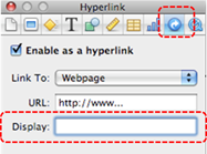
10.2 Provide Context for Hyperlinks
Hyperlink text in your document should be meaningful when read out of context. To be an effective navigation aid, the link text should describe the destination of the link.
Consider the experience of screen reader users: Generally, screen readers generate a list of links, and screen reader users navigate this list alphabetically. Hyperlink text such as “click here” or “more” is meaningless in this context.
In order to be useful to someone using a screen reader, ensure that hyperlink text is self-describing and meaningful on its own.
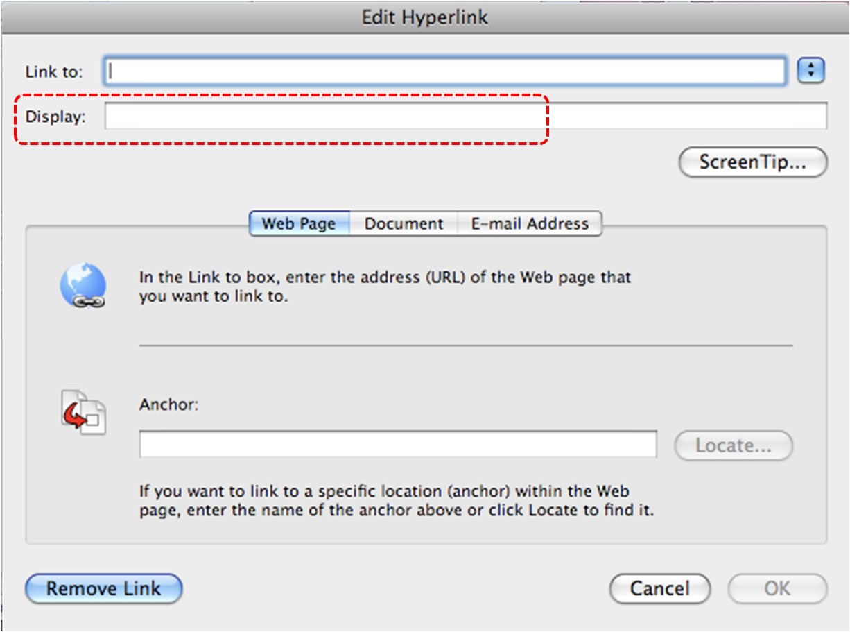
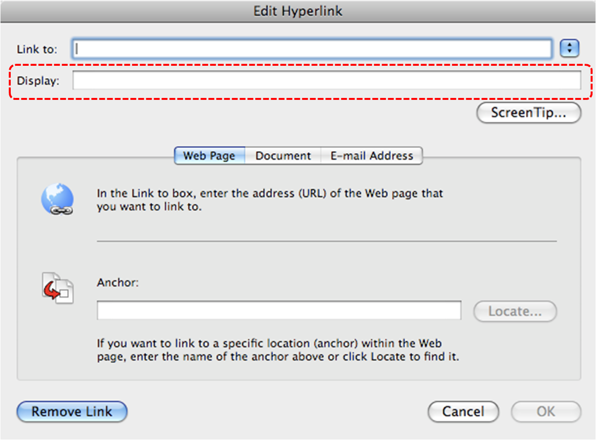
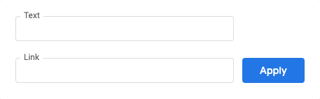
To add hyperlinks with meaningful text
- Go to menu item: Insert > Link. Alternately, you can select the text you’d like to add a link to and press Ctrl+K (or Cmd+K on Macs).
- In the pop-up box, enter descriptive text in the Text display box.
- Enter the link address in the Link.
- Select Apply.
10.3 Accessible Presentations
It is important to consider accessibility before, during, and after presentations. Below is a helpful link with guidance on how to make presentations accessible to all:
Enable live automatic captions when presenting
In Google Slides, you can present slides with automatic captions that displays the speaker’s words in real time at the bottom of the screen.
Note: This feature is only available on Chrome devices in U.S. English. Also, captions are not stored.
Step 1: Set up your microphone
- Google Slides requires your computer’s microphone or an external microphone paired with your computer to be turned on and working.
- Devices and microphones vary, so be sure to check your computer’s settings. Typically, these settings are found under System Preferences on a Mac or in the Control Panel on a PC.
Step 2: Present with captions
- Connect to the internet.
- Open your presentation.
- To start presenting, click Present.
- To turn on captions, click CC.
As you speak, the captions (without punctuation) appear at the bottom of the screen. - To turn off captions, click CC again.
For more details on enabling live automatic captions when presenting, see Google: Present slides with captions.
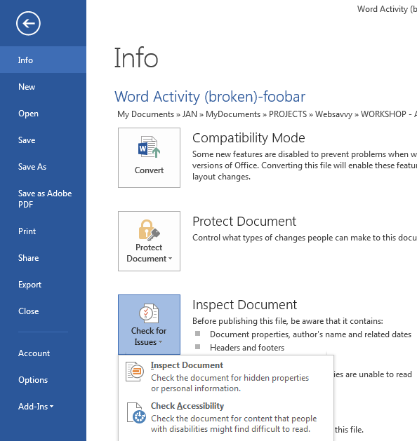
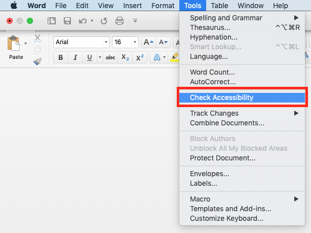
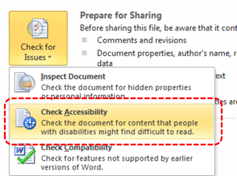
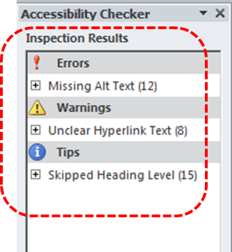
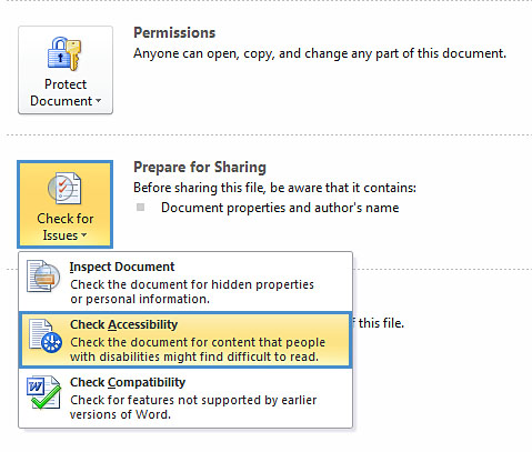
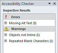
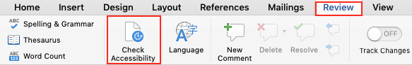
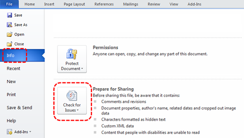
Technique 11. Check Accessibility
At this time (December 2019), Google Slides does not offer a mechanism to check for potential accessibility errors in your document prior to publishing. However, a third-party add-on called Grackle Sheets can be used to check the accessibility of your workbook (see below).
In order to get some indication of the accessibility of your document or template (see Technique 1), then you may consider saving the file into HTML or PDF in order to perform an accessibility check in one of those formats, as described below.
To evaluate HTML accessibility
If you wish to check the accessibility of your document or template (see Technique 1), one option is to save it into HTML format and use one of the web accessibility checkers available online. Such as:
To evaluate PDF accessibility
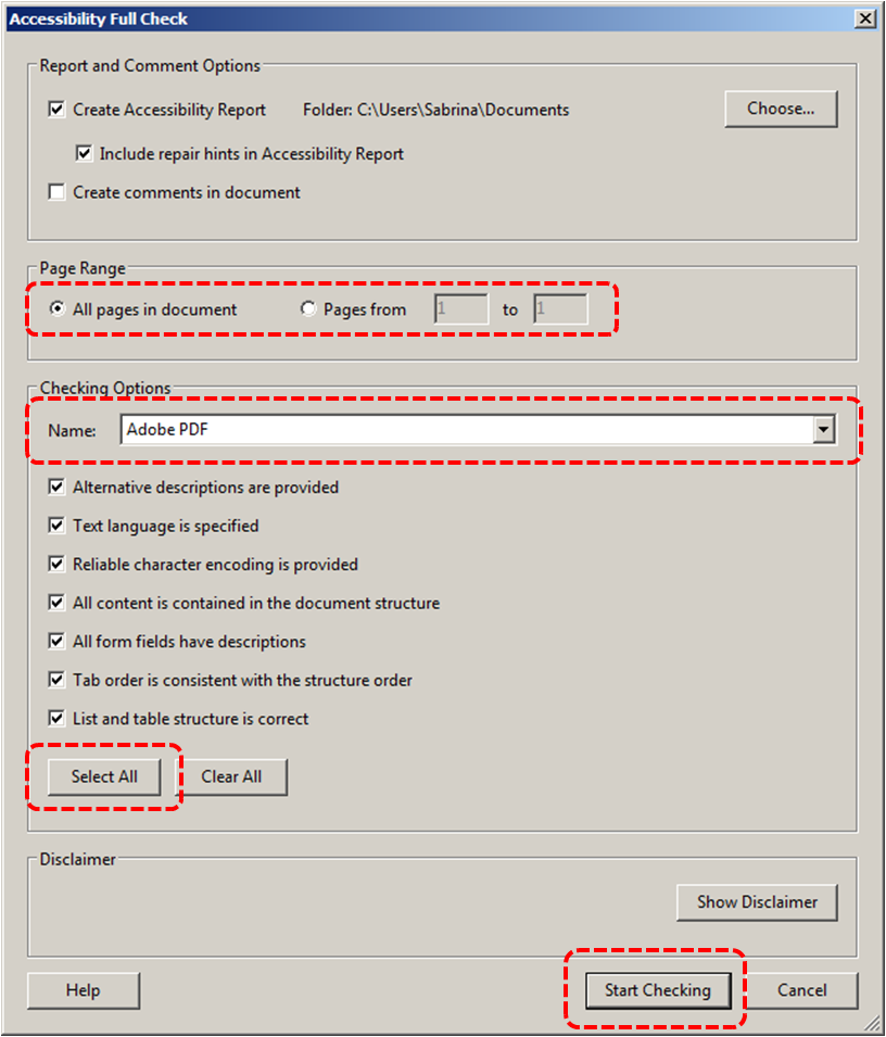
If you saved your document in tagged PDF format, you can use the following tools and steps to evaluate the accessibility of the PDF document:
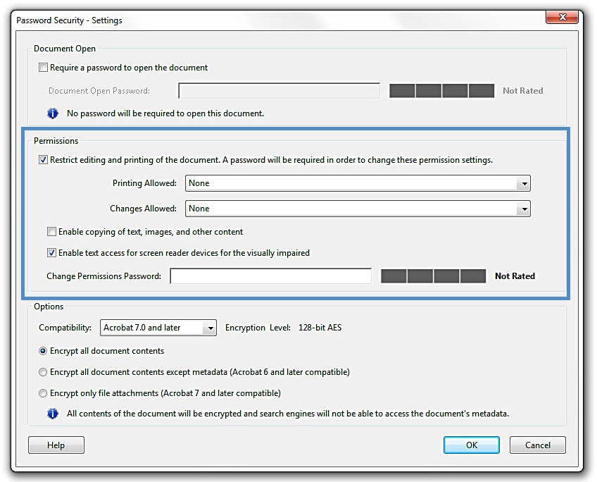
To evaluate PDF accessibility in Adobe Acrobat Professional
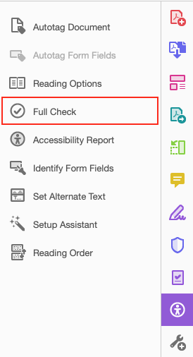
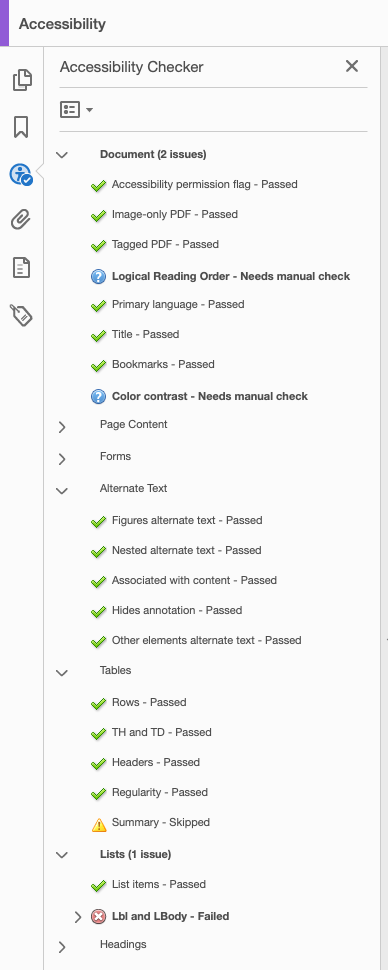
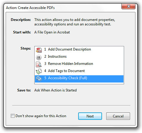
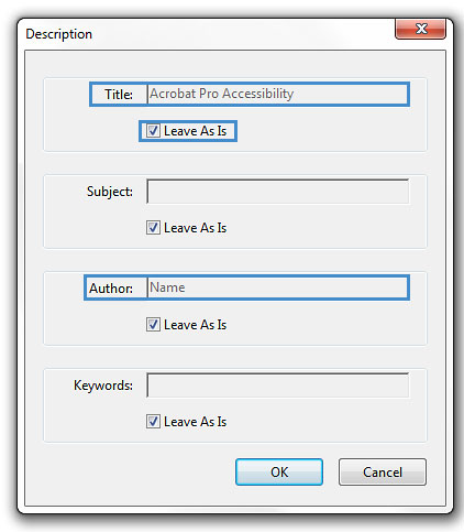
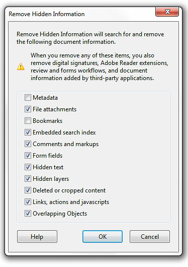
- Go to menu item: Advanced > Accessibility > Full Check…
- In the Full Check dialog, select all the checking option
- Select the Start Checking button
Editor’s note: For detailed instructions, see our section on how to check accessibility using Adobe Acrobat Professional.
Grackle Slides
Warning: Automated accessibility checkers cannot be trusted to check for all accessibility concerns, so be sure to review the recommended techniques in this document.
What is Grackle Slides? Grackle Slides is a third-party add-on that runs on spreadsheets created in Google Sheets. It helps with checking and improving the digital accessibility of your document. Due to the nature of Google Sheets, some accessibility features, such as tables, are only fully accessible when exporting the document to another format, like an HTML file.
How does it work? After Grackle is launched, It scans the current spreadsheet for accessibility issues and identifies and locates errors. Feedback appears in a sidebar that is docked on right-side of the screen. By exploring the sidebar, you can immediately learn about accessibility issues and find and fix the detected errors by interacting with the Grackle sidebar. Due to the nature of Google Slides, some accessibility features, such as tables, are only fully accessible when exporting the document to another format, like a HTML or PDF file.
Note: Grackle’s accessibility checker is free to use; however, the ability to export and produce accessible HTML spreadsheets, and so on, is only free for the first 30 days (as of December 2019).
At the time of testing, creating tagged PDFs in Grackle Slides is still in beta testing. While there are some export limitations, Grackle Slides performs accessibility checks that are valuable.
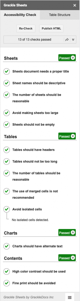
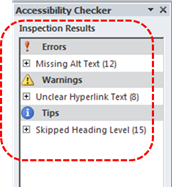
Grackle Slides performs the following 16 accessibility checks:
- Presentation
- Presentation title is required
- Document language should be specified
- Slides
- A slide should have a title
- Slide title should be unique
- A slide should not be empty
- Tables
- Tables should be tagged and described
- The use of merged cells is not recommended
- The use of empty cells is not recommended
- Elements
- Images should have alternative text
- Elements should have alternative text
- Text boxes should not be empty
- Lists should not be broken apart
- Content
- Fine print should be avoided
- High color contrast should be used
- In-line style changes may lack clear meaning
- Empty trailing lines should be removed
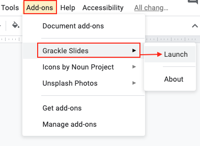
How to install Grackle Slides
Grackle Slides can be installed from the Add-ons menu of a Google Slides document.
- Open a Google presentation document.
- Select Add-ons > Get Add-ons.
- Search for “Grackle” in the search field.
- Select the add-on and click Install.
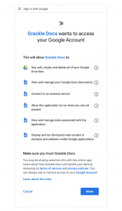
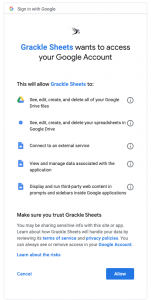
- Note: A message will appear requesting access to data that the add-on needs to work. Review the message and click Allow.
How to launch and use Grackle Sheet
Grackle Sheets is simple to launch and is accessed from the Add-ons menu.
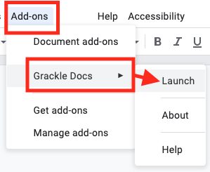
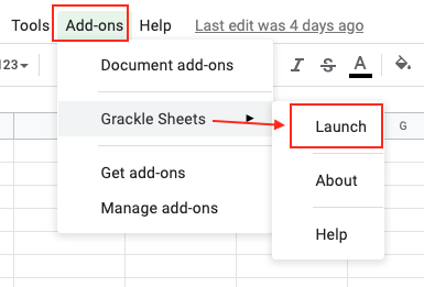
- Open a Google Slide document.
- From the Add-ons menu, select Grackle Slides, then select Launch.
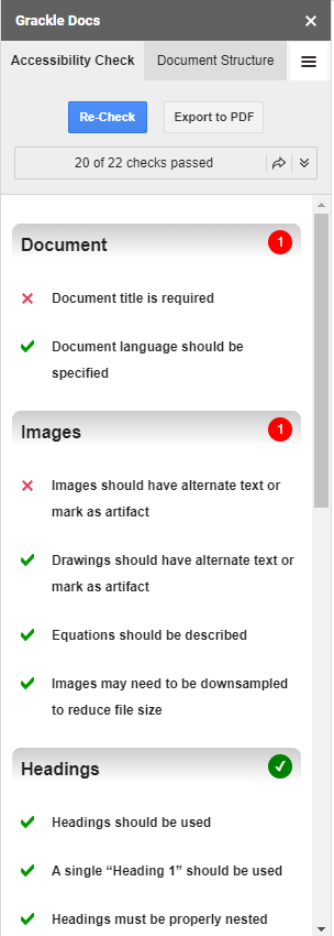
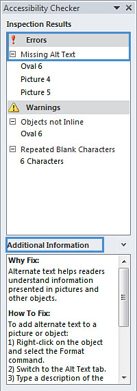
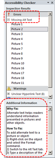
- A sidebar launches that identifies errors and warnings.
- Clicking on each error and warning will expand the selection and provide guidance on how to resolve each issue.
- Select the “Locate” button on any flagged item will take you to that line of the document to review.
- Continue to review and address each flagged item.
- Select the “Re-Check” button at the top of the sidebar to update the report.
- Continue to revise until all checks have passed.
Troubleshooting Grackle Slides
When testing the Grackle Slides, we found that the plugin would sometimes error out. Grackle Slides would indicate that the checks are complete, but the remediation functionality in the Grackle sidebar is not responsive.
Steps you can take when the Grackle Slide plugin does not function correctly:
- Export as a Microsoft PowerPoint file
- Open a new presentation file.
- Go to File > Import slides
- Run Grackle again
Note: After exporting to PowerPoint, you can run Microsoft’s built-in accessibility checker.
Technique 12. Use Accessibility Features when Saving/Exporting to Other Formats
In some cases, additional steps must be taken in order to ensure accessibility information is preserved when saving/exporting to formats other than the default.
To save in a different format
- Go to menu item: File > Download as
- Select format
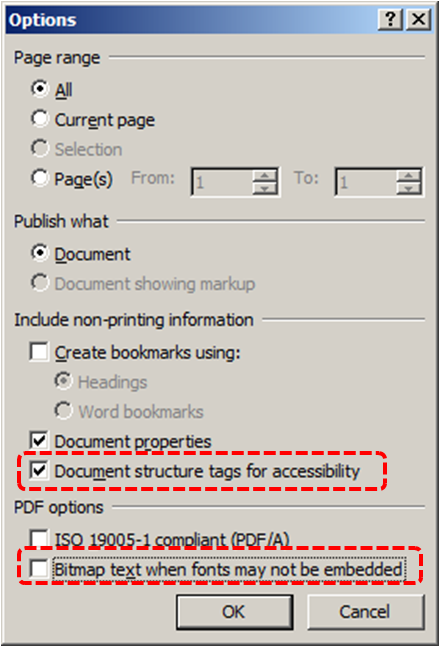
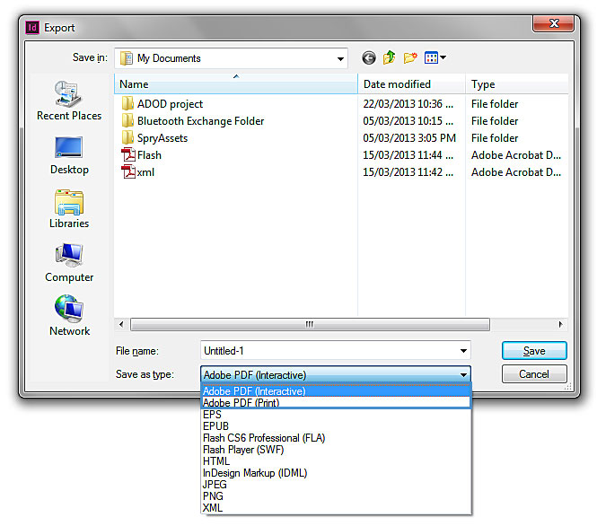
PDF
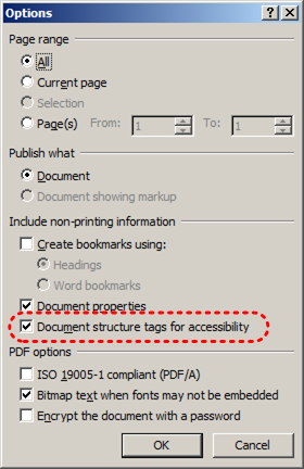
PDF documents are not always accessible. Accessible PDF documents are often called “Tagged PDF” because they include “tags” that encode structural information required for accessibility. To evaluate the accessibility of your PDF document, see Technique 11.
To clean up your HTML file
- Remove unnecessary styles, line breaks, etc.
- Remove unnecessary id, class, and attributes
- Remove font tags
- Remove styles in the <head> tag
- Ensure the <th> tags have a scope attribute
- Remove <p> tags nested inside <th> and <td> tags
- Check for accessibility (see Technique 11)
Note: you may wish to use HTML editors or utilities to help with this process.
Technique 13. Consider Using Accessibility Support Applications/Plugins
Disclaimer: This list is provided for information purposes only. It is not exhaustive and inclusion of an application or plug-in on the list does not constitute a recommendation or guarantee of results.
The following accessibility related plug-ins and support are available for Google Slides:
Accessibility Help
If you are interested in what features are provided to make using Google Slides more accessible to users, documentation is provided in online articles and Help forums:
- Go to menu item: Help > Google Docs Help Center
References and Resources
- Google Slides Help Center (a list of help topics)
- Google Slides Learning Center (list of tutorials and guides)
- Grackle Slides (plugin that checks for accessibility)
- Google: Make your document or presentation more accessible
- GAWDS Writing Better Alt Text
Acknowledgments
This document was produced as part of the Accessible Digital Office Document (ADOD) Project.
This project has been developed by the Inclusive Design Research Centre, OCAD University as part of an EnAbling Change Partnership project with the Government of Ontario and UNESCO (United Nations Educational, Scientific and Cultural Organization).

Source: Authoring Techniques for Accessible Office Documents: Google docs: Presentation by the Inclusive Design Research Centre (IDRC) used under CC-BY-SA 3.0.